Built with Framer
Type Design — Marmite Defontes
Guillaume Berry
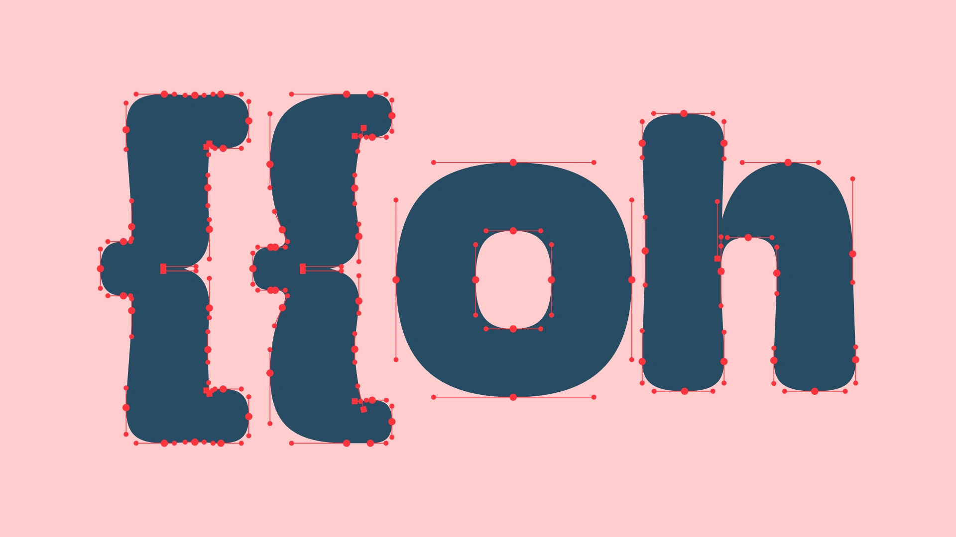
With Marmite Defontes, I create typefaces that balance personality and practicality. I’ve always believed that good typography should do more than decorate — it should communicate with clarity and character. Every typeface I design is built to feel distinctive, yet easy to use in both print and digital environments.
What I love about this approach is that it gives other designers tools they can trust: fonts that carry a strong voice but adapt gracefully to many projects. When you choose a Marmite Defontes typeface, you’re choosing more than shapes and letters — you’re choosing a tone and texture that can define how your message feels. And you also support an independent type foundry
That’s the kind of value I aim to bring to every collaboration: design that’s expressive, functional, and made to last.
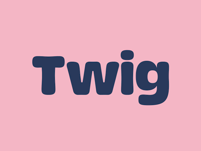
Details for the Twig typeface
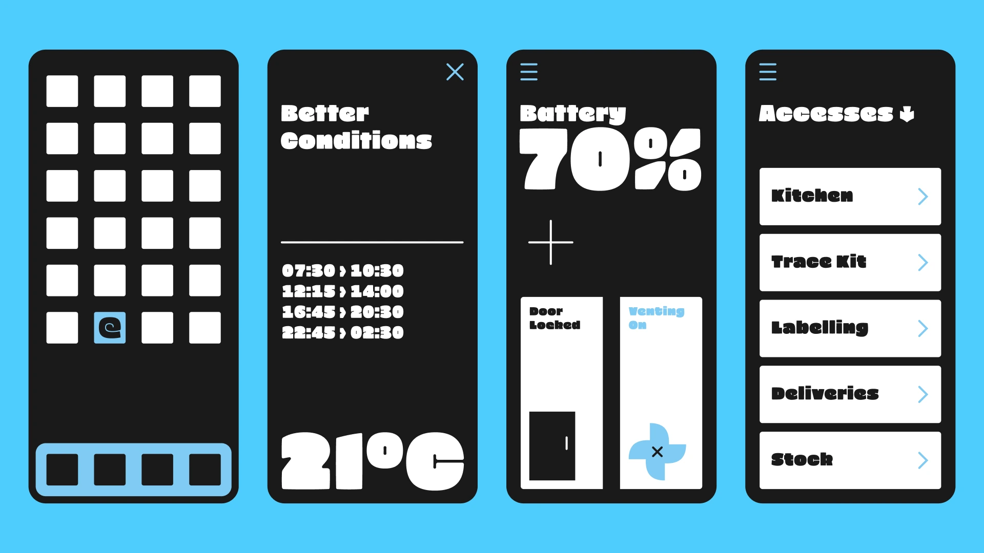
Zoyg font family sneak peek
Taku font family early showcase
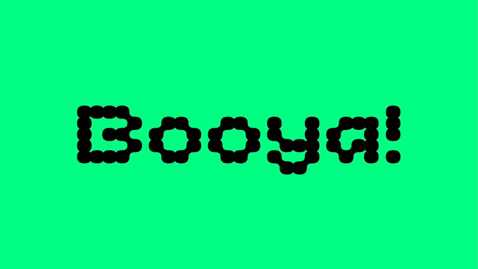
Metaplasm font family
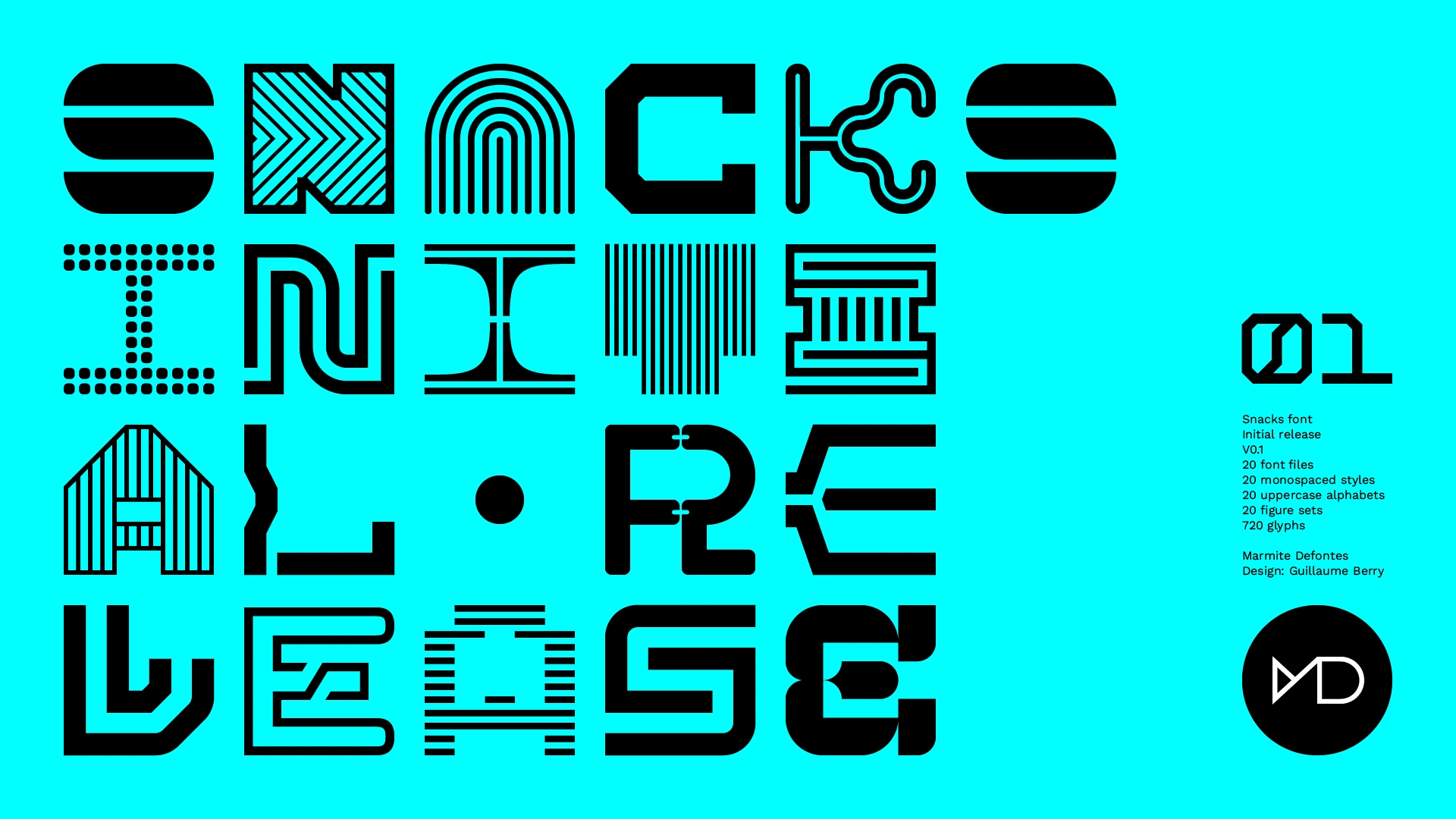
Specimen cover for the Snacks font collection
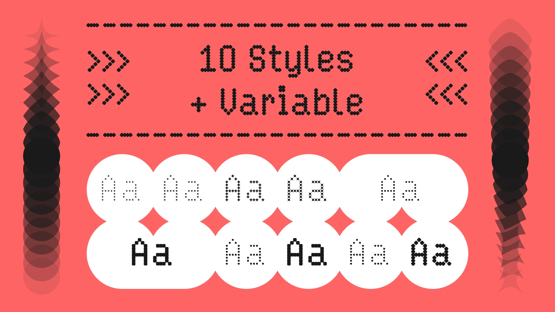
Key visual for the Kuiper variable font family
Piggle font in use

Work in progress for the Japanese version of Piggle
Like this project
Posted May 18, 2025
I design and produce fonts under the name Marmite Defontes. Retail fonts, some custom fonts and letter work, always with personality and care for details.
Likes
0
Views
20
Timeline
Jan 1, 2022 - Ongoing