Brand Identity Development for Le’taste
pritesh suthar
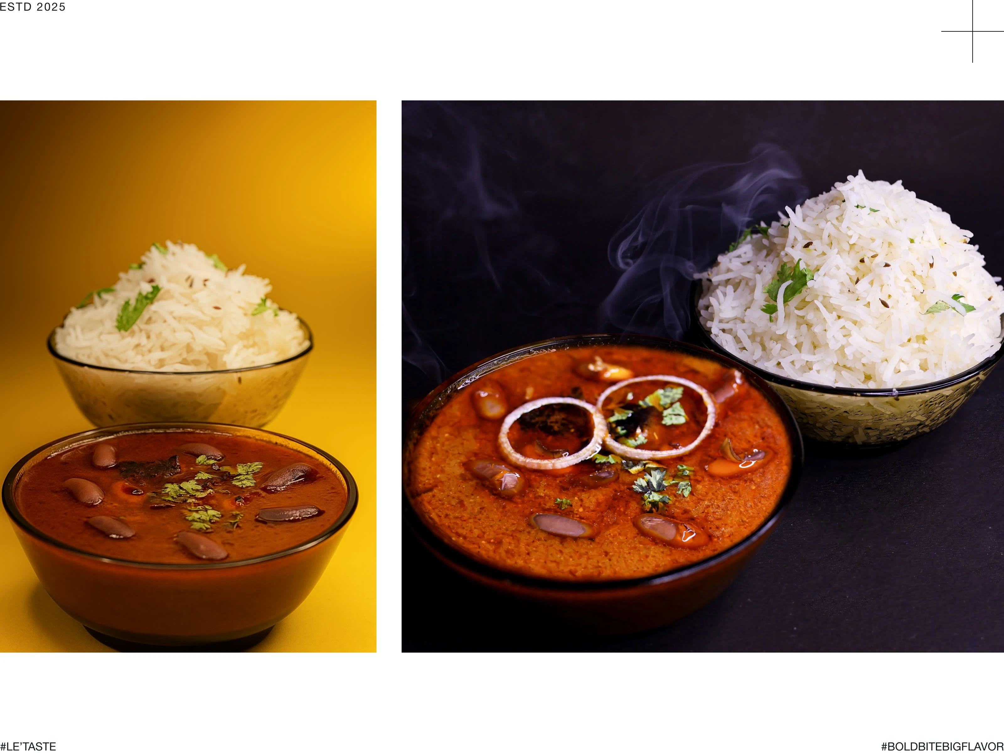
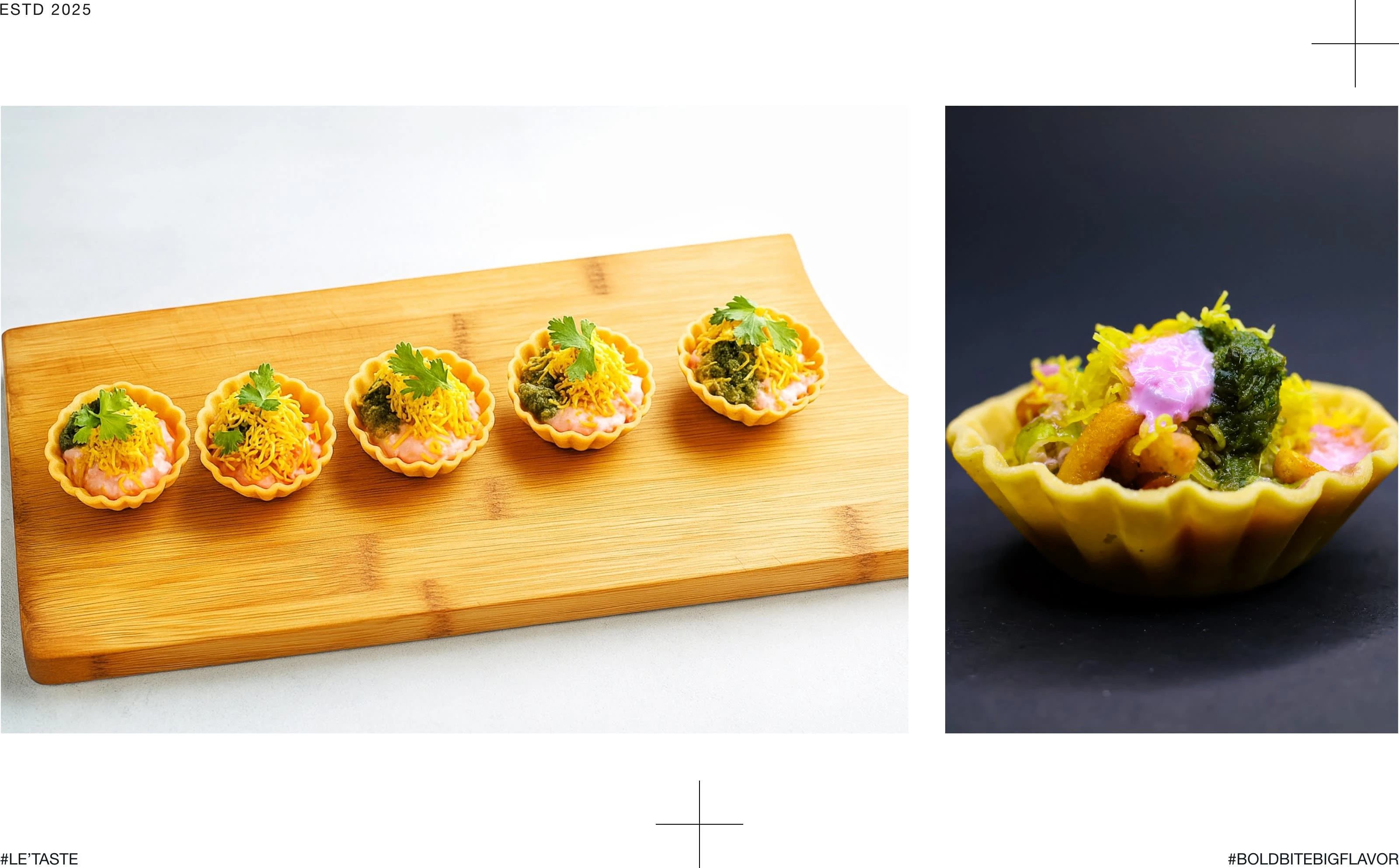
Le’taste is a cloud kitchen brand that delivers a fusion of homemade Gujarati food, Mexican bites, and Italian comfort dishes, bringing global flavors into a local kitchen experience. The brand focuses on authentic homemade taste crafted with love — served fresh through Zomato.
my role
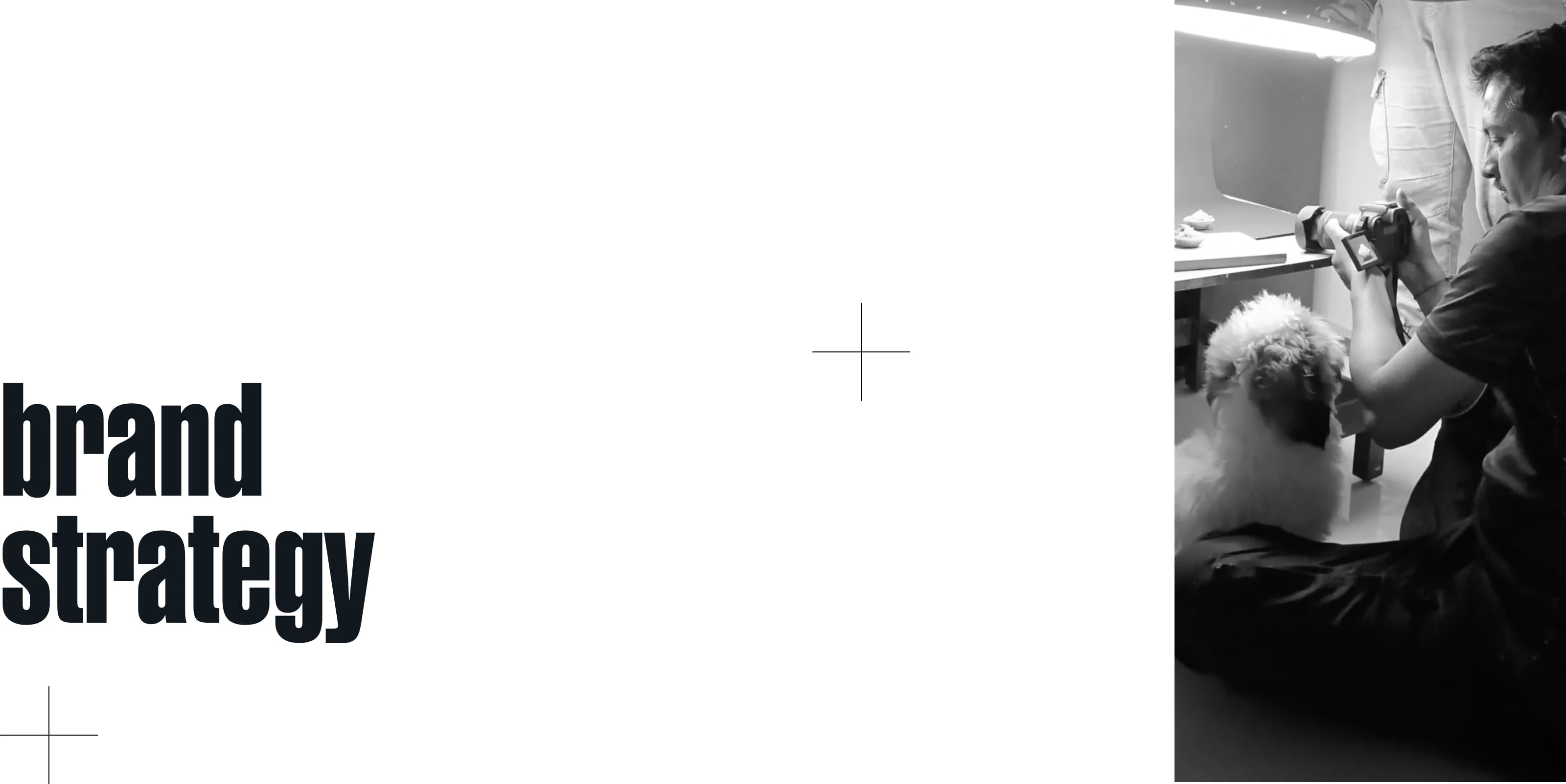
As the Brand Designer and Creative Director, my role was to develop the complete brand identity — from brand strategy and logo design to visual identity, photography and marketing applications.
The client approached us to create a strong brand identity that reflects their homemade authenticity yet feels modern and appealing for online food delivery customers.
Challenges Identified:
No clear brand identity or visual consistency
Lack of differentiation among other local cloud kitchens on Zomato
Need to communicate both home-cooked comfort and bold, flavorful experience
Goal:
To design a distinctive and memorable brand identity that captures the brand’s fusion of tradition and boldness — making Le’taste stand out in the competitive cloud kitchen market.
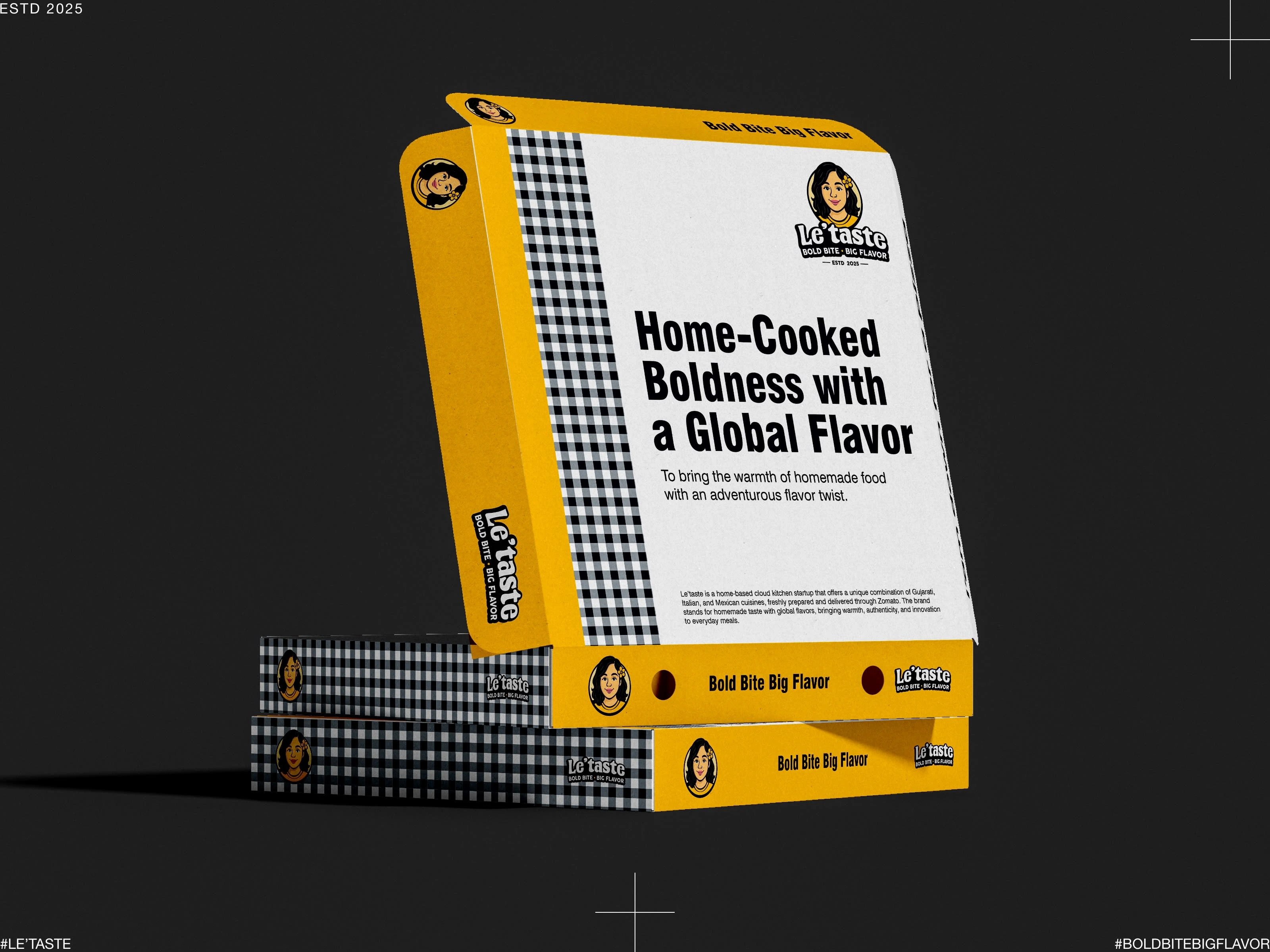
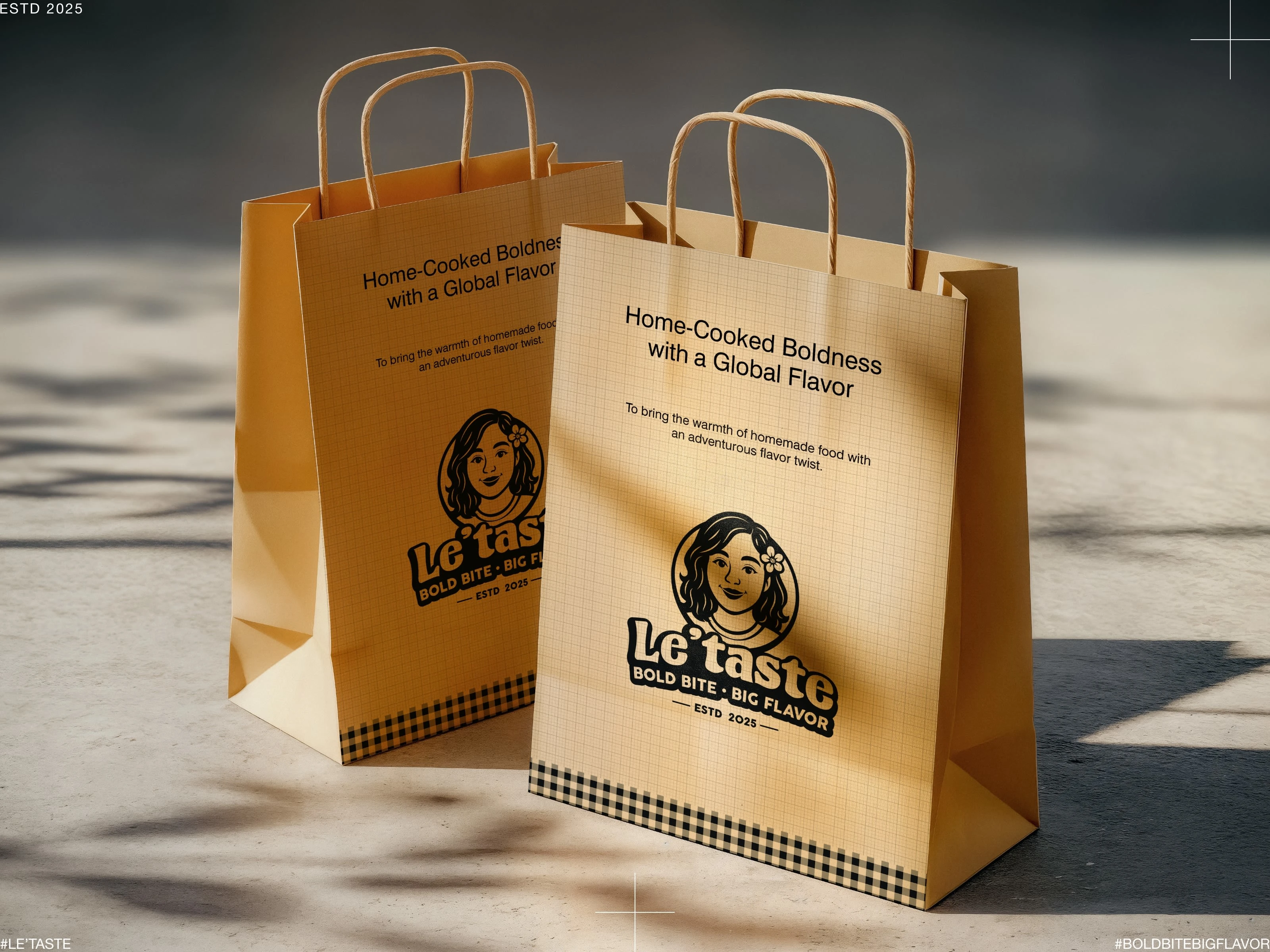
Our brand strategy focused on defining Le’taste’s essence as “Home-cooked boldness with a global flavor.”
Brand Purpose:
To bring the warmth of homemade food with an adventurous flavor twist.
Mission:
To serve flavorful, freshly prepared homemade meals that delight every bite.
Core Values:
Authenticity
Boldness
Quality
Care
Brand Personality:
Friendly, Warm, Bold, and Flavorful.
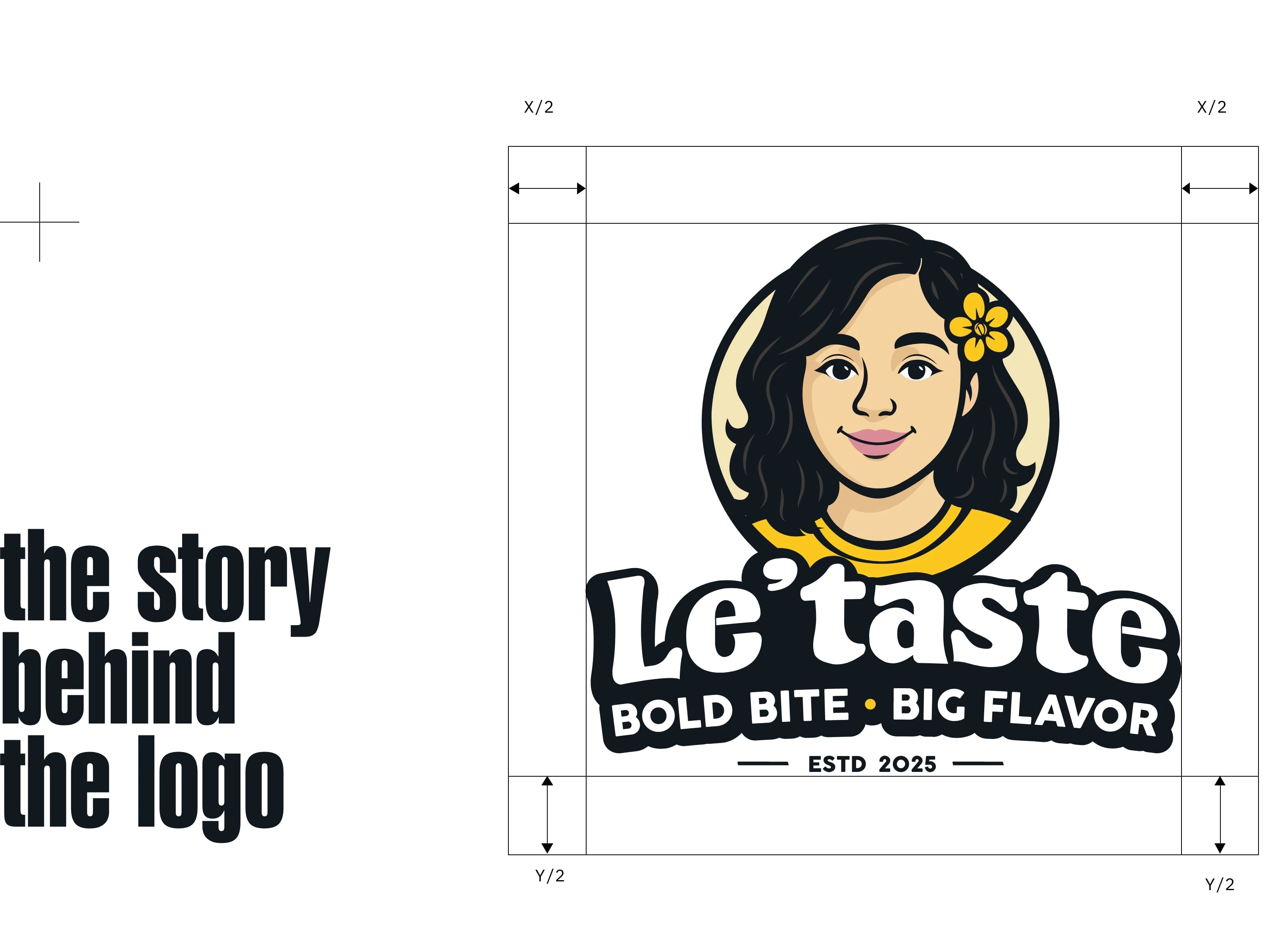
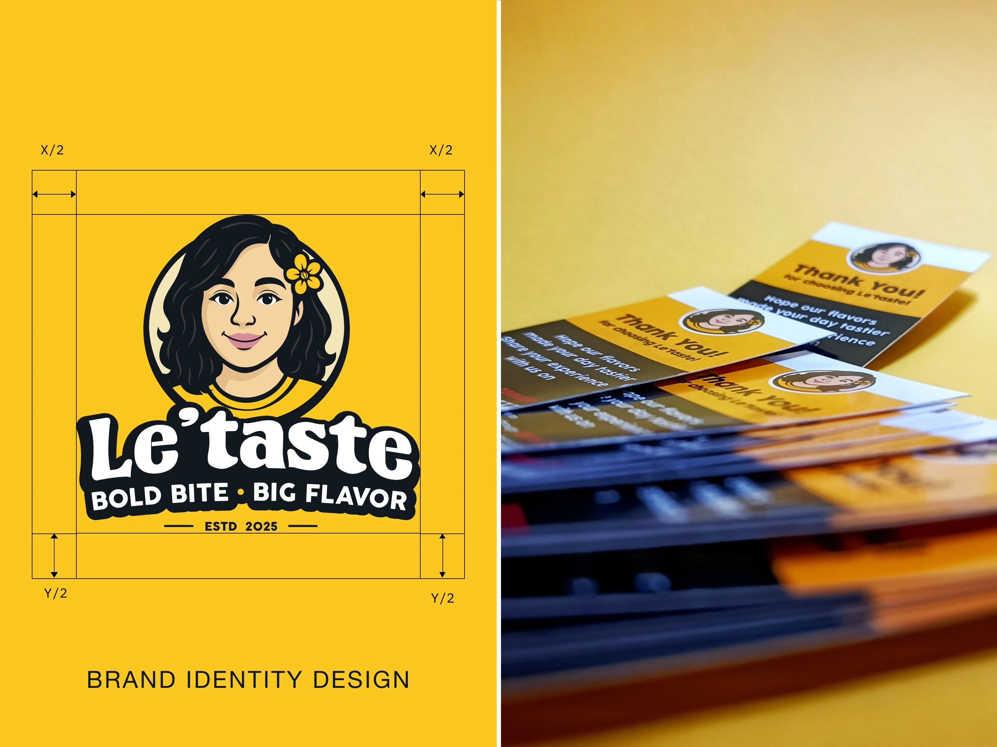
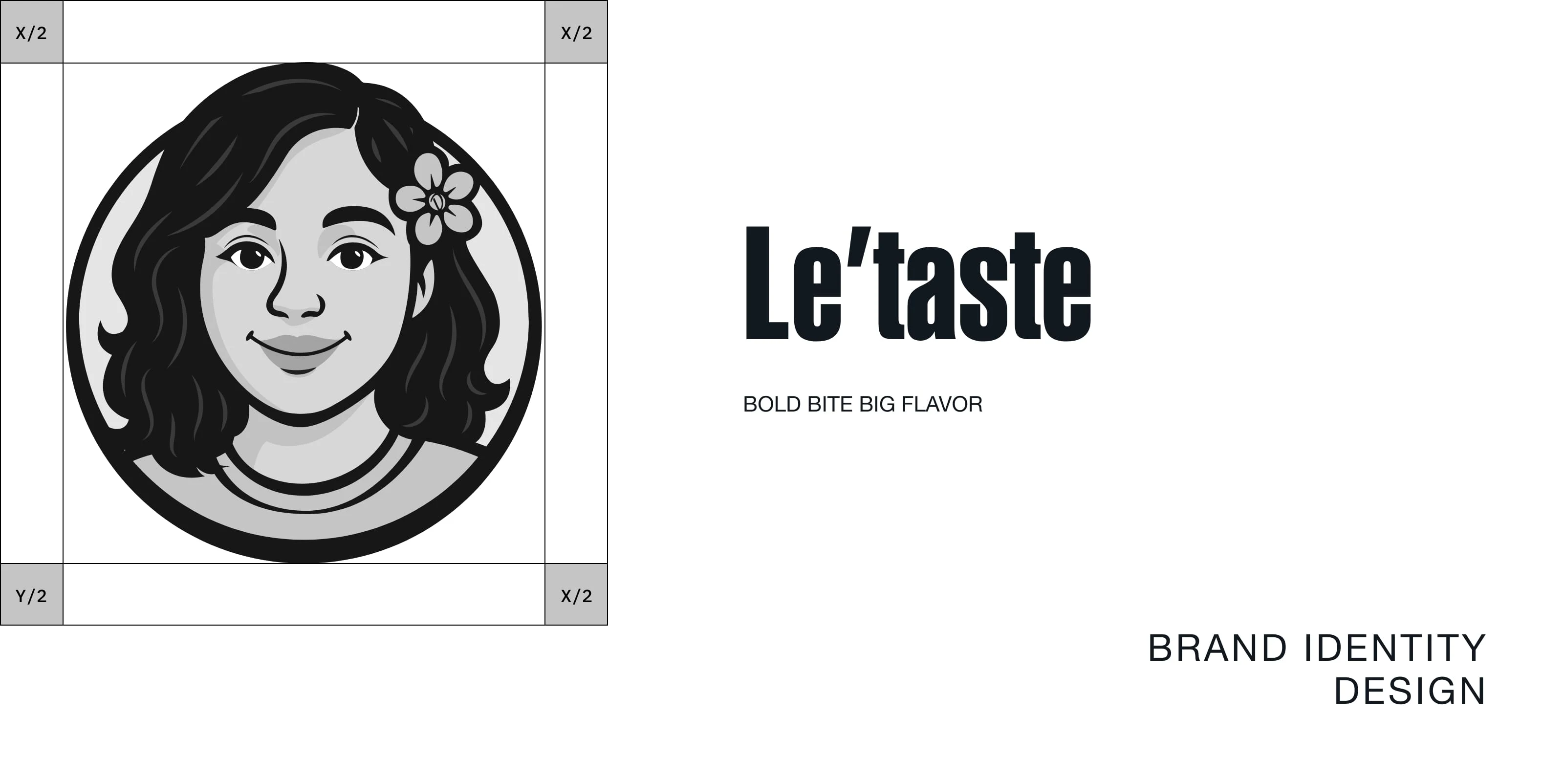
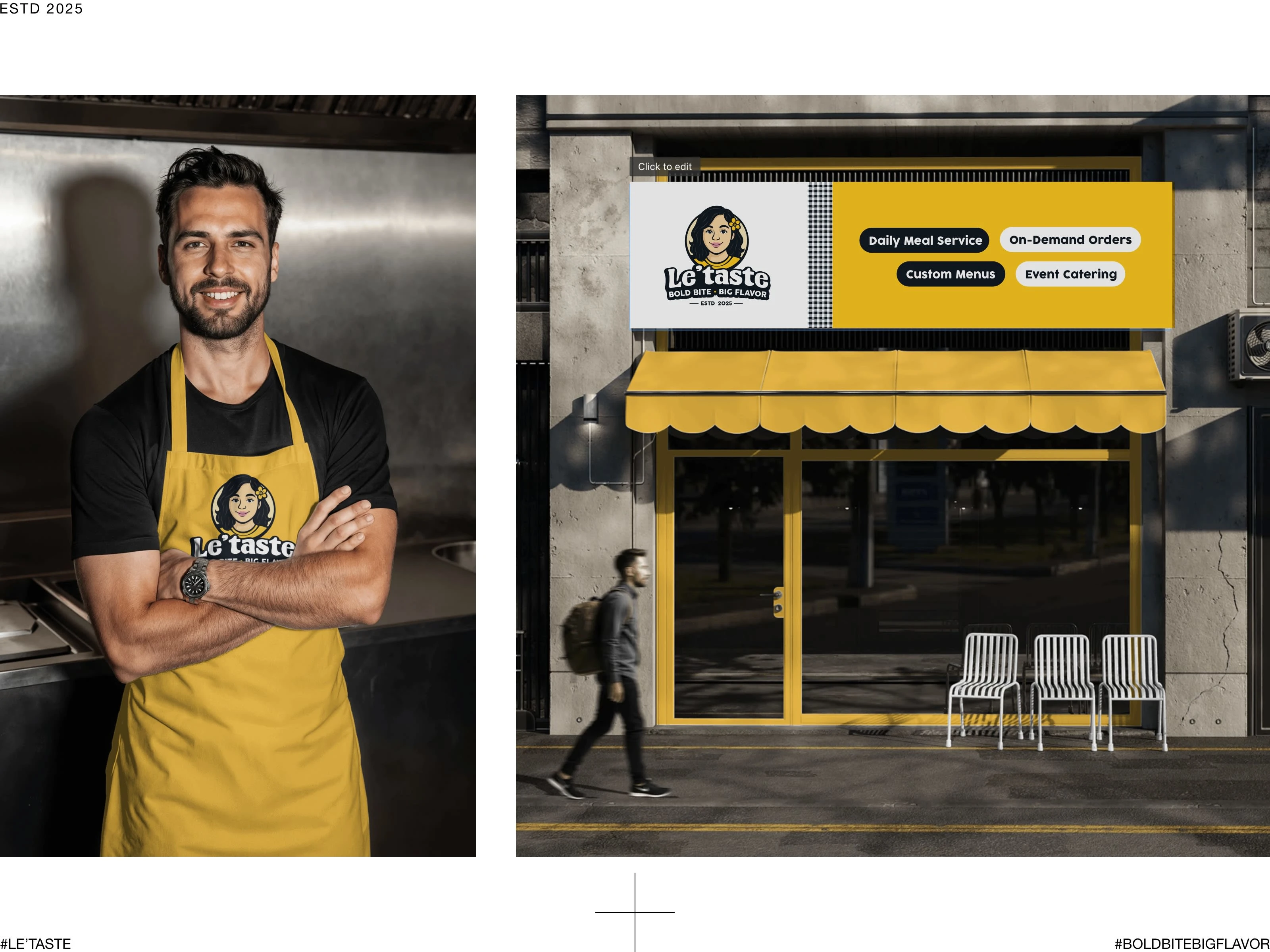
The logo design was created with a clear purpose. The mascot artwork is inspired by KFC brand, so we created the face of Le’taste’s owner, giving the brand a personal and authentic touch. The name Le’taste itself carries meaning — it represents a Gujarati restaurant that offers customers high-quality, delicious Gujarati food with a true homemade taste.
Interestingly, the name Le’taste can be read in two ways — Le taste (meaning “take the taste”) and Let taste (meaning “something new to experience”).
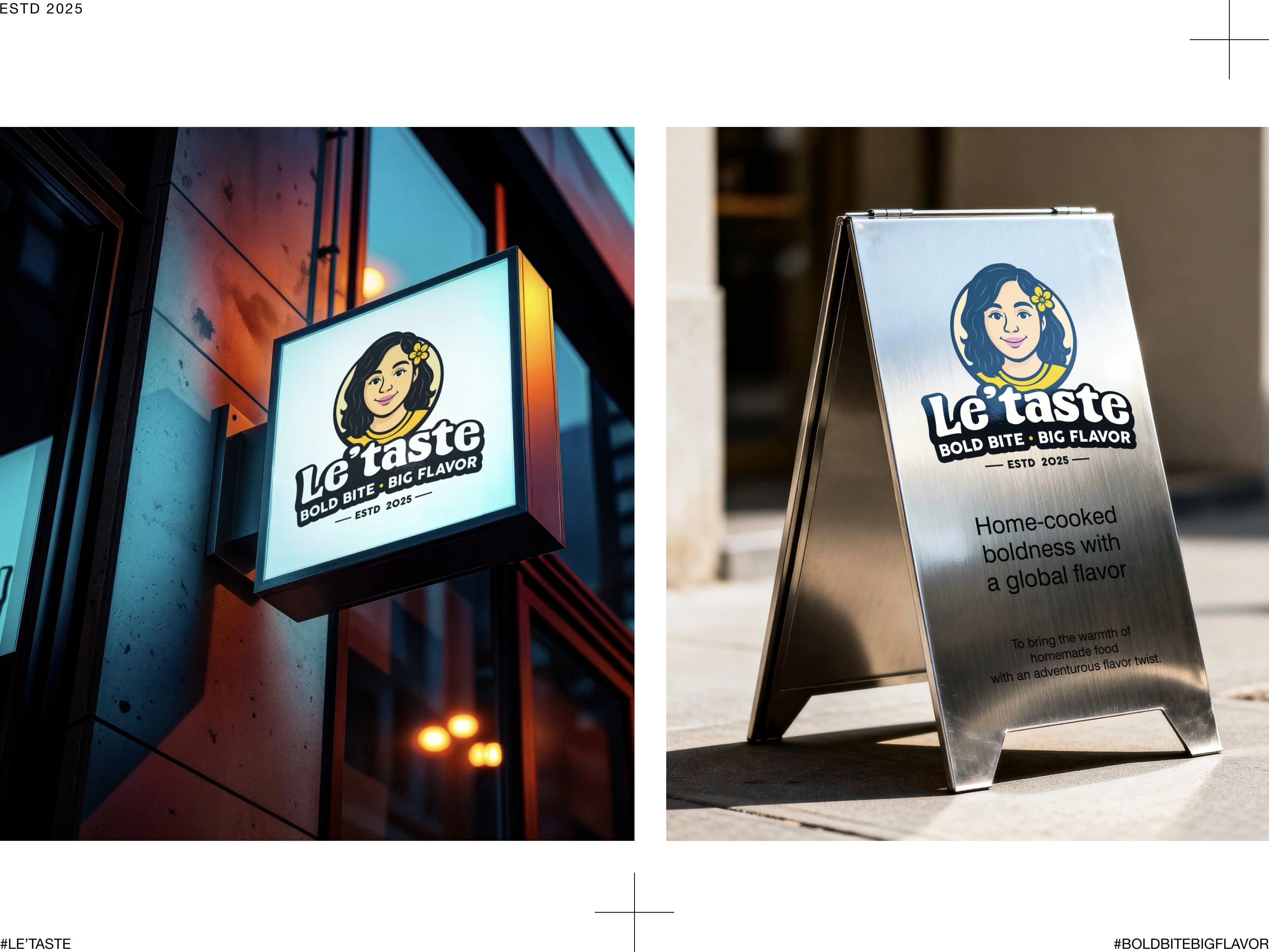
Our tagline, “Bold Bite Big Flavor” perfectly reflects this idea — with every bite, you experience the rich, bold flavors of home.
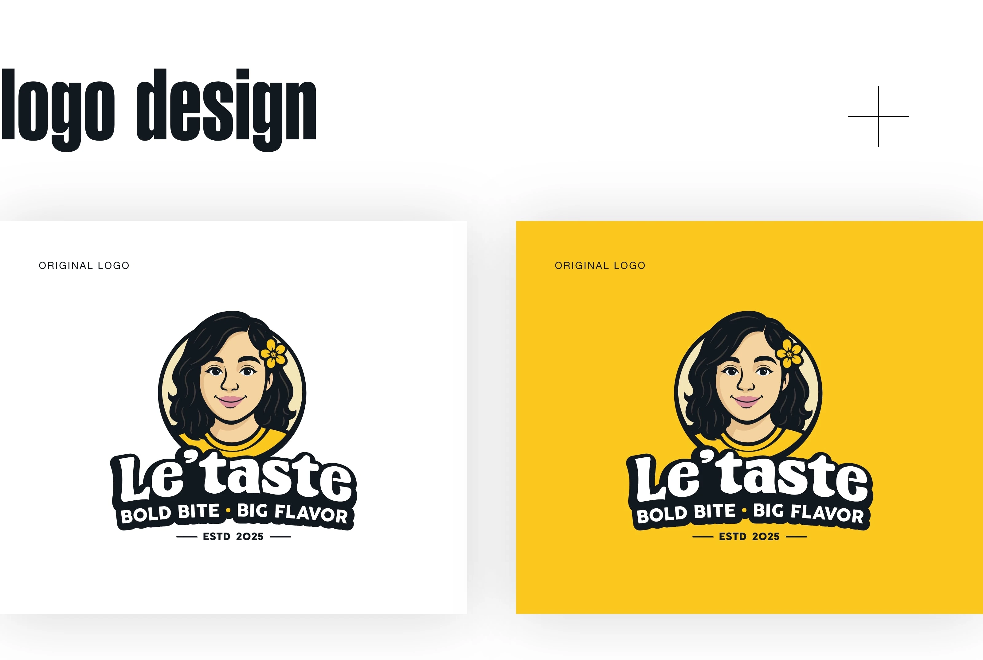
The main reason for finalizing this logo was that the client wanted a mascot-style design, and the mascot artwork slightly resembles the client’s face. The typography has a slight curve because the client wanted something different from plain text. They also preferred a bold look and feel, so this logo was finally selected.
As I mentioned in the slide above, the client liked the mascot design style because they were inspired by the KFC logo. So, we tried to create a similar style. Since they wanted to use yellow and black colors, we finalized those shades for the logo.
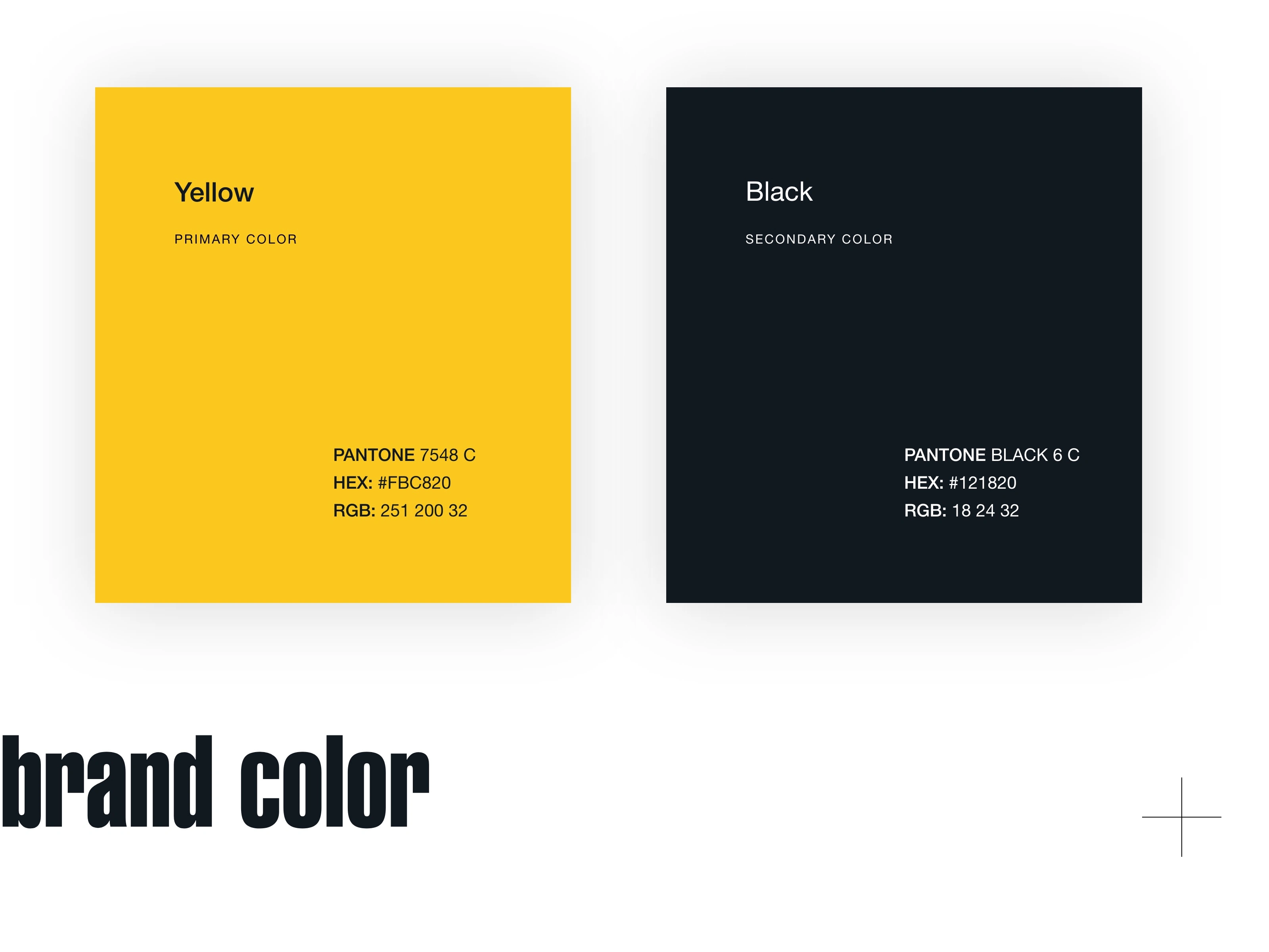
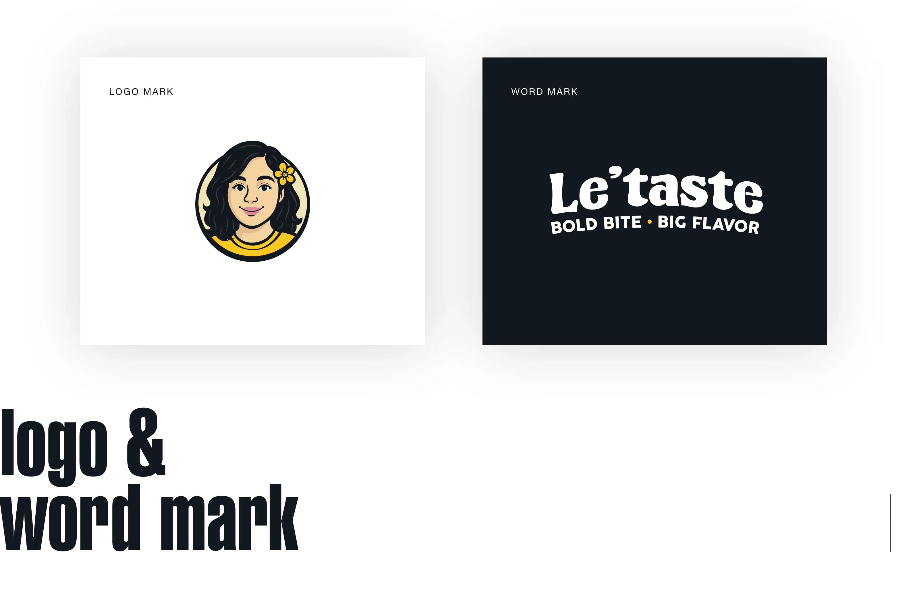
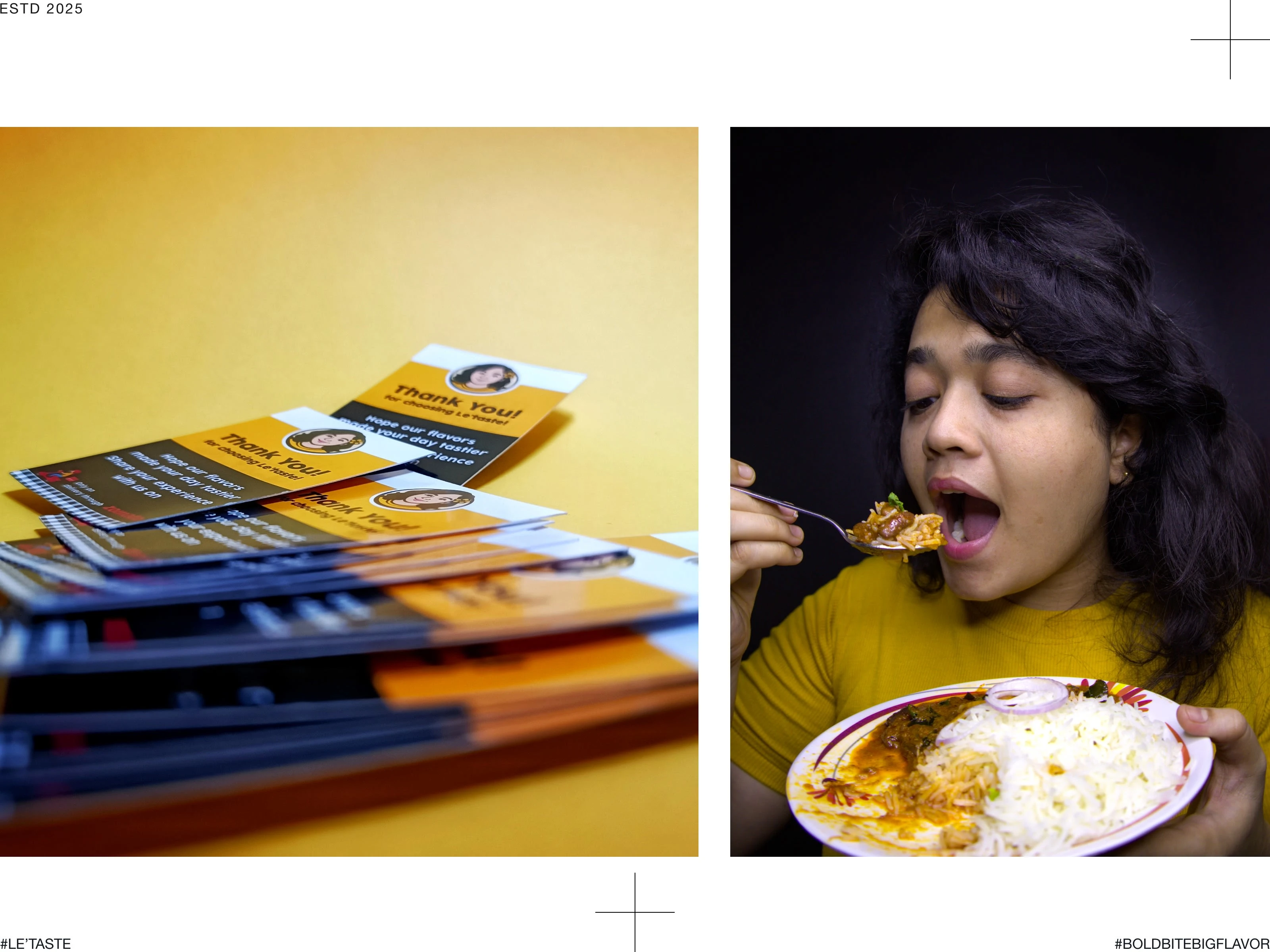
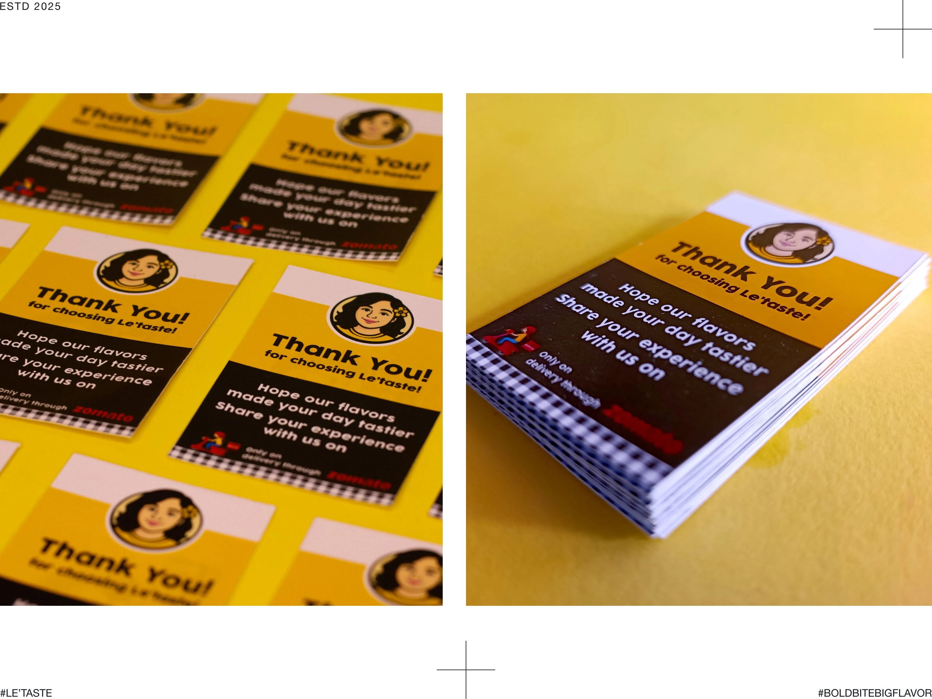
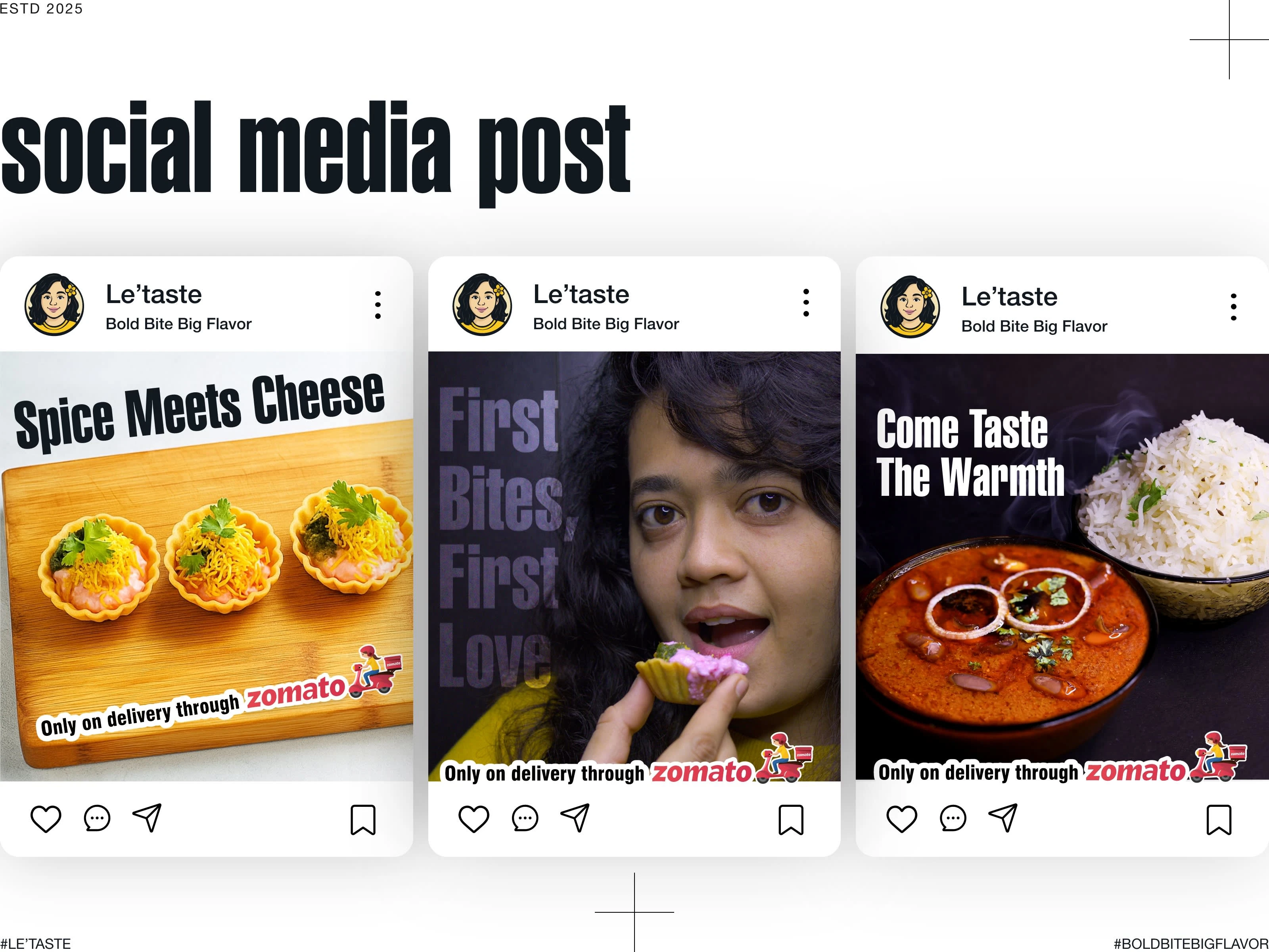
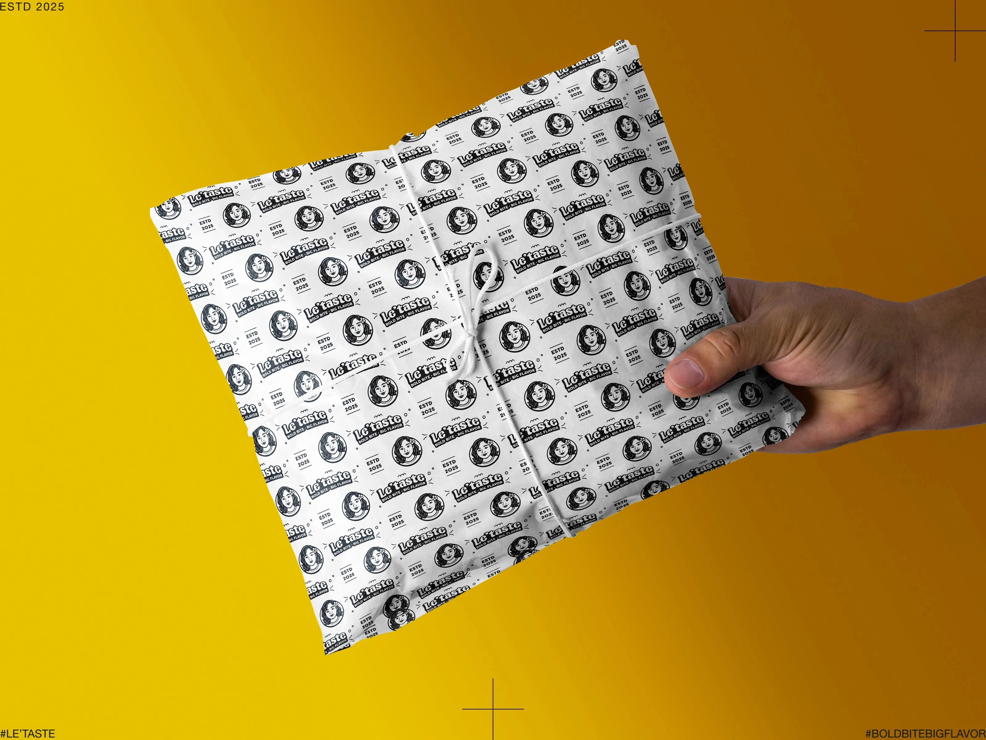
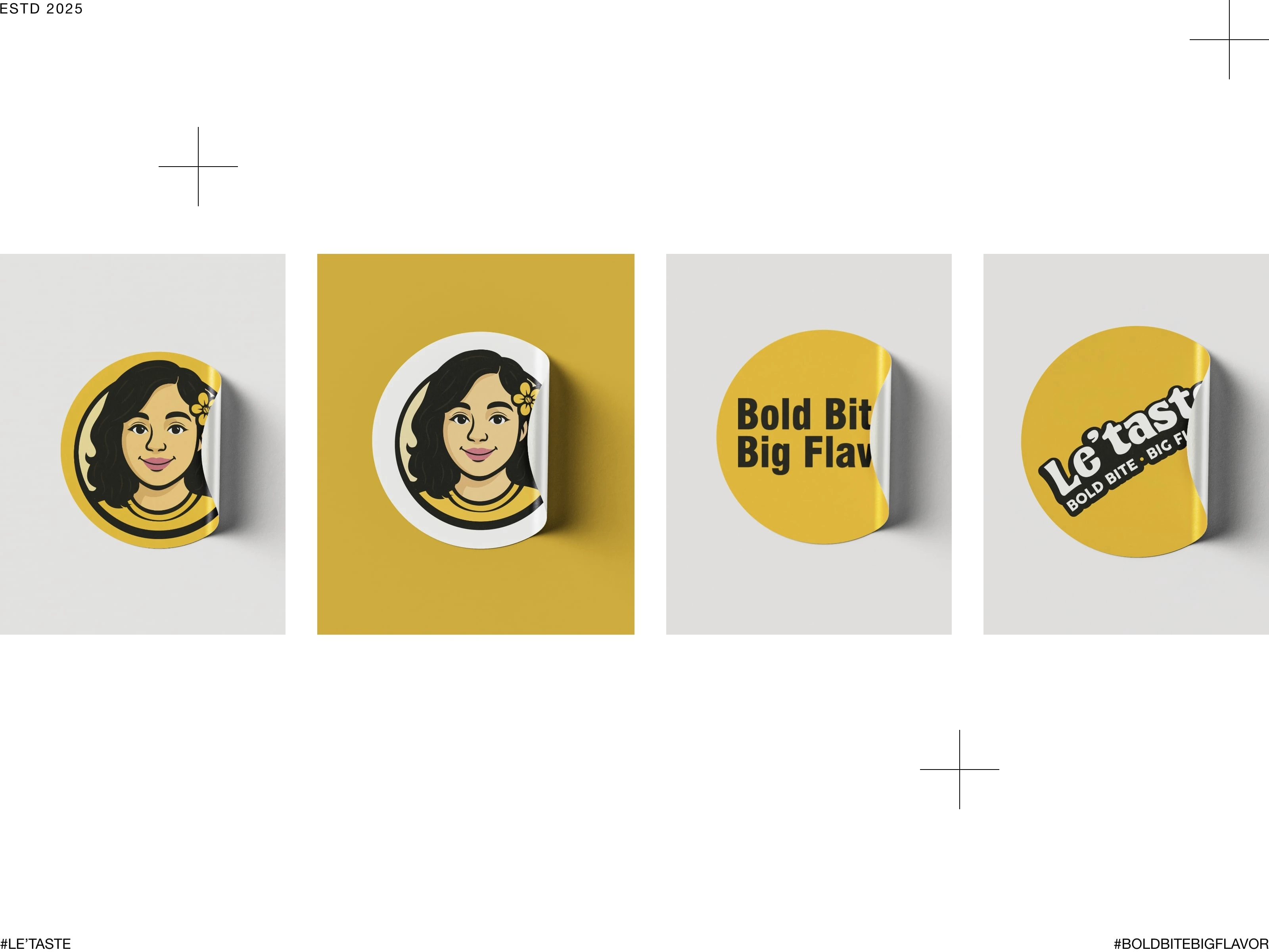
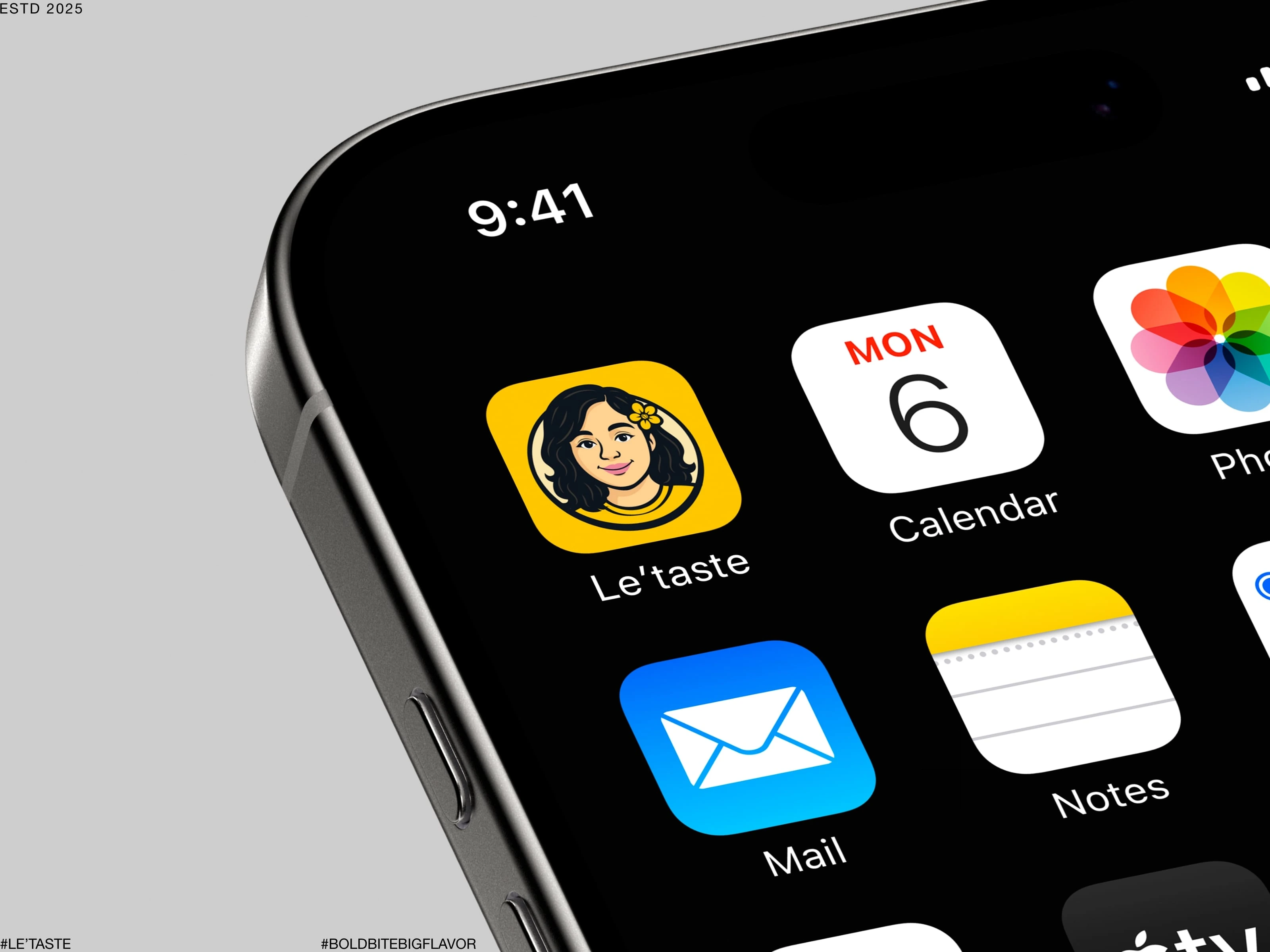
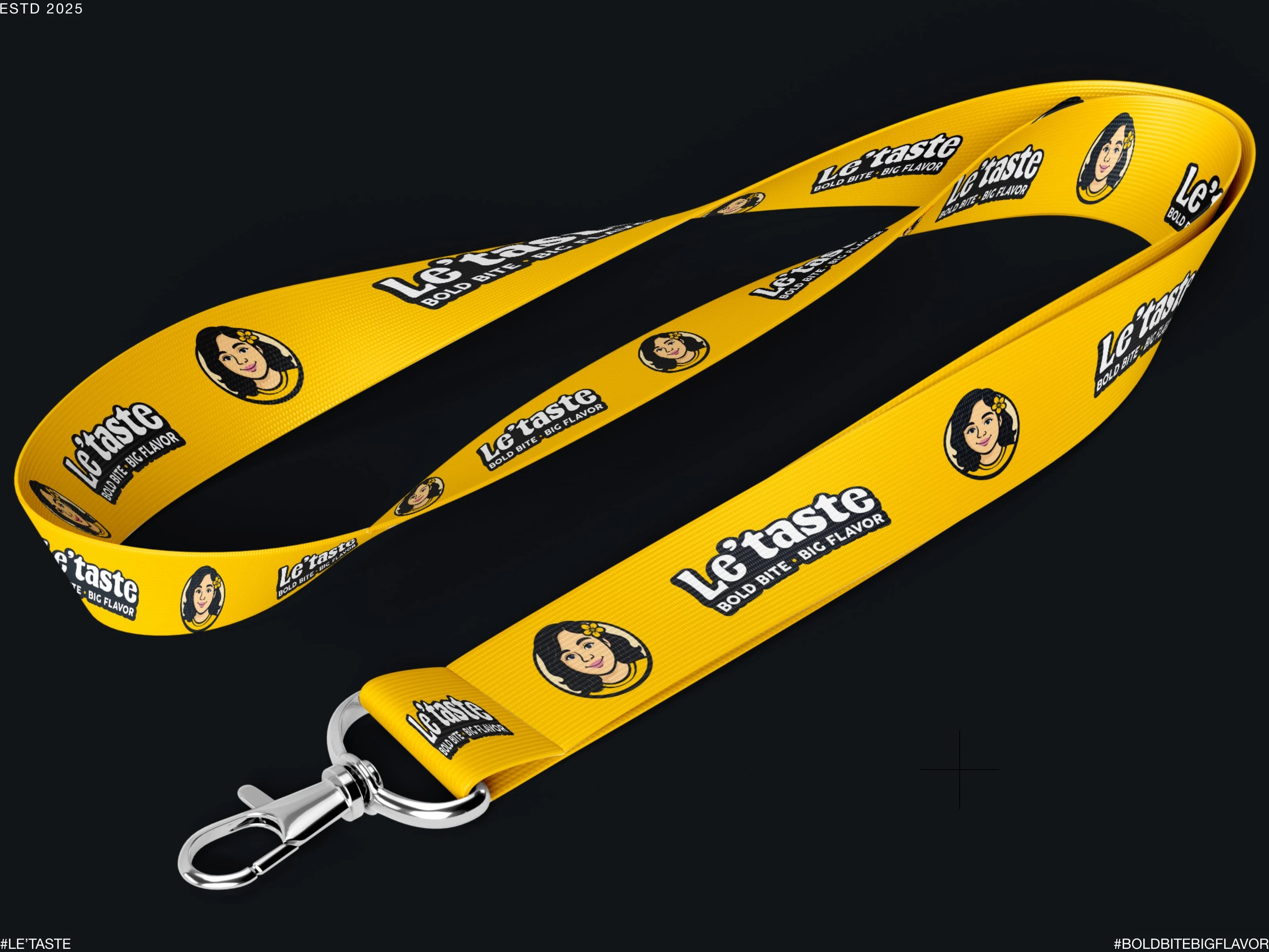
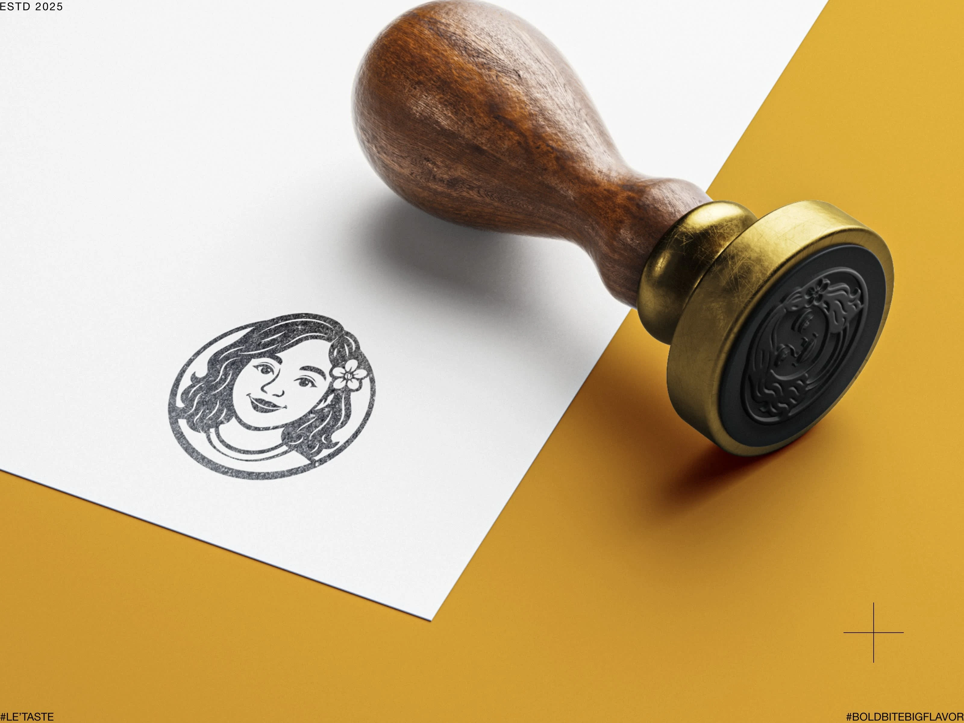
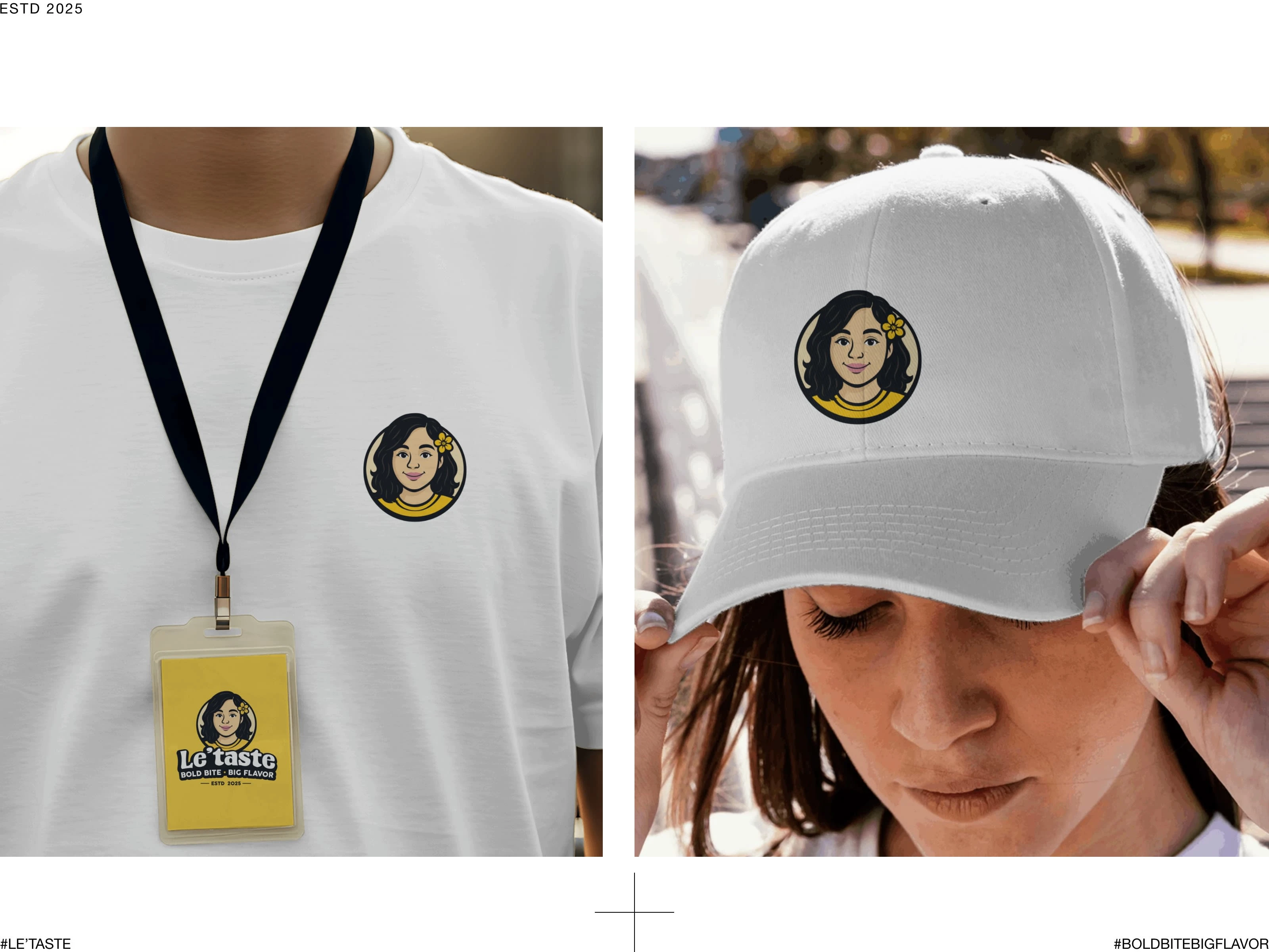
Le’taste’s visual system was designed to ensure consistency and versatility across digital and physical touchpoints.
Like this project
Posted Nov 1, 2025
Developed a unique brand identity for Le’taste, a cloud kitchen brand.