Home Design Application
Steps 1 :- Requirements
The project embarks on its journey with a pivotal phase – initiating conversations with the client. This stage is instrumental in shaping the project's trajectory. Through in-depth meetings and thoughtful discussions, I actively engage with the client to gain profound insights into their vision, preferences, and requirements. These interactions serve as the cornerstone upon which the entire project is built. They lay the foundation for a venture that is impeccably aligned with the client's goals and aspirations. the paramount objective of this phase is to not only comprehend but also fulfill the client's needs and ensure their utmost satisfaction with the work.
Steps 2 :- Project Analysis
Following in-depth client meetings, the Project Analysis phase takes center stage. Here, I embark on a journey of profound exploration into the project's intricacies. This entails a deep dive into the scope, challenges, and opportunities that lie ahead. This phase is not just a formality; it's the compass that sets our course. It plays a pivotal role in charting the right direction for the project, defining its goals, and ensuring a clear path forward. By delving into the project's nuances, I uncover hidden potential and address potential pitfalls. This comprehensive analysis lays the groundwork for an informed and strategic approach that paves the way for a successful project.
Steps 3 :- Project Research
In this pivotal step, I go above and beyond to ensure that every aspect of the project is grounded in data-driven insights. Simultaneously, I explore the vast expanse of competitors' offerings, dissecting their strengths and weaknesses. What sets my research approach apart is my dedication to differentiation. I not only rely on established trends but also value the unique perspectives of clients. This dual approach empowers me to craft an application that stands out from the crowd. This research-driven foundation paves the way for innovative design choices and a project direction that is uniquely tailored to meet both client expectations and user needs.
Steps 4 :- Application Flow
Armed with a precise comprehension of the project's objectives, I embark on the meticulous task of crafting the Application Flow. This pivotal step involves the creation of intricate diagrams and blueprints that paint a clear picture of how users will navigate through the application. This phase is the backbone of a user-centric experience. It's where we engineer a journey that is both seamless and intuitive, ensuring that every interaction serves a purpose. The Application Flow acts as our roadmap, guiding users through the application's landscape with precision. Our aim is to transform complexity into simplicity, and ambiguity into clarity. With a carefully crafted Application Flow, we pave the way for an experience that effortlessly connects users with the heart of the project's functionality, resulting in user satisfaction and project success.
Steps 5 :- Wireframe
The Wireframe phase is where the project's structural framework takes shape. These wireframes act as the essential architectural blueprints, focusing solely on layout and functionality, free from visual distractions. This phase is pivotal for fine-tuning the user experience, ensuring seamless and intuitive interactions. Wireframes serve a dual purpose. Firstly, they provide a clear understanding of the application's flow and functionality, facilitating iterative refinement. Secondly, I share them with clients for feedback and review, promoting transparency and alignment with their vision. Wireframes are dynamic tools, not static drawings, enabling constant improvement and ensuring the project reflects my creative vision while meeting client expectations.
Steps 6 :- Color Fonts and Spacing
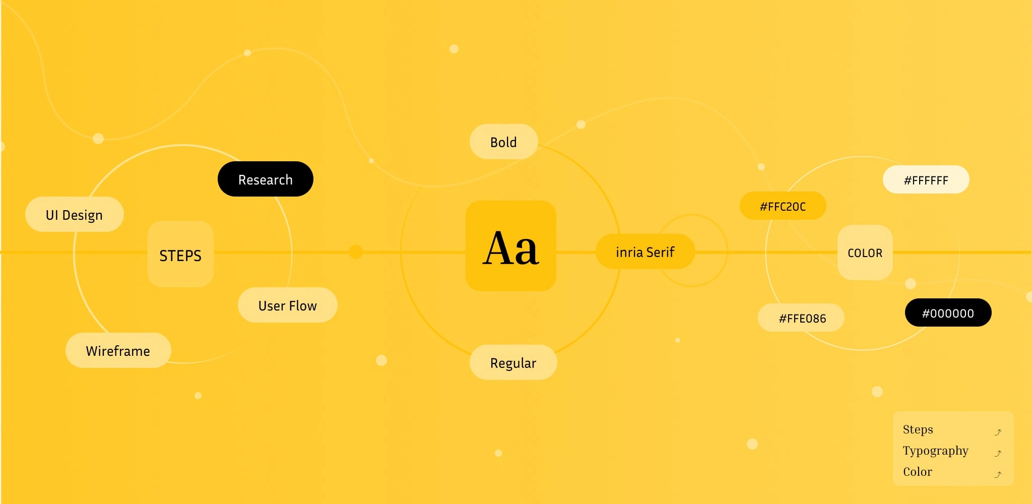
In the Color, Fonts, and Spacing phase, the project comes to life with a meticulous focus on aesthetics and visual harmony. Here, I curate a palette of colors that resonate deeply with users, setting the tone for the entire experience. Fonts are selected with precision, forming a cohesive visual language that unifies the project's design. This step holds immense significance because it directly impacts the project's appeal. The right choice of colors, fonts, and spacing ensures a visually pleasing and engaging application. Conversely, neglecting these aspects can detract from the overall user experience. Given its critical role, this phase may require more time and attention, but the investment is essential. It is in these details that the application's aesthetics and user engagement truly shine, making it a key pillar of our design journey.
Steps 7 :- UI Design
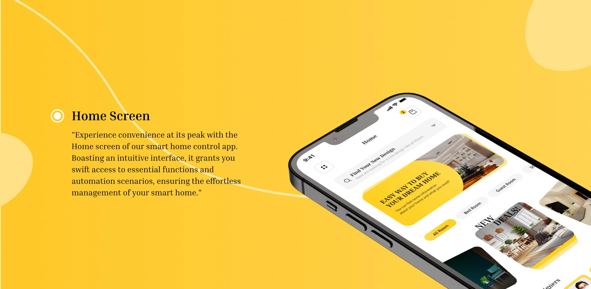
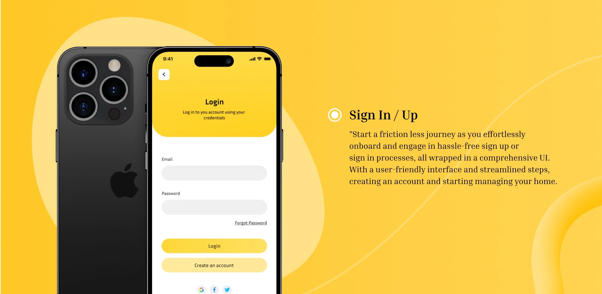
In the UI Design phase, my vision springs to life, and each design element is meticulously crafted. From buttons to icons, every detail is thoughtfully considered to ensure alignment with the application's overarching theme. This phase is where aesthetics and functionality converge seamlessly, creating an immersive user experience. My commitment to excellence extends beyond the initial design. I methodically review each element, one step at a time, to ensure that it not only meets the client's requirements but also exceeds their expectations. This iterative approach ensures that the final product is not just visually captivating but also functionally impeccable. Furthermore, client feedback remains integral throughout this phase. I consider and implement changes as needed, making collaboration a cornerstone of our design process. This dedication to continuous improvement makes the UI Design phase a pivotal step in our journey towards a remarkable project.
Like this project
Posted Mar 16, 2024
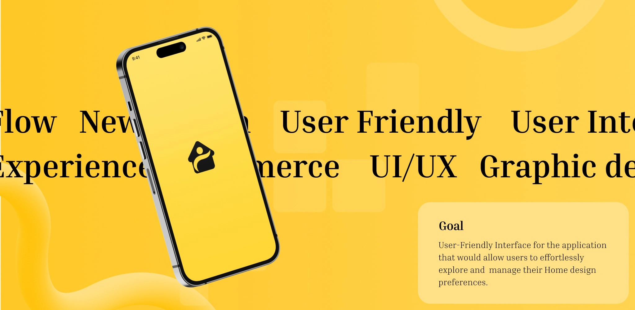
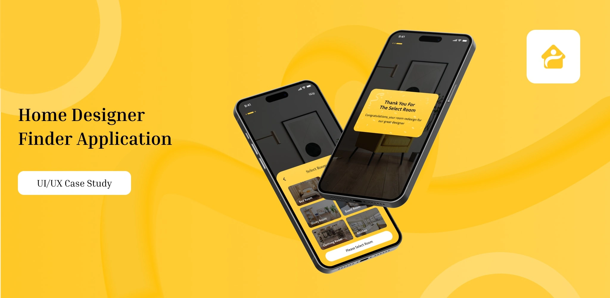
User-Friendly Interface for the application that would allow users to effortlessly explore and manage their Home design preferences.
Likes
0
Views
0


