Cramp Care - Visual Identity Design
Devyani Goyal
CRAMP CARE
Cramps, mood disorders, and tiredness are just a few of the challenges menstruation cycles throw up, along with the taboo surrounding periods that creates an unnecessary stigma around these problems. Painkillers have many negative effects on the body and bulky heating pads cannot be worn all day when you have work to do.
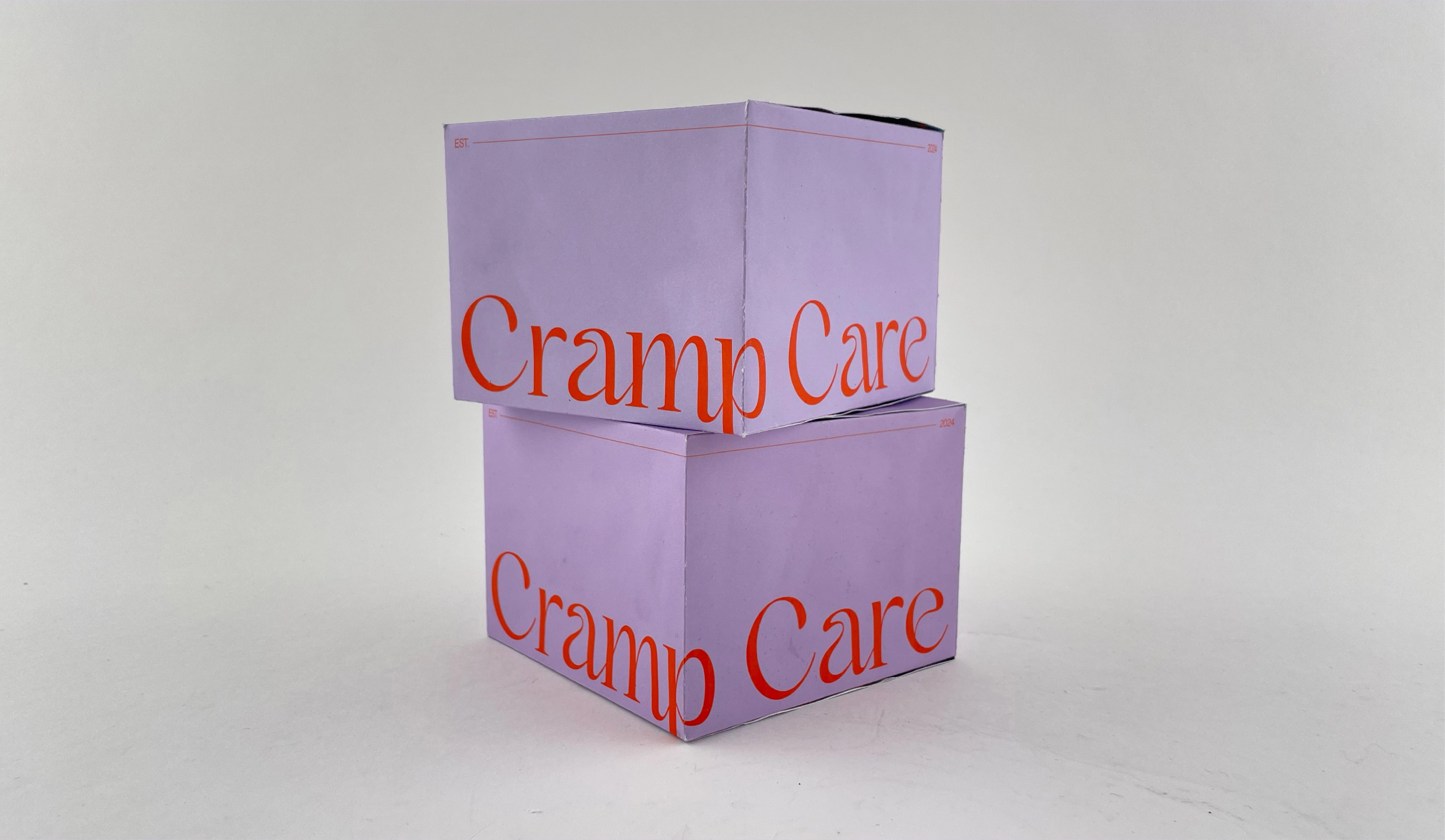
Cramp Care is a (fictional) brand that produces stick-on heating pads for menstrual cramps. These heating pads can be worn comfortably on areas where one feels cramps so daily tasks can be carried out with ease. The visual identity gives a bold and distinct identity to the brand which is reflective across all its applications.
VISUAL IDENTITY
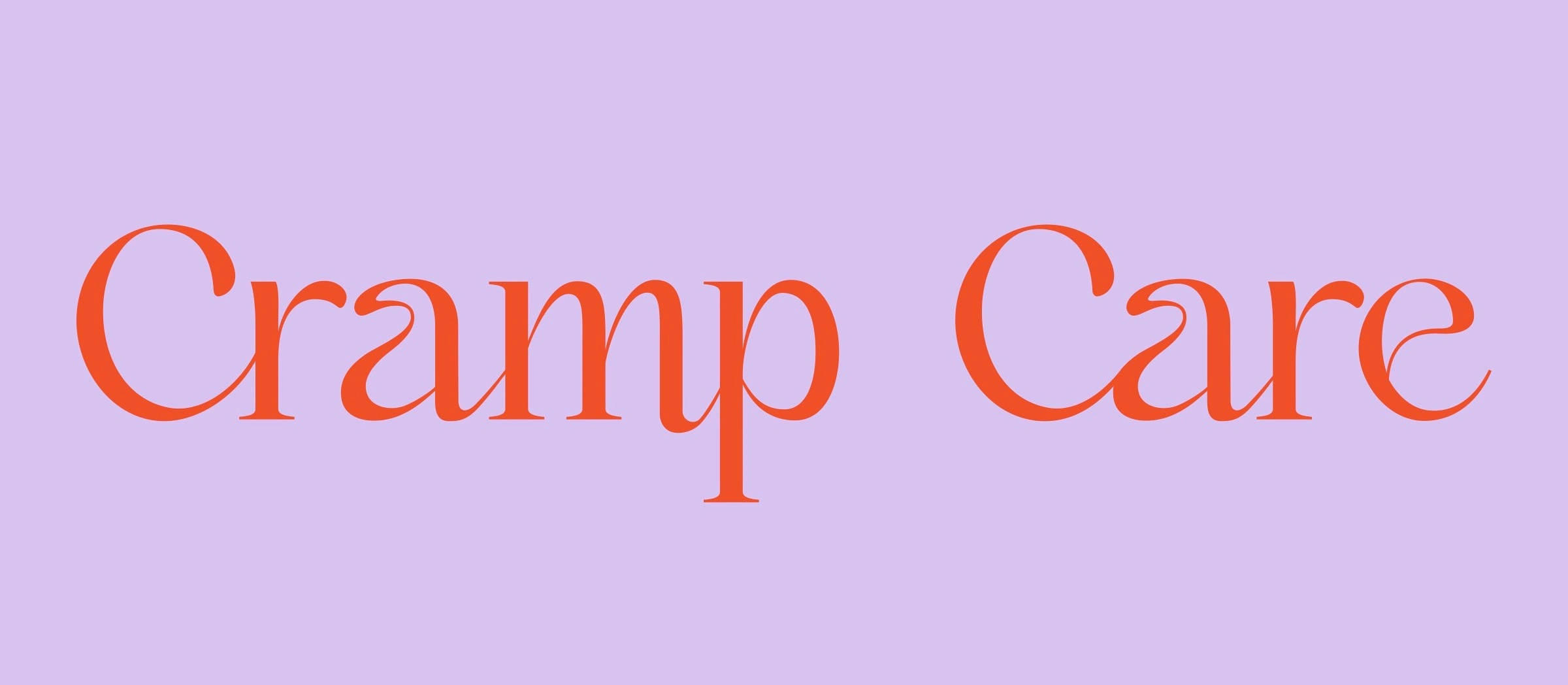
Logotype
The Cramp Care logotype is set in Kaftan Serif typeface which invokes an elegant as well as bold look. The logotype is versatile and can be applied in different color pairings depending on the context.
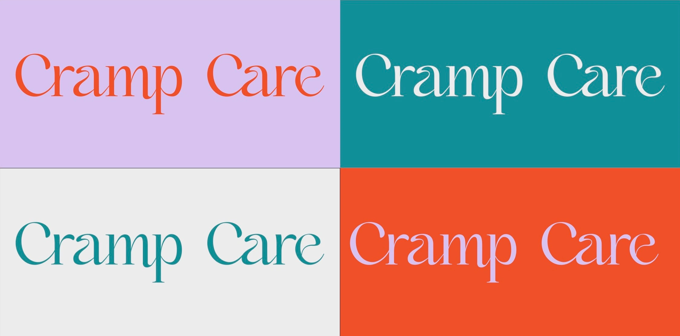
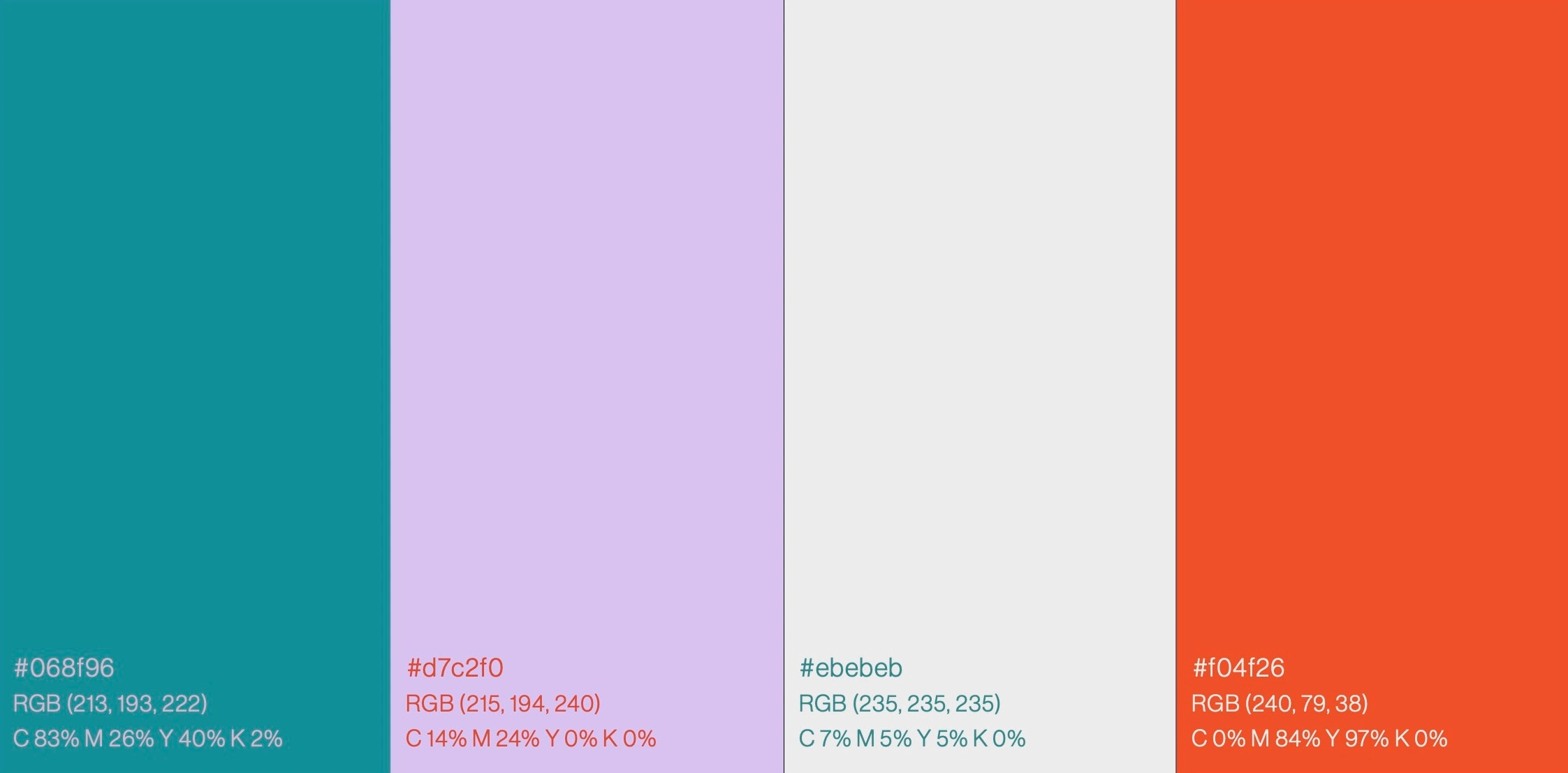
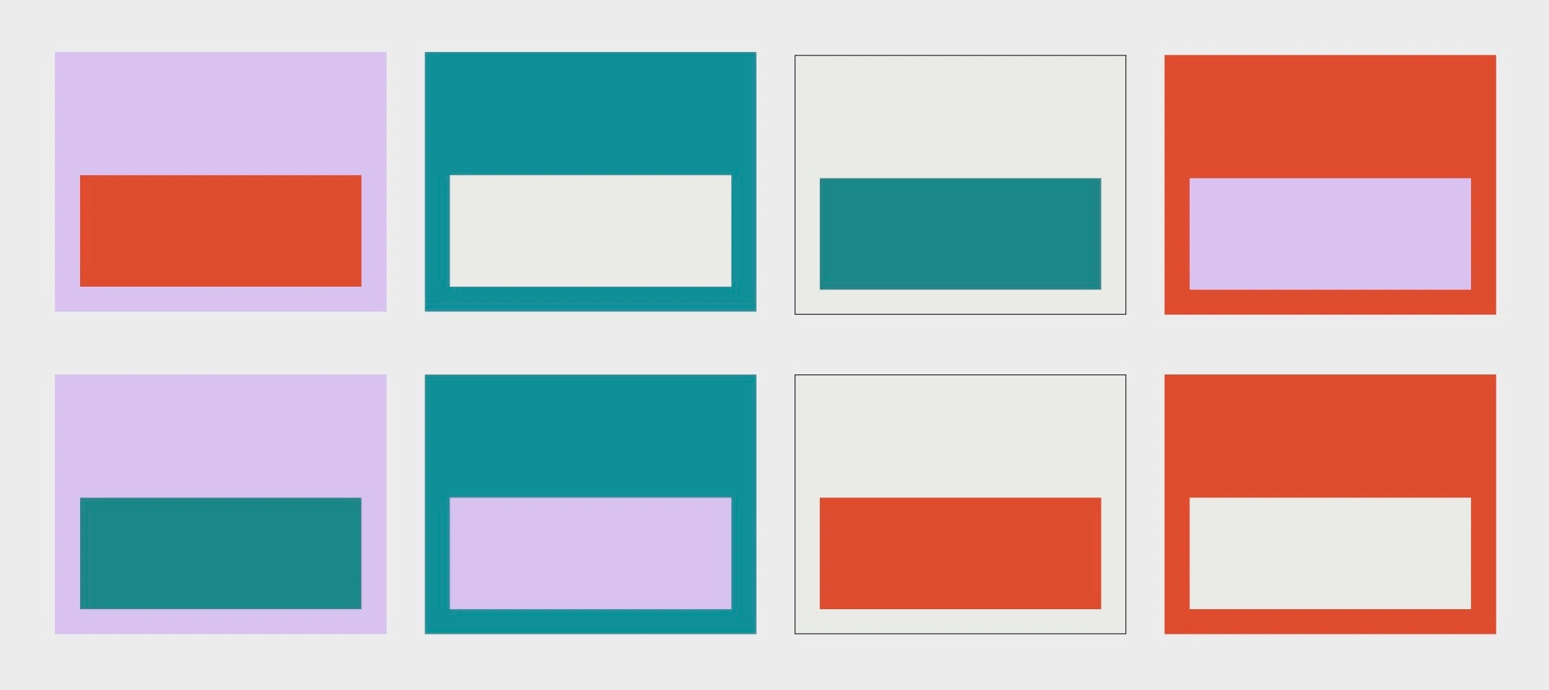
Color Scheme
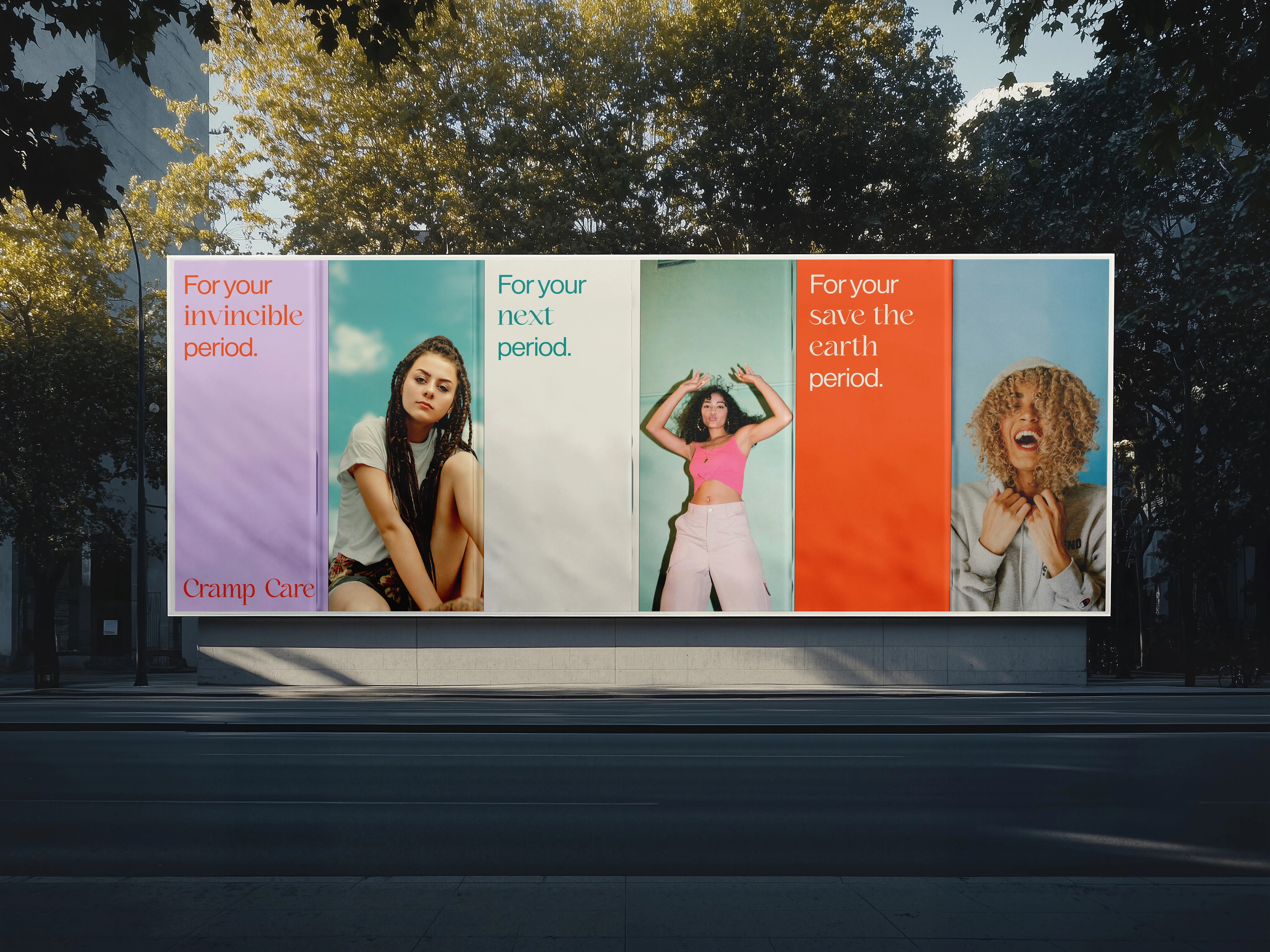
Cramp Care’s color scheme is a combination of some vibrant colors, reflecting the brand’s bold, diverse, and playful values. The different color pairings are highly contrasting and inform everything from packaging to marketing visuals.
PACKAGING DESIGN
The packaging design developed into an interactive experience in which the user can interact with the tear strip to reveal more details about the product on the inside of the packaging.
USER MANUAL
A User Manual accompanies the packaging box which features simple line illustrations to demonstrate the use of the device.
BRAND GUIDELINES
Like this project
Posted Jul 3, 2025
Cramp Care produces comfortable and easy-to-use stick-on heating pads for menstrual cramps. The visual identity gives a bold and distinct identity to the brand.