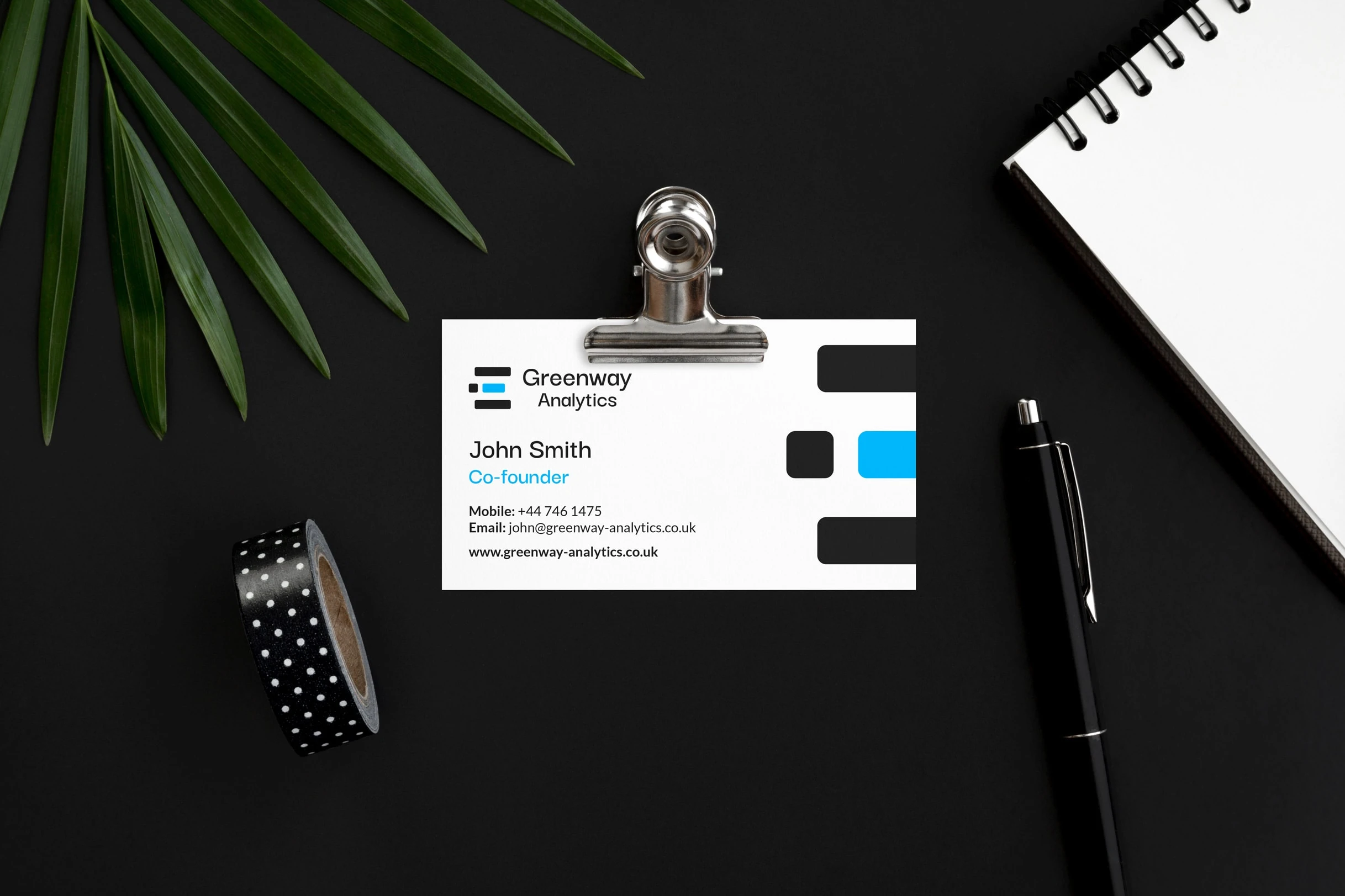
Greenway Analytics, Brand Identity Design
Overview
Greenway Analytics is a company that provides data for companies. Their goal is to modernise the way companies share data with the public through transparency and honesty. They needed a brand
identity and various graphic elements to help them gain funding from investors.
Results
My goal for this project was to create an identity that was adaptable. This is why there are different versions of the logo that uses the stripes. On their own, the stripes represent the movement of data. However, when combined with the brand name the logo works to replace the letter ‘E’. I also wanted to stick to colours that were fresh, which is why I used sky blue as the primary colour, symbolising truth.


Like this project
Posted Oct 12, 2022
Greenway Analytics modernises the way organisations present their data, in order to make it more transparent and truthful.


