Seso Global, Brand Identity Design
Overview
Seso Global is a property marketplace, primarily based in West Africa. They act as a one-stop shop for digital real estate transactions. With the growth of the company, they needed a refresh of their logo. I worked closely with the business owners and their team to produce a brand and visual identity that felt new and familiar.
Results
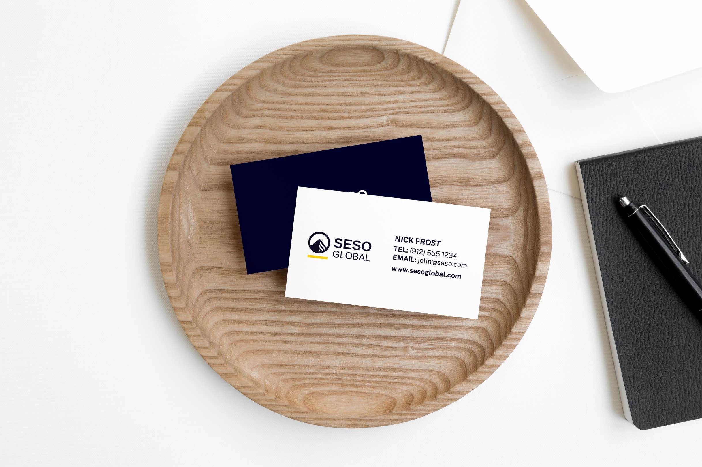
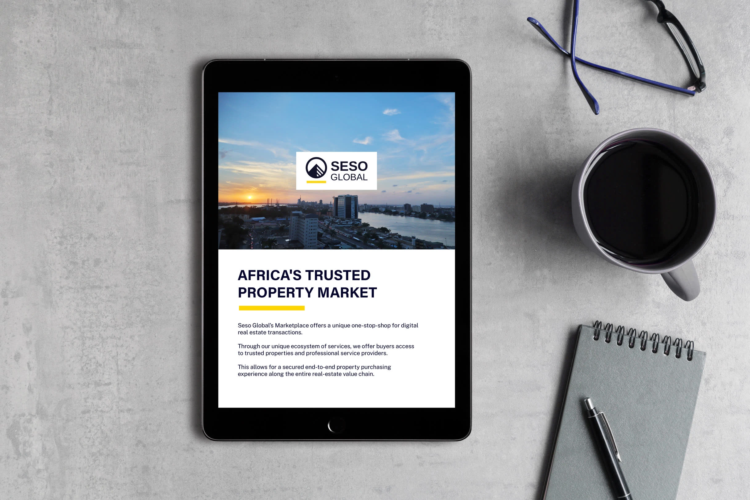
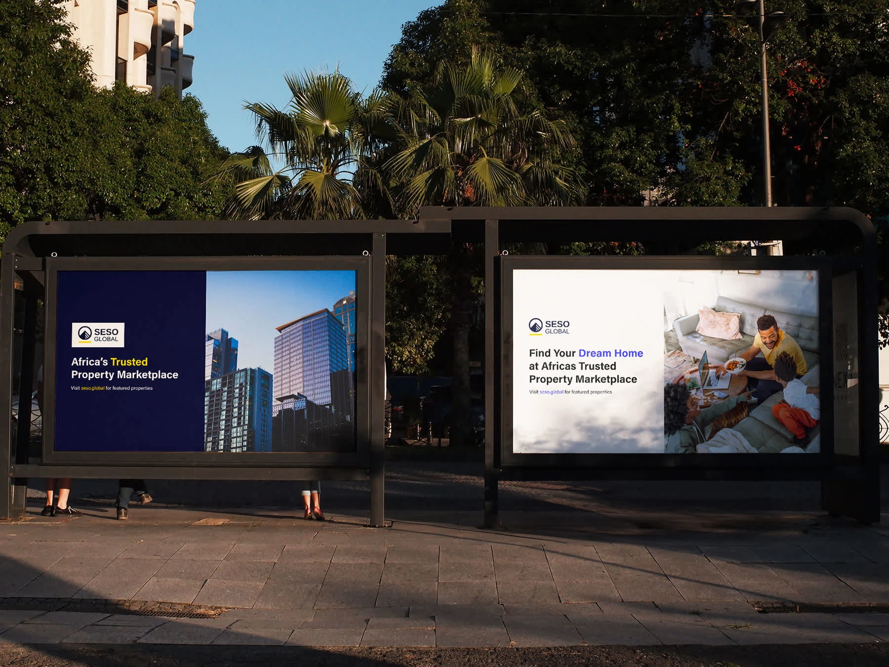
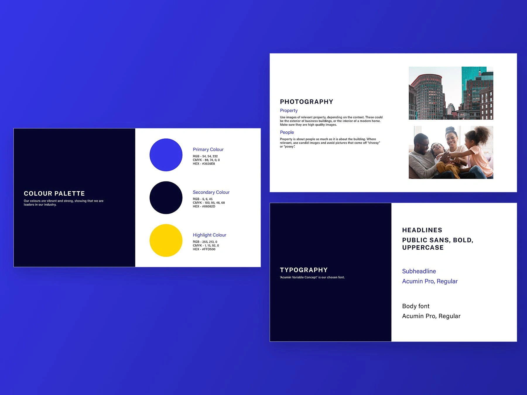
I decided to do a brand refresh rather than a complete redesign, with a bolder logo, colour palette and an updated typeface. Drawing inspiration from the shape of pyramids and tall commercial buildings that you would find in most modern cities, we updated the logo to be more responsive and modern. Finally, I provided Seso with a visual language that can be used in marketing and communications.




Like this project
Posted Oct 12, 2022
Seso Global is a property marketplace, primarily based in West Africa. They were provided a rebrand to help them connect with a modern audience.
Likes
0
Views
13
Clients
Seso Global

