Branding for Tomo House: Logo Design + Brand Assets
For the launch of Tomo House, an authentic Japanese matcha brand in Singapore, the branding needed to strike a delicate balance between honoring Japanese tradition and resonating with a modern, earthy aesthetic.
Tomo House, meaning "friend house," takes this concept to heart. At the center of the brand identity is a clever design choice: The "u" subtly forms a matcha cup, symbolizing a sense of gathering and homeliness within the "house." This thoughtful logo becomes an emblem of connection, perfectly reflecting the brand's promise of authenticity and community in each cup.
Tomo House Video
Tomo House Video
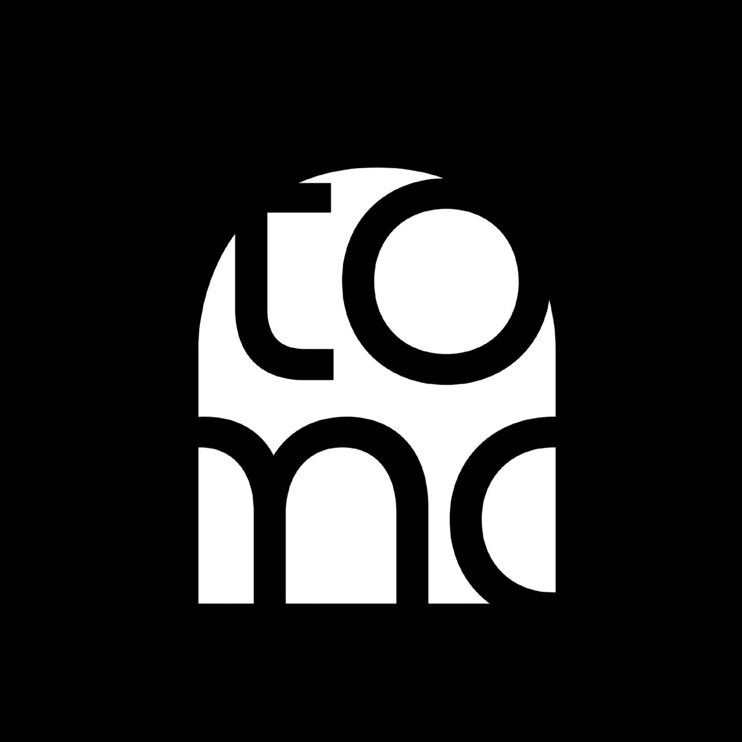
Different variations of the logos

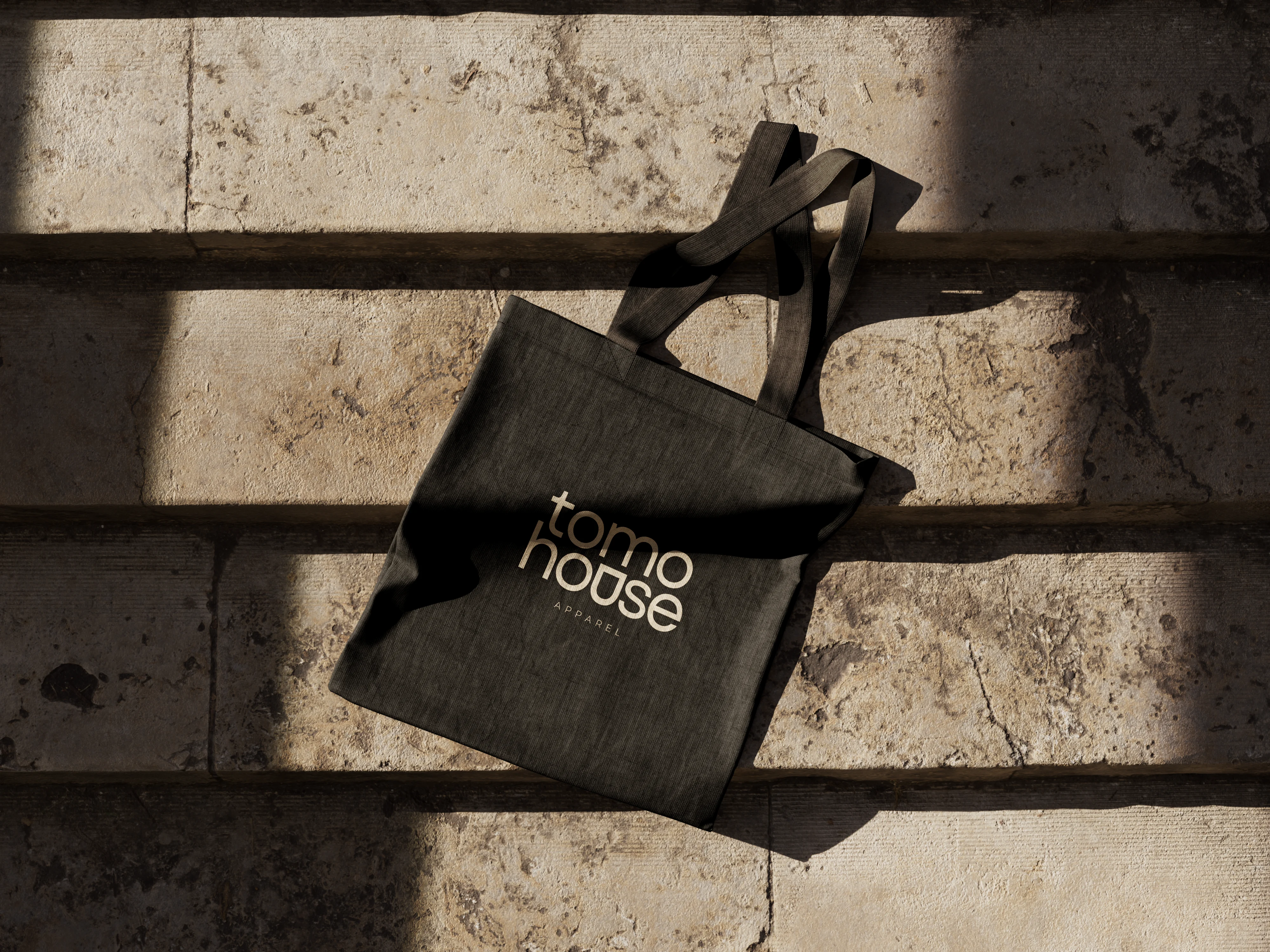
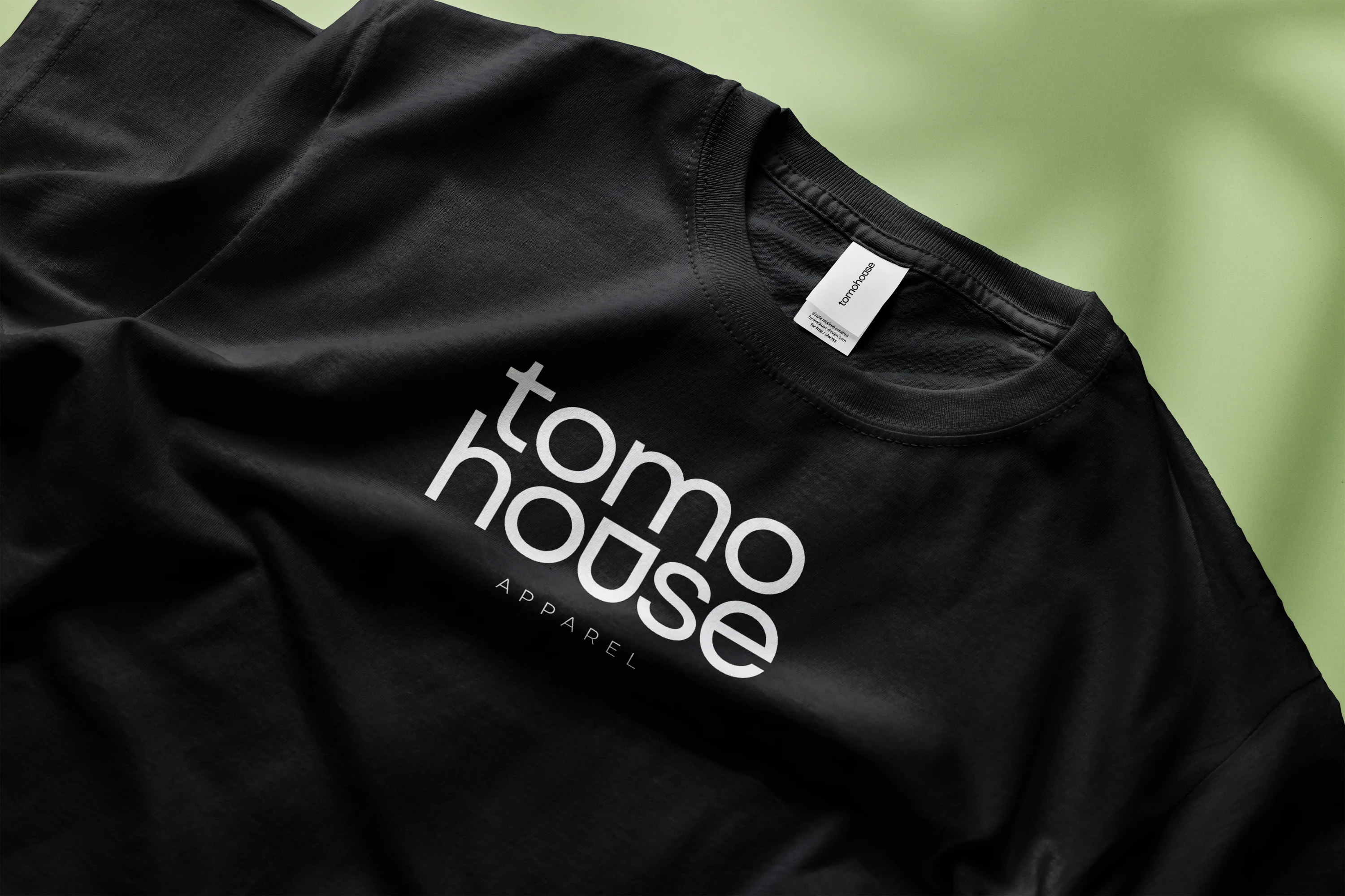
Tomo House Apparels
Like this project
Posted Nov 7, 2024
Tomo House, a new Japanese matcha brand in Singapore, blends tradition with a modern touch. Its logo’s “u” forms a matcha cup, symbolizing warmth and community.


