Modern POS System
Context
F&B businesses rely on traditional POS systems to keep track of orders and inventory management for their daily operations. It should be noted that this project was for a poke-bowl company and I was brought on board after the team had decided on a wireframe. This project allowed me to explore new ideas and test UI trends.
Project details
Timeline: January - Ongoing 2023
Type: UX/UI design, Brand design
Platform: Tablet, Desktop
Role: UX/UI Designer
Main objective
The poke-bowl company tried existing applications in the market and had a subpar user experience because of outdated UI. From this, we determined the main objective was to design a POS system with modern UI while incorporating new UX patterns in the users' workflow. The question then becomes:
How might we improve the UI of POS systems while incorporating modern UX patterns in the user's workflow?
Minimum viable design system
Before diving into hi-fidelity design, I discussed with the team on the brand direction for this POS system and came up with a quick style guide with references:
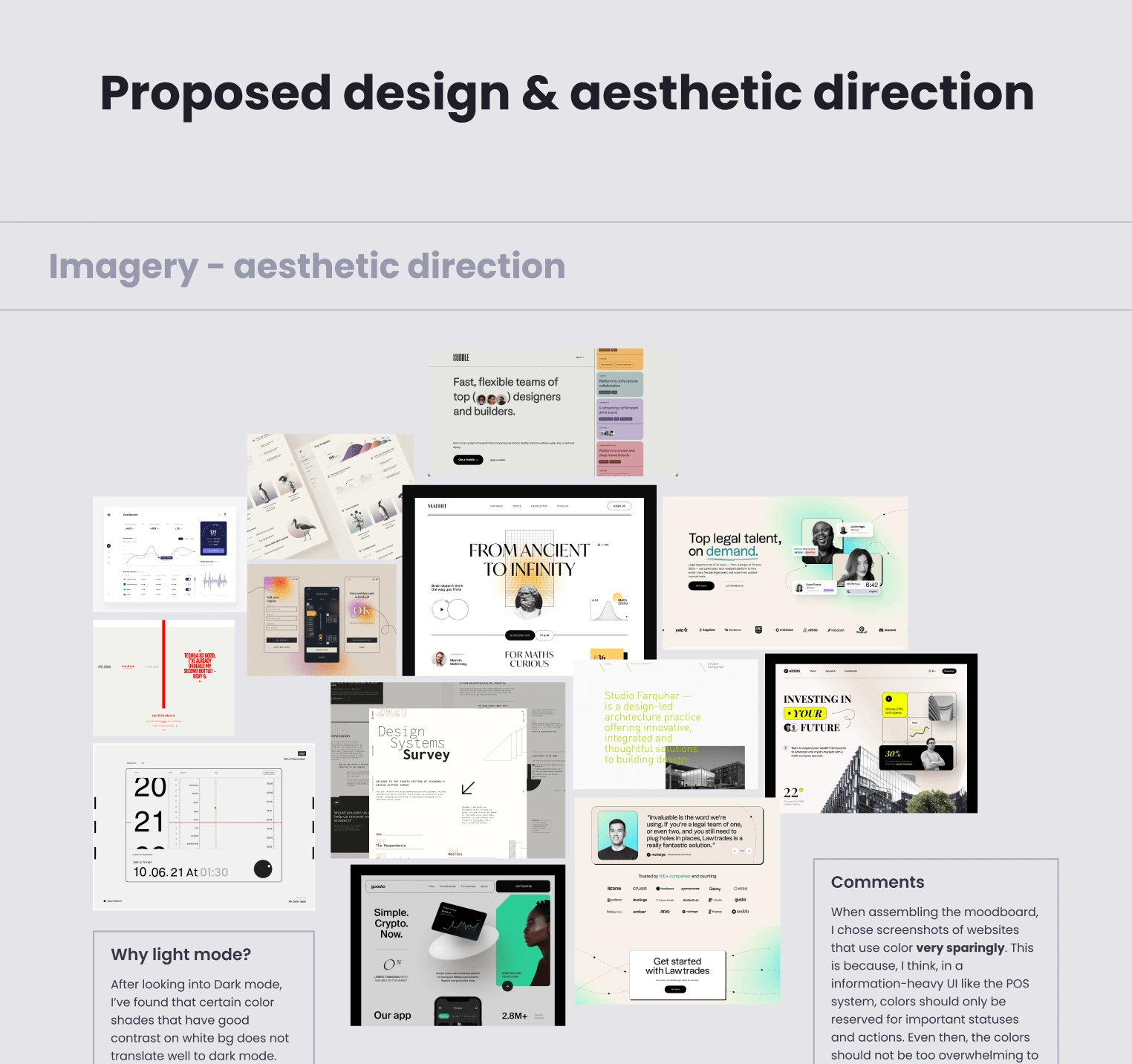
UI References from other products and websites
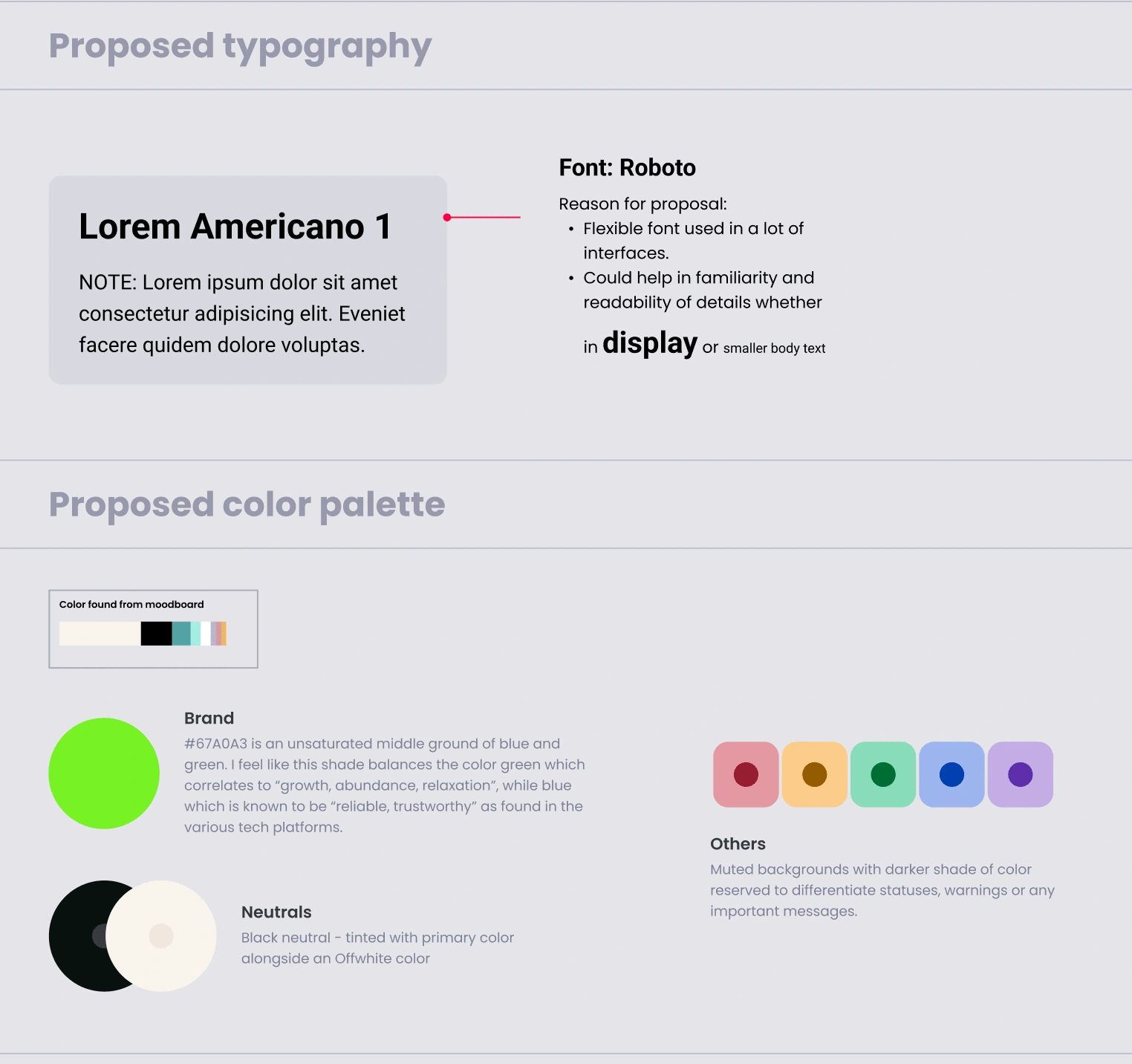
Proposed typography and color palette
First draft
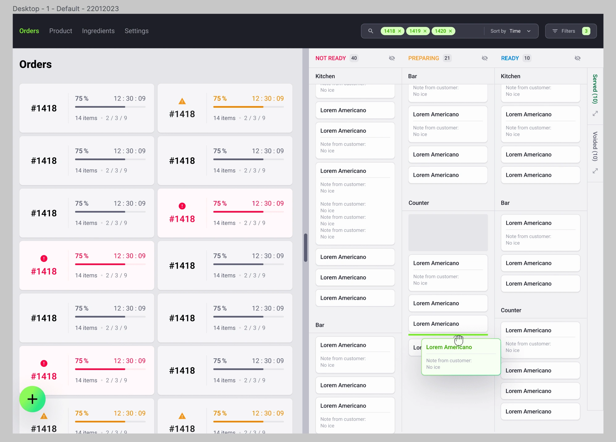
In the first draft, I tried to go for a more "tech" look with the cool neutrals and green accents. Focusing more on the neutrals allowed important statuses to shine more when necessary. However, the team wanted to incorporate more of the accent green and achieving a non-corporate look and feel for the UI.
Iterate, interate, iter—
After receiving feedback on the first draft, I got straight to work. It was a very challenging task as I had to tip toe between Trendy and Functional.
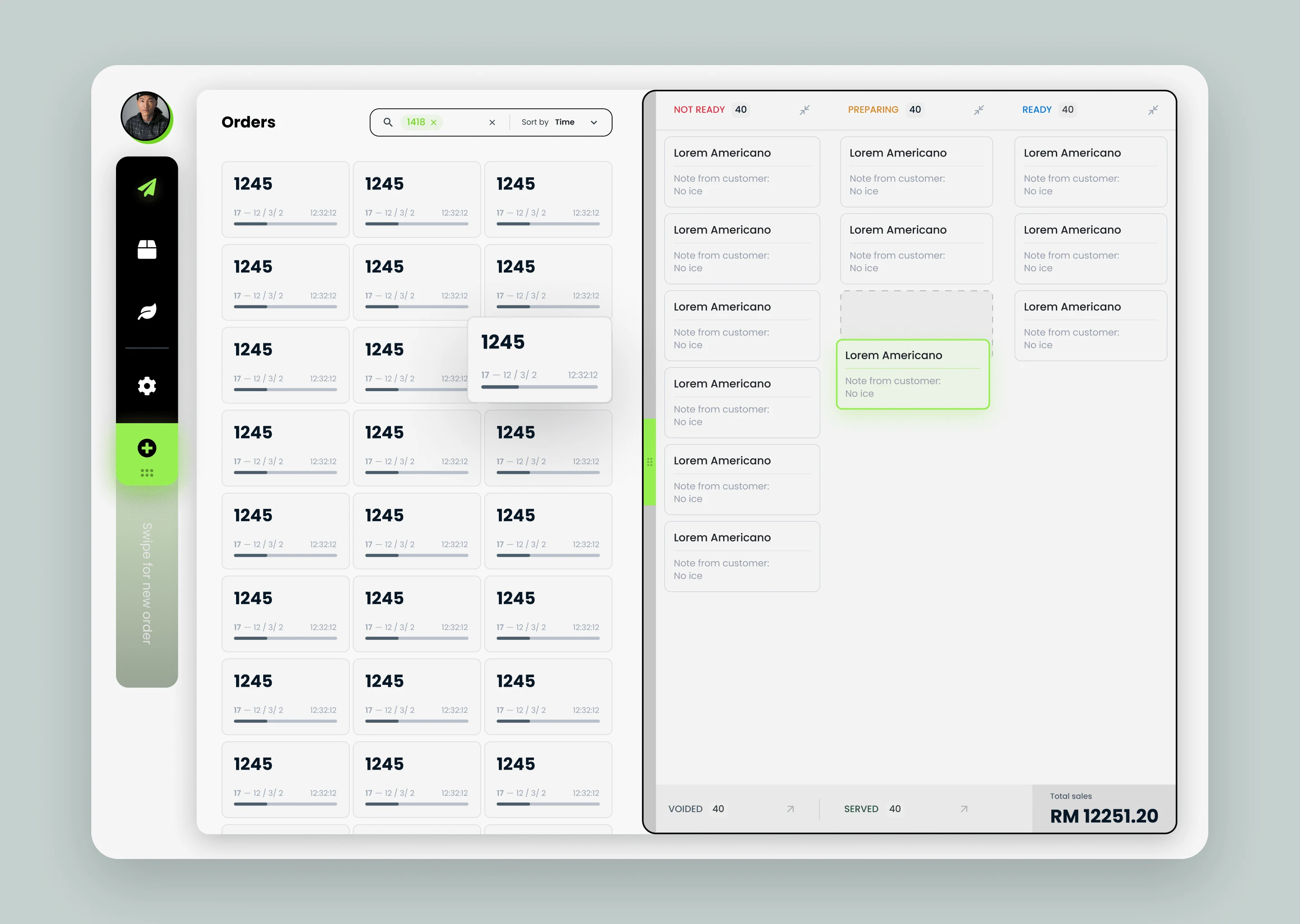
However, after a lot more iterations, here's the result:
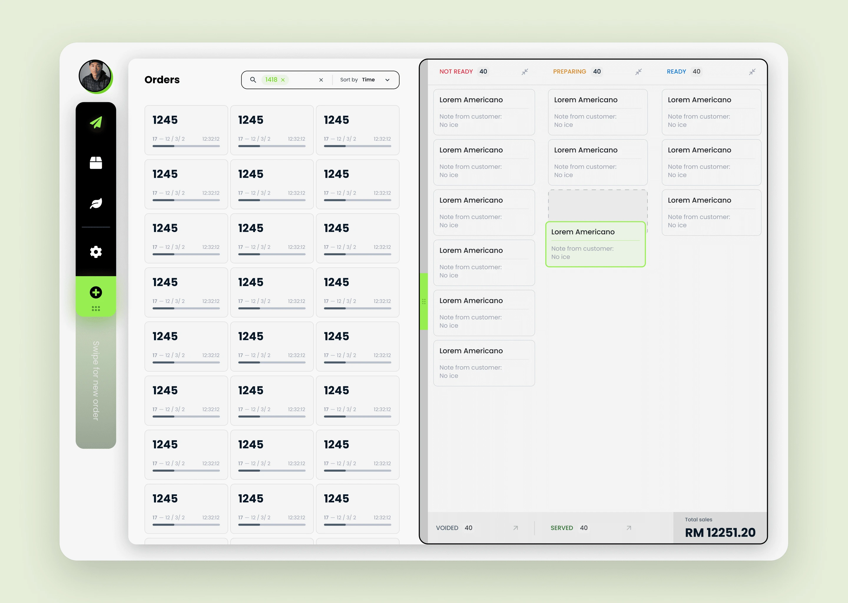
Final UI
Like this project
Posted Mar 8, 2023
I worked with a small team to design the brand and UI of their POS system. Here, I explored how to make trendy UI's functional.
Likes
0
Views
105

