Delivery Rider Filter
For confidentiality reasons I have omitted the actual names and branding for the following design. All information in this case study is my own.
Project details
Timeline: April 2023 - May 2023
Type: UX Design, Research
Platform: Mobile application
Role: UX Designer
Deliverables: UI/UX Design, Research
Context
GaleRider delivery riders are frustrated by the need to frequently adjust filter preferences when using the delivery filter. They are also unaware of added filters and whether they have been applied, which can impact their earning potential.
Main objective
The main objective of this task was to improve the filtering experience and earning potential of deliver riders.
Process overview
Research → Synthesis → Wireframe → Hi-fi Design → Validation
During the research phase, I conducted a user interview with a few delivery riders to understand their experiences and pain points. Later on, I used Google Analytics to find out the most commonly used filters on the app. Based on the gathered information, I started with lo fi / low-fidelity sketches and used that as an early POC to gather feedback from relevant stakeholders. After multiple rounds of iteration, I used the lo fi sketches and created a hi fi prototype which is then tested again with several users for validation.
Research
First, I conducted interviews with several delivery riders and their managers to get a basic idea how the filter was being used by our delivery riders
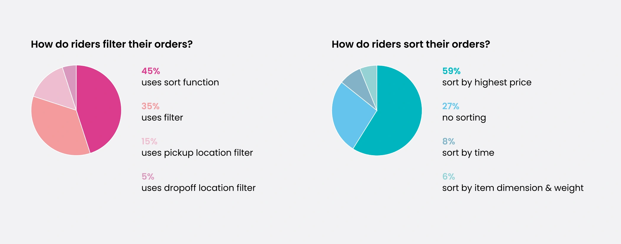
Pie chart breakdown of riders' most used filters and sorting options
After that, I also gathered data from Google Analytics where we discovered that delivery riders had a specific set of filters to view the “best” delivery orders in terms of price and delivery feasibility.
By gathering both qualitative and quantitative data, I was able to understand the problem more.
Findings
In short, GaleRider delivery riders have a preset filter in mind to find the best orders at any given time. However, the positioning and layout of the filter menu caused a lot of frustration for riders, who found their preferences reset every time they opened the app. Additionally, riders were unsure whether filters were being applied to their list of orders, which could significantly impact their earning potential.
Wireframe
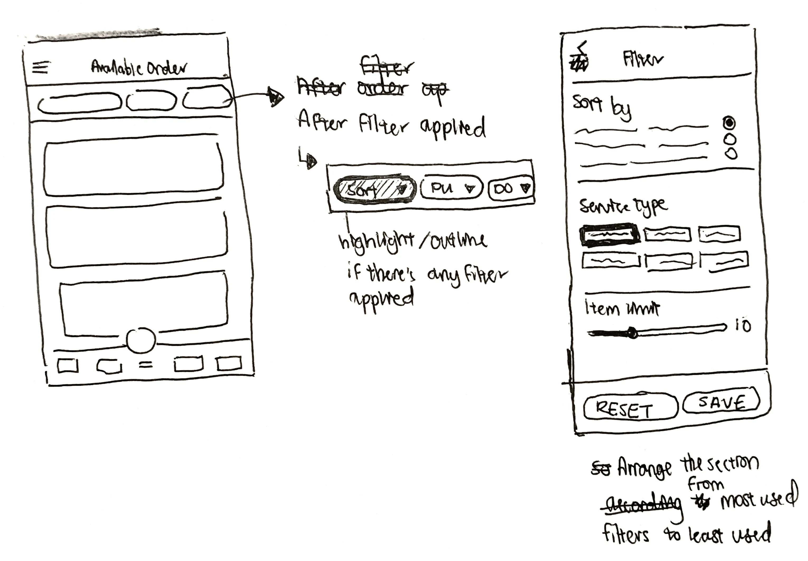
Based on the riders' usage data and general feedback, I started with lo fi sketches and went through multiple rounds of iterations.
Lo fi sketches
These sketches were used to get initial feedback from relevant stakeholders.
Hi fi design
I then converted the sketches into a hi fi design as seen below:
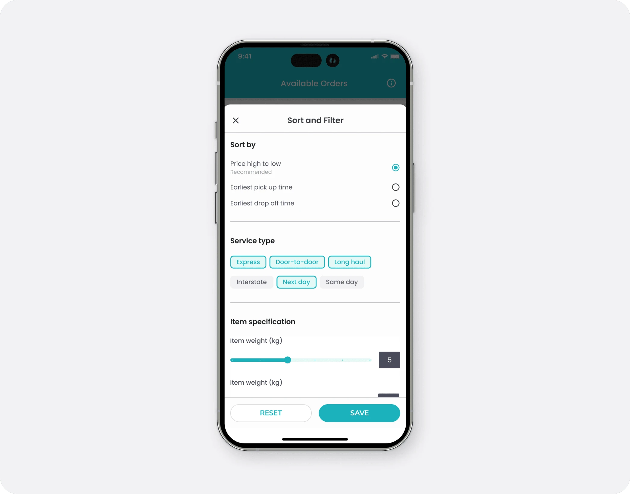
Final design of the delivery rider filter
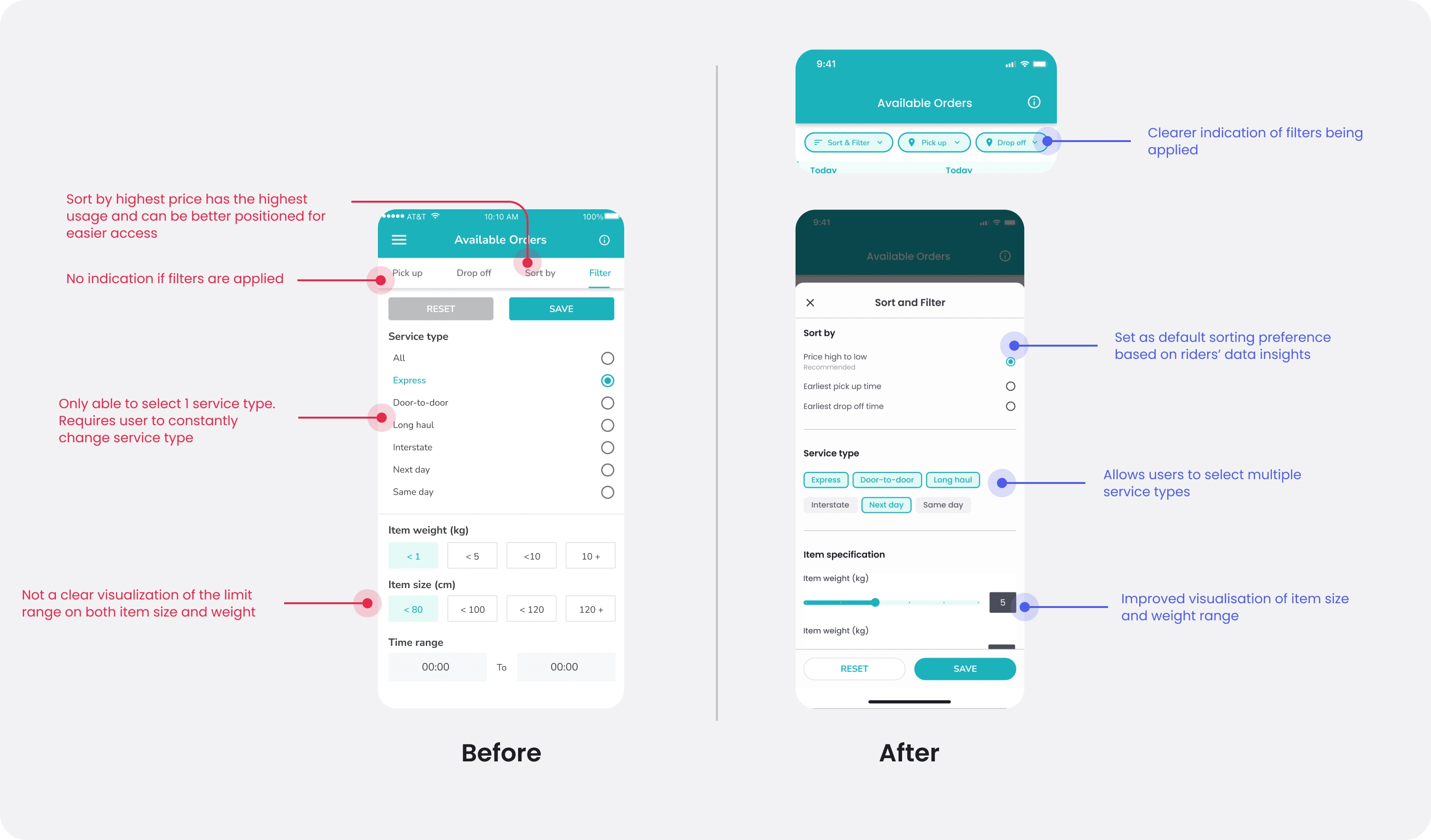
Before and After
Testing & Validation
After completing the hi-fi prototype, I used it to test on several candidates to validate the design. Here are some key findings from it:
Users were more aware that filters were applied
Users found it extremely convenient that the most popular filter options were placed at the top
Users were able to select more service types
Conclusion
The test validated that the redesign solved the pain points for GaleRider delivery riders. It allowed them to save their filter preferences, making it easier to find the best orders at any given time. Additionally, they were now able to see which filters were being applied, which helped them to maximize their earning potential. The simple and intuitive design made the app more user-friendly, resulting in a better experience for GaleRider delivery riders.
Like this project
Posted Mar 8, 2023
Redesigned the delivery rider filter with data-driven design and relieved major pain points from previous iteration.
Likes
0
Views
25

