CLASSICA COFFEE BRANDING
CLIENT:
Classica is a premium coffee shop owned by a local coffee farm in Pyin Oo Lwin. In an effort to diversify and forward integrate their business, they decided to open a coffee shop near Kandawgyi Lake in Pyin Oo Lwin.
CHALLENGE:
Classica needed a brand identity system for their coffee shop that would align with their premium positioning and provide a consistent brand experience across all touchpoints in the café.
SOLUTION:
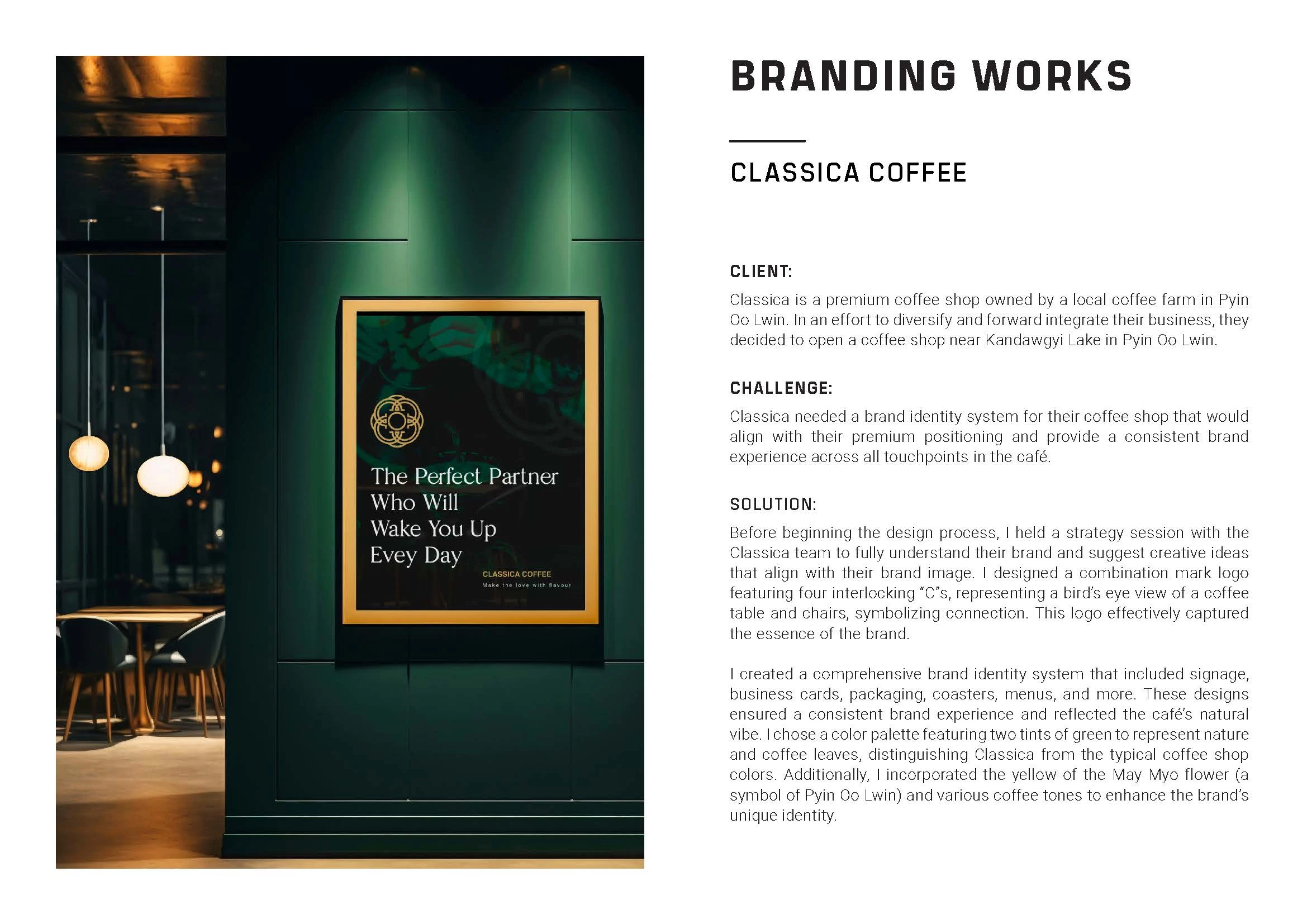
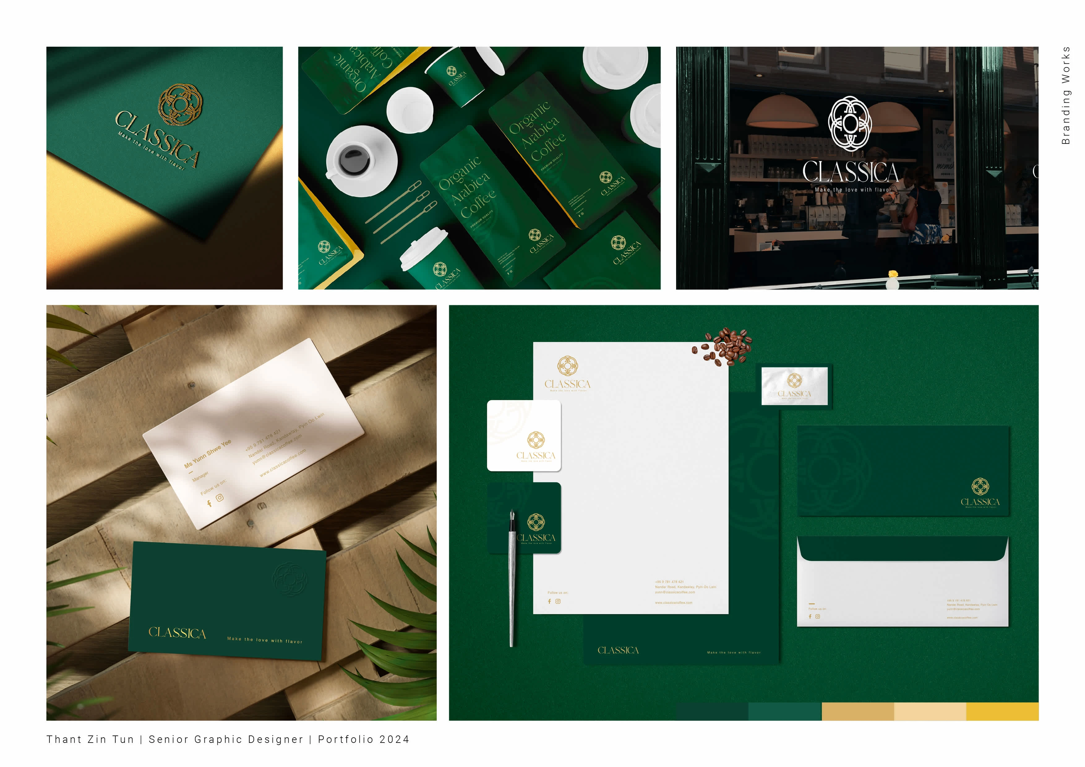
Before beginning the design process, I held a strategy session with the Classica team to fully understand their brand and suggest creative ideas that align with their brand image. I designed a combination mark logo featuring four interlocking “C”s, representing a bird’s eye view of a coffee table and chairs, symbolizing connection. This logo effectively captured the essence of the brand. I created a comprehensive brand identity system that included signage, business cards, packaging, coasters, menus, and more. These designs ensured a consistent brand experience and reflected the café’s natural vibe. I chose a color palette featuring two tints of green to represent nature and coffee leaves, distinguishing Classica from the typical coffee shop colors. Additionally, I incorporated the yellow of the May Myo flower (a symbol of Pyin Oo Lwin) and various coffee tones to enhance the brand’s unique identity.


Like this project
Posted Sep 16, 2024
Brand Identity and Design System for Classica Coffee


