Bike Sales Interactive Dashboard
Carly Louis
Bike Sales Interactive Dashboard
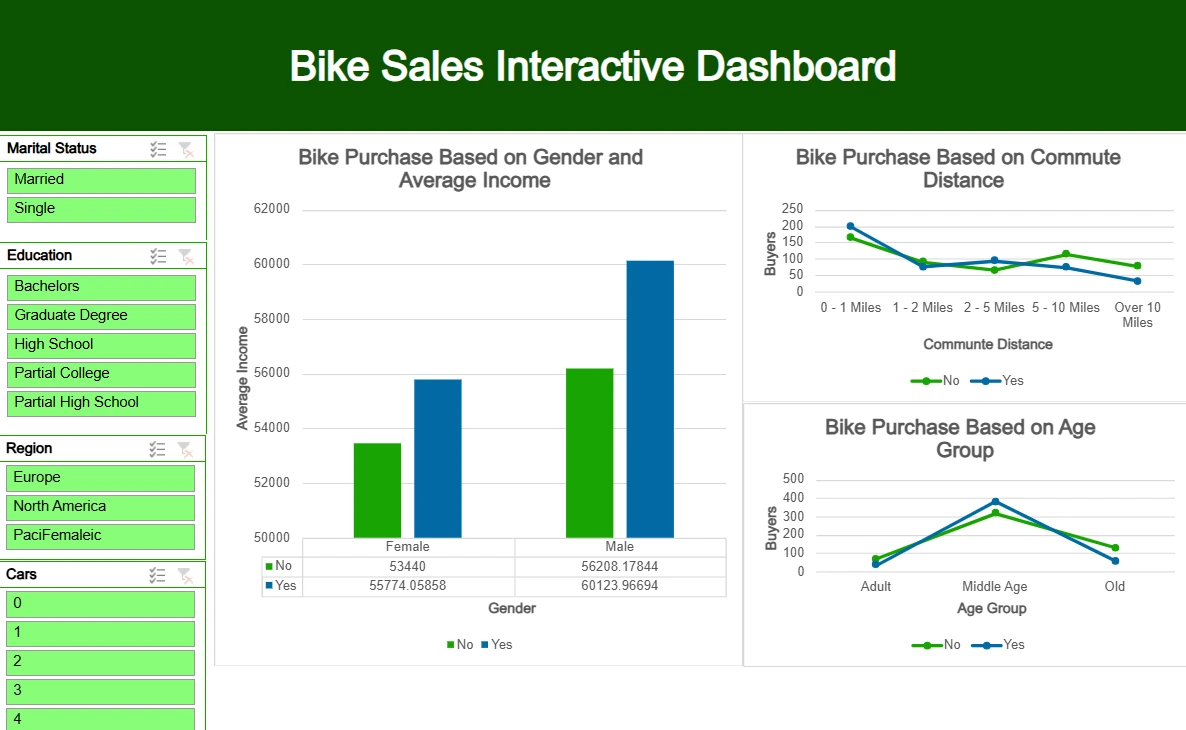
This repository showcases an interactive Excel dashboard that visualizes sales data for a bike company. The analysis focuses on several key metrics, including income, commute distance, and age group, to determine trends in bike purchases.
📝 Project Overview
This project involves analyzing and visualizing data in Microsoft Excel, using tools such as Pivot Tables and charts to create a dynamic, interactive dashboard. The dashboard provides insights into:
Bike purchase behavior by gender and income
Impact of commute distance on bike purchases
Bike purchases across different age groups
📊 Key Features
Filterable Metrics: Users can filter data by marital status, education, region, and number of cars to drill down into specific customer segments.
Comparison by Income and Gender: A bar chart showing the correlation between gender, income levels, and bike purchase decisions.
Commute Distance Analysis: A line graph illustrating how commute distance impacts bike purchases.
Age Group Insights: A visual breakdown of bike purchases across different age groups (Adult, Middle Age, Old).
🛠️ Tools Used
Microsoft Excel: The dashboard was created using Excel’s PivotTables, slicers, and various chart types for visualization.
Advanced Excel Techniques: Used advanced formulas and filters to make the data dynamic and interactive.
📸 Screenshot
🎯 Purpose
This project highlights my ability to:
Analyze large datasets in Excel.
Create intuitive and interactive dashboards.
Provide insights into customer behavior and business trends through data visualization.
🧑💻 Author: Carly Louis
Feel free to explore this repository to learn more about the analysis and the interactive features of the dashboard.
Like this project
Posted Oct 10, 2024
Excel Project. Contribute to CarlyLouis/Excel_Proj development by creating an account on GitHub.
Likes
0
Views
3