Eyinju Brand Identity & Packaging Design
01 — Introduction
Eyinju is a luxury bead and accessory brand inspired by the depth, beauty, and spiritual meaning of traditional African craftsmanship. The brand reimagines ancient cultural elements into modern, elegant pieces creating a bridge between heritage and contemporary luxury.
Eyinju stands for sophistication, authenticity, and timeless artistry.


02 — Project Goal
To create a brand identity that reflects:
The luxury and premium quality of the products
The cultural roots behind the beadwork
A modern elegance that appeals to high-end customers
A visual system that blends tradition + luxury seamlessly
The final identity had to feel exclusive, rich, and culturally respectful while still being modern and minimalistic.

03 — Color Palette
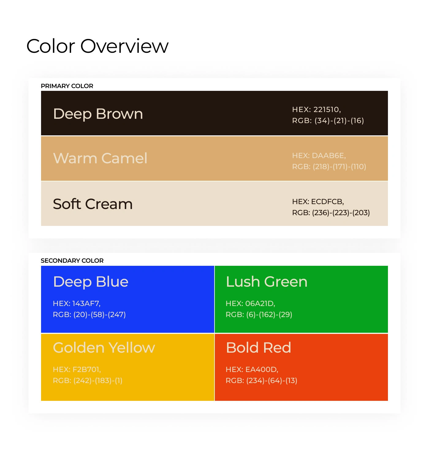
The brand uses a warm, rich, premium palette inspired by natural gemstones and earth tones:
Primary: Deep Brown (#221510)
Accents: Gold, Bronze, Amber, Black
These colors communicate elegance, depth, warmth, and exclusivity.

04 — Research Phase
To shape the identity, I studied:
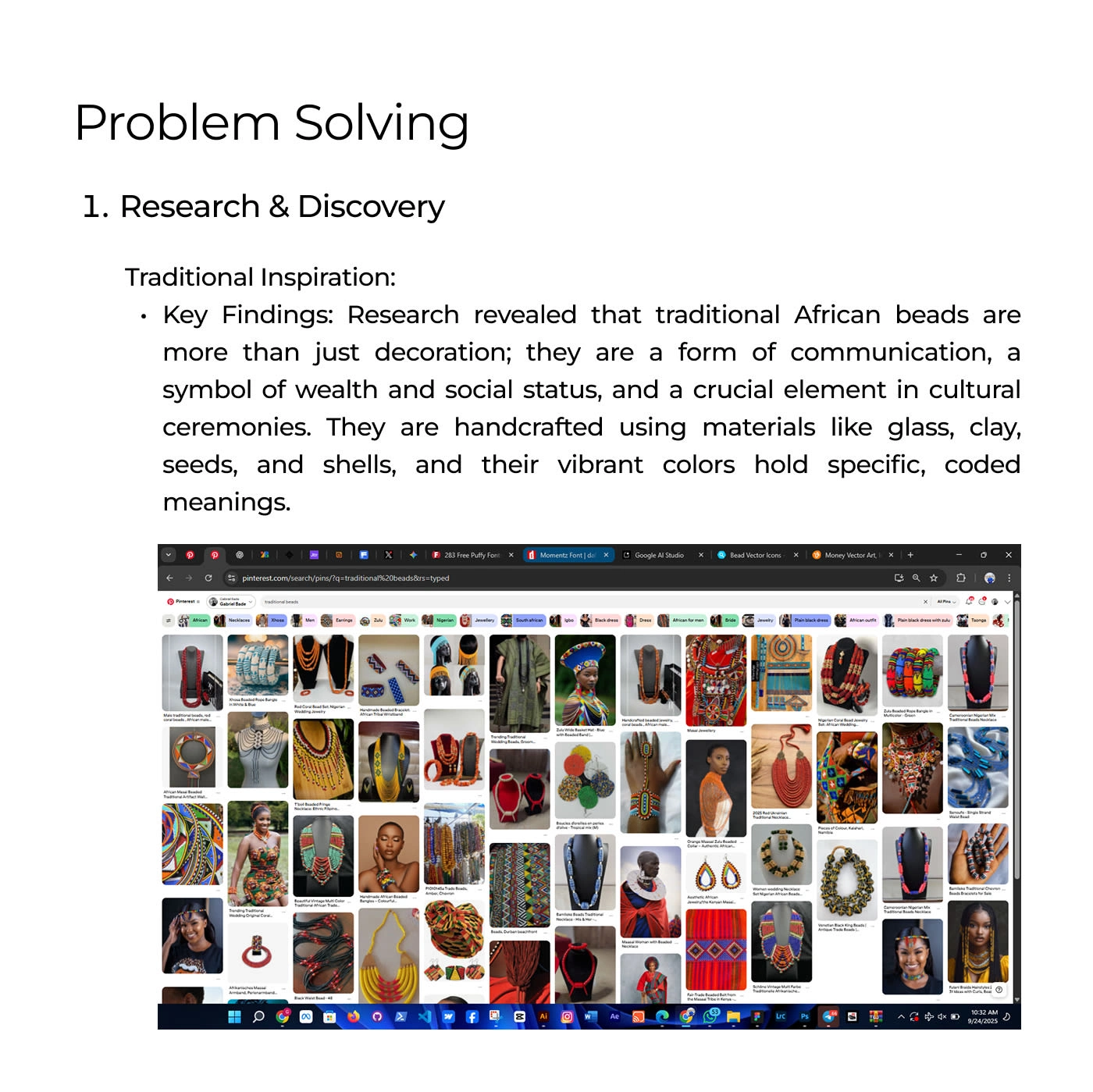
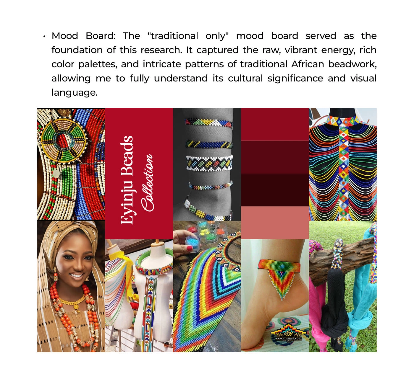
Traditional Influence Research
Focused on beadwork from four African cultures:
Yoruba – spiritual symbolism & royal identity
Maasai – color storytelling & community identity
Zulu – geometric patterns & coded messages
Krobo – glass bead craftsmanship & ancestral meaning
These insights formed the foundation for the traditional mood board.
Luxury Brand Research
I also studied modern luxury brands to understand:
Minimalistic design language
High-end product photography
Premium color systems
Material choices (gold, gemstone tones, satin, glass, crystal)
How exclusivity is created through packaging and storytelling
This informed the luxury mood board.

05 — Brand Concept
Eyinju’s concept centers on “Heritage Refined.”
The idea is that every bead carries history, but the presentation elevates it into fine luxury.
The visual direction blends:
Deep rich tones (brown, bronze, gold)
High-contrast shadows
Soft, elegant curves
Clean typography
Modern luxury layouts
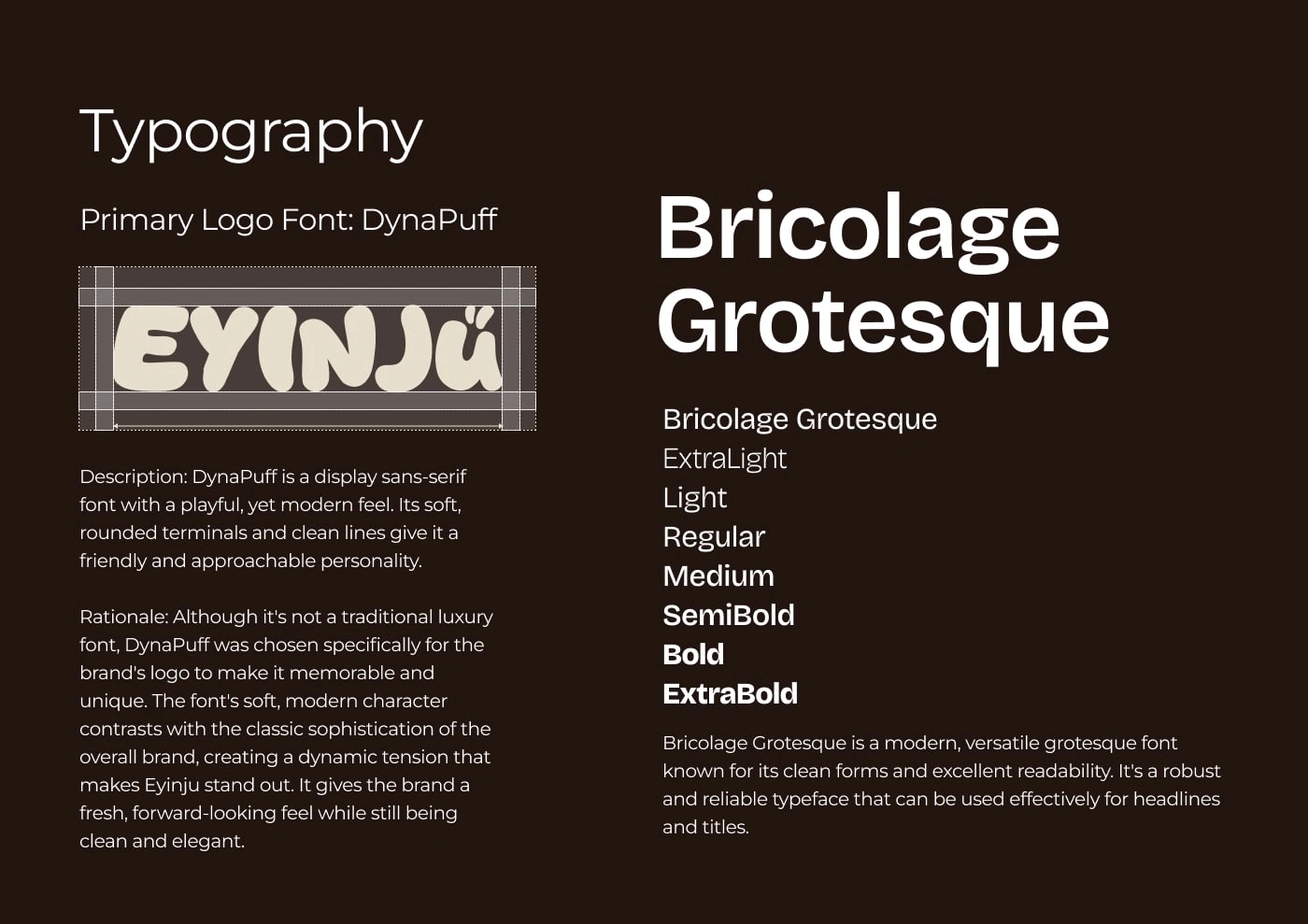
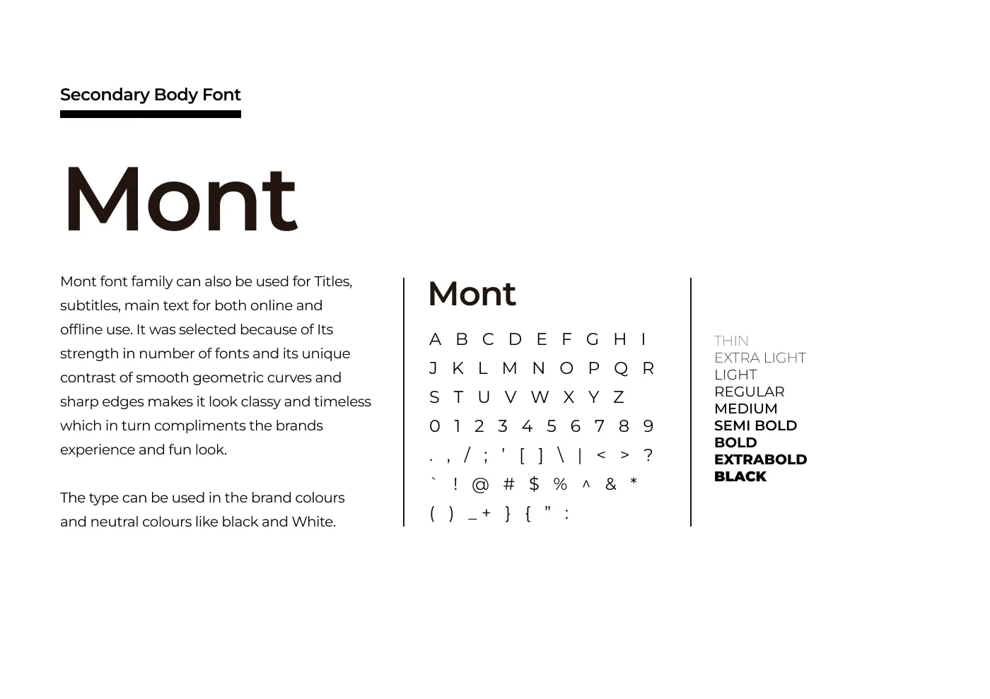
06 — Typography
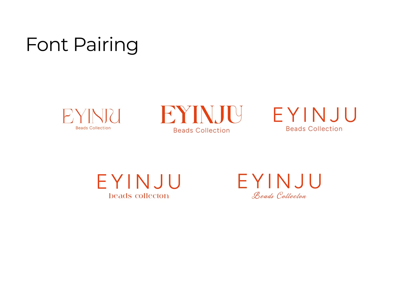
The type system reflects modern luxury:
Serif typeface for elegance and premium feel
Sans-serif typeface for balance, readability, and modernity
The combination gives Eyinju a sophisticated but clean identity.
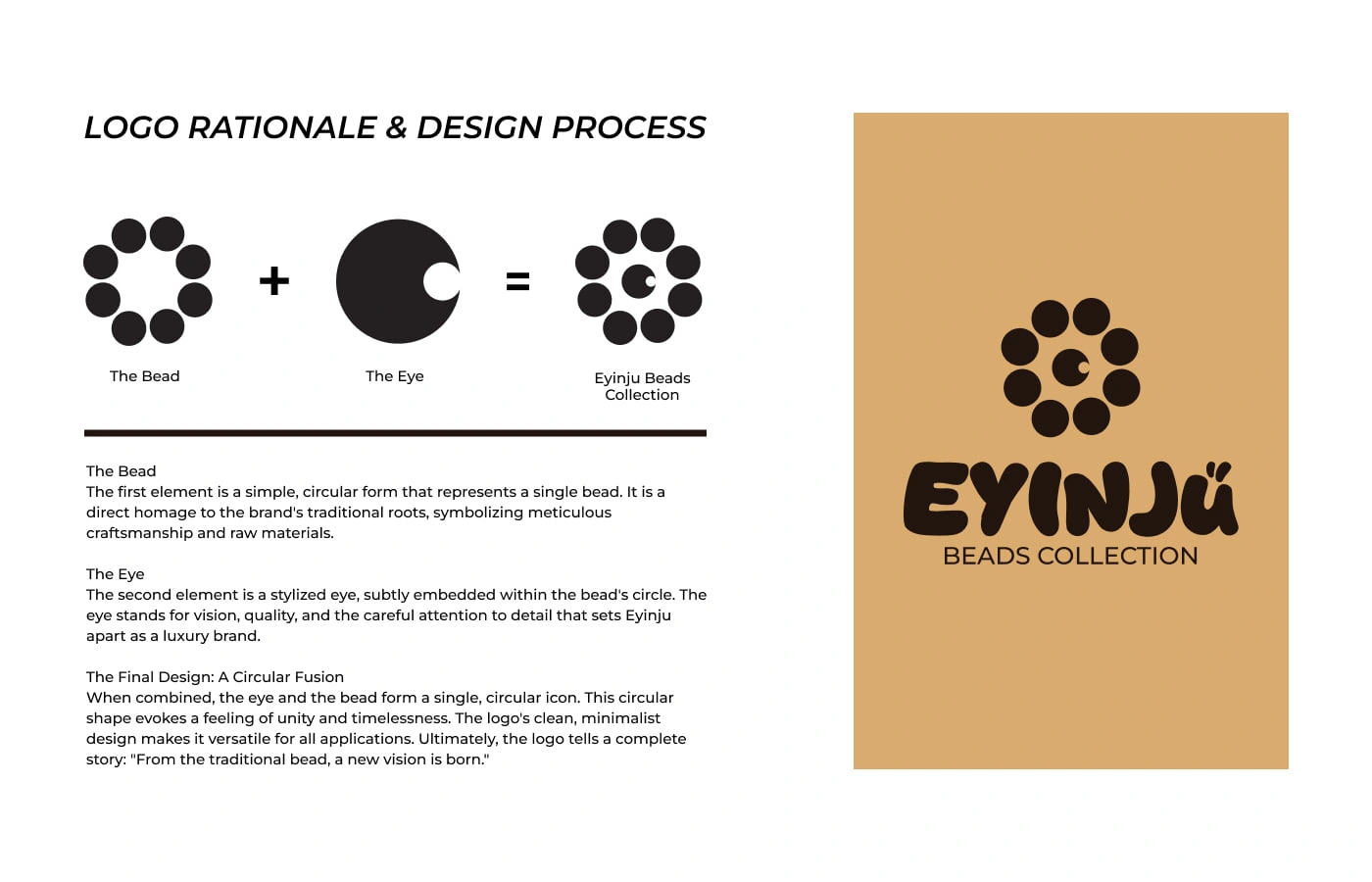
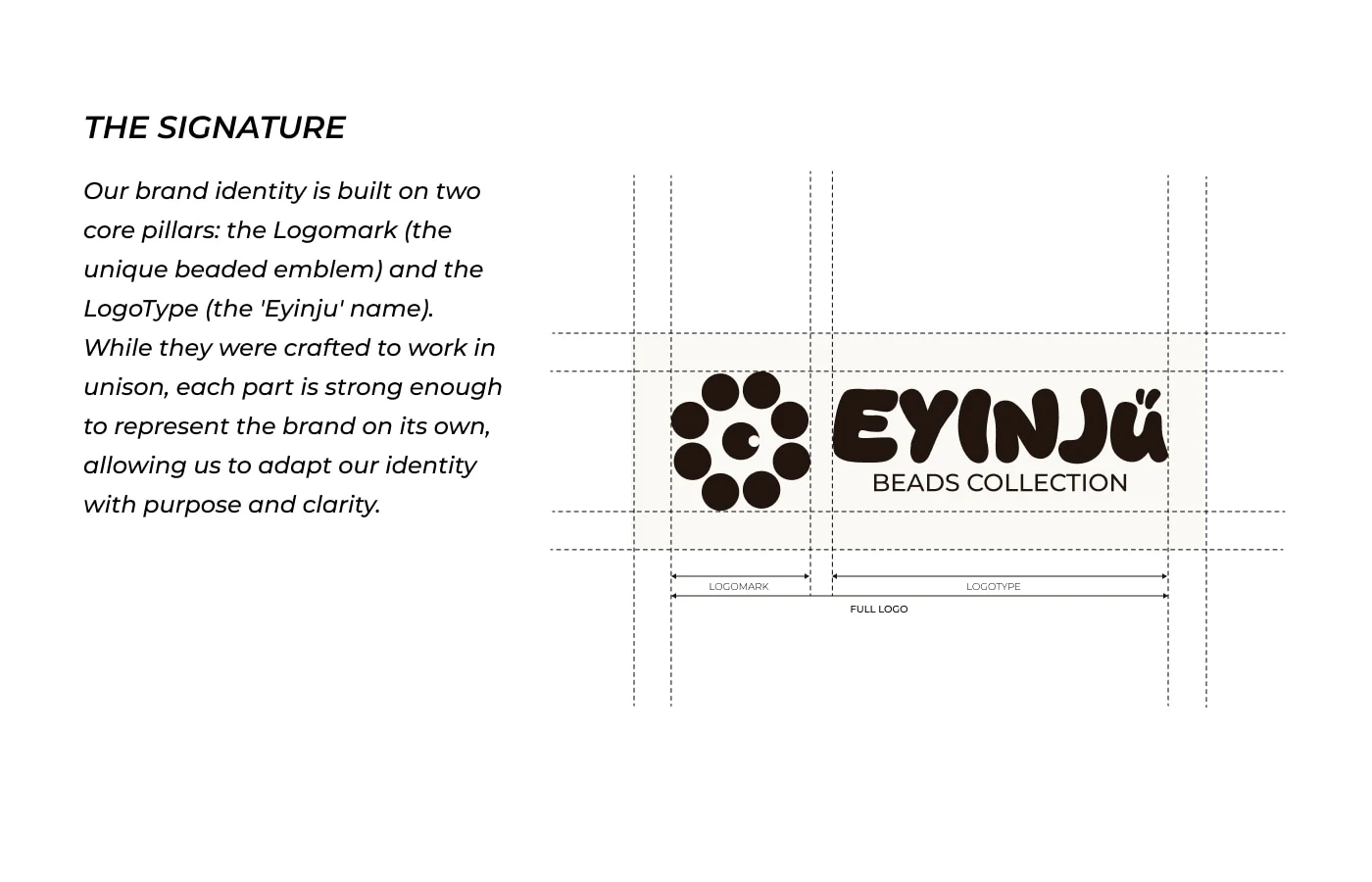
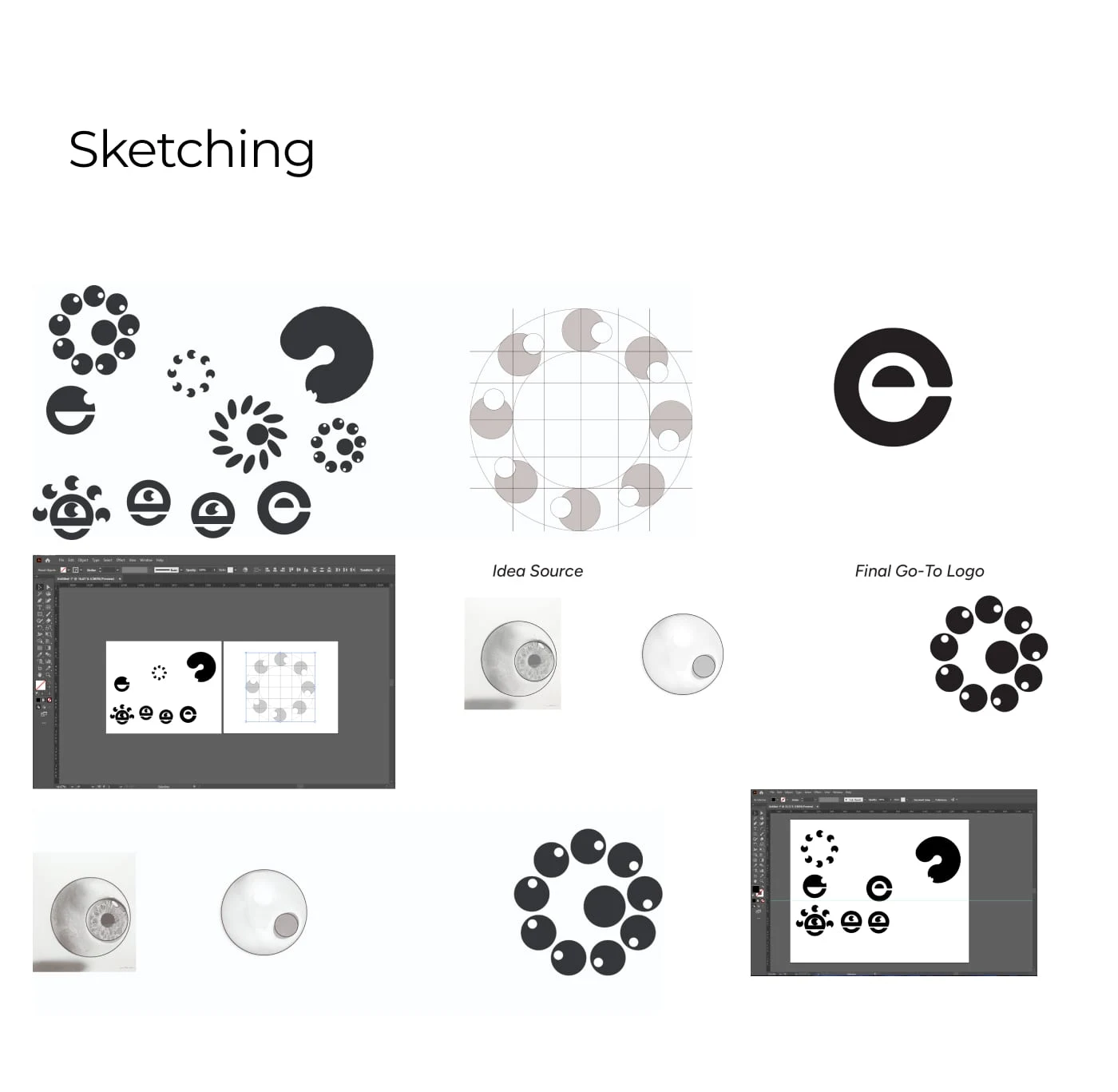
07 — Logo Design
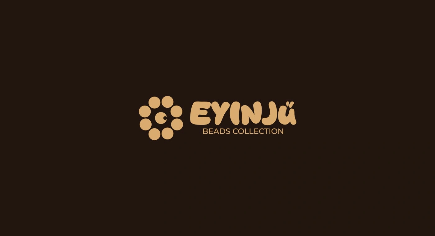
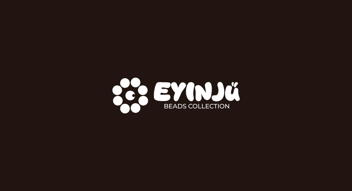
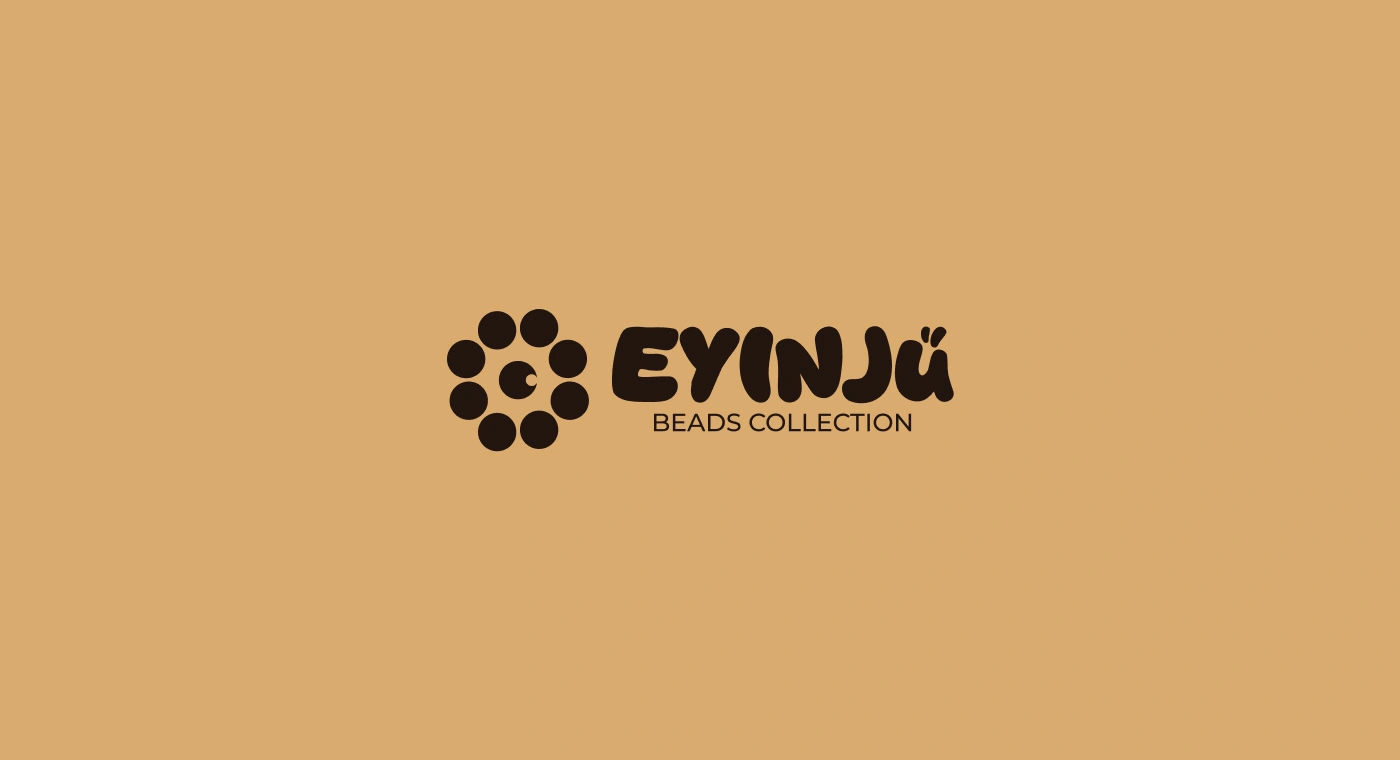
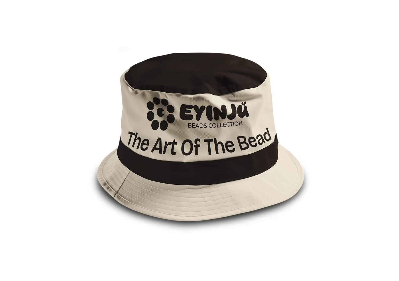
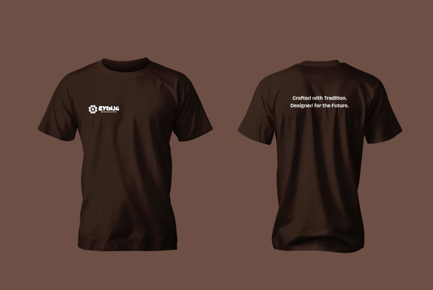
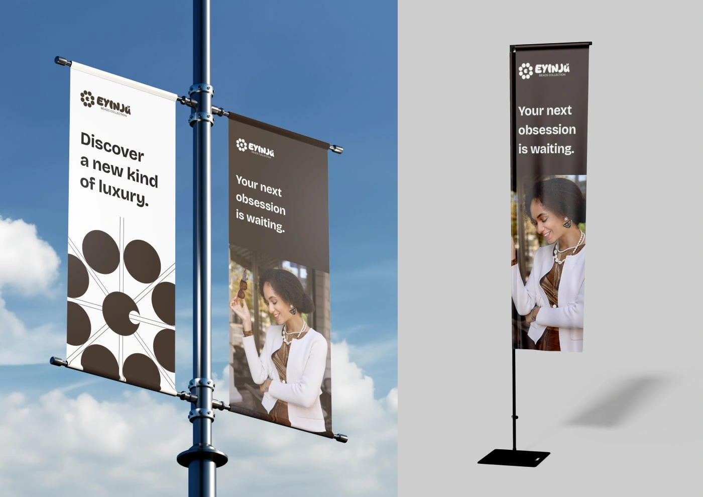
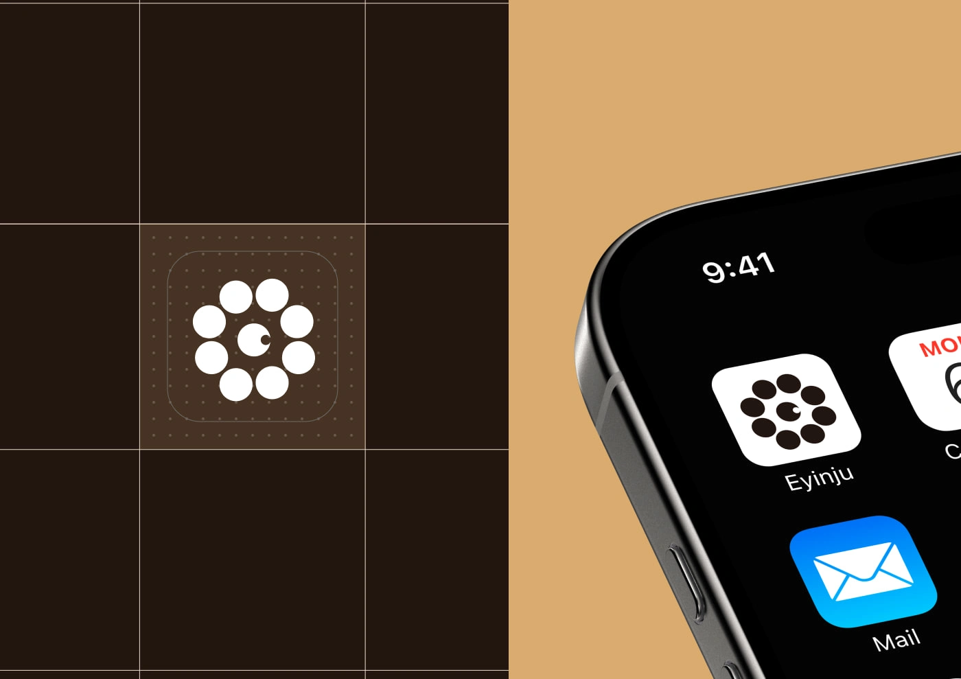
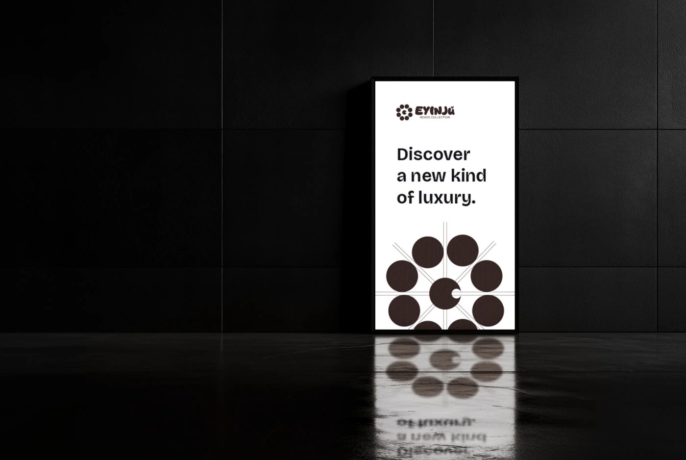
The logo represents the essence of beads—connection, heritage, and craftsmanship.
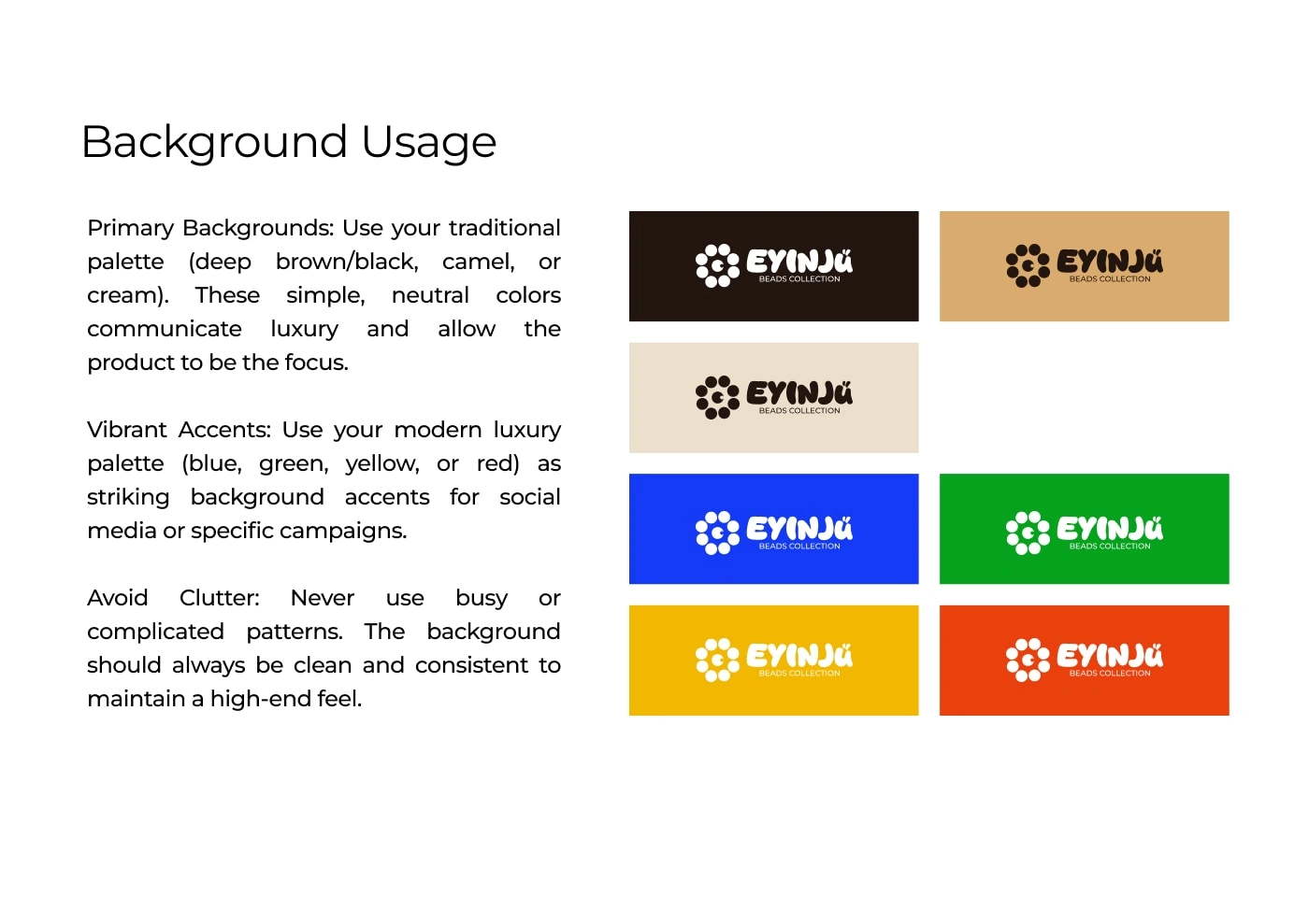
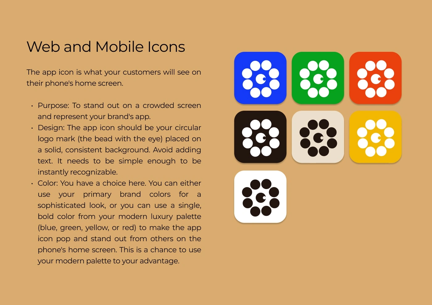
It is built to work:
On packaging
On jewelry cards
On online stores
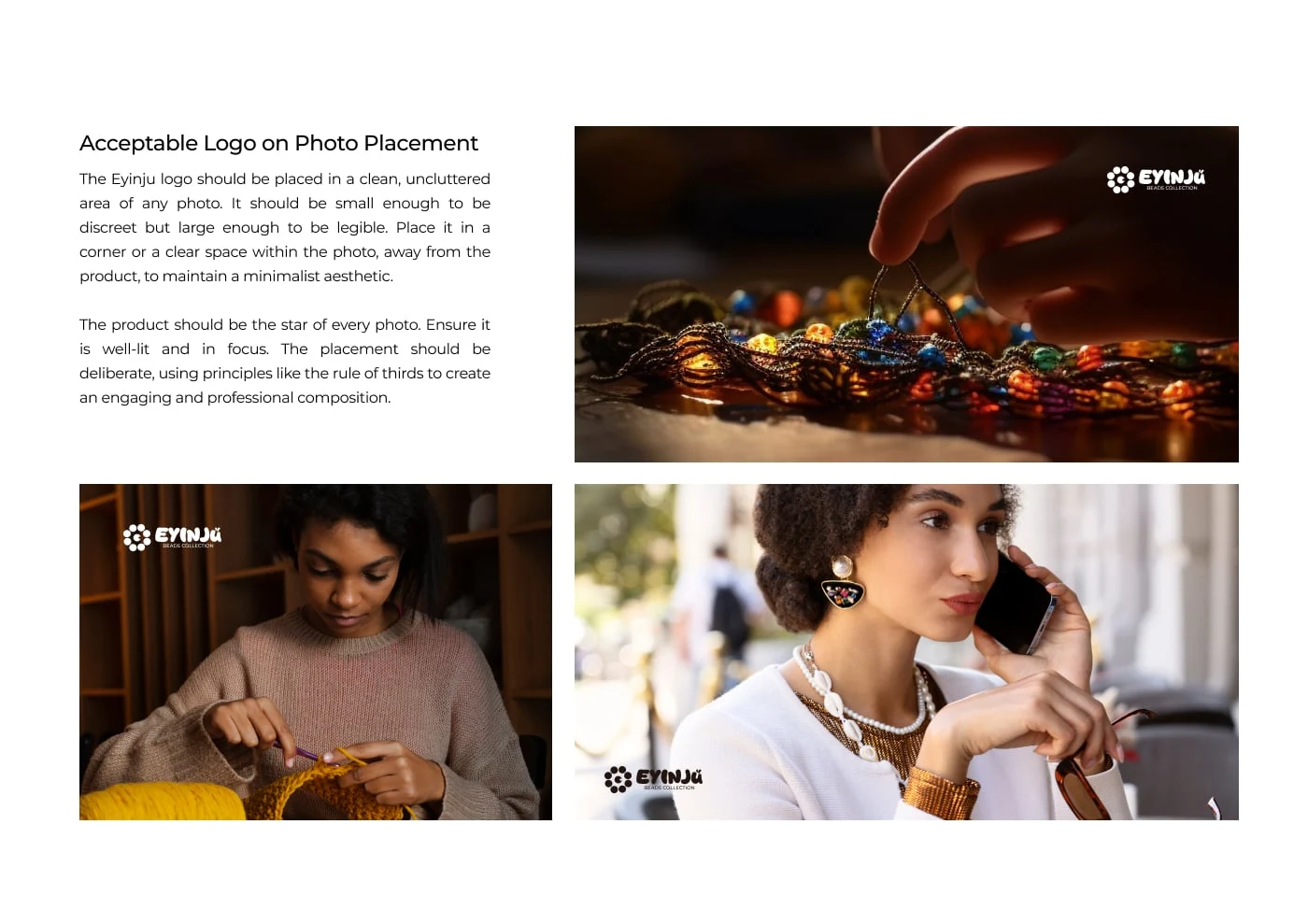
As a high-end signature mark on photos
The logo is minimal, timeless, and instantly recognizable.
08 — Photography Direction
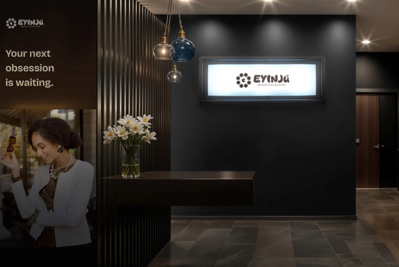
The photography style is inspired by luxury beauty campaigns:
Dramatic shadows
Rich brown tones
Soft highlights
Jewel-focused compositions
Depth, elegance, and mood
This helps present the brand as premium, artistic, and rich in culture.


09 — Packaging Direction
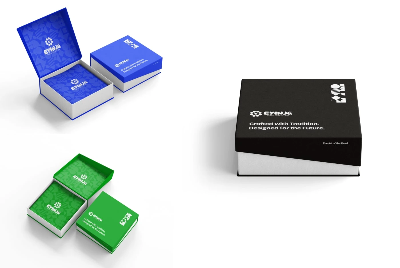
Packaging was designed to feel like a luxury unboxing experience:
Matte deep-brown boxes
Gold foil logo
Satin interior
Thick premium card materials
Clean minimal layouts
The unboxing moment becomes part of the brand story.
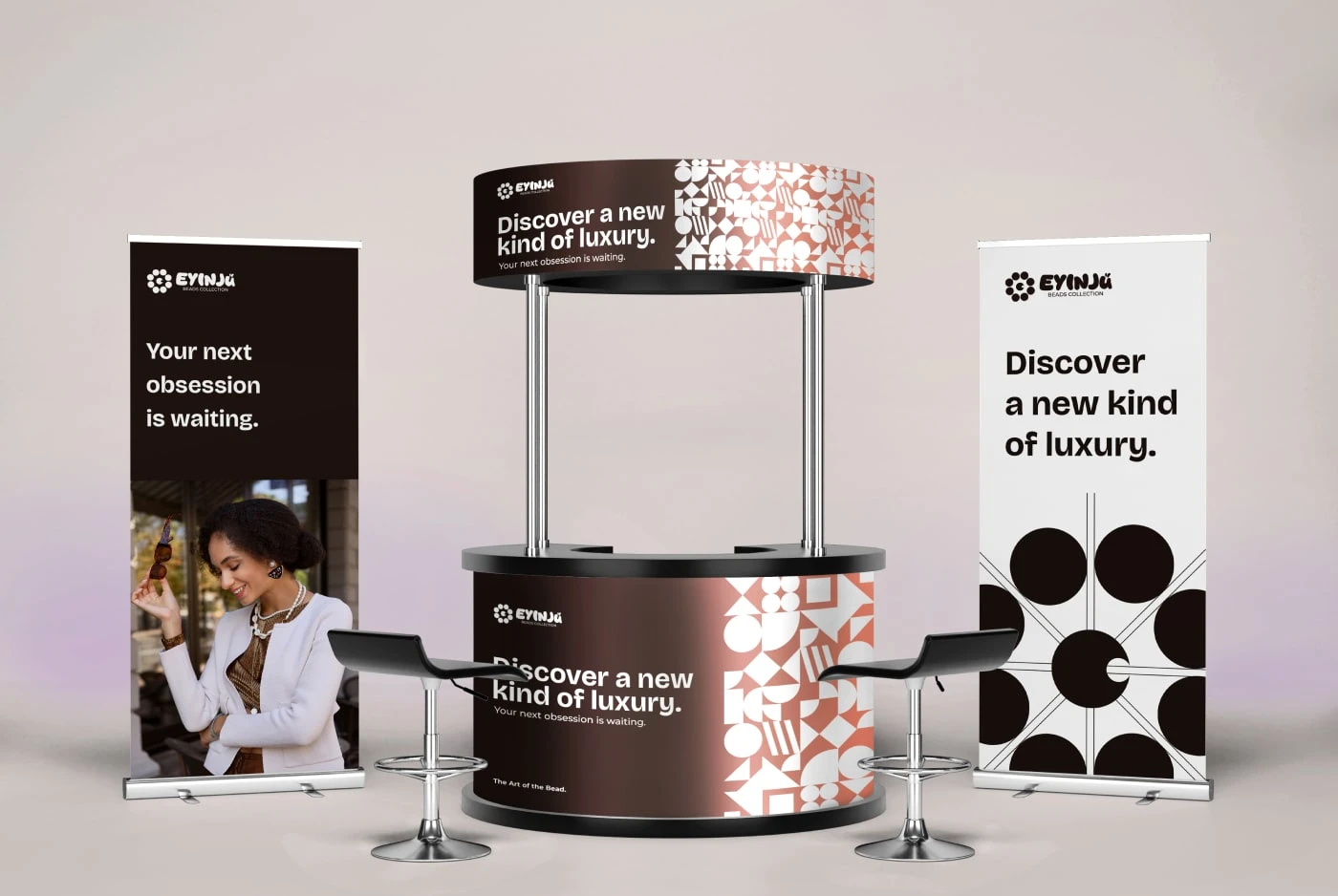
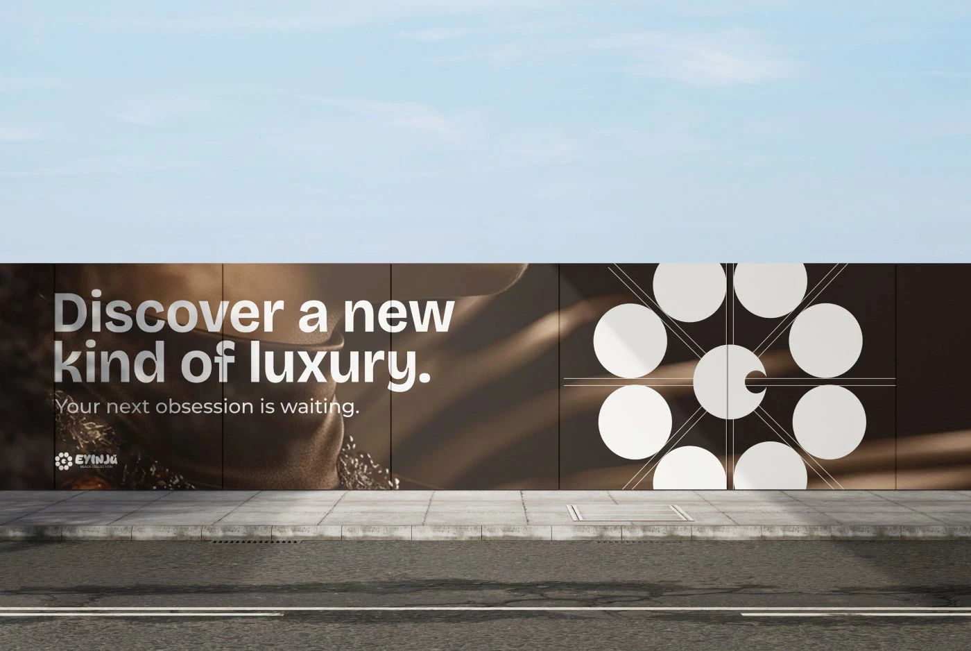
10 — Final Outcome
The brand identity for Eyinju successfully merges traditional African craftsmanship with modern luxury aesthetics.
The result is a timeless, premium brand that honors culture while standing confidently in the luxury market.
Like this project
Posted Oct 2, 2025
Eyinju: Crafting Luxury from Ancient TraditionsThe Core ChallengeThe project for Eyinju began with a singular, crucial business challenge: to elevate tradition…
Likes
2
Views
3
Timeline
Sep 8, 2025 - Sep 29, 2025

