Arden Rumaire — Luxury Fashion Brand Identity

Mara Mel


ARDEN RUMAIRE
A brand built to make scarcity feel like culture, not marketing.
Arden Rumaire is a luxury fashion brand built around one rule: only ten pieces of each design. I developed the brand for the client, translating that principle into its strategy, visual identity, clothing, imagery, and video.
Quiet luxury already has a familiar visual language: cream cashmere, equestrian imagery, and restrained wordmarks.
That became the problem.
Arden Rumaire was entering a category where almost every new luxury brand had learned how to look established. The harder question was how to actually feel distinct without abandoning the restraint that makes the category desirable in the first place.
And Arden Rumaire had something most of them didn't.
A rule.
Every design would be produced only ten times.
No restocks.
No second edition.
No return next season.
Once ten pieces exist, that design is finished.
The work began with one question:
How do you build heritage before you have history?
You create something worth remembering.
I made scarcity the organizing principle of the brand. The ten-piece limit informed a restrained identity: fewer pieces, smaller marks, and recurring visual rituals. A consistent emblem and editorial language give the brand continuity even as each design reaches its final edition.
The brand world became less about fashion campaigns and more about fragments of a life.
A woman cycling through an old city street. A quiet afternoon around horses. Hands shaping clay in a pottery studio. A coral sofa in a room that looks inherited rather than decorated. A cashmere collar caught for half a second as somebody turns toward the camera. The clothing is present in every scene. It is almost never the loudest thing in it. That became the visual rule.
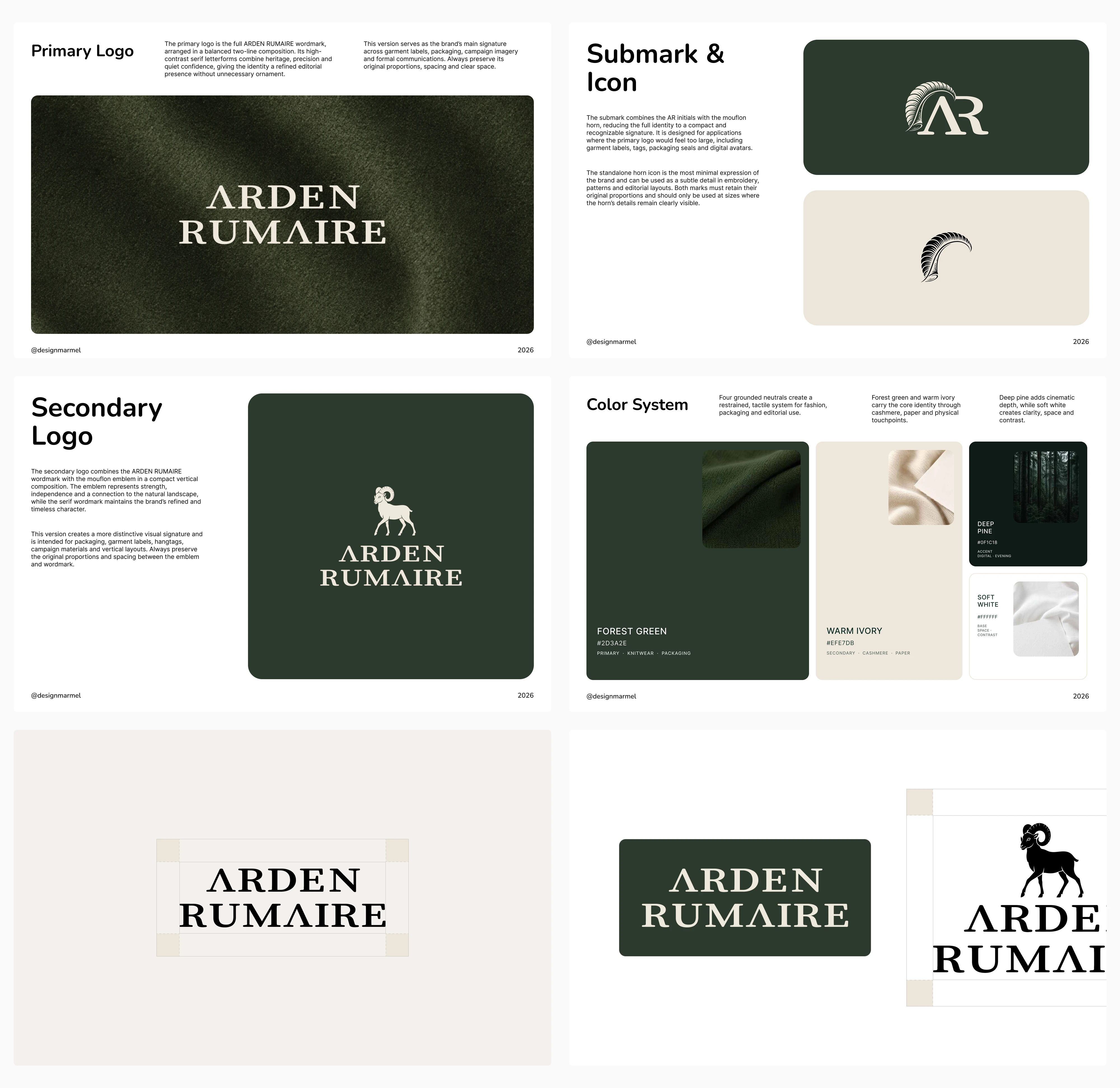
Visual identity system: primary and secondary logos, submark, and color palette.
The Mark
I chose the mouflon as Arden Rumaire's recurring symbol for its connection to landscape and its restrained, resilient character. I reduced the emblem to a signature that could work at an intimate scale, alongside the wordmark and across the wider visual identity.
Small. Embroidered. Usually discovered rather than presented. The same principle shaped the wordmark. Nothing needed to announce itself from across the room. The brand should reward the person who comes closer.
The Imagery
All videos in this project were generated with AI. I developed their creative direction to express the brand’s visual language: soft grain, intimate framing, and an archival editorial atmosphere.
Instead, Arden Rumaire lives somewhere between archival editorial photography and a memory that may never have happened. Soft grain. Imperfect framing. Camera flashes. Natural movement. Women looking away from the lens. City traffic passing through a shot.
The idea was never to make the brand look vintage.
It was to make the images feel as though they already had a past.
Like this project
Posted Sep 6, 2026
Brand strategy, visual identity, clothing, imagery, and AI-generated video for Arden Rumaire, a luxury fashion brand limited to ten pieces per design.