Your Comprehensive Management Assistant
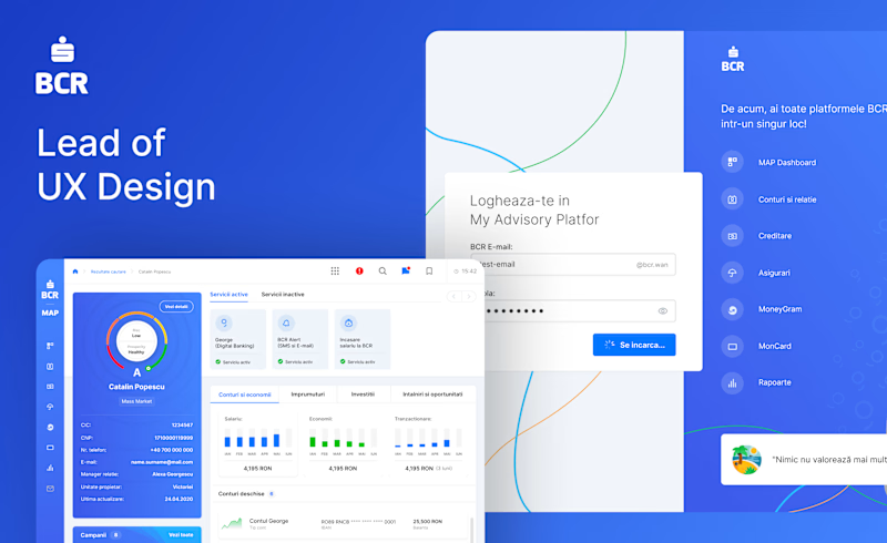
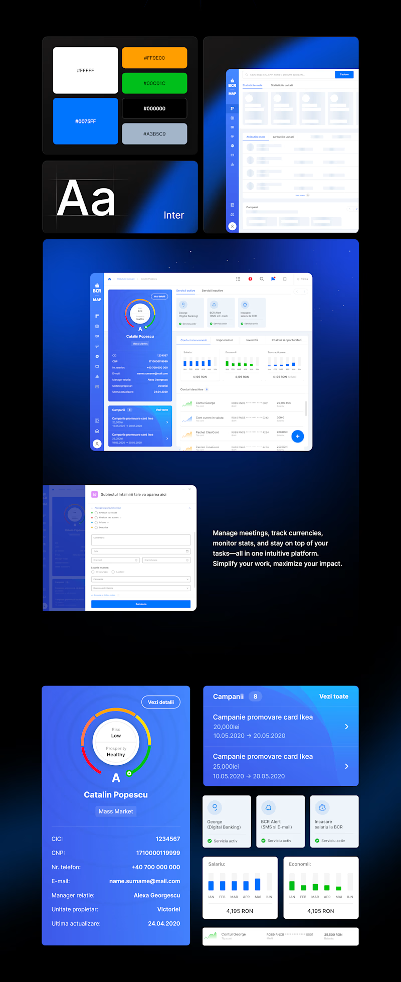
MAP is an all-in-one platform designed to streamline and enhance your daily workflow. With MAP, you can efficiently manage client meetings, stay updated on currency exchange rates like the Euro and Dollar, monitor the performance statistics of your banking unit, and keep track of your personal tasks and responsibilities. Simplify your workday with a tool that keeps everything you need in one place.
📋 Task
I was assigned the UI/UX design for a platform that helps users manage their daily tasks, including scheduling client meetings, tracking currency exchange rates, monitoring organizational statistics, and overseeing personal responsibilities. My role involved creating an intuitive and visually appealing interface that ensures a seamless user experience across all functionalities.
📕 Challenges
📌 Balancing Simplicity with Functionality
Ensuring the dashboard includes all the necessary features (meetings, currency tracking, statistics, task management) without overwhelming users with complexity.
📌 Designing for Diverse User Needs
Users may have different roles, preferences, and levels of tech-savviness.
📌 Data Presentation and Visual Hierarchy
Presenting large amounts of data, such as statistics or currency updates, in a clear and digestible way.
📌 Ensuring Responsiveness Across Devices
Designing a dashboard that works seamlessly on desktops, tablets, and mobile devices.
📌 Accessibility and Inclusivity
Designing a platform that is accessible to users with disabilities, such as visual impairments.
📌 Real-Time Updates Without Overloading Users
Incorporating real-time data updates (e.g., currency rates) without overwhelming users with notifications or information.
📌 Collaborating with Developers
Ensuring the design vision is accurately implemented during development.
💡 Turning complexity into clarity
Designing the MAP Dashboard was all about tackling challenges head-on to create an intuitive, user-focused platform. From streamlined workflows to engaging visuals, here’s how I transformed ideas into a seamless experience.

Consistency and Enhanced User Experience
Building on the success of the initial platform concept, we focused on refining the MAP Dashboard, ensuring its user interface aligned with a seamless and intuitive experience. The goal was to maintain consistency across all features while meeting the high standards of functionality and user satisfaction.

Impactful Results Through User-Centered Design
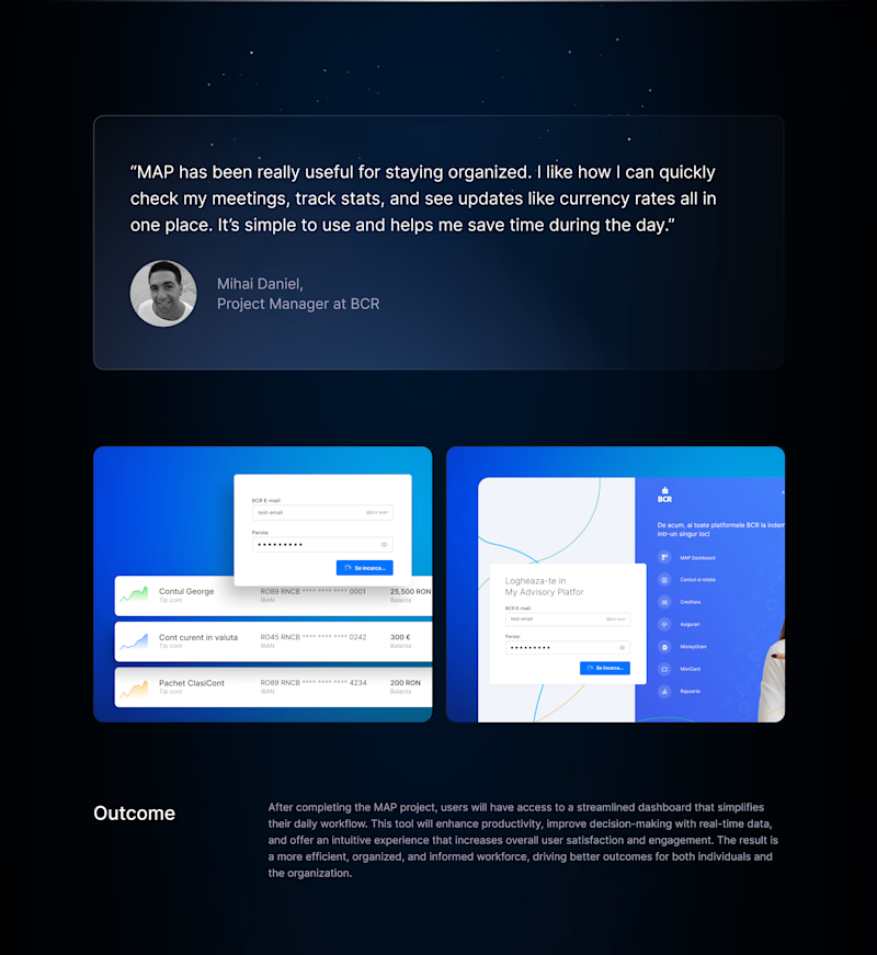
The MAP Dashboard delivered measurable outcomes, including improved task efficiency, enhanced user engagement, and streamlined workflows. Users praised its intuitive design, making it an essential tool for daily productivity.


