Kids’ Meals — Multi-Format Brand System

Nychta Studio


Project overview
Kids’ Meals — Multi-Format Brand System
Approach
Project overview
Kids' Meals already had an established identity. My role was to design and refine outreach assets so they followed that system more consistently across fundraising, volunteer, community, and public-awareness communication.
Outcome
The challenge
A nonprofit can have a strong existing brand and still lose consistency when many outreach assets are created for different audiences and settings. The need was not a rebrand, but better adherence across the materials being produced.
Role & tools
The approach
I worked as the designer within the established Kids' Meals identity, refining typography, color, imagery, hierarchy, and calls to action across the project assets. I used the existing visual language as the standard for each piece rather than claiming ownership of the rebrand itself.
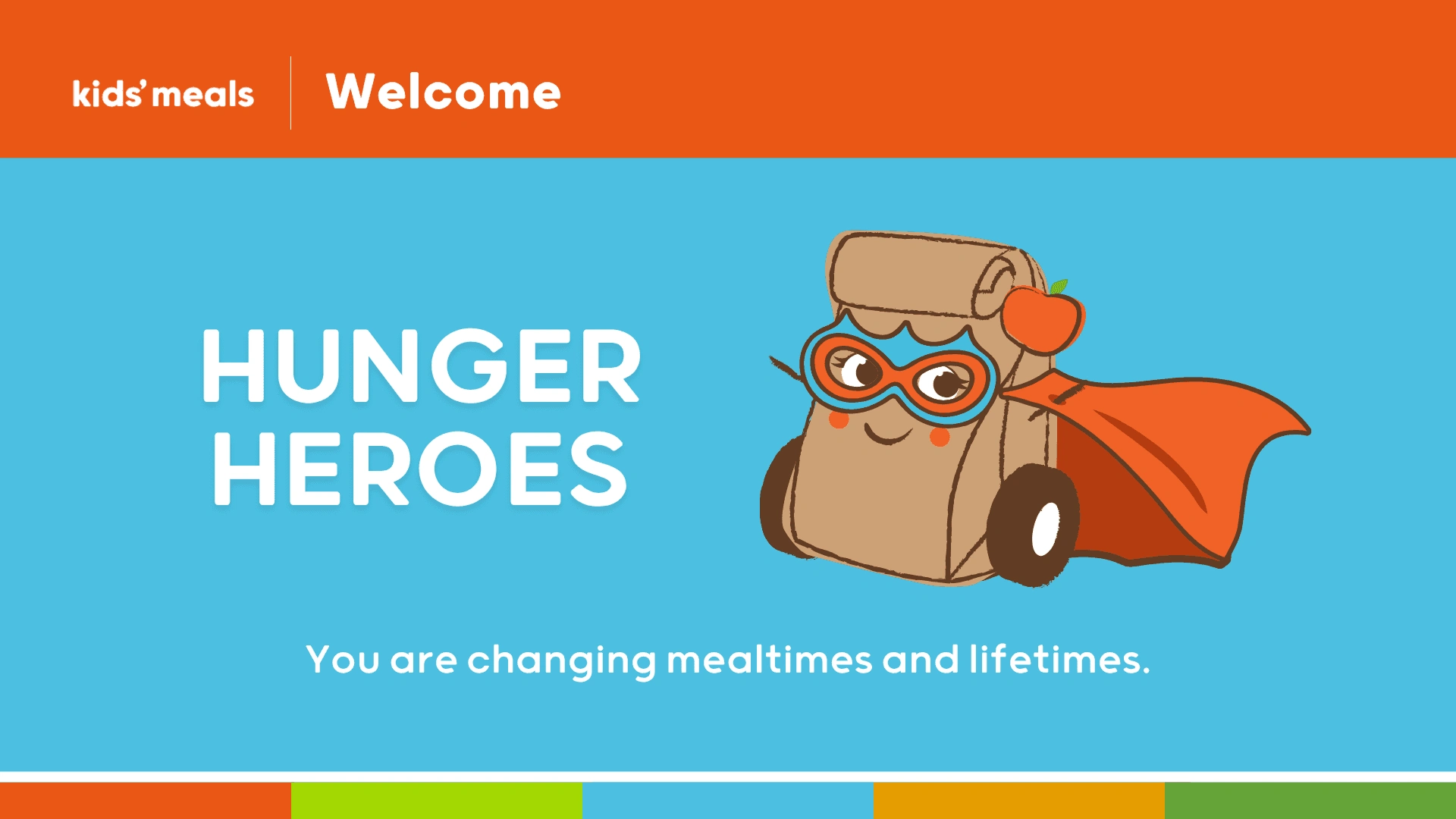
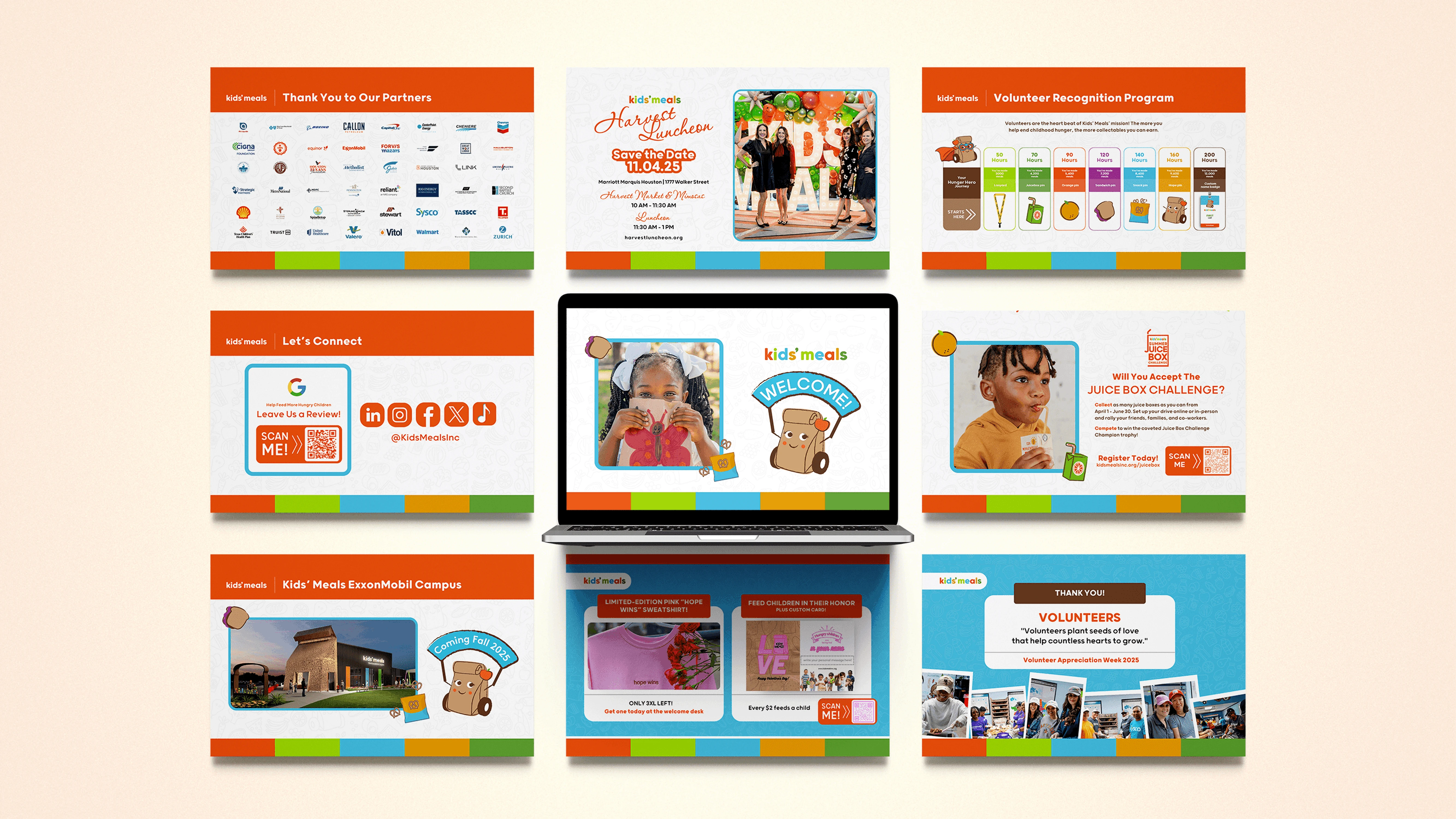
Kids’ Meals Presentation — a multi-slide donor and community story carrying the brand into presentation format.
What we delivered
• Designed outreach materials within the established Kids' Meals identity
• Improved alignment of typography, color, imagery, and hierarchy across assets
• Kept child-focused warmth and clear calls to action working together
• Supported more consistent brand execution across varied community touchpoints
Kids’ Meals Cards — practical branded collateral supporting donor, volunteer, and family touchpoints.
Print & Large Format — the identity scaled into physical community-facing materials.
The result
The assets presented a more consistent expression of the established Kids' Meals brand. Supporters, partners, volunteers, and community audiences could encounter clearer, more cohesive communication across touchpoints.
Like this project
Posted Aug 19, 2026
Built Kids’ Meals’ warm brand system across seven asset formats, from vehicle graphics and events to social, email, print, and fundraising materials.
Likes
0
Views
1