Fitness Coaching Funnel Landing Page

Shubhang Chouhan


The Project
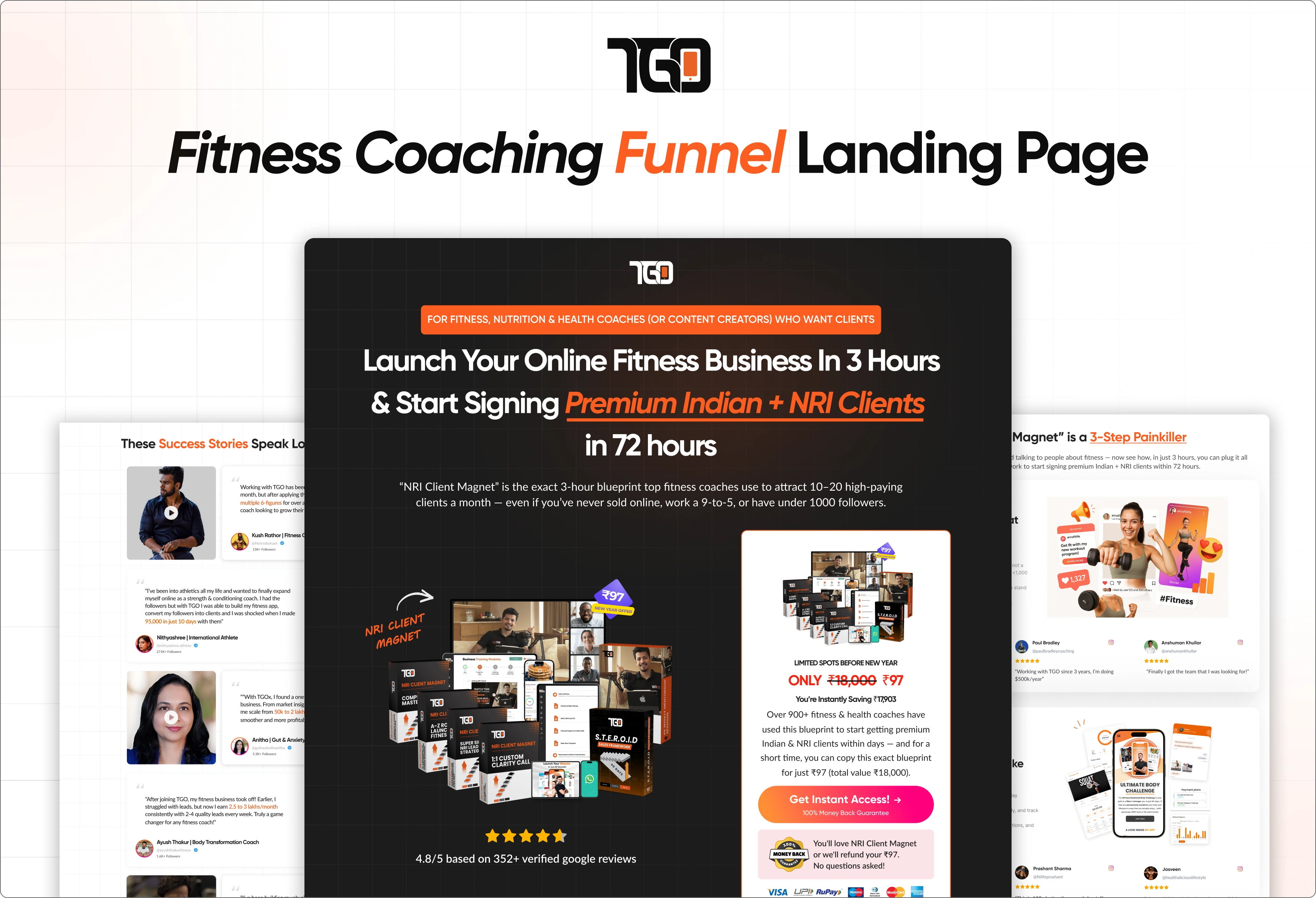
TrainerGoesOnline needed a dedicated landing page for its fitness coaching business offer, targeting coaches and fitness professionals who wanted to build and grow their online coaching business.
Unlike a traditional website, the page had a much more focused purpose: take a visitor who may be unfamiliar with the brand and guide them toward a low-friction ₹97 purchase.
The experience was designed to communicate the opportunity quickly, establish credibility, explain the value of the offer, and make the next step feel easy.
The Challenge
The audience arriving on the page could be completely new to TrainerGoesOnline.
That meant the experience had to answer several questions quickly:
What is this?
Is this relevant to me?
Can I trust TGO?
What will I get?
Is it worth trying?
The challenge was to communicate a significant amount of information while keeping the page focused, visually engaging, and conversion-oriented.
The experience needed to balance persuasion with clarity rather than simply stacking sales content on a page.
The Design Goal
Turn curiosity into confidence.
The landing page was built around three core goals:
01 — Capture Attention
Create an immediate visual and messaging hierarchy that communicates the opportunity without requiring visitors to read the entire page.
02 — Build Confidence
Use credibility, reviews, ratings, coach adoption, and clear value communication to reduce hesitation for first-time visitors.
03 — Drive Action
Keep the journey focused on the ₹97 offer and provide clear opportunities to move forward once the visitor understands the value.
The Conversion Journey
I structured the experience around a simple progression:
Attention → Problem → Opportunity → Value → Proof → Offer → Action
Each section has a specific role in moving the visitor forward.
Rather than introducing the purchase immediately, the page first establishes the problem and opportunity, explains how the solution helps, reinforces credibility, and then brings the visitor back to the offer.
This creates a more natural progression from "What is this?" to "This could be useful for me."
Establishing Trust
For cold traffic, credibility was an important part of the experience.
The page uses existing proof points such as:
352+ Reviews · 4.8★ Rating · 700+ Coaches Onboarded
to reassure visitors that the offer is backed by an established coaching ecosystem.
Rather than keeping social proof isolated at the bottom of the page, credibility is incorporated into the overall conversion narrative.
Communicating the Value
The offer needed to feel understandable before it felt purchasable.
The page progressively introduces:
The problem fitness coaches face
The opportunity to build an online coaching business
What the program provides
The benefits of the system
Supporting proof
The ₹97 entry point
This approach helps visitors understand why the offer exists and what they stand to gain before asking them to take action.
Visual Direction
The visual direction intentionally moves away from the softer aesthetic commonly associated with wellness websites.
The dark interface, bold typography, strong imagery, and high-contrast sections create a visual language that feels:
Bold · Energetic · Premium · Performance-driven
The design also uses strong section breaks and visual hierarchy to make a long-form sales page feel easier to navigate.
Instead of treating the page as one continuous block of content, each section has a distinct visual purpose while remaining part of the same conversion journey.
CTA & Conversion Hierarchy
Because the page has one primary business objective, I kept the CTA hierarchy intentionally focused.
Rather than introducing competing navigation paths, the experience repeatedly gives users an opportunity to act at the moments where enough information has been established to make that action feel relevant.
The result is a landing page that behaves more like a guided sales experience than a conventional website.
Responsive Experience
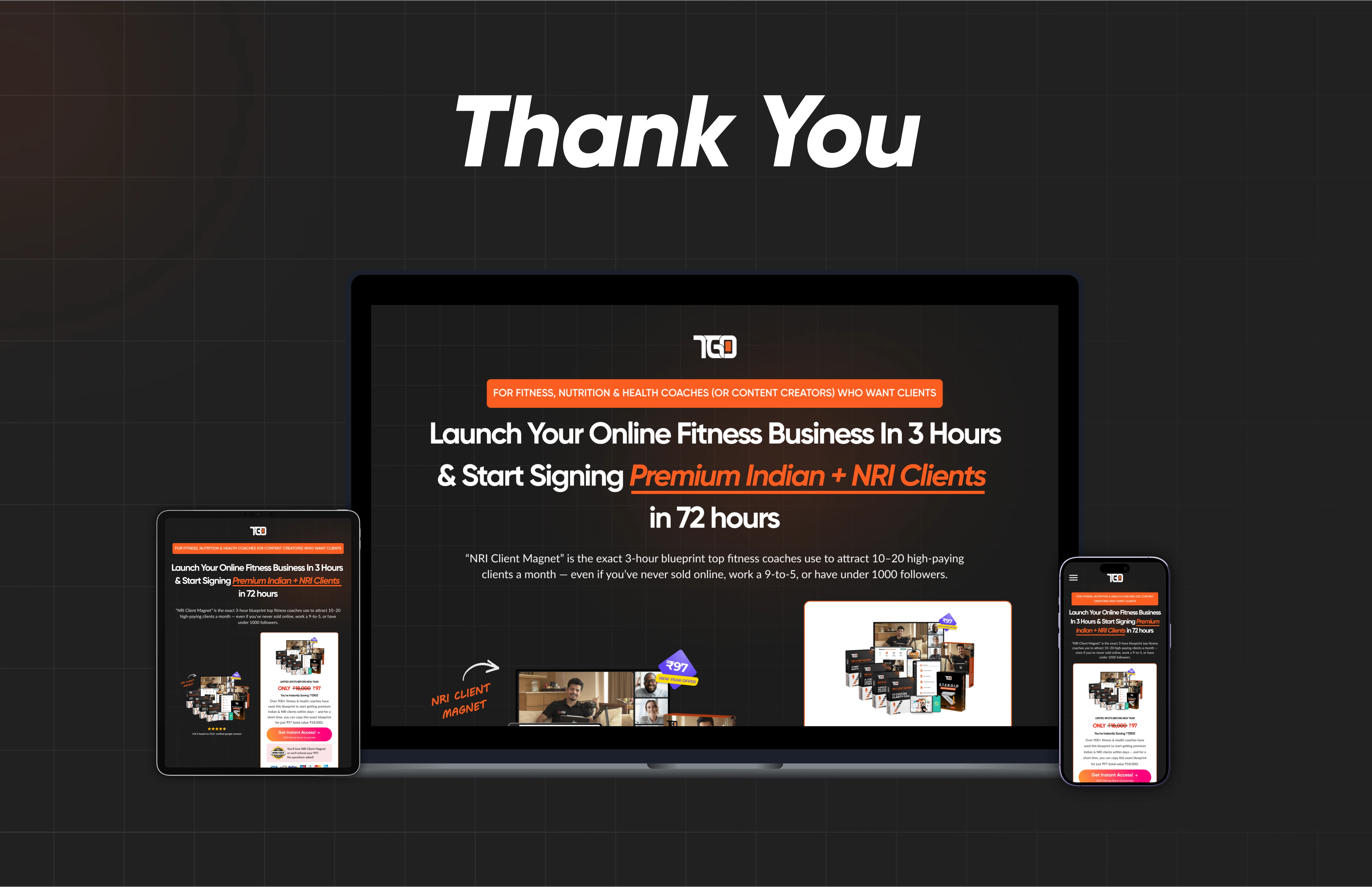
The funnel was designed to work across desktop and mobile while maintaining the same conversion hierarchy.
Key considerations included:
Preserving the primary CTA
Maintaining strong headline hierarchy
Adapting large visual sections
Keeping proof points easy to scan
Reworking content density for smaller screens
Ensuring the offer remains prominent throughout the journey
Key UX Decisions
01 — One clear conversion goal
The experience is intentionally focused around the core offer rather than giving visitors unnecessary navigation choices.
02 — Sell the transformation, not just the product
The page communicates the larger opportunity for fitness coaches before explaining the offer itself.
03 — Use proof where hesitation happens
Reviews, ratings, and adoption numbers reinforce confidence as users evaluate whether the offer is credible.
04 — Progressive persuasion
The page doesn't attempt to make the entire argument in the hero. Each section adds another reason for the visitor to continue.
05 — Reduce the risk of trying
The ₹97 entry point provides a low-friction next step for visitors who aren't ready to make a larger commitment.
Outcome
The final result is a conversion-focused fitness funnel that combines positioning, storytelling, social proof, offer communication, and strong visual hierarchy into a single experience.
Instead of functioning as a general brand website, the page gives visitors a focused path:
Discover the opportunity → Understand the value → Build trust → Take action
The final funnel was designed in Figma and implemented through Kajabi.

Like this project
Posted Mar 16, 2026
A high-conversion fitness funnel designed to turn cold traffic into interested buyers through a focused, trust-driven journey.