SaaS Fitness App Landing Page

Shubhang Chouhan

The Project
The TGO Fitness App is designed to help fitness professionals manage and grow their online coaching business through a single platform.
The goal of the landing page was to create a clear, engaging entry point for potential users—quickly communicating what the app does, why it is valuable, and why fitness professionals should consider signing up.
Rather than presenting the product as a collection of features, the experience was designed around the value it creates for coaches and their businesses.
The Challenge
Fitness professionals are often presented with multiple tools for different parts of their business—client management, workouts, nutrition, payments, communication, and growth.
The landing page needed to communicate how TGO brings these needs together without overwhelming visitors with a long list of product features.
The key goals were to:
Explain the product quickly
Communicate the value for fitness professionals
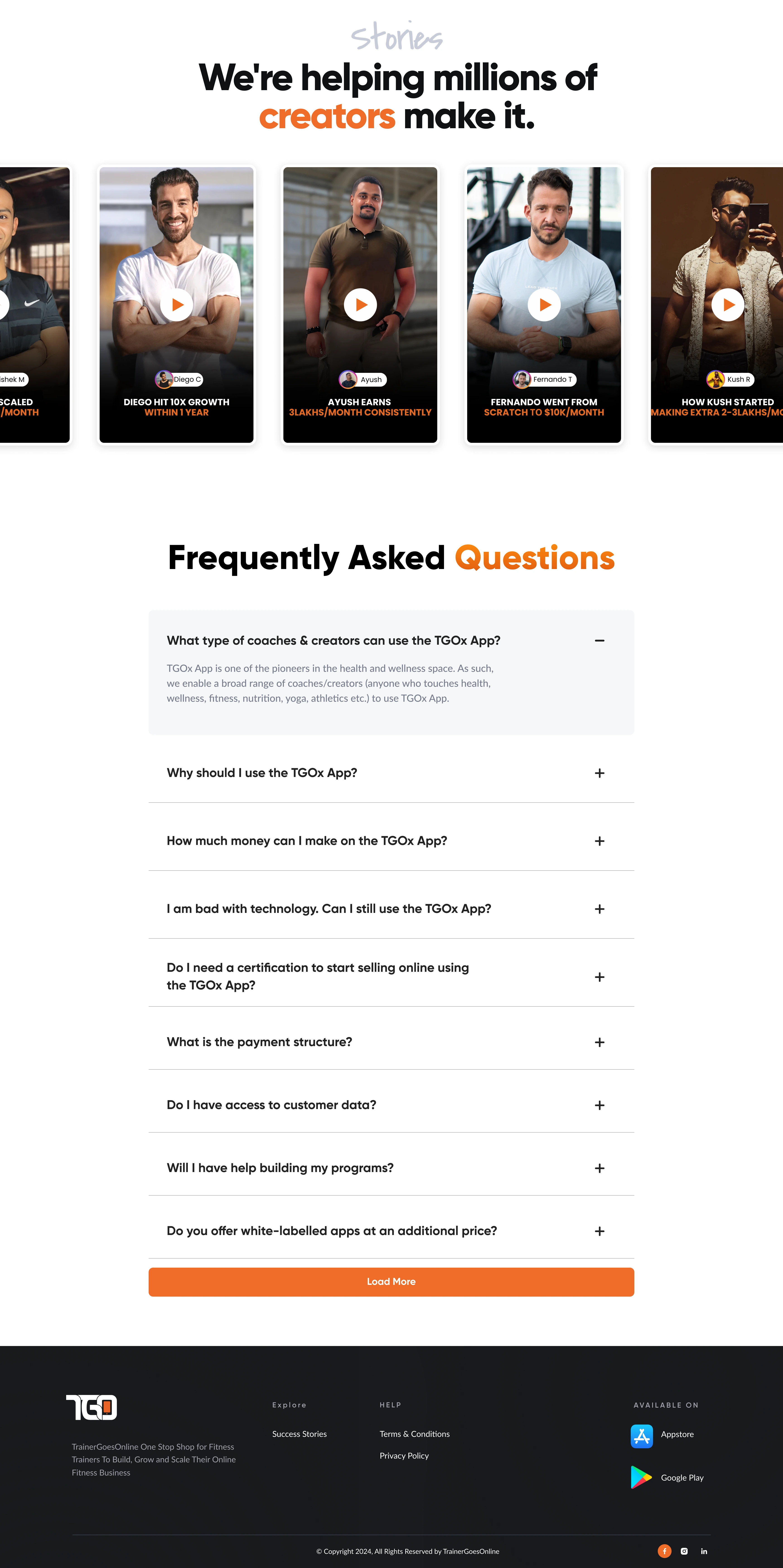
Make the platform feel credible and easy to adopt
Present features in a way that feels relevant rather than technical
Maintain a strong visual connection to the fitness industry
Guide visitors naturally toward signing up
The Design Goal
Make the product feel as powerful as the business it helps build.
The experience was built around three principles:
01 — Communicate Value Quickly
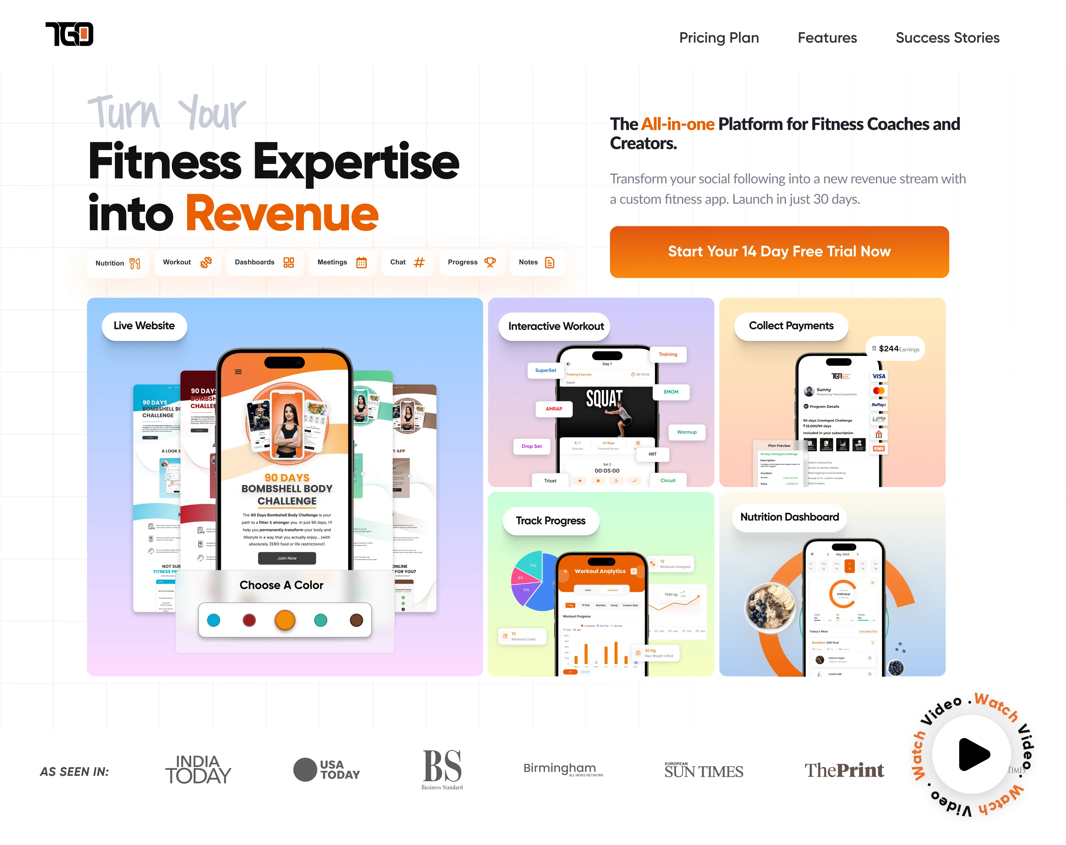
The opening experience immediately establishes what TGO is and who it is built for, giving visitors a clear reason to continue exploring.
02 — Connect Features to Benefits
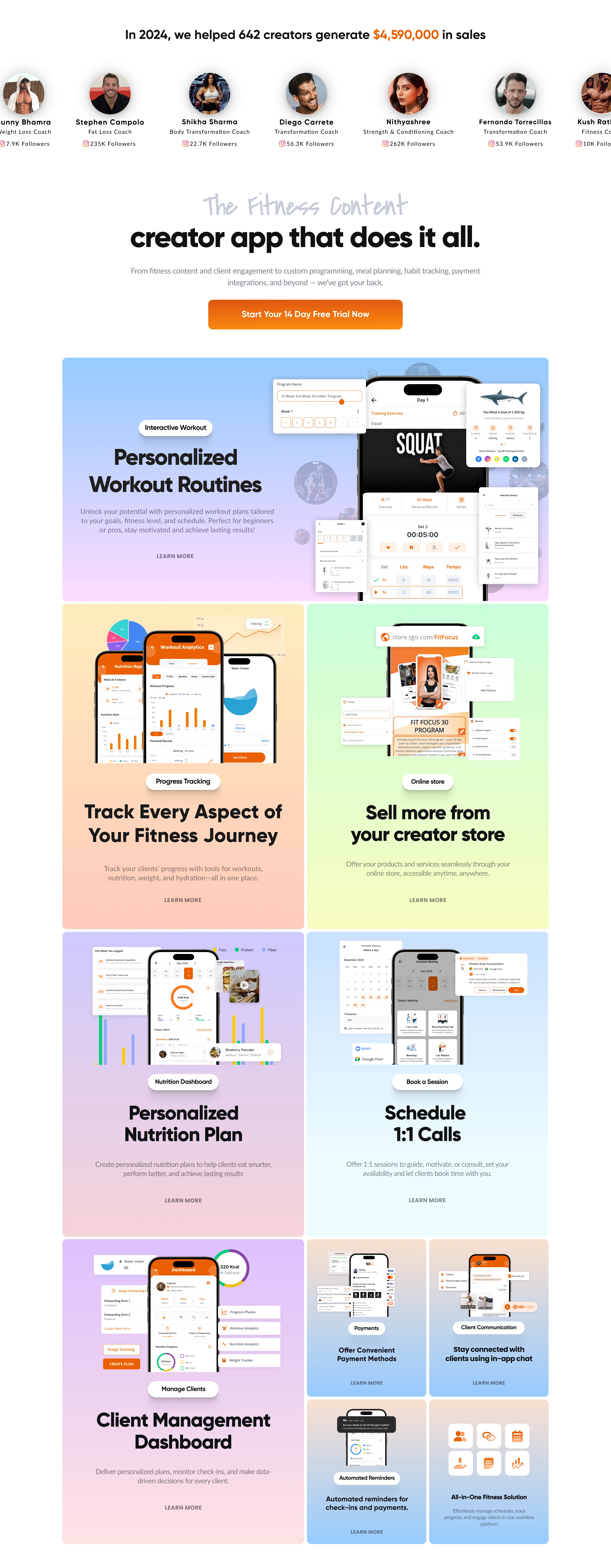
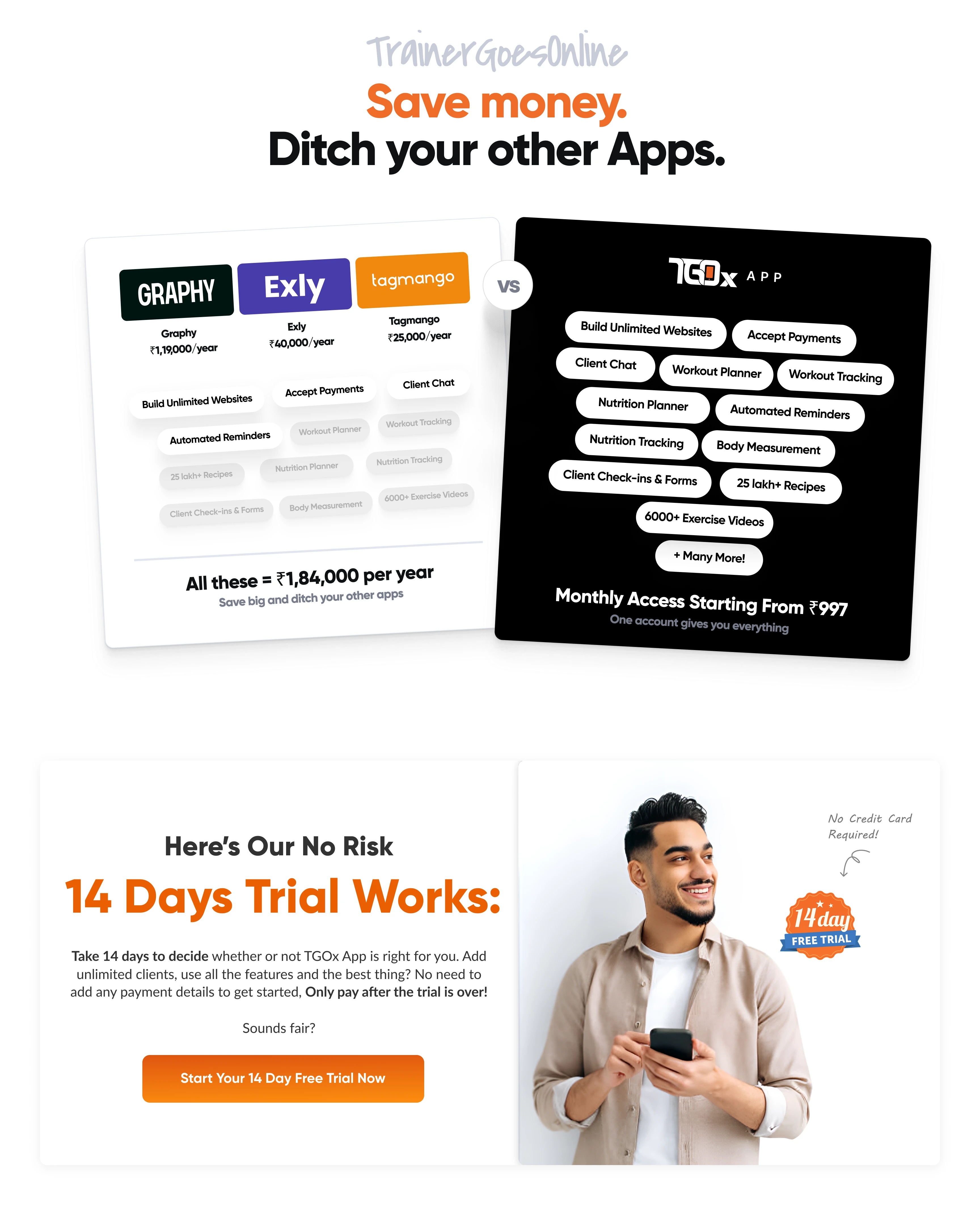
Instead of treating features as isolated capabilities, the page presents them in the context of how they help coaches manage clients, deliver programs, and grow their business.
03 — Keep the Journey Focused
The page uses a clear visual hierarchy and consistent CTA placement to guide users toward the next step without unnecessary distractions.
Product Storytelling
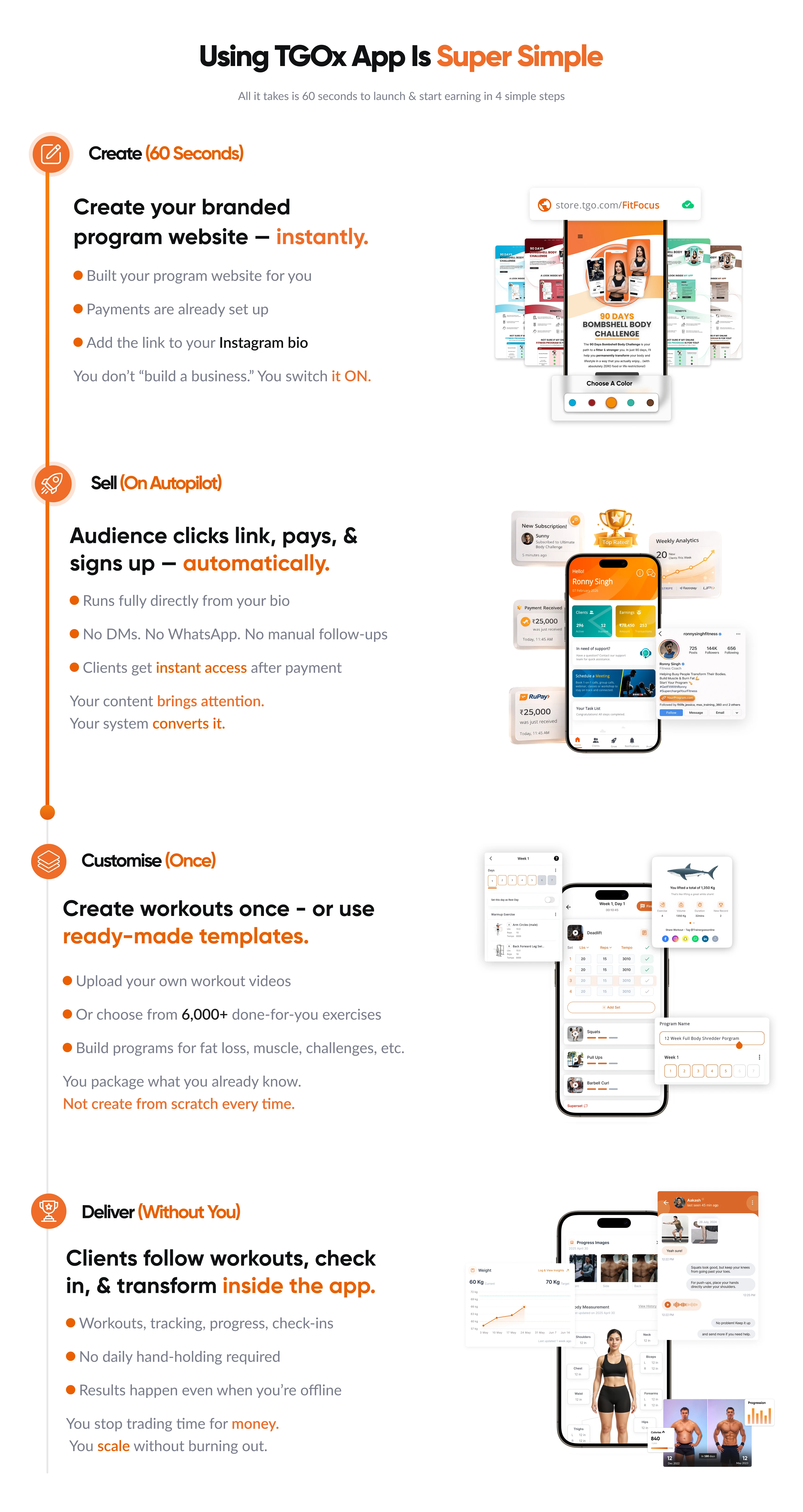
I structured the landing page around a simple progression:
Discover → Understand → Explore → Trust → Sign Up
The page gradually introduces the product, its capabilities, and its value instead of presenting everything at once.
This creates a more digestible experience for visitors who may be discovering TGO for the first time
Communicating the Product
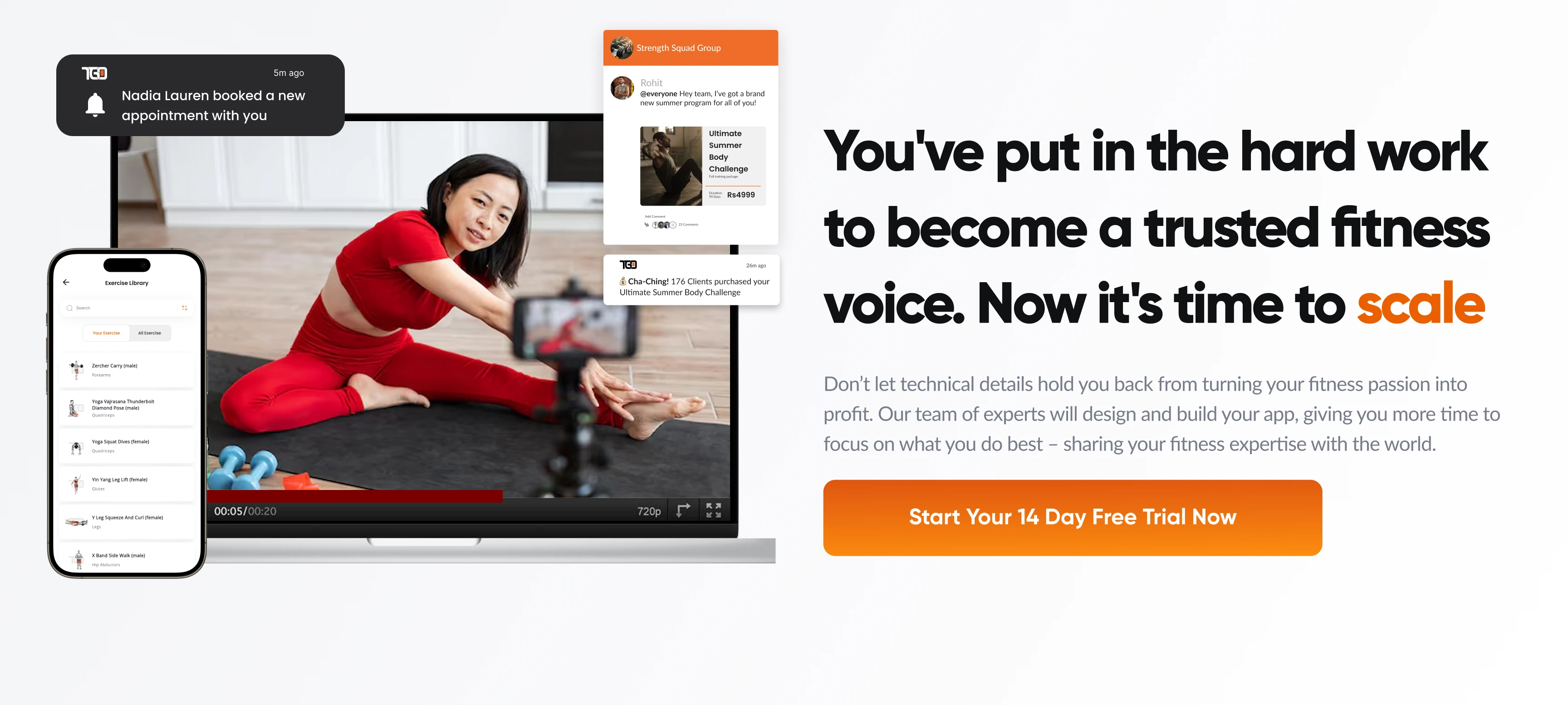
A key part of the design was showing the product rather than relying entirely on marketing copy.
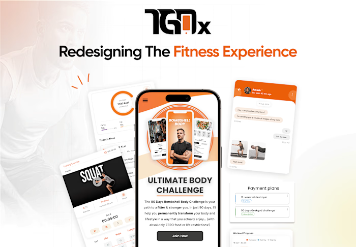
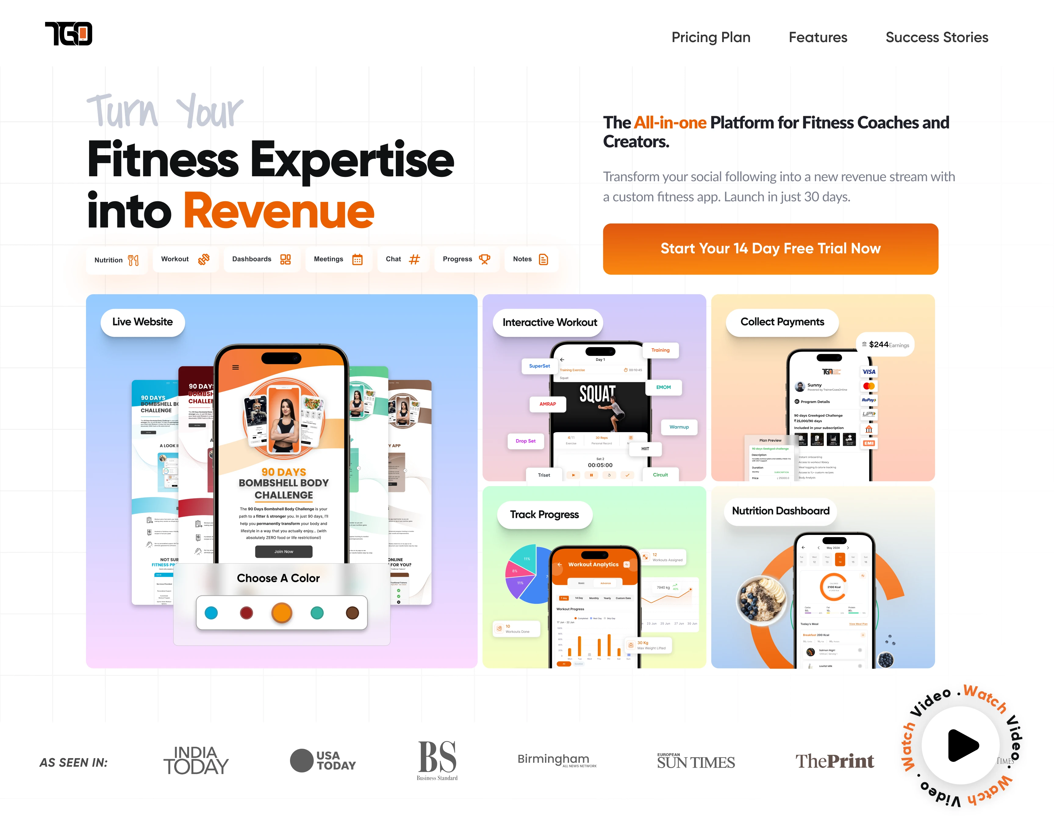
App interfaces are incorporated throughout the page to give visitors a visual understanding of the experience.
This helps answer an important question early in the journey:
"What would using this platform actually feel like?"
The product screens also provide visual variety throughout the long-form landing page while reinforcing the connection between each benefit and the actual product.
Visual Direction
The visual direction was designed to feel energetic, modern, and performance-driven, reflecting the fitness industry while positioning TGO as a professional digital platform.
The interface combines:
Bold typography
Strong imagery
High-contrast layouts
Product UI showcases
Structured content sections
Clear CTA hierarchy
Dynamic visual compositions
The goal was to balance fitness energy with SaaS credibility rather than making the experience feel like a generic fitness website.
Building the Conversion Journey
The page was designed to maintain momentum throughout the experience.
Early sections focus on attention and positioning, while subsequent sections provide more detail about the product and its capabilities.
As visitors move further down the page, the content shifts from:
"What is TGO?"
to:
"How can TGO help me?"
and ultimately:
"I'm ready to try it."
This progression keeps the CTA connected to the information users need before making a decision.
Responsive Experience
The landing page was designed to maintain the same product story and visual hierarchy across desktop and mobile.
Key considerations included:
Preserving headline hierarchy
Adapting product screenshots for smaller screens
Maintaining clear CTA visibility
Managing content density
Reworking visual compositions for mobile
Keeping feature sections easy to scan
Key UX Decisions
01 — Lead with the product value
The experience establishes why the platform matters before diving into individual features.
02 — Show, don't just tell
Real product UI is used throughout the page to make the platform tangible and easier to understand.
03 — Benefits over feature dumping
Features are presented in relation to the problems they solve for fitness professionals.
04 — Progressive storytelling
Information is introduced in stages so visitors can build an understanding of the product without being overwhelmed.
05 — Consistent conversion path
The CTA remains visually prominent throughout the experience, giving interested visitors a clear next step.
Outcome
The final result is a focused SaaS landing page that combines product storytelling, fitness-focused visual design, and conversion-oriented UX.
The experience gives potential users a clear path to:
Understand the product → Explore its capabilities → See the experience → Build confidence → Sign up
The landing page provides TGO with a dedicated digital experience for communicating its fitness platform to prospective users.
Like this project
Posted Feb 28, 2026
A high-energy landing page designed to introduce the TGO Fitness App, communicate its value clearly, and turn interest into sign-ups.
Likes
0
Views
10