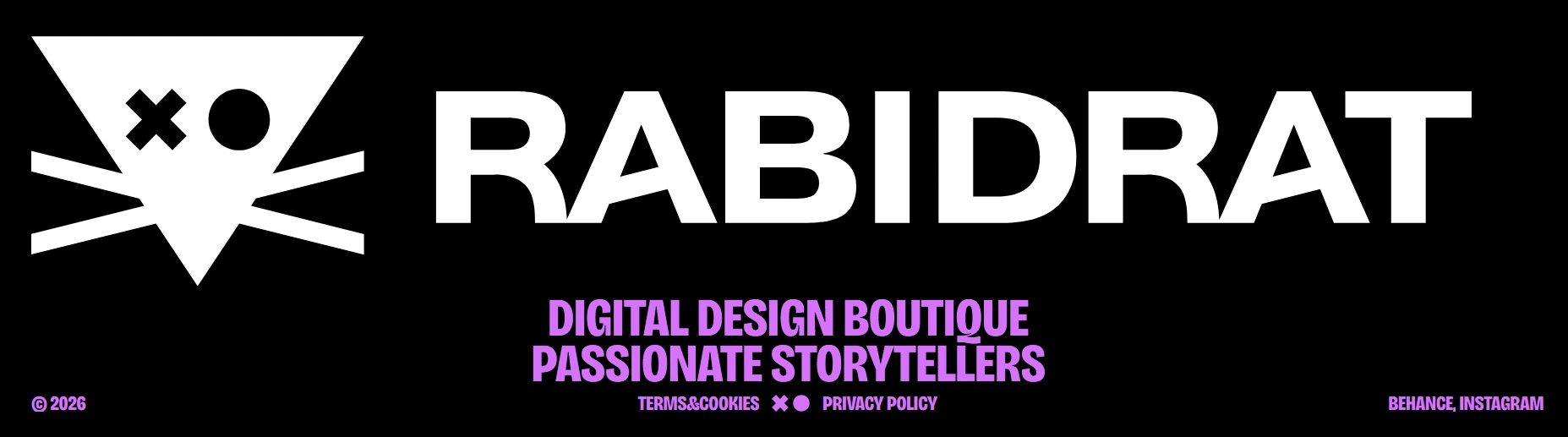
RABIDRAT / Branding&Webdesign
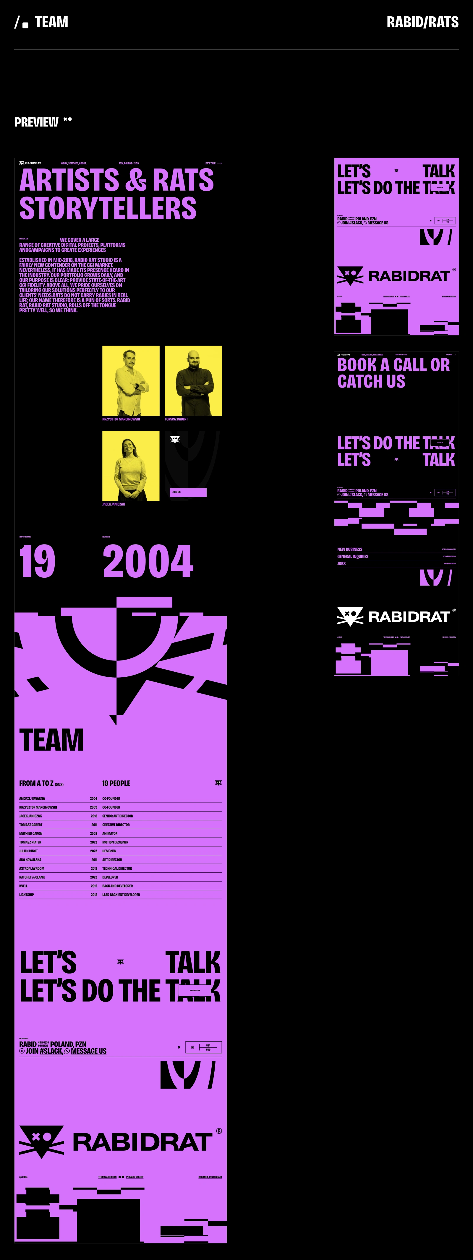
Jacek Janiczak
Artrats and Storytellers
WHO WE ARE:
We specialize in a wide range of creative digital projects, from brand videos to teasers, video games, and interactive content. Above all, we take pride in tailoring our solutions to meet our clients' needs perfectly. Rats do not carry rabies in real life; our name, therefore, is a pun of sorts. RABIDRAT rolls off the tongue pretty well, so we think.
SCOPE OF WORK:
Branding/Merch: Jacek Janiczak
UX/UI/Motion: Piotr Kaźmierczak
CLIENT:
https://rabidrat.pl/

Logo
(Evolution & Refinement)
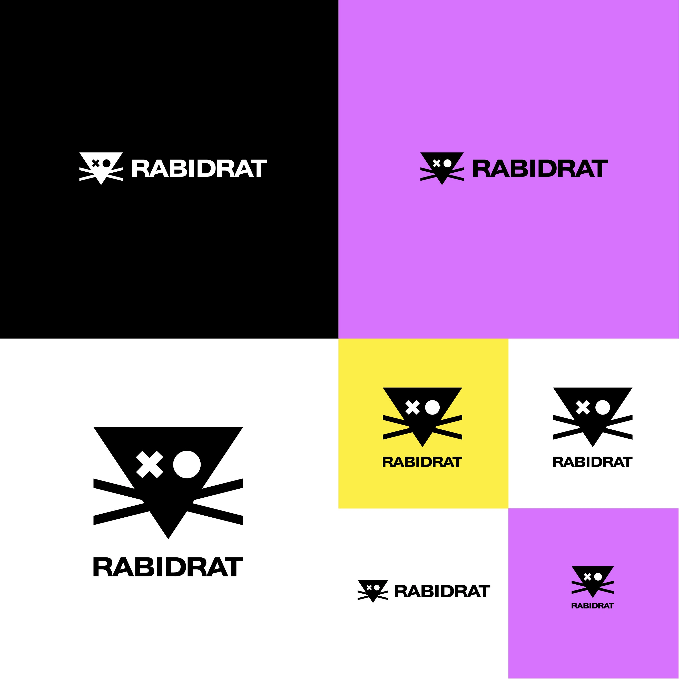
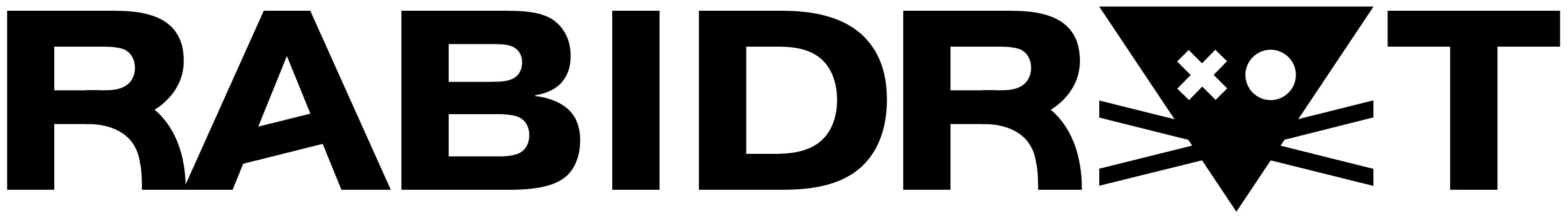
We didn't start from scratch; we evolved the beast. Based on the original RABIDRAT mark, we completely redrew the symbol from the ground up, meticulously refining the proportions to make it sharper and more balanced.
Instead of smooth, corporate vector shapes, we embraced a raw, pixelated vibe rooted in early internet aesthetics and hacker culture. To match the aggressive and unapologetic nature of the icon, we also designed 100% custom typography for the logotype. It’s not a polite brand mark—it's built to bite.
Responsive
Logo System
In today's visual noise, a mark has to hit hard at any scale.
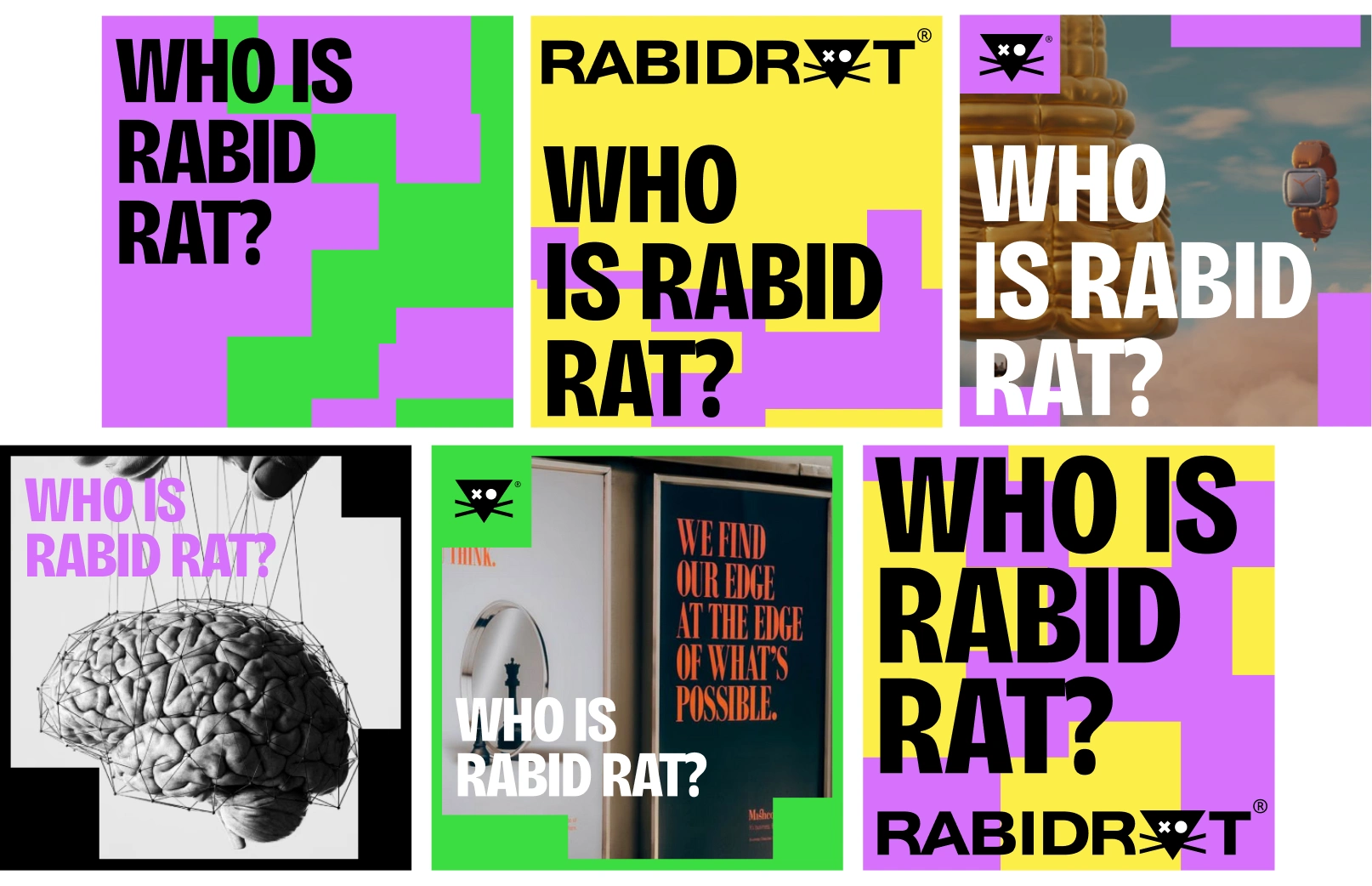
We designed a responsive logo system that seamlessly strips back from the full lockup (symbol + custom logotype) down to its purest, minimalist pixel form. Whether it’s scaled up on a massive screen, heavily embroidered on a hoodie, or squeezed into an Instagram micro-avatar, the rat never loses its teeth or its rebellious character.
The Grid
& Visual System
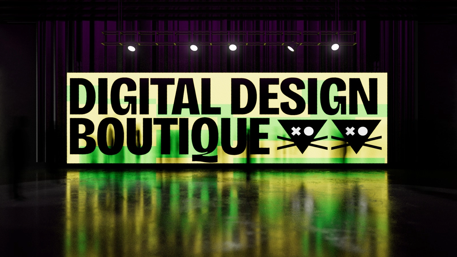
We anchored the entire visual communication system on a strict, modular grid. It echoes the rigid structure of memory blocks and raw, early-web user interfaces. This underlying mathematical order gives us absolute freedom on the front end. It allows us to juggle neon acid colors, aggressive typography, and pixel art with total control. We can break the rules precisely because we built an unbreakable foundation.
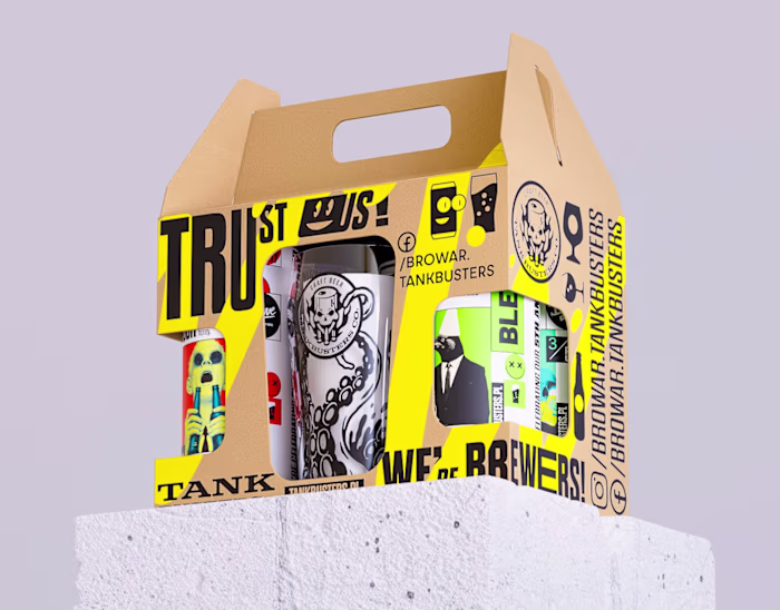
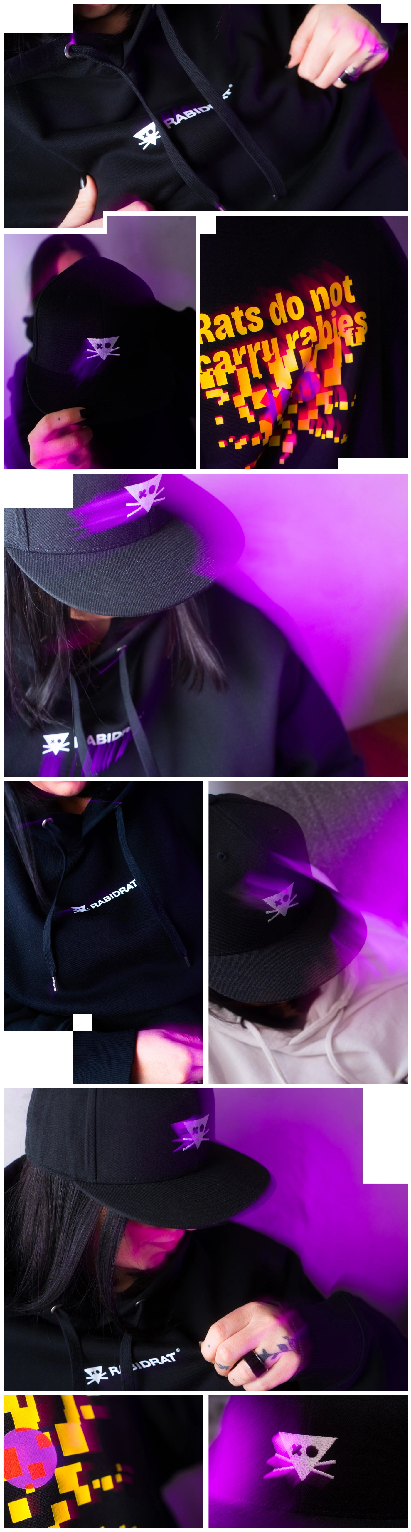
Apparel
We took the raw, pixelated graphics, brutalist typography, and acid-neon aesthetics out of the screen and dropped them heavily onto premium streetwear. Featuring bold, aggressive prints on black heavy cotton, this apparel acts as a uniform for those who navigate the noise and refuse to play by the rules. It’s our visual system, translated into something you can wear.
Break
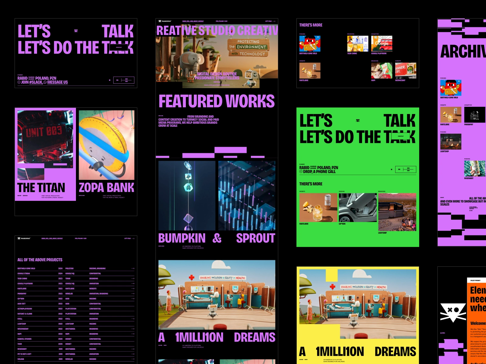
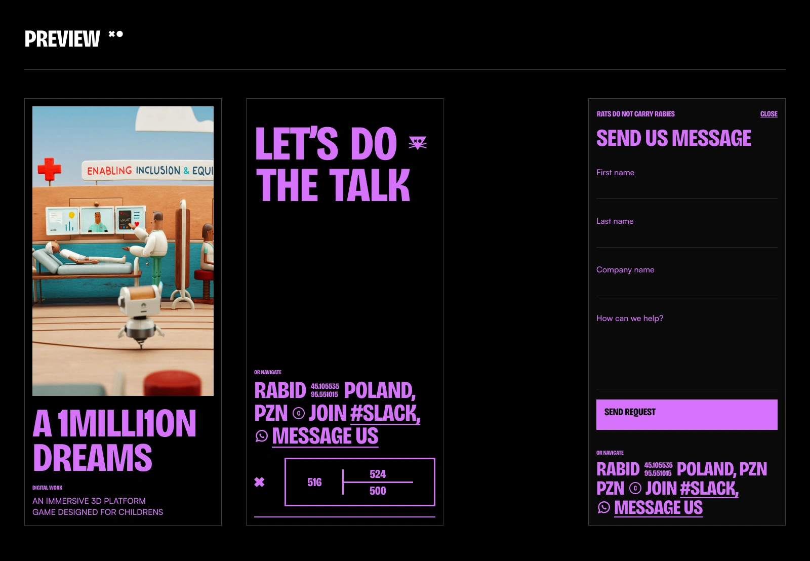
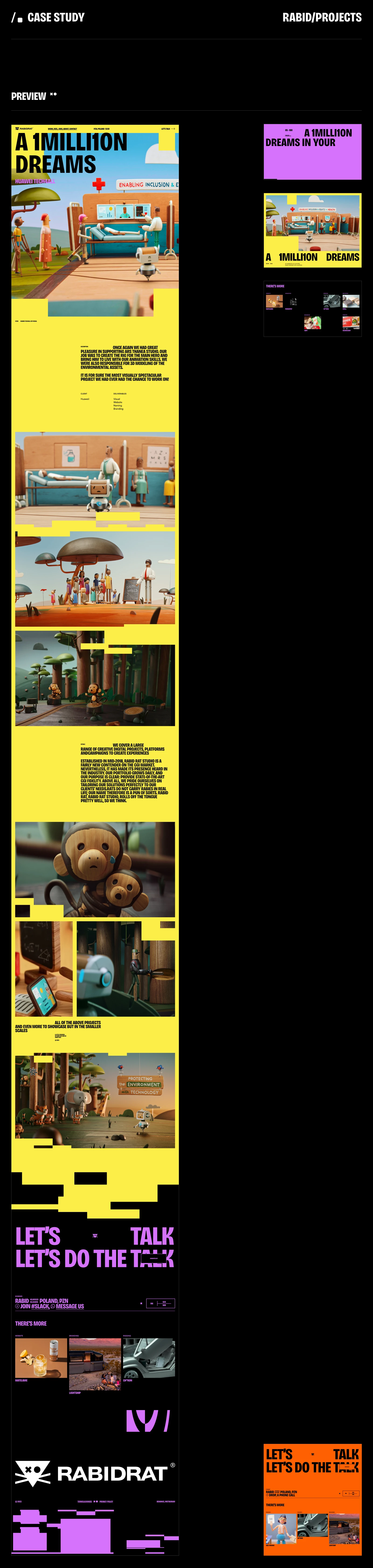
Website
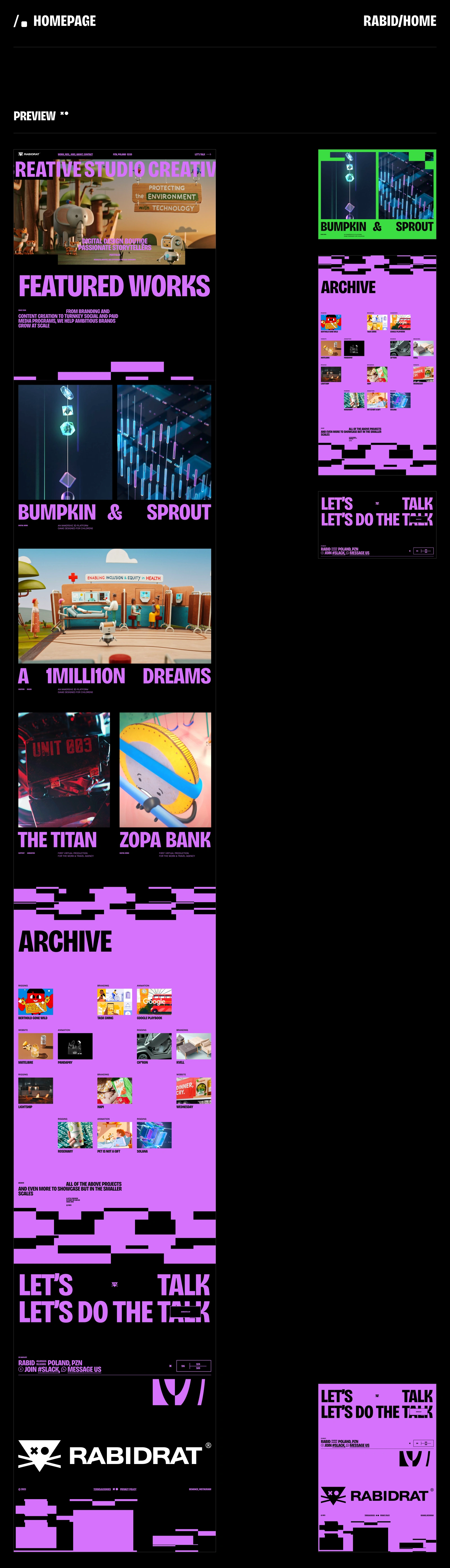
This isn't just a website – it's a digital extension of the brand's core philosophy. A platform where the visual rebellion lives and breathes in real-time, allowing users to navigate through our structured anarchy while experiencing the full weight of our aesthetic principles in their purest digital form.
We translated the raw digital DNA directly into a living, breathing web experience that refuses to compromise. The website inherits the same modular grid system, becoming a digital playground where brutalist navigation meets pixel-perfect precision. Every page loads like a memory dump – fast, aggressive, and unapologetically direct.
The interface strips away all unnecessary noise, leaving only what matters: pure information architecture built on the same mathematical foundation that governs our visual system. Neon-acid highlights cut through dark backgrounds, while our responsive logo system scales flawlessly across every breakpoint – from desktop monuments to mobile micro-interactions.
Typography hits as hard on screen as it does on fabric. Our custom web fonts maintain that same rebellious edge, whether they're dominating hero sections or compressed into tight navigation elements. The grid system ensures every pixel has purpose, every animation serves a function, and every scroll reveals calculated chaos.


Like this project
Posted May 19, 2026
Branding and webdesign created for Rabidart https://rabidrat.pl/