Danita Youth- Brand Identity Design For Youth Organisation

Chichi Mpande


Danita Youth Foundation
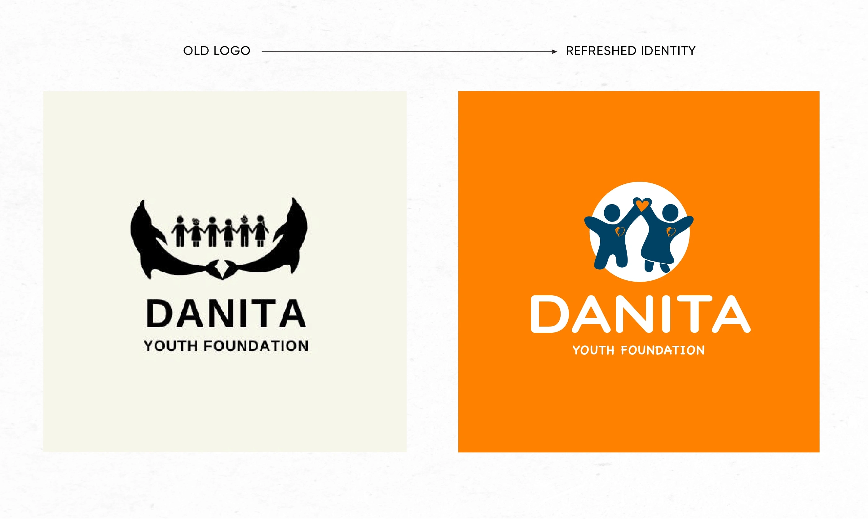
Danita Youth Foundation is a charity foundation founded in Zimbabwe that is focused on the development of young people. They wanted a new visual identity that truly represented their core values and make them more recognizable to both the local community and global community. Their request was for the incorporation of dolphins and children in the logo as their previous logo.
Visual Identity Redesign
BRAND STRATEGY
Why does the brand exist?
Danita Youth is an organisation founded to support the development of the youth. The brand seeks to combine the power of sport and education to enable the youth in the local communities. Their mission is to build sustainable and impactful programmes that provide accessibility to deliver change and growth amongst young Zimbabweans.
What future do they help create?
Danita aims to help inspire, empower, and unite young people in their communities to become leaders amongst themselves and for themselves. To not be limited by their circumstances and to assist in helping them achieve their personal goals.
What are values guide the brand ?
With Inspiration, Unity, and Empowerment at its core, the brand aims to help young people to take control of their circumstances and help them cultivate a pathway to a better future and better community.
VISUAL IDENTITY
Started out by defining keywords to guide my creative process of crafting the visual identity of the brand.
WARM • VIBRANT • YOUTHFUL
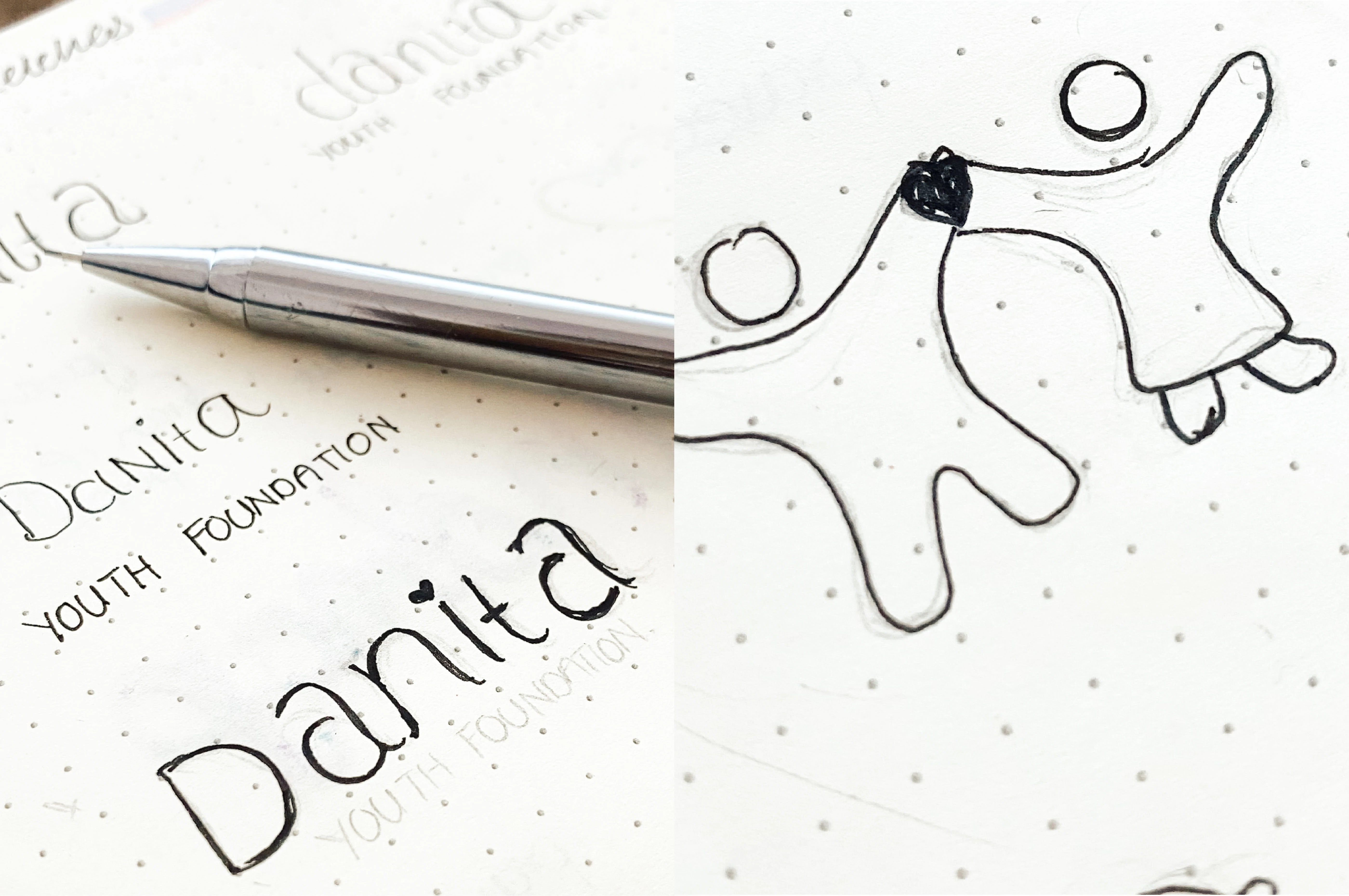
Sketching Process
LOGO CONSTRUCTION
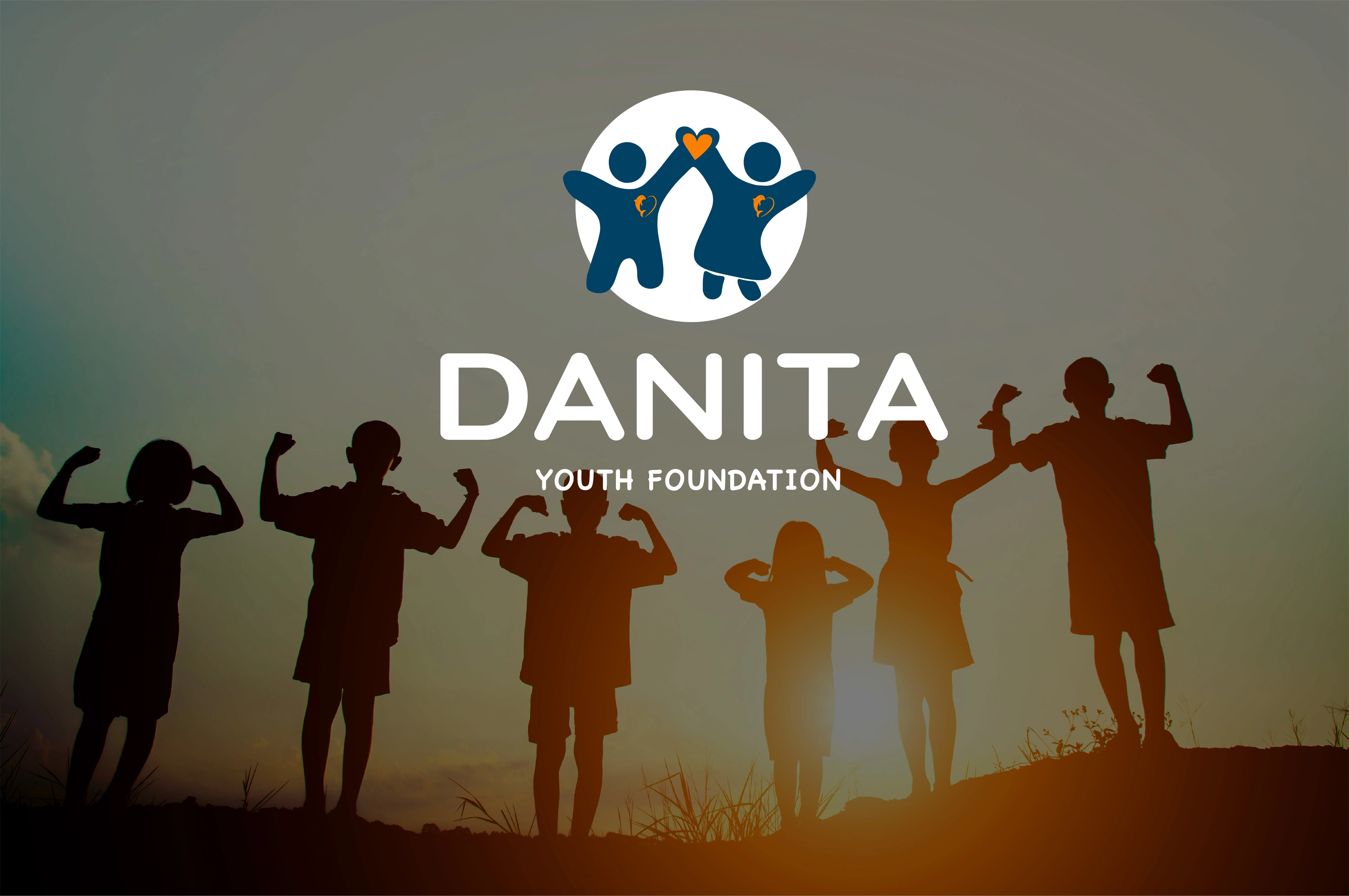
The logo mark had to be the most fundamental part of the logo. The illustration of the boy a girl holding hands in a form of a heart was the perfect fit for the creative direction that we had established as it embodied a compassionate and welcoming persona that truly portrays what Danita Youth Foundation is about.
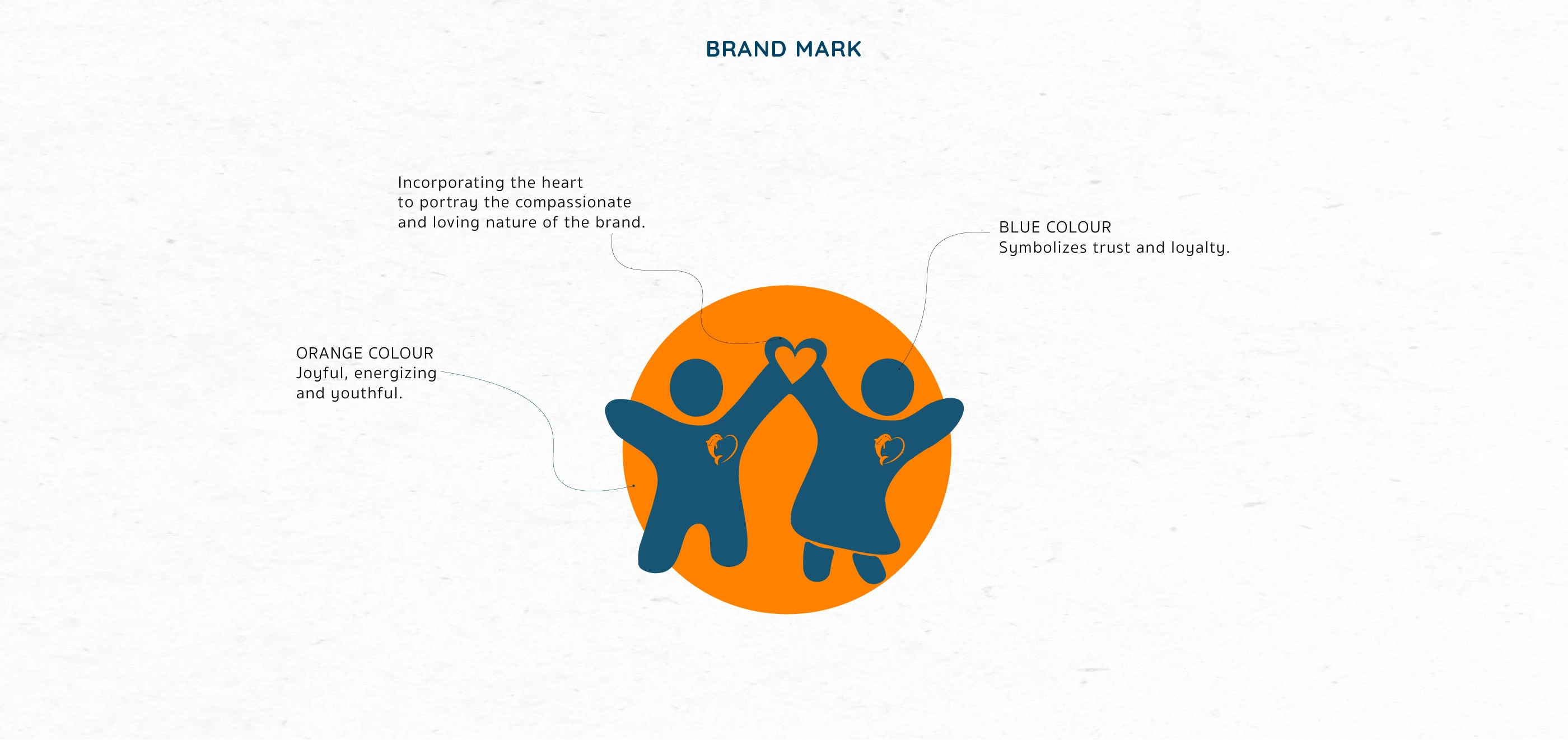
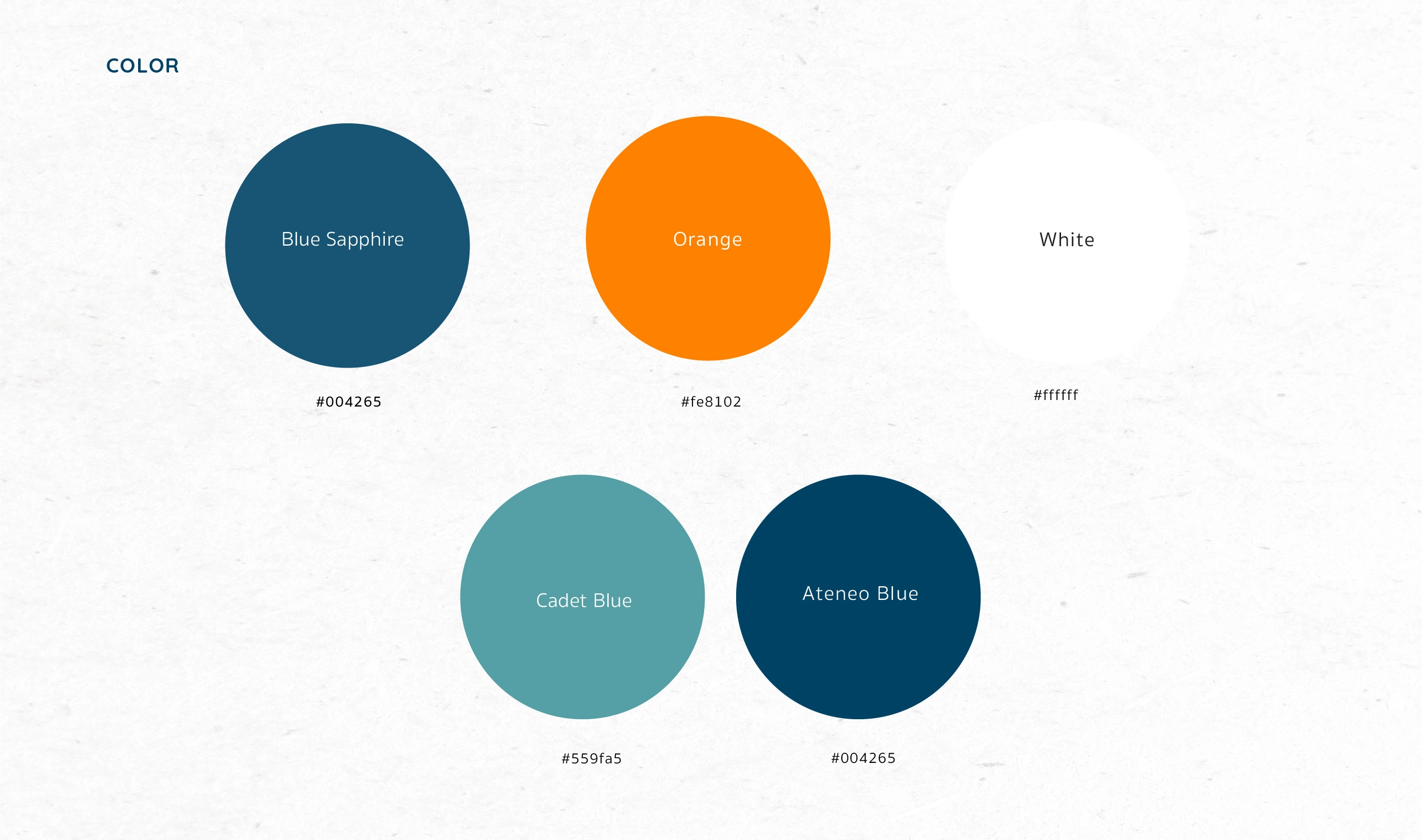
COLOR PALETTE
The aim was to pick colours that compliment the nature of the brand in the best way possible. The warmth and vibrancy of orange represents the youthfulness of the brand paired well with the shades of blue that communicate sense of trust and security. All these characteristics are necessary for an organisation like Danita as it wants to create a sense of trust and loyalty for the youth aswell as potential partners and sponsors.
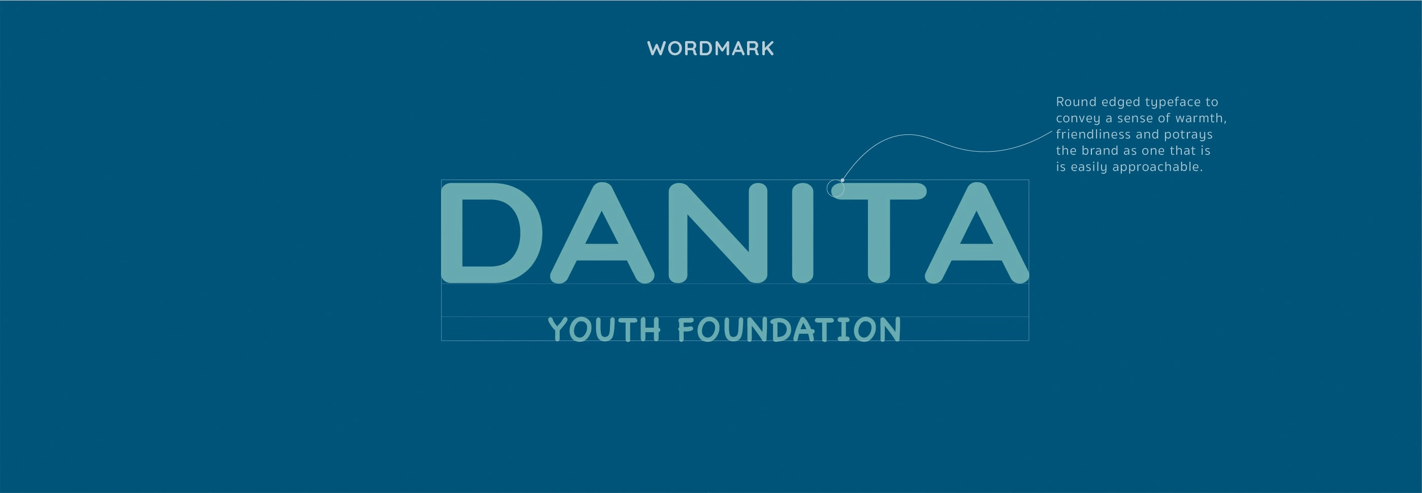
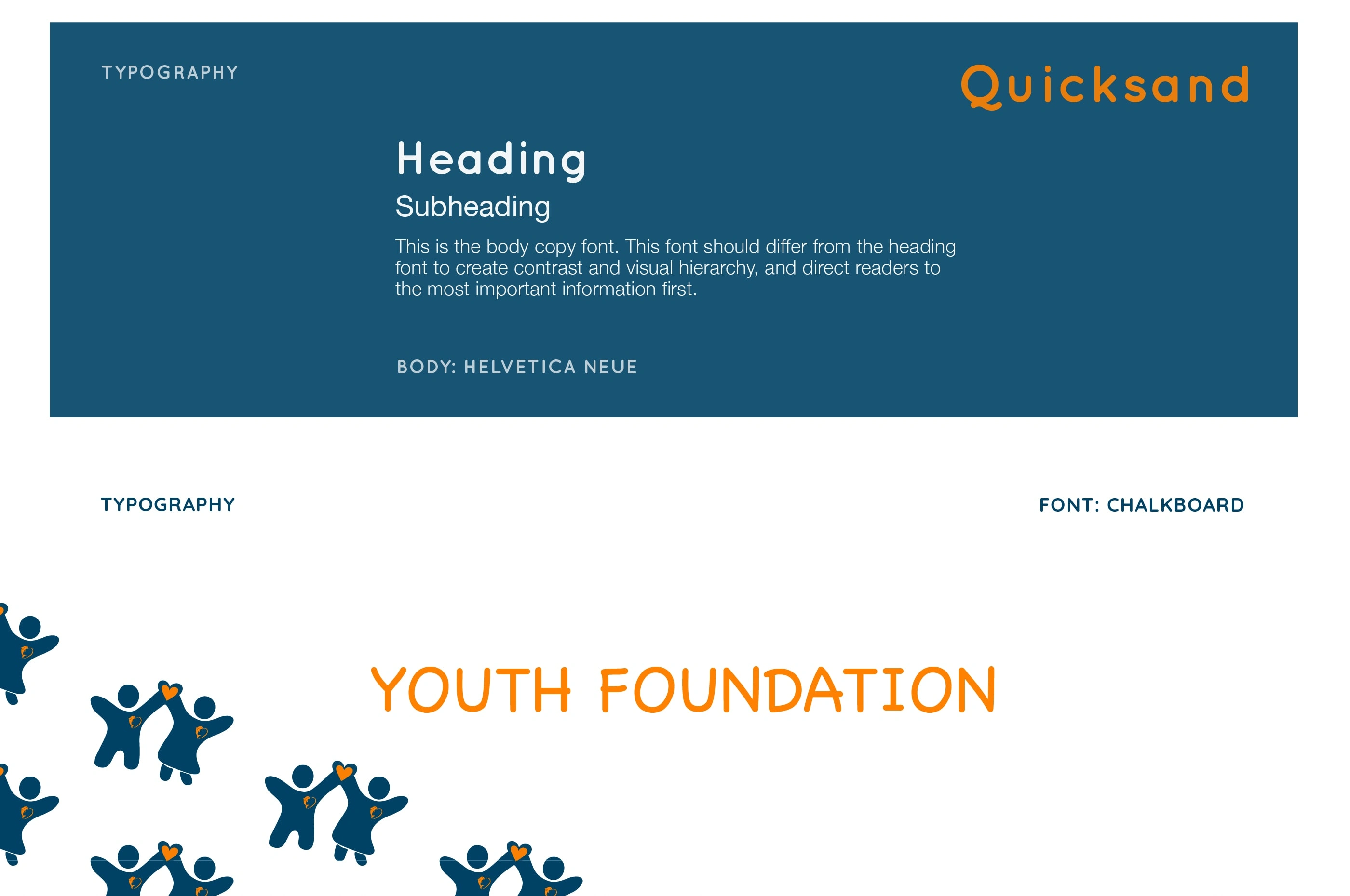
TYPOGRAPHY
After finalising the logo mark, it was important to select a font that complimented the icon and the personality of the brand. In this case, I went with the Quicksand and Chalkboard, fonts that are warm and inviting. Quicksand is an agreeable font and the rounded terminals of the letters give the overall logo a welcoming look and feel, whereas Chalkboard has a bold yet quirky and playful character that pairs well with the more refined Quicksand.
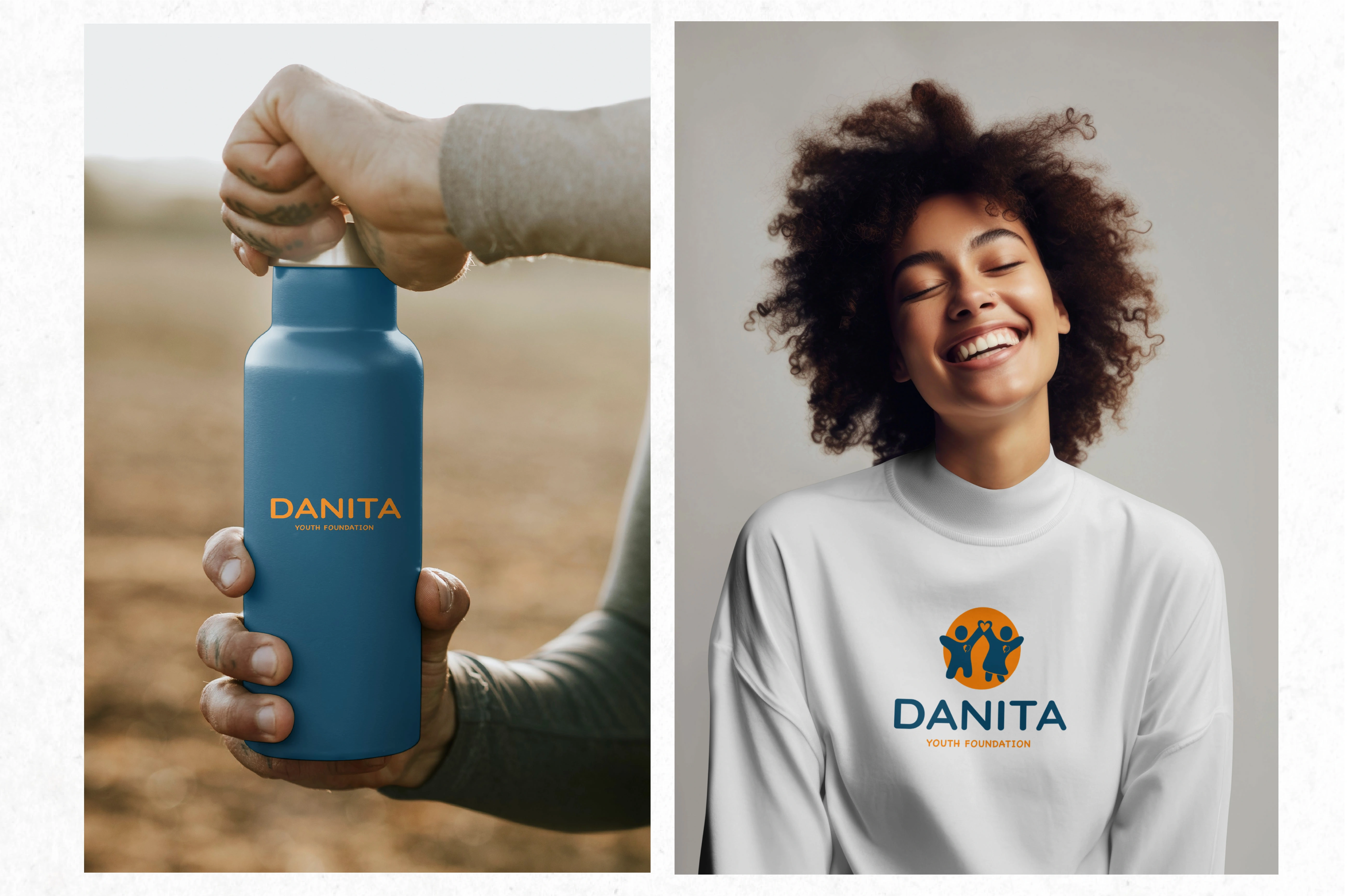
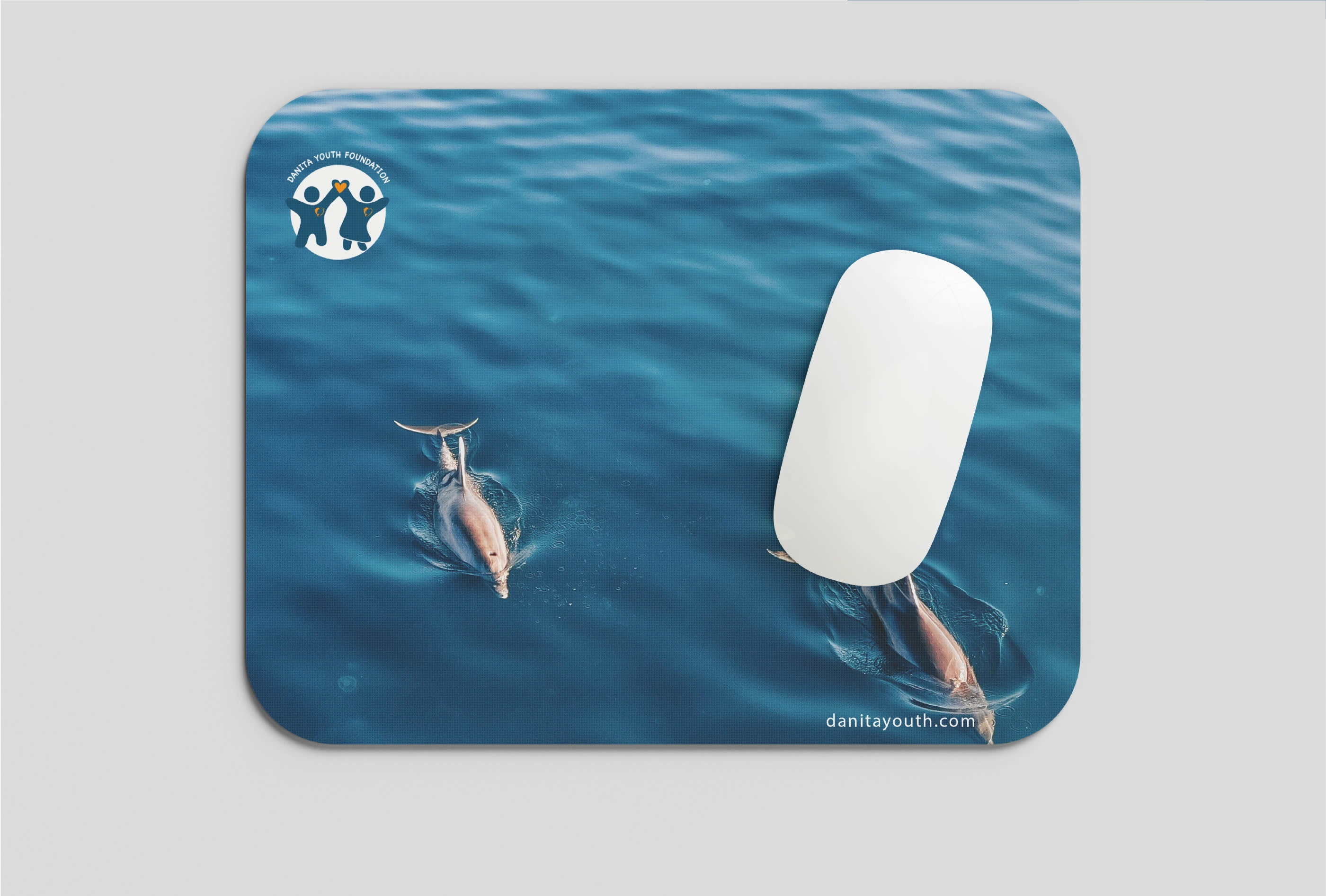
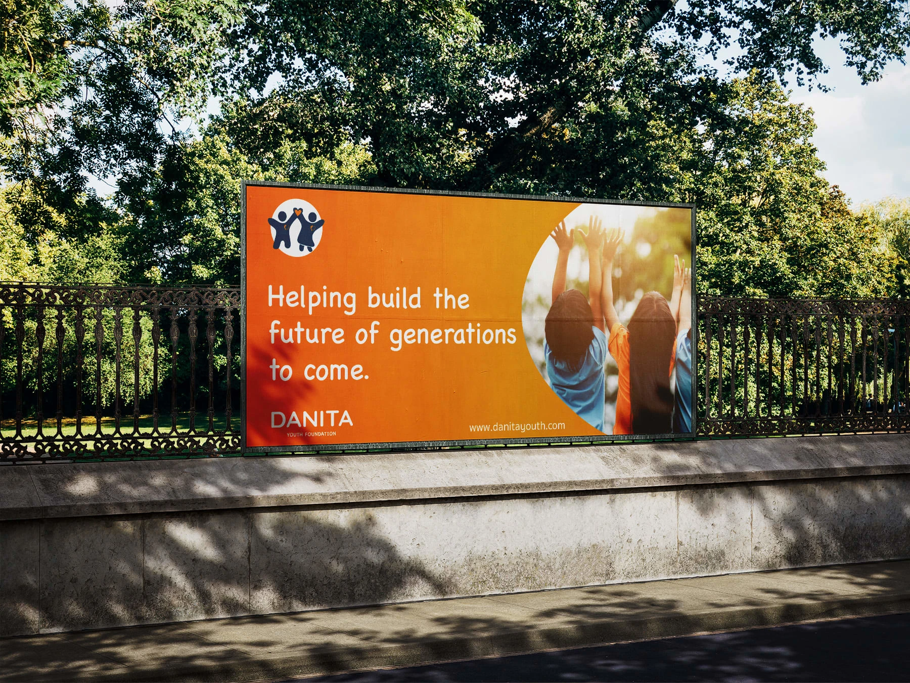
MOCKUPS AND IMPLEMENTATION


Like this project
Posted Feb 22, 2024
Crafted a new visual identity and strategy for a youth organisation that deeply reflected the nature of the brand and made it more visible to the community.