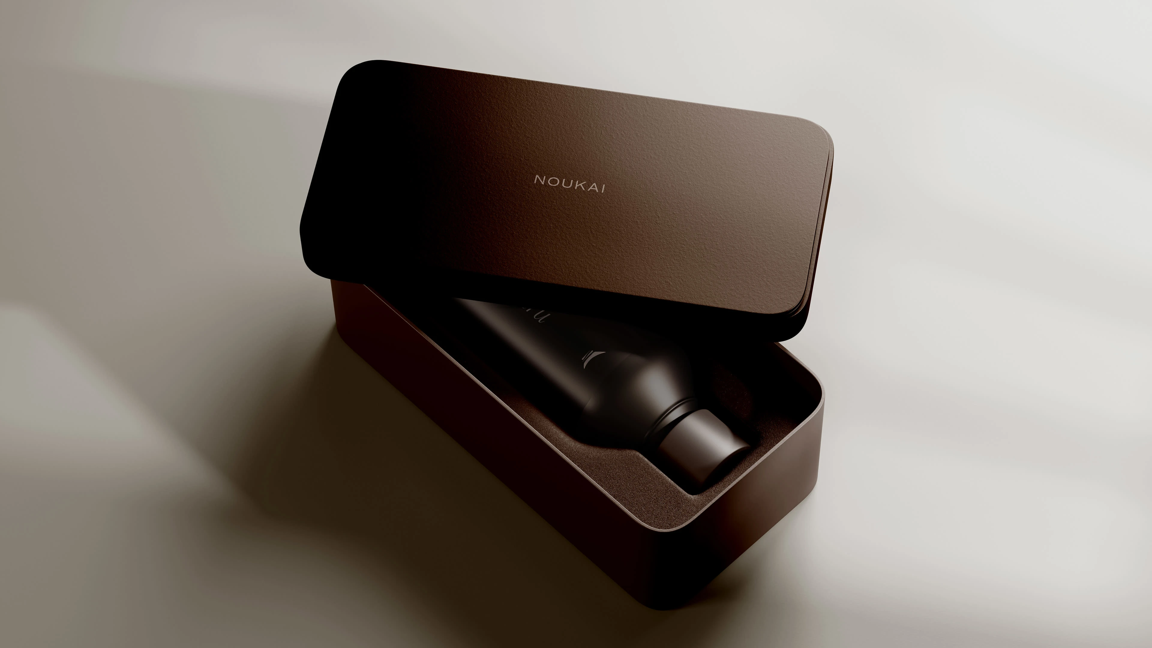
Brand Identity and Packaging for Noukai
Luiza Bola
Noukai is a vessel of stillness, a dance of elements, a quiet revolution in beauty.
In a world driven by urgency and excess, Noukai emerges as a pause — an invitation to return to essence. Rooted in the discipline of craft and the movement of nature, the brand flows with intention, transforming skincare into a contemplative ritual. Each product becomes a gesture: gentle, deliberate, and deeply attuned to the rhythms of inner and outer worlds.
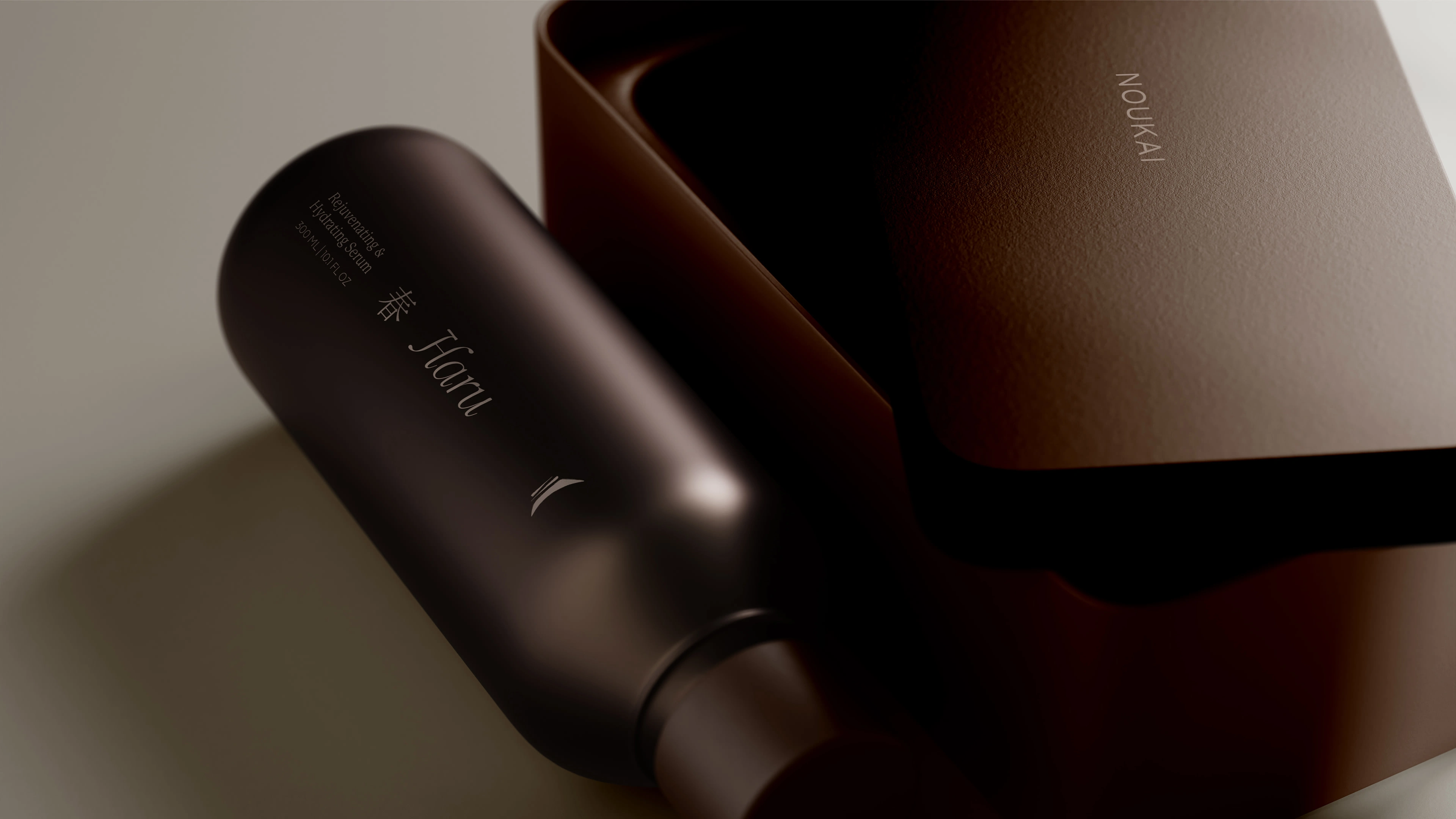
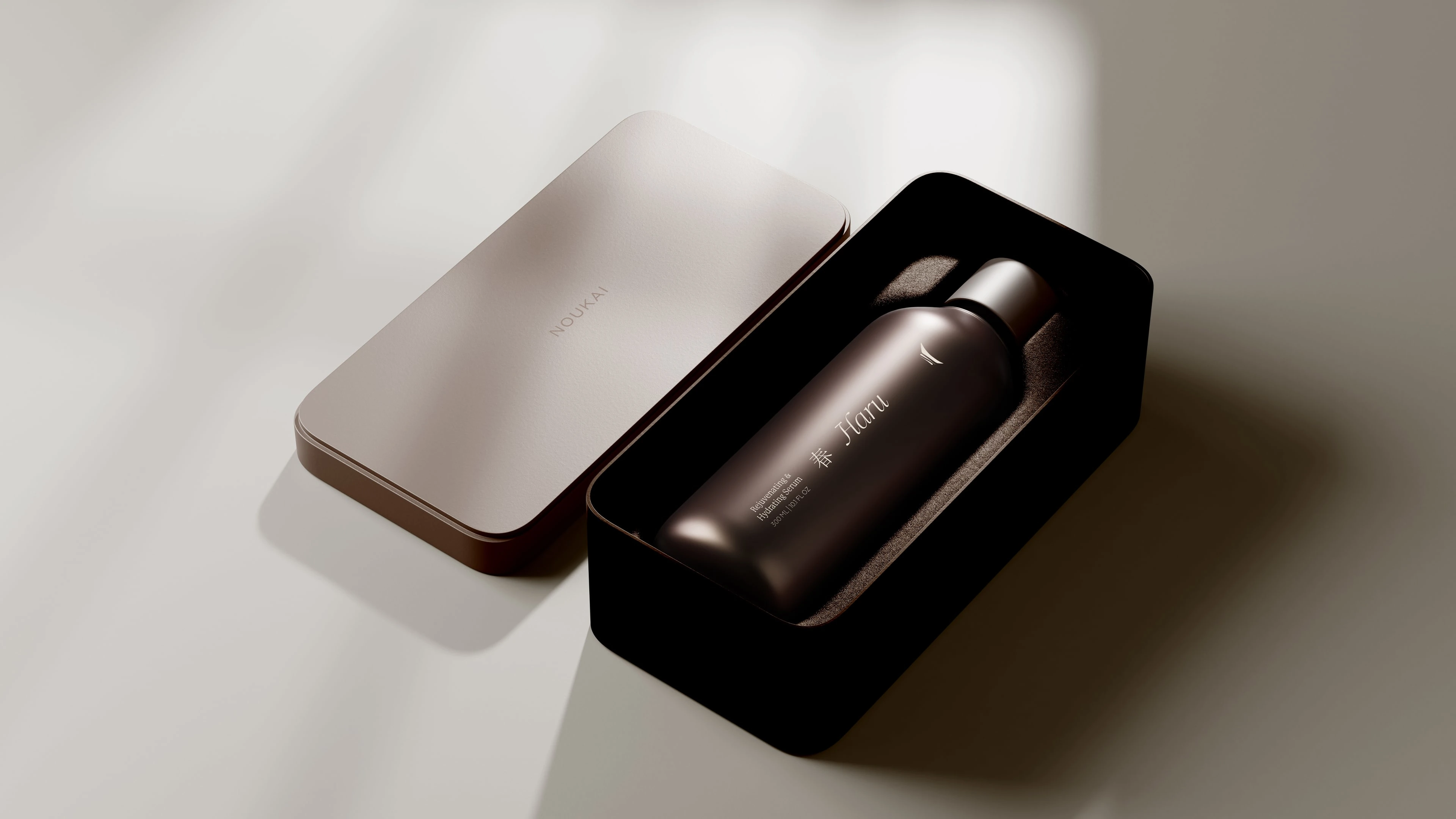
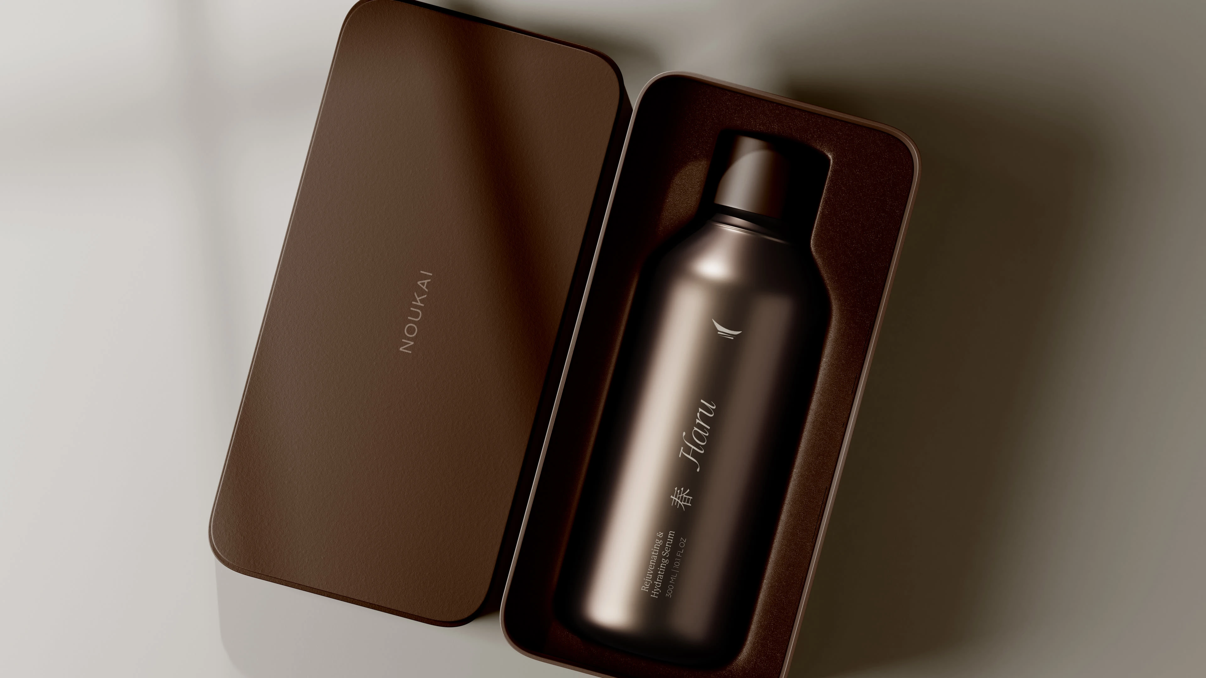
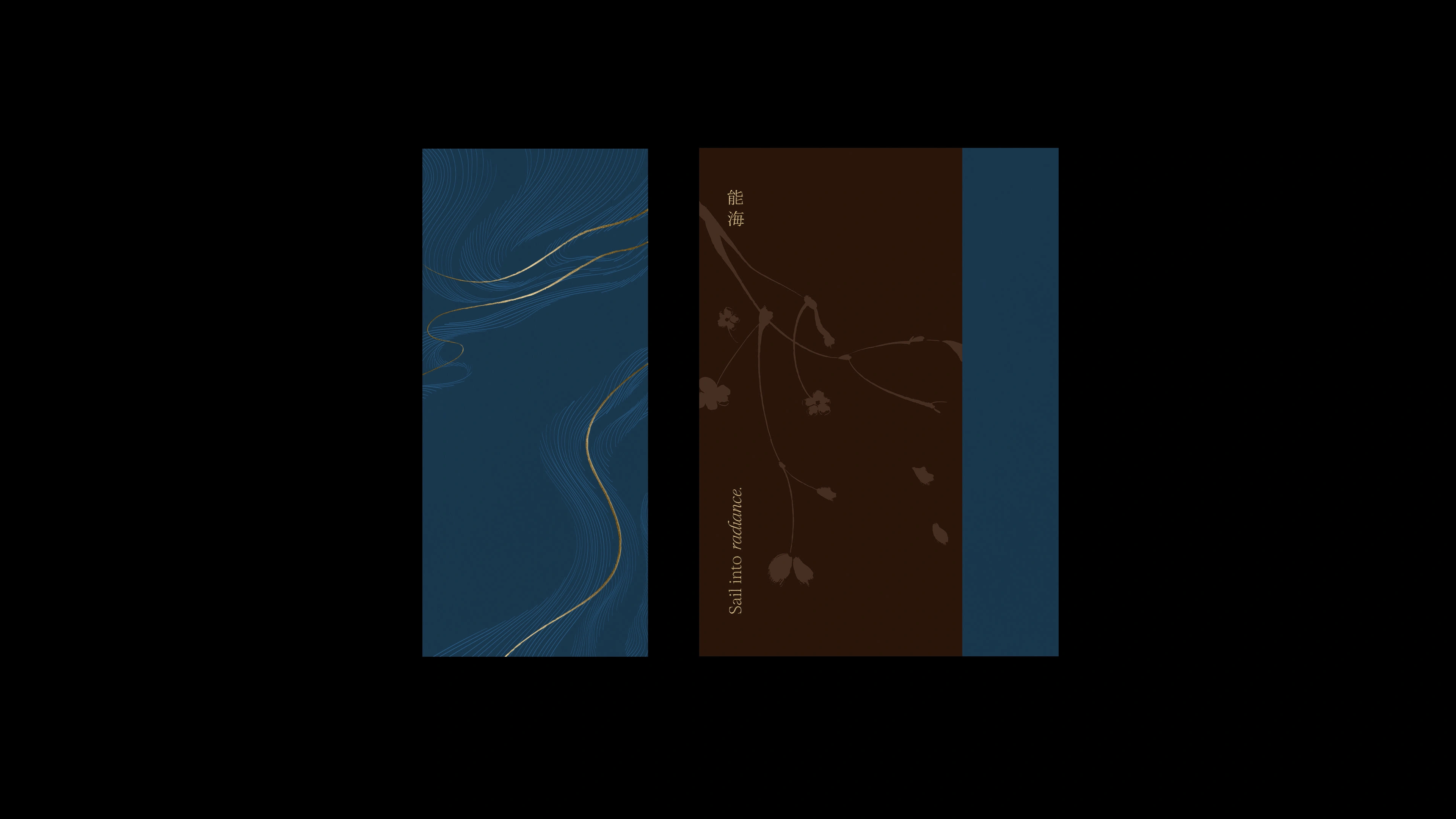
Guided by the dual meaning of its name — Nou for mastery, Kai for ocean — Noukai embodies harmony between skill and softness. It is not simply about correcting the skin, but about navigating it, like a boat across quiet waters, sensing each current with care.
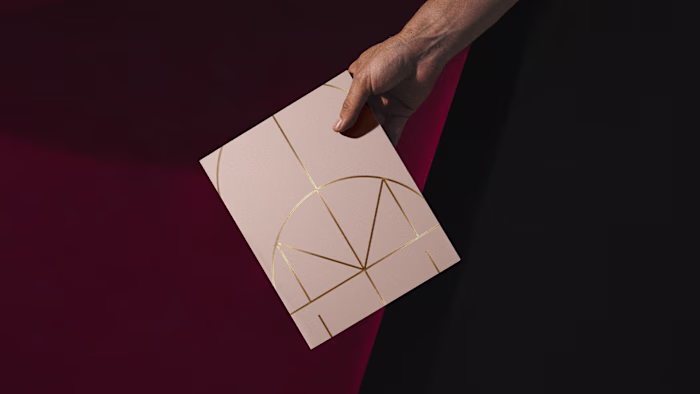
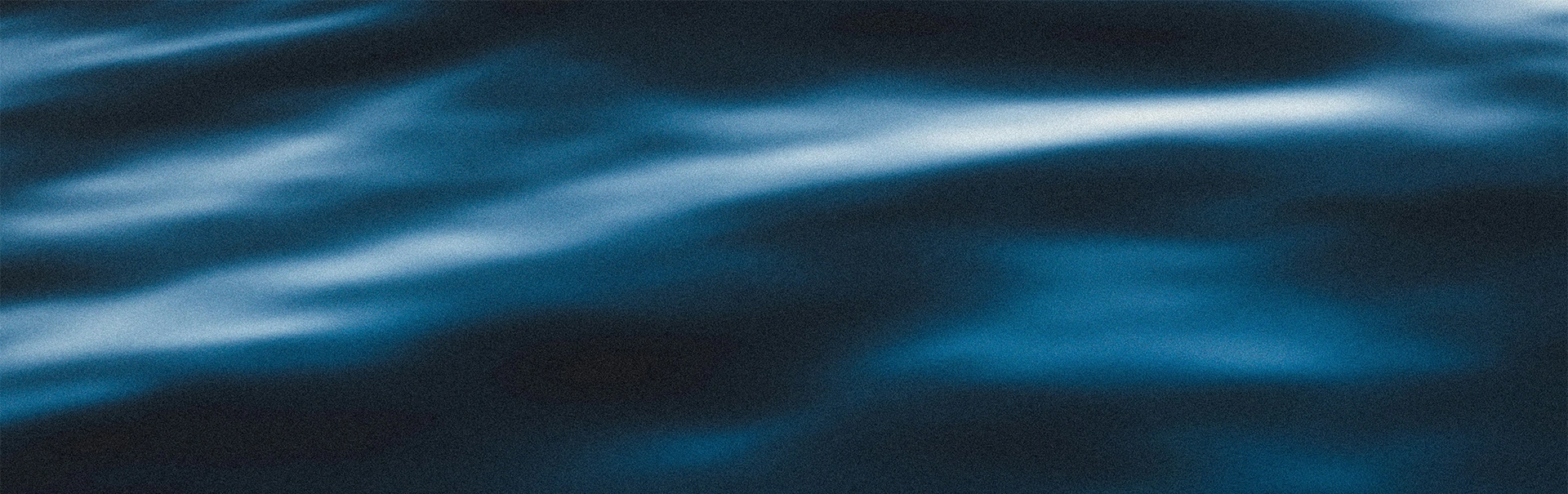
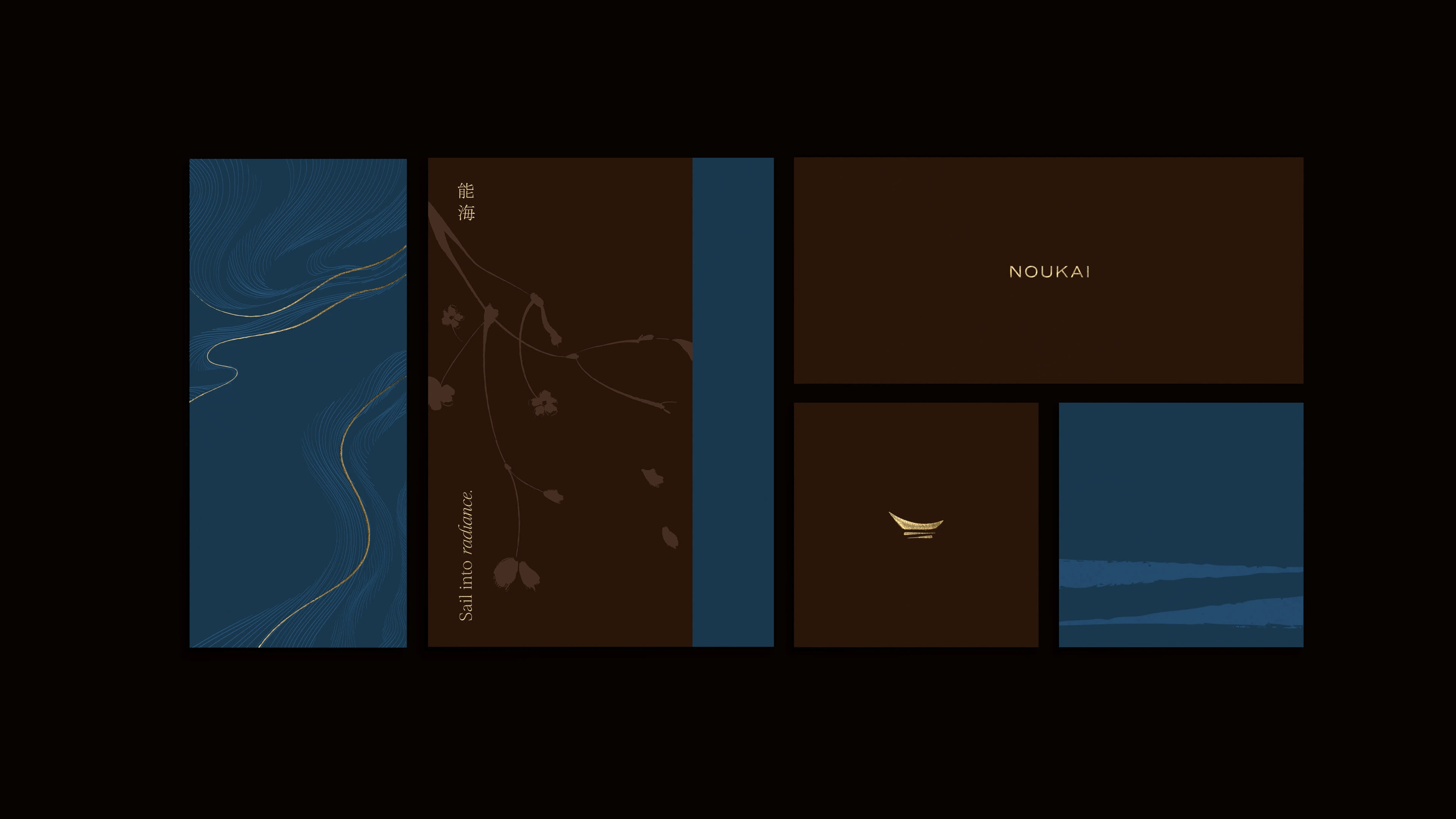
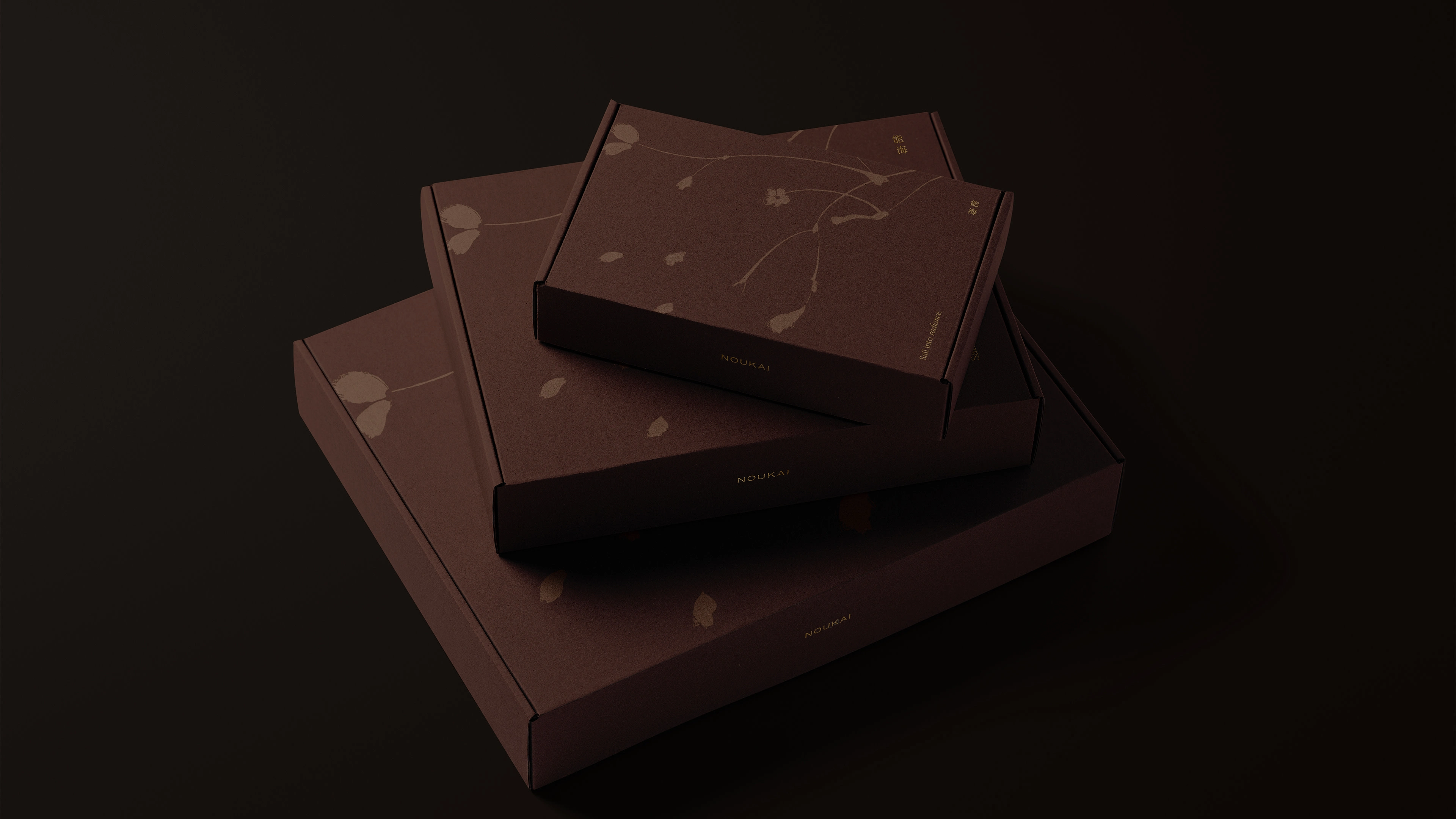
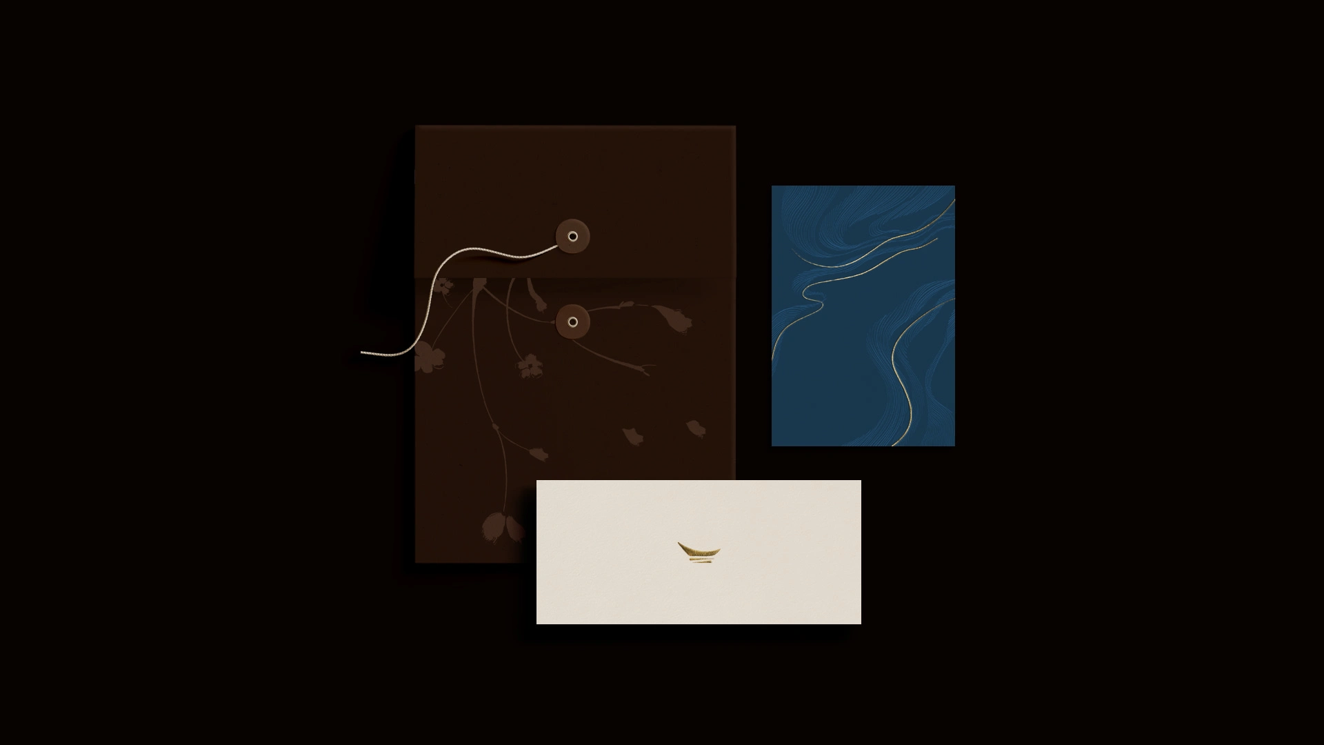
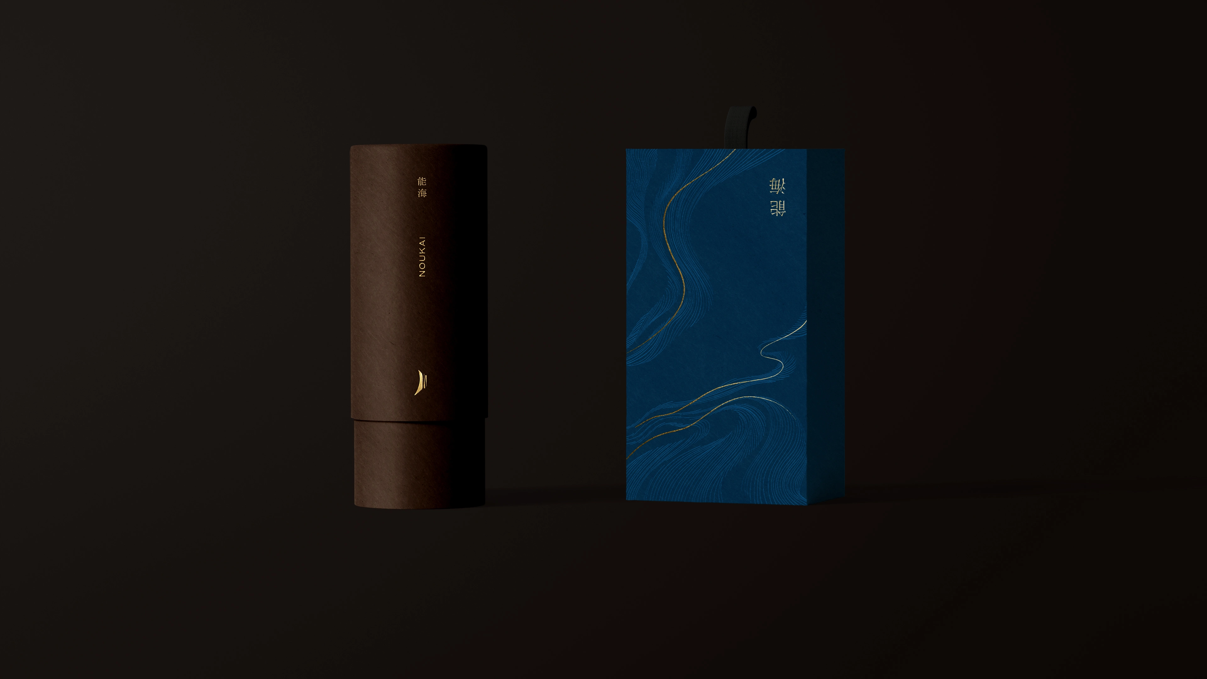
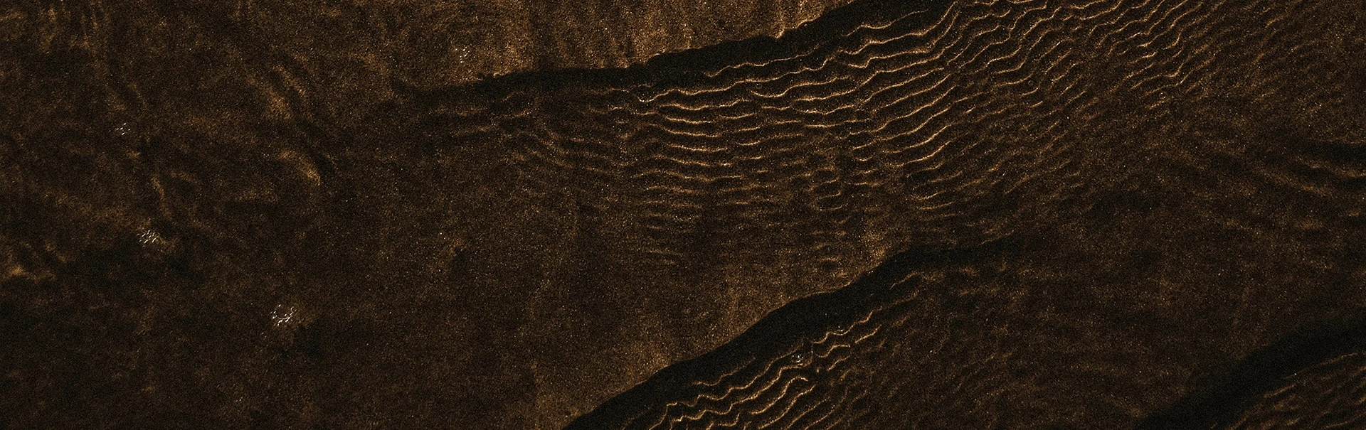
The brand’s identity is a study in contrasts: earthy and oceanic, organic and precise, grounded and transcendent. The visual language evokes this duality through flowing lines that suggest ocean currents, botanical silhouettes that speak of natural healing, and textural brushwork that reconnects us to human touch. Each element exists not to impress, but to invite attention. To slow the gaze.
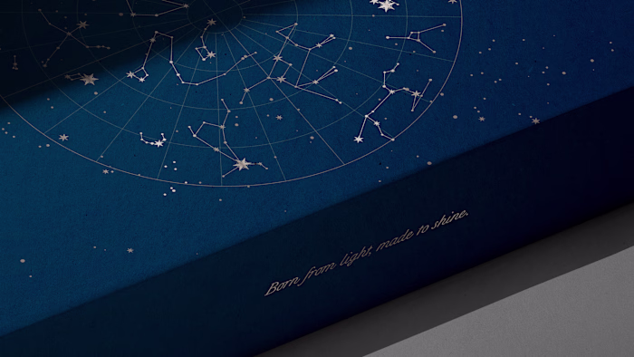
Noukai’s mark is subtle yet symbolic — a golden path that traces movement, presence, and inner light. Paired with a palette of deep browns and oceanic blues, the brand finds its voice in silence: contemplative, tactile, and emotionally resonant. Noukai is not a product. It is a practice. A return to ritual. A celebration of what happens when design, nature, and emotion move as one. To sail inward is to begin anew. This is Noukai.
This project was featured in Behance’s Packaging gallery.

Like this project
Posted Oct 13, 2025
A visual identity that drifts between stillness and motion – echoing Noukai’s essence of ritual, depth, and the quiet power of intentional beauty.