Brand Identity and Packaging for Horya
Luiza Bola
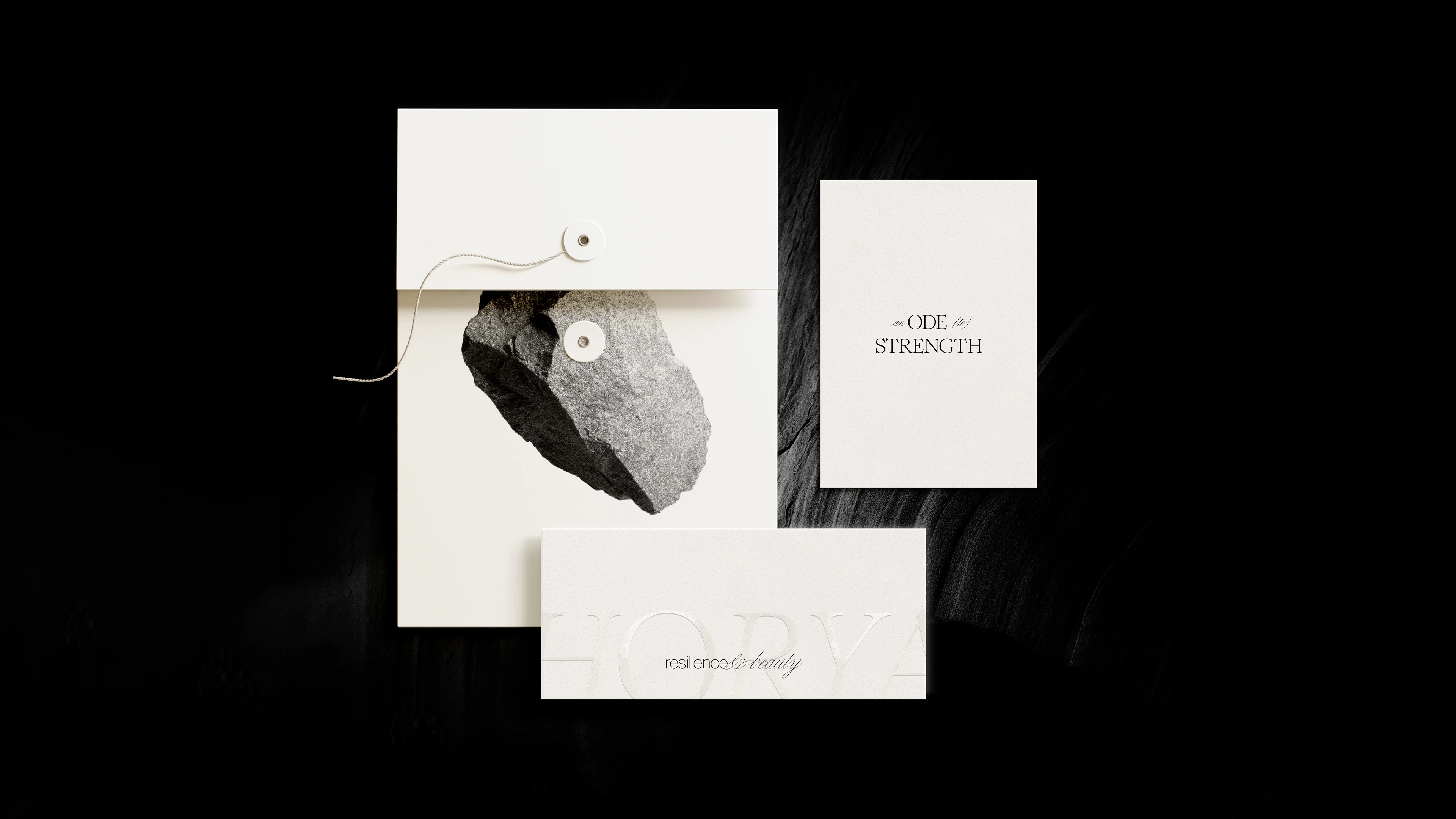
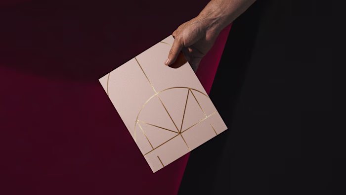
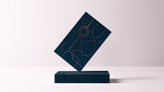
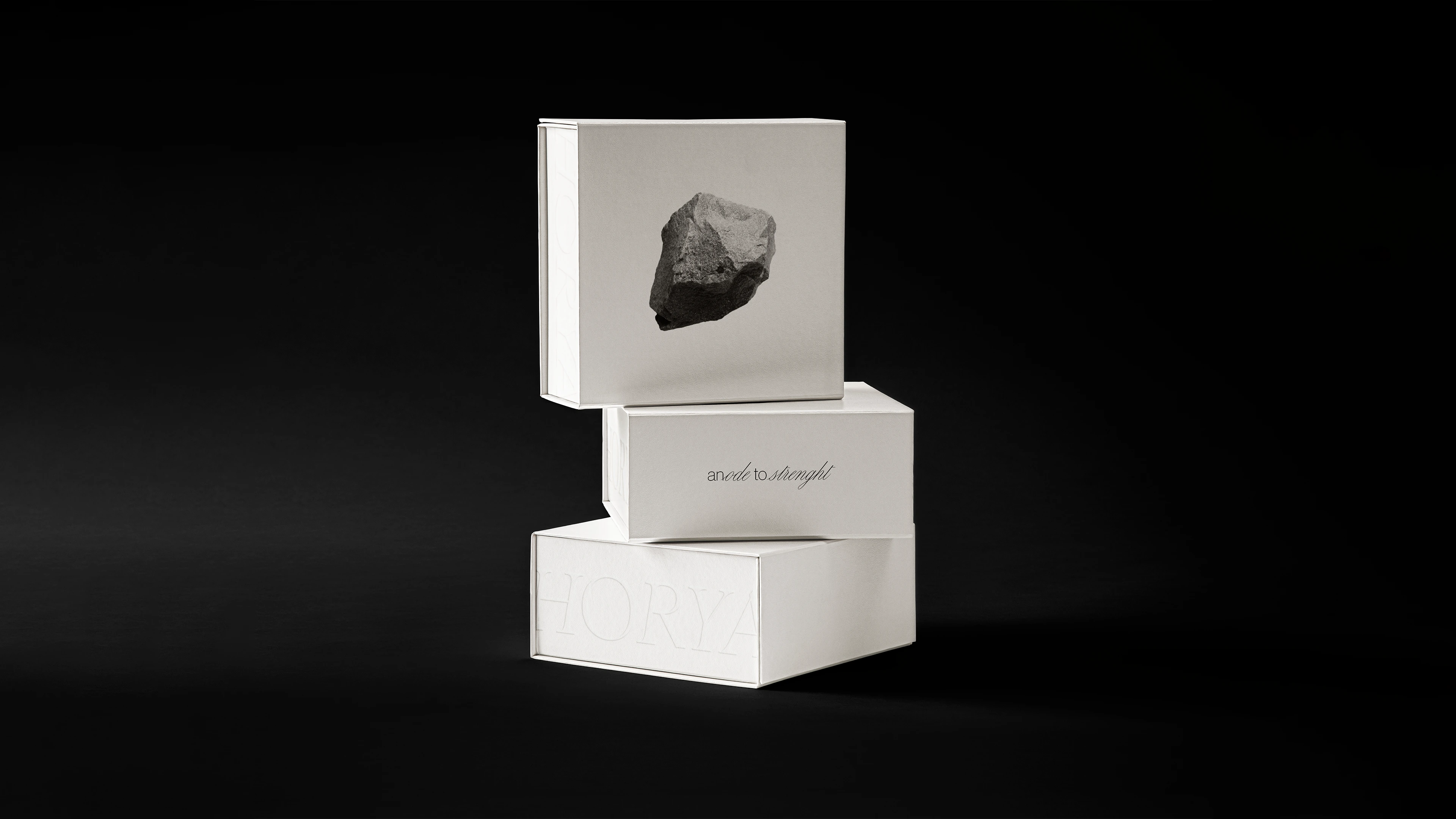
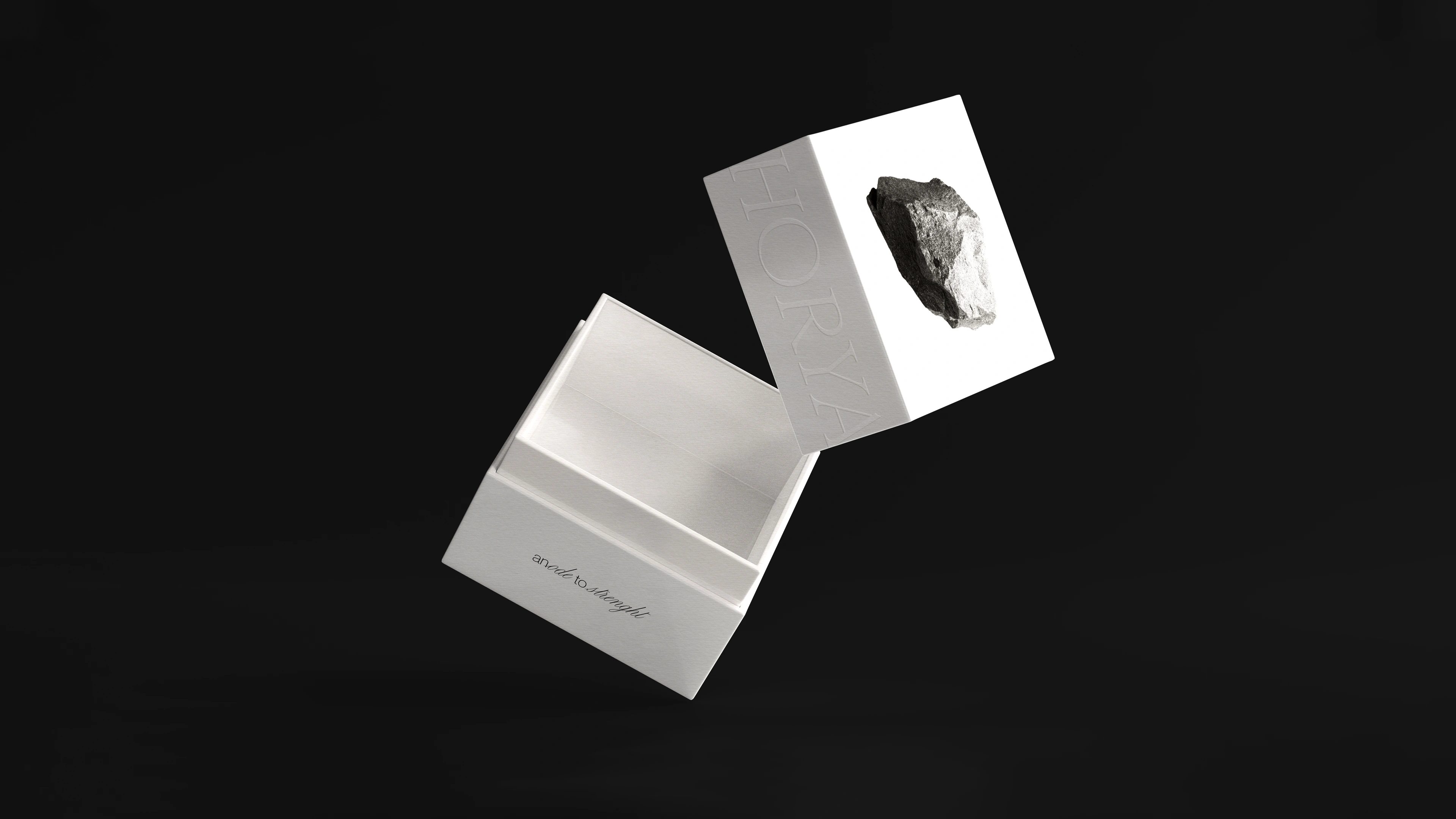
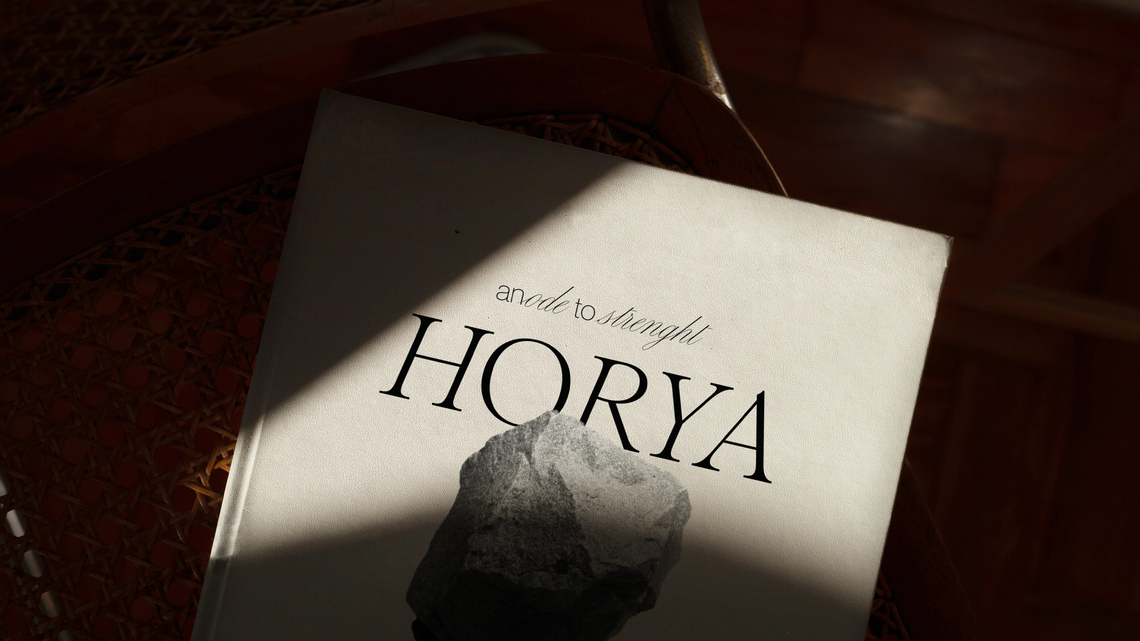
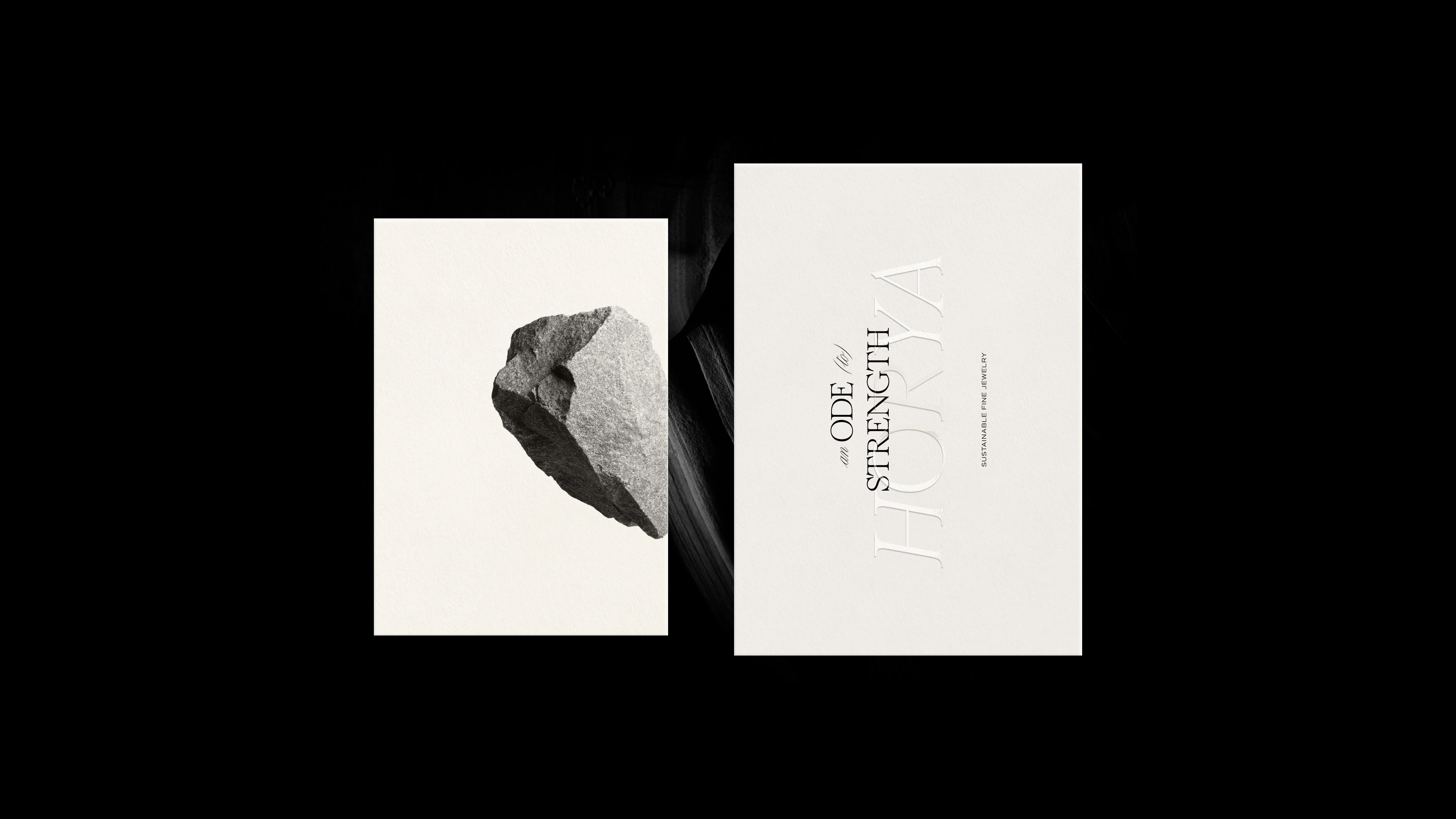
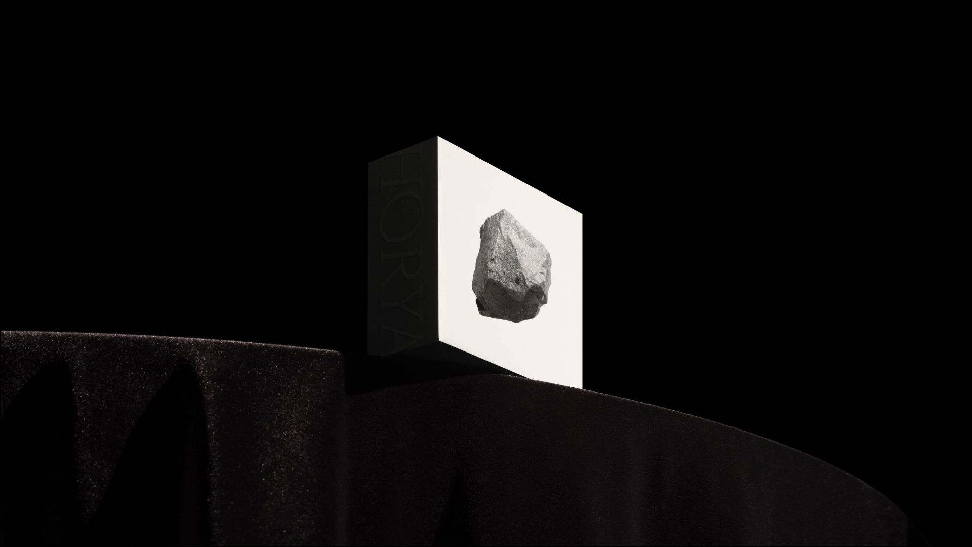
HORYA – AN ODE TO STRENGTH.
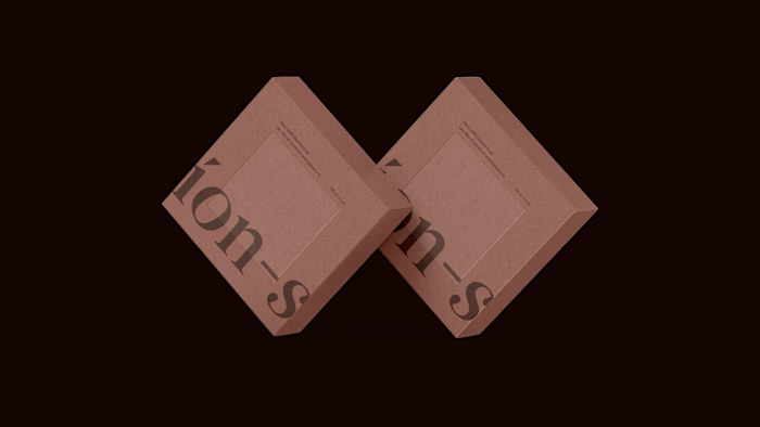
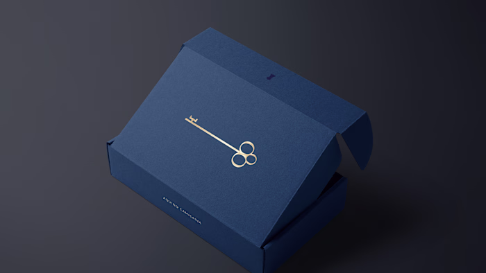
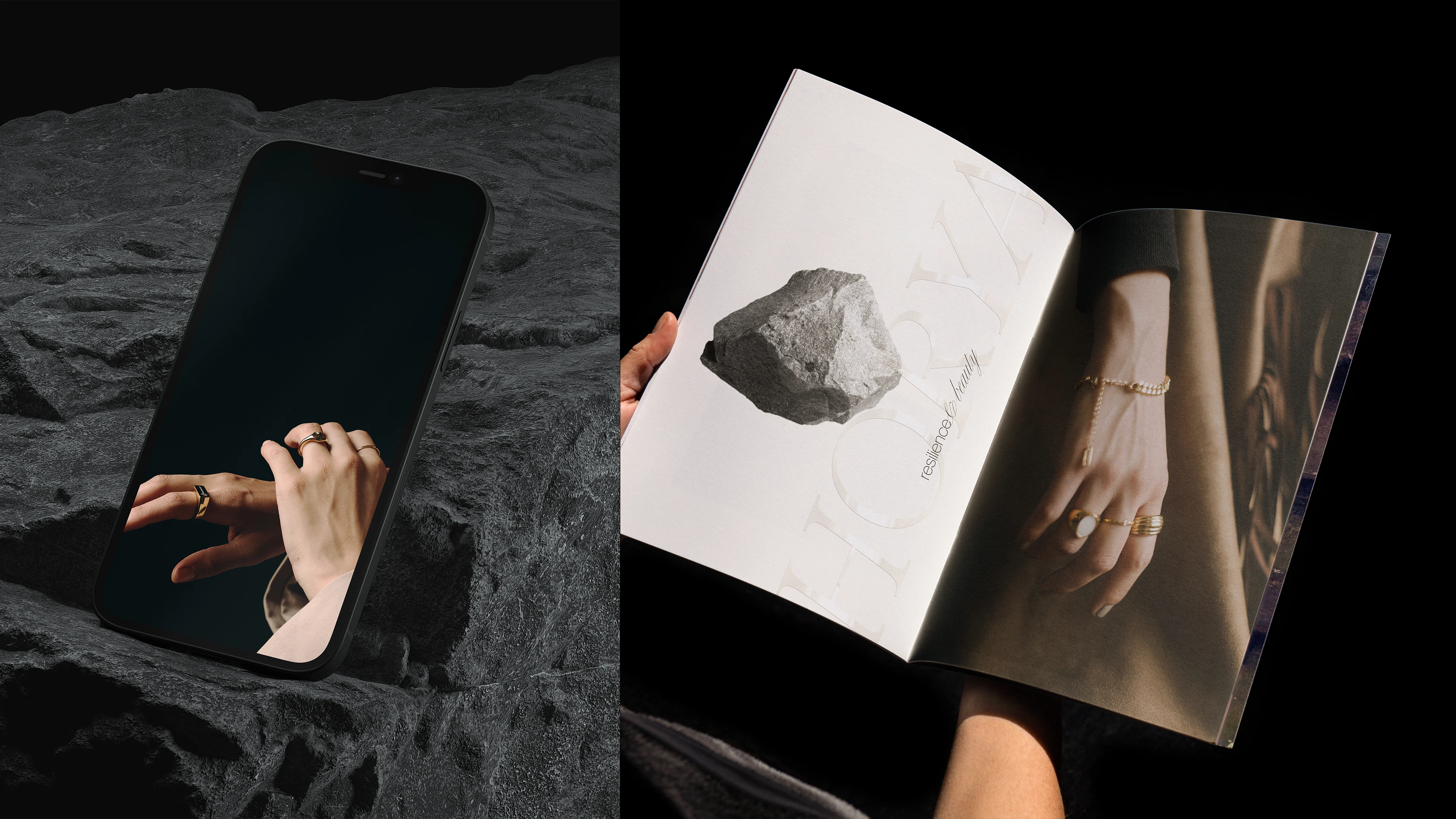
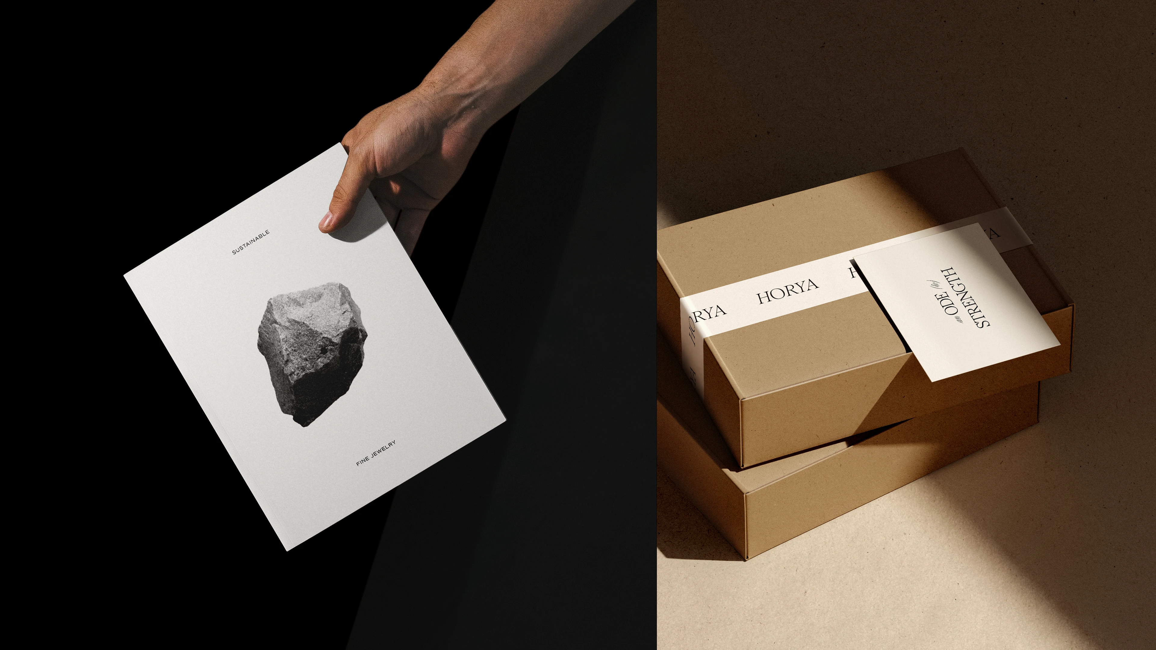
Horya is a sustainable fine jewelry brand. Their pieces are made with lab-grown diamonds and gems and recycled 18k solid gold, using traditional craftsmanship techniques, ensuring that each piece is carefully crafted and that two pieces are never alike.
Drawing upon the brand's powerful motto, we have brought the purest concept of strength to the visual identity: the representation of stones. Stones, which underpin and structure constructions, are the raw material of art, sharpen instruments and processes, create fire and light. They are also endowed with beauty, bringing to the visual identity the perfect portrayal of Horya's essence and what it can provide to each person who wears its jewelry: strength, beauty, resilience, sophistication, and power.
This project was featured in Behance’s Brand gallery.

Like this project
Posted Oct 13, 2025
Visual identity shaped by the raw strength of stone, reflecting Horya’s essence: beauty, resilience, and the power within every crafted jewel.