Brand Identity and Packaging for ÍON-s
Luiza Bola
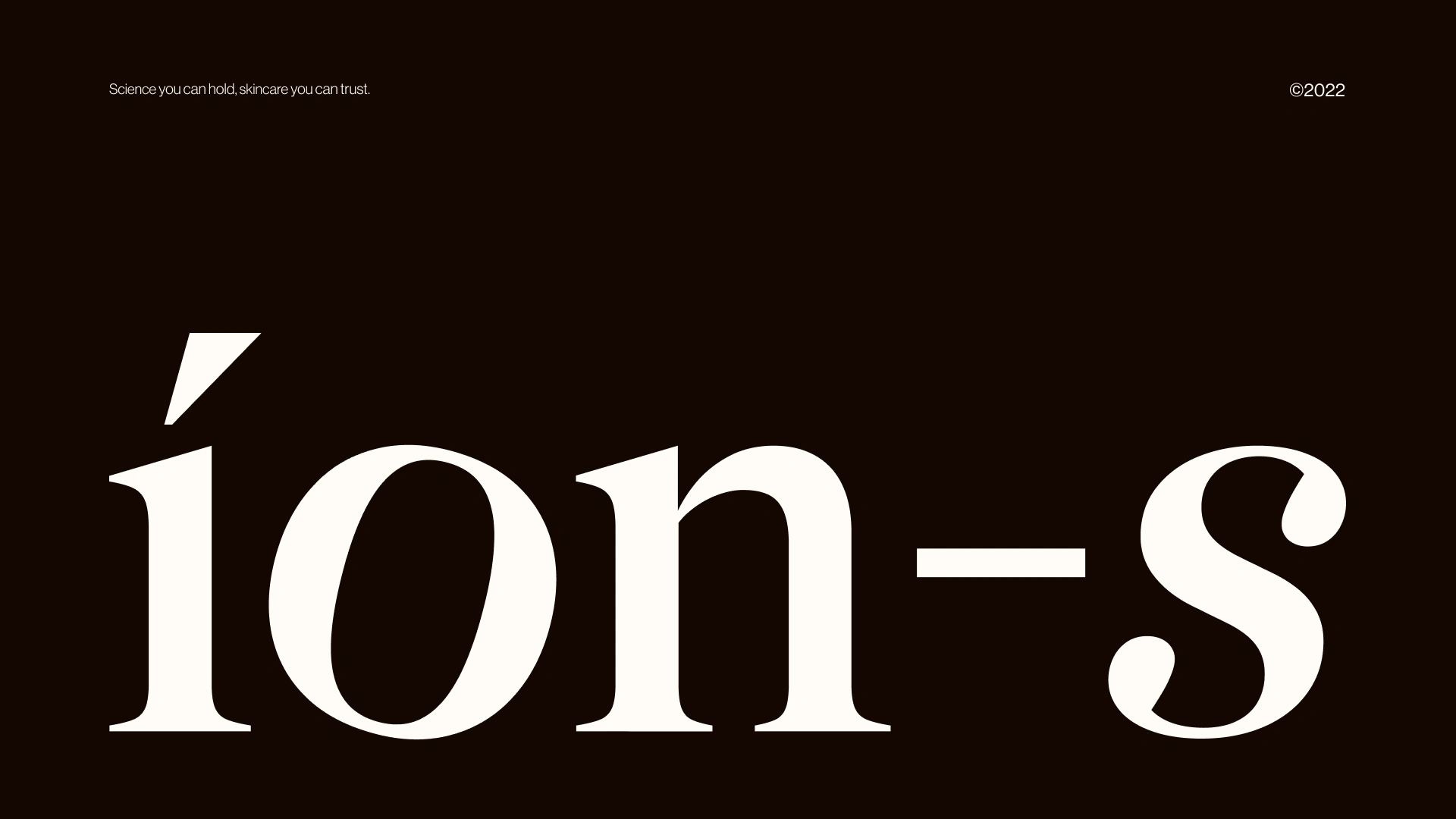
ÍON-s
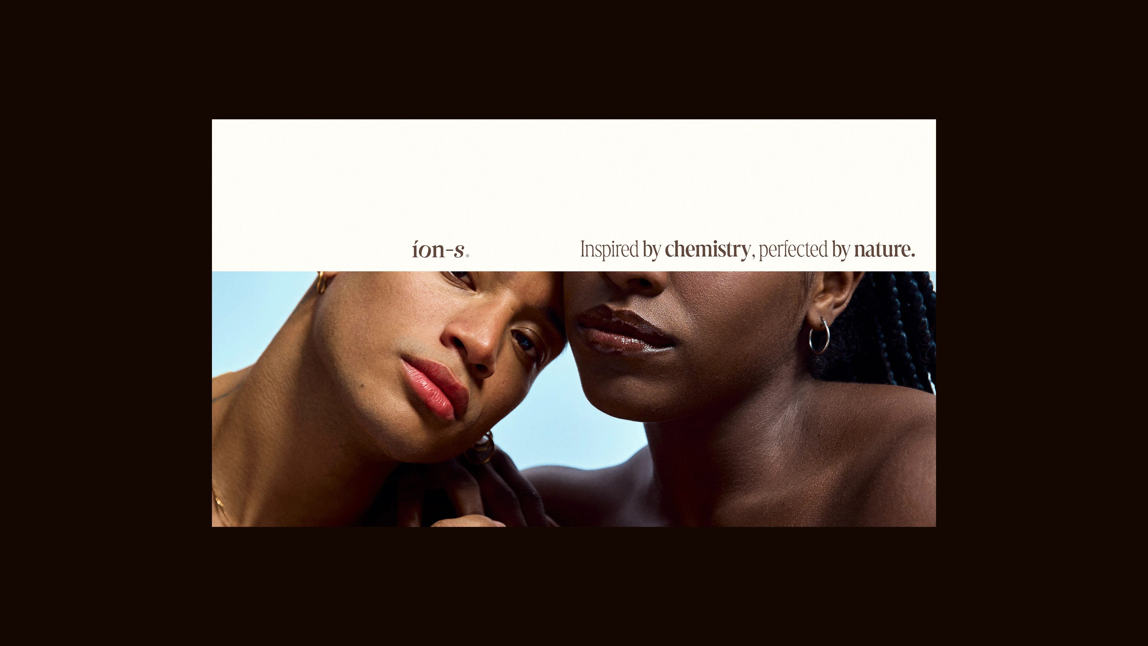
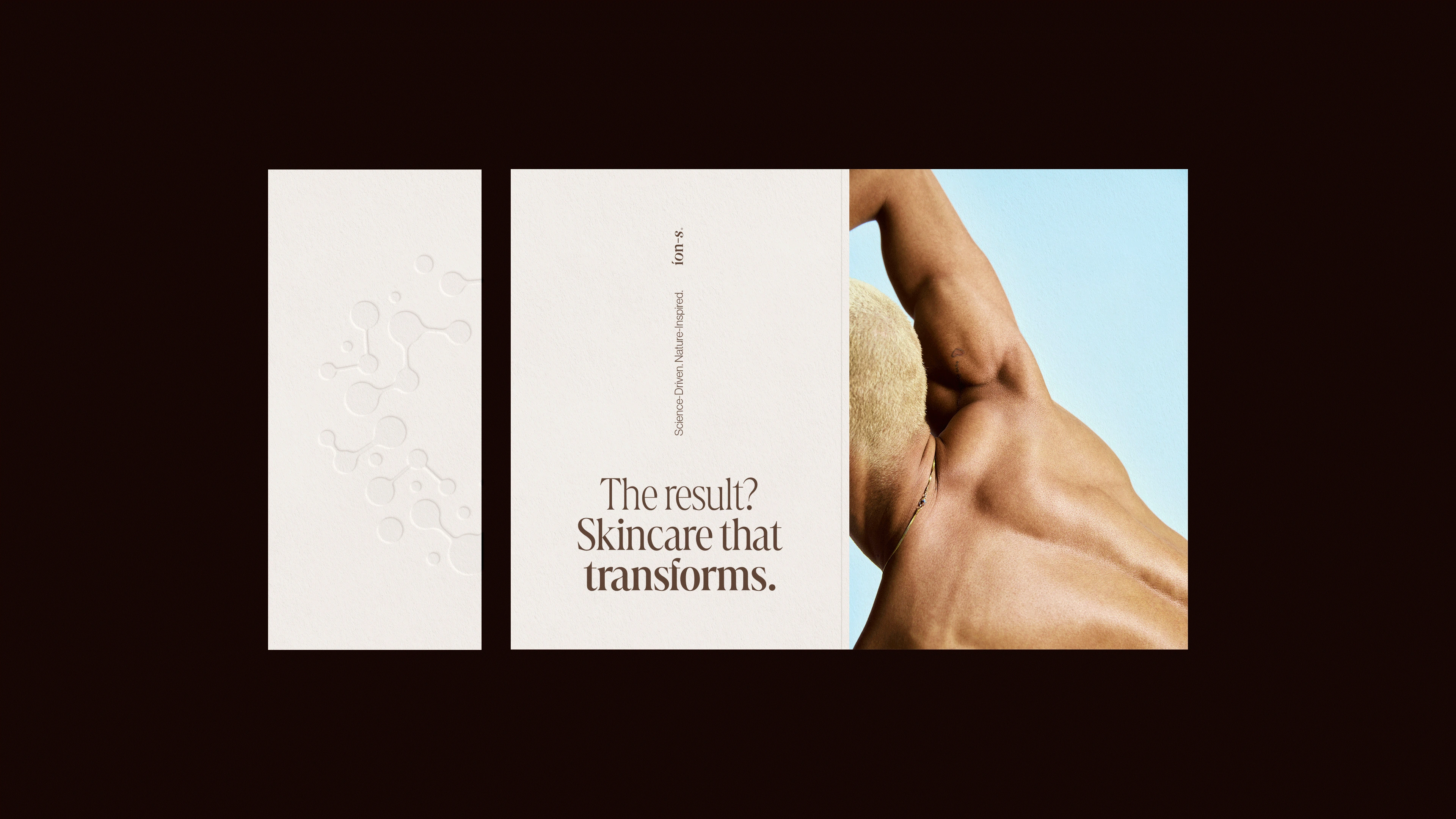
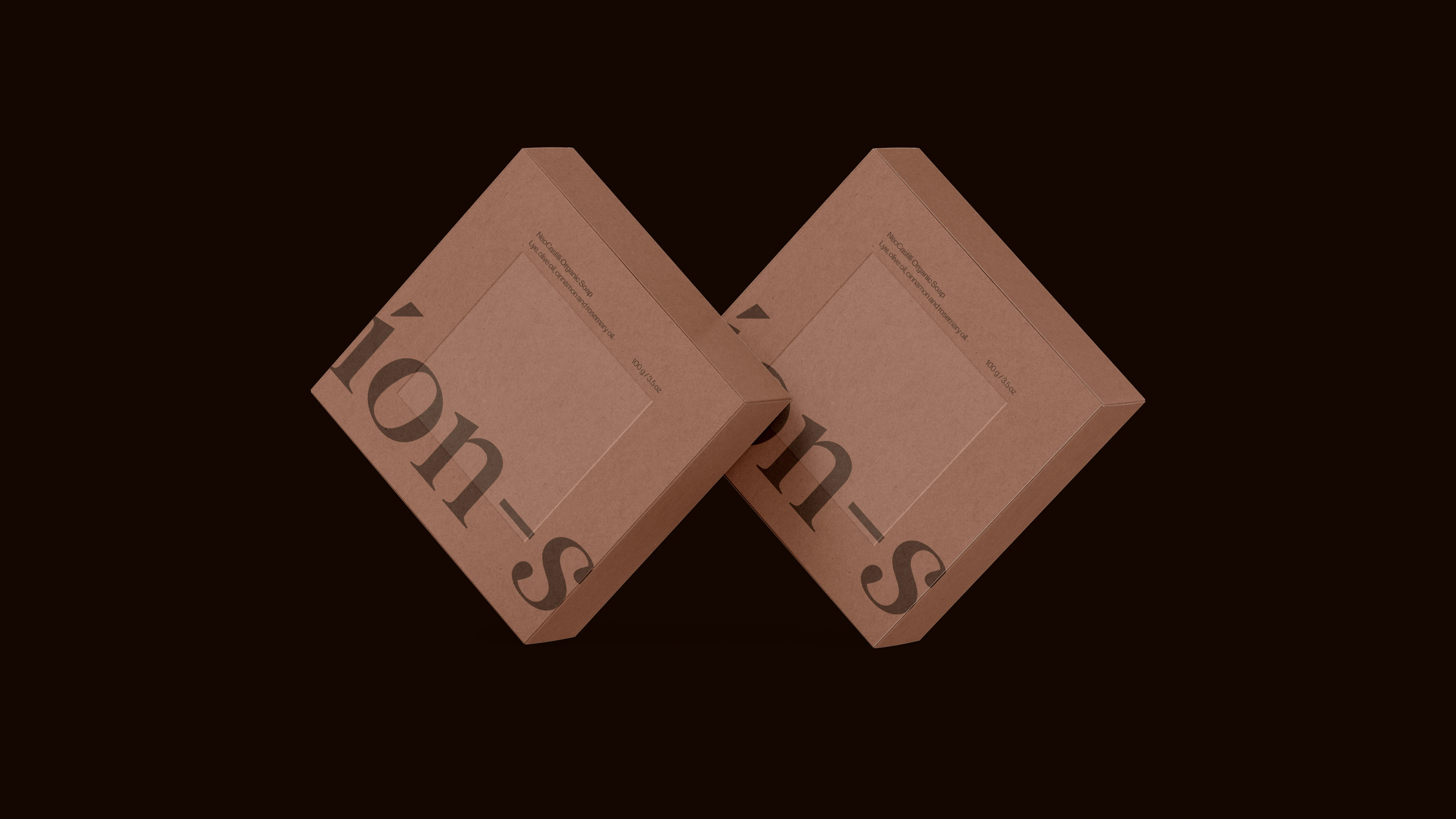
ÍON-s is a Brazilian brand that arises from the belief in clean beauty, which respects and values its consumers in all spheres. Through science and technology, combined with artisanal craftsmanship, it brings new solutions to the market in clean beauty, based on sustainability and well-being: bar cosmetics formulated to be gentle on the environment and with ingredients that are more compatible with our skin.
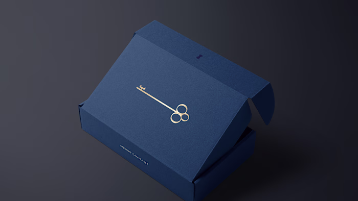
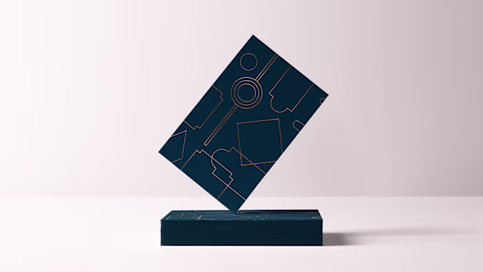
For the construction and conceptualization of the symbol present in ÍON-S's visual identity, a profound reflection was carried out on the brand's principles, values, essences, and how-to. When we combine the appreciation of science with its name, which directly alludes to chemistry, we immediately think of atoms and the representation of chemical molecules; and at this point, we focus heavily on circular forms, drawing from semiotics, which allude to unity, movement, and expansion – words that, in turn, make perfect sense when we think about atomic structures.
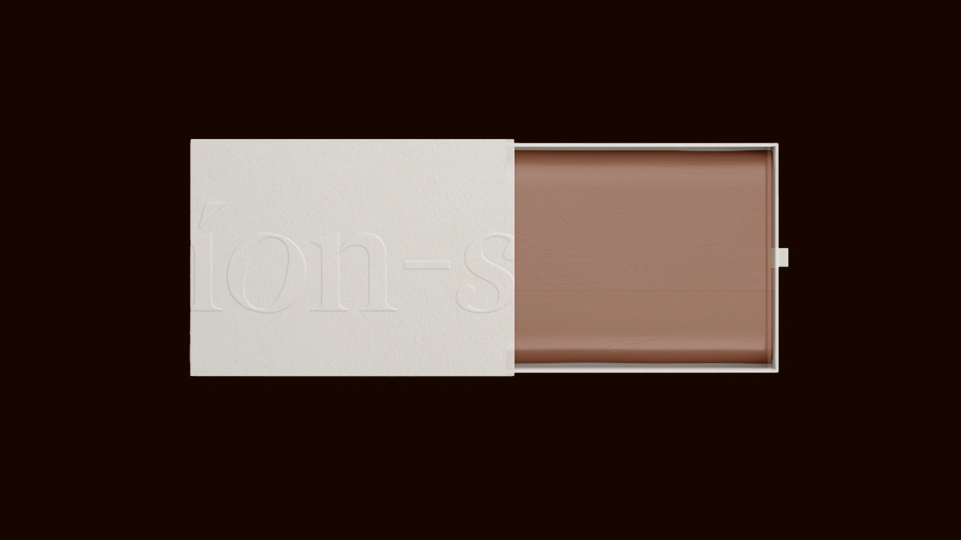
The logo conveys elegance and modernity, with the tilted "O" alluding to the conceptualization of the project, representing atoms and molecules.

Like this project
Posted Oct 13, 2025
Visual identity that merges chemistry, care, and movement, with circular forms evoking atoms, unity, and the innovation of clean beauty.