Gallito 20 Tapas: Brand Identity & Brand Strategy
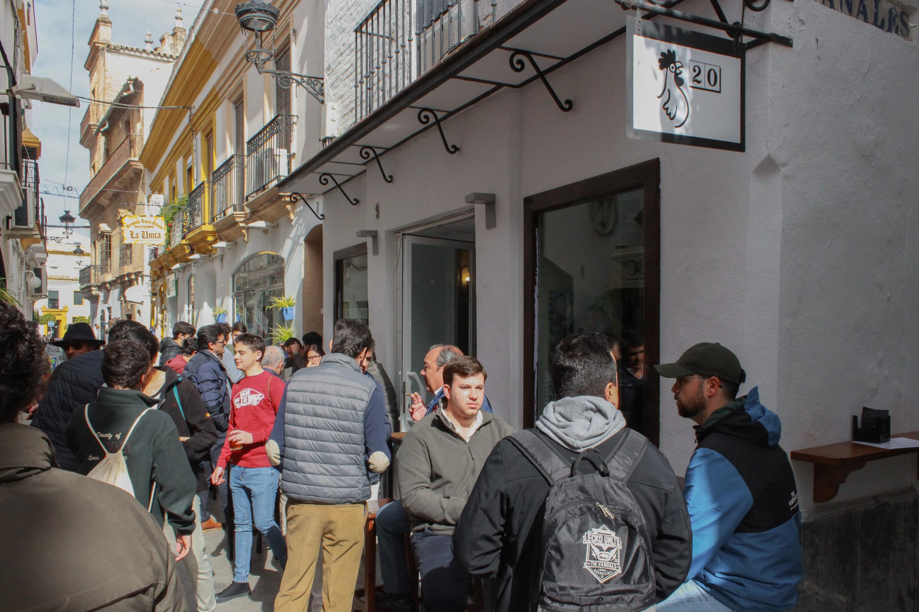
Gallito 20 is a modern take on the traditional Andalusian tapas bar, blending cultural heritage with a fresh, youthful vibe. Designed as a vibrant space for friends to gather over Cruzcampo beers, it captures the spirit of shared joy and everyday celebration.
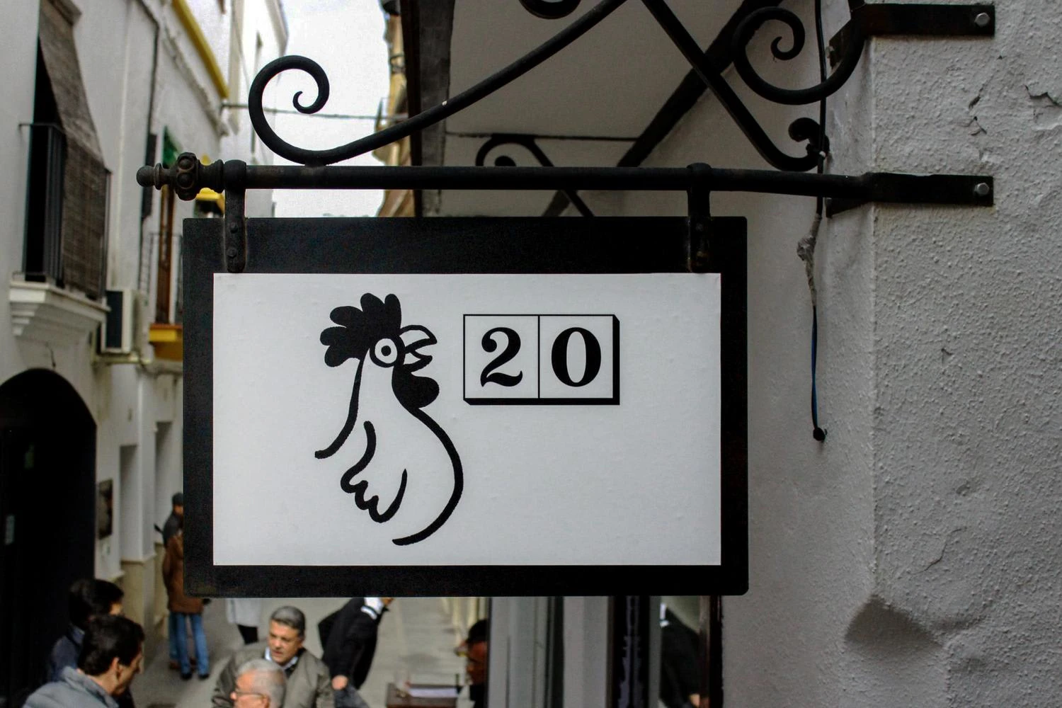
The visual identity draws from Seville’s iconic street tile typography, with the name referencing a street from the Feria de Sevilla and evoking the cultural richness of the city. The simple color palette keeps the focus on the brand’s essence—its flavors, its charm, and its signature humor—while the name "Gallito" adds personality rooted in local tradition.

Logotype

Symbol
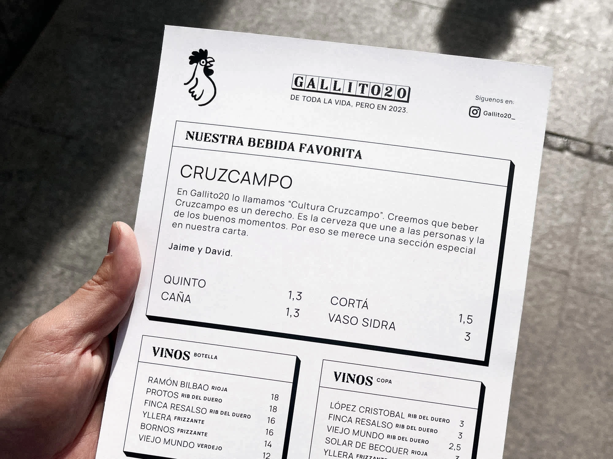
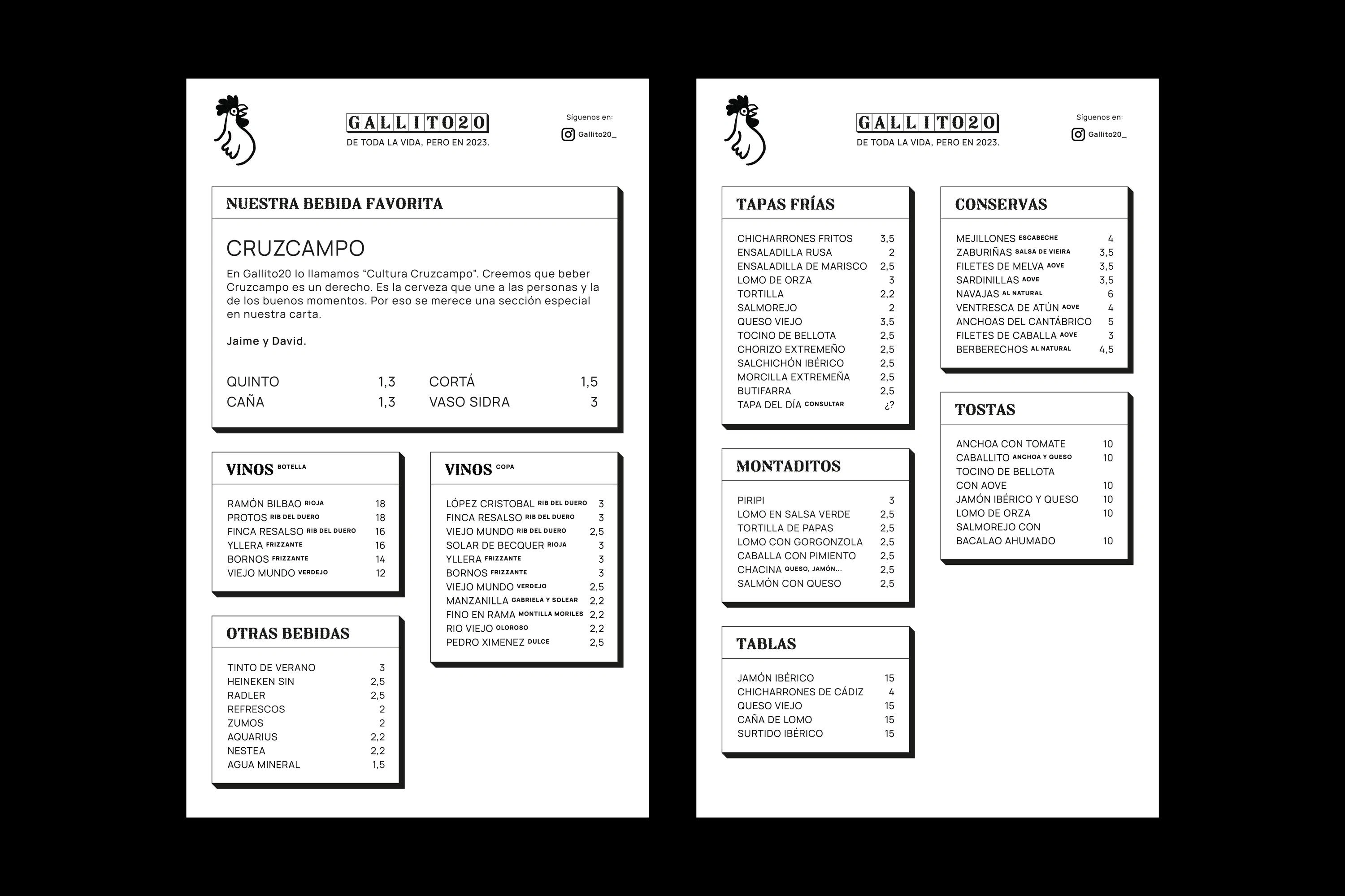
Menu
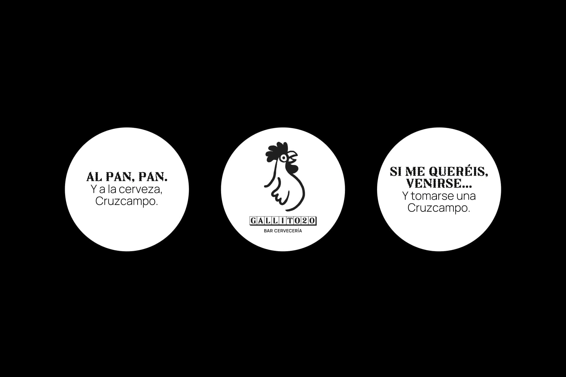

Illustrations


Napkin

Invitation

Like this project
Posted Jun 23, 2025
Gallito 20 reimagines the Andalusian tapas bar with bold type, local humor, and a vibrant spirit—where tradition meets youthful energy.
Likes
4
Views
15
Timeline
Apr 1, 2023 - May 15, 2023


