GoodBarber Portal Redesign

Loïc LE LAY


Project Overview
In 2021, I had the opportunity to work on the redesign of the GooodBarber portal, focusing on both its structural framework and visual design. GooodBarber is a platform that offers a wide range of solutions to help users create apps. The goal of the redesign was to create an intuitive and engaging user experience that would guide users seamlessly from their entry point—whether from the homepage, solutions pages, or mailing campaigns—toward the app creation process, which is crucial for conversion.
Challenges and Goal
Complex User Journey: Users enter the portal from various touchpoints (Homepage, Solutions Pages, Email Campaigns), each with different expectations and goals in the design. The challenge was to design a seamless flow that would guide users to the app creation process.
App Category Selection: A common issue in many app-building platforms is the category selection process, which often feels like a tedious and static task. GooodBarber’s existing method was a simple list, which didn’t provide an engaging or intuitive experience.
Consistency and Visual Appeal: The portal had to feel cohesive with GooodBarber’s branding while offering a modern, user-friendly interface.
In the case of GooodBarber, the key goal was likely to create a smoother, more intuitive user experience while maintaining a visually appealing and cohesive brand presence. This would ultimately enhance the user journey, making it easier for users to navigate from the homepage to the app creation process without unnecessary friction, thus increasing conversions.
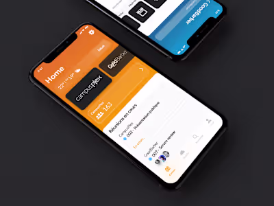
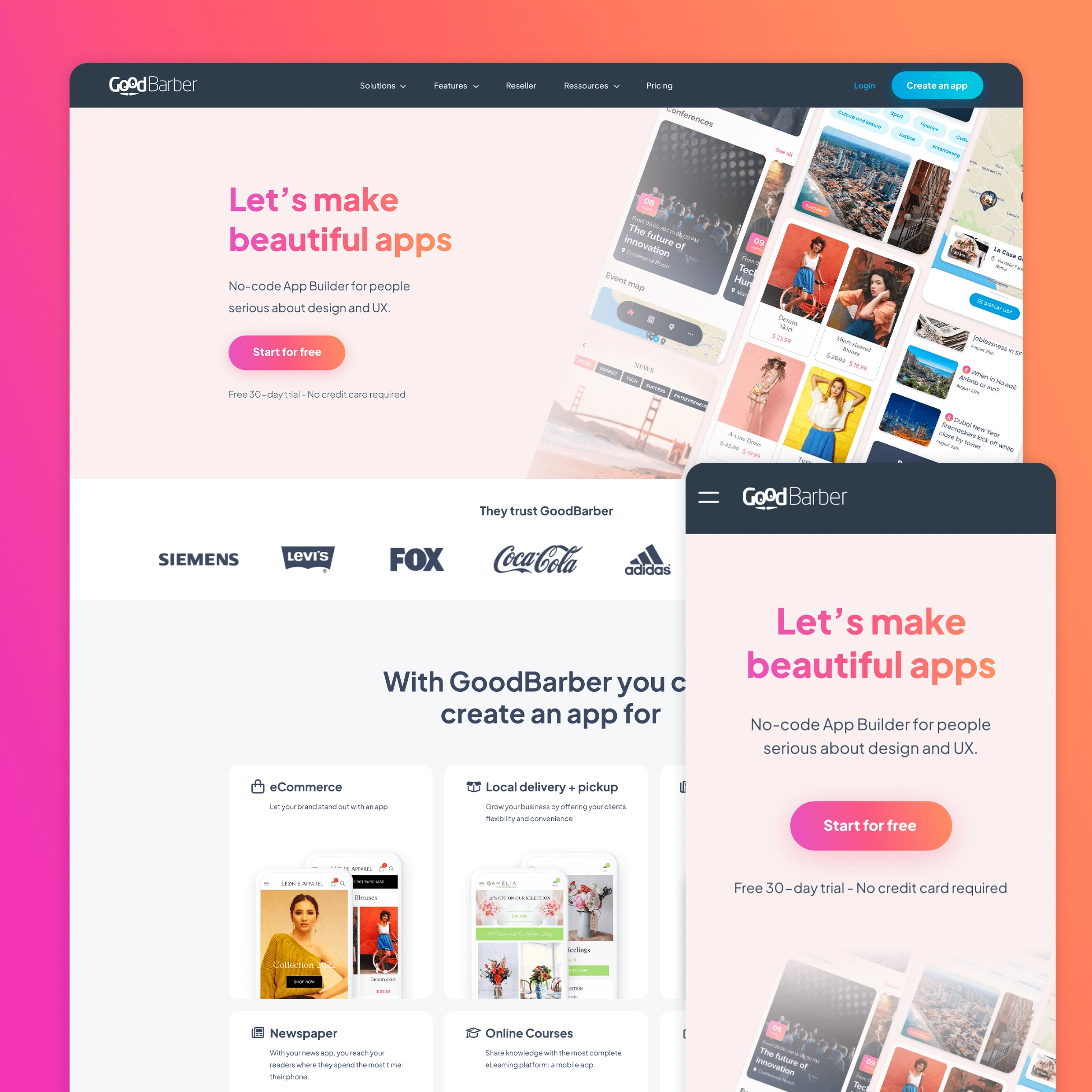
Homepage
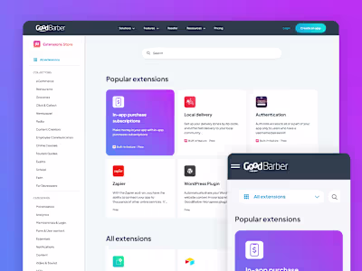
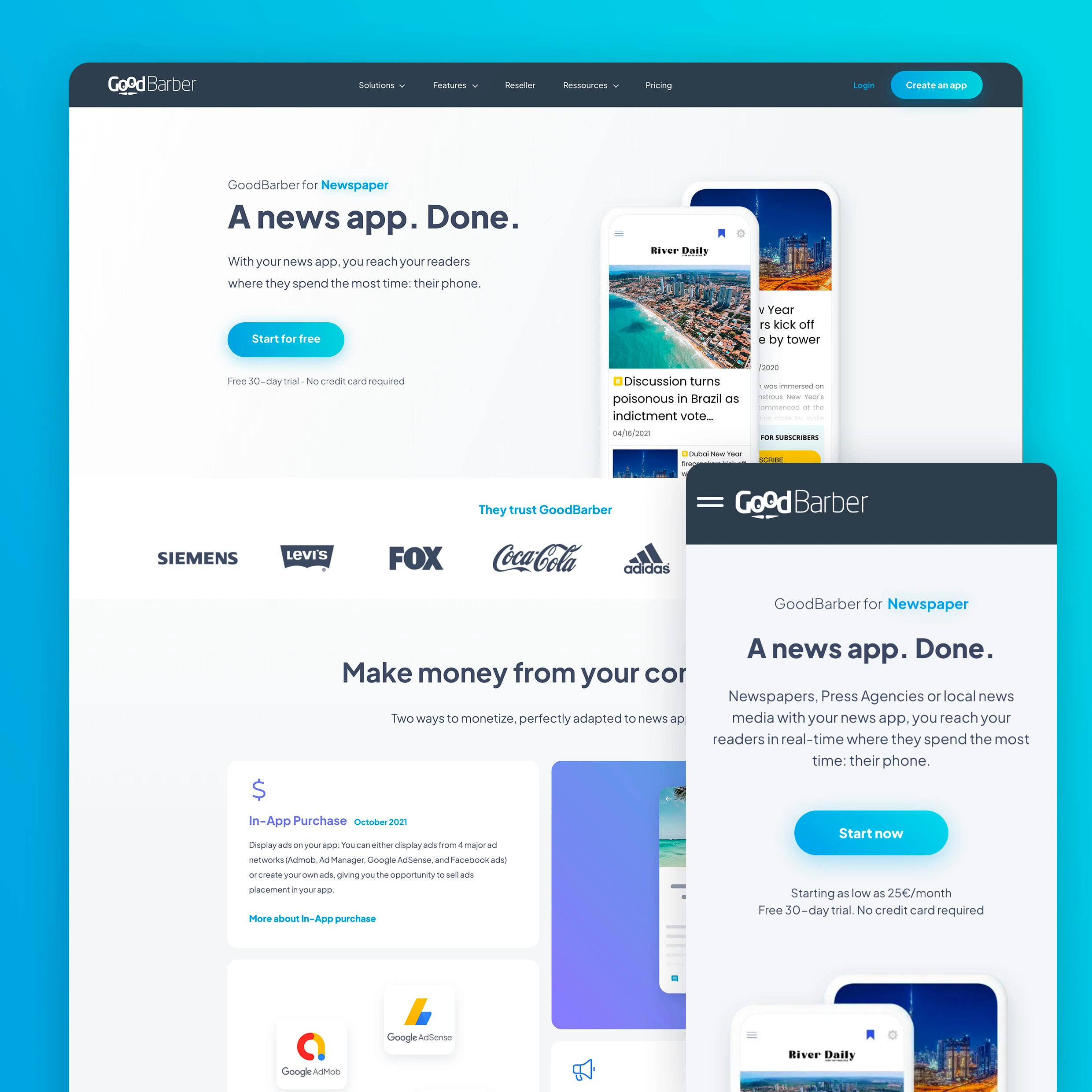
Solutions pages
GoodBarber offers a wide range of solutions for app creation.
For each solution, we developed dedicated argumentative pages to present them in the most compelling and narrative-driven way possible.
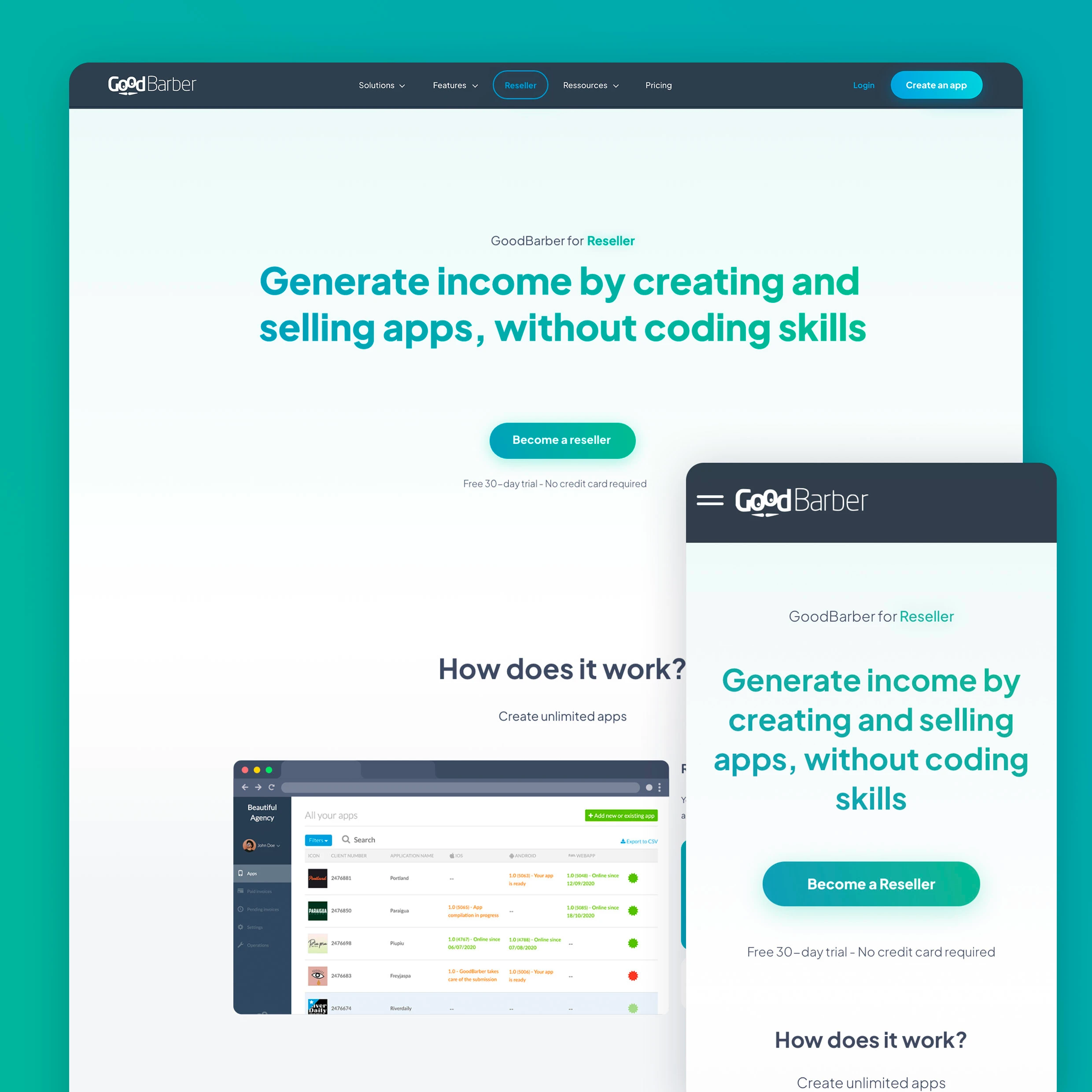
App Reseller pages
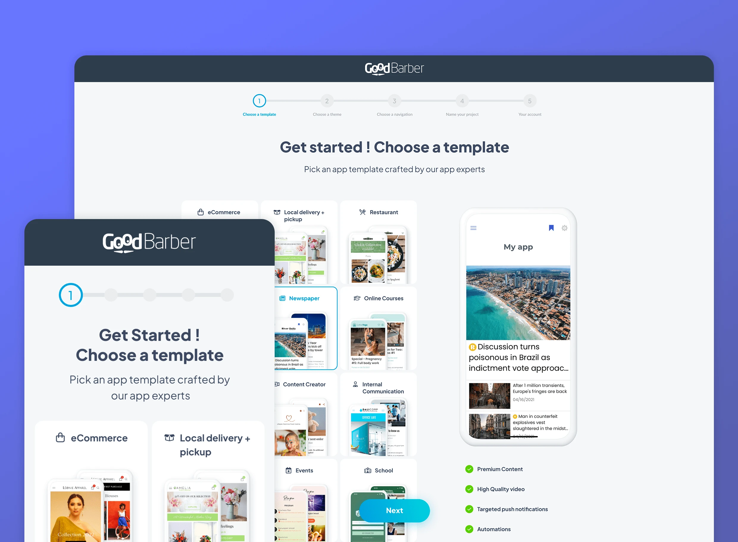
Creation process
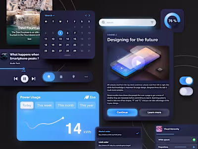
We define with the Product design team, 5 easy steps to highlight key features of the product and create aha moments for the users.
To find these, we searched for a set of actions or behaviors correlated to the core value discovery, key features of the app building experience. And once we have found a high correlation, we could make calculated adjustments to nudge more users towards those aha-inducing behaviors.
You can test it here : https://www.goodbarber.com/create/
Creation Process
Process
Research & Discovery (Marketing Team):
User Research: We looked into user behavior, feedback, and pain points from the previous portal to better understand the target audience.
Competitive Analysis: We analyzed similar platforms to spot trends, industry standards, and ways to stand out.
Problem Definition:
From our research, we identified key issues like improving navigation, making information clearer, and refreshing the design to feel more modern.
A big focus was ensuring users could move smoothly between pages, like going from the homepage to solutions and the app creation process, without confusion.
Ideation & Wireframing:
We sketched out layouts, user flows, and wireframes to map out an intuitive structure that made it easy for users to navigate and reach the app creation process.
Visual Design:
After finalizing the wireframes, we focused on the visual design—choosing colors, typography, and overall aesthetics that matched GooodBarber’s branding.
I worked closely with the in-house graphic designer to keep everything consistent between UI elements and illustrations.
Development & Animations:
The graphic designer created illustrations, while I animated them to make the pages more dynamic and engaging.
Animations, like smooth transitions for app category selection, were coded to ensure the experience felt fluid and polished.
Testing & Iteration:
User Testing in intern: We conducted usability testing in intern to gather feedback on the new design.
A/B Testing: We ran A/B tests to compare the new design with the old version, particularly focusing on conversion rates. The new design saw a significant increase in users progressing through the app creation steps, with a higher engagement rate in the category selection process.
Iterative Improvements: Based on multiple feedbacks and analytics, minor adjustments were made to fine-tune the animations and user flows. For example, we added tooltips to clarify certain features and made the app category selection process even more dynamic.
Launch & Optimization:
Once everything was fine-tuned, we launched the redesigned portal. Post-launch analytics helped us track user behavior and make further improvements where needed.
Results
Improved Conversion Rates: The redesign resulted in a noticeable increase in users progressing to the app creation process, ultimately leading to higher conversions for GooodBarber’s services.
Engaged User Base: User engagement on the app category selection page saw a dramatic improvement due to the more dynamic and intuitive design.
Enhanced Brand Perception: The visual design and smoother user experience helped elevate GooodBarber’s brand perception, presenting the company as a more modern and user-friendly platform for app creation.
Like this project
Posted Mar 31, 2022
I worked on the redesign of GooodBarber's portal, aiming to create a cohesive and intuitive user experience.
Likes
0
Views
73
Clients
GoodBarber