TITAN SMART PLATFORM
Creating a mobile application for India's first fully made in India smartwatch
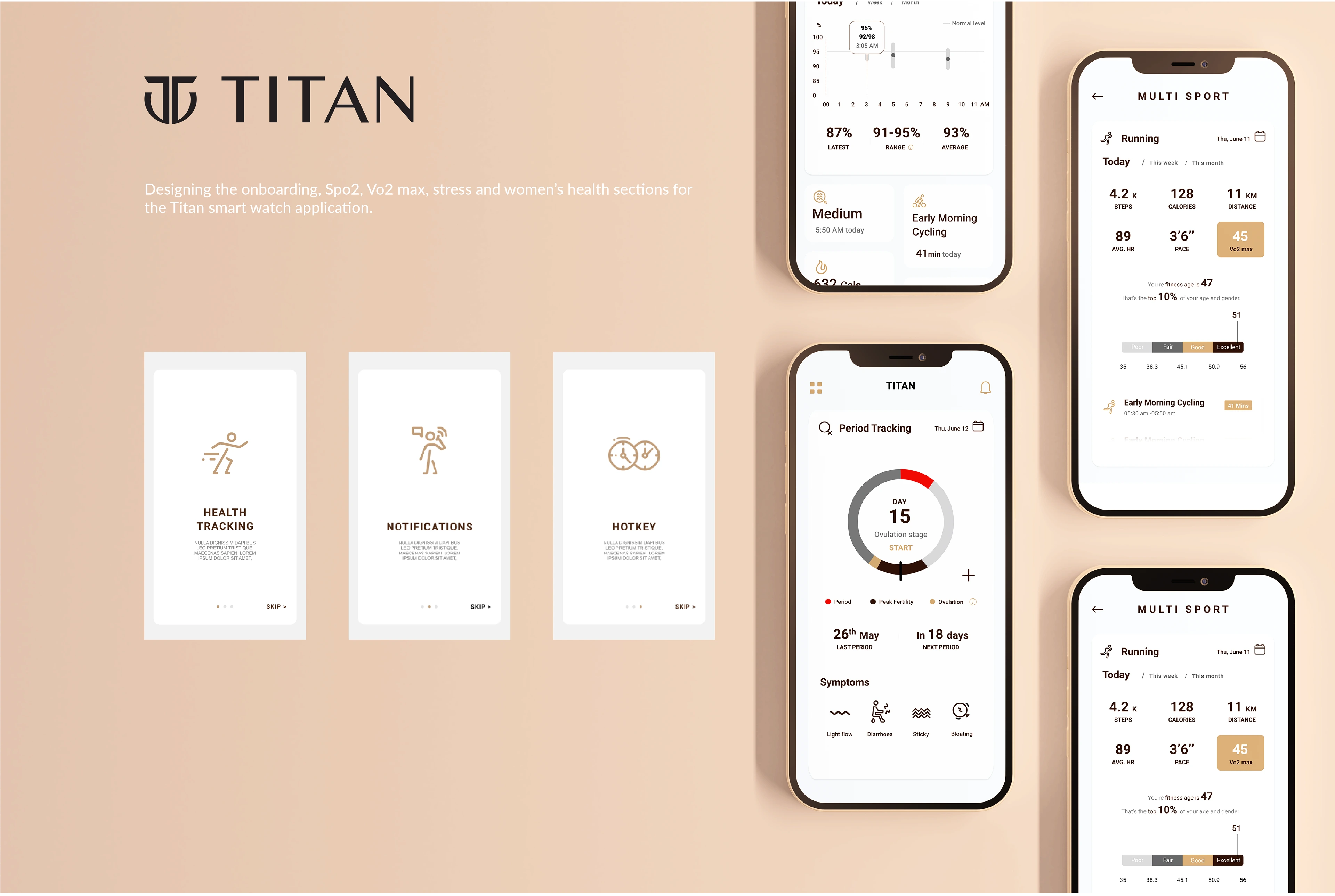
Project background : Titan is a leading lifestyle brand of India and the fifth largest watch manufacturer of the country. Titan was in the process of launching the first fully made in India smart watch. For this project I was a part of the smart wearables experience team as a UX design intern which consisted of three other UX designers.
Scope of work : I joined the team midway in the project. I was responsible for designing the user interface and experience for onboarding, Spo2, Vo2 max, Stress and Women's health sections for the Titan smart watch application.
About the brand : Titan Company Limited (Titan), a joint venture between the Tata Group and the Tamil Nadu Industrial Development Corporation (TIDCO), commenced its operations in 1984 under the name Titan Watches Limited. Over the last three decades, Titan has expanded into under penetrated markets and created lifestyle brands across different product categories. Titan is widely known for transforming the watch and jewellery industry in India and for shaping India’s retail market by pioneering experiential retail.
Design process
Since I joined the project midway the design process I followed consisted of 4 stages. Define: where the research was analysed and further explored through the creation of personas, and defining project goals; Ideate, where Information architecture and sketching helped create the structure and the content; Prototyping consisted of visual design, UI kit creation and wire framing, before building the prototype, and Testing it with users in the final stage. Priority revisions were made based on the Usability test.

STAGE TWO : Define
During this stage, I analysed the research from the competitor analysis and interviews to create a solid persona, which helped me define the project goals and made sure they aligned with the overall vision.
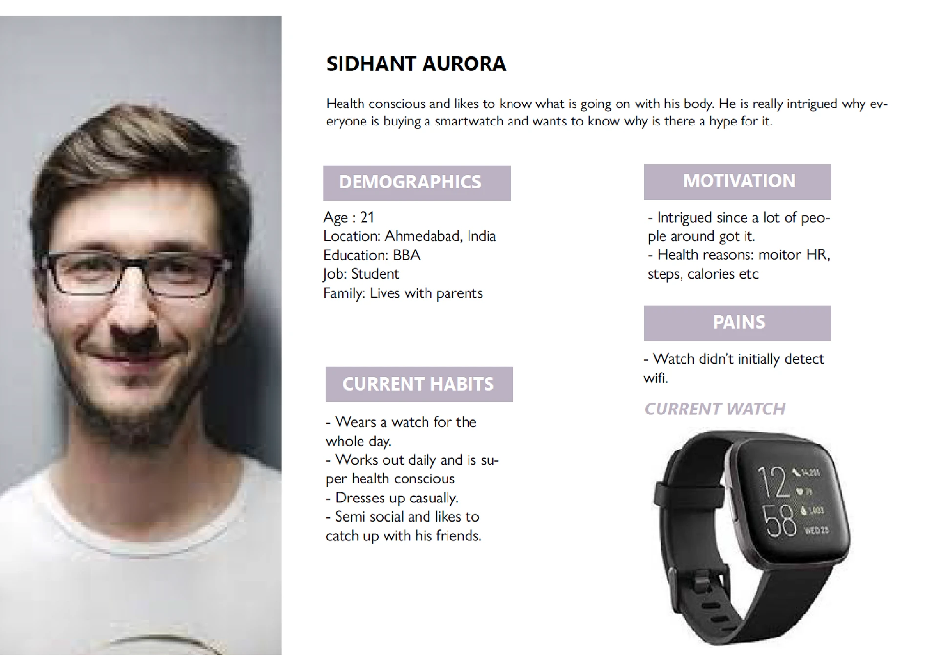
User Personas
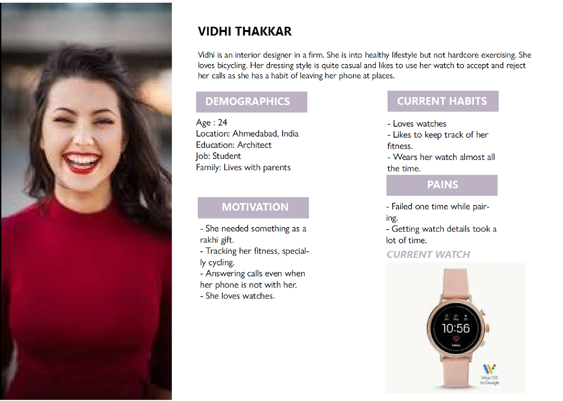
I created 4 personas based on my research. The goal was to address the major needs of the user groups, the millennials who want to be fit and the fitness passionates. I made sure to reflect back on these personas from time to time, to make informed design decisions. Since the process work is under NDA I'll be putting up a dummy persona to give an idea of the same.
STAGE THREE: Ideate
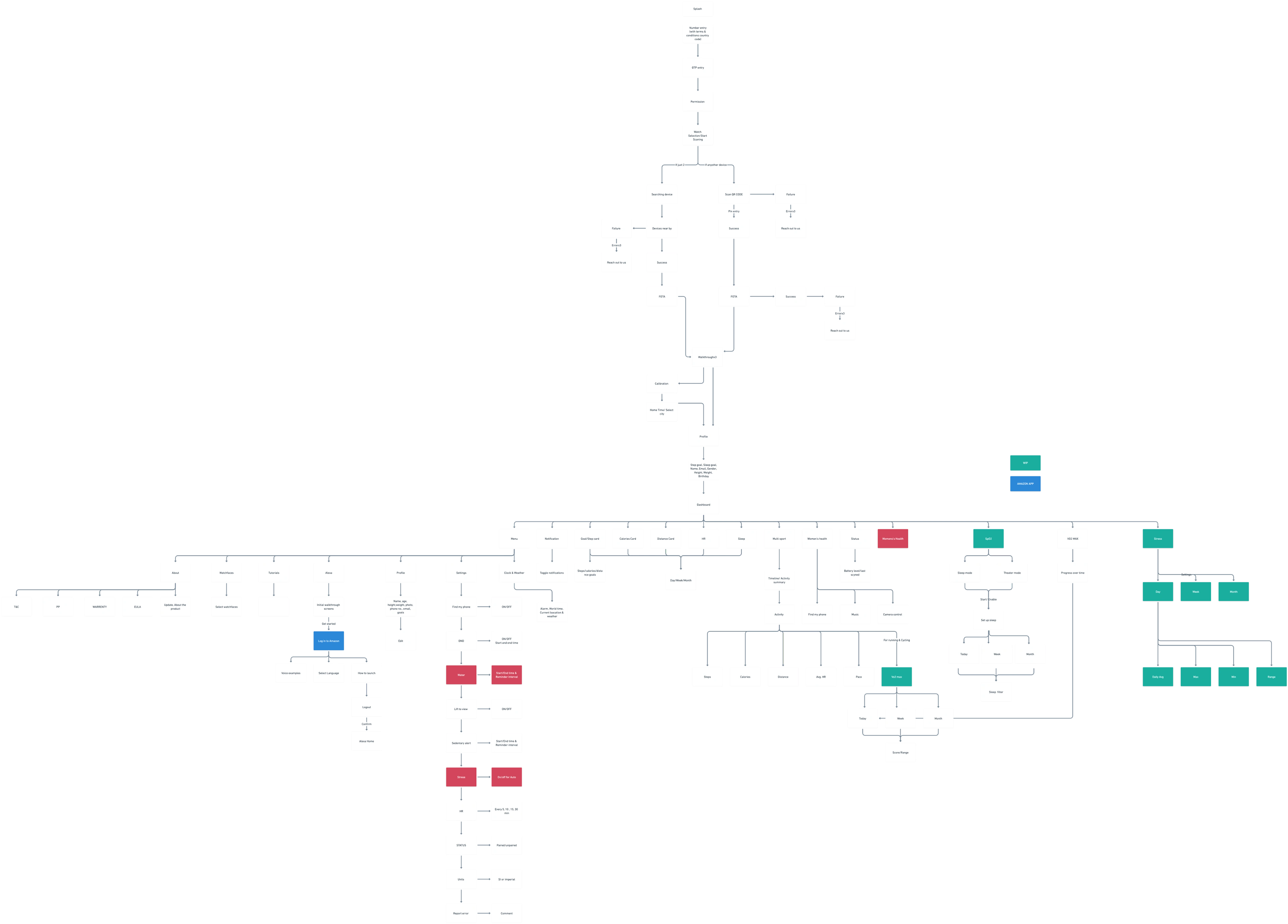
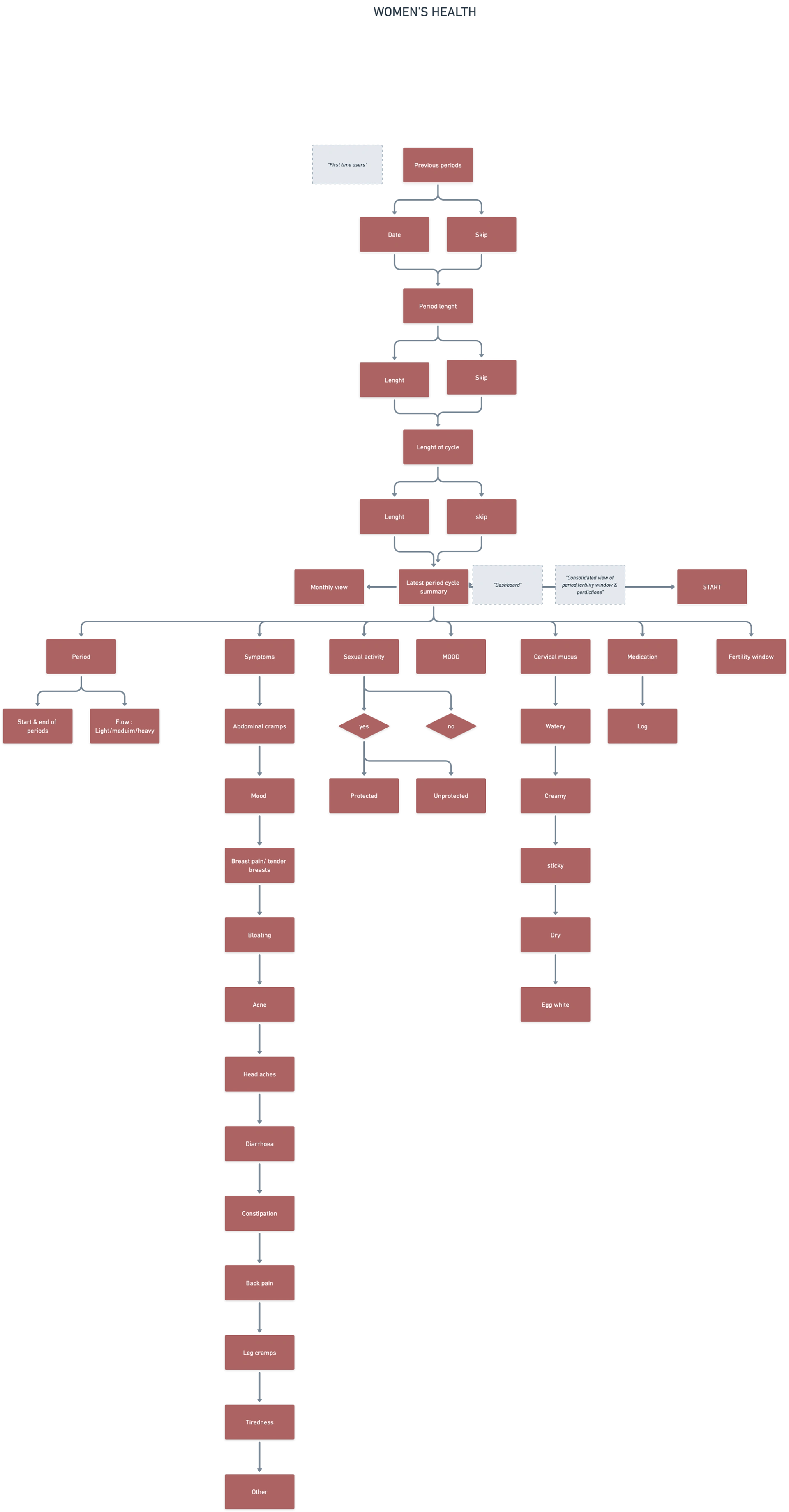
During this stage, I created the information architecture and wireframes of the application.
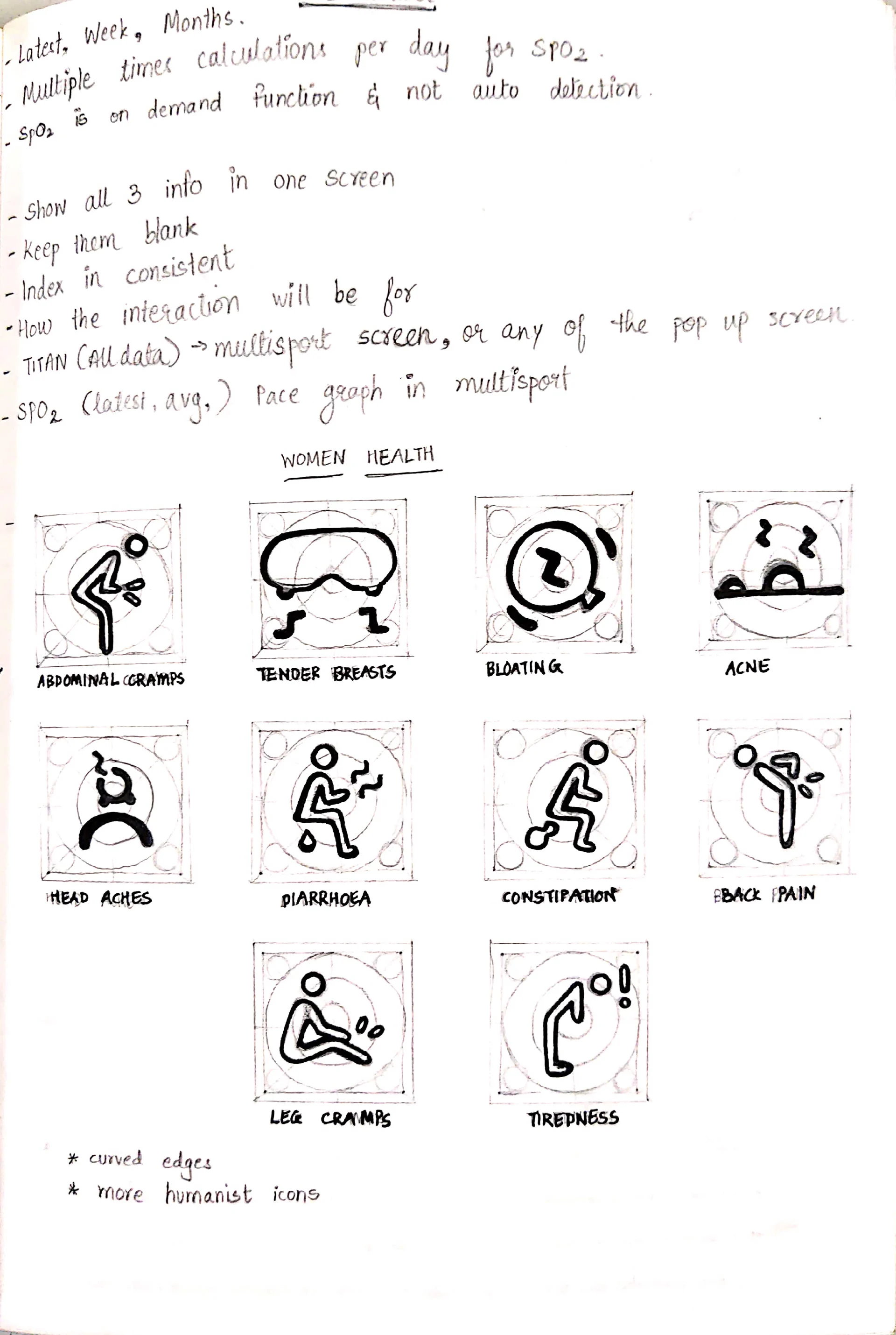
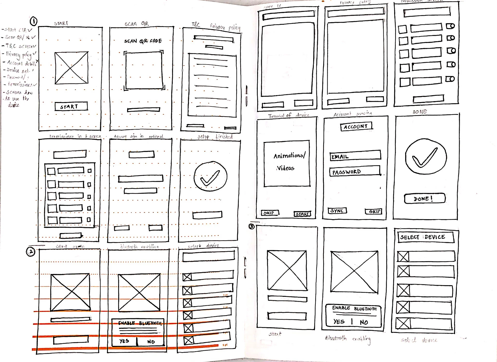
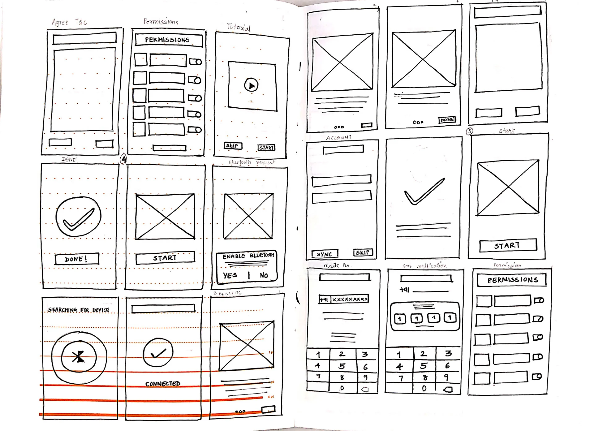
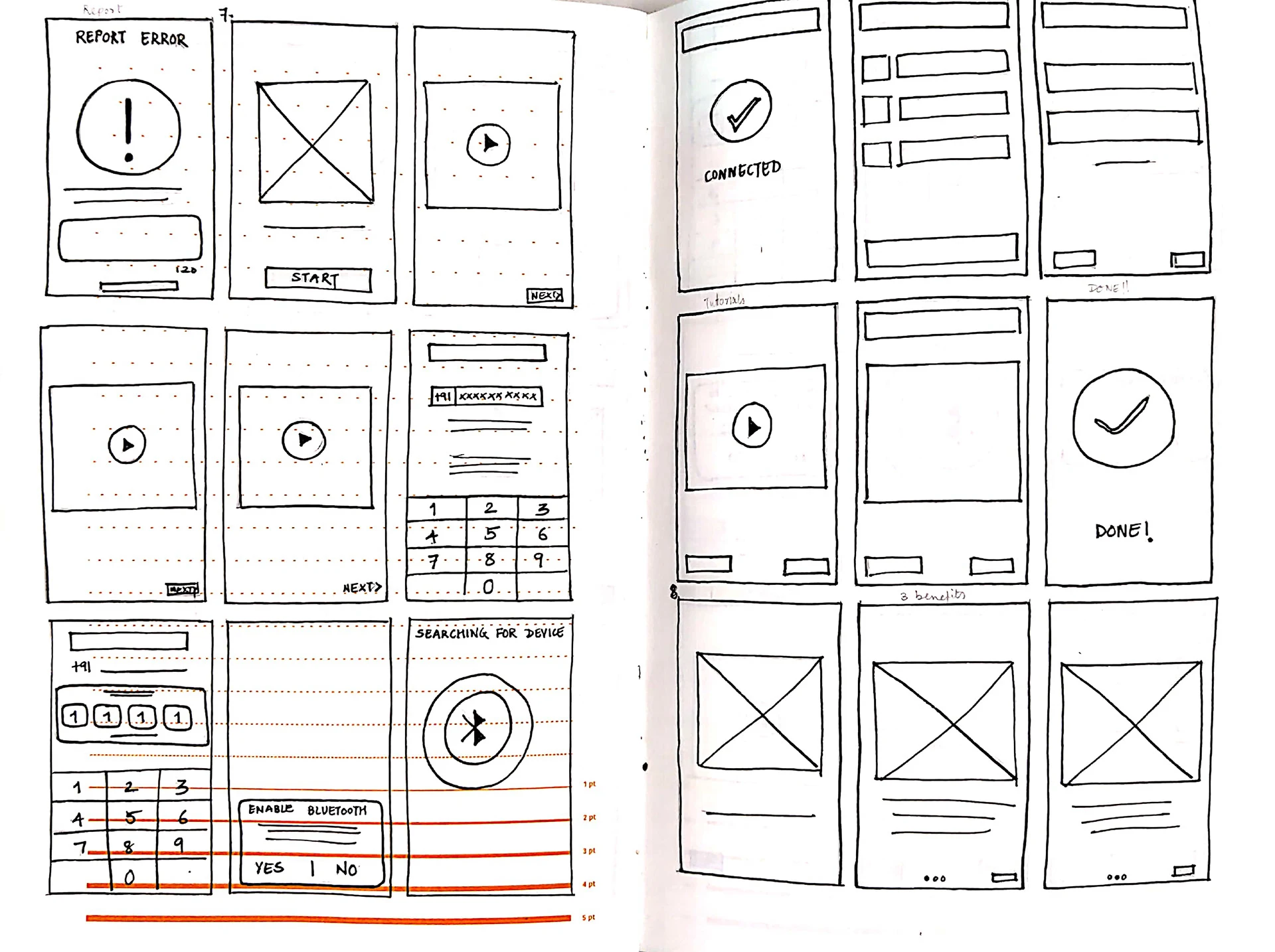
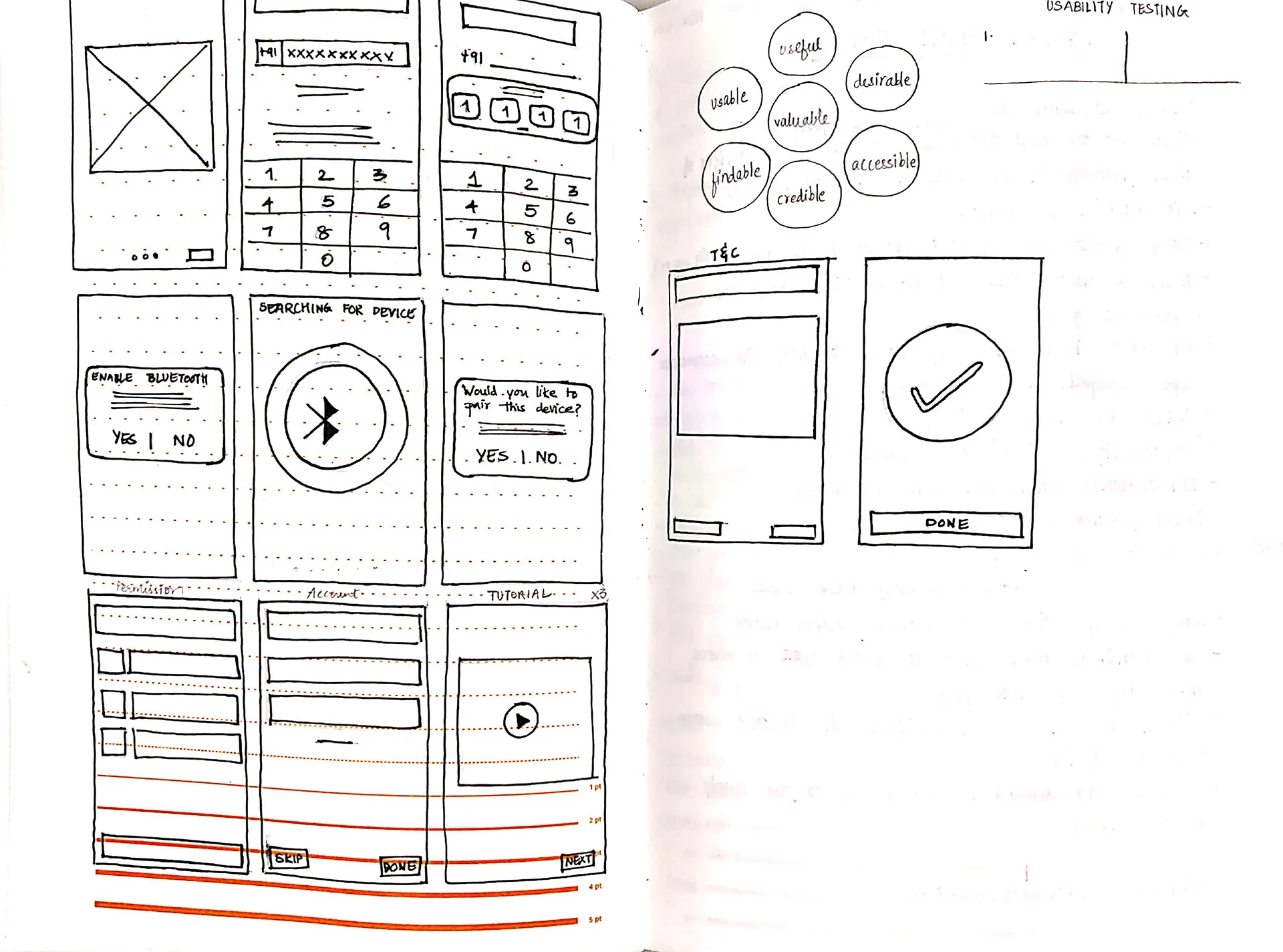
Paper sketches
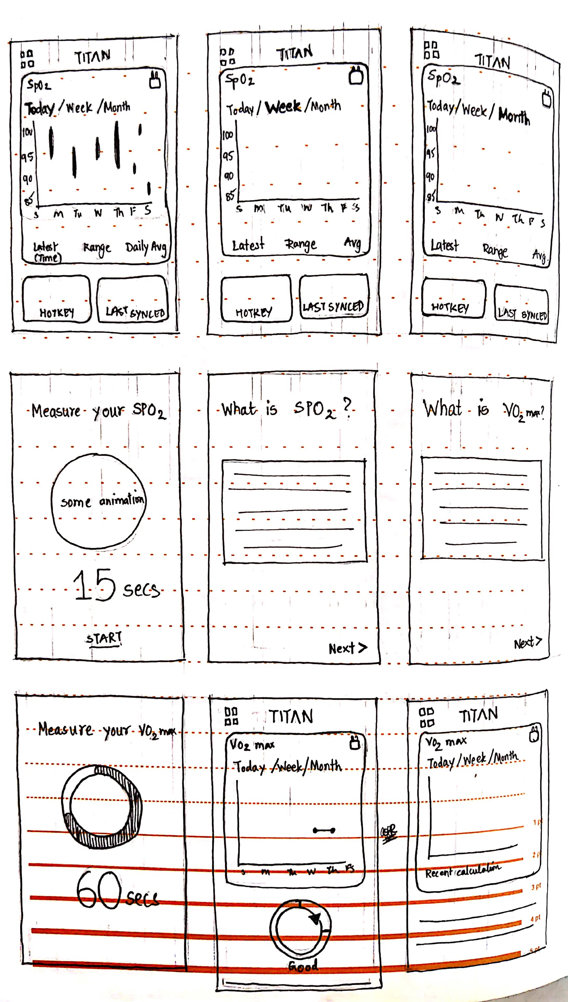
Sketching on paper helped me to explore ideas without a limitation, and helped me expand my thinking. I presented these sketches to my team and we discussed possible layouts/alternatives for the various screens in the application.
I then incorporated their feedback, suggestions, and some new ideas in the wire-framing stage.
STAGE FOUR: Prototype
This was the stage I was most excited for, to digitize wireframes and build the prototype that would be tested with the internal stakeholders and the target user group.
Creating digital wireframes
The wireframes began with sketching on paper, which helped me to brainstorm with a free hand. I then digitised the designs I liked, and brought them to life on Adobe XD.
High fidelity screens
As I had joined the project midway most of the UI kit had been created. Some of icons for stress, women's health and the other new sections that were added were created by me. It was a different learning experience when you have to follow and execute new concepts in an existing design system.
When we were designing and testing it out within the team there was one major feedback for the stress icon. People were getting confused what icon it was without the text.
Other point that the stakeholders mentioned was that the dashboard was very crowded.
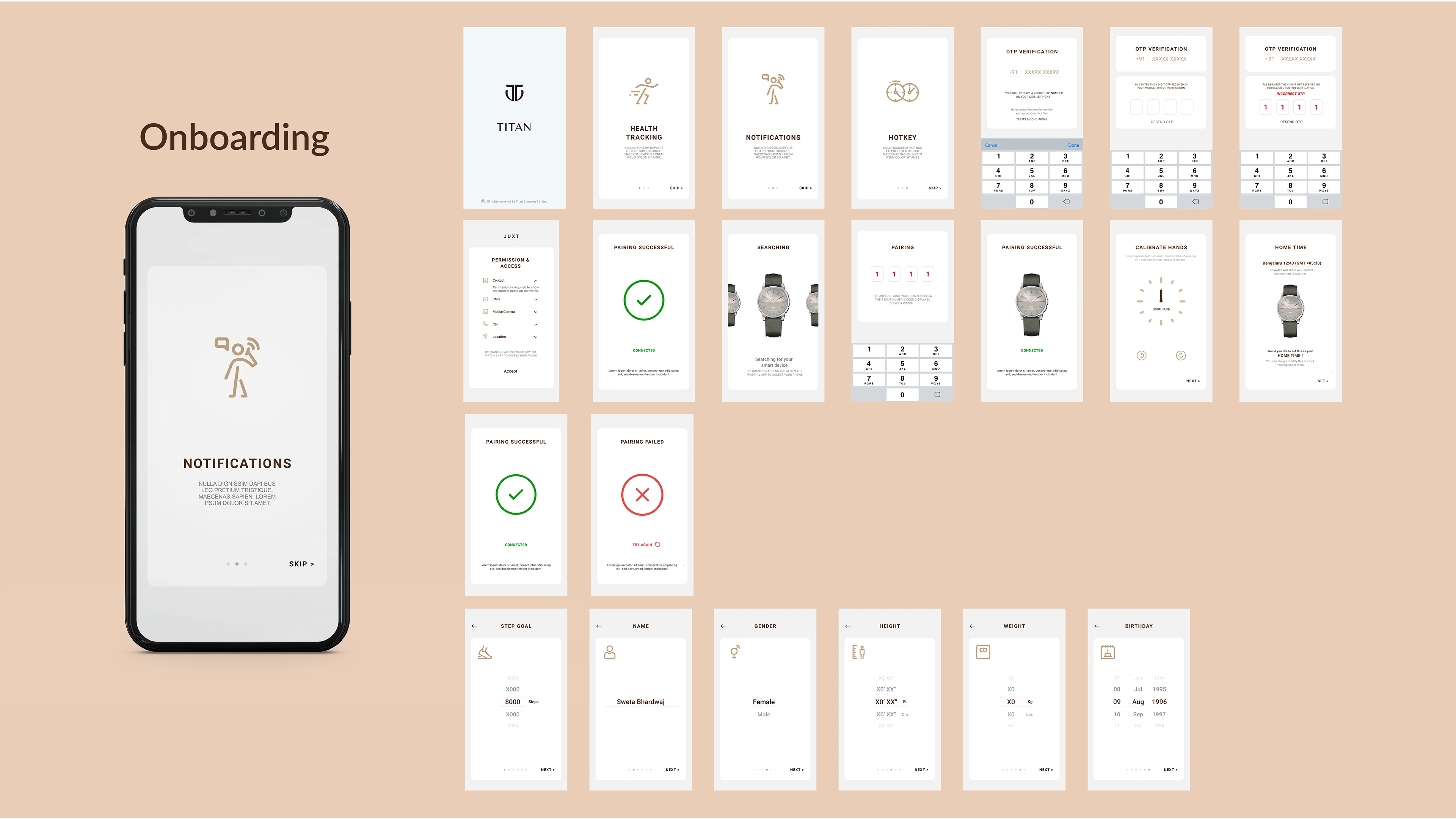
Onboarding
Onboarding is the first handshake between a user and a device. According to the current users in the market one aspect that Titan lacked was the onboarding process it currently used. This was the origination of my graduation project but the current onboarding design was very similar to the existing ones in the market. Due to NDA I cannot put all the screens that have been designed.
The key screens that are absolutely necessary: Pairing screen, Sign up screen, Account details, Terms & Conditions screen, Permissions screen
Spo2
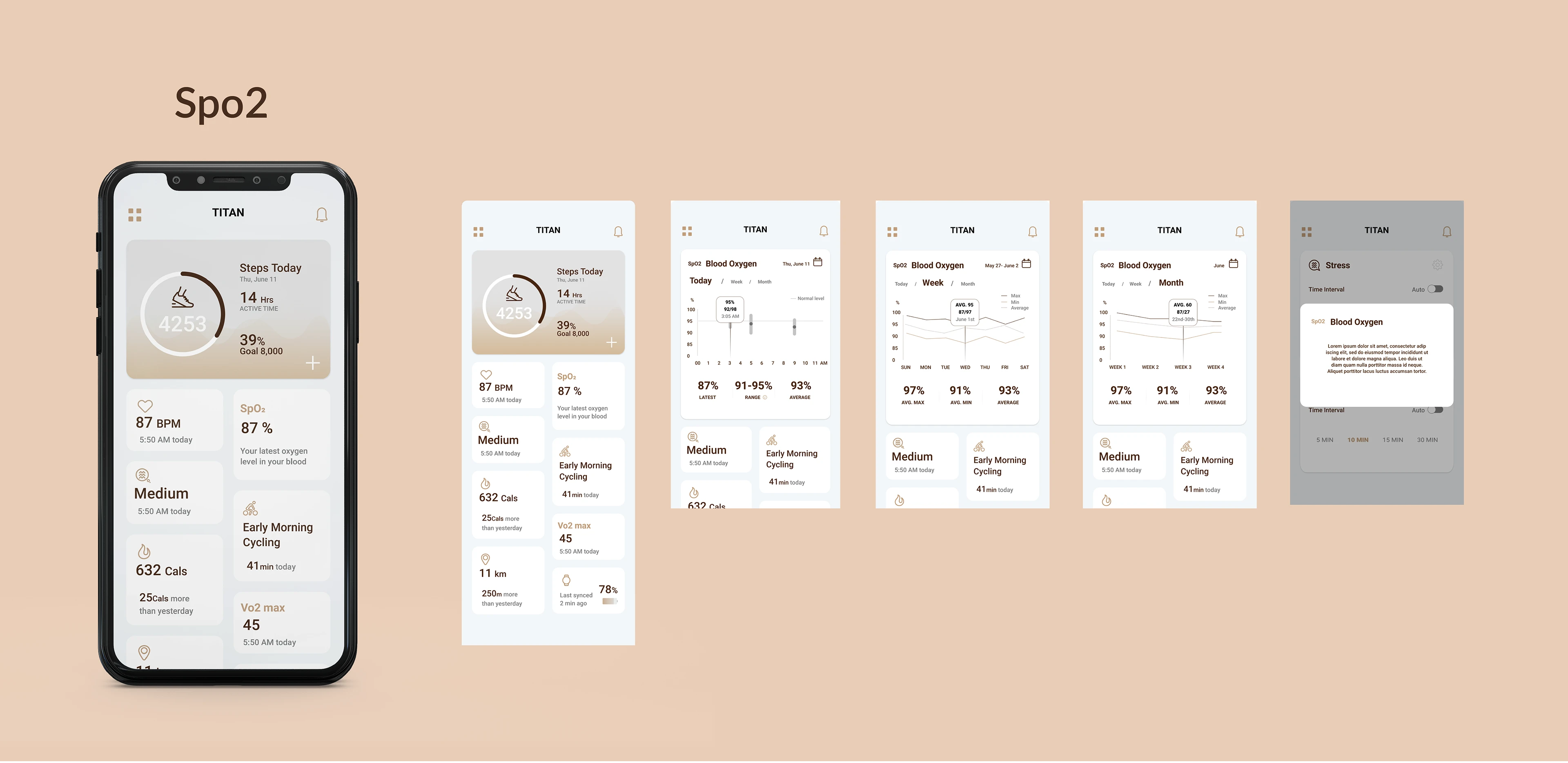
Smartwatches offer a lot of features that help you monitor your health and fitness. One such feature is blood oxygen monitoring or SpO2 monitoring which allows you to keep a track of your blood oxygen levels. While smartwatches may not be as accurate as medical devices, they allow you to find out if something’s wrong.
The key points kept in mind while designing :
· What is Spo2?
· The graphical representation changes according to today, week and month
· The values that need to be shown like the latest score, average score and range on the screen.
· A line indicating the normal/good Spo2.
Vo2 Max
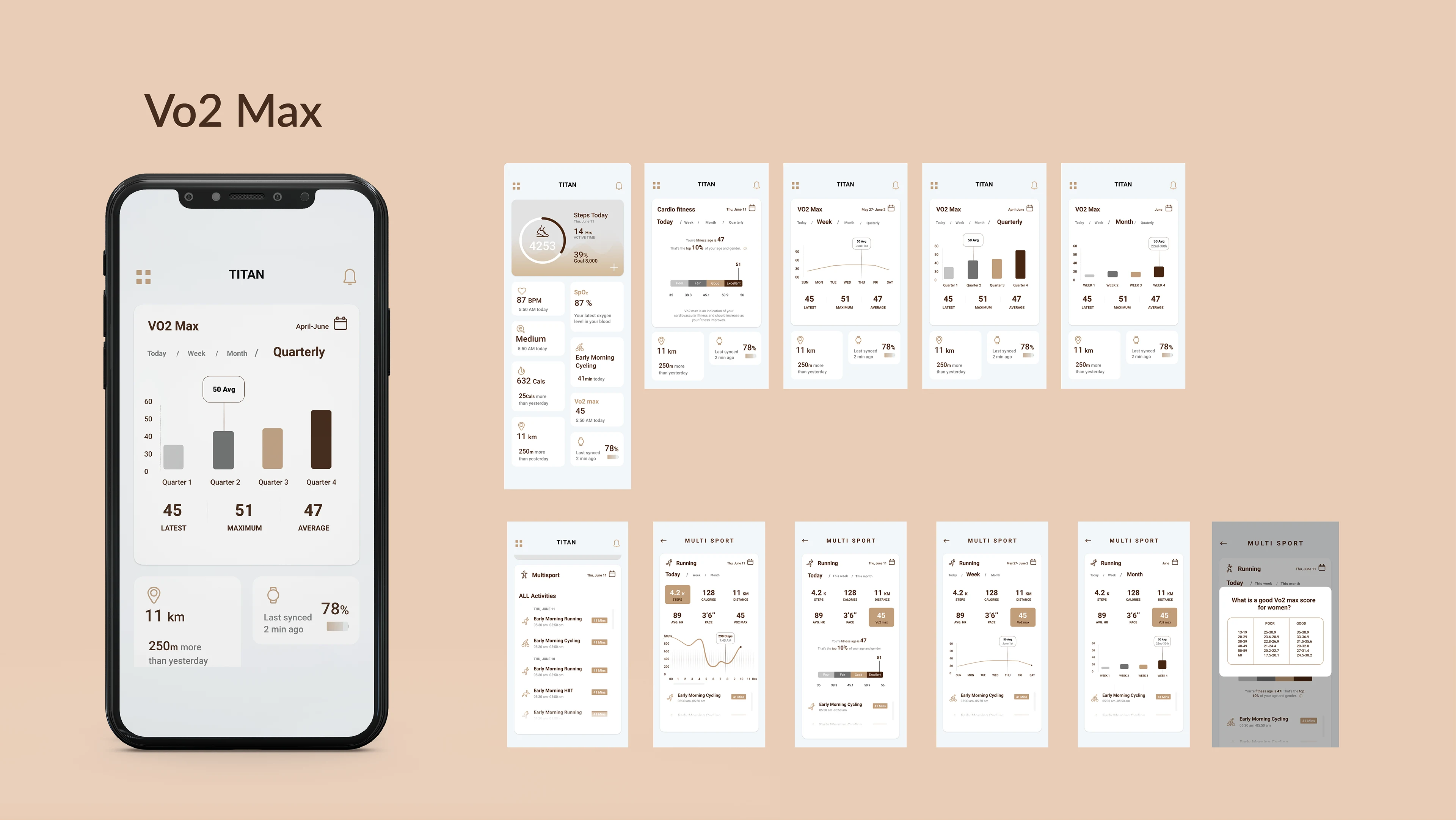
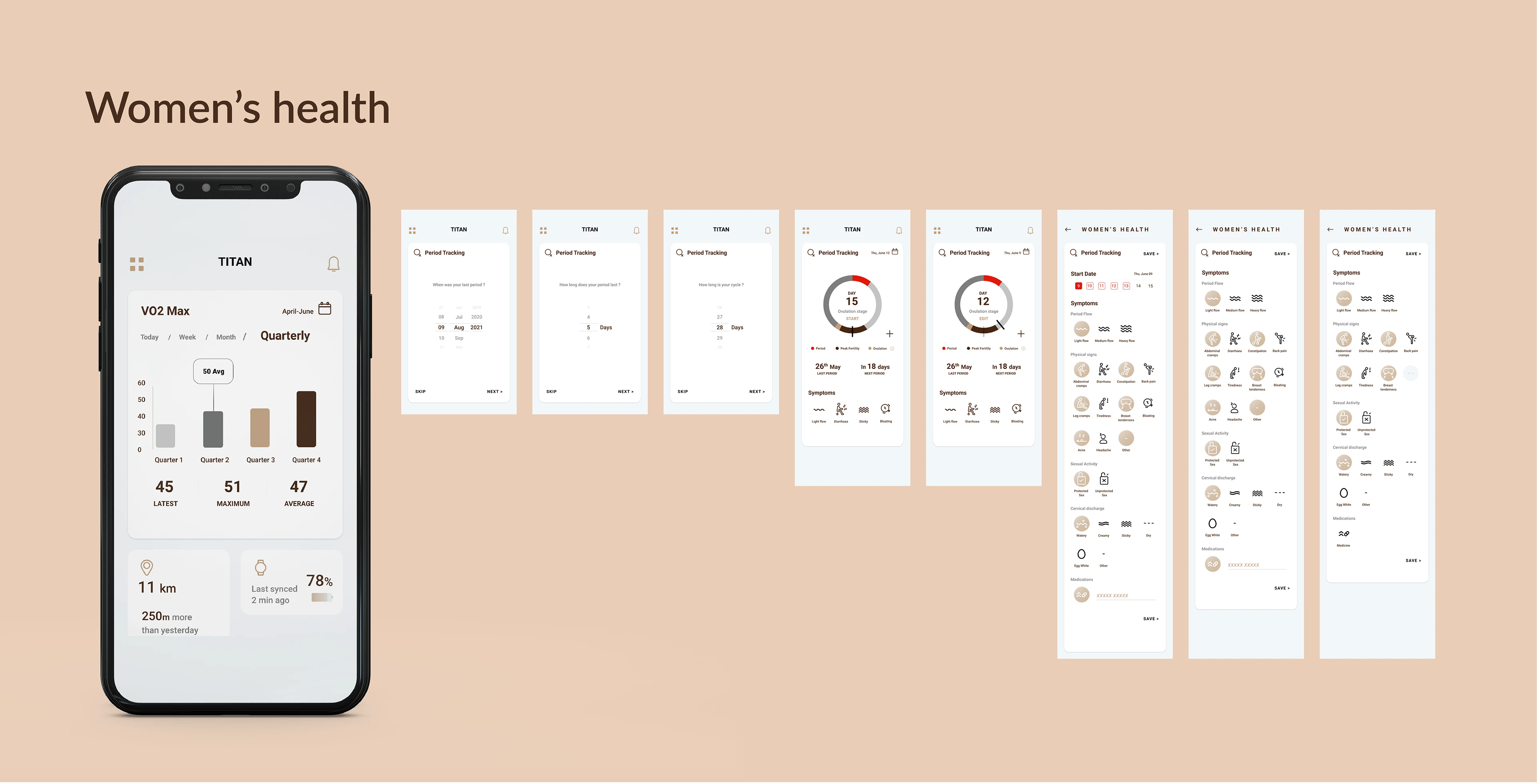
VO2 max is the maximum volume of oxygen (in milliliters) you can consume per minute per kilogram of body weight at your maximum performance. VO2 max is an indication of aerobic fitness and should increase as your level of fitness improves. This was a fairly new domain that took a little more research, exploration to reach the final design stage/flow. Since VO2 max is measured when you perform physical strenuous outdoor activities. This is why VO2 max had two flows in the app.
The key points kept in mind while designing :
· What is Vo2 max
· The graphical representation changes according to today, week, month and quarterly
· A fitness score to differentiate from the other apps
· Measured over a period of time to show better results
Women's health
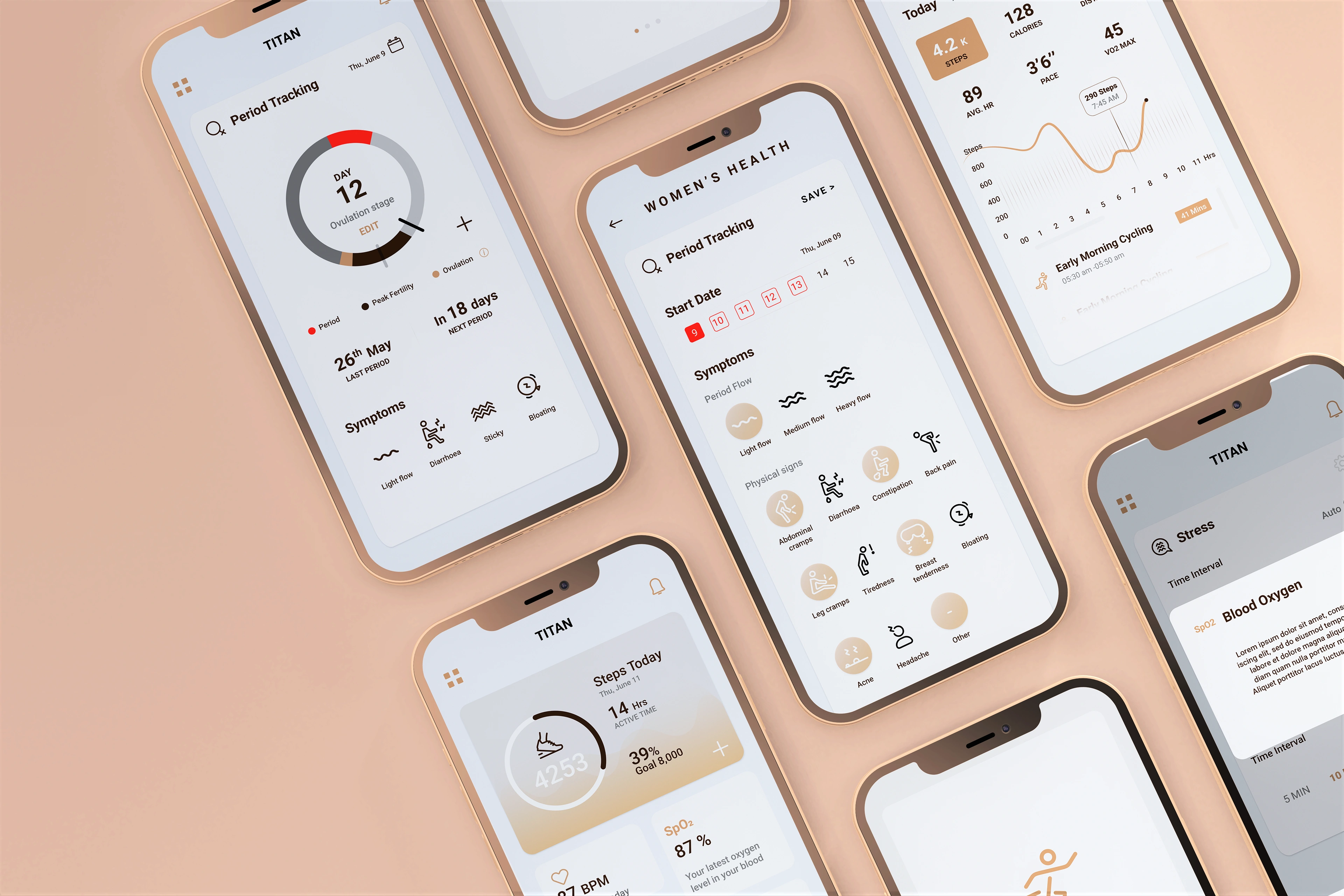
This particularly included the period tracking of a women, the particular symptoms one has to face in cycles, the next period cycle, different stages of the period cycle, length etc. In this section I also got the opportunity to design the icon set.
STAGE FIVE: Test
In this stage I tested out my prototype with users, to note down any pain points or difficulties they may have while navigating certain sections in the app.
Key Findings From Usability Test
The usability test was conducted with the help of loop 11 with 5 participants recording them as they navigated through different tasks which I asked them to carry out. I noticed a pain point with the stress icon, and where to go next from the dashboard. Rest of the flows the users carried out quite smoothly.
Learnings and takeaways
• Working on this project reminded me how collaborative design is, and requires various people and teams to come together to create a great product.
• This was my first time working on a live project and it was full of learning. I learnt that as a designer, it is also important to be articulate with your ideas, create rapid prototypes for meetings where you are explaining a concept, and overall being clear and crisp with your communication and presentation skills.
• I also learnt that some ideas might sound great, but upon implementation, you realise it does not add much value; this is where testing becomes key.
Like this project
Posted Jul 24, 2023
Creating a mobile application for India's first fully made in India smartwatch
Likes
0
Views
5
Clients
Titan Company

