Calculator Concept – Light & Dark Modes
Alex Prokhorov
Calculator Concept – Light & Dark Modes
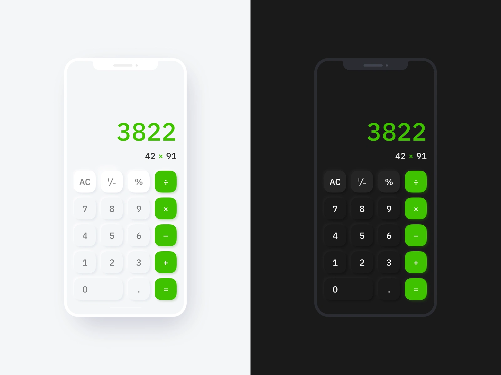
A clean, minimal take on the classic calculator app—fully optimized for both light and dark mode.
With a focus on clarity, contrast, and modern UI styling, this design keeps interactions smooth and intuitive.
Green accents highlight key actions, while rounded buttons and subtle shadows add just enough depth to keep things tactile and approachable.
Which mode would you use more? 💭

Like this project
Posted Mar 26, 2025
A clean, minimal take on the classic calculator app. With a focus on clarity, contrast, and modern UI, this design keeps interactions smooth and intuitive.
Likes
2
Views
30