Meria (JustMining) branding and Web3 website
Arthur Lambert
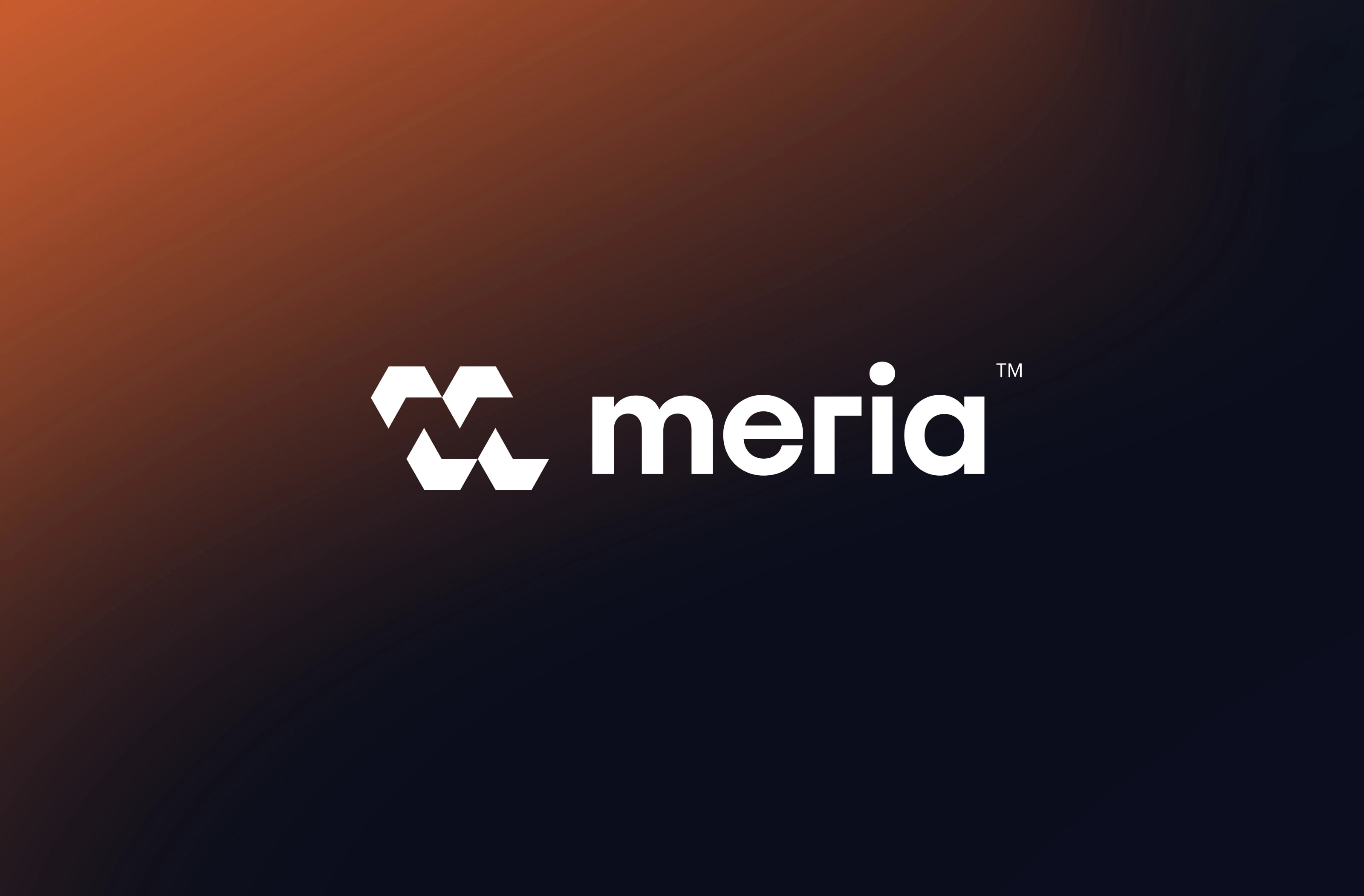
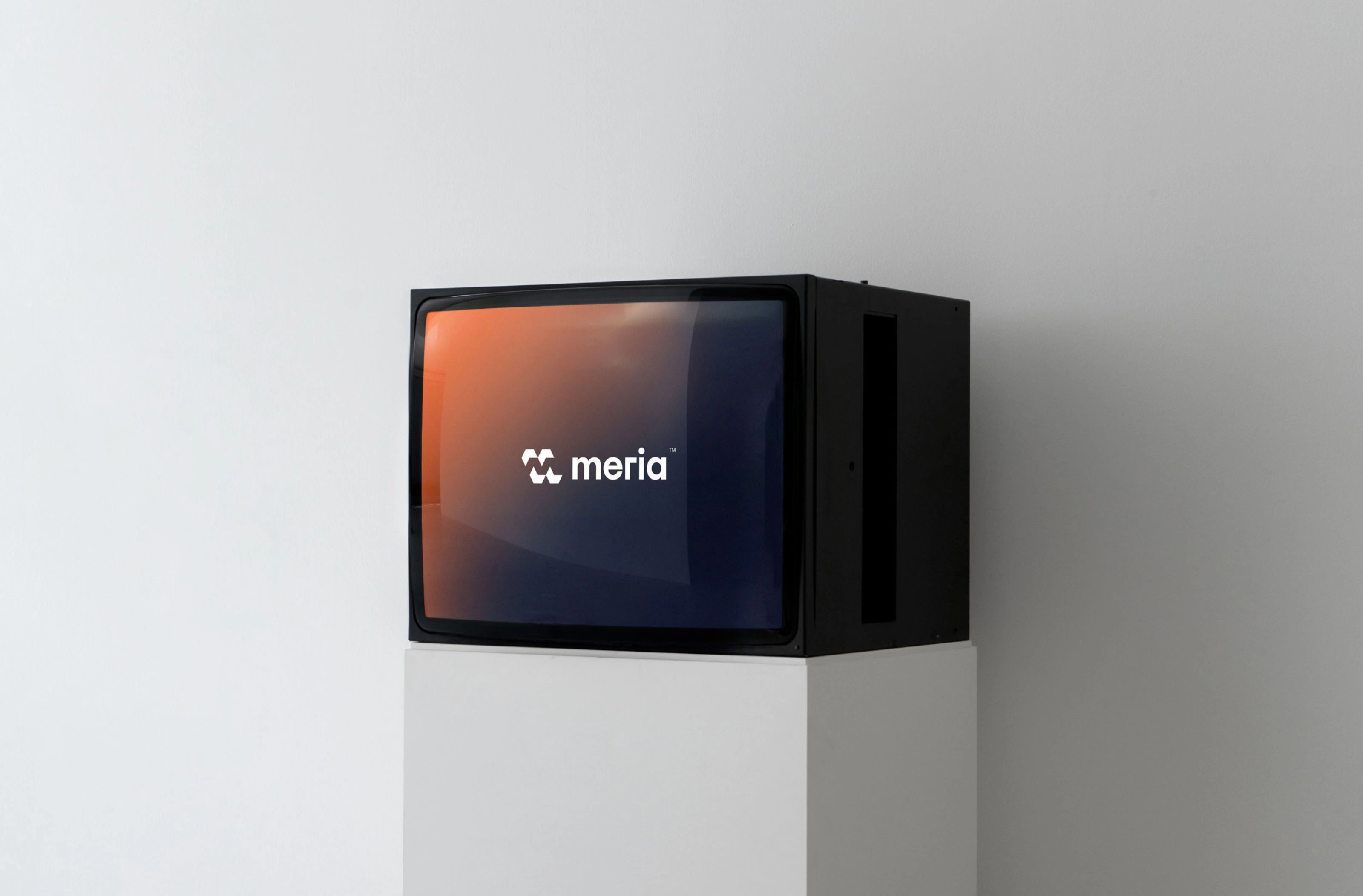
The customer was presented with various concepts before discovering the core theme central to the Meria identity. Its name (meaning "cedar" in Japanese) enabled Kezako to weave its narrative and craft an emblematic logo. Every detail was meticulously considered, including the typography of the logo: the R's right angle emphasizes the brand's tech-oriented nature, the A's highly rounded form adds depth with its straight leg, and the diminutive M ensures immediate legibility.
Like this project
Posted Apr 9, 2024
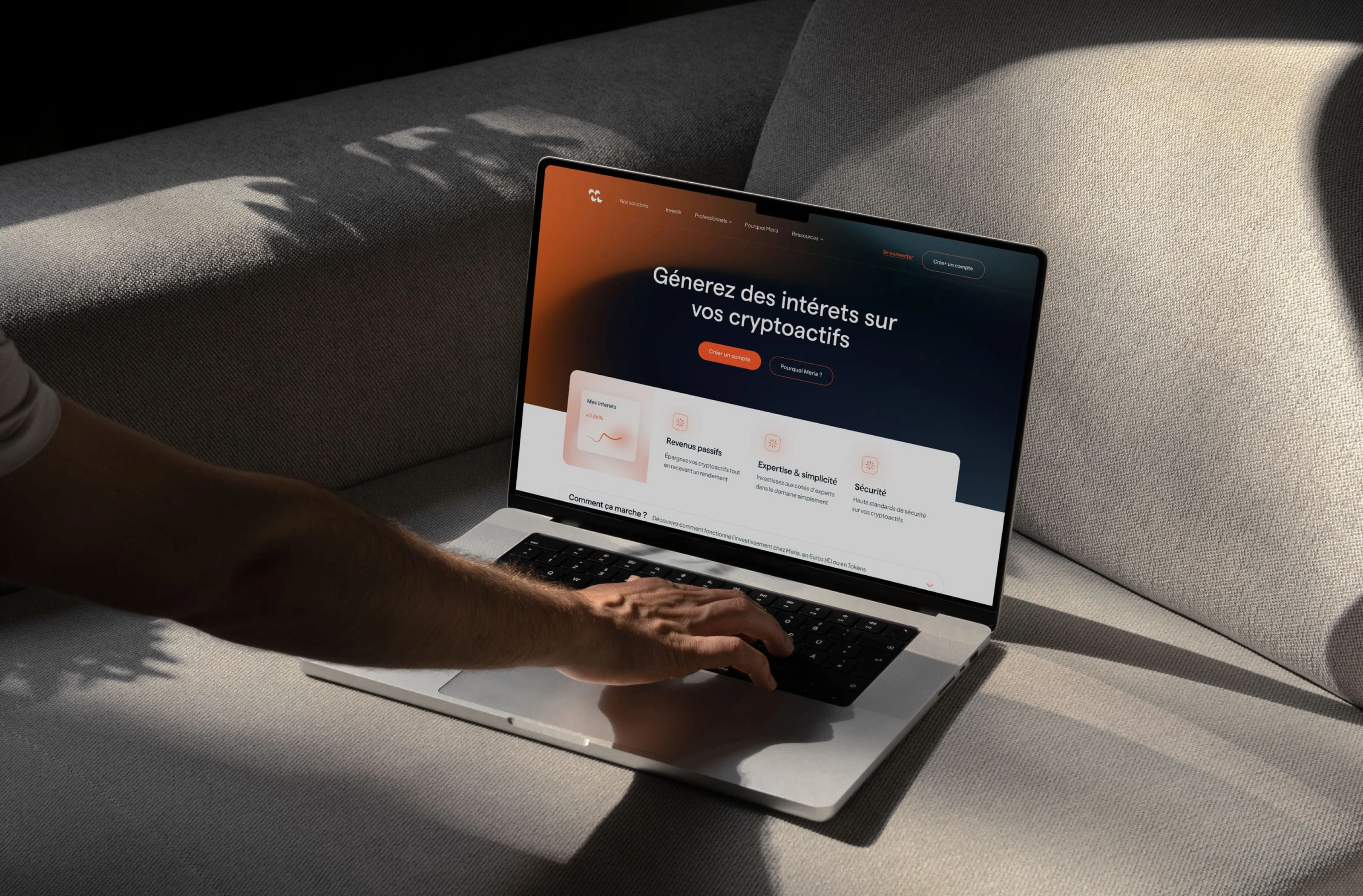
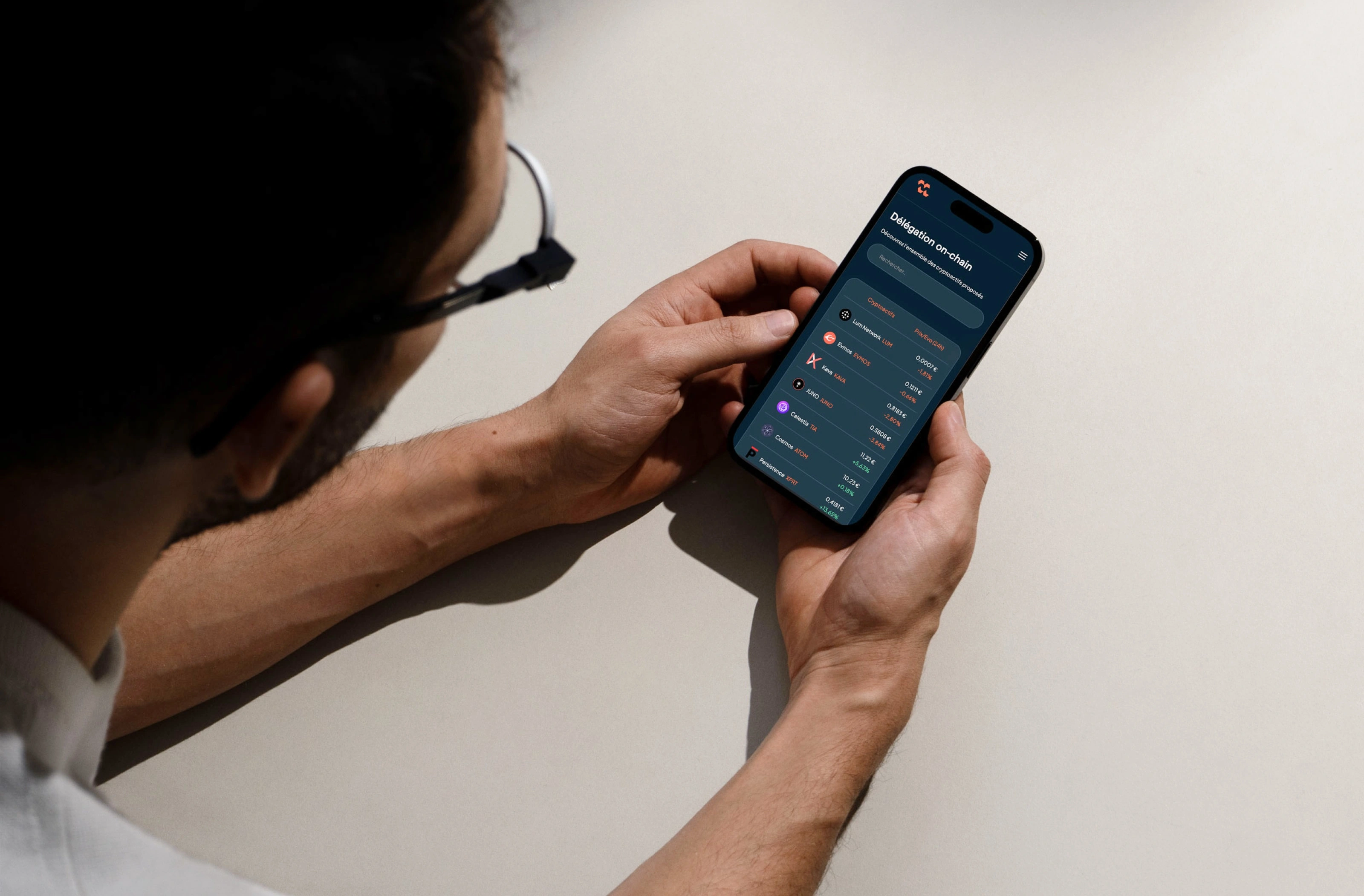
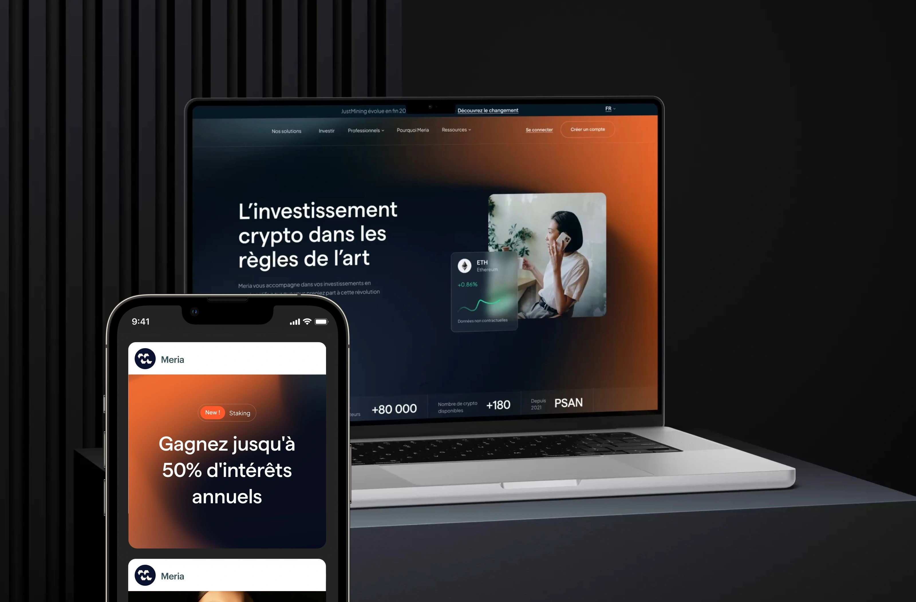
We recently underwent a rebranding, transitioning Justmining into Meria. Expand our services and adapt to the current trends in the blockchain and cryptocurrenc