Inner Canvas

Preeti Sharma


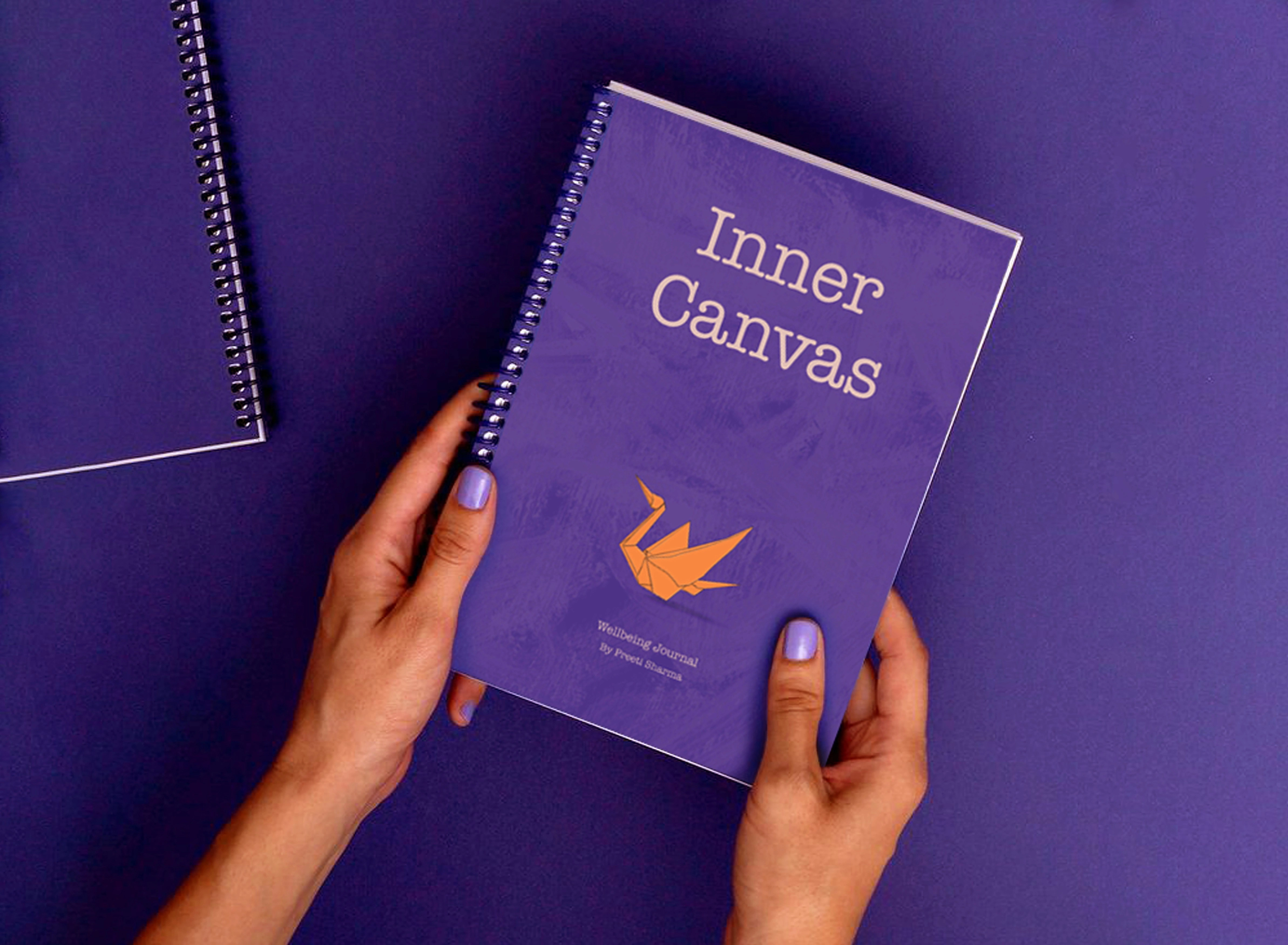
Inner Canvas
An exploration of creative journalling practices
problem
Mental health and wellbeing have become increasingly important global issues, with young people being most affected by stress, anxiety, and emotional challenges. These issues are also reflected in Asian communities in Aotearoa New Zealand, as studies indicate that young Asians can be at increased risk of depression while facing barriers to accessing mental health support. In most Asian societies, discussions about mental health are perceived as a personal or sensitive matter, which can discourage people from expressing their feelings and struggles. As a result, there is a growing need for alternative methods that support emotional reflection in a way that is safe, personal, and culturally sensitive.
solution
Inner Canvas is driven by a desire to understand how creative practices like drawing and visual storytelling can play a meaningful role in supporting the wellbeing of young Asians (aged 18 to 28) in Aotearoa New Zealand. Instead of presenting mental health through a clinical or problem-focused perspective, I want to explore how creative prompts, visual metaphors, and culturally resonant design elements can encourage self-reflection. Creative practices like journalling, drawing and visual expression have been widely identified as accessible tools for self-reflection and emotional expression. These practices allow people to engage with their thoughts and feelings, and help build awareness of their emotions.
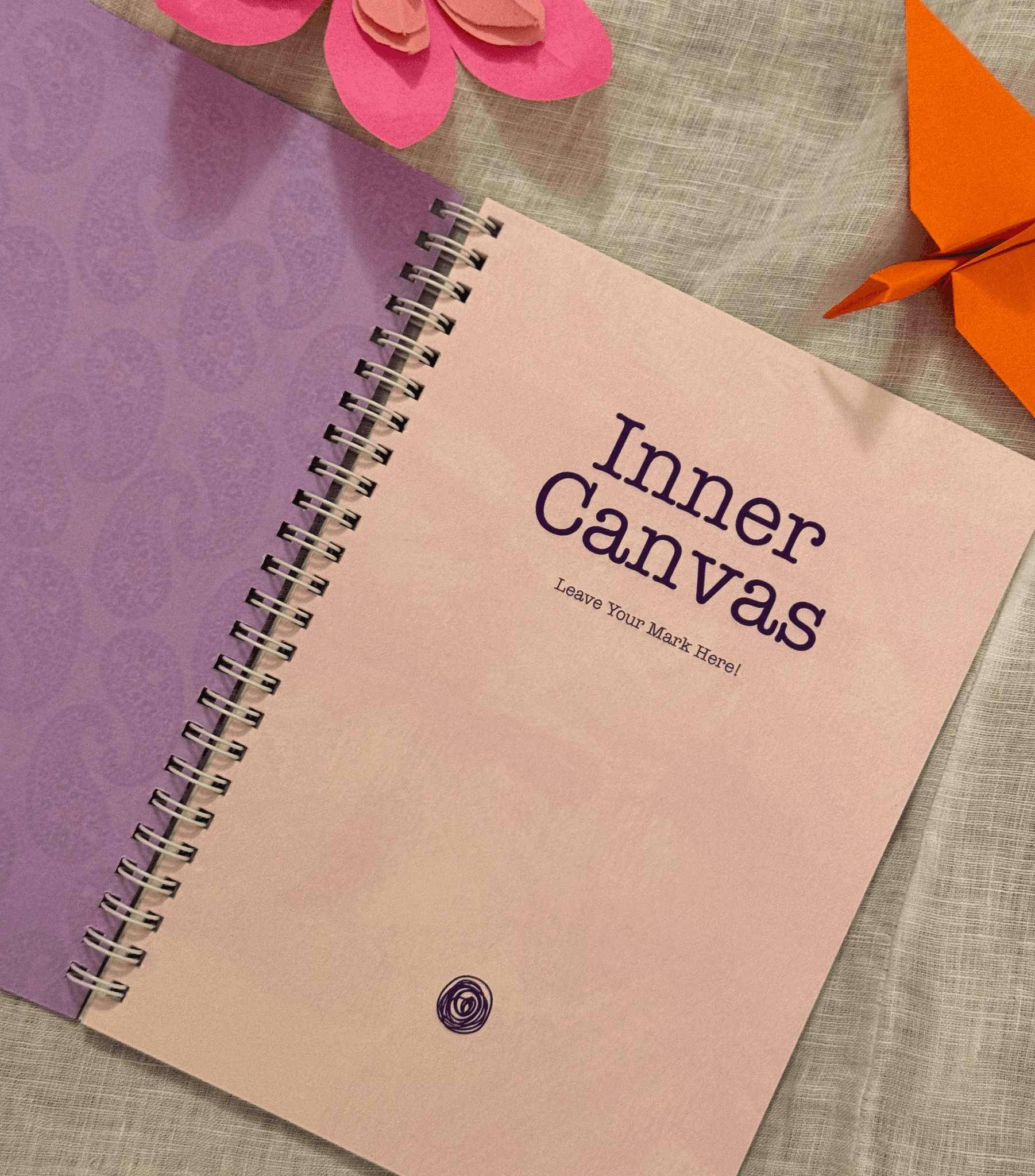
Being an immigrant and a designer searching for my cultural identity and belonging in Aotearoa New Zealand, Inner Canvas is informed by both personal experience and academic research. That positionality shaped the way I approached the research, with curiosity, empathy and a desire to listen to the communities this work was meant to serve. I have designed an interactive journal that provides young people with a safe journalling space to explore their emotions and take proactive steps to reduce negative thoughts. To create a visual journalling space that feels familiar, meaningful and emotionally safe, I have focused on Asian visual language through drawing on nature-based symbolism, patterns, and motifs across Asian cultural traditions
This led to the following research question: How might human-centred design and culturally sensitive visual communication be used to enhance creative journalling experiences to support the wellbeing of young Asians in Aotearoa New Zealand?
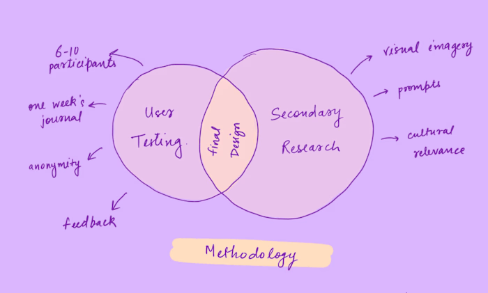
The framework is informed by human-centred design, social design, design psychology, and trauma-informed design, which focus on empathy, cultural sensitivity, and emotional experience. The journal was tested with 11 participants from the target audience with ethical considerations, who engaged with the visuals, prompts and activities for a week and gave feedback about their experience. I have also interviewed two Asian mental health professionals and had peer reviews. While the overall feedback was highly positive, I also recieved constructive suggestions.
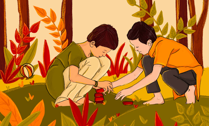
Throughout the development process, I was trying to make the journal more engaging and relatable for Asian users. In my visual journey, I consistently reflected on cultural sensitivity, approachability, clarity of visuals and layout, the relationship between prompts and their corresponding illustrations, accessible language, and overall practicality. I kept visual components to a minimum so that the user could add their own drawings, writing and thoughts without feeling restricted by the design. This approach reduces pressure and reinforces the idea that there are no ‘right’ or ‘wrong’ responses. I have embedded metaphors throughout the visual language through elements like blossoms, flowing water, bowls of ramen, and light imagery. The prompts focus on ‘what is strong’ rather than ‘what is wrong’, while still recognising the challenges. It fosters resilience, self confidence, and solution-based thinking, while reducing stigma through person-first and empowering language.
“I am not providing a solution, instead this is an attempt towards better wellbeing”
Through culturally sensitive prompts, drawings and visual activities, the aim was to create a gentle space for reflection and emotional expression that drew on the visual richness of Asian traditions and the use of creative practices. From a design perspective, Inner Canvas was a true reminder that empathy and cultural awareness are not optional but the foundation requirement. Designing for a community requires listening, staying humble and the ability to allow the work to be influenced by the community it serves. Looking ahead to expand this project.
year
2026
timeframe
1 Year
tools
Procreate, Indesign
category
Personal Project
01
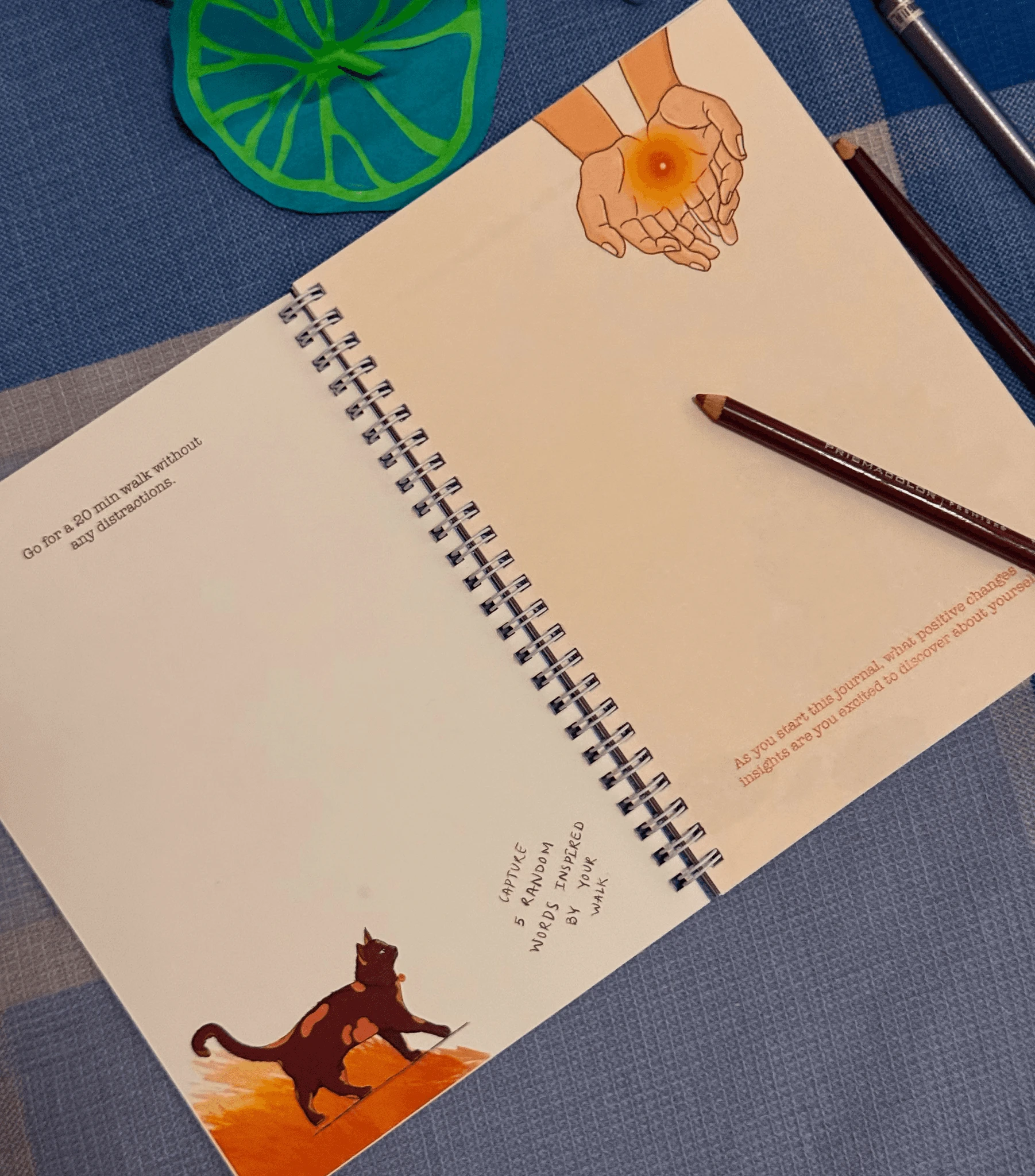
Inner Canvas initial pages
02
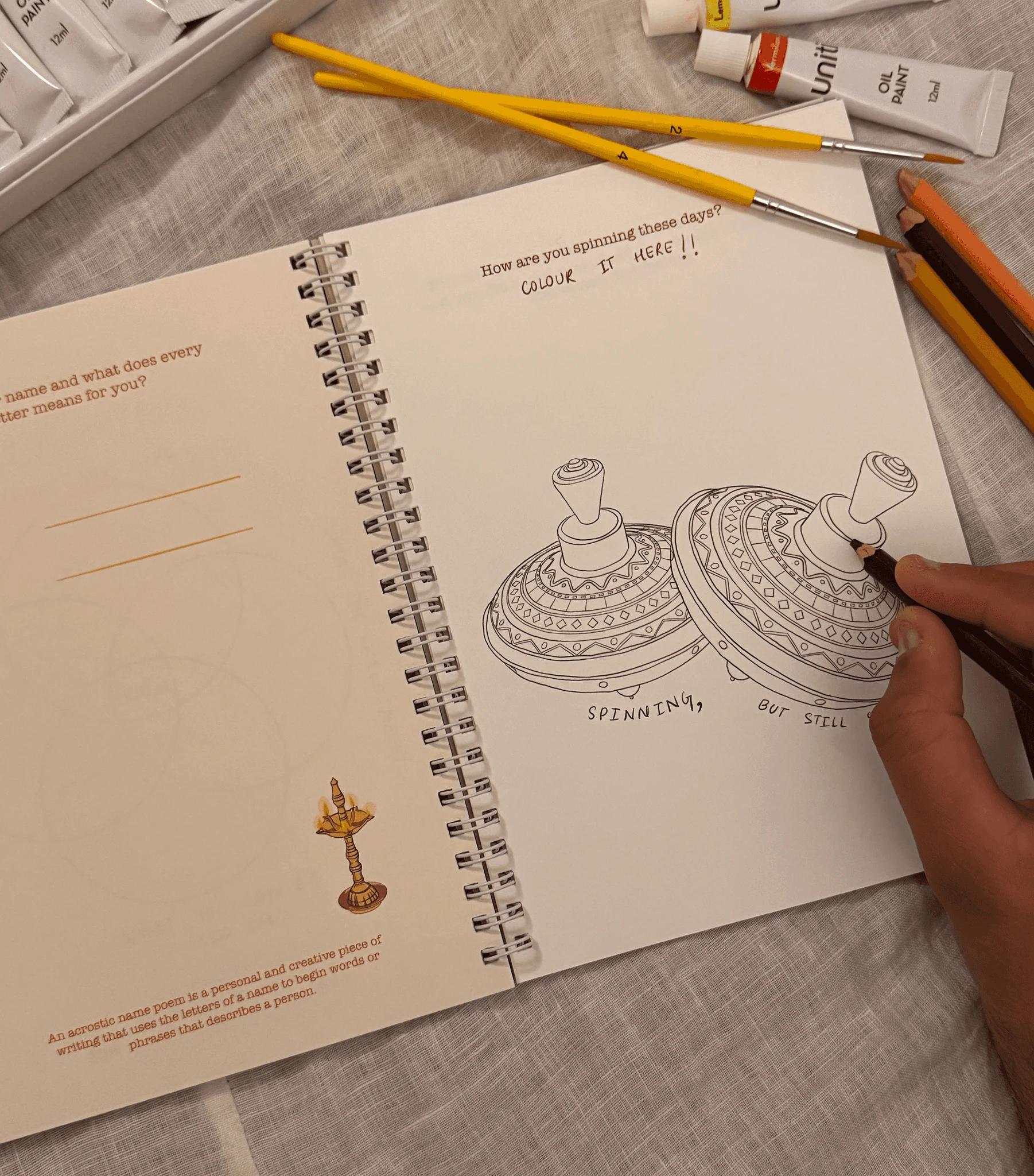
Colouring activities
03
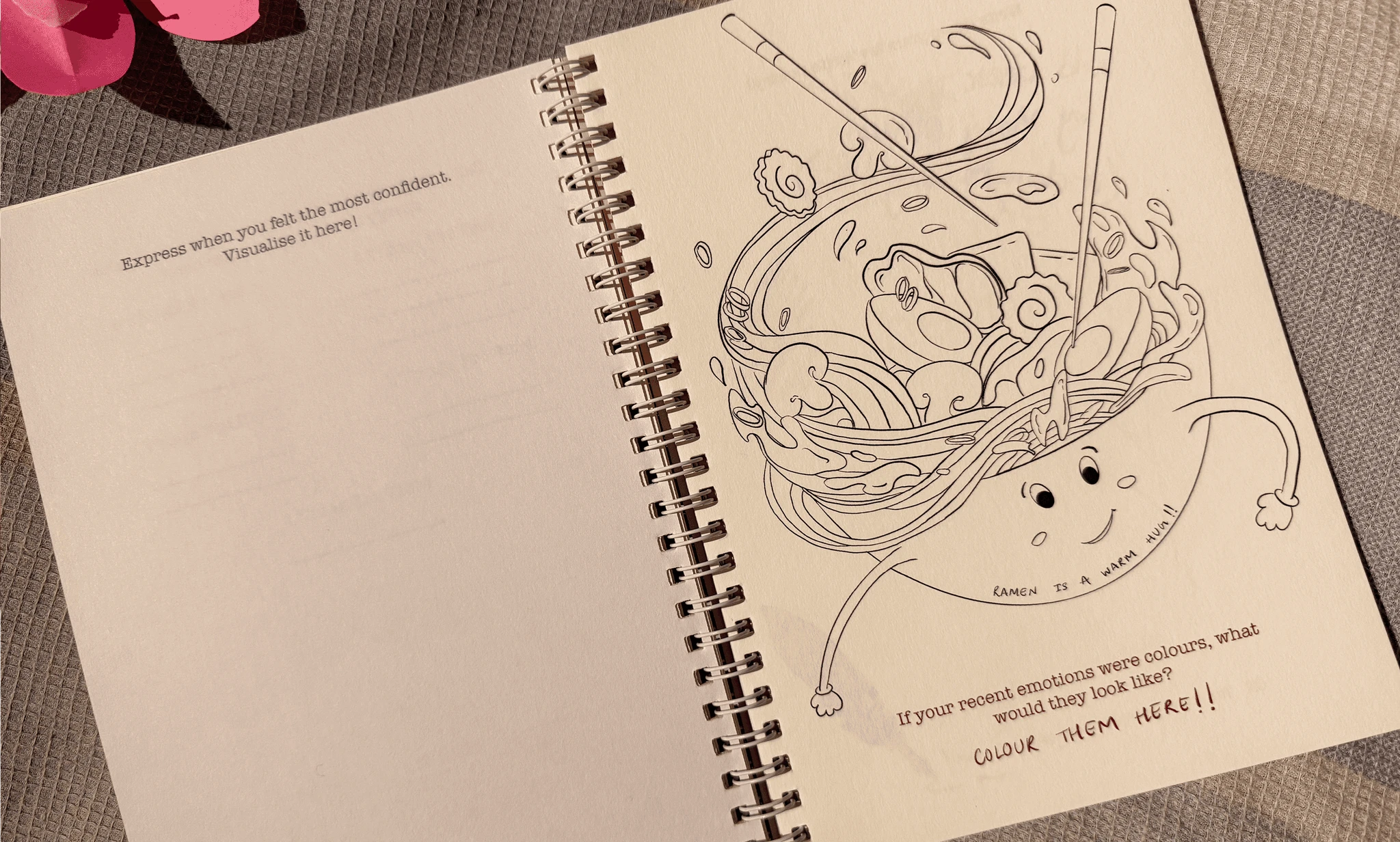
Colouring activities
04
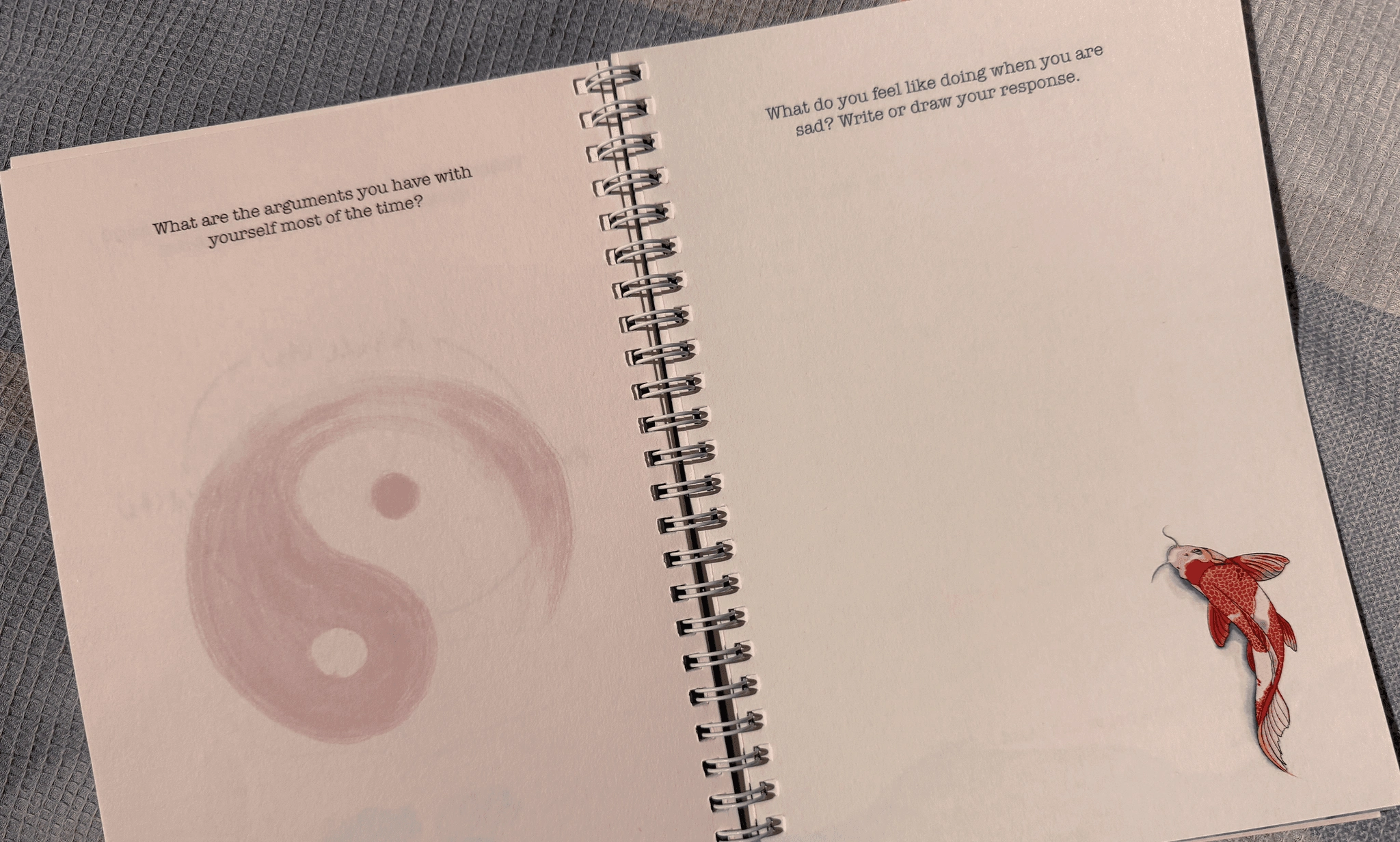
Journal Pages
Like this project
Posted Oct 16, 2026
Research-led creative journalling project exploring culturally sensitive prompts and visuals to support wellbeing for young Asians in Aotearoa NZ.
Likes
0
Views
0