🍌 Habizz
Amelia Rana
Spreading smiles, one bite at a time!
Embodies "Habizz" commitment to bring joy through snack experience.
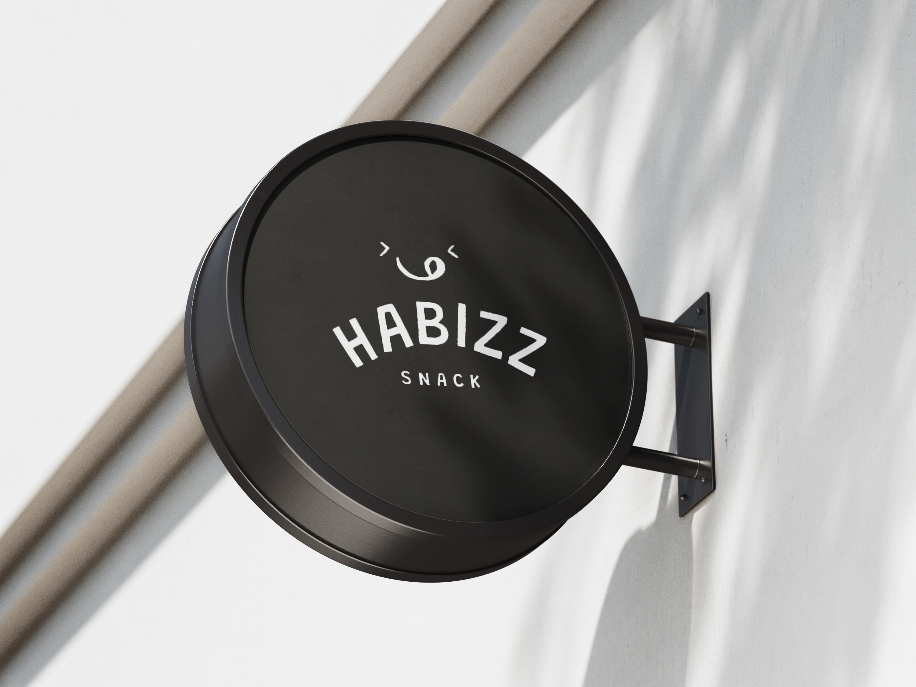
Our design identity begins with our logo—a playful and inviting mark that reflects our brand's ethos of happiness and enjoyment. It incorporates vibrant colors and a cheerful iconography that instantly brightens moods and creates a sense of anticipation.
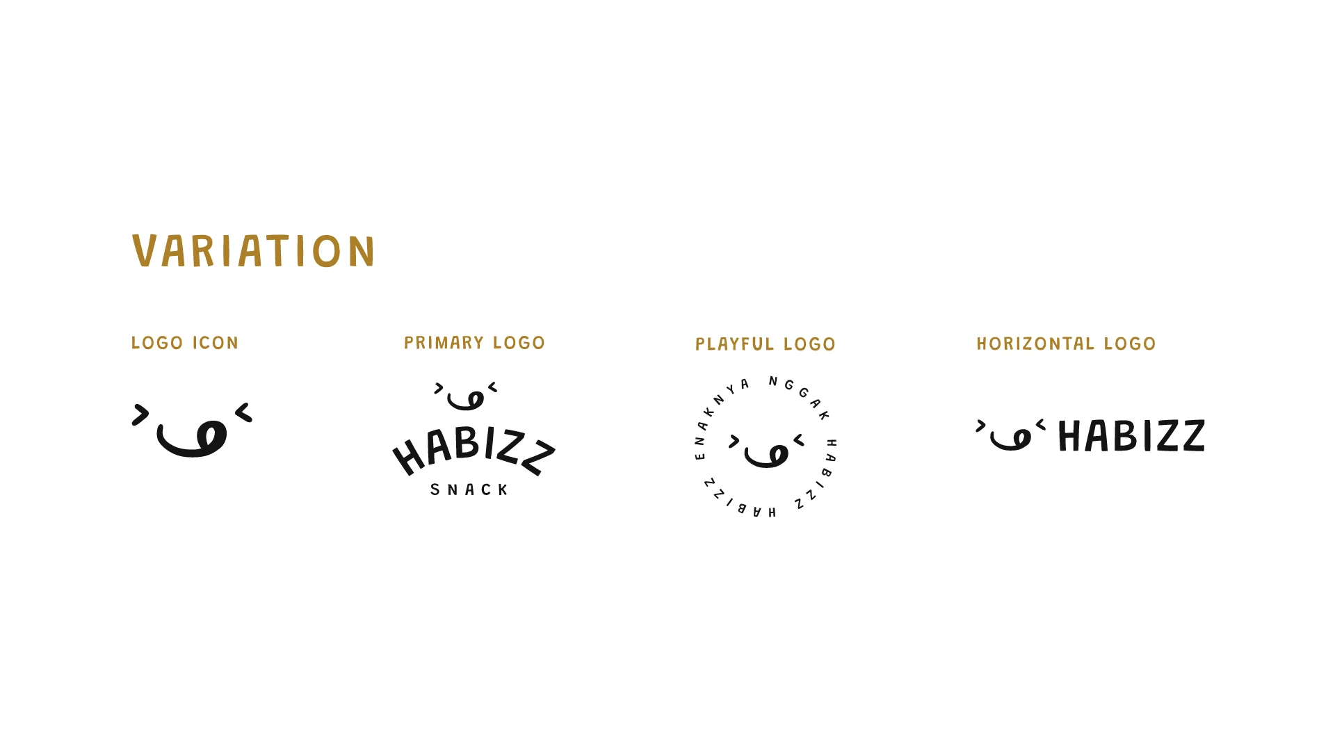
Fun icon and typography plays a key role in conveying this brand's personality.
Bold and customized made fonts not only capture attention but also evoke a sense of playfulness and excitement. Each letter is crafted to reflect the energetic and joyful spirit of the snacks, ensuring that every interaction with brand is a delightful experience.
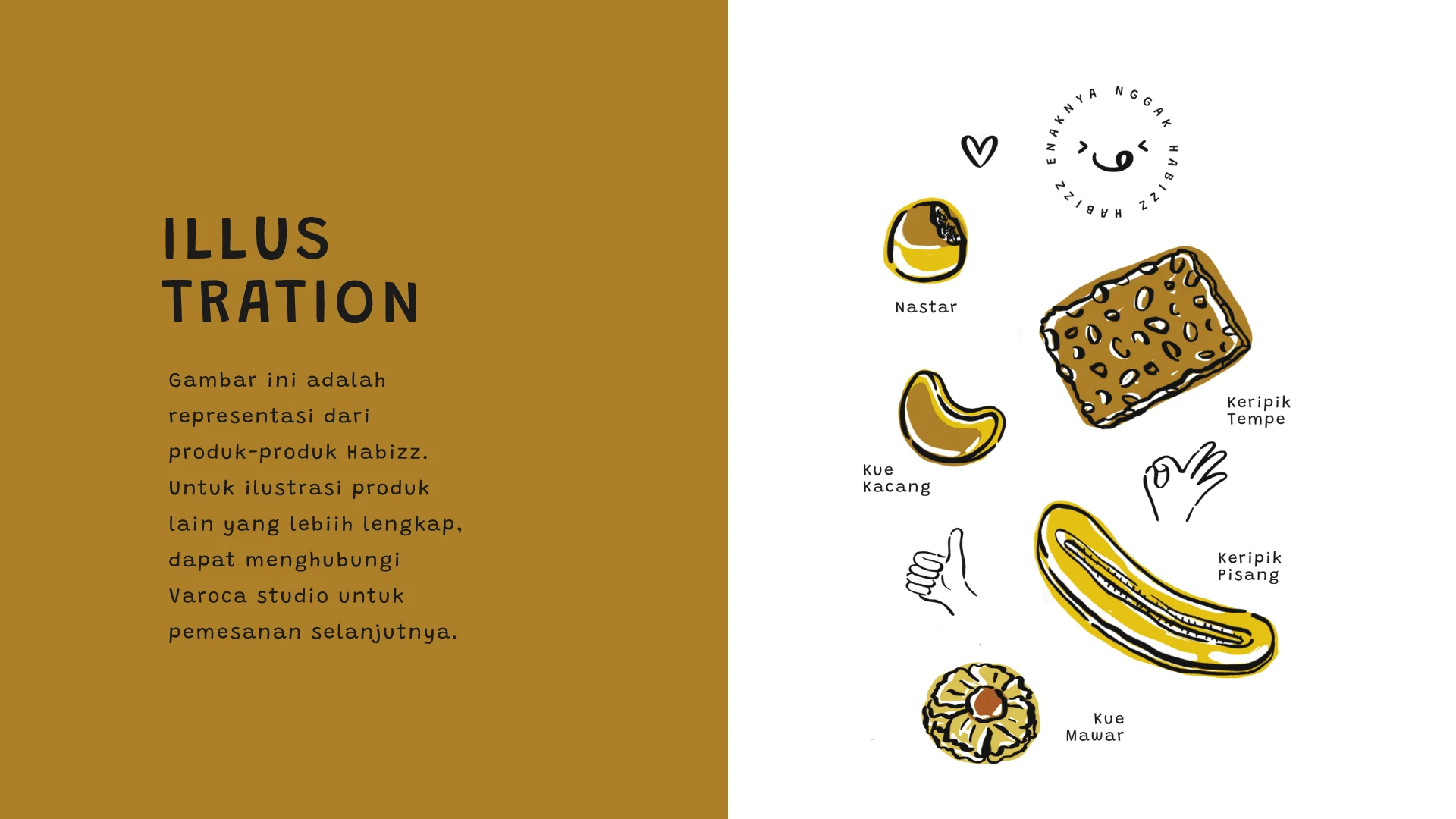
It's a vibrant expression of our brand's cheerful spirit. Each illustration is carefully crafted to complement our playful identity, adding personal touch and charm to our packaging and marketing materials
👀
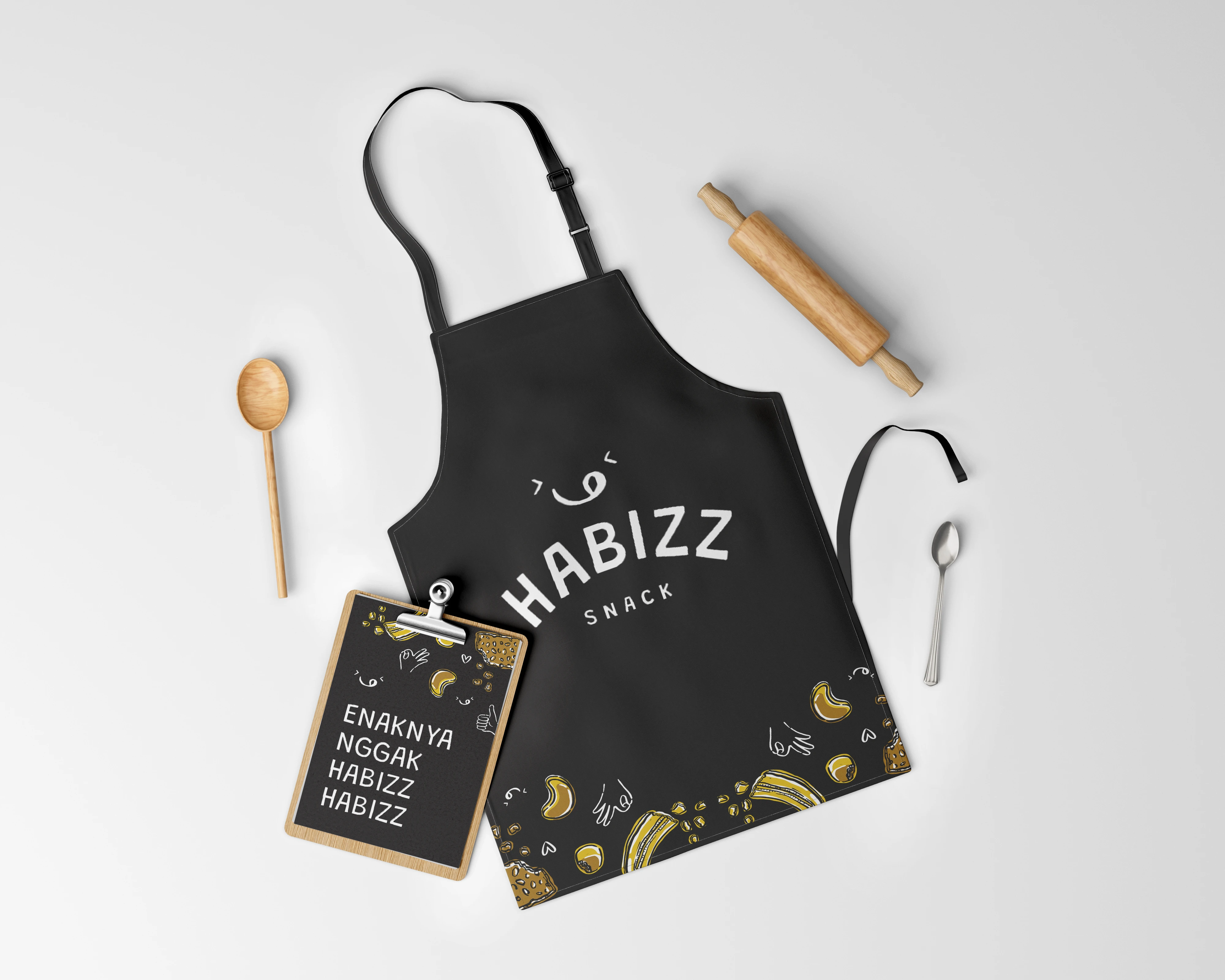
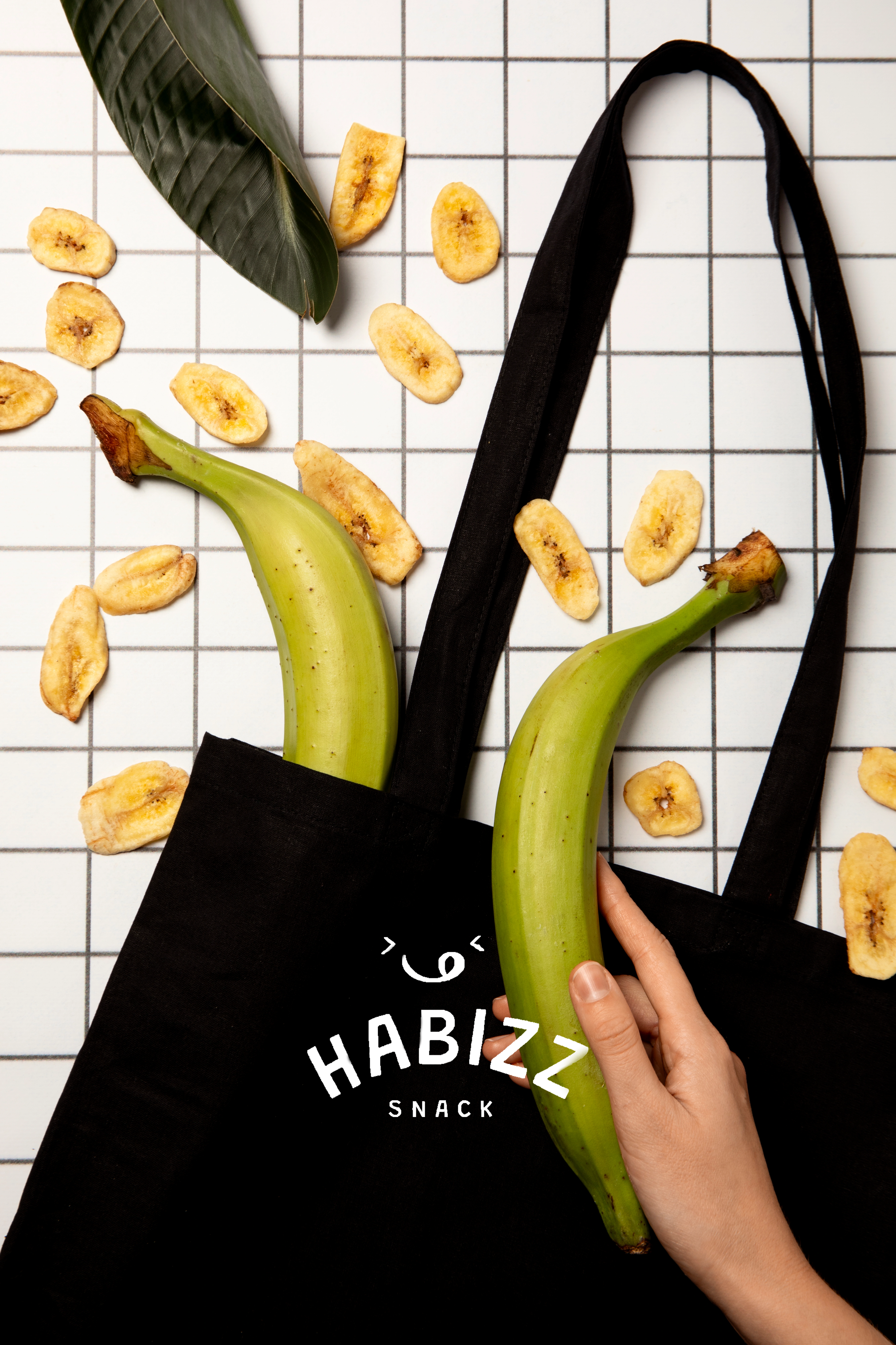
Look at this fun yet professional look at the apron!
PACKAGING! ✨
Each package is thoughtfully designed to not only protect the freshness of our snacks but also to communicate our brand story. From eye-catching graphics to witty taglines, our packaging invites customers to indulge in a moment of happiness with each bite.
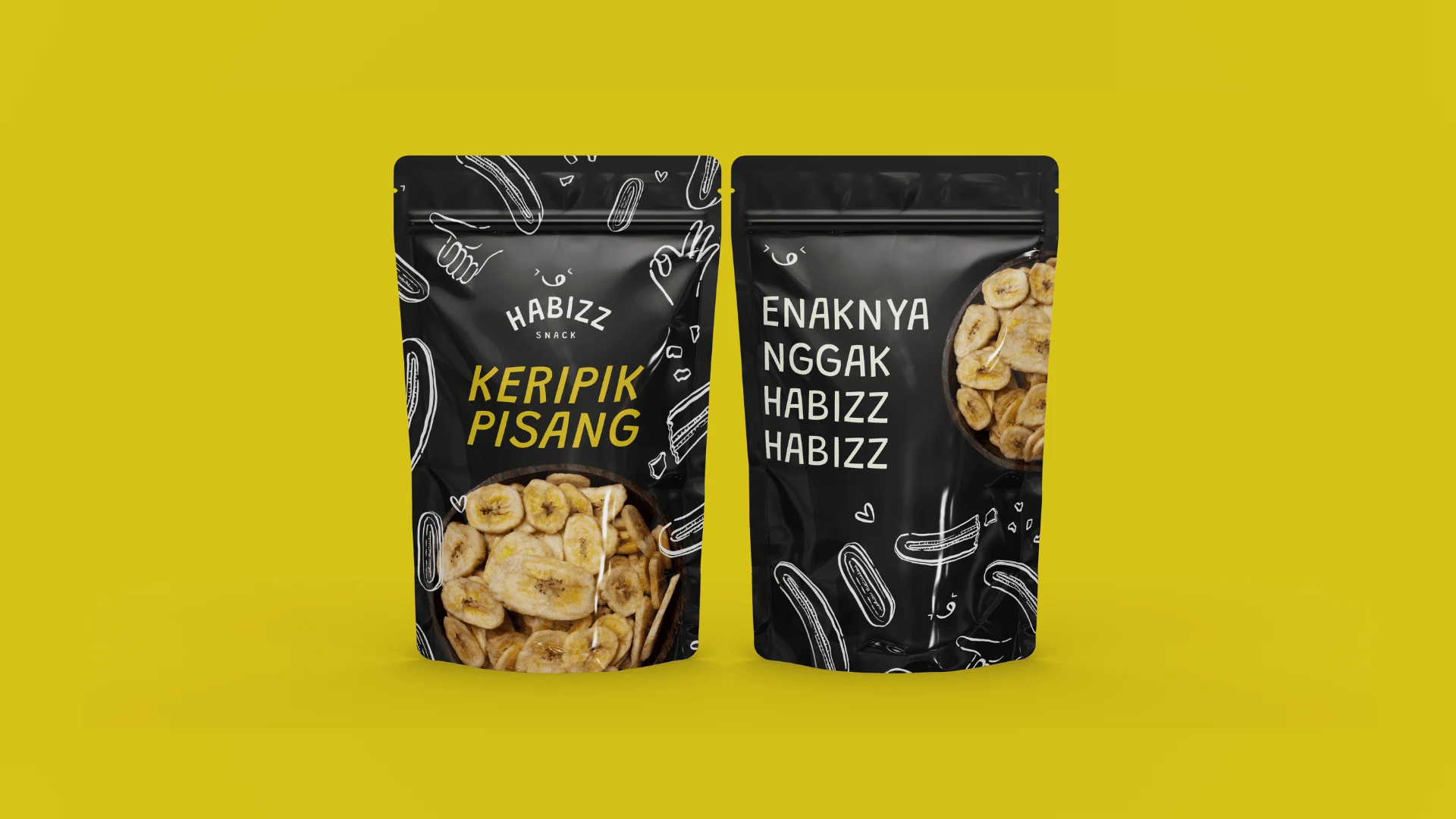
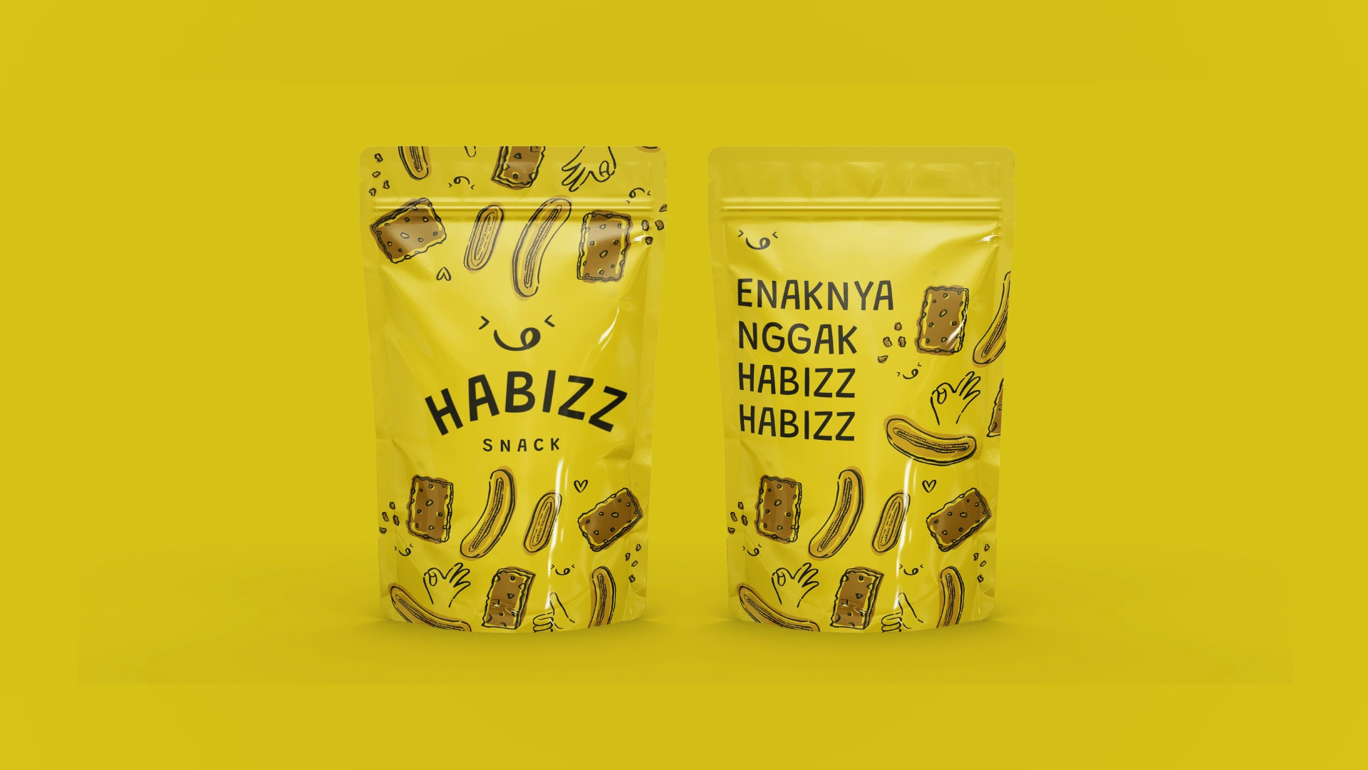
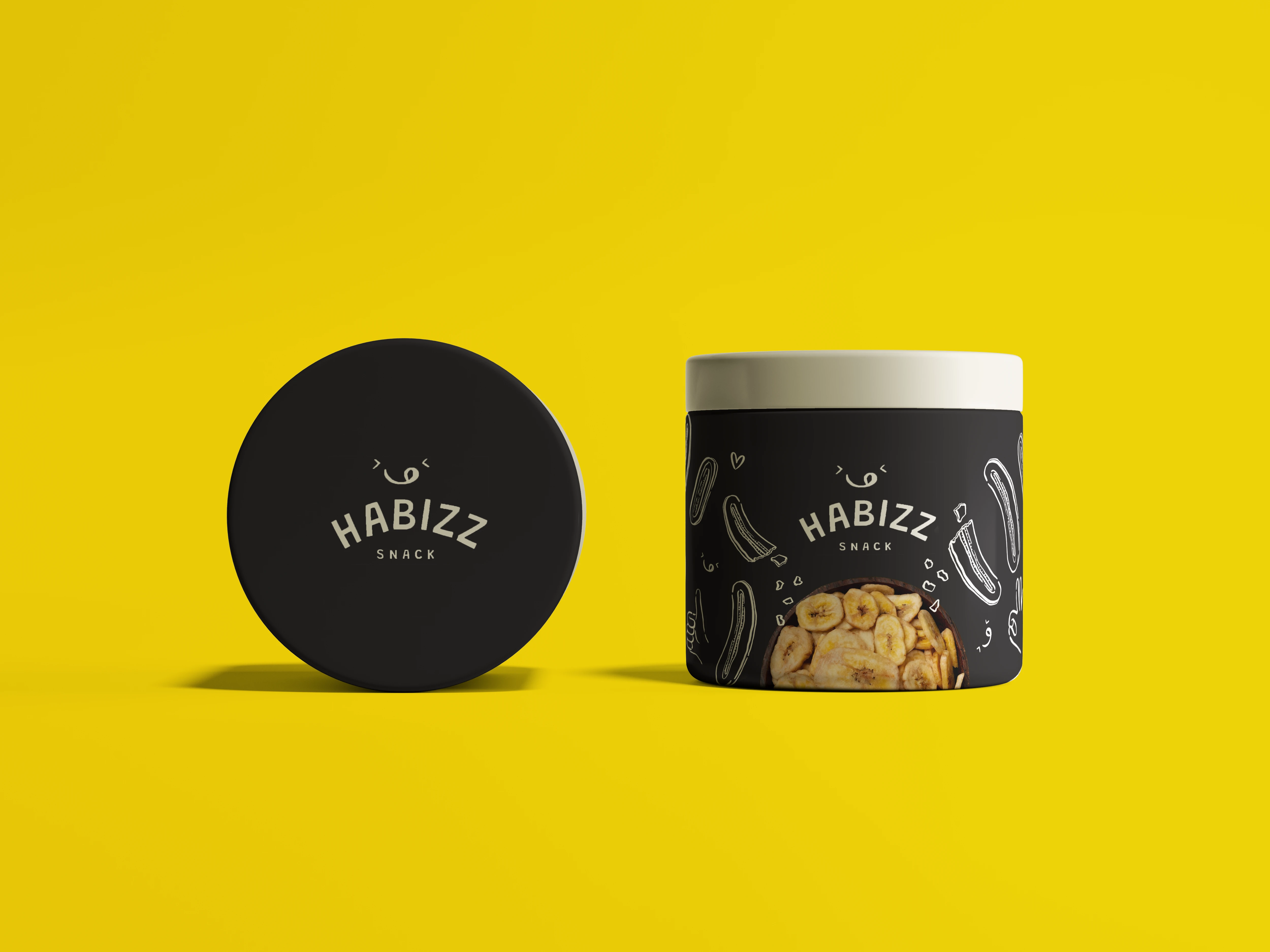
Our design isn't just about looking good; it's about making you feel good. With vibrant color, playful font, and charming illustration, we're dedicated to delivering joy and spreading smiles. With Habizz we're about turning snack time into a delightful, one bite at a time.
🍌
Like this project
Posted Jul 10, 2024
Experience the joy of Habizz through our fun, creative packaging. Our designs are made to spread happiness, one snack at a time.
Likes
0
Views
18
Tags