Tío Gilito - Restaurant Rebranding

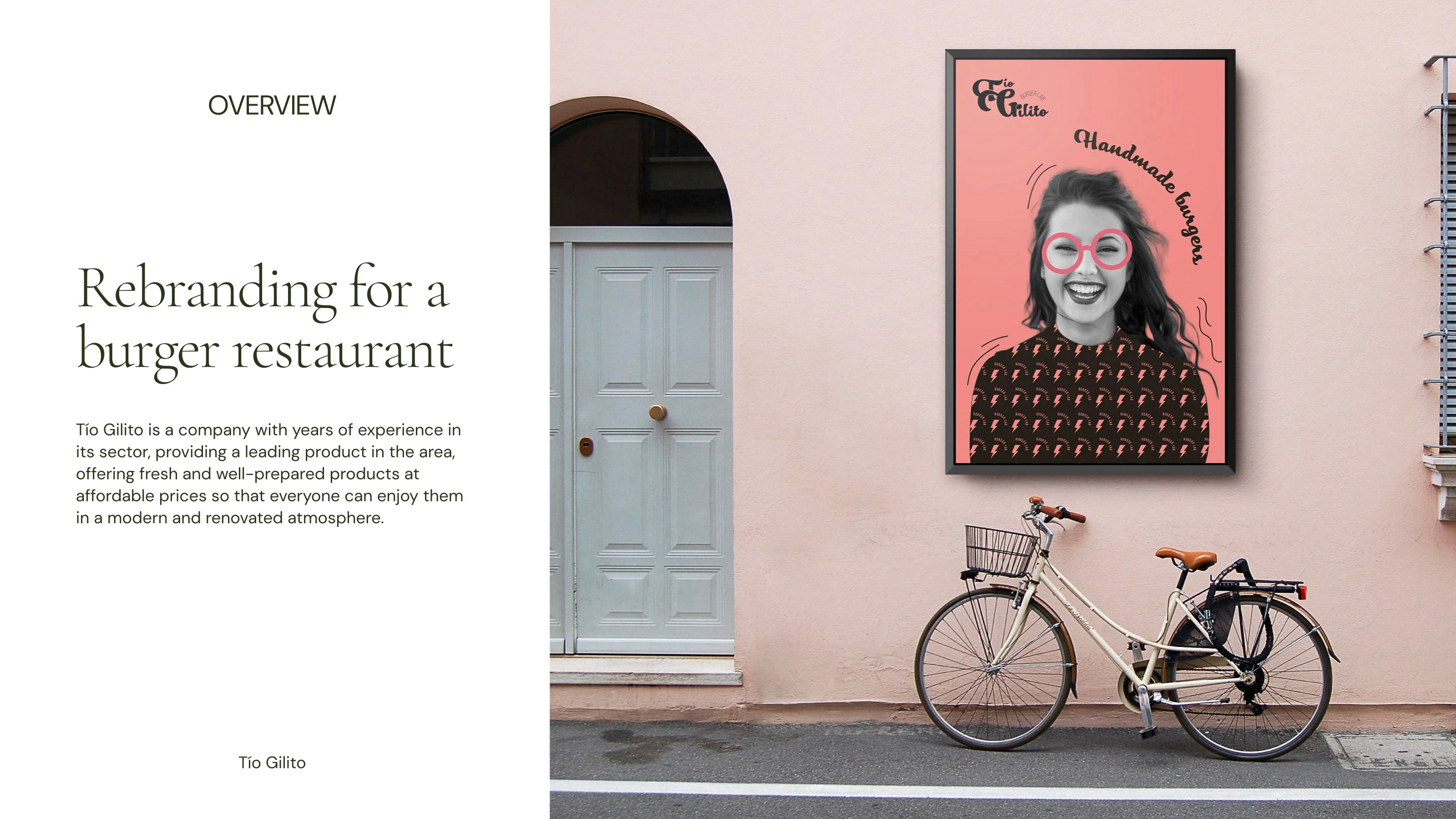
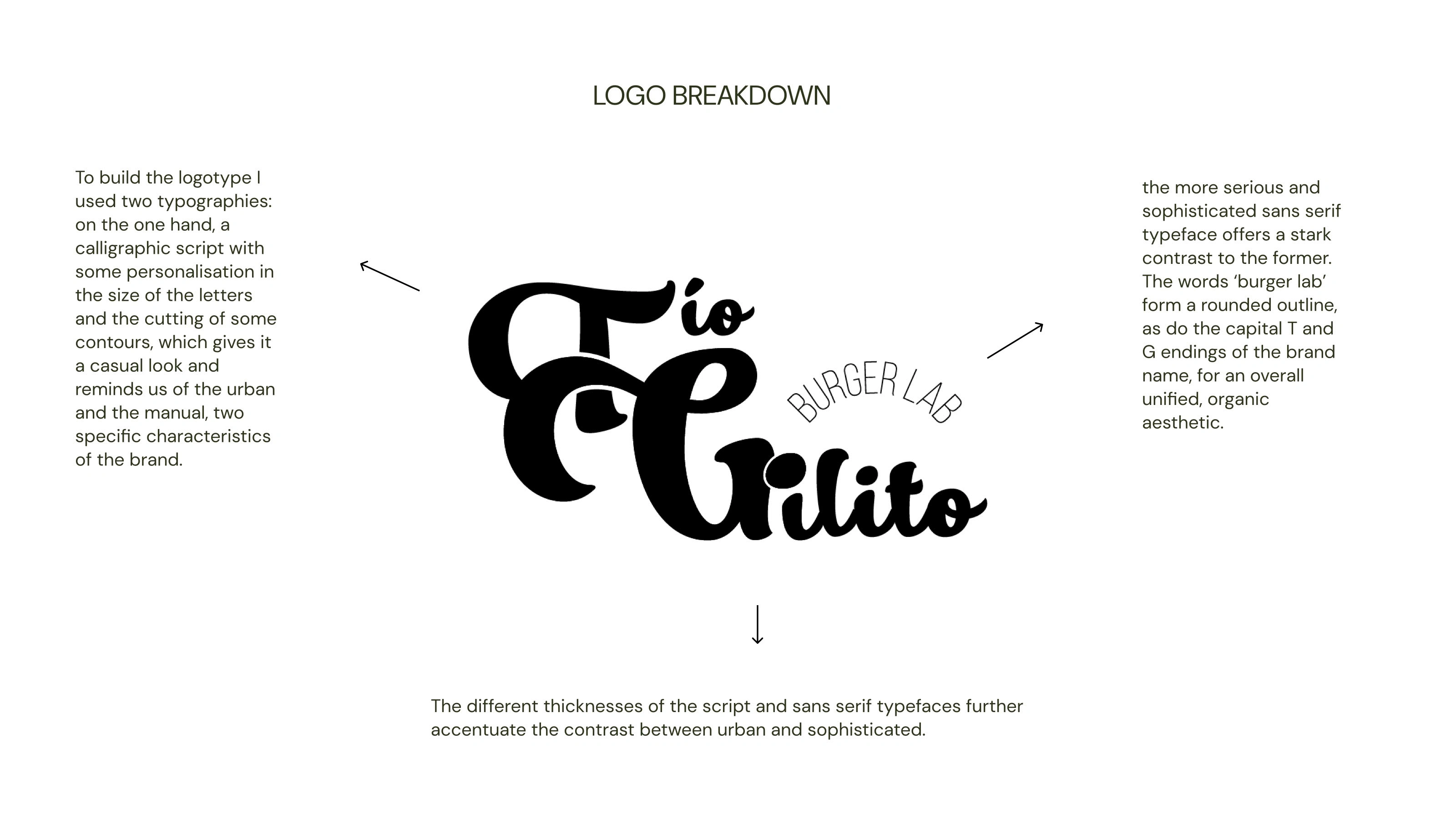
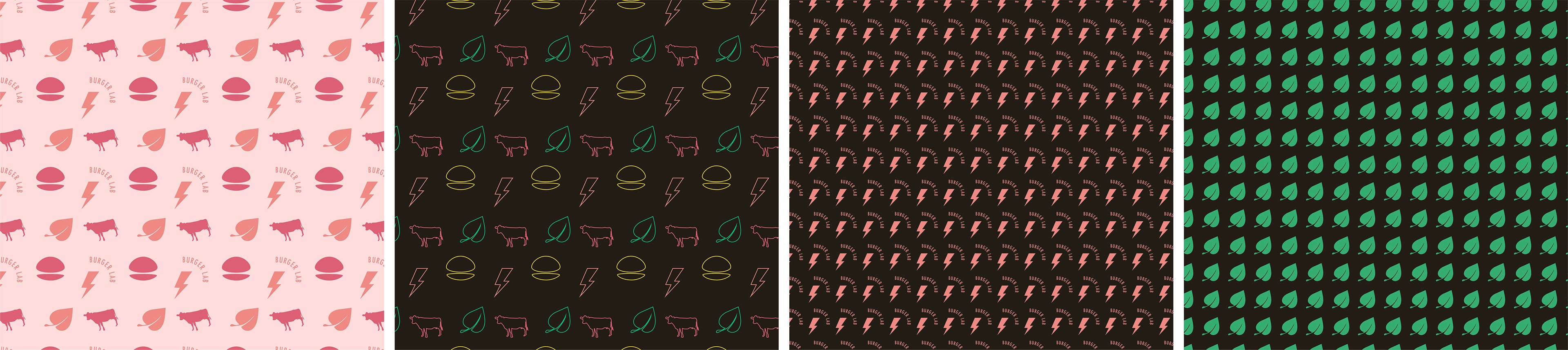
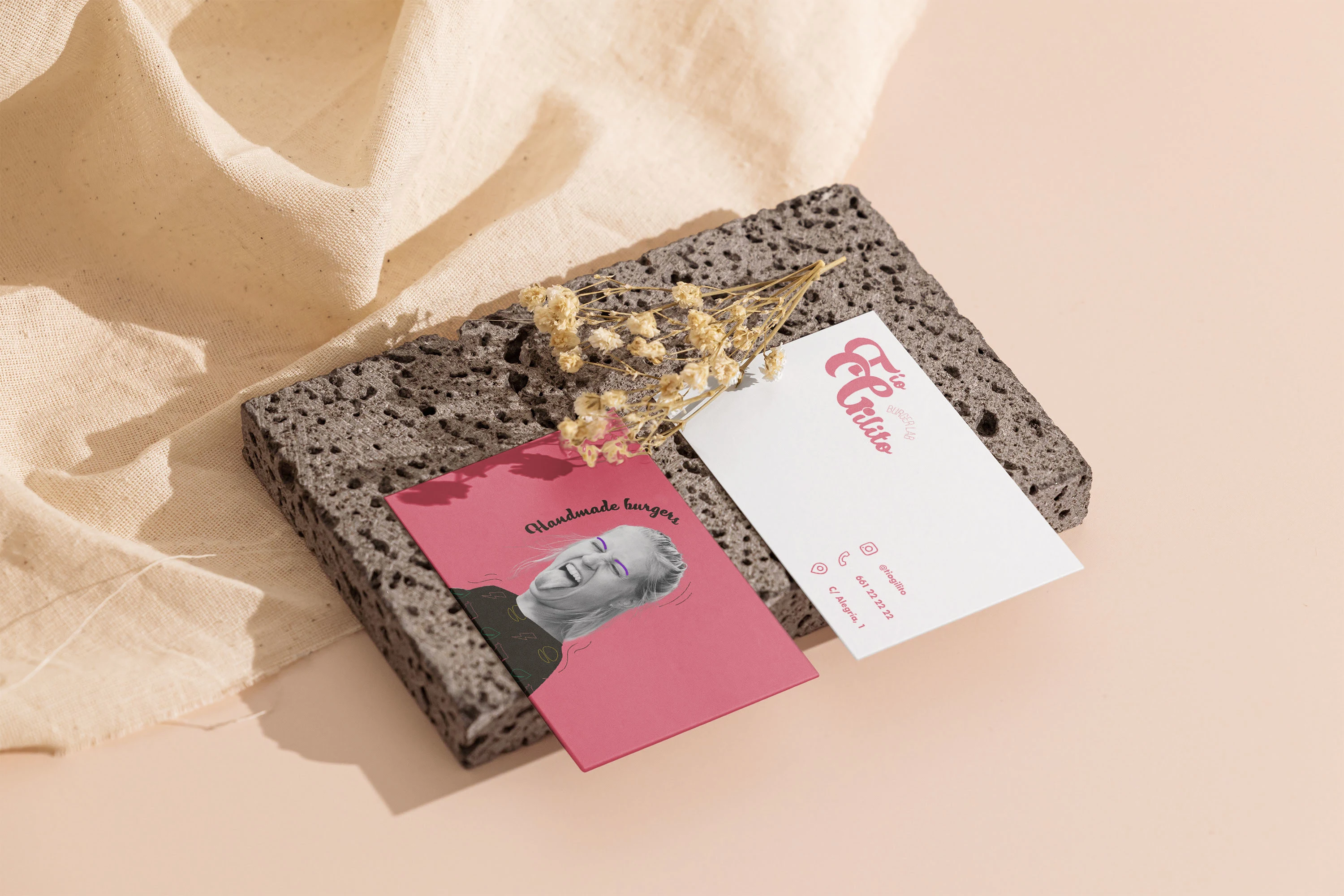
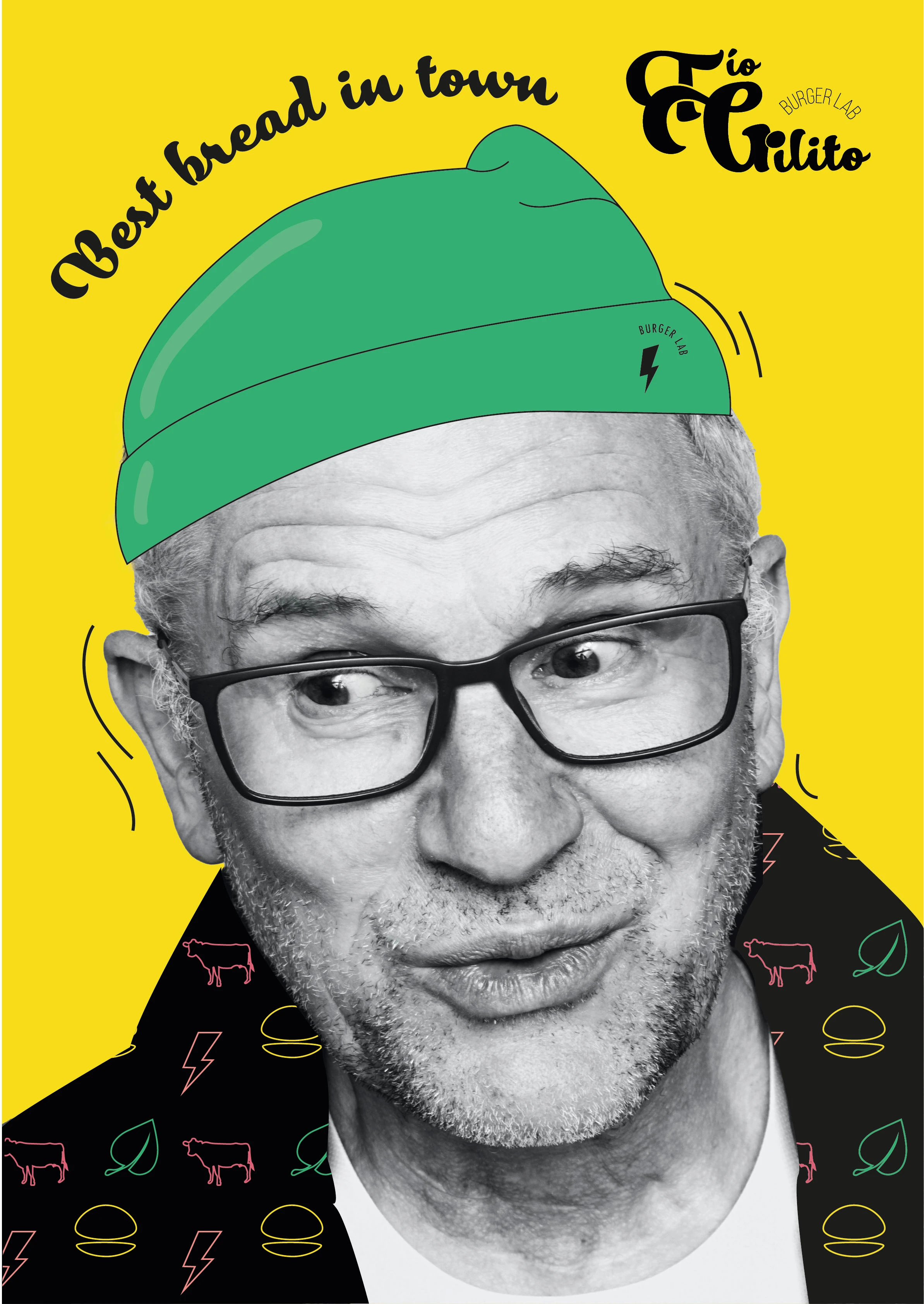
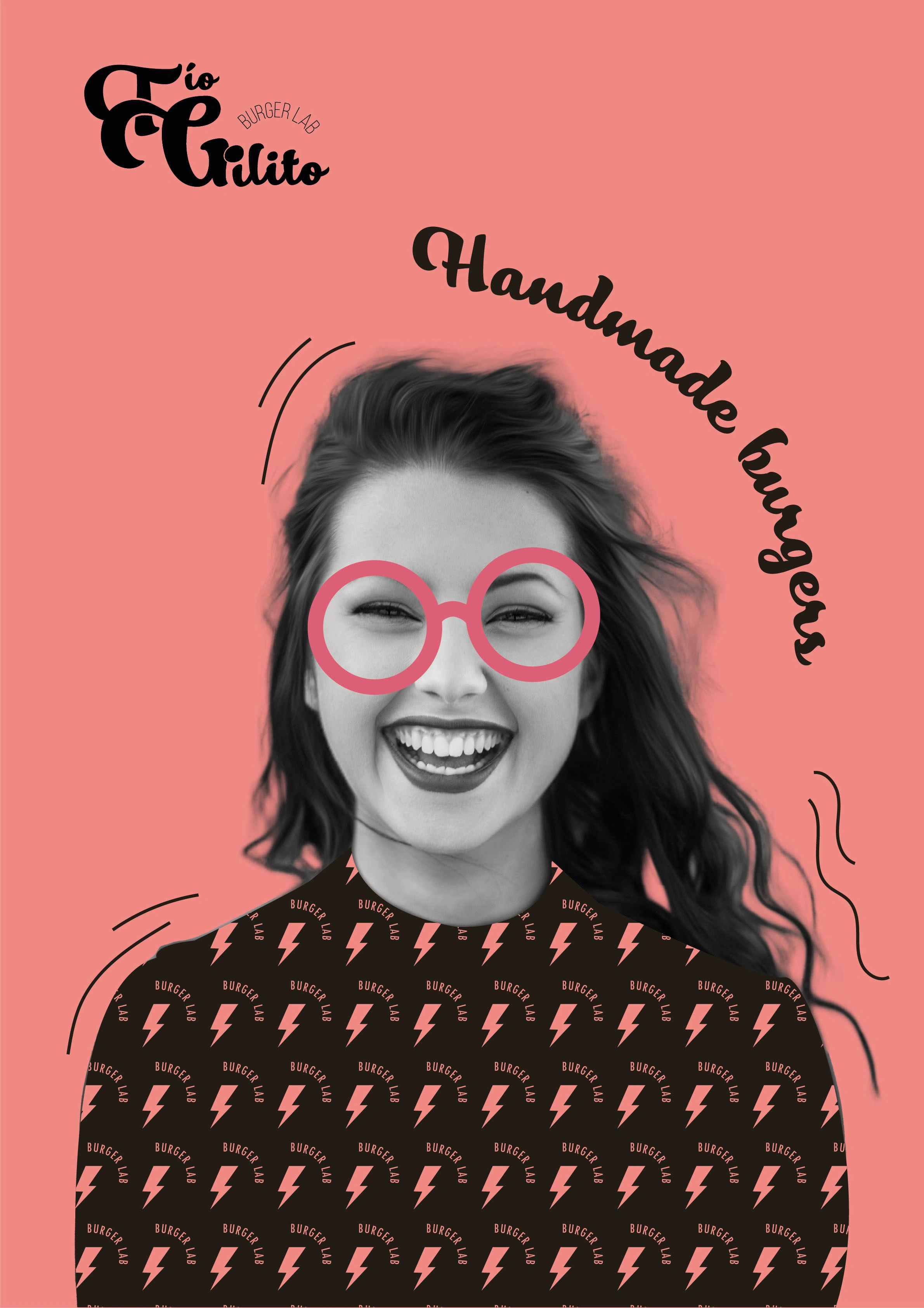
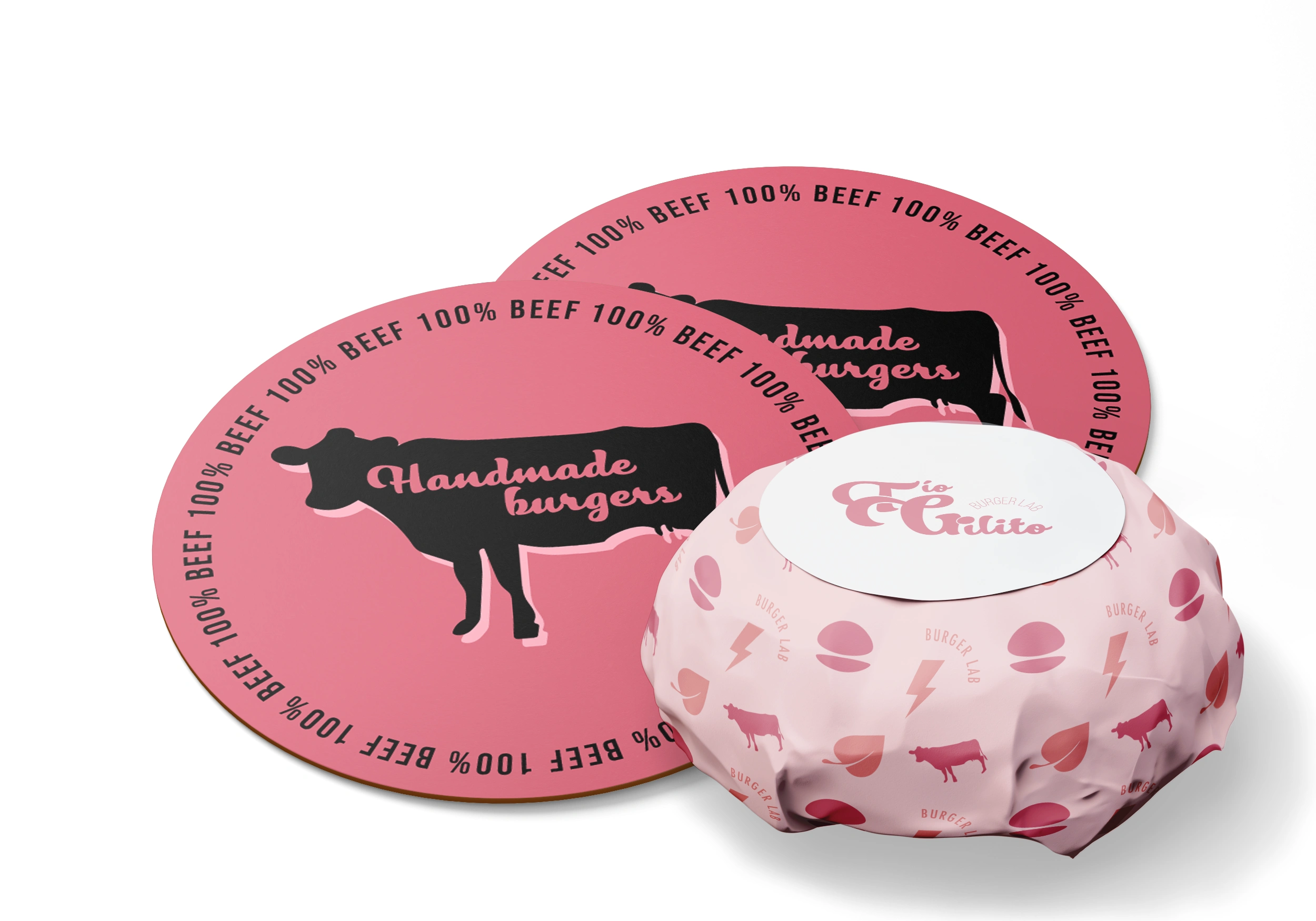
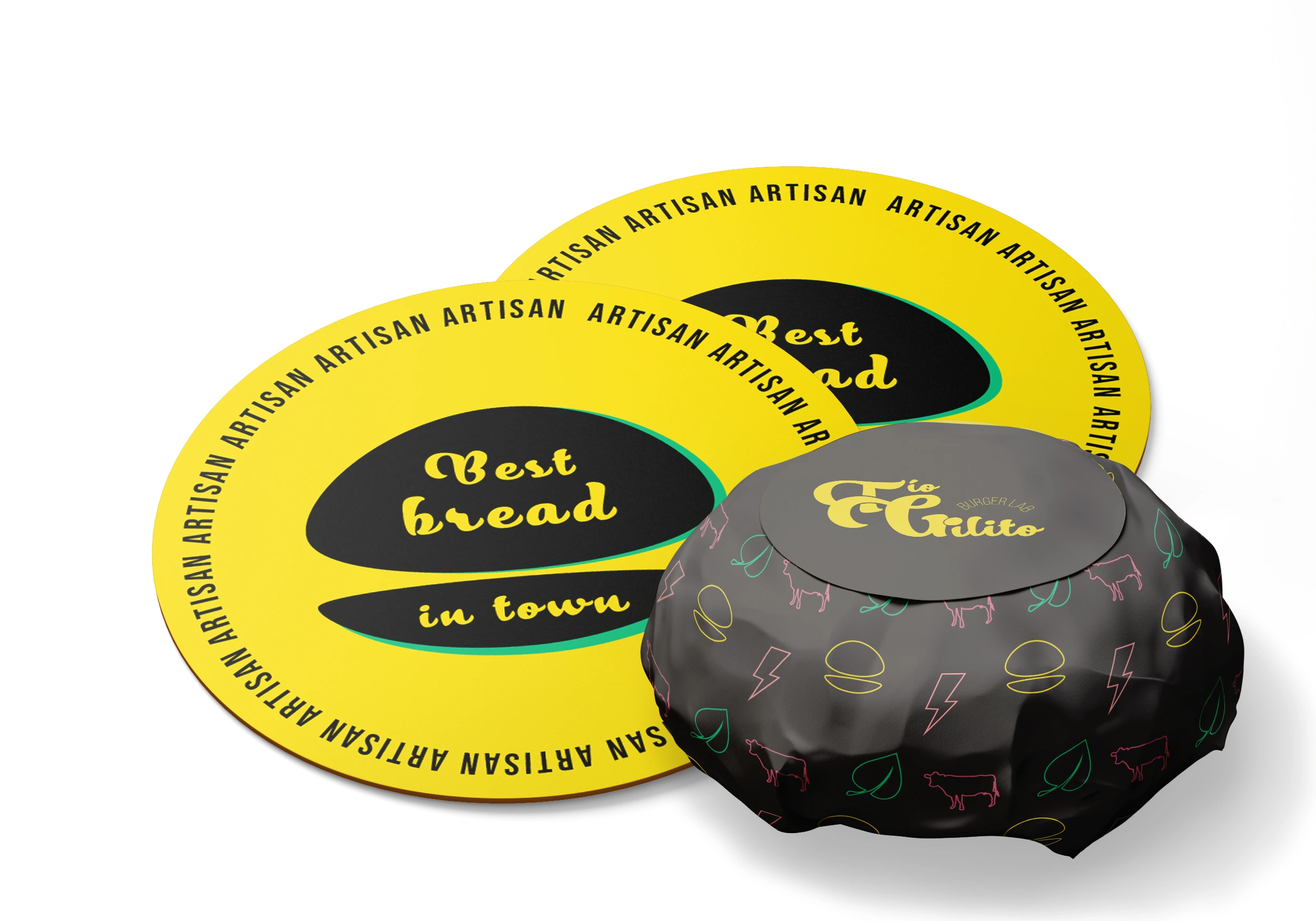
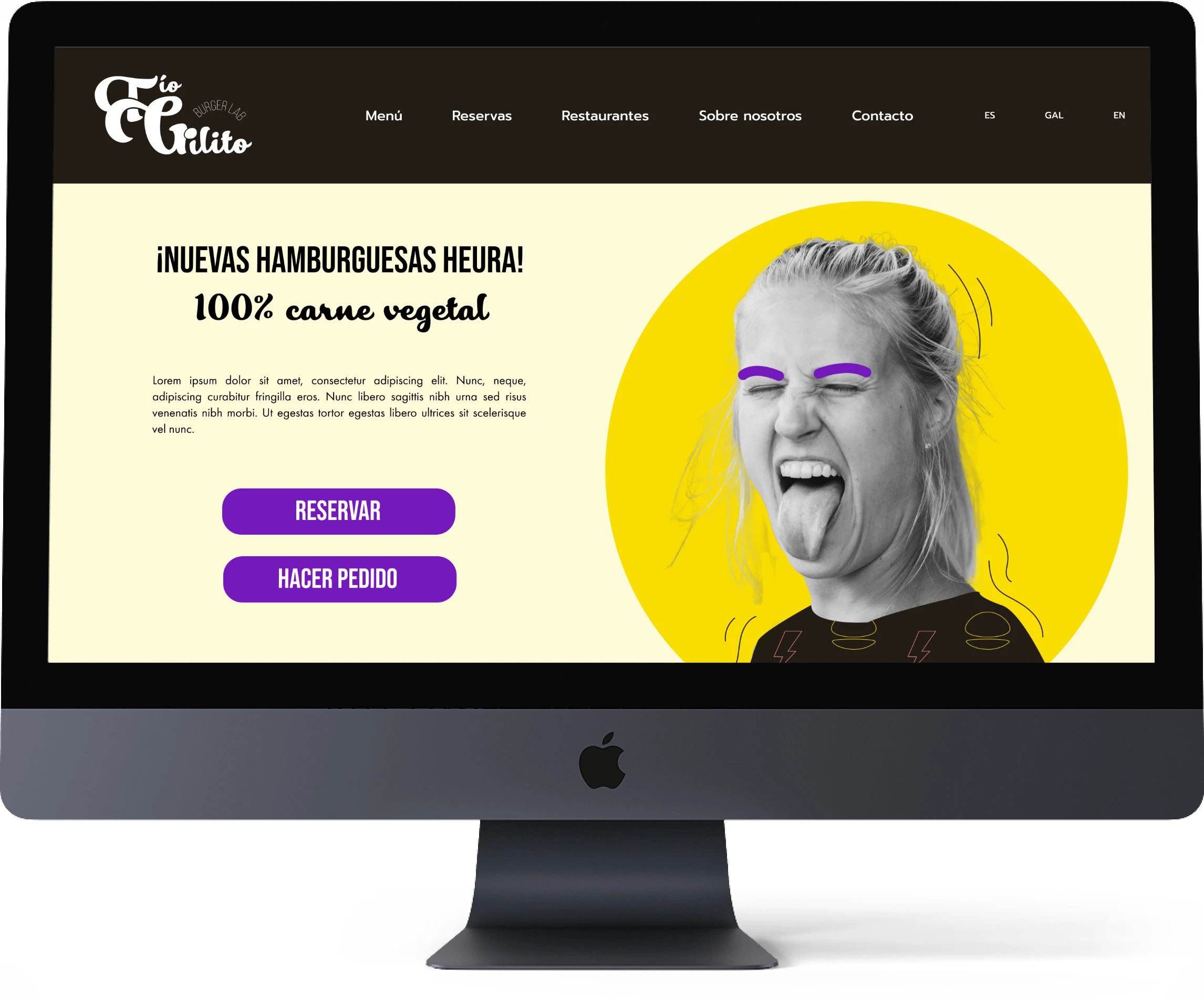
This new image contrasts an urban, youthful and friendly look with the touch of sophistication that the experience offers.

I have chosen this palette with saturated, attractive colours that transmit the dynamism of fast food. The energy, optimism, vitality and closeness that they evoke connect with the age range of our ideal public and contrast with the black and white, typical of the interior design of the restaurant, which provides a touch of elegance and freshness.

I also create a secondary palette, with the same colours as the primary palette but lowering the saturation, which will be used in some cases as a support and complement to the main palette.
0 likes · 6 views · Oct 28, 2024
Graphic Design, Adobe Illustrator, Adobe Photoshop