Rivian
Rivian is an electric car manufacturer based in the United States. Think Tesla, but for large adventure-themed electric utility vehicles. Their business model, akin to Tesla, brings a direct-to-consumer model through an engaging online experience and 'Spaces' (showrooms) dotted around the US.
Potential buyers are able to purchase a Rivian through their website or in one of the Spaces - but for this project, I asked the question: why isn't there a purchasing app from one of the most forward thinking companies? Rivian currently offers a companion app for existing owners that offers vehicle control and supplementary information - but what if the app could be more than that? What if it could offer non-Rivian users a way to learn about and then purchase a vehicle?
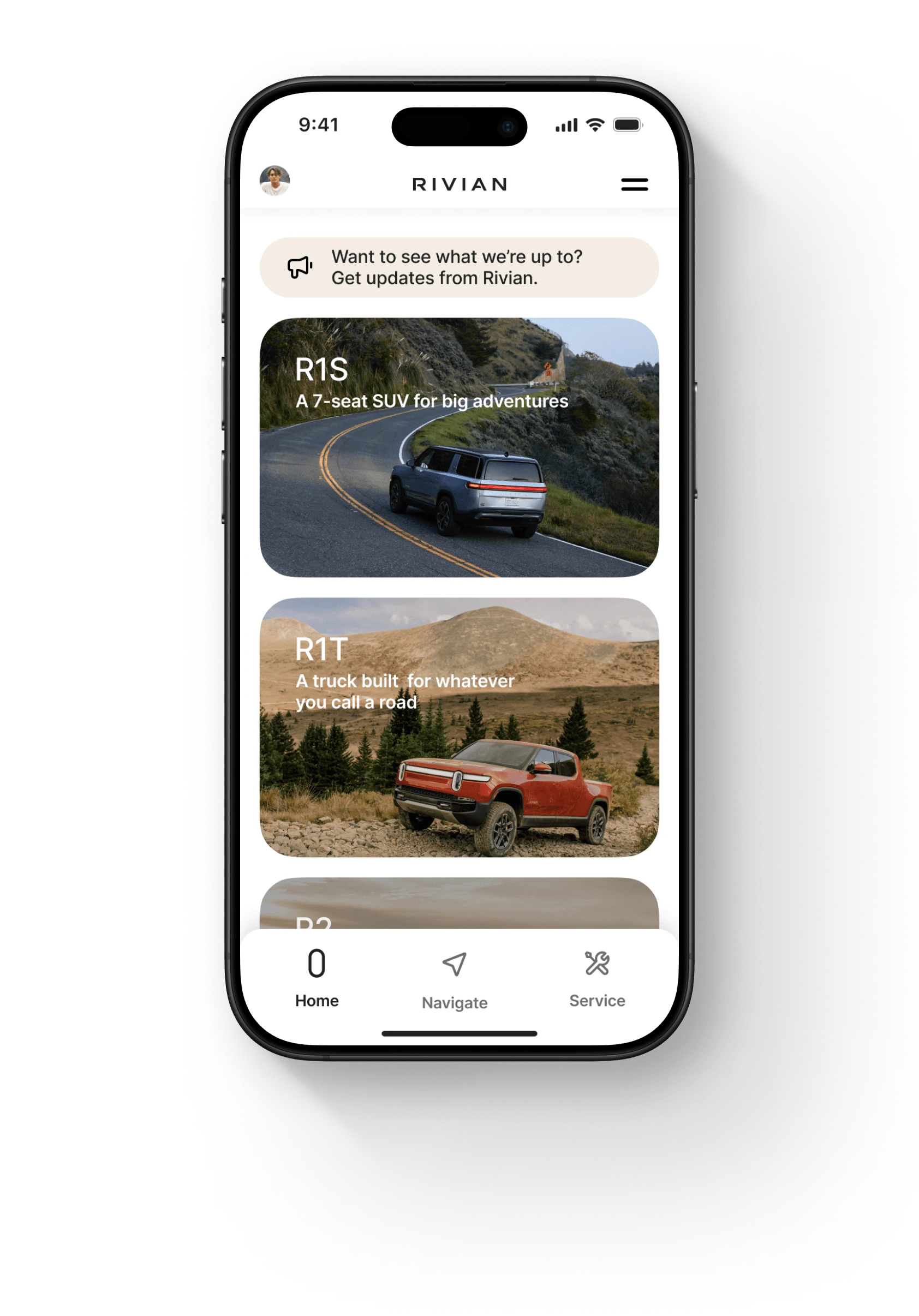
The Home Screen introduces Rivian's lineup with striking visuals. Each vehicle model is showcased with vibrant, full-width cards featuring high-quality imagery. The model name and a highlight invite users to explore further.
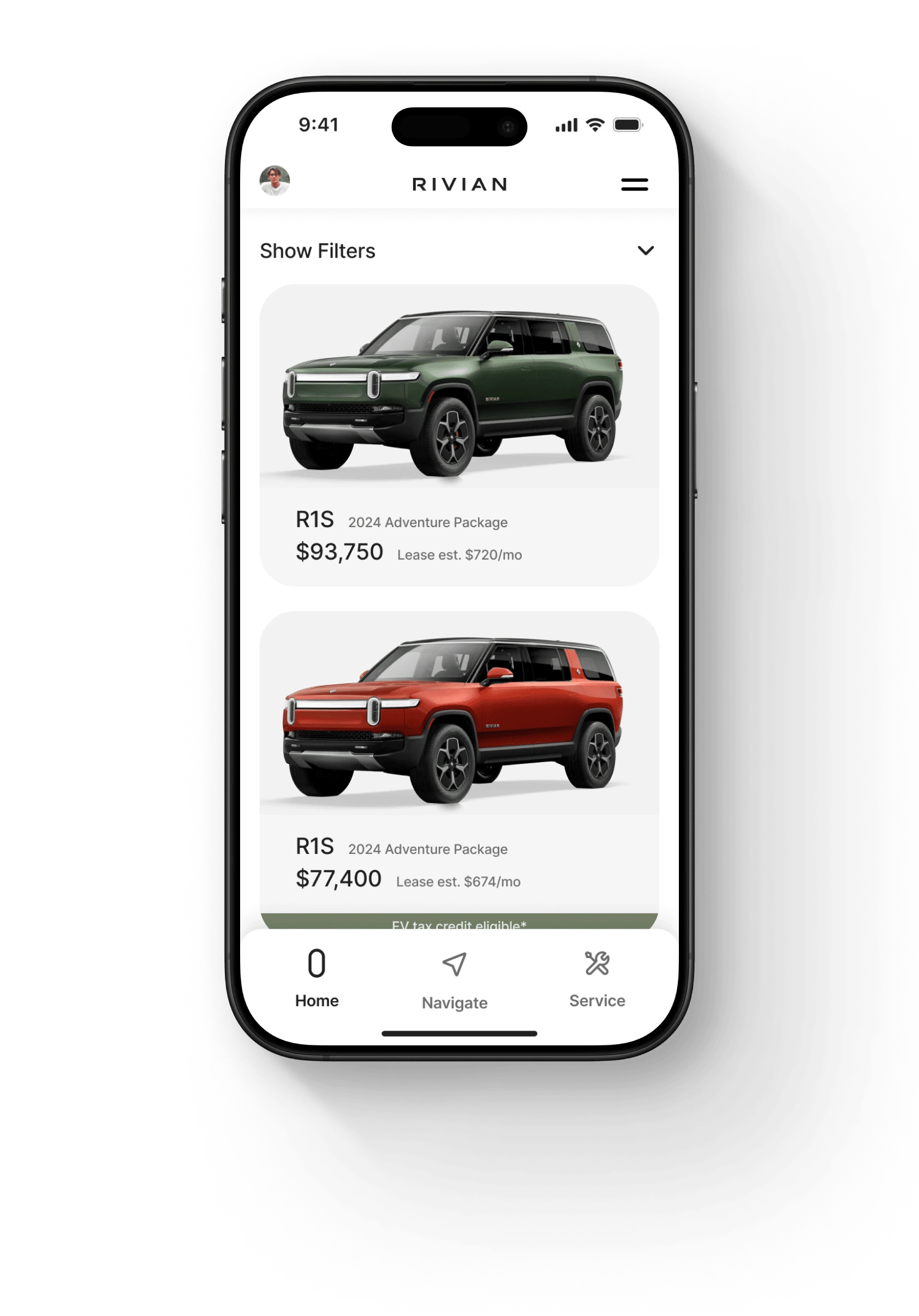
The Inventory Screen lists the available inventory with clean, minimalistic cards. Each card displays a high-resolution vehicle image against a white background, along with key details such as model year, price, and monthly lease options.
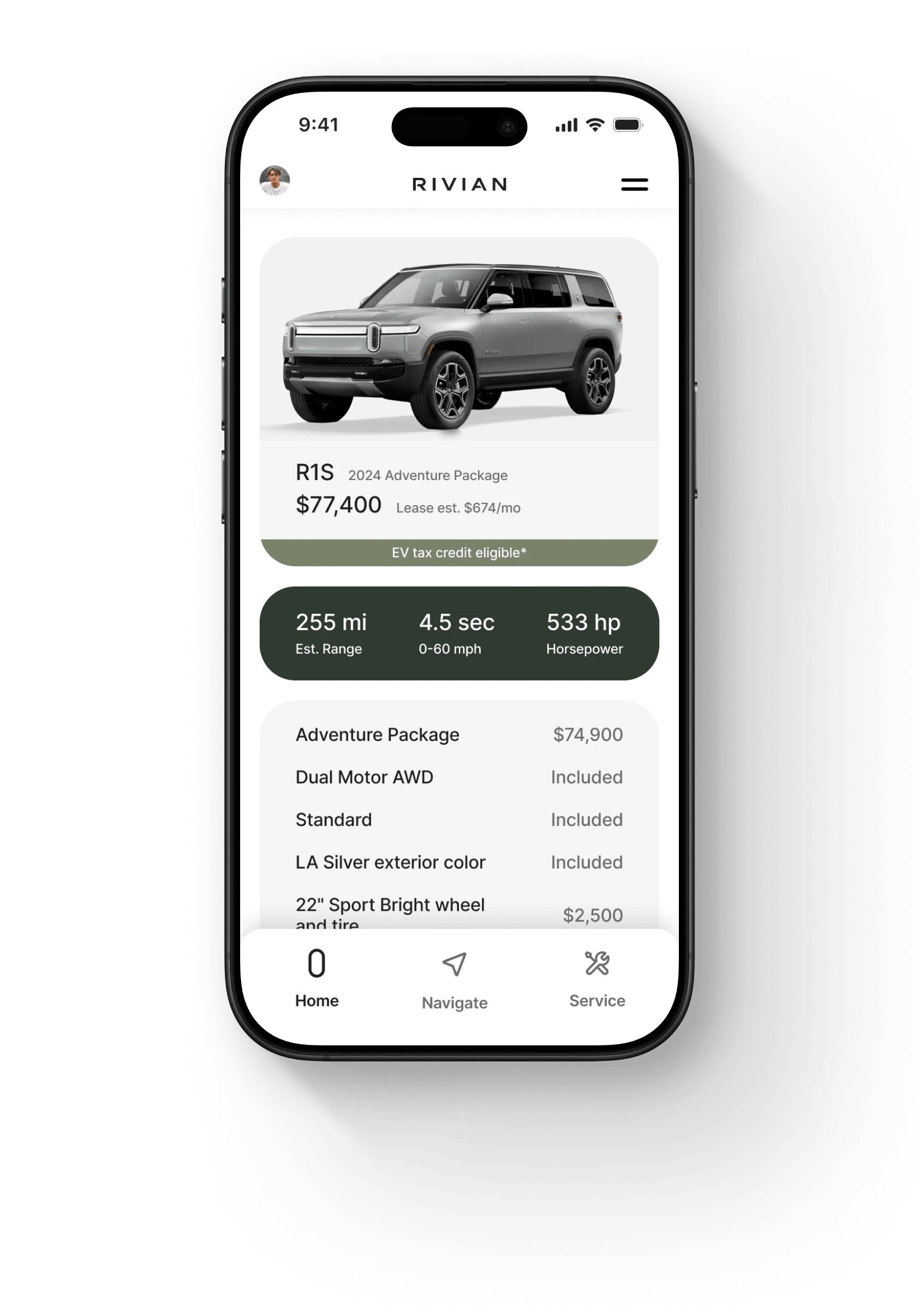
When a vehicle is selected, users are guided to a detailed view showcasing an in-depth breakdown of vehicle features and specifications. From range and acceleration statistics to horsepower and standout features, the design has been thought out to give users a breath of information that is easy to understand.
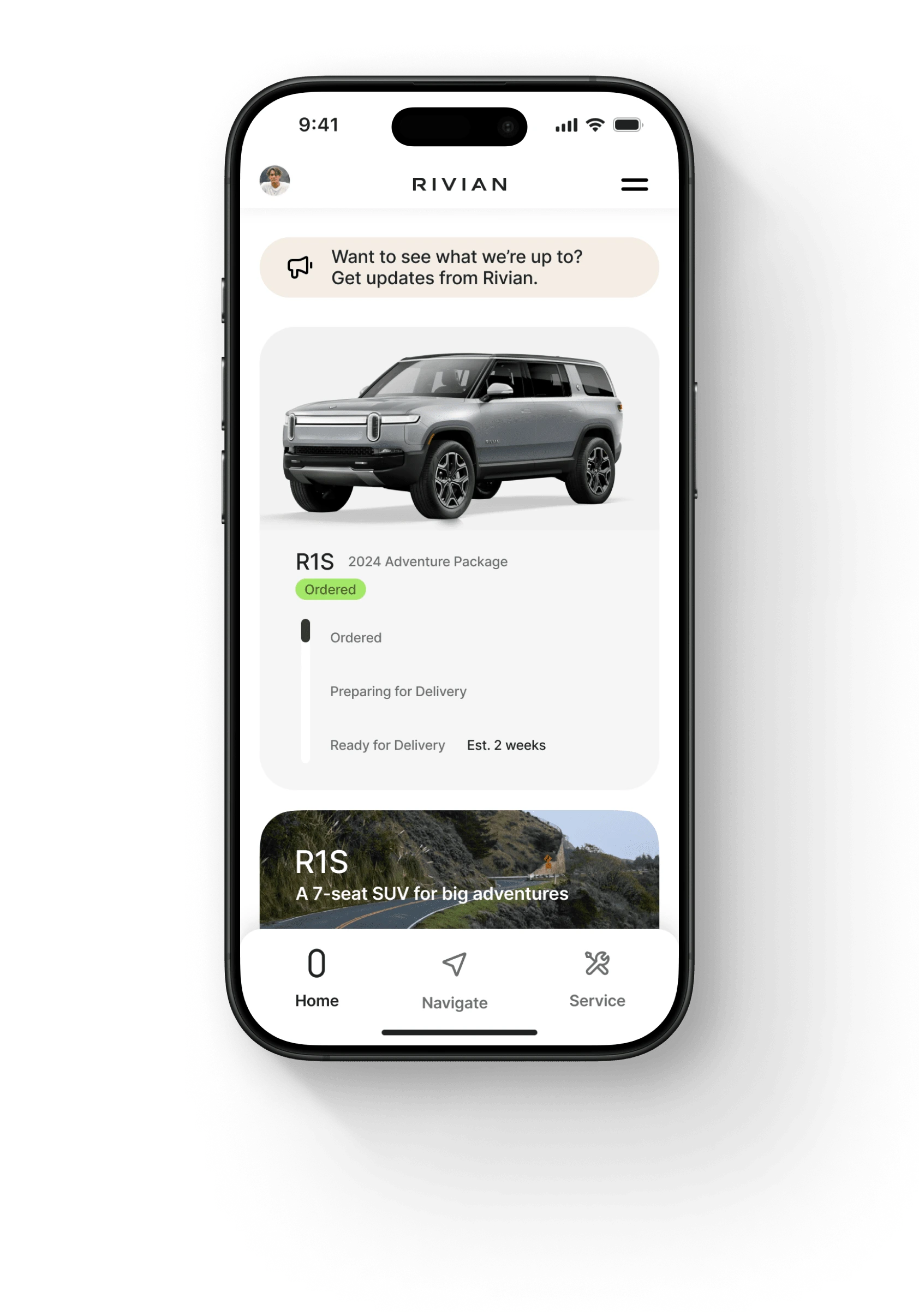
After completing a purchase, the Home Screen updates with a new Order Status card. This card highlights the user's ordered vehicle with a visual confirmation and real-time progress updates – keeping users informed every step of the way. Now imagine if this also updated users as the vehicle makes its way through the assembly line at the factory?
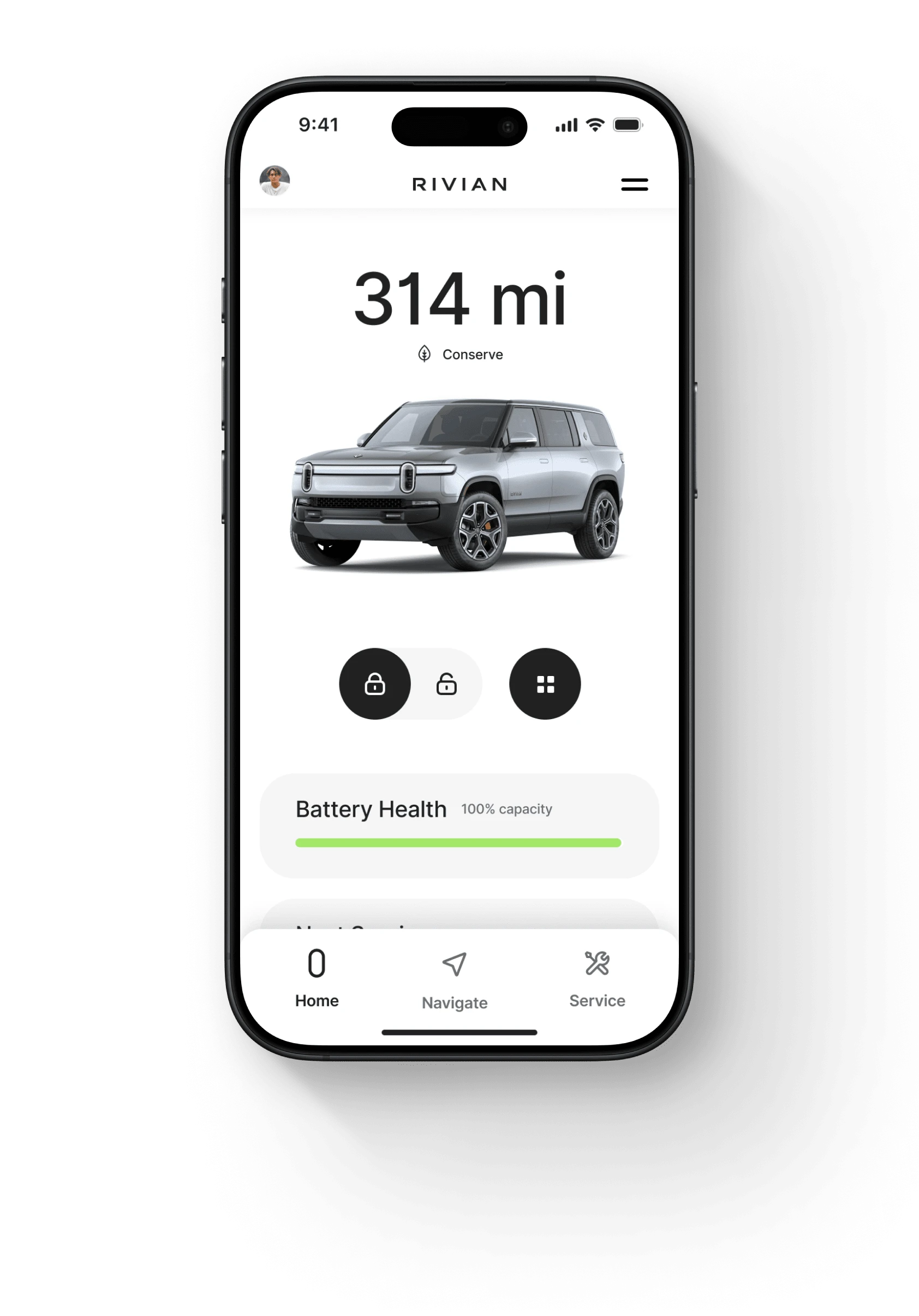
When the user takes ownership of their vehicle, the app automatically updates to become the Rivian companion app - showing basic vehicle controls and supplementary information.
Purchase User Flow
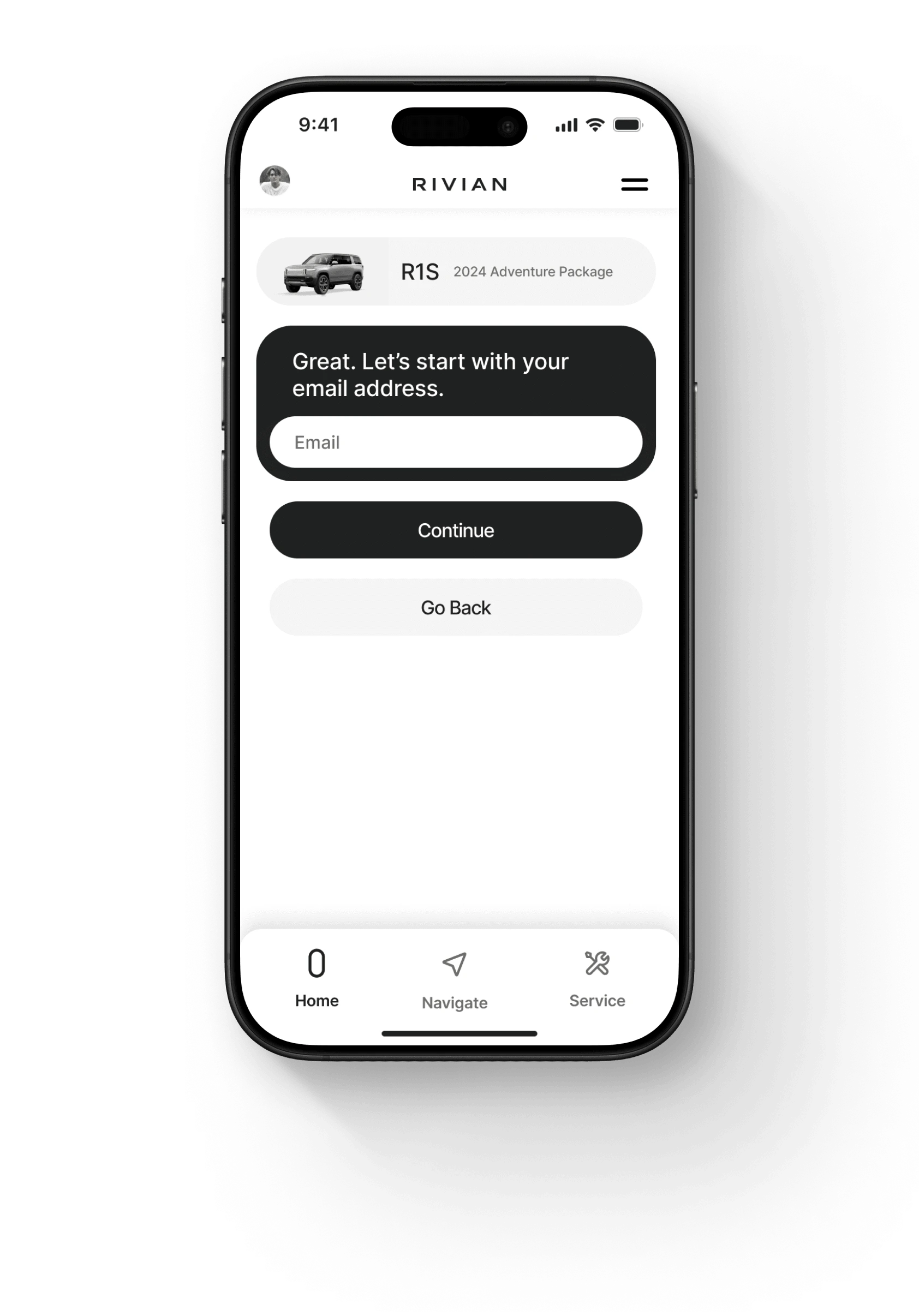
This screen introduces the first step in the purchase flow after the user has selected their chosen vehicle. The first card highlights the selected vehicle, keeping the user connected to their choice throughout the process. The user is gently prompted to provide their email address.
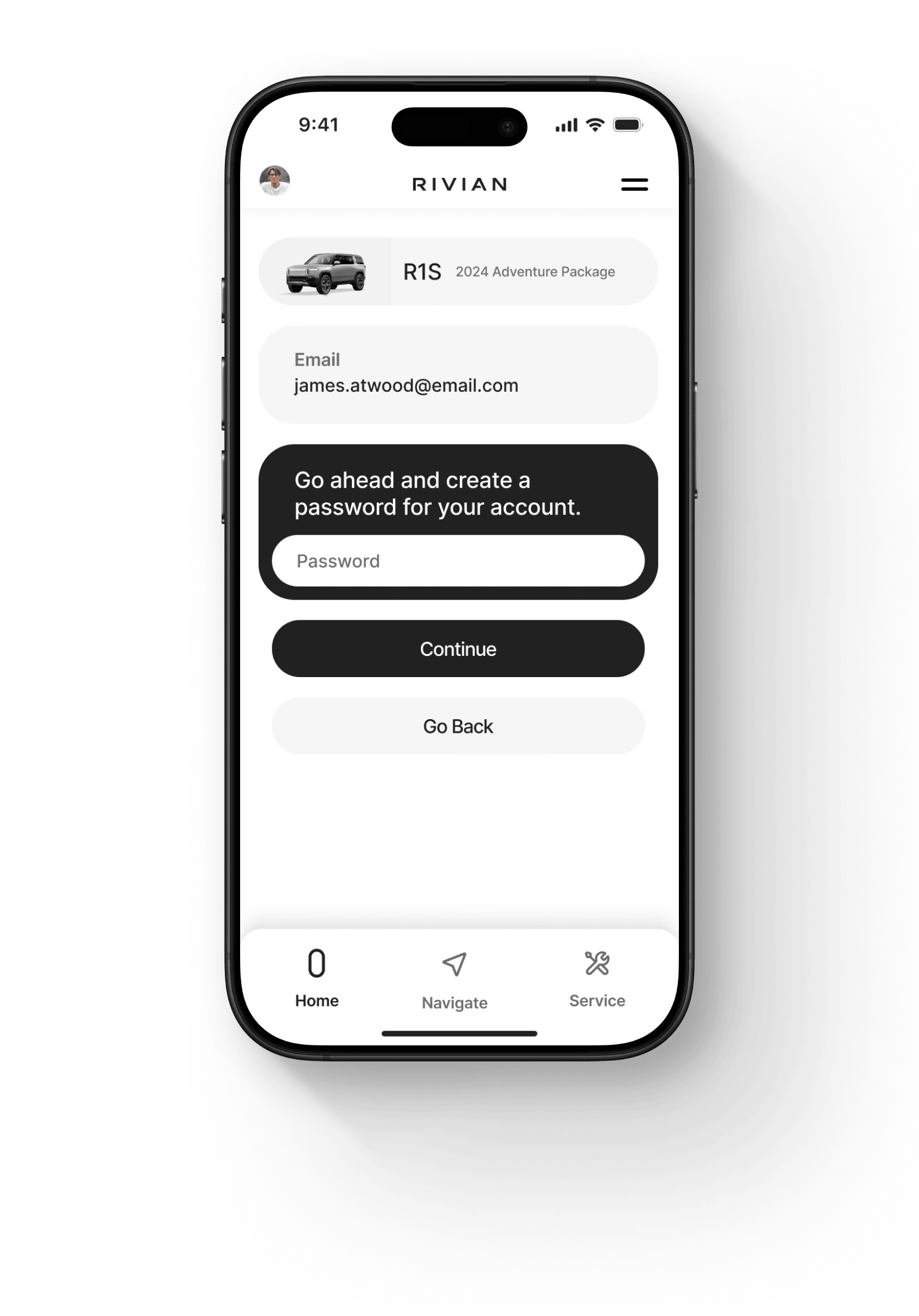
Building on the flow, the next screen prompts the user to create a password for their account. The vehicle card remains at the top, maintaining continuity and reinforcing the user's choice. A new card displays the email address entered on the previous screen, providing clear confirmation of their input and reducing cognitive load – ensuring users feel confident in their progress while keeping the interface clean and intuitive.
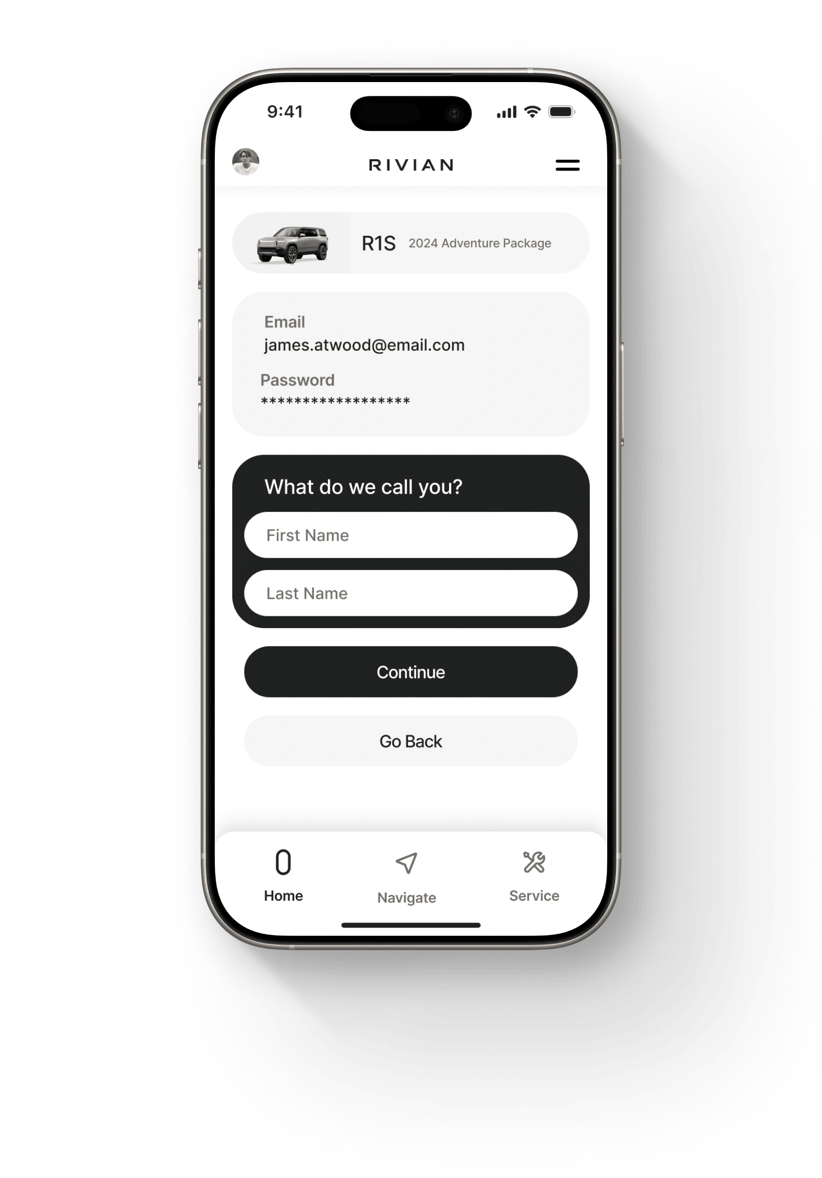
The next screen invites users to enter their first and last name, further personalizing their account. The step-by-step progression of the purchase flow ensures a smooth onboarding experience, instilling trust and clarity at every interaction.
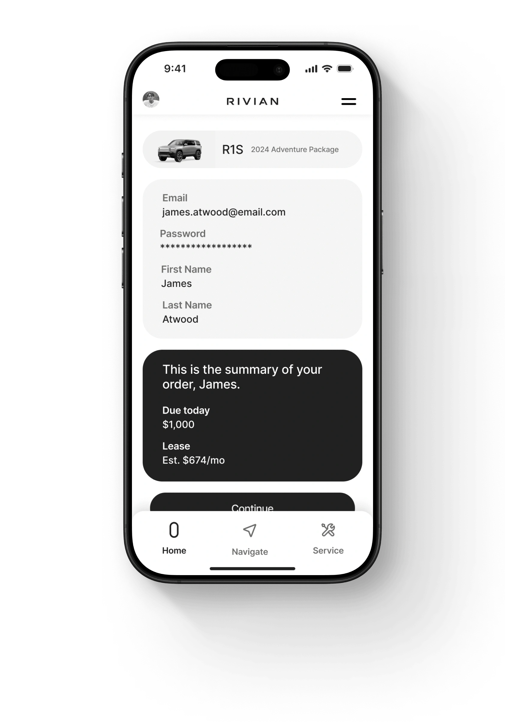
The next screen offers users a moment to review all essential information before proceeding. The new card presents an order overview, highlighting key information such as the amount due today. This layout ensures transparency with the aim of empowering users to proceed with confidence.
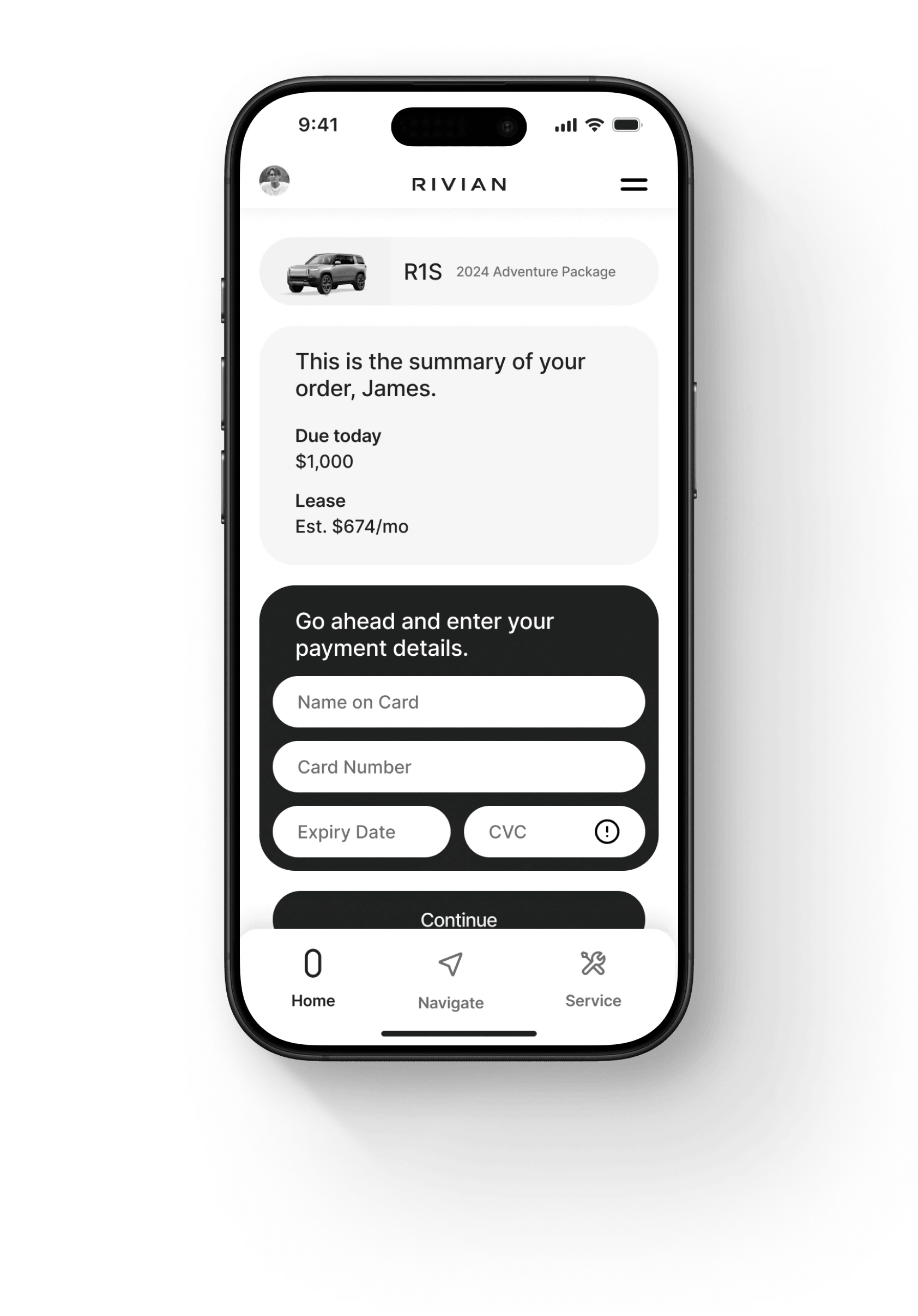
This screen introduces the payment screen, for a seamless transition into finalizing the purchase. The top card continues to display the selected vehicle, reinforcing the user's decision, while the second card now summarizes the order. The new card includes fields for payment information, presented with clarity and security to instill trust in completing the transaction.
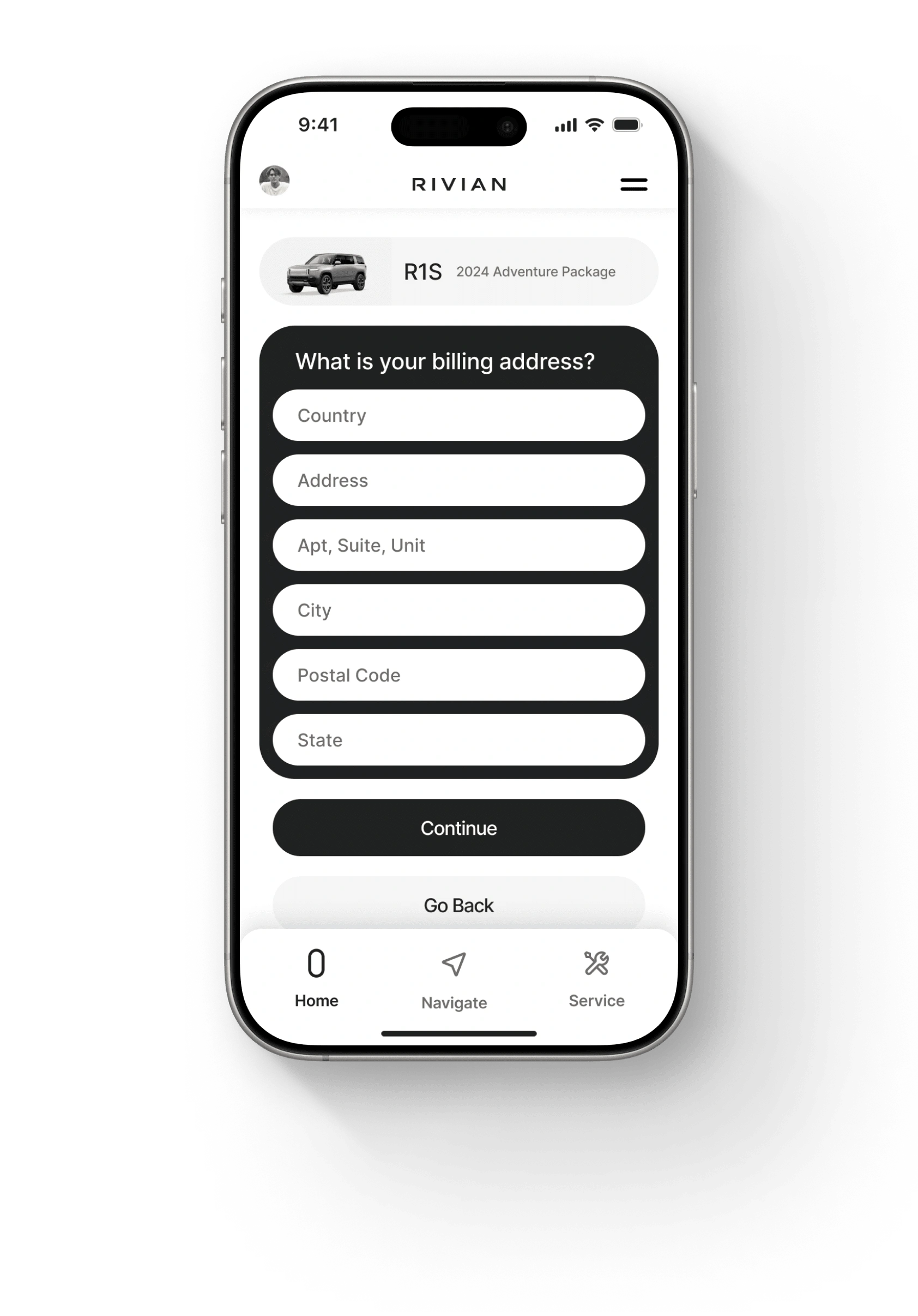
In this step, users are prompted to enter their billing address in a simple and focused manner. While all the necessary steps in the previous screens could technically have fit on one screen, this segmented flow was intentionally designed to create a more user-friendly experience. By splitting the process into clear, sequential steps, we reduce cognitive load and give users the mental space to complete each action without feeling overwhelmed.
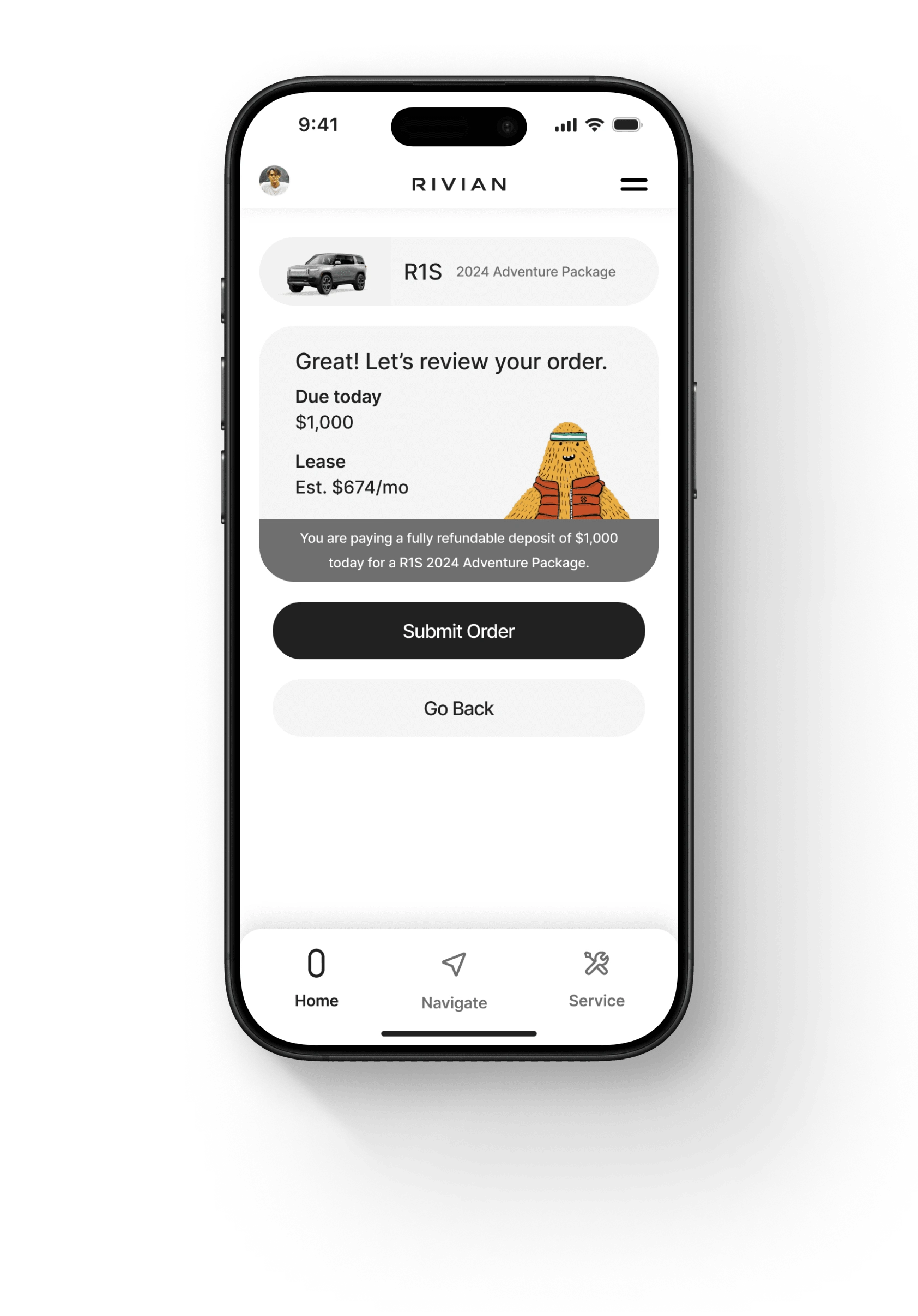
The final screen in the purchase flow invites users to confirm their decision with clarity and confidence. At the top, the vehicle card has remained steadfast and prominently displayed, reinforcing the connection to their selected vehicle. The detailed summary card outlines the deposit amount, ensuring complete transparency – and additional information further clarifies that this deposit is fully refundable.
Like this project
Posted Jan 9, 2025
This project introduces a new purchase flow for the Rivian mobile app.
Likes
0
Views
7

