Starbucks
The Starbucks app is an essential tool for millions of coffee drinkers around the world, and redesigning the app is no small feat. This project took a little over four weeks to research and redesign the core screens.
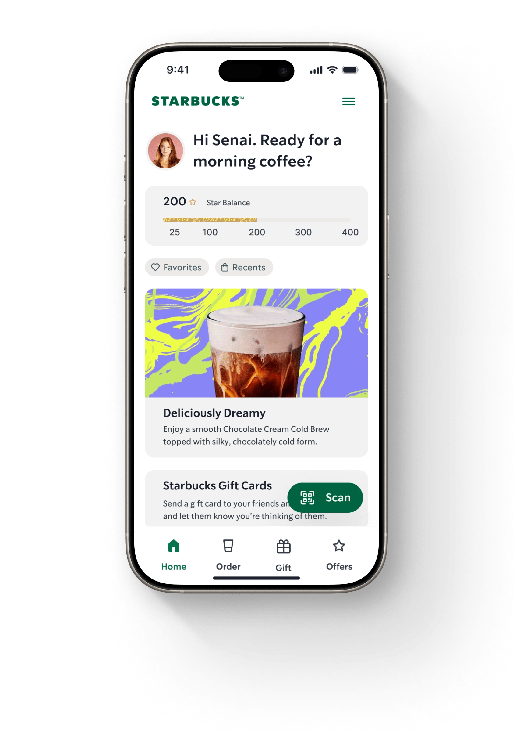
The Home Screen greets users with a warm welcome. Below, users have access to their rewards, current offers and nearby events, putting the most relevant and engaging information front and center.
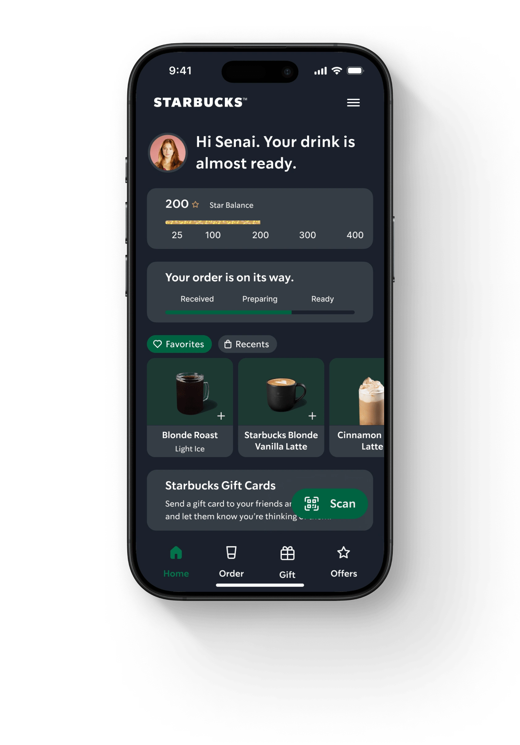
A dark mode version of the Home Screen introduces a sleek, modern aesthetic that isn't available to users today. With a quick toggle, users can view a horizontal carousel of their favorite or most recent drinks. Event-based widgets appear to provide users with the information they need in the moment – for example, the status of a recently ordered drink.
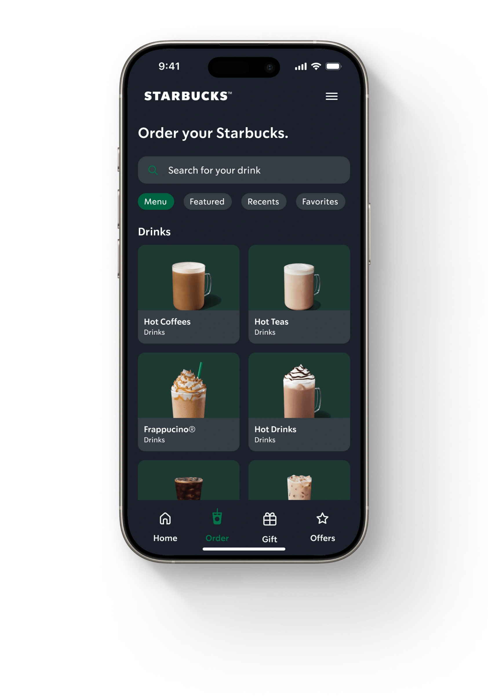
The Menu Screen is redesigned with the Fitt's Law design principle in mind. By using large, visually distinct cards, the menu simplifies navigation. Users can quickly identify and tap into their drink category without overthinking – reducing the cognitive load and streamlining their experience.
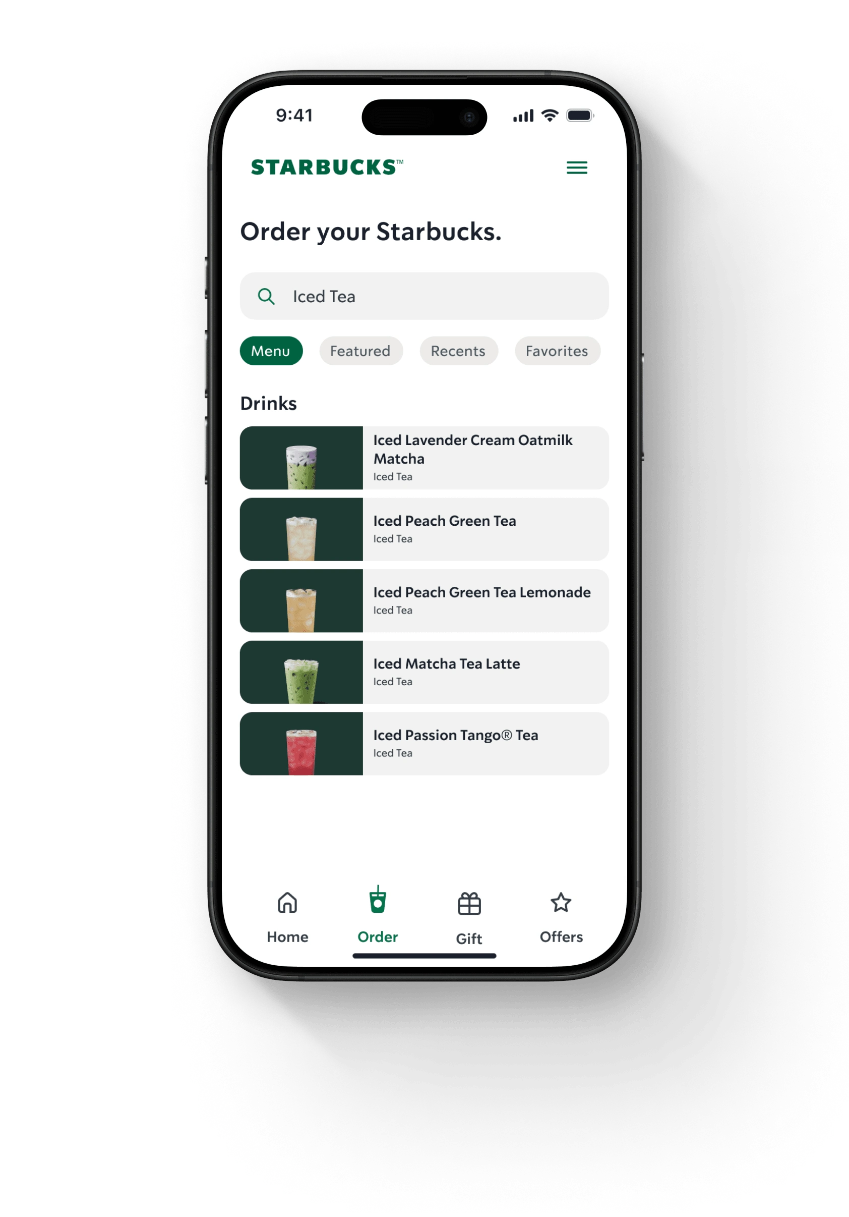
The redesigned Search provides users with a clean and visually engaging way to find their drink. Each result is displayed as a card featuring the drink. Leveraging progressive disclosure, the layout focuses only on what the user is engaged with – reducing the cognitive load again and streamlining their experience.
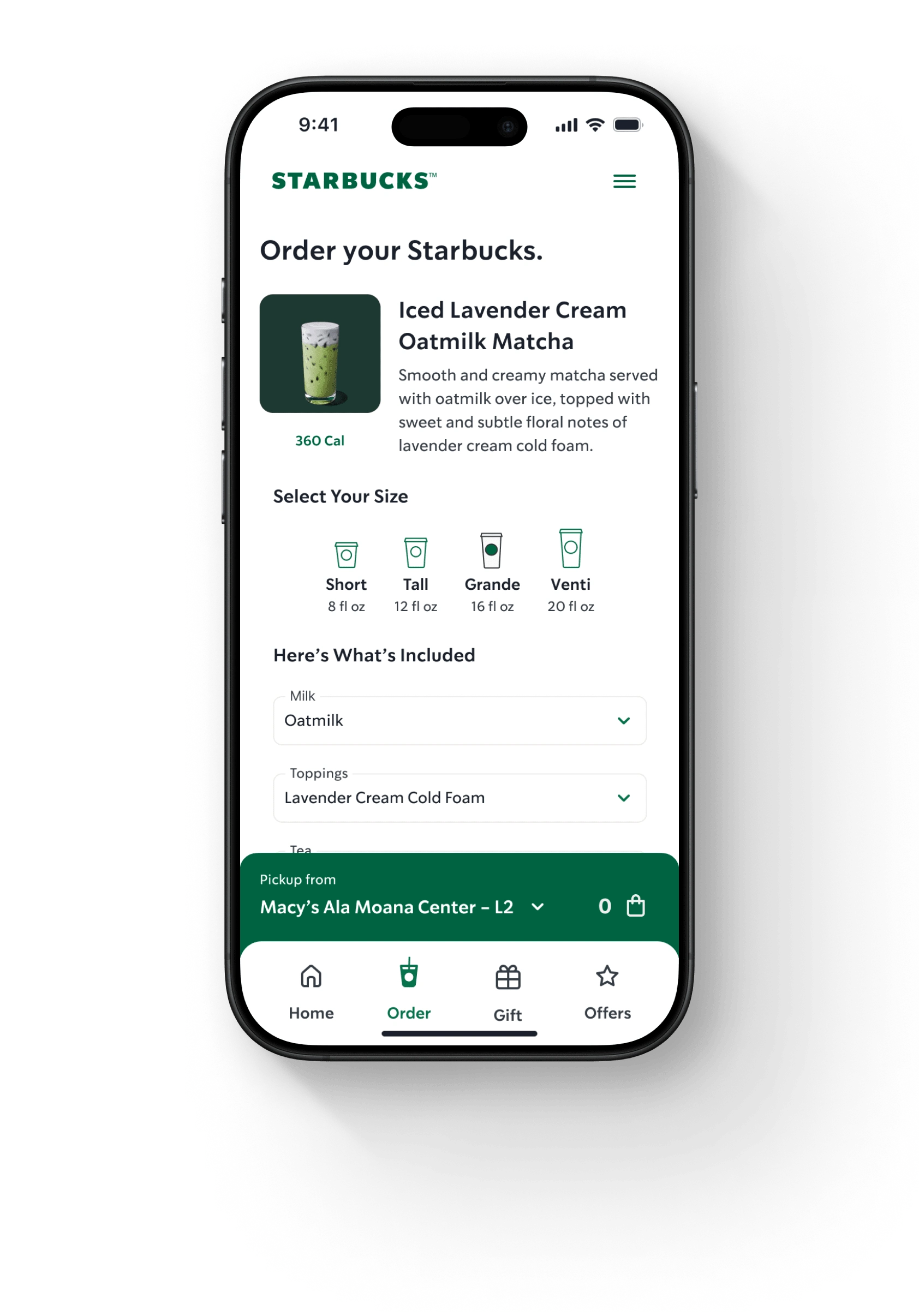
The Order Screen is designed to offer users the flexibility of their perfect drink without overwhelming the experience. Drink sizes, add-ons, and more are grouped into intuitive sections and users can make their adjustments intuitively. This screen focuses on clarity and simplicity.
Like this project
Posted Jan 9, 2025
This project shows a redesigned user interface for the Starbucks app.
Likes
0
Views
4
