Rmmbr — Branding
Alevtyna Makovska
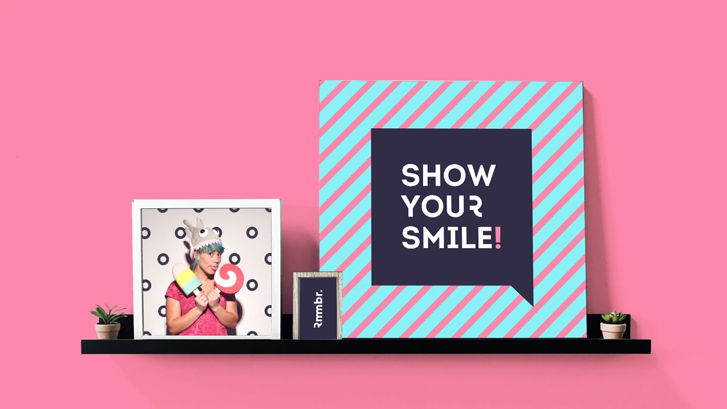
Rmmbr.
Brand identity for a company offering photo booth services and equipment for events.
⭐️ Services
• Сreative Direction
• Brand Communication
• Logo & Brand Identity
• Brand Collateral
• Promo Materials
• Marketing Materials
• Brand Guideline
🍀 Challenge
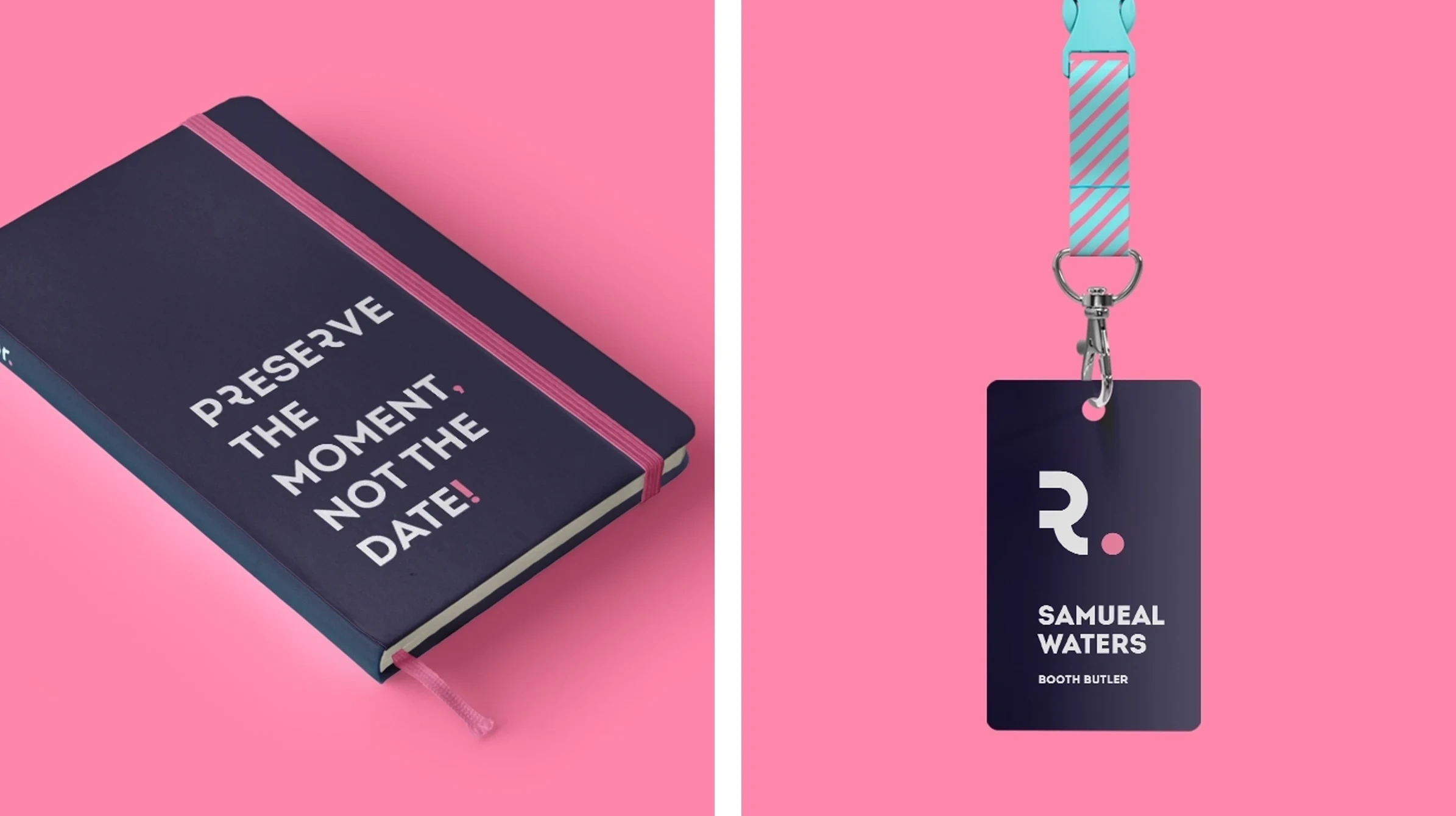
New branding for a company that provides photo booth services, equipment, and accessories for events. With a simple no-nonsense approach, Rmmbr communicates like real people as they engage with their audience. The task was to create a brand that would feel friendly and human to convey to their consumers the passion and joy that the company puts into their product.
🎯 Strategy
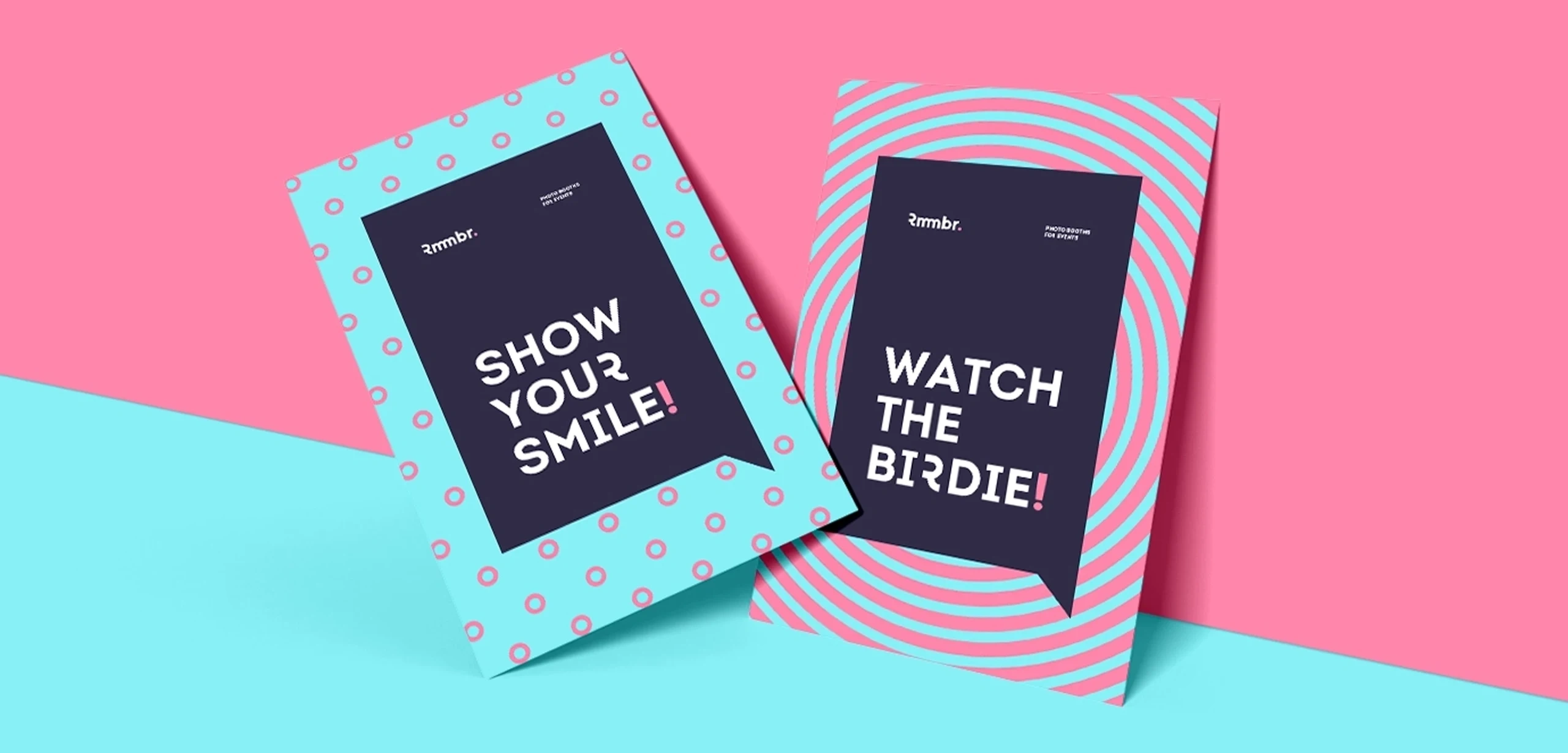
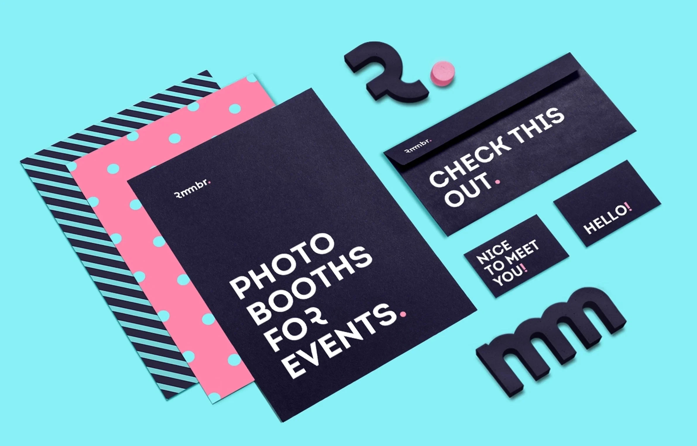
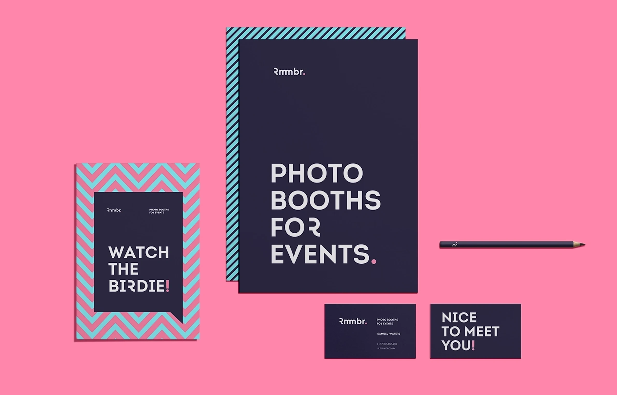
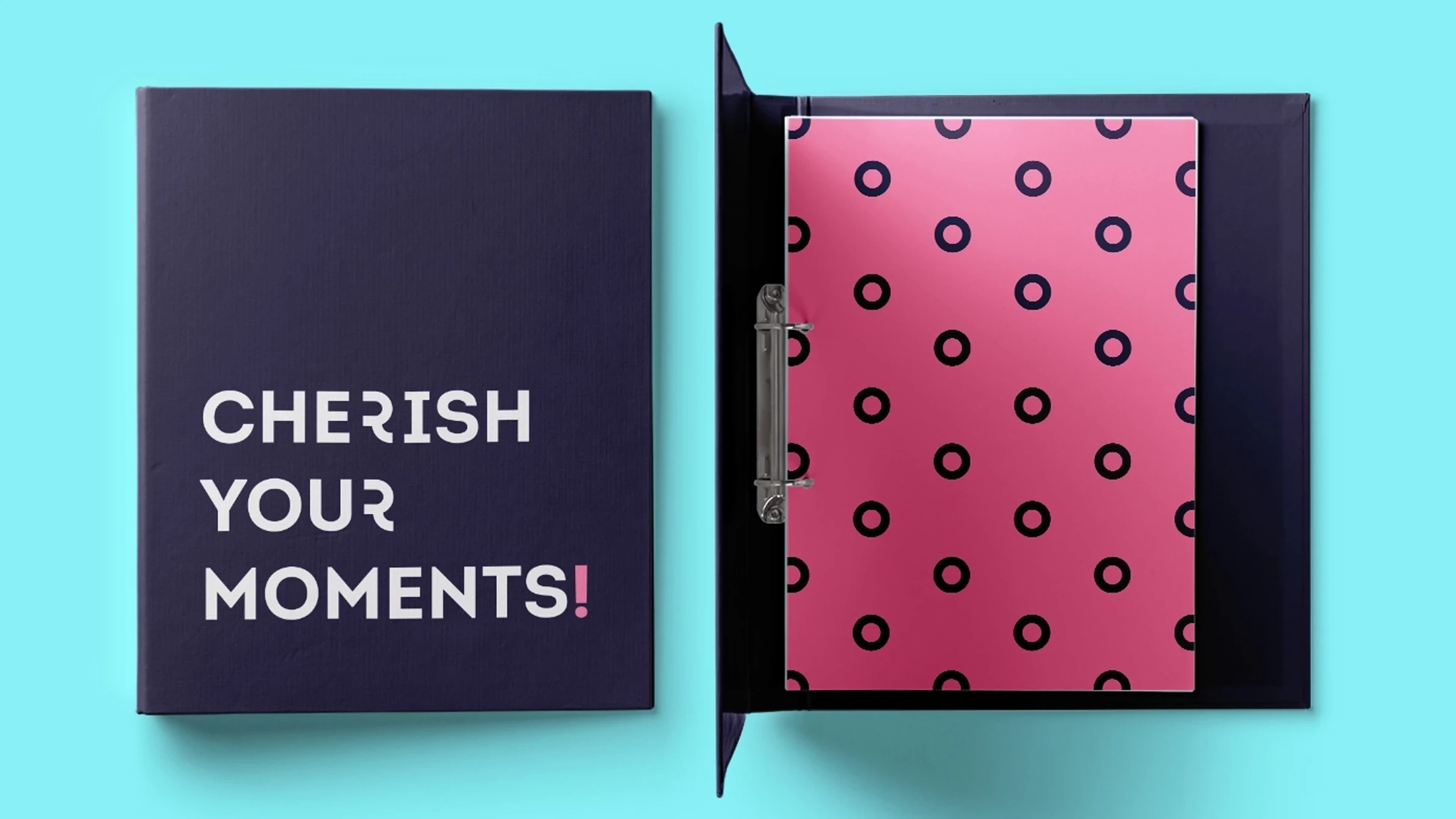
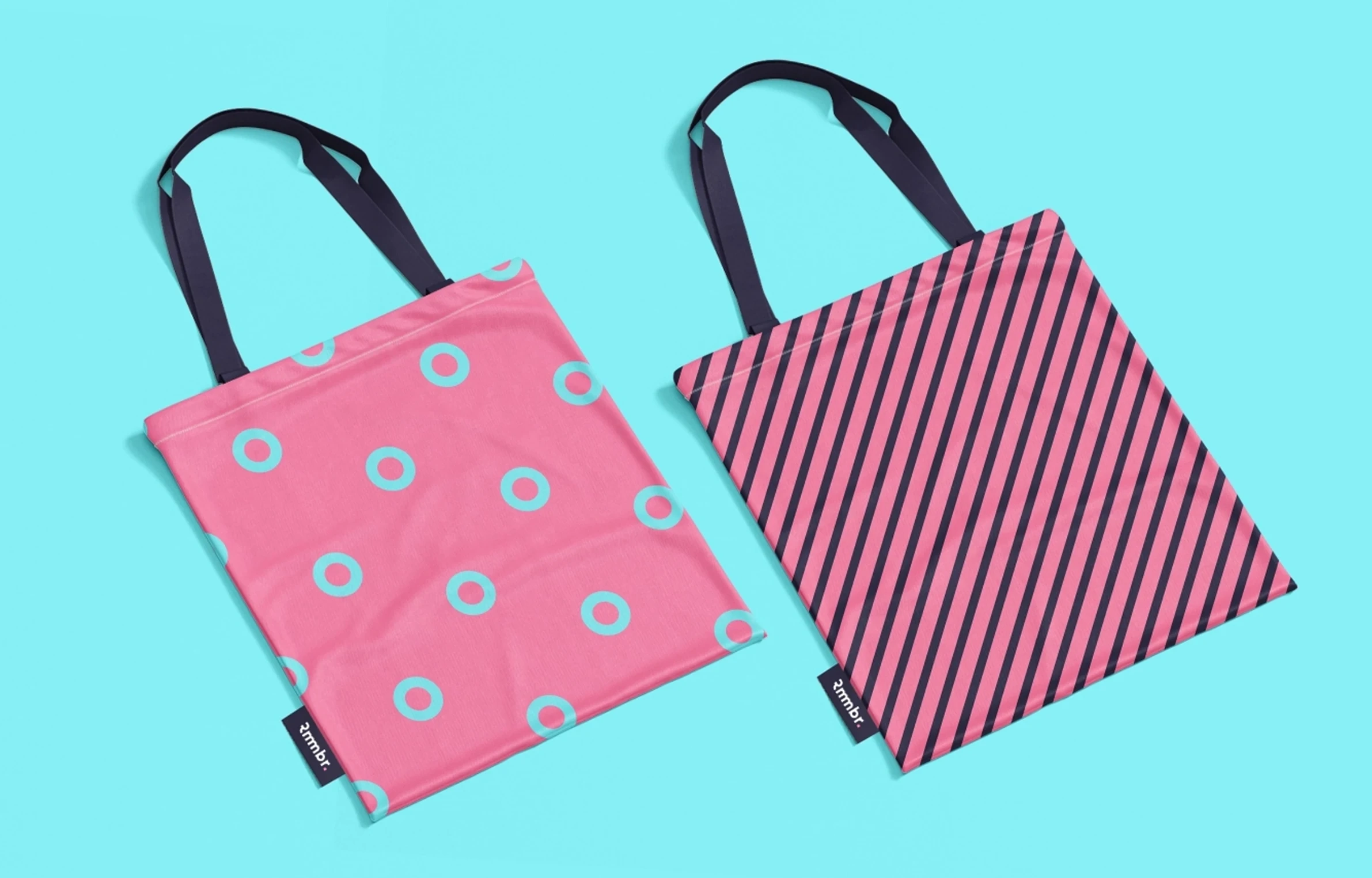
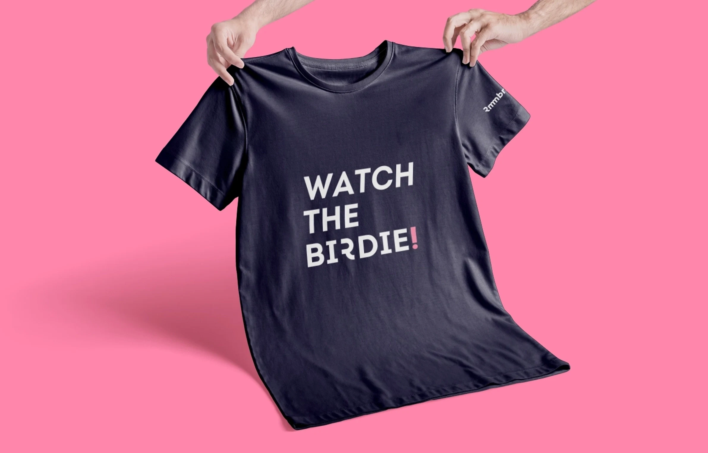
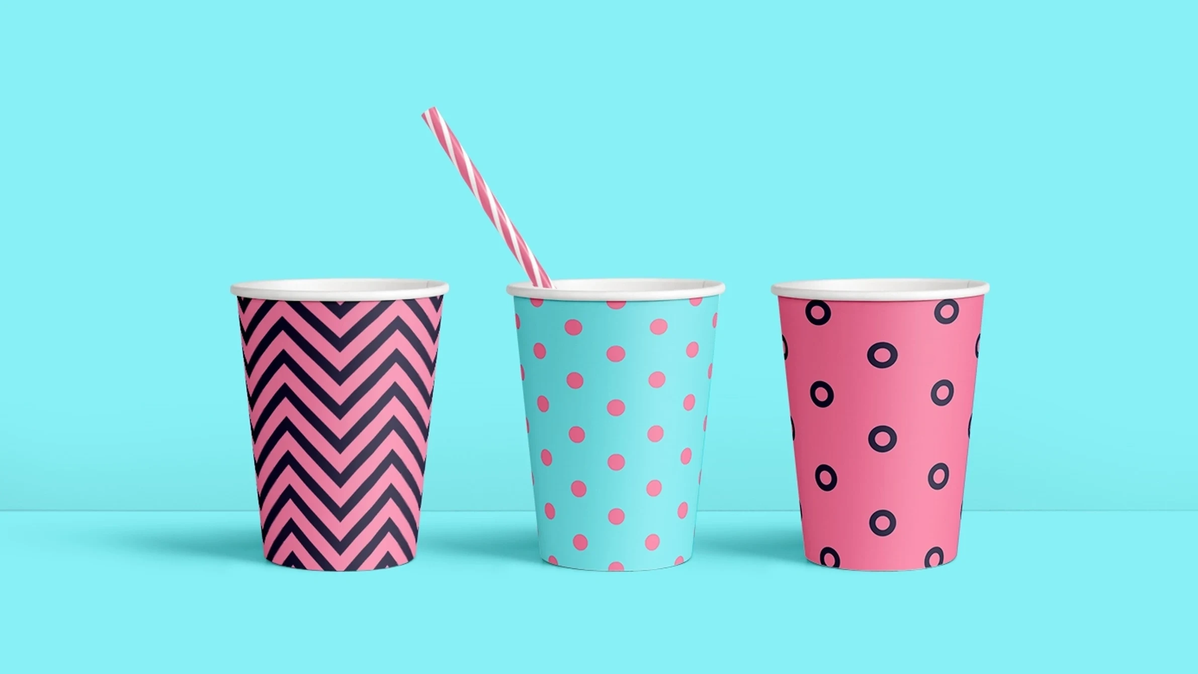
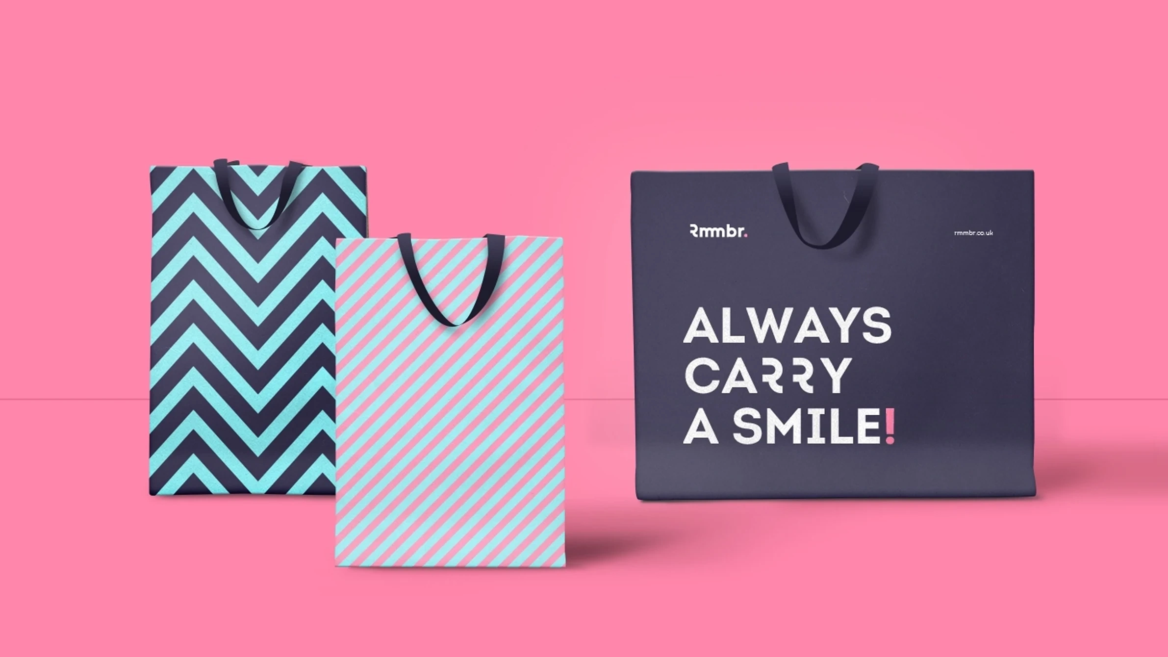
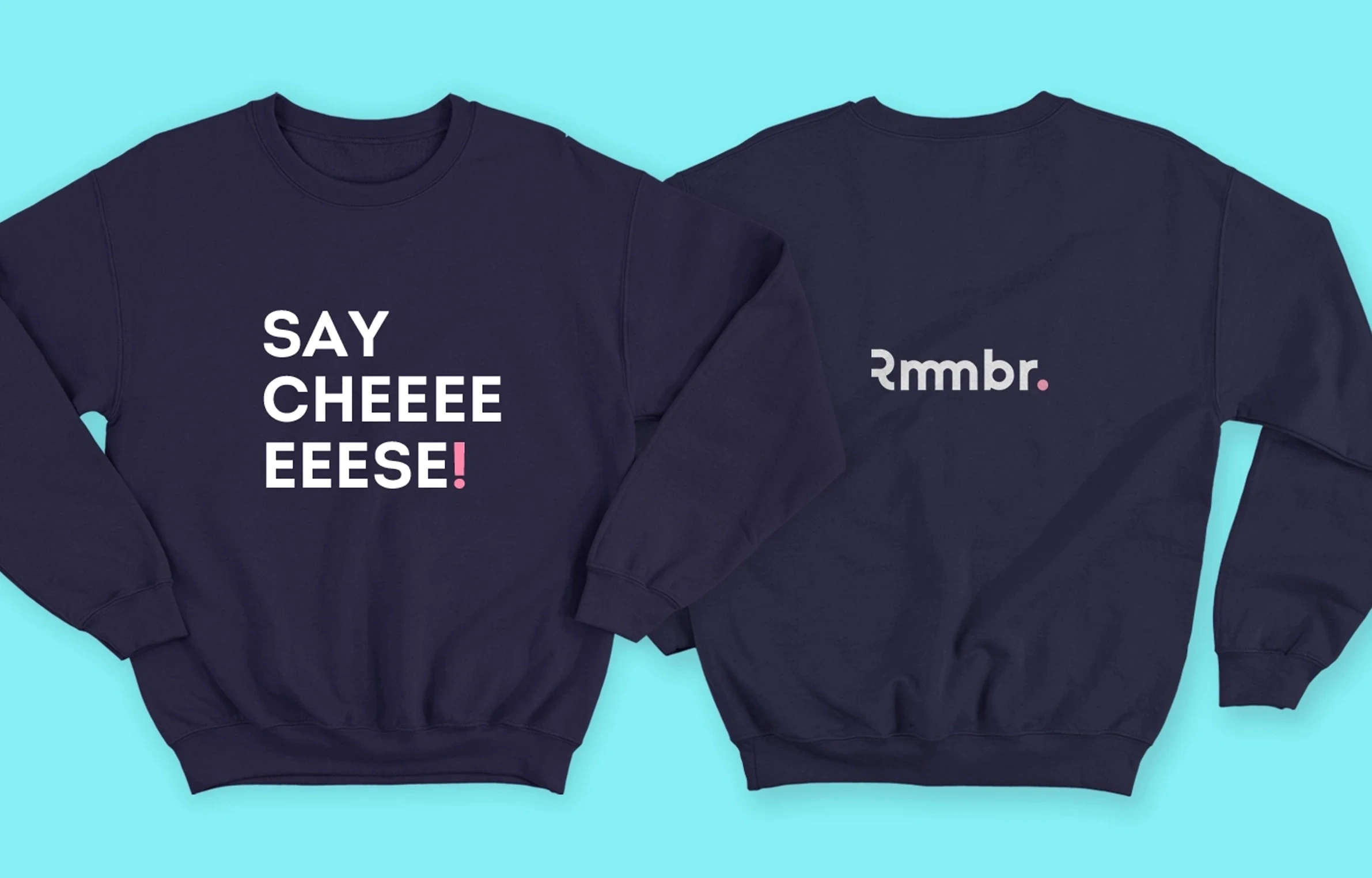
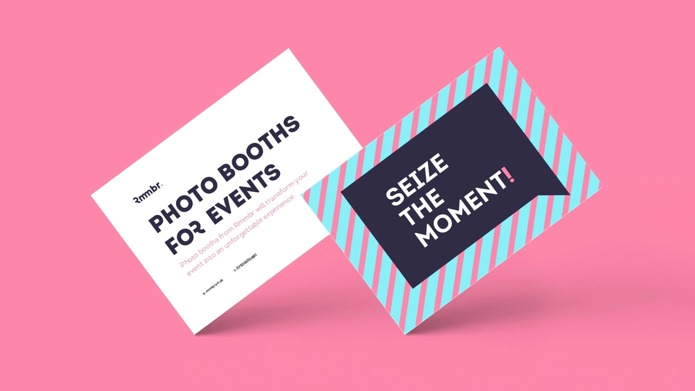
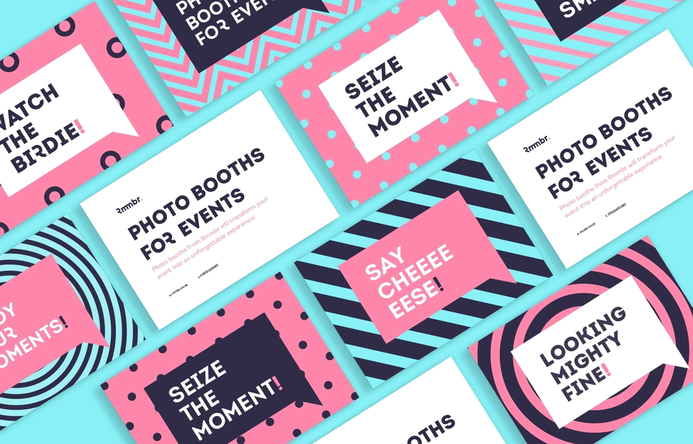
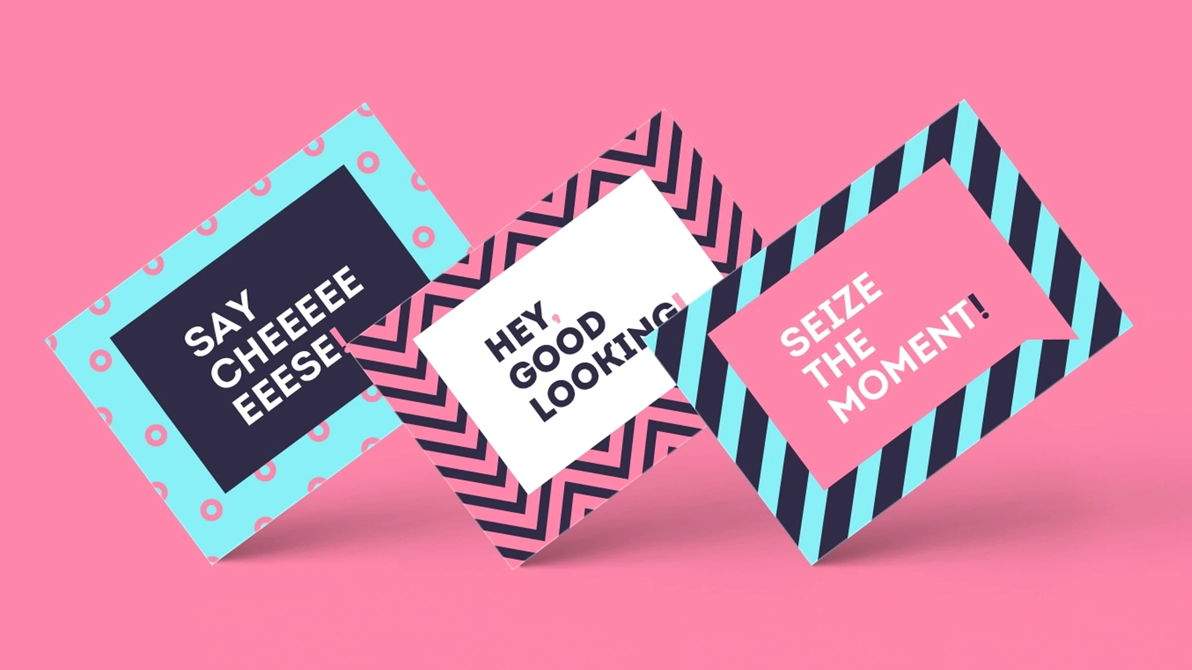
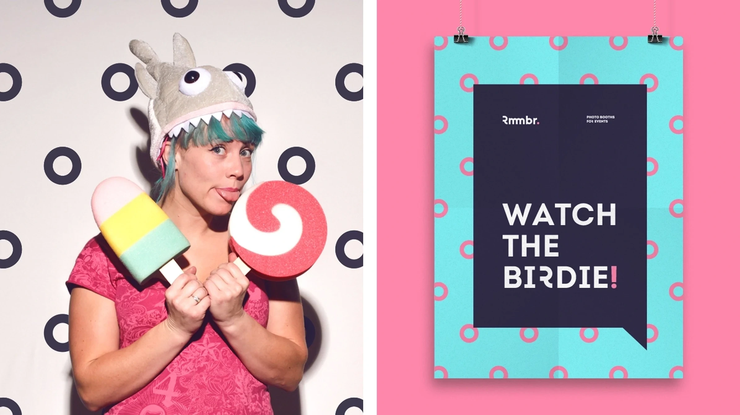
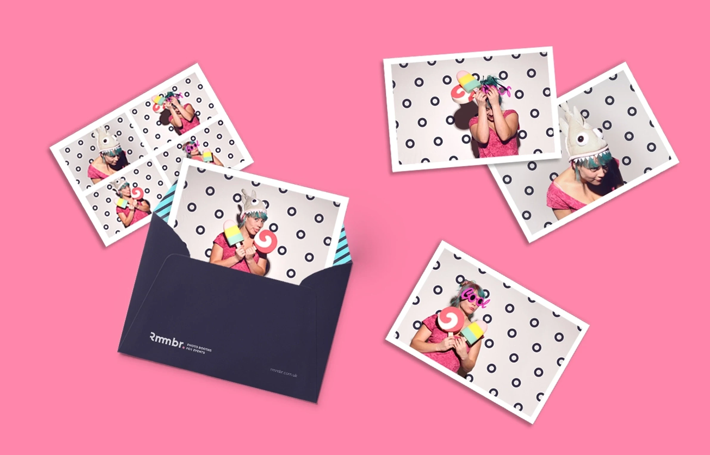
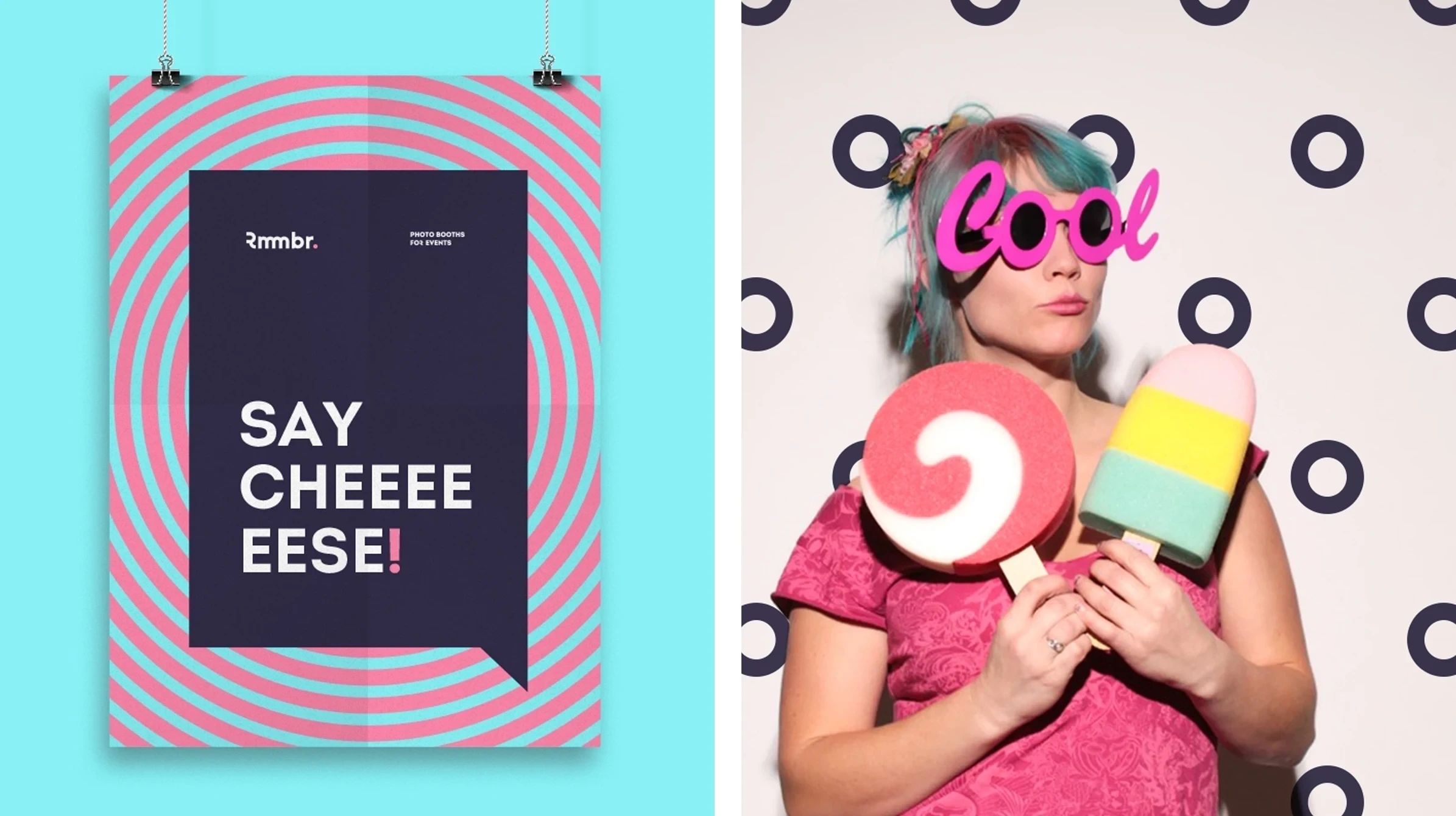
The visual strategy focuses on values such as honesty, fun, and friendliness. This concept creates a full colorful client-facing brand with great character and warmth. It includes a bright color palette, simple patterns and inspirational quotes that conveys upbeat energy and spontaneity of the new brand.
🌈 Design
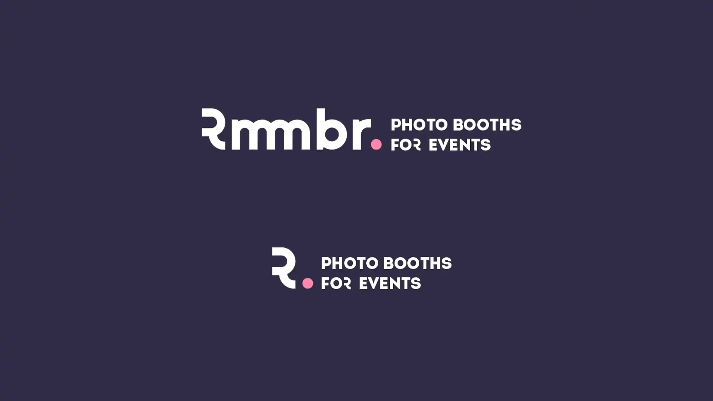
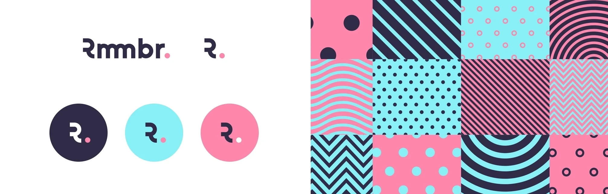
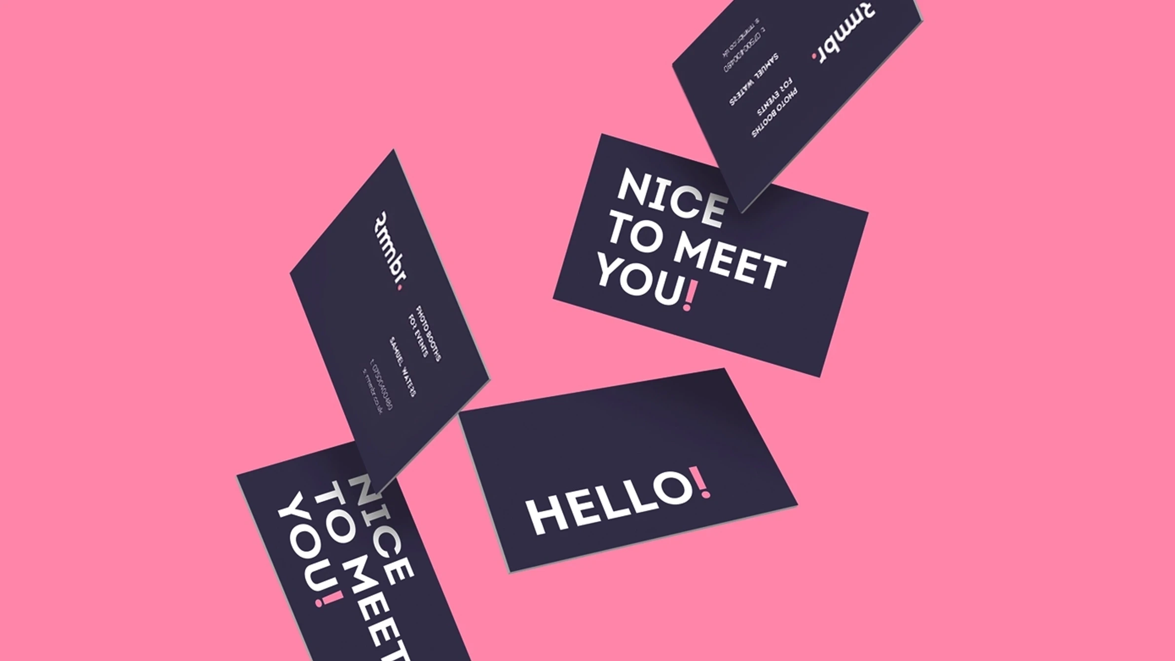
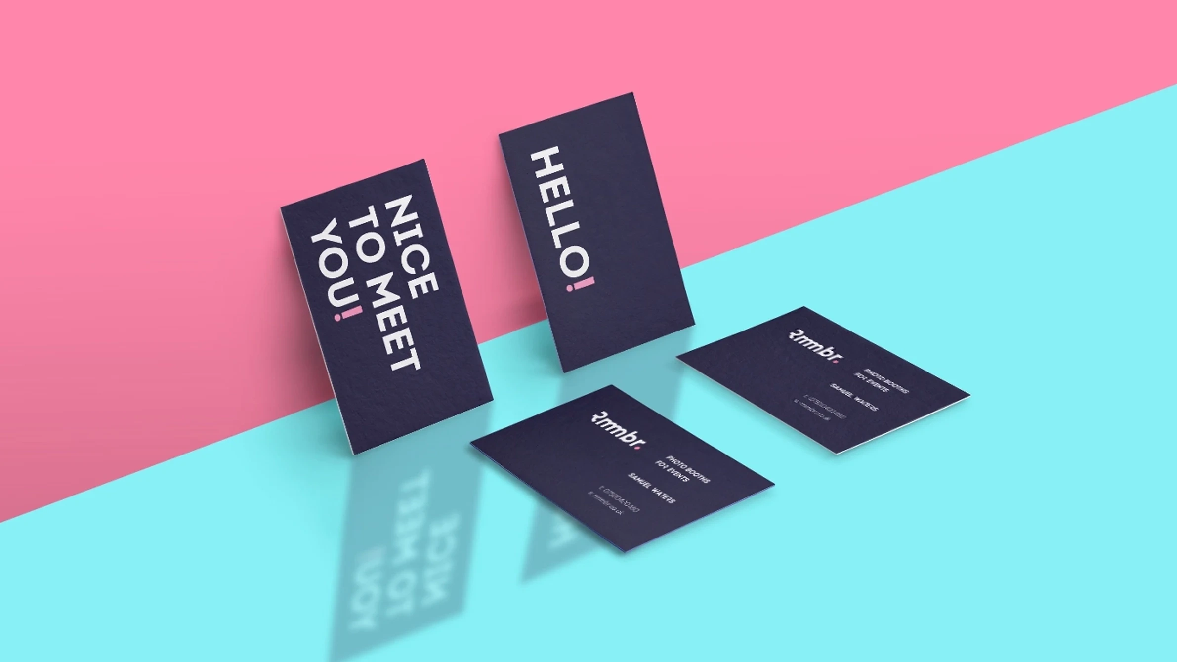
The unique nature of the double “mm” in the logo demonstrates the idea of connection between people and their shared memories. Combined with a strong color palette consisting of pink and blue, the identity is accompanied by playful patterns that serve as the backdrop to a confident visual language. To enhance the tone of the message of the text, punctuation marks in the sentences are highlighted with the main color of the brand. Using clean type, fun phrases, and a bright color palette gives the brand a human and fun feel.
🚀 Result
The positive, attention-grabbing new brand identity plays off a joyful attitude and accurately reflects the brand as a space where you have fun and create warm memories with friends.
Have a project in mind?
Book a free consultation to discuss your project and
branding needs, and explore how I can help you!
👉 Book a Google Meet Call
Like this project
Posted Oct 25, 2024
Brand identity for a company offering photo booth services and equipment for events.
Likes
0
Views
13