Virgin Atlantic Mobile App | 🚢 Onboard Navigation 🗺️
Introduction
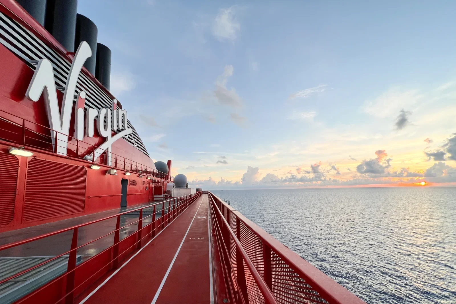
Ahoy Sailors! 🚢 Setting sail with Virgin Voyages is an absolute blast! From live entertainment to dance parties and mouthwatering cuisine, there's never a dull moment on board. Virgin prides itself on its mobile app, designed to keep sailors in the loop with events, announcements, spending, and more.
However, upon boarding, I couldn't help but notice a hiccup in Virgin's otherwise stellar experience: onboard navigation. Finding restaurants, activity areas, and even my own cabin proved to be quite the challenge from the get-go.
And it wasn't just me; chatting with fellow sailors revealed a shared frustration. Many echoed my sentiments, feeling like they were aimlessly wandering the ship and potentially missing out on exciting experiences. One sailor even lamented,
"I didn't get to indulge in the ice cream station as much as I'd hoped because I had no idea it was there. I stumbled upon it after our second port visit."
It was crystal clear: we needed to chart 🧭 a course for improvement. 🚢
User Interviews
📝As part of our efforts to understand navigation and overall user experience on the Virgin Voyages ship, we conducted user interviews with a group of ten passengers. The goal was to gather firsthand insights into their boarding experience, including their initial impressions, areas of interest, and interactions with onboard assistance.
Methodology
Participants: We interviewed ten passengers who recently boarded the ship.
*These passengers were not apart of the Rockstar or upgraded packages.Interview Questions:
We felt the experience navigating the boat would be different after the first day, so we performed two interviews. One on the first day and one the last day.FRIST DAY QUESTIONS: Boarding
How many Virgin Voyages Cruise have you been on?
How was your overall experience when you first boarded the ship? How did you feel?
2. Where was the first place you wanted to visit when you stepped on board?
3. Did you seek assistance or ask anyone for help navigating the ship?
LAST DAY QUESTIONS: Leaving the Ship
4. How was navigating the boat when finding your way to events?
5. What were some ways you navigated around the boat?
6. How satisfied were you at the end of your trip with the amount of events, restaurants, and other experiences you were able to see.
7. Any further feedback about the trip you would like to add?
Findings
Overall Boarding Experience:
Responses varied from excitement and awe to slight confusion due to the unfamiliarity of the ship.
Most participants expressed positive sentiments about the welcoming atmosphere and unique design elements.
I was initially lost when I got on the boat. I had to ask where to elevators were and where I could find food. I didn’t even know there was a boat map until about the last day.
First Place of Interest:
The majority of interviewees mentioned dining areas or their cabins as their initial destinations.
Some were eager to explore specific amenities highlighted during pre-boarding information.
It was a little overwhelming especially with all the sailors boarding at once. When I boarded, I wanted to get something to eat before heading to my room. I immediately had to ask for directions, twice.
Assistance and Navigation:
80% of participants actively sought assistance or directions from staff upon boarding.
Some relied onboard signage to navigate independently.
During the voyage users did complain about how to navigate elevators, stairs and hallways. Check out some feedback from our sailors 👇
The boat is kinda confusing, especially on some parts that wont allow you to go down a floor. We had to go up a level to get to 2 levels below. Other times I wanted to get to the gym but I couldnt find the name on the directory boards in the hallway. I did notice the gym names are not the same in the app and on the wall.
Real FOMO (Fear of Missing Out)
Sailors shared that with so much to do on the boat and so little time, they felt a real fear of missing out. Many wanted to visit every bar and restaurant but had no way of knowing if they had missed something. This left them feeling like they couldn't fully enjoy all the ship had to offer.
After being on the boat for a week, I don't think I saw everything. After looking at my app the today (last day) I realized I missed a lot. I did feel like I wasted some time trying to find things. I would get lost at least twice a day.
Recommendations
Clear Navigation Signage 🪧 : Enhance onboard signage to guide passengers to key areas of interest upon boarding.
Interactive Onboarding Map 🗺️ : Provide digital resources highlighting popular destinations and amenities accessible via the Virgin Voyages mobile app.
Staff Accessibility👨💼: Ensure approachable staff members are readily available for passenger inquiries and assistance.
The initial interviews with onboard sailors provide valuable insights into their boarding experience and navigation preferences. These findings will inform the development of navigation features aimed at improving overall user experience and enhancing sailors' ability to explore and enjoy the Virgin Voyages ship efficiently. Through continuous feedback and iteration, we aim to create a seamless and enjoyable journey for all passengers.
Wire-framing
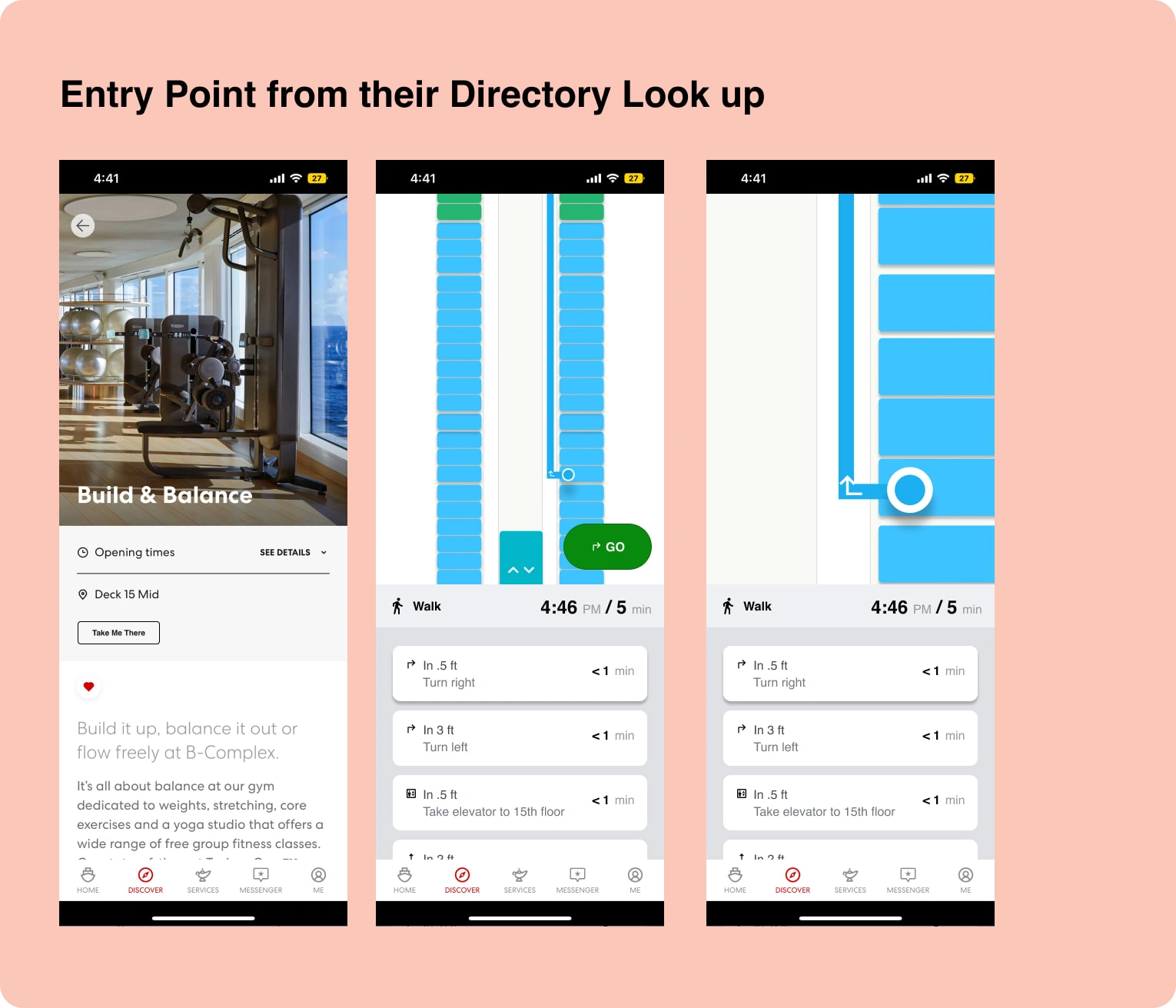
Rough sketches were created to conceptualize the basic layout and essential elements of the interactive map.
Focus areas included the navigation icons, and the main map display.
One main goal was to make a simple entry point to their current mobile app. Hi-Fidelity Prototype
Usability Testing
Usability testing played a crucial role in refining the interactive map. The primary objective was to evaluate the effectiveness of the prototype in real-world scenarios and gather user feedback for further improvements. Here’s an overview of the testing process and its outcomes:
Testing Setup:
A group of sailors representing different demographics and levels of tech-savviness were recruited for the usability testing.
Participants were asked to perform common tasks, such as finding a specific restaurant, locating the nearest restroom, and checking event schedules using the interactive map.
Methodology:
Observational studies were conducted to monitor how users interacted with the prototypes.
Participants were asked to think aloud while navigating the map, providing real-time feedback on their experience.
Travel time to locate destinations was recorded to measure efficiency improvements.
Key Findings:
Improved Efficiency: The new interactive map design saved an average time of 1:74 off the users' travel time compared to the previous version. This significant time saving highlighted the improved usability and effectiveness of the new design.
Ease of Use: Users found the map intuitive and easy to navigate, with many appreciating the clear layout and responsive controls.
Conclusion:
The usability testing phase was instrumental in validating and refining the interactive map wireframes for the Virgin Voyages on-ship mobile app. By closely observing user interactions and gathering detailed feedback, we were able to make targeted improvements that significantly enhanced the user experience. The resulting design reduced travel time, reduced anxiety of FOMO for users, and provided an intuitive and accessible navigation tool, ensuring a smoother and more enjoyable experience for all sailors on board.
Like this project
Posted May 17, 2024
Virgin Voyages' app lacks good onboard navigation, leading to missed experiences. Enhancing it with maps, wayfinding, and real-time tracking will improve sailor
