UNIQUE TRADE | UI/UX website redesign
Welcome to my Unique Trade case where I unveil the transformative journey of redesigning :)
As a UI/UX designer, my goal was to enhance the company's online presence and create an intuitive, engaging, and modern user experience that aligns seamlessly with their position as a prominent supplier of automotive components in Ukraine.
The problem
The original Unique Trade website has several problems that needed fixing to improve how users interact with the site and how the brand is presented. The key issues included:
1. Old-Fashioned Look: looks outdated and doesn't match the professional and high-quality image of Unique Trade.
2. Hard to Use:
- The navigation is confusing, making it hard for users to find what they need.
- The overall user experience is frustrating, especially when searching for products or checking out.
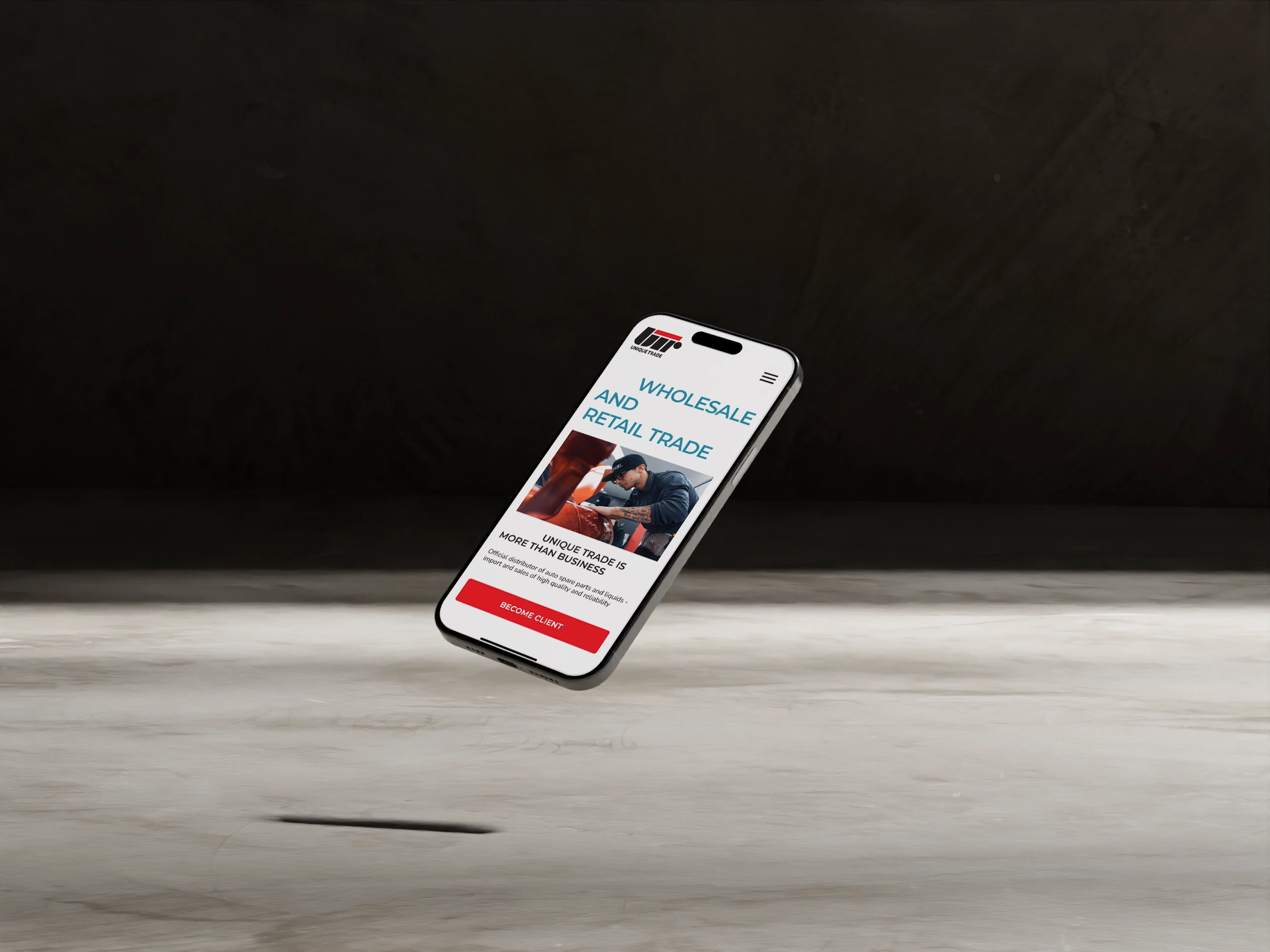
3. Not Mobile-Friendly: isn't optimized for mobile devices, making it difficult to use on smartphones and tablets.
4. Poor Product Display: Product pages are messy and lacked detailed information and good images, making it hard for users to decide on purchases.
5. Limited Engagement Features: There is not enough clear calls to action, which are important for guiding users to make purchases or engage with the brand.
The solution: What was done?
Fixing these issues with a redesign aimed to create a more user-friendly, visually appealing, and efficient website that better represents Unique Trade's values and meets the needs of their customers.
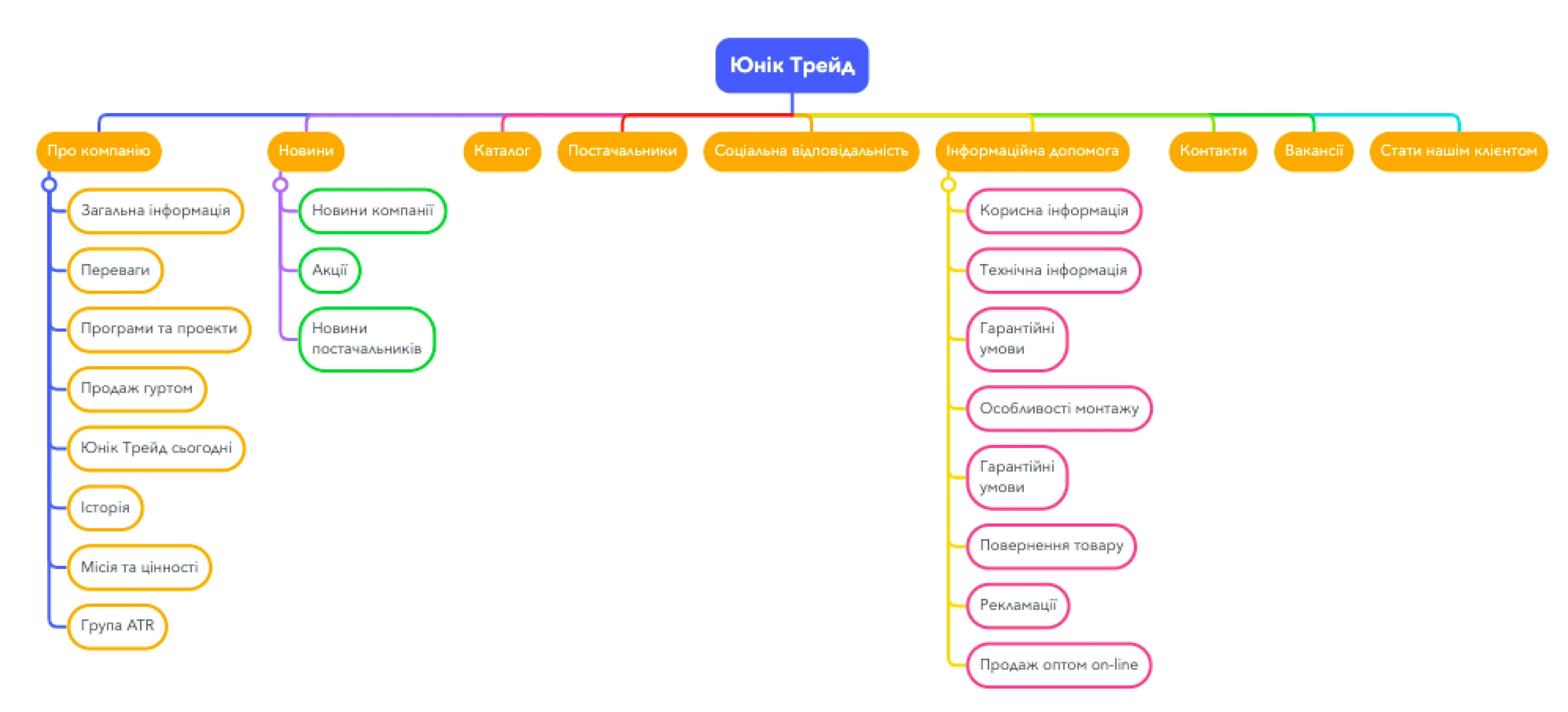
1. Sitemap
A new sitemap was created to provide a clear and logical structure for the website, ensuring that all information and product categories are easily accessible. And to optimize user flow, guiding visitors through the site in an intuitive and efficient manner.
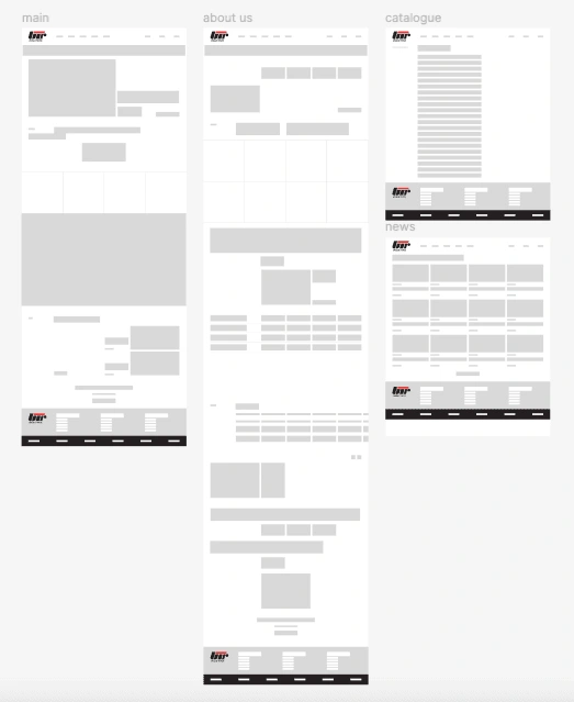
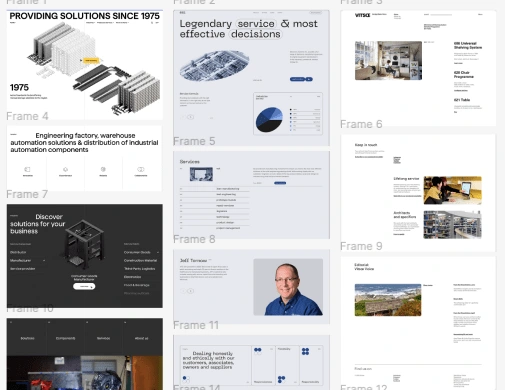
2. Wireframing
Wireframes were developed to outline the basic layout and structure of each page. This step helped in visualizing the placement of key elements like navigation menus, product listings, and calls-to-action.
3. Moodboarding
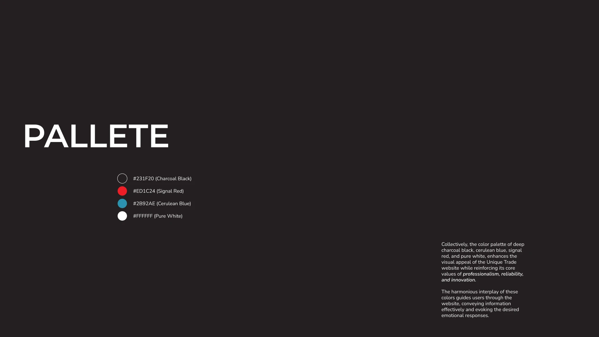
Moodboards were created to capture the desired visual style and tone of the redesign. This included selecting color palettes, typography, and imagery that align with Unique Trade’s brand identity.
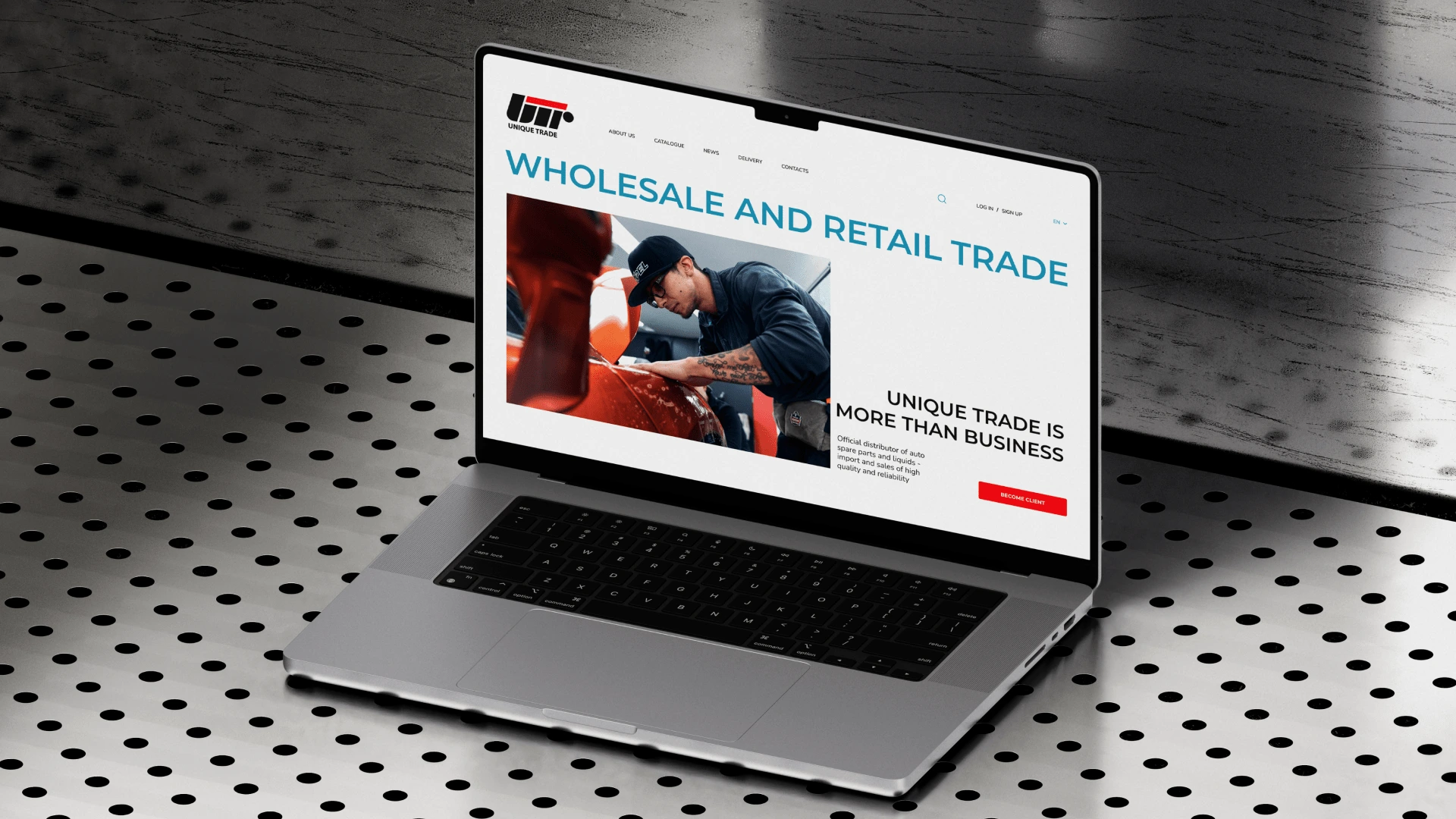
4. The redesign
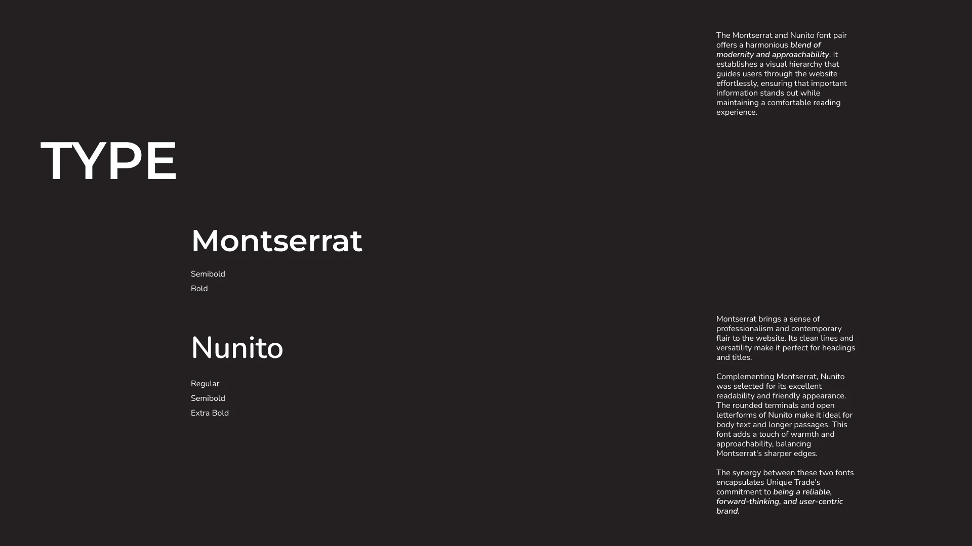
Montserrat and Nunito fonts were chosen for their readability and modern appeal, creating a cohesive and attractive visual style.

The Output
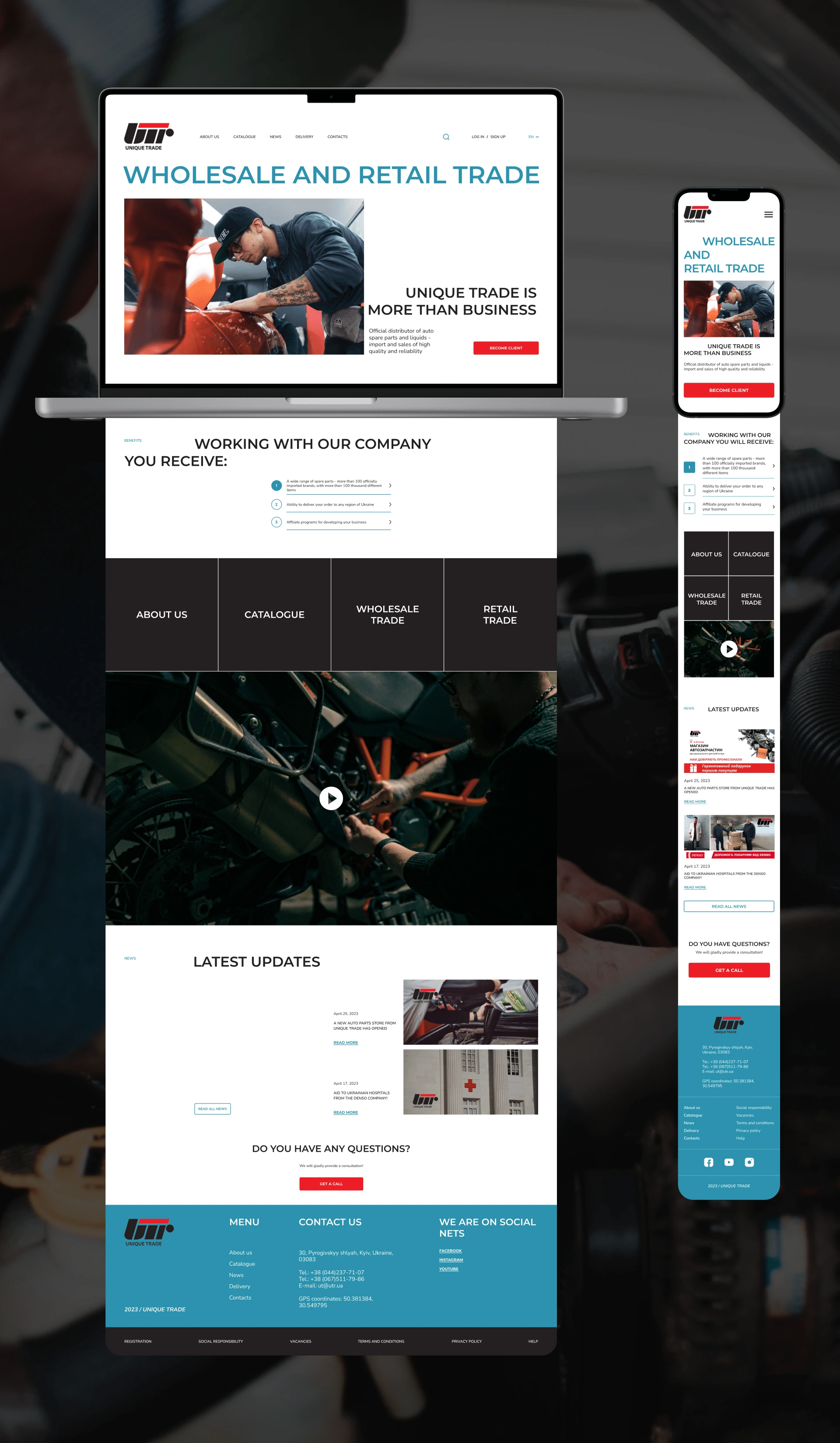
To address the issues and improve Unique Trade's online presence, several key changes were made during the redesign:
1. Updated Visual Design:
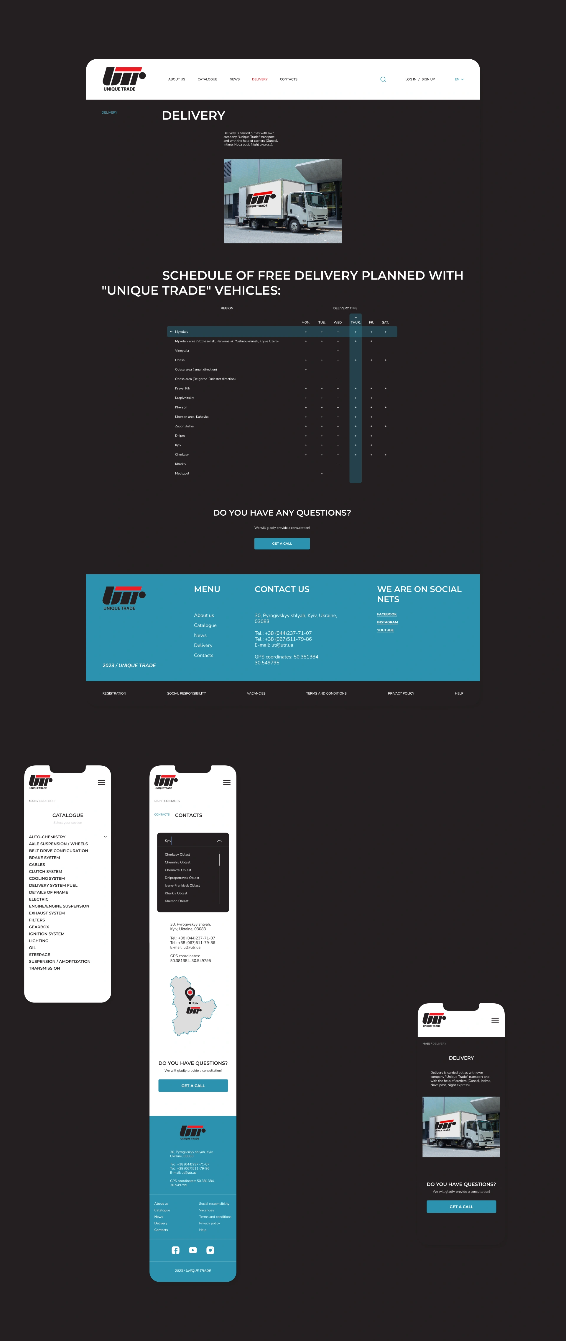
- Modern Look: A contemporary and professional design was implemented, using a refined color palette and high-quality images to reflect Unique Trade's brand values.
- Improved Typography: Montserrat and Nunito fonts were chosen for their readability and modern appeal, creating a cohesive and attractive visual style.
2. Enhanced User Experience:
- Simplified Navigation: The website's navigation was reorganized to be more intuitive, making it easier for users to find products and information quickly.
- Streamlined User Journey: The overall user experience was improved, especially in the product search and checkout processes, making them smoother and less frustrating.
3. Mobile Optimization:
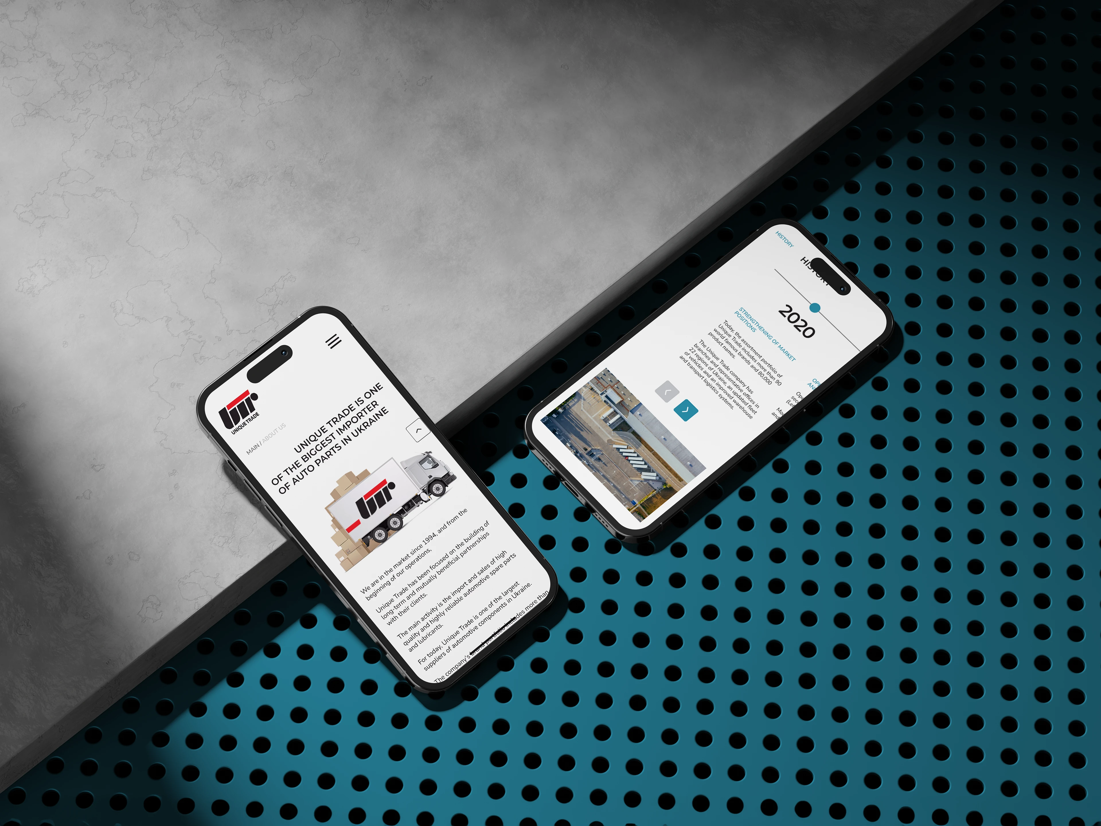
The site was redesigned to be fully responsive, ensuring a seamless and consistent experience across all devices, including smartphones and tablets.
4. Better Product Presentation:
Product pages were revamped to include comprehensive descriptions, specifications, and high-quality images, helping users make informed purchasing decisions.
5. Interactive and Engaging Features:
Engaging elements such as clear calls-to-action and interactive features were added to keep users interested and guide them towards making purchases.
Thank you for watching!
Ready to elevate your design game? Let's collaborate and bring your next project to life.
Like this project
Posted Jun 10, 2024
Welcome to my Unique Trade case study where I unveil the transformative journey of redesigning
Likes
0
Views
13

