Built with Jitter
Hawaii Tourism Authority: Custom Animated Type
Jess Palmer
In collaboration with the Hawaiian Islands and the Hawaiʻi Tourism Authority, this video campaign sought to reframe travel to Hawaiʻi—not as escapism, but as a return to connection. The piece invites visitors to experience the islands through the eyes of its people and culture, centering the Hawaiian language and values as both anchor and compass.
This was a particularly meaningful project with a film crew that included Malia Ann Obama, whose personal ties to Hawaiʻi added a deeper resonance to the storytelling.
The Ask
Design animated text and graphic overlays that embody the emotional texture of Hawaiian culture—one rooted in warmth, heritage, nature, and the sacred. My role was to bring these moments to life in a way that felt organic, hand-crafted, and reverent to the land and language.
Creative Approach
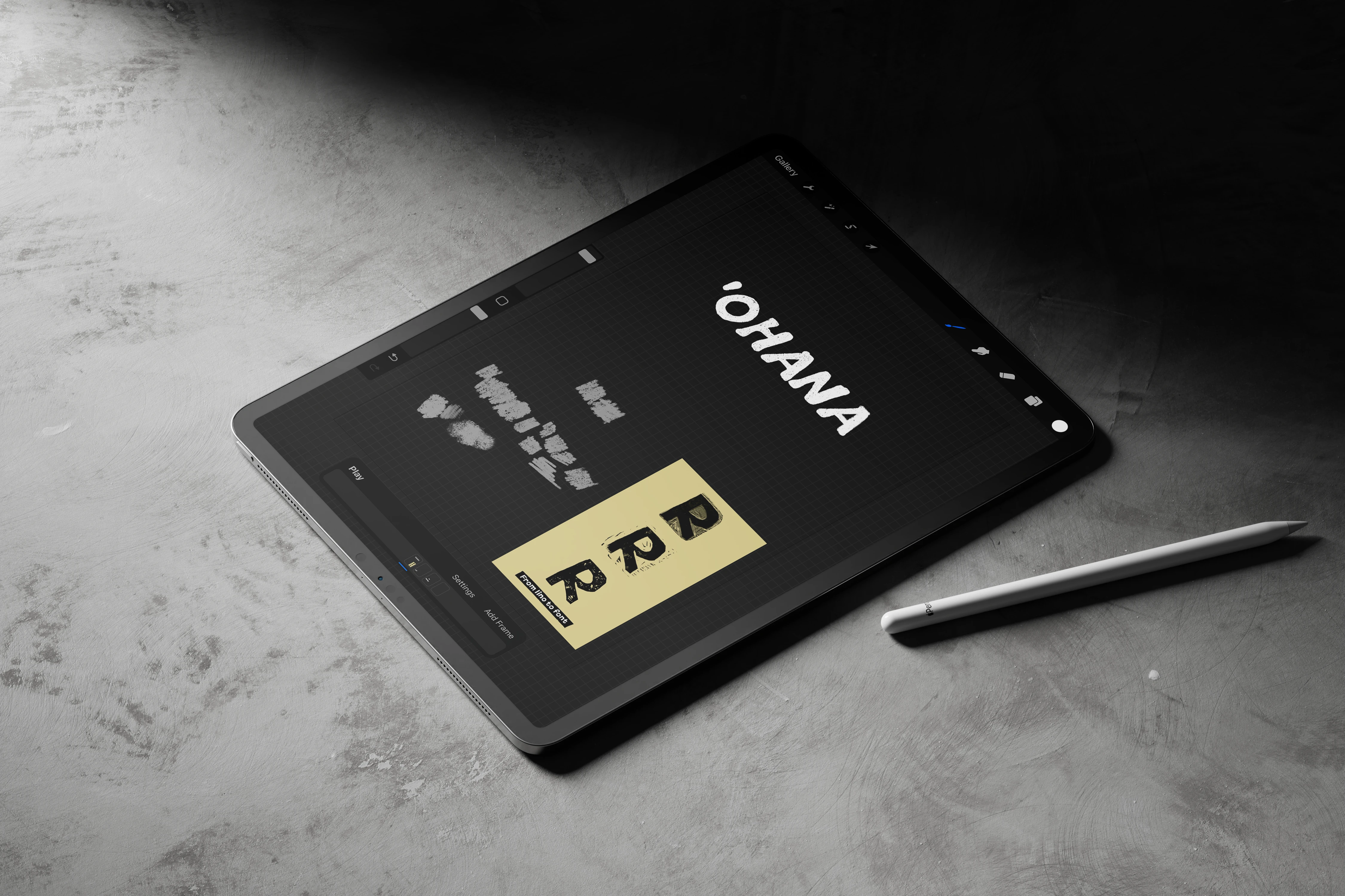
I chose a hand-drawn, imperfect, and highly textural type treatment to reflect the living, breathing energy of Hawaiʻi itself. The lettering is animated to feel alive—casual but intentional—like the rhythm of the waves or the sway of a palm.
For the typeface, I selected Mauna Loa, a sans-serif display font inspired by vintage Hawaiian maps and mid-century cartographic lettering. Its tactile, nostalgic quality helped root the work in a sense of place. I then customized, layered, and animated the words to match the pacing of the narration and visuals.
Each animated word—drawn from the Hawaiian language—serves as a cultural touchstone in the story, expressing themes like “”ohana” “kuleana,” and “mālama.” These aren’t just translations—they’re philosophies that define life in the islands.
Why It Works
Cultural Alignment: The animation style echoes traditional Hawaiian craftsmanship—handmade, textural, and storied.
Strategic Typography: Vintage-inspired fonts helped us bridge past and present, grounding the piece in authenticity.
Narrative Flow: The timing and movement of each animated word mirrors the voiceover, guiding the viewer emotionally through the story.
Tourism with Intention: This campaign was not about escapism. It was about reverence—for the land, the culture, and the kuleana (responsibility) that comes with visiting.
Like this project
Posted Sep 10, 2025
Hand-drawn, textural typography animated to echo Hawaiian culture—'ohana,' kuleana, mālama—rooted in reverent design that honors land, language & heritage.
Likes
0
Views
14
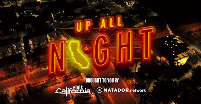
Clients

Matador Network
Hawaii Tourism Authority