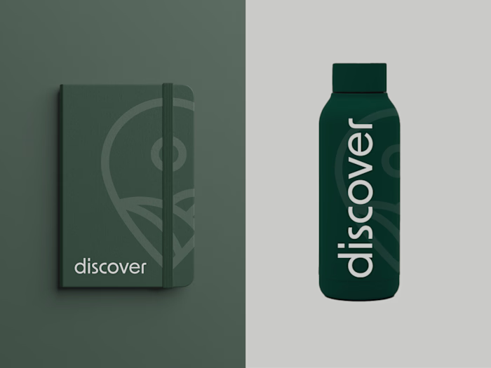
Mini Branding Kit
Vittoria Miceli
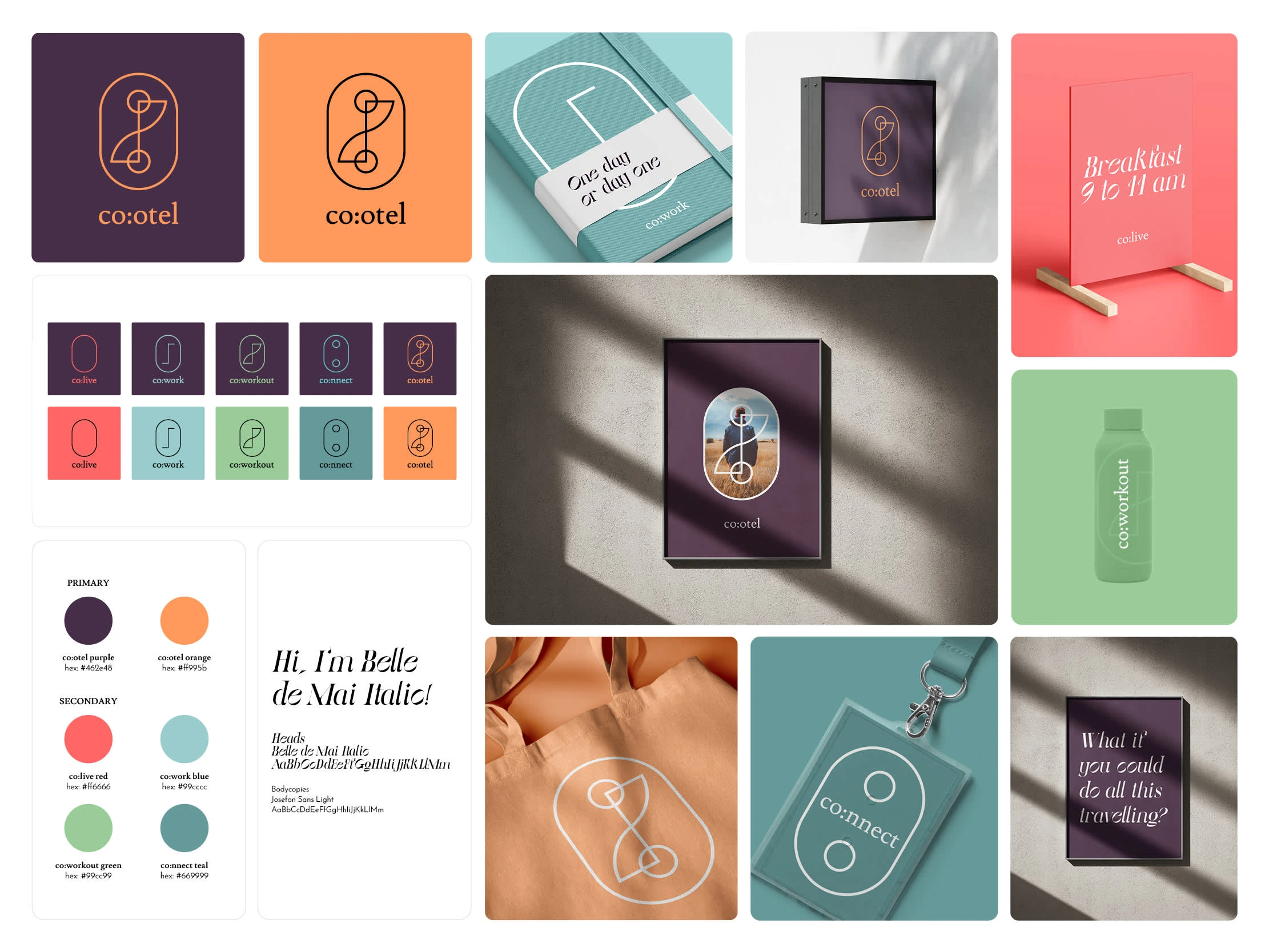
co:otel unlocks workspaces, gyms, and stays in underused hotels globally for digital nomads and fuels connections through events and activities.
'
The logo explained:
As part of the Cootel brand development, I designed a composable logo system made up of four core icons, each representing a fundamental pillar of the brand:
Colive – symbolized by a window, reflecting comfort, home, and shared living spaces.
Cowork – represented by stacked desks, capturing productivity, collaboration, and flexible workspaces.
Coworkout – visualized as a circuit, embodying movement, energy, and wellbeing.
Connect – depicted by a plug outlet, symbolizing connectivity, both digitally and socially.
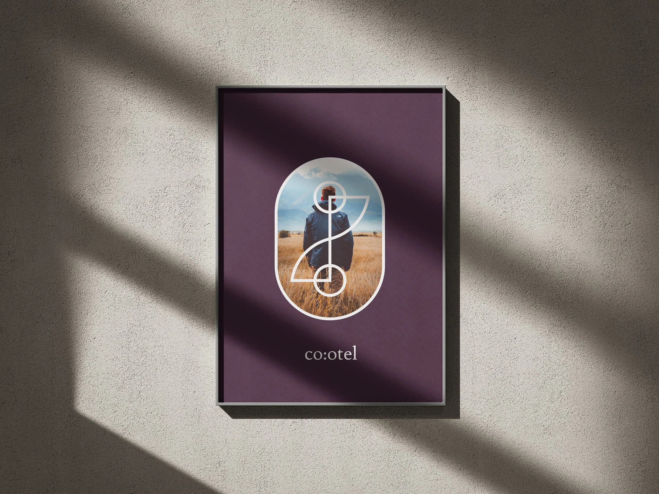
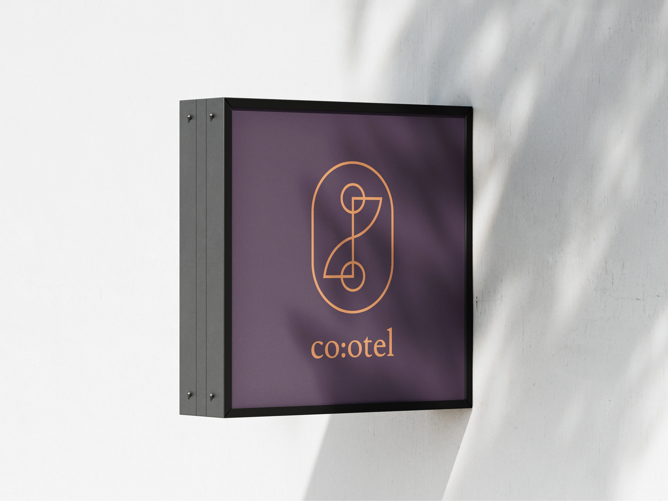
By juxtaposing and combining four icons, the main Cootel icon is formed. This modular and conceptual approach not only reinforces the holistic nature of the brand, but also provides a scalable visual identity that can evolve alongside its services.


Like this project
Posted Jul 13, 2025
co:otel unlocks workspaces, gyms, and stays in underused hotels globally for digital nomads and fuels connections through events and activities.