
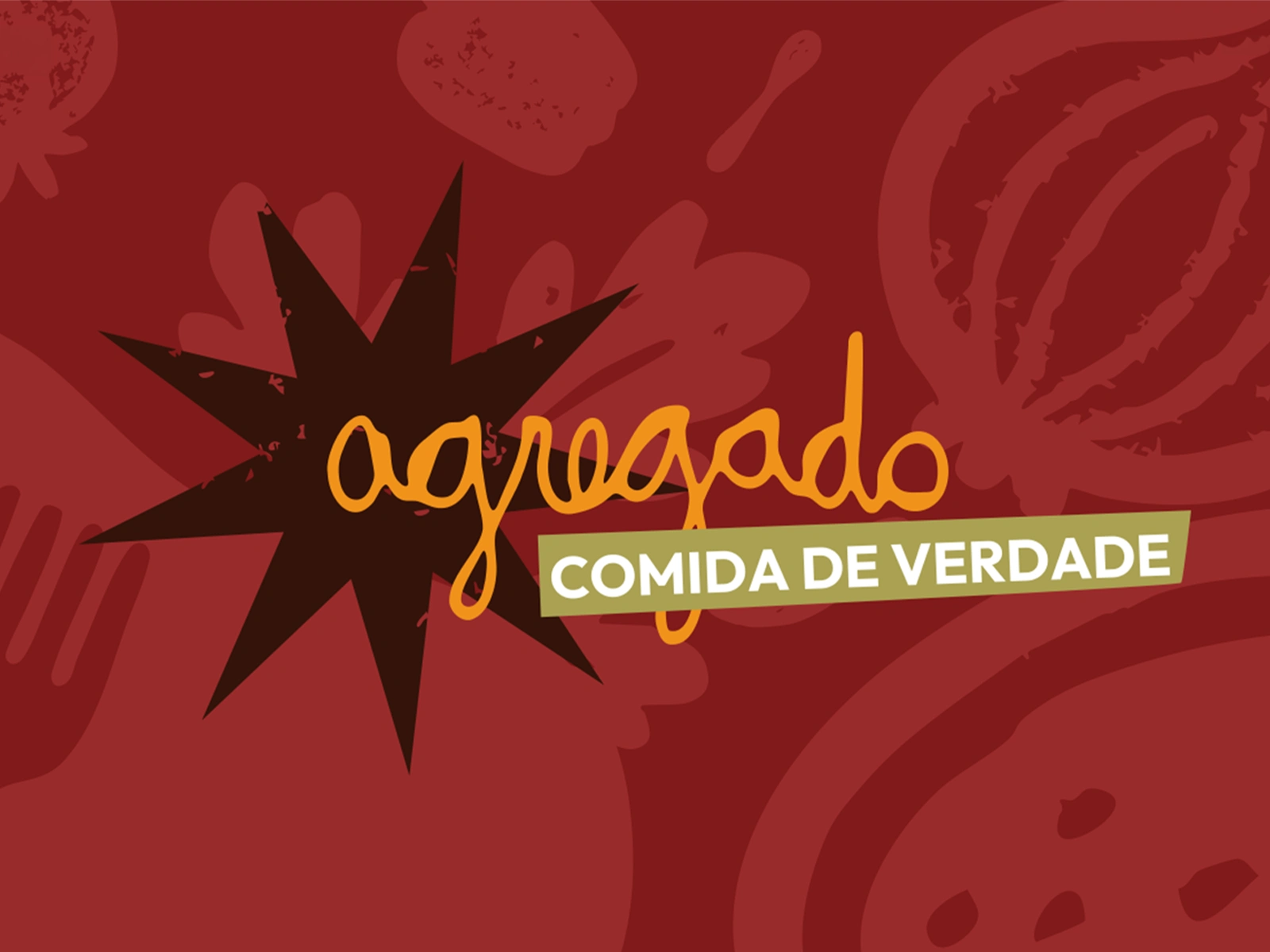
Agregado's logotype
Visual Identity applied to a staff's t-shirt.
Context
Agregado is a restaurant rooted in the suburbs of Rio de Janeiro. “Comida de verdade” (“real food”) sums up its offer: generous portions and the feeling of being welcomed into a full house.
The graphic library draws on ingredients and kitchen utensils.
What I designed
I led the art direction and designed the visual identity, from the handwritten wordmark and color palette to a set of textured illustrations. The same shapes work as small icons or fill the frame, so I could use them across social posts, uniforms, and takeaway packaging.
Instagram application for brand messaging and the daily menu.
From the feed to the doorstep
On Instagram, “Casa cheia, prato cheio” (“Full house, full plate”) gets a bold graphic treatment, while the daily menu uses a paper-like panel over a food photo to keep the dishes easy to scan. For delivery, I used the kitchen illustrations to frame the storefront and wrap around the takeaway containers and paper bag.
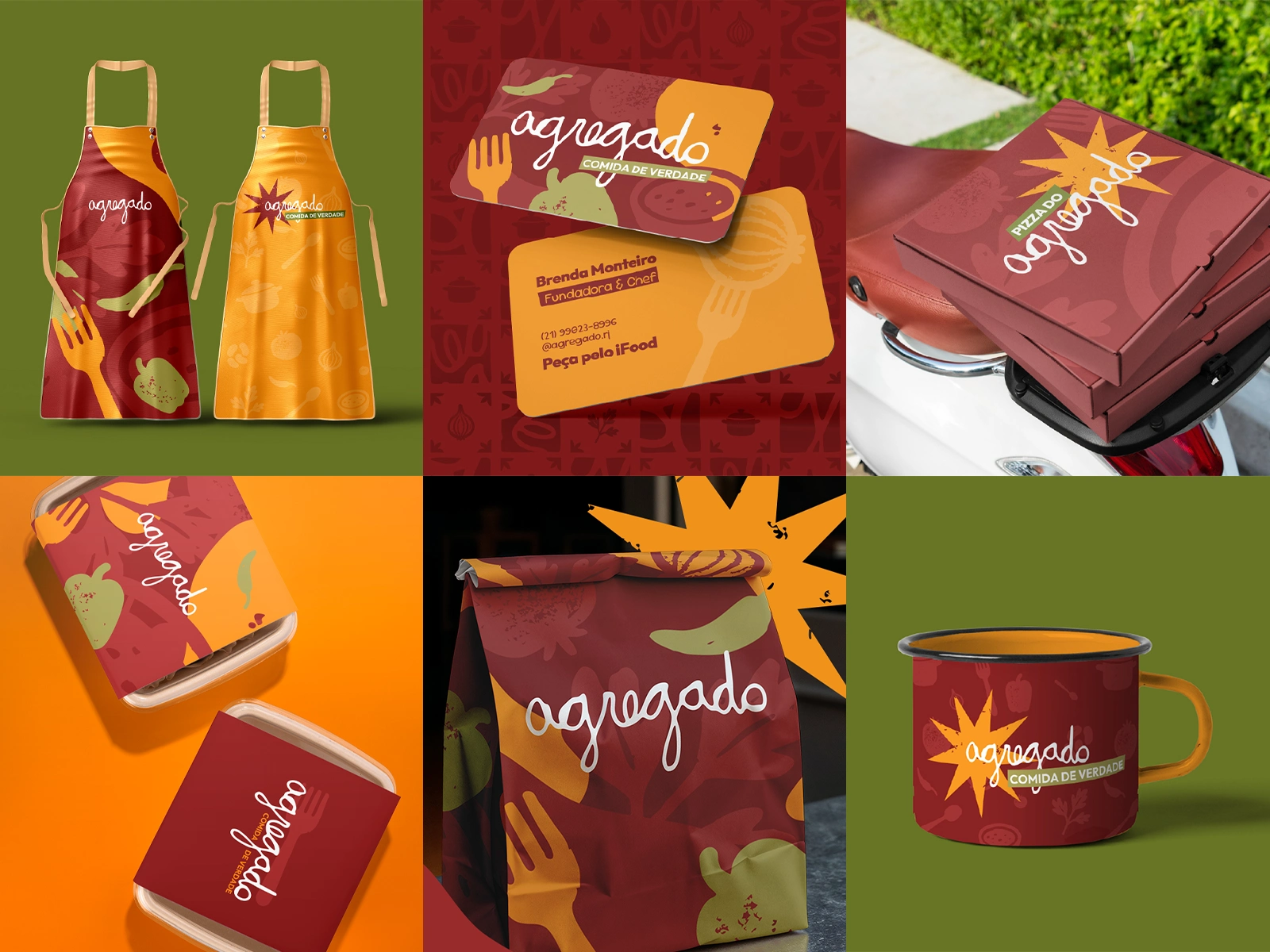
packaging and other brand applications.
0 likes · 0 views · Nov 17, 2026
Visual identity and art direction for a Rio de Janeiro restaurant, applied to social media, staff uniforms, and delivery packaging.

