
Context
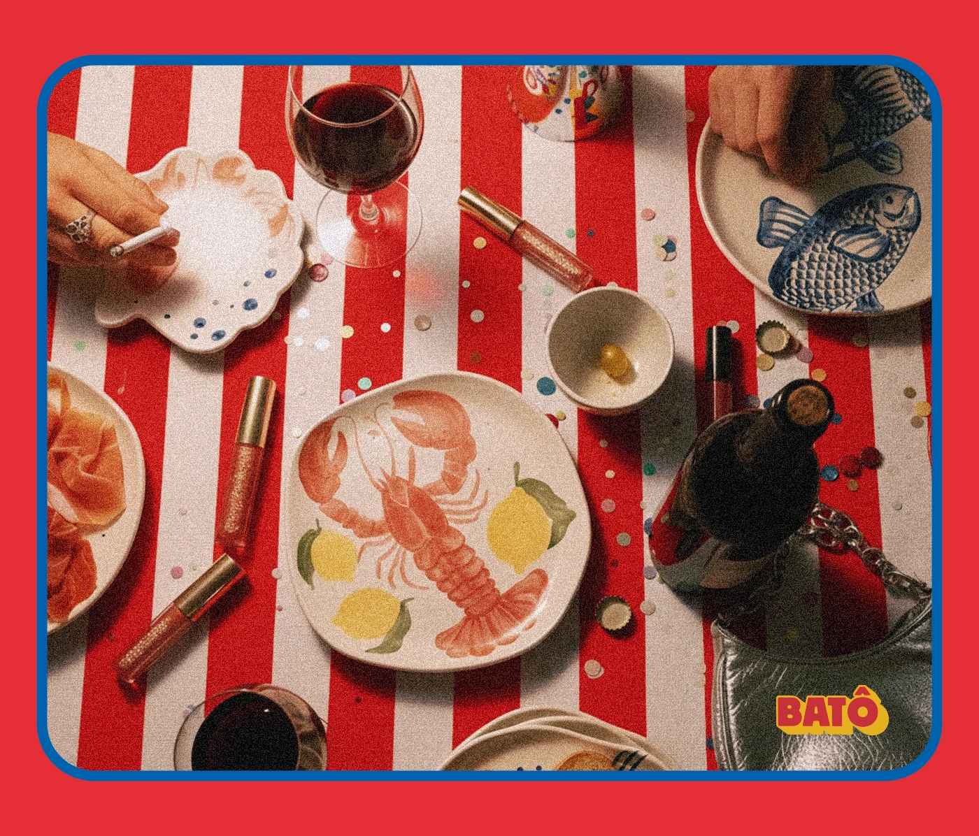
Studio Batô is an independent ceramics practice. I took “Forma, cor e afeto” (“Form, color, and affection”) as the starting point for the identity. The ceramics already made a statement at the table, and I wanted the graphics to have that same presence.
Building the identity
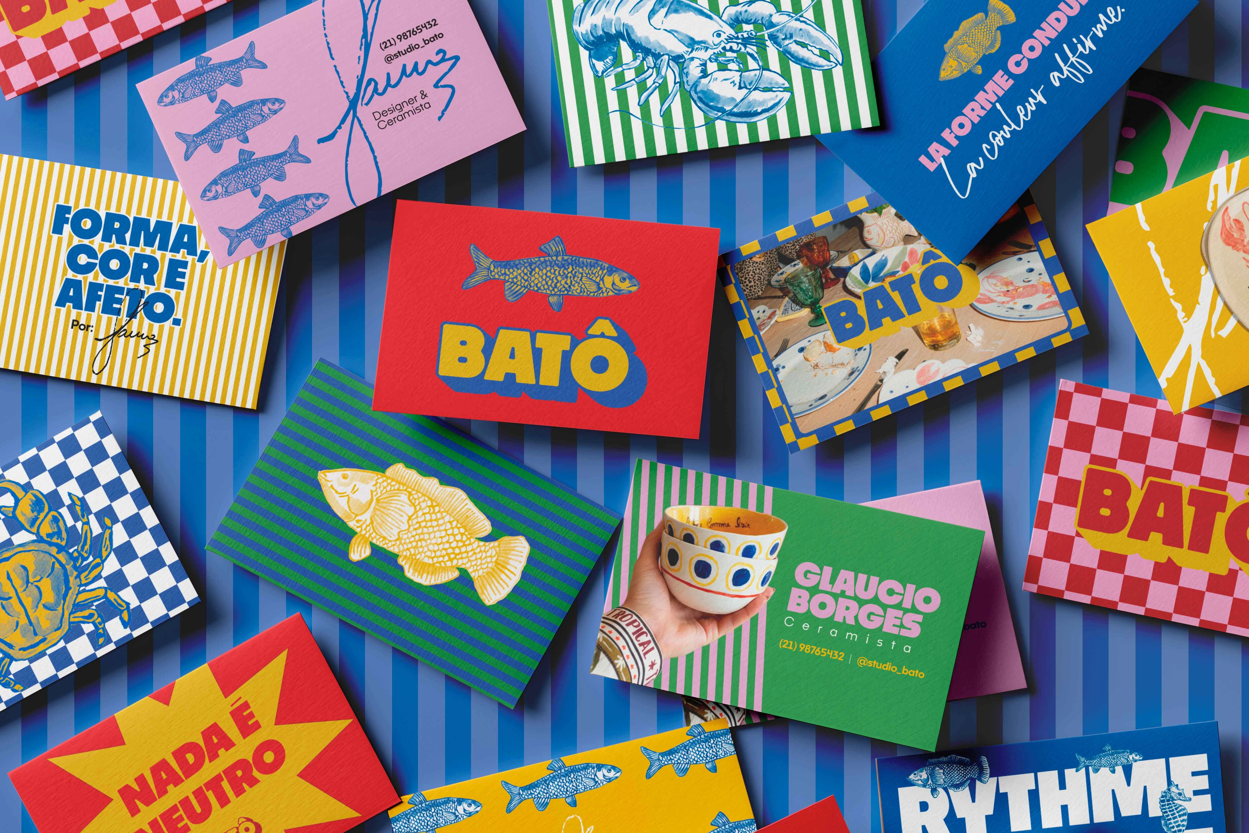
I paired a chunky, shadowed wordmark with detailed sardine illustrations, then used stripes and checkerboards to give the compositions rhythm. I kept the letterforms consistent while changing the color pairings, so the logo could sit on bright yellow, pink, green, or red and still read as Batô.
From print to Instagram
On the tote, rows of sardines turn the bag into a repeat pattern. On Instagram, the same palette connects graphic posts such as “Nada é neutro” (“Nothing is neutral”) with close-ups of the ceramics. I used the patterns as full backgrounds or small accents depending on how much room the object needed.
0 likes · 0 views · Nov 17, 2026
Art direction and visual identity for Studio Batô, an independent ceramics practice. A bold wordmark, illustrated sardines, and clashing patterns carry the bran

