Spuds — Crafting a Bold Identity for Fast Food Culture
Ojo Oyewole
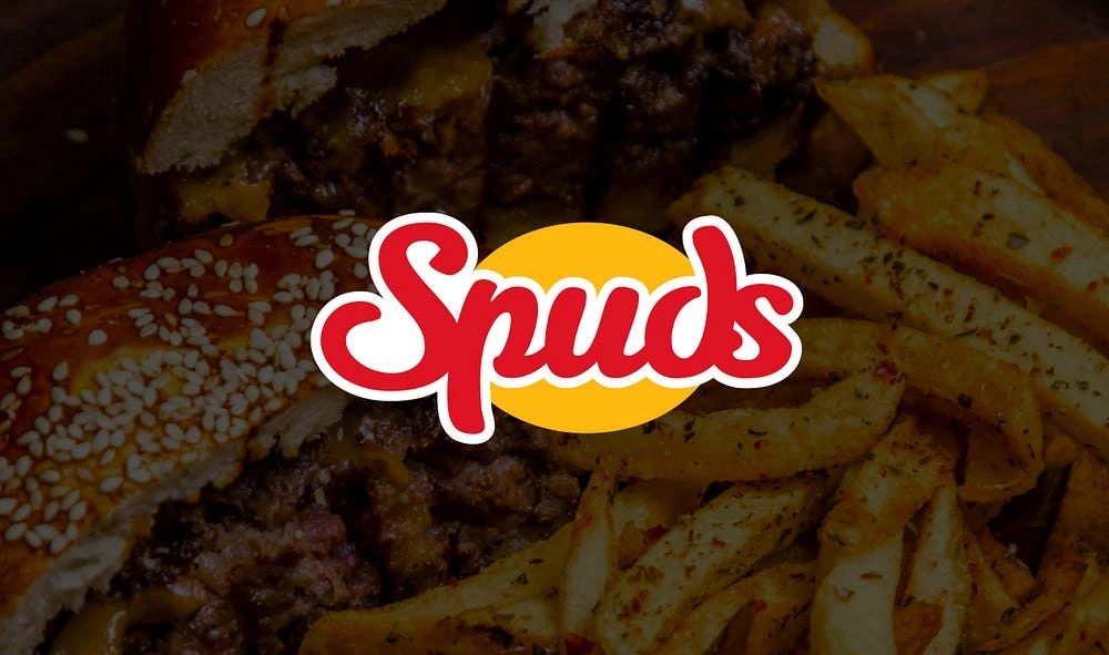
Spuds – Designing a Distinct Identity for a Burger-Led Fast Food Brand
Client: Spuds
Industry: Food & Beverage
Scope: Brand Identity Design
Services: Brand Strategy, Logo Design, Visual Identity, Graphic System, Packaging Direction
Brand Overview
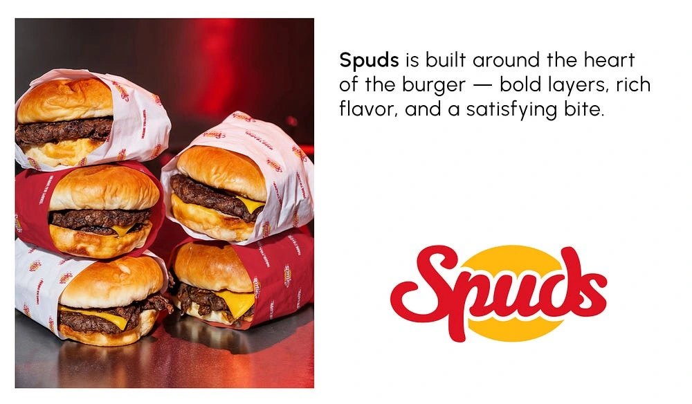
Spuds is a modern fast-food brand focused on burgers as the hero product, supported by fries and chicken. The goal was to design a bold and memorable identity that feels energetic, appetizing, and playful. The brand needed to connect with a youthful audience and communicate speed, flavor, and fun through visuals.
Brand Strategy
The Spuds identity was built to feel confident, friendly, and modern. The brand is positioned as a fun and approachable fast-food option that delivers satisfaction in every bite. Every design decision was guided by the need to create strong appetite appeal and instant recognition.
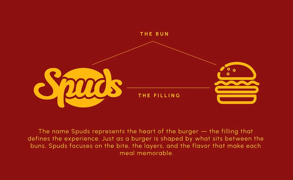
The Name — Spuds
The name Spuds represents the heart of fast food culture. It symbolizes flavor, filling, and enjoyment. While burgers are the main focus, the name allows flexibility for fries and chicken to exist naturally within the brand. It is simple, memorable, and easy to connect with.
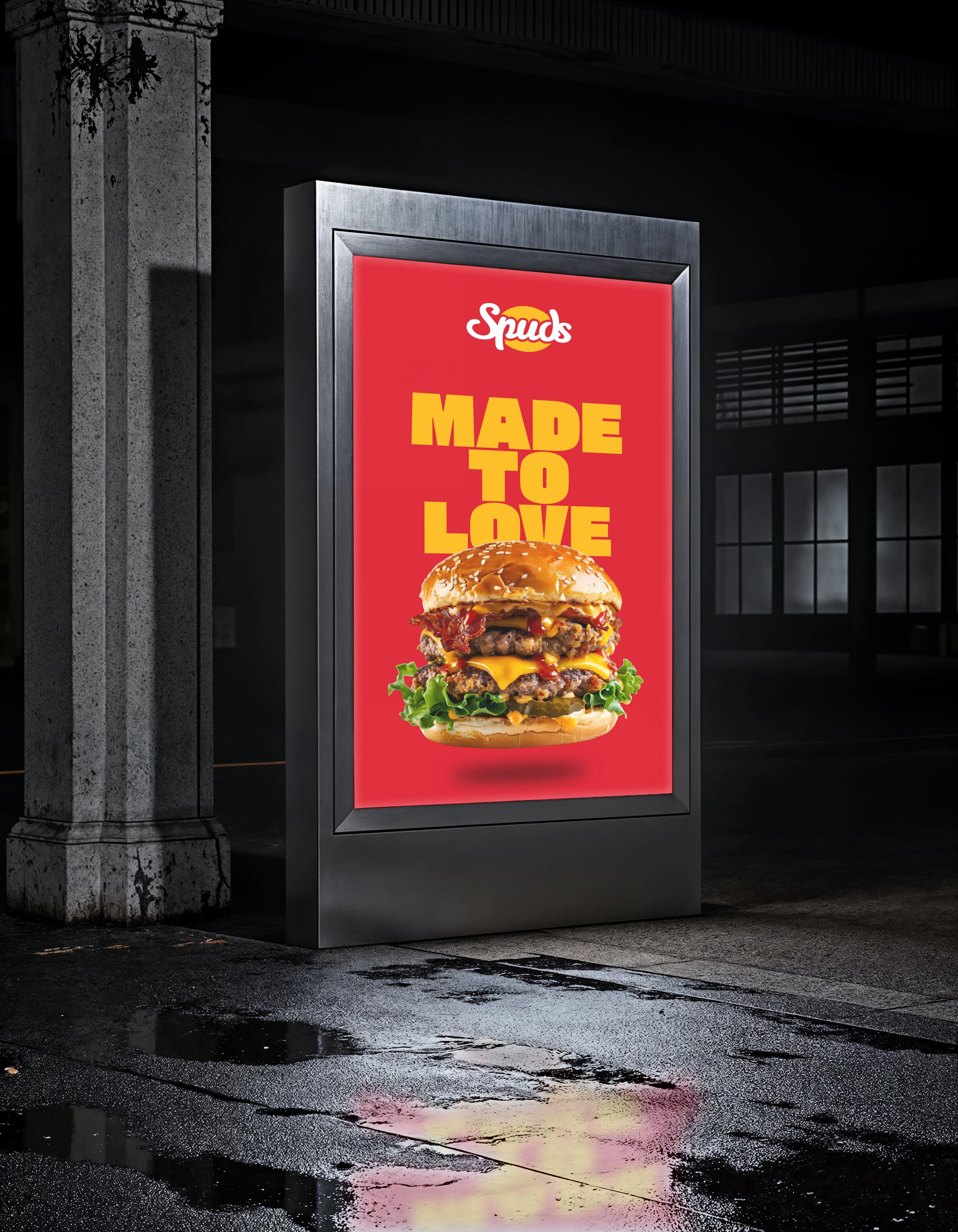
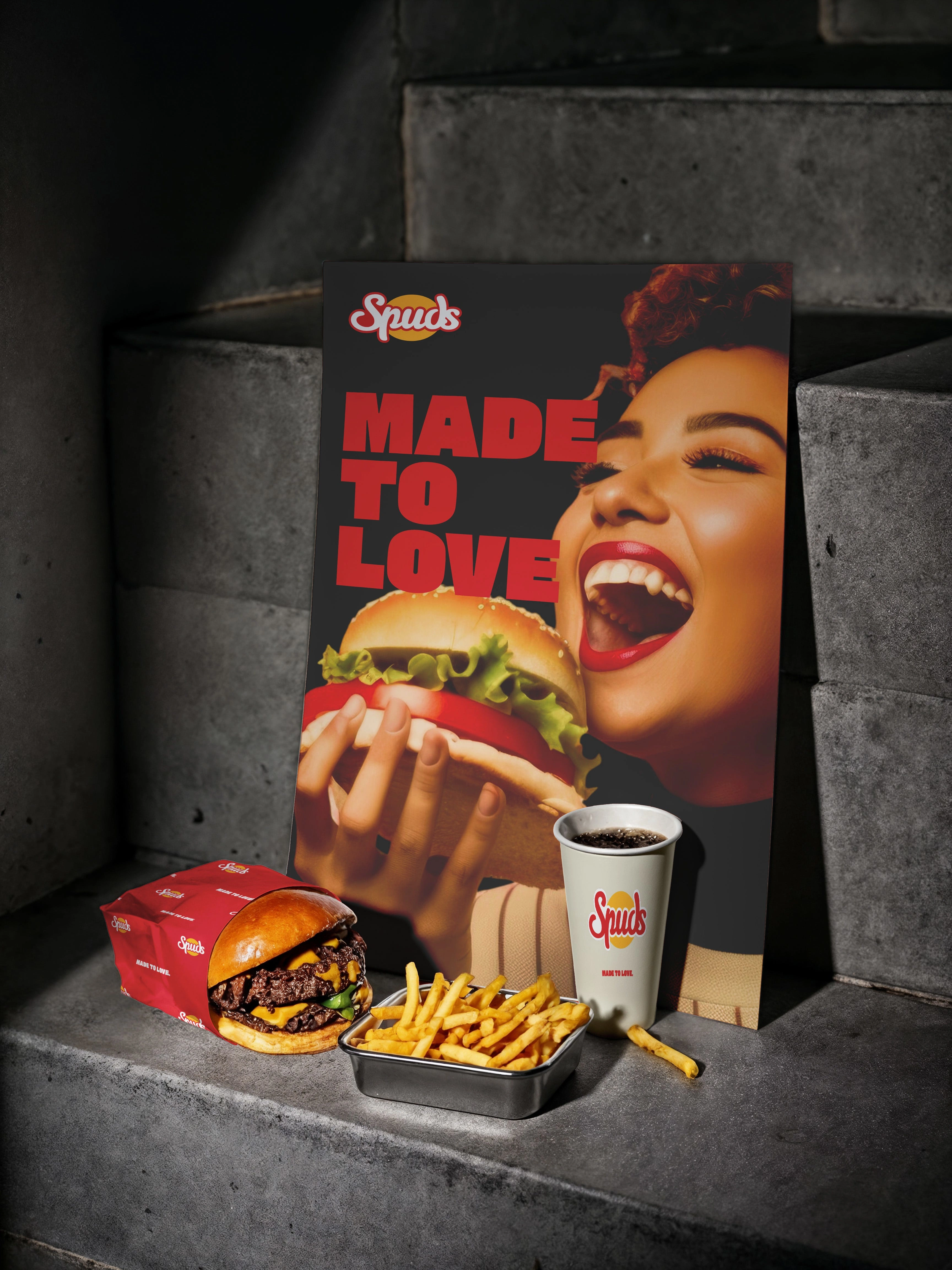
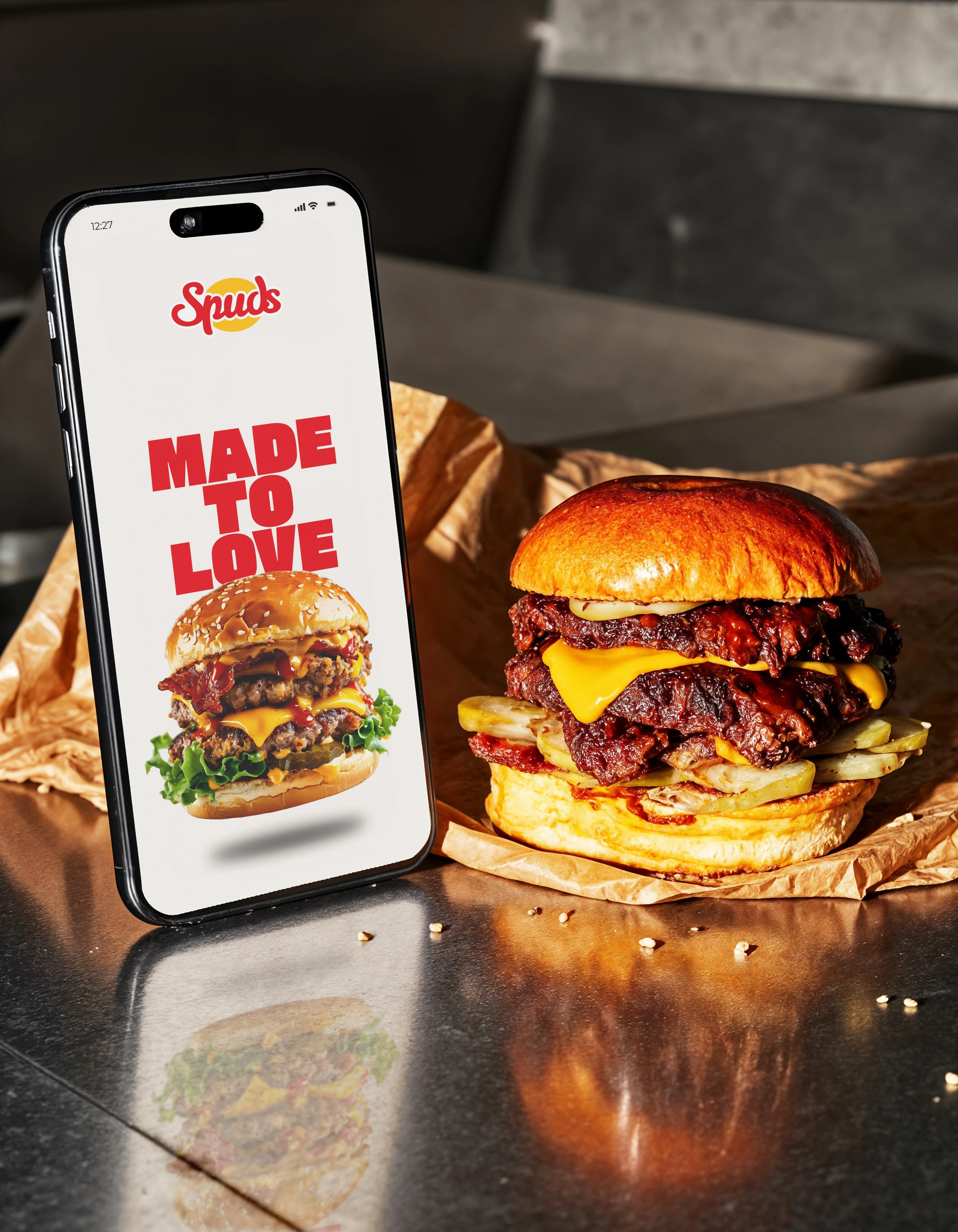
Poster
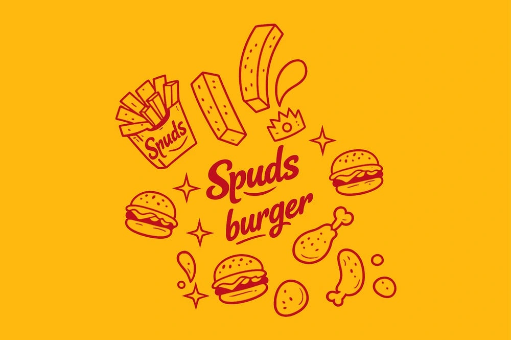
Brand icons
Logo Concept
The Spuds logo was designed as a bold custom wordmark with rounded, friendly forms. The visual style hints at burger shapes and fast-food culture without being overly literal. The logo is clean, modern, and scalable for multiple uses.
Logo concept
Visual Language
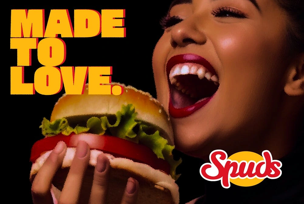
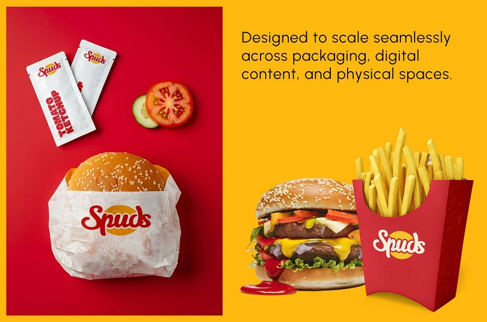
The visual identity of Spuds is centered around appetite and energy. The system uses strong colors, playful graphics, and simple layouts to create a fun and engaging brand experience. The design language ensures that the brand feels lively, youthful, and easy to recognize at first glance.
Logo on red
Logo on white
Color Identity
The Spuds color palette was chosen to reflect warmth, appetite, and excitement. Bold reds represent energy and hunger appeal, while vibrant yellow tones bring feelings of freshness and fun. The color system creates strong contrast and ensures the brand stands out across packaging, signage, and promotional materials.
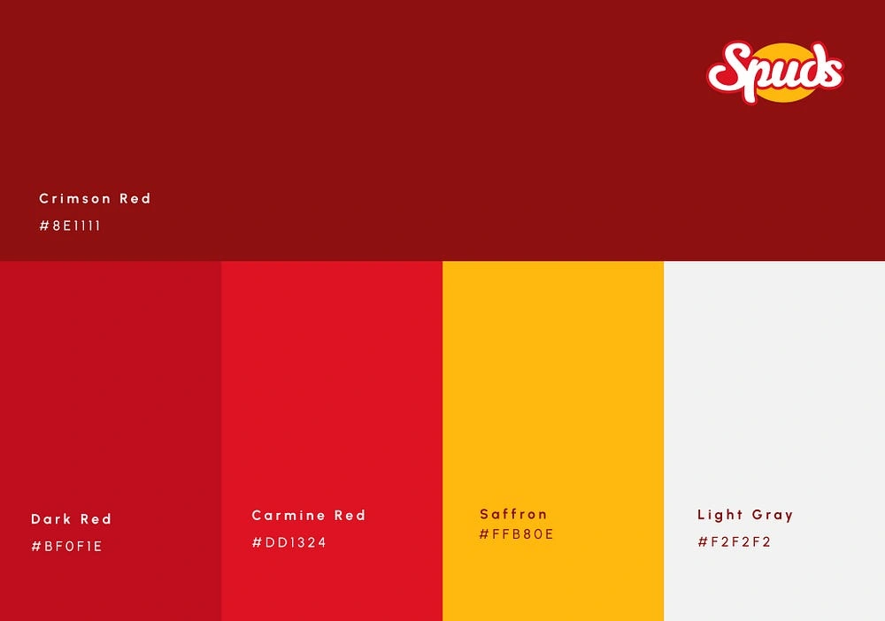
colors
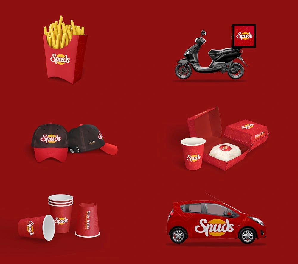
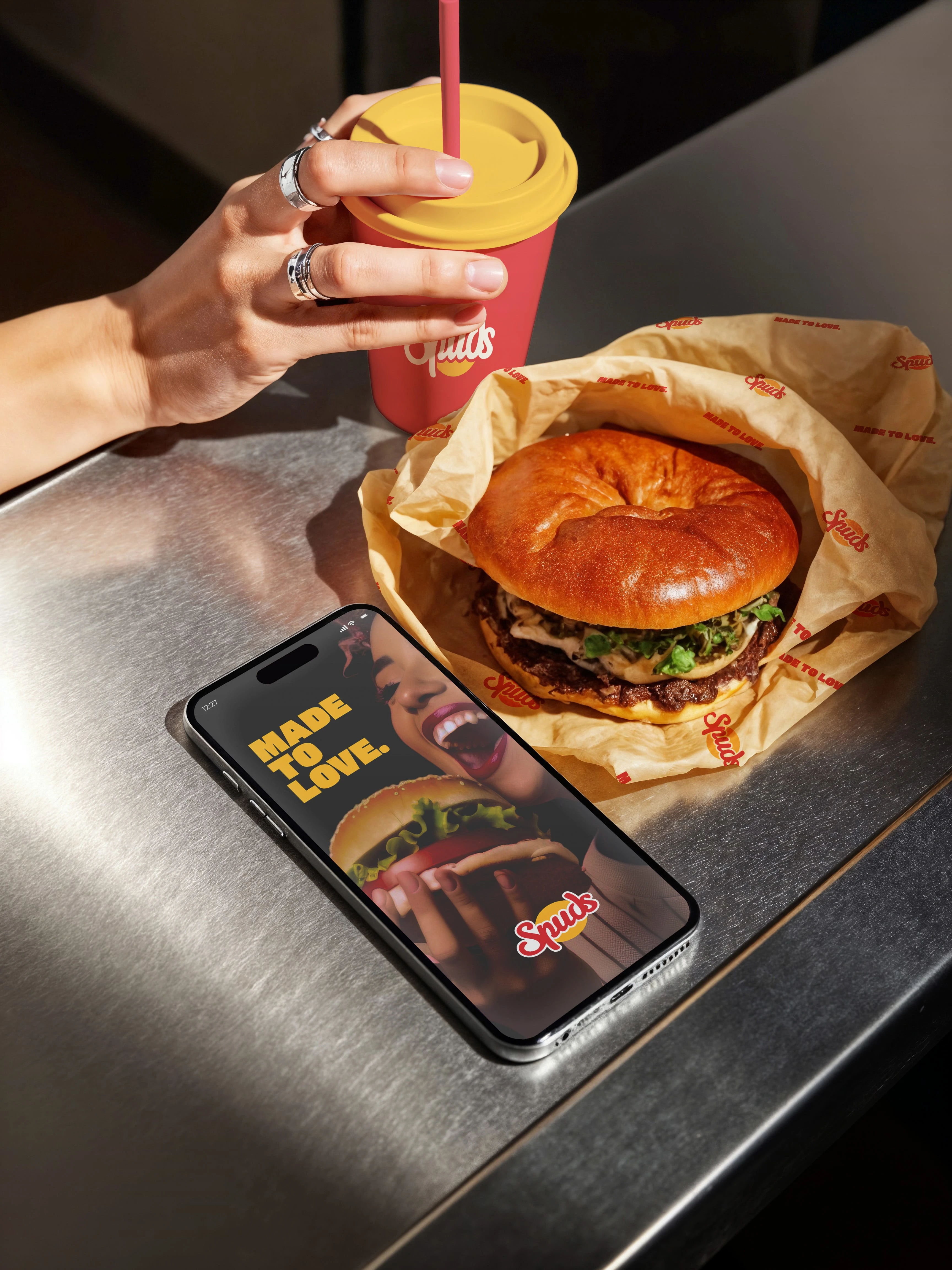
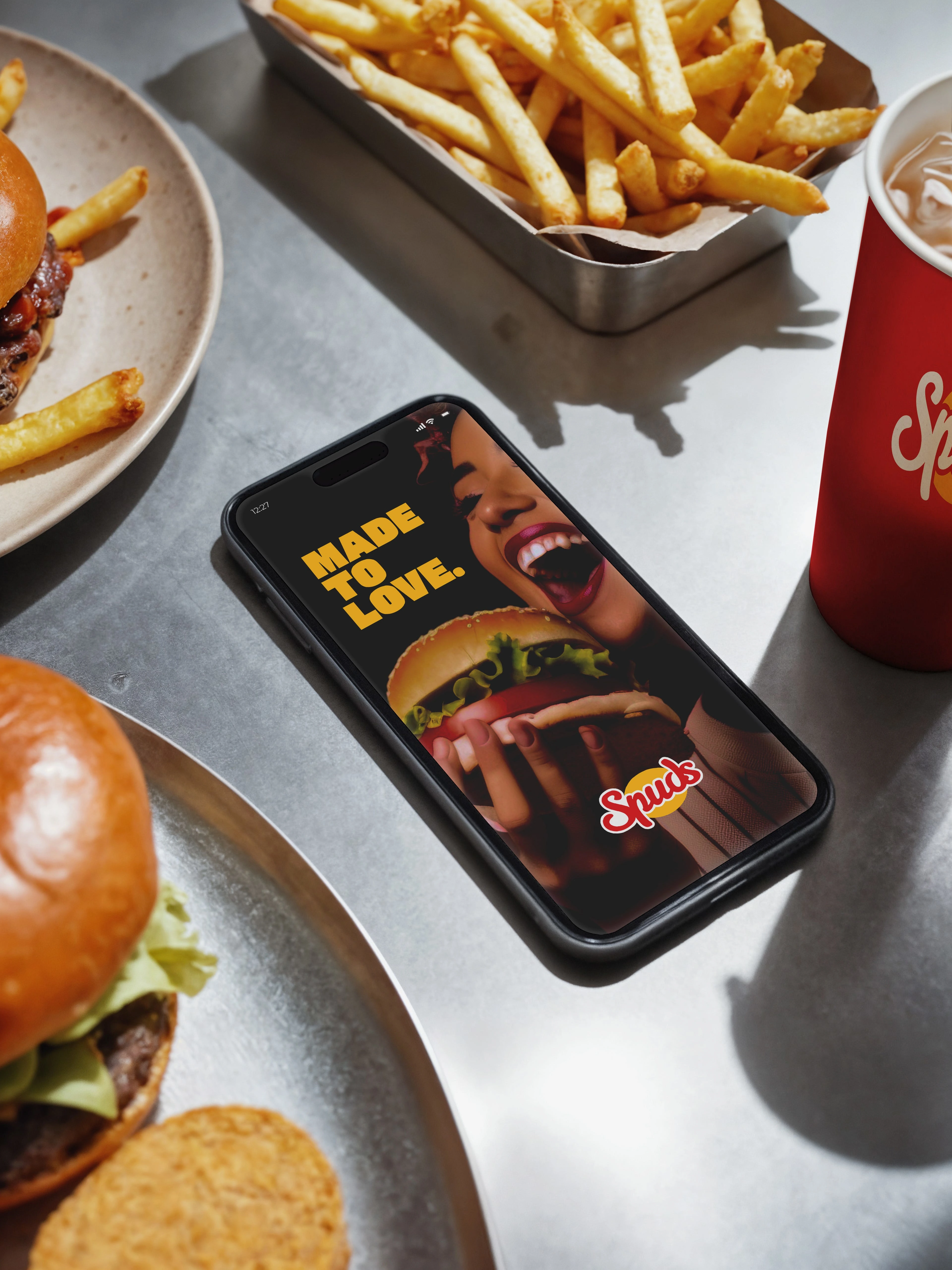
mockups
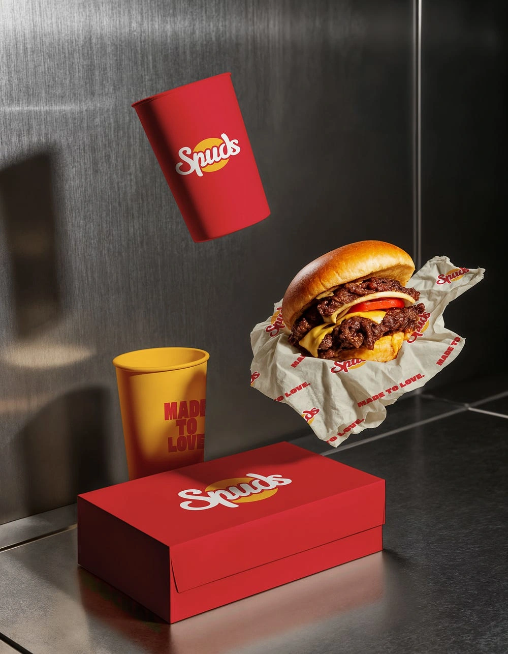
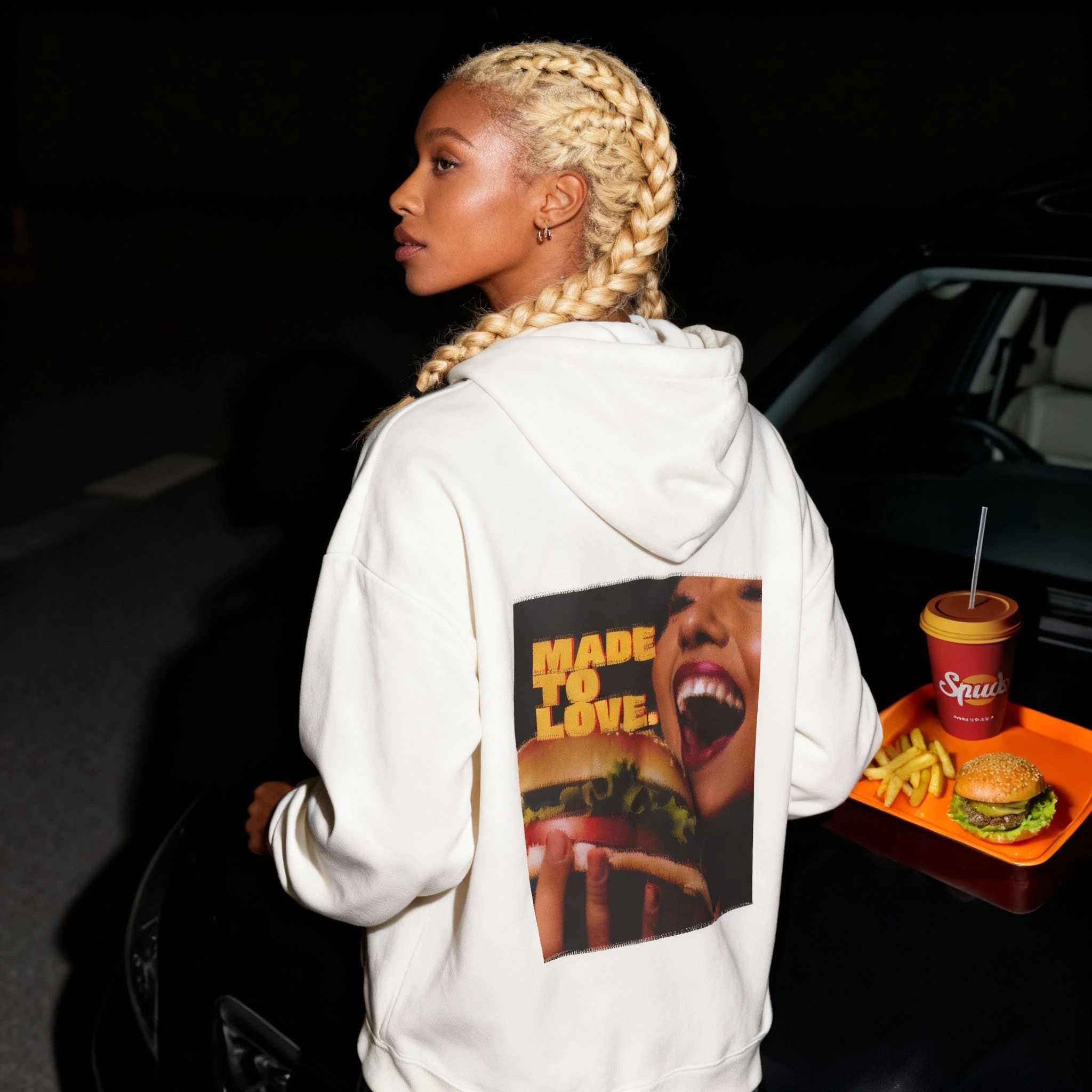
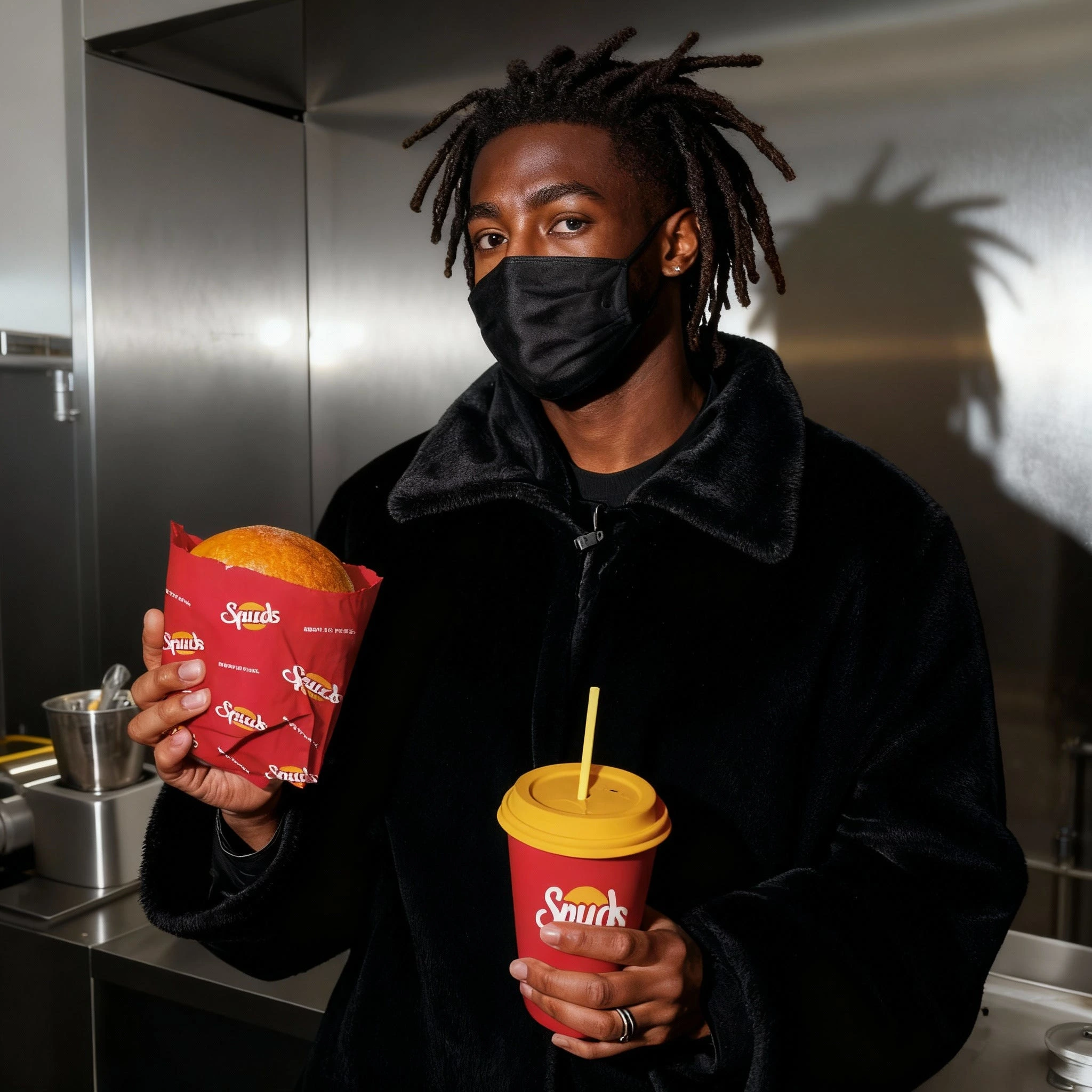
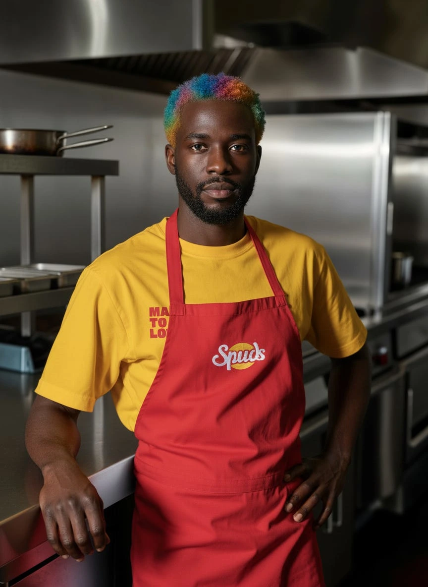
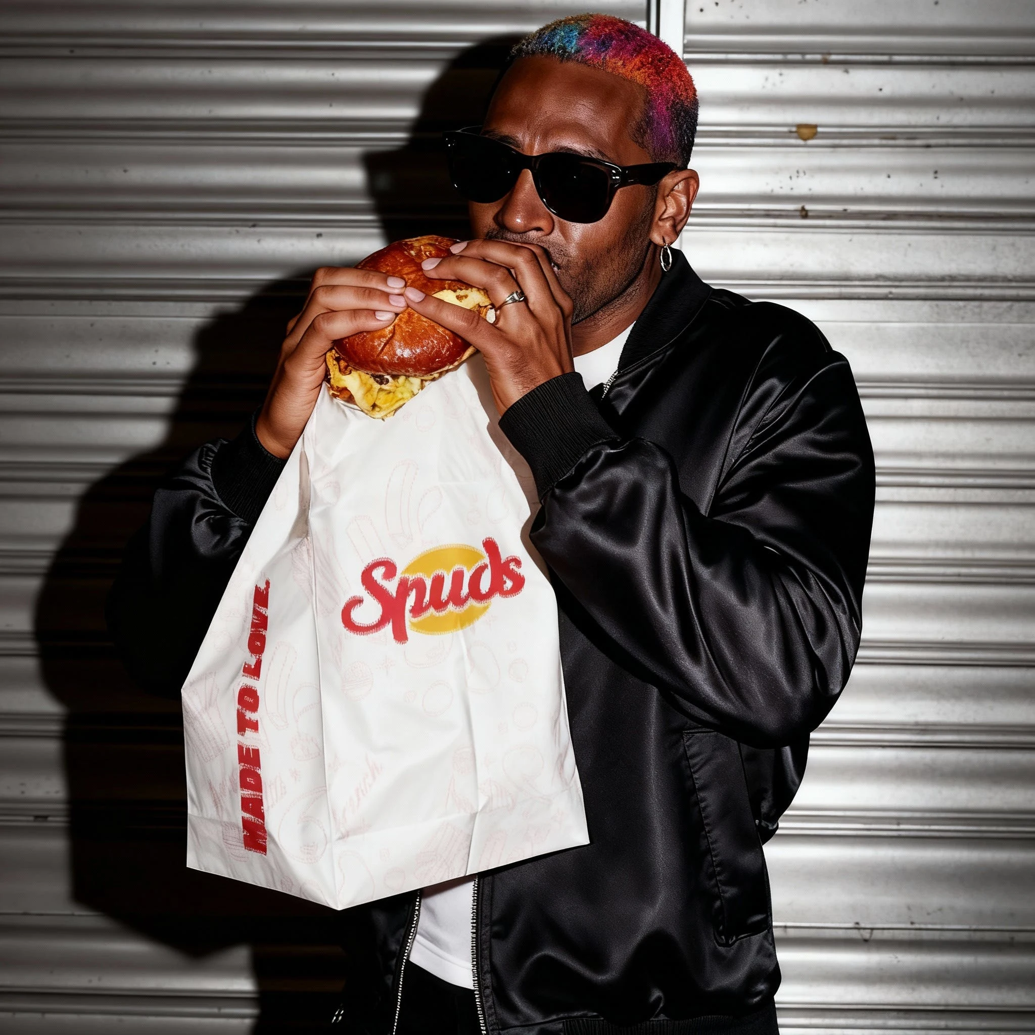
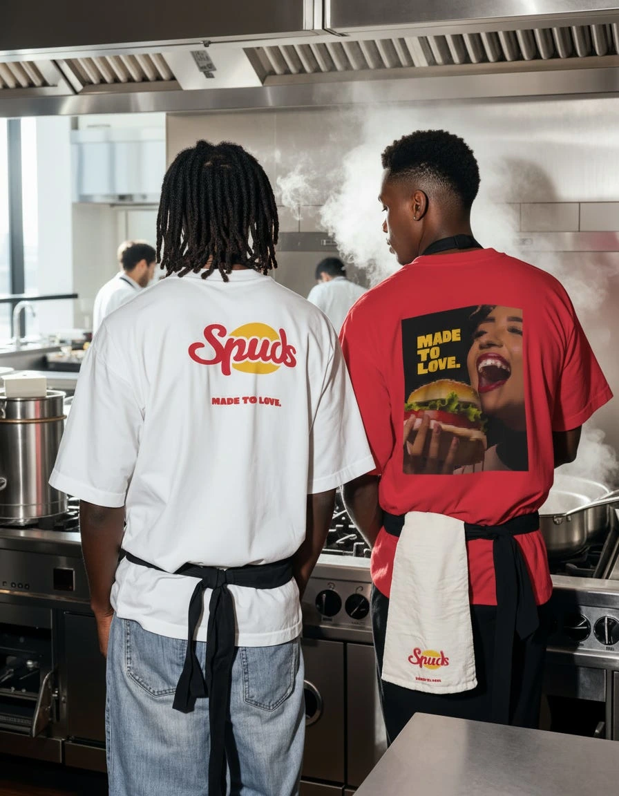
Brand Applications
The identity was designed to function across multiple real-world touchpoints. Spuds branding extends naturally into food packaging, takeaway bags, uniforms, menu boards, and merchandise. Each application maintains a consistent look and feel, ensuring the brand remains unified wherever it appears.

Final Outcome
The Spuds project resulted in a complete and scalable brand identity system. The design delivers a strong visual presence that is playful, bold, and commercially effective. It establishes a solid foundation for a fast-food brand that can grow and remain consistent over time.
Like this project
Posted Feb 3, 2026
A complete brand identity project for Spuds, built to capture bold flavor and fun energy through a modern visual system for burgers, fries, and chicken.