Tokopedia Official Store: Revamp entire page
Hilmi Salim
Tokopedia Official Store: Revamp entire page to help buyer discover promotion from trusted brands.
Overview
One of the five main features included in the main navigation of the Tokopedia app is the Official Store (OS). Unfortunately, this page is not frequently visited by Tokopedia buyers. Those who do visit often find the layout confusing and the product offerings unappealing. Therefore, this page needs to be revamped to increase traffic and engagement, which could ultimately boost sales for the Official Store.
Scope
UX Design, Research, Prototyping, Testing, Moodboarding, Design guidelines for creative and business team.
Timeline
Q4 2019 - Q1 2020
Background
The Tokopedia Official Store is one of the features that Tokopedia aims to emphasize for our buyers, particularly on mobile devices. However, the current design is not optimal in terms of traffic and engagement on that page. Additionally, the current layout does not cater to the business's requirements for highlighting various campaigns, brands, and other Tokopedia offers. Therefore, we need to revisit the design of the Official Store page to ensure it bring more impact for Tokopedia.
Objective
For buyer:
Buyers can comfortably discover the page and find products that match their preferences.
For business team;
Assist the business team in managing the page more easily and achieving optimal conversion results.
The Users
Buyer who’s looking for original product from trusted brand
According to the behavioral research carried out by our research team, the majority of our users are:
Residing in the Jabodetabek area.
Between the ages of 31 and 40.
Incurring monthly routine expenses ranging from 1.25 million to 5 million rupiah.
In addition to demographics, the research also revealed some significant user behaviors, which include:
The Promo Seeker
Those who visit the official store page to look for brands and products that are currently on promotion.
Main goal:
Obtaining original products at promotional prices or with discounts.
The Impulsive Buyer
Those who visit the official store page to browse and see what products are available and appealing to purchase.
Main goal:
Explore the page to see what products are available and potentially purchase them if they match their preferences.
Success metrics
Maintain user engagement with the OS homepage to potentially boost the number of transactions from the Official Store.
This was the primary measurement of success for this product. Now, let's find out if this product succeeded or not. You can see the impact in the final section. 👍
Understand our existing page
Assessing what didn't work for our users in the existing page
Based on testing results from several users, design audit, and discussions with the business team, I have identified a pattern of issues occurring on the Official Store page. There are at least five problems that I have noted for revamping this page.
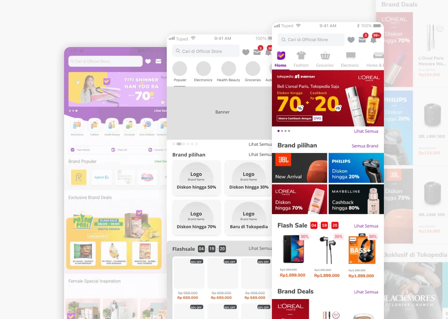
Problem 01 - Users find the displayed promotions confusing
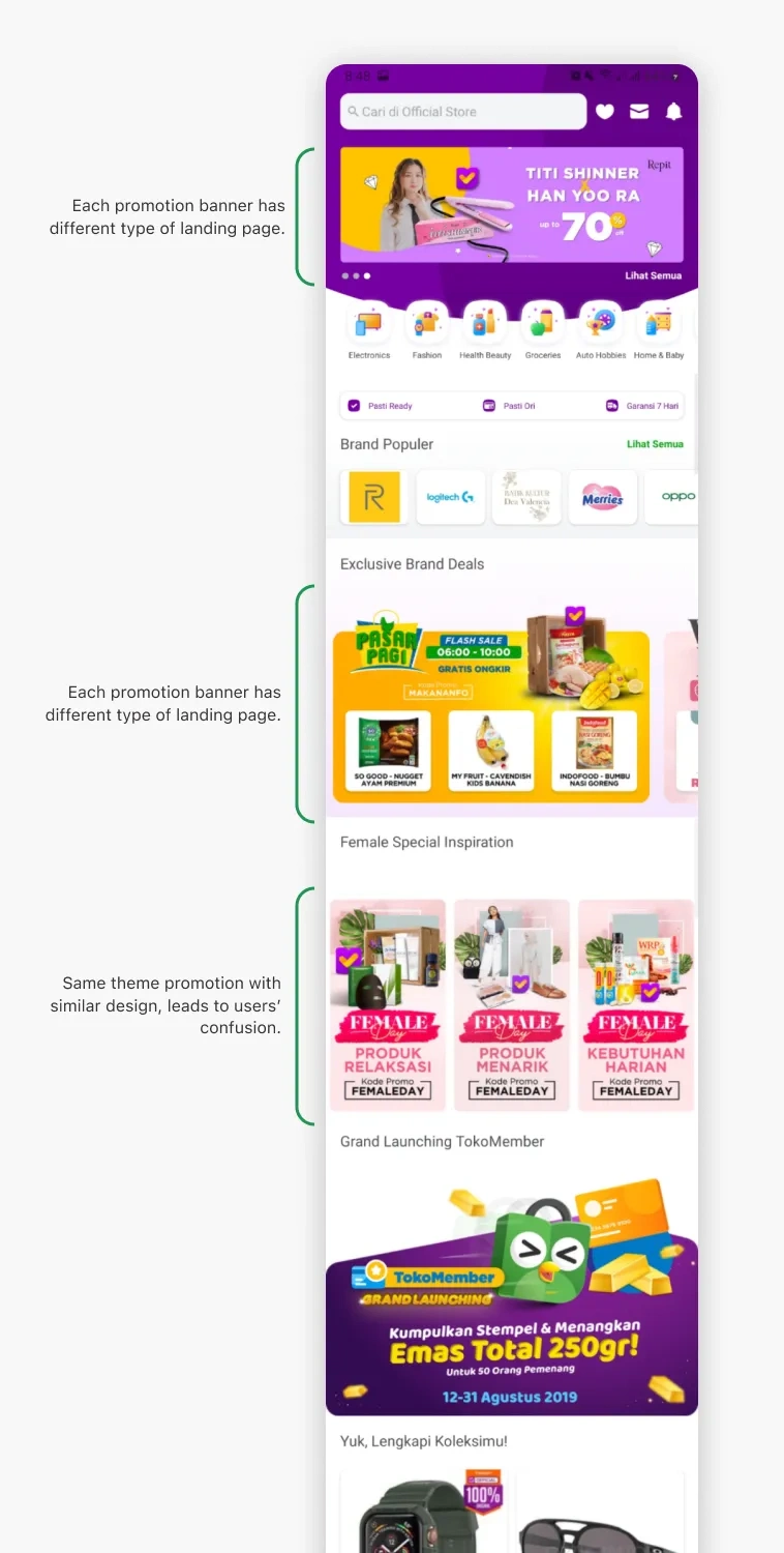
Users become confused by the excessive number of promotions, particularly due to their random arrangement without any discernible pattern.
Additionally, promotions in the same section redirect to inconsistent pages; for example, one banner might redirect to a shop, while another redirects to a promotional page, etc. This inconsistency in user experience leads to confusion as it does not meet user expectations.
The primary issue here stems from the lack of guidelines for the business team on how to maintain the page.
Problem 02 - Navigating back and forth between categories
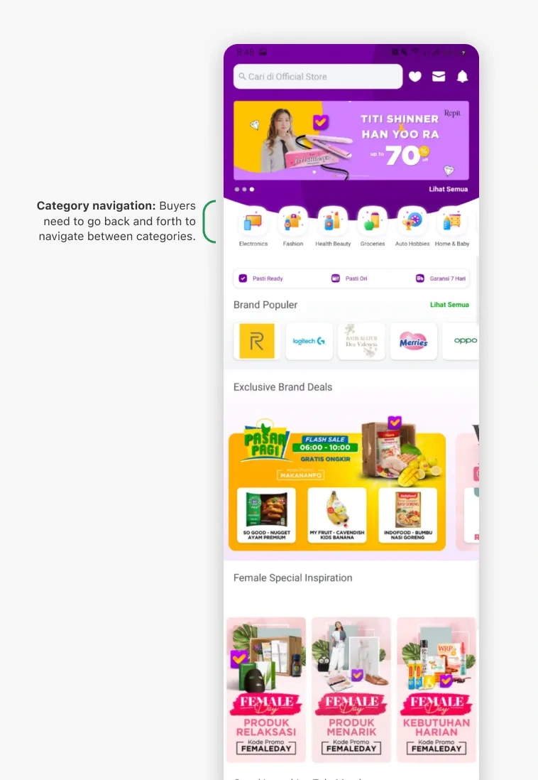
Based on user personas, they enjoy searching for promotional items in the official store and exploring what products are available on the page. This indicates that while buyers are interested in exploring promotion products in the page, yet they do not find it comfortable enough to navigate the categories.
This issue arises because navigation to different categories is done through icons that redirect users to a new page. If users wish to switch categories, they must first return to the previous page and then click on another category icon.
This results in users having to go back and forth to explore products or categories on the official store page.
Problem 03 - Too many horizontal scrolls for promotions
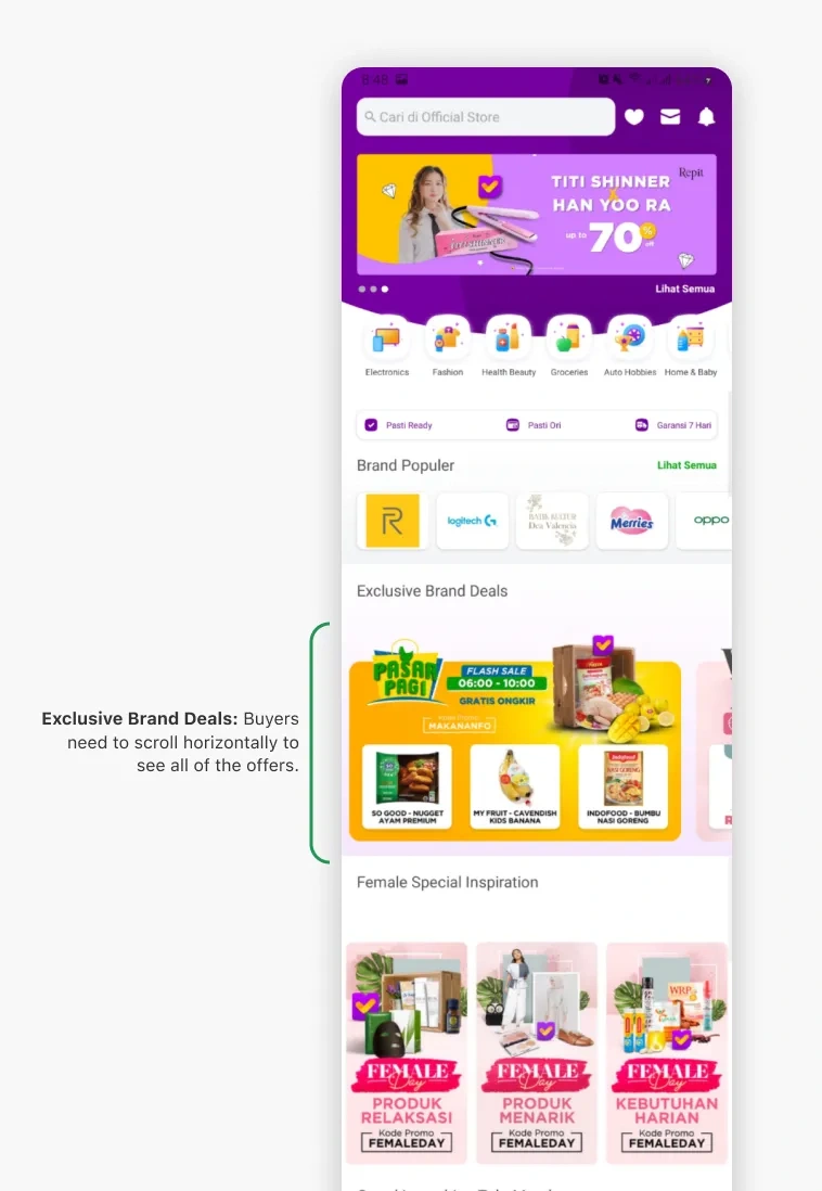
Based on the data gathered, the more promotions there are in a single horizontal scroll, the promotions positioned towards the end tend to perform poorly.
This data indicates that users are not comfortable with performing horizontal scrolls to find the best available offers.
Problem 04 - Competing for promotional space on the official’s store main page
Business teams from each category are competing to place their category-specific promotions on the main page due to low traffic to their category pages.
As a result, the main page of the official store is filled with promotions but is not neatly structured, causing confusion among buyers regarding this OS homepage.
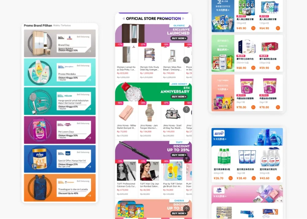
Problem 05 - The promotional banner display appears cluttered.
The creative team producing the promotional banners lacks design guidelines, resulting in inconsistent and untidy-looking banners.
For example, some banners display promo codes prominently, and the number of products shown in a single banner is so high that it looks crowded and unclear to buyers.
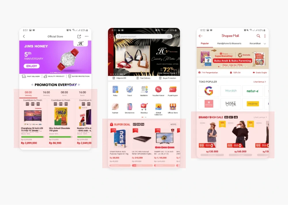
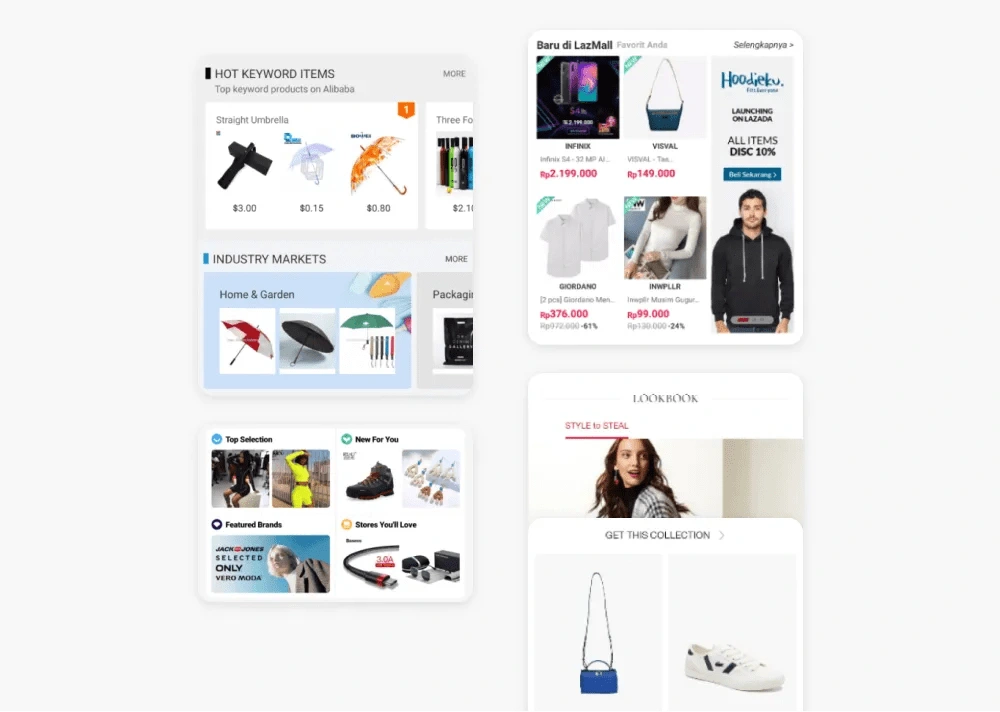
Competitive Landscape
Analyze competitors who provide a similar page.
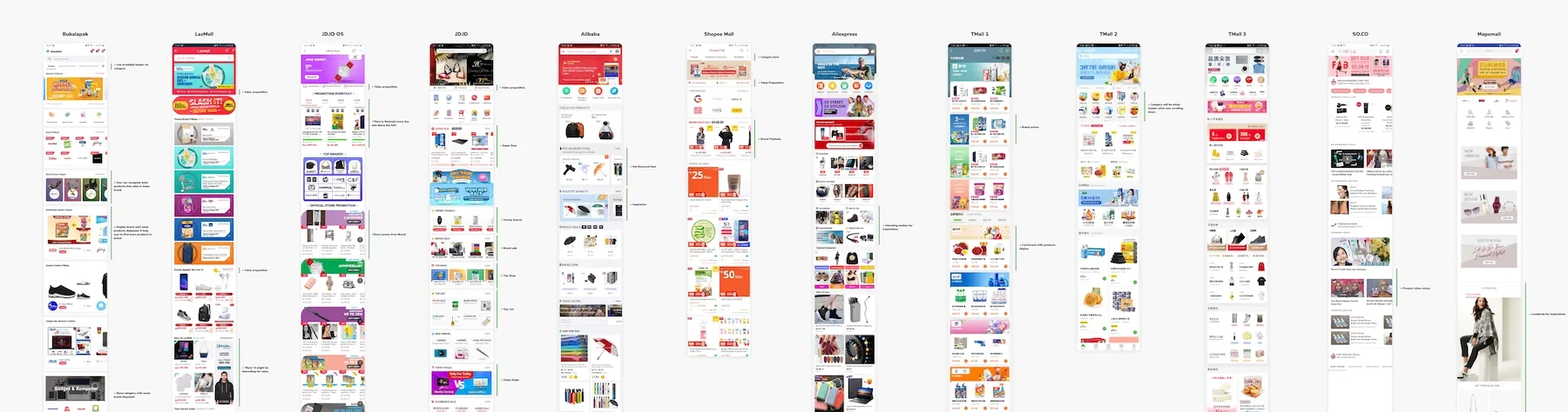
Competitors
Aiming to enhance user experience beyond what competitors provide, I conducted a comprehensive analysis of several platforms to gather insights on their appearance and usability. I analyzed at least 10 platforms, including Bukalapak, LazMall, JD.ID, Alibaba, Shopee Mall, Aliexpress, TMall, SO.CO, Mapemall.
Key insights
Insight 01 - Use scrollable navigation header
This category navigation allows buyers to easily move from one category to another.
Additionally, the navigation tab is made sticky, ensuring it remains visible as users browse the page.
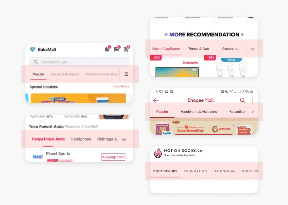
Insight 02 - Brand logo with product thumbnail
Users can understand what products are sold by the brand, making them more familiar with what the brand offers.
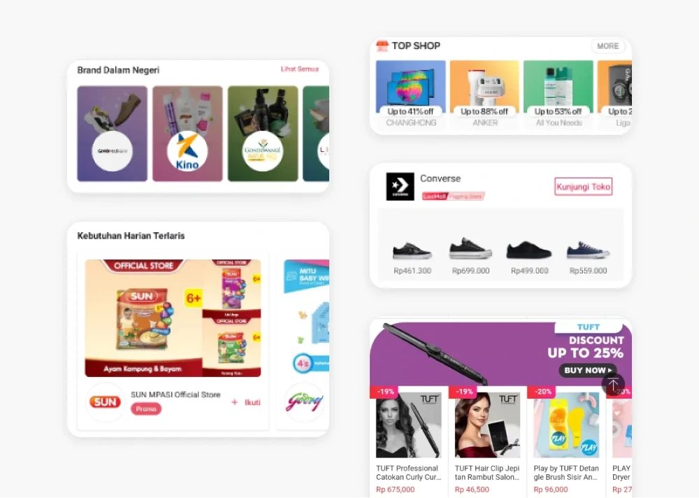
Insight 03 - Display more brands that are currently on promotion
Show promotions from brands in a sequential order from top to bottom, allowing users to comfortably view all available promotions.
Insight 04 - Highlight flash sale at the top
Place promotions with limited time at the top of the list, enabling buyers not to miss the opportunity to take advantage of these time-sensitive promotions.
Insight 05 - Shopping Inspiration Available
This feature allows users to gain shopping inspiration from popular trends, inspiration categories, top selections, new items for you, and stores you might like, among others.
Problem statement
🤔 Confusing redirection
Buyers feel that the promotions available in Tokopedia's official store have confusing and inconsistent redirection pages.
🧭 Hard to navigate
Buyers experience difficulty when trying to browse products from available categories due to having to go back and forth to switch categories.
🔎 Hard to find interesting promotion
Buyers find it challenging to locate appealing promotions on the page due to a cluttered display and excessive horizontal scrolling.
Ideation Process
Based on insights gained from earlier processes, I came up with these triggering questions:
How might we..
How might we make browsing the OS products more enjoyable?
How might we assist buyers in finding the best-priced products from the OS?
How might we maintain the page so that it remains neat and not confusing for users?
The Solutions & Design
All New Official Store Page! What makes this different from the previous design?
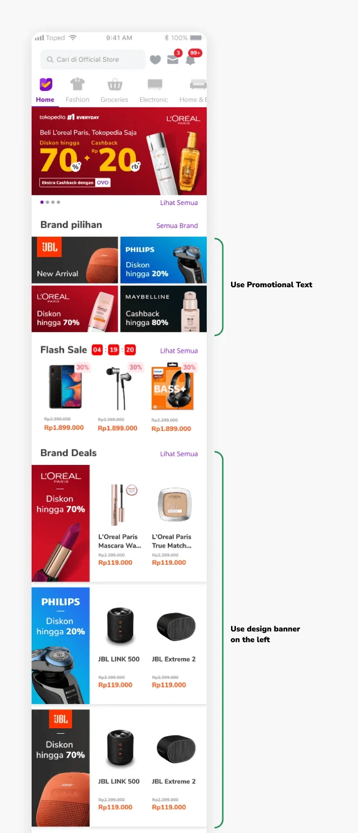
Solution 01 - Page structure
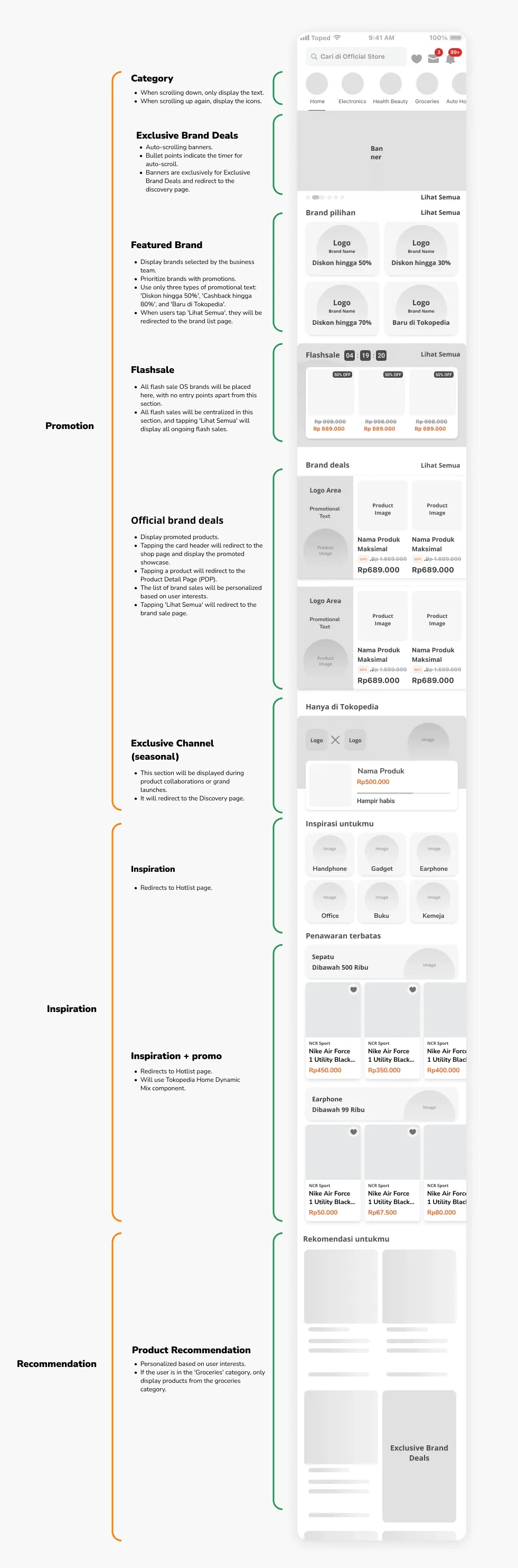
The page had become cluttered because the business team was uncertain about how to effectively place their content.
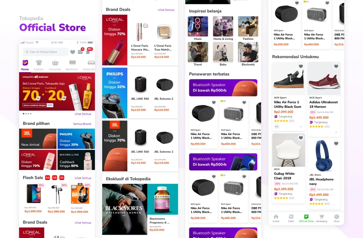
As a solution, I established a clear information architecture (IA) for the page, dividing it into three main sections:
Promotion To accommodate buyers seeking products from trusted brands that are currently on promotion.
Inspiration To cater to buyers visiting the OS page to discover what products and brands are available at Tokopedia's Official Store.
Recommendation To assist buyers who are unsure about what product they want to purchase.
This categorization was informed by our buyer behavior data, which showed a strong interest in promotions.
Additionally, this IA incorporates personalization logic that aligns with the buyer’s interests, enhancing their browsing experience on this page.
To ensure consistency in the user experience and reduce the learning curve, this page structure is also applied across all category tabs.
Solution 02 - Category Navigation
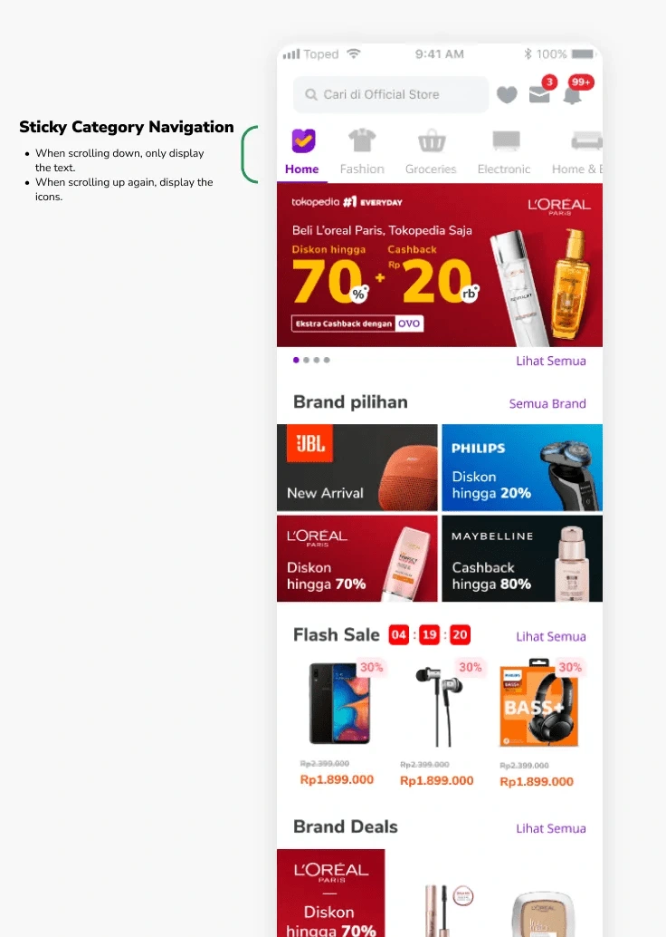
One reason for the low traffic to the category page was that in the previous design, the category navigation was placed below the promotional banner. This placement deterred buyers from exploring the categories due to the cumbersome back-and-forth navigation required.
To address this, I decided to move the category navigation to the entry point, positioning it as the main navigation at the top of the page. This change ensures that buyers can easily navigate to each category page.
Solution 03 - Page redirection
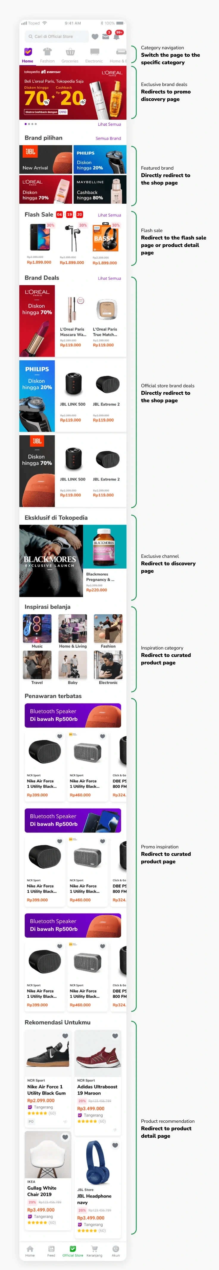
One of the reasons our users didn't fully enjoy exploring the page was the inconsistency in redirections within one section. Simply put, our design didn't meet their expectations.
To address this, I established guidelines for each section to streamline the page's usage. The sections on the page include the following:
Category navigation
Horizontal scroll navigation.
Clicking on the category navigation changes the page to the specific category.
Exclusive brand deals
Carousel banner.
Redirects to the promo discovery page.
Featured brand
Redirects directly to the shop page.
Flash sale
Tokopedia Campaign.
Redirects to the flash sale page.
Redirects to the product detail page if the user clicks on the product card.
Official store brand deals
Redirects directly to the shop page.
Redirects to the product detail page if the user clicks on the product card.
Exclusive channel
For collaboration campaigns.
Redirects to the discovery page if the user clicks on the banner.
Redirects to the product detail page if the user clicks on the product card.
Inspiration category
Redirects to the curated product page.
Promo inspiration
Redirects to the curated product page if the user clicks on the banner.
Redirects to the product detail page if the user clicks on the product card.
Product recommendation
Shows relevant products based on user affinity.
Redirects to the product detail page.
Solution 04 - Creative assets guidelines
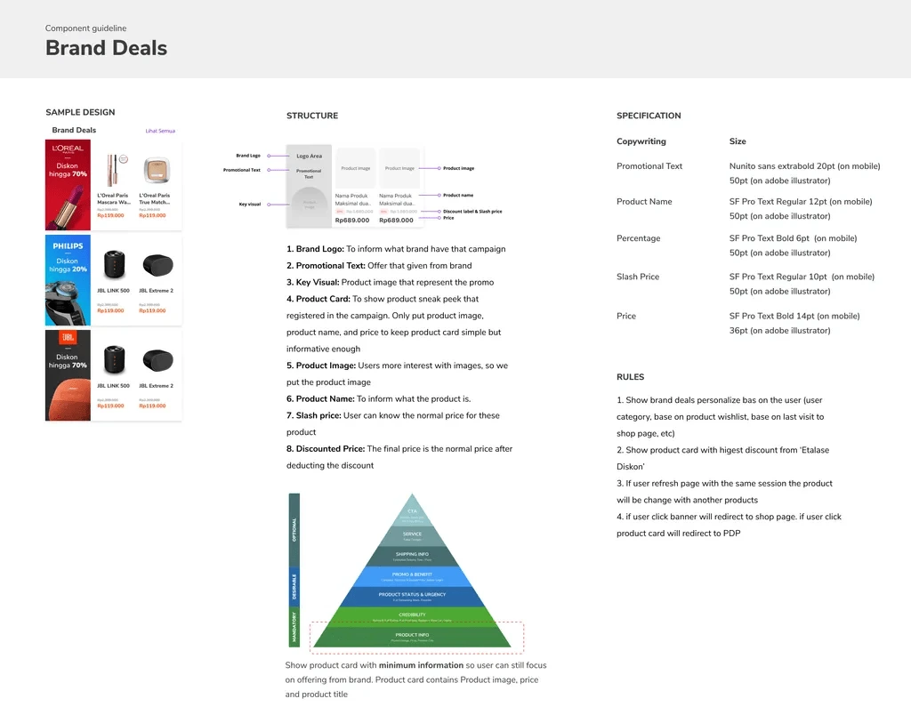
I developed a visual guide to serve as a reference for the creative team when producing promotional banners.
Solution 05 - Business guidelines
I developed a design documentation for the business team to understand the detailed specifications of each component and how to properly maintain the page.
The information includes:
Design Values
Guideline Principles
Visual Guide
Copywriting Guide
Specific Design Specifications for Each Component
Design Validation
Conducted Guerilla test for Our New Design
To ensure our design meets users’ needs and is user-friendly, I initiated guerilla testing. We targeted 7 representative buyers who frequently shop on Tokopedia.
What did we aim to validate?
Scenario 01 - Can buyers easily navigate to specific categories?
Buyers were asked to navigate to at least 3 categories on the new OS page.
Scenario 02 - Impression of the New Design
Buyers were asked about their impressions of using the new OS page layout.
Scenario 03 - Design Layout Preferences
Buyers were asked about their preferences regarding the design layouts we provided.
Testing insights
💡 The “AHA” moment
Generally, most users were interested in the new design and felt comfortable exploring the page and switching categories with the new layout.
Users were not interested in clicking banners
The design presented during testing lacked information about the extent of promotions offered by the brand. We gained the insight that buyers would be more motivated to explore further if the banners included promotional details.
Widget preference
Buyers preferred the brand deals widget layout with banners on the left side. This arrangement was perceived as more organized since all promotional banners were on the left, and the offered products were displayed on the right.
Iterations
Addressing the Usability Issues to Improve User Experience
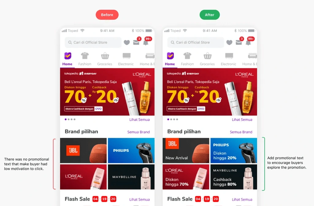
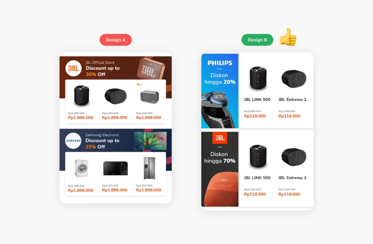
Design Adjustment 01 - Include discount information on brand banners
Based on insights from the previous process, we decided to add promotional information to the selected brand banners.
Adding promotional text significantly motivated users to click and explore the brand further.
Design Adjustment 02 - Position banners on the left for brand deals design
Based on user preference testing, users preferred a layout design that places the banner on the left and the products on the right. This arrangement makes the page appear more organized and easier to navigate from top to bottom.
The Final Design
Design Components & All Use Cases Needed
To hand over the design to the engineers, I detailed every use case. Additionally, I created design components to facilitate easy adjustments in the future.
End Result
After the launch of the new Official Store design, we achieved surprising results, with the number of page visits to categories in the OS evenly distributed and increasing by up to 200% - 300%. These numbers met the targets of our defined success metrics.
*I am unable to disclose the increase in sales figures due to the confidentiality of the data.
Recognition
Thank you to all the teams that contributed to and made this project possible.
Annur Syahdiyanto as Product Design Manager, Dwiki Arhansa as Principal UI Designer, Monika Halim as AVP of Design, Chyntia Mokoginta as Product Manager, and all the other teams whose members I cannot mention individually.
Lesson learned
Don’t hesitate to change the existing design and think outside the box, as your ideas might lead to better solutions. For instance, the original design placed the category navigation below the promotion banner. I decided to move the category navigation to the header as a sticky element. The results were impressive, with traffic to other categories increasing by over 200%.
In my previous roles, I primarily focused on seller-side design, especially designing the seller dashboard for desktop versions. Transitioning to the Official Store team and working on the mobile version highlighted the importance of benchmarking against competitors, creating moodboards, and conducting thorough component explorations. This approach was invaluable in finding the best design solutions.
Thank you! I hope this case study could be insightful for you. ✨
Like this project
Posted Jan 14, 2025
UX Design, Research, Prototyping, Testing, Moodboarding, Design guidelines for creative and business team.
Likes
0
Views
14