Soft Solutions UI/UX Redesign Project

Grecia Valero


A Landing Page That Matches the Product
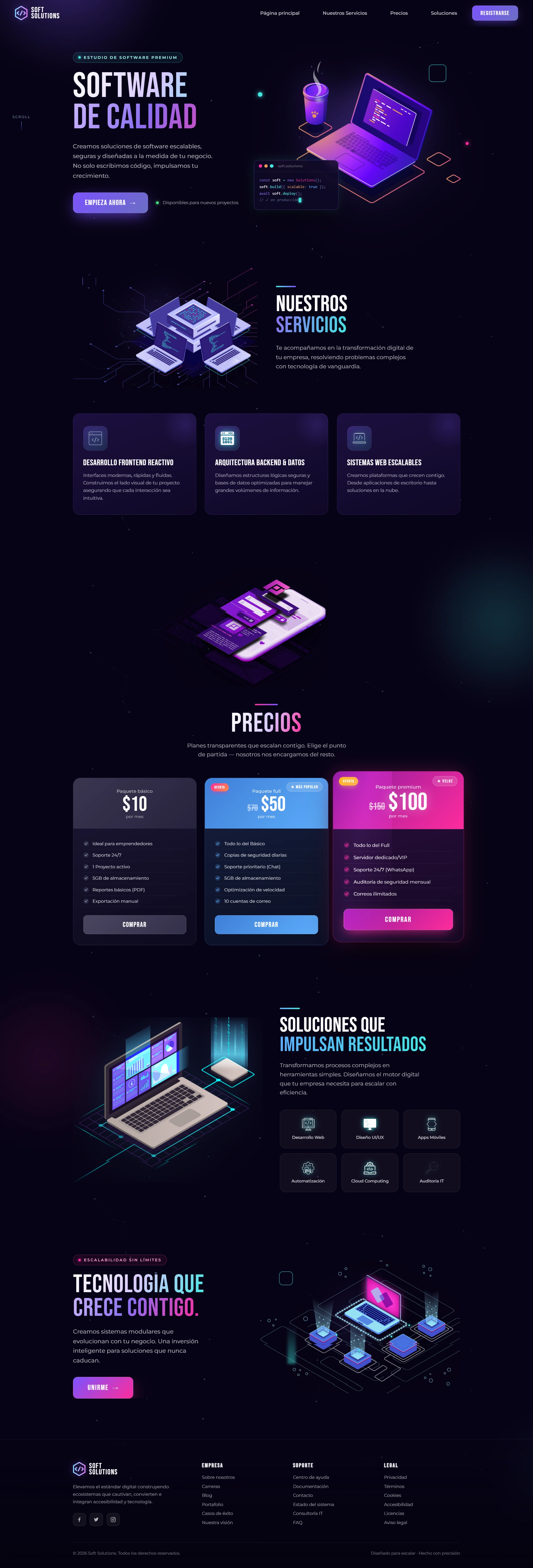
The redesigned Soft Solutions site now visually matches the sophistication of the software it sells. The dark, code-inspired UI builds instant credibility with a technical audience, while the refined pricing structure and clearer visual hierarchy are built to move visitors toward action, not just admire the illustrations. It's proof that a redesign doesn't need to abandon what worked before; it needs to sharpen it, layer in stronger UX psychology, and give it a visual language the brand can grow into.
This project showcases my effective approach as an experienced freelance UI/UX designer: redesigns aren't just about making something "look better", they're about aligning visual identity with audience psychology and business goals. By moving Soft Solutions from a generic light SaaS look to a distinctive, dark-mode tech brand, this case study demonstrates how strategic UI/UX design decisions, color systems, typographic hierarchy, and conversion-focused pricing components directly support a software agency's credibility and lead-generation goals.
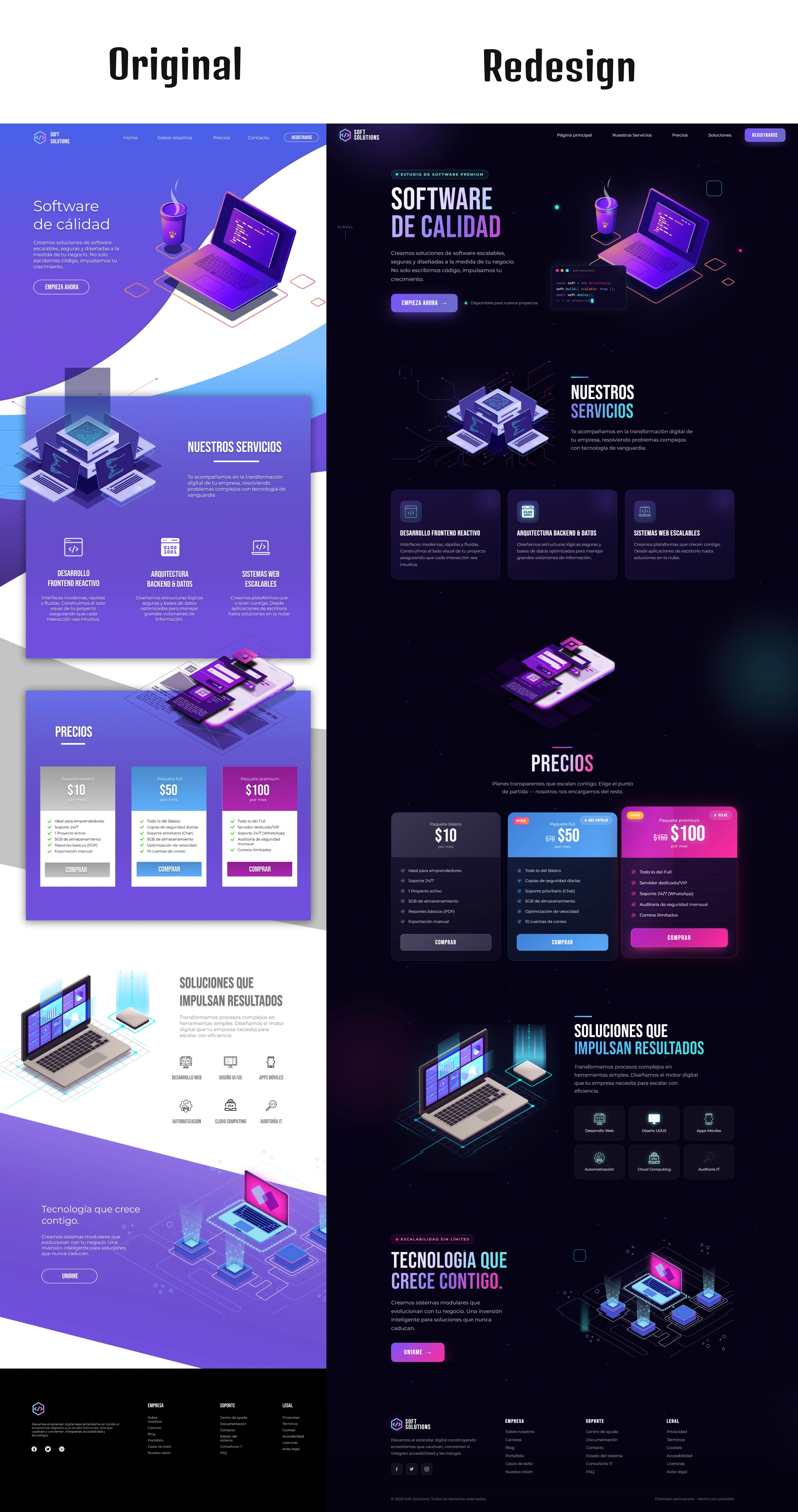
Before & After: What Changed
Color System: Light purple gradient background → near-black canvas with cyan/magenta neon accents
Typography: Standard sans-serif headings → bold condensed display type with gradient treatment
Hero Section: Static illustration only → illustration + live code-editor mockup + trust badges
Cards & Sections: Flat color blocks → glassmorphic panels with borders and icon badges
Pricing: Simple comparison table → conversion-optimized cards with discount and popularity badges
Overall Tone: Friendly, approachable SaaS → premium, technical, developer-grade brand
Design & Tools
UI/UX Design & Prototyping: Figma (full design system rebuild, dark-mode color tokens, component variants)
Illustration: Adobe Illustrator & Freepik (isometric vector assets, re-lit and re-composed for dark backgrounds)
Focus Areas: Conversion-driven UI, information architecture, visual hierarchy, dark-mode accessibility
Why This Redesign Matters
This project showcases my approach as a freelance UI/UX designer: redesigns aren't just about making something "look better", they're about aligning visual identity with audience psychology and business goals. By moving Soft Solutions from a generic light SaaS look to a distinctive, dark-mode tech brand, this case study demonstrates how strategic UI/UX design decisions — color systems, typographic hierarchy, and conversion-focused pricing components — directly support a software agency's credibility and lead-generation goals.
Like this project
Posted Jul 19, 2026
Redesigned Soft Solutions site with dark-mode, improved UX.
Likes
1
Views
17
Clients
Soft Solutions