Green Eco Glassmorphism Redesign

Grecia Valero

The original EcoNature homepage was built on a classic minimalist foundation: generous white space, a restrained color palette, and content given plenty of room to breathe. It worked, but the client came to me wanting something that felt more modern. A homepage with more visual depth and a "wow" factor for donors and visitors landing on the site for the first time, without losing the clarity and professionalism that made the original design trustworthy in the first place. Additionally, the client requests both light and dark modes, with the default dark mode having green tones.
Hero parallax effect
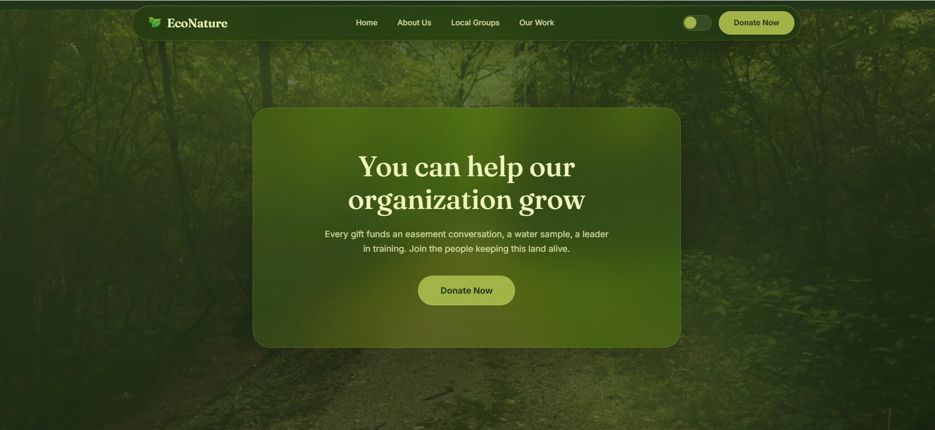
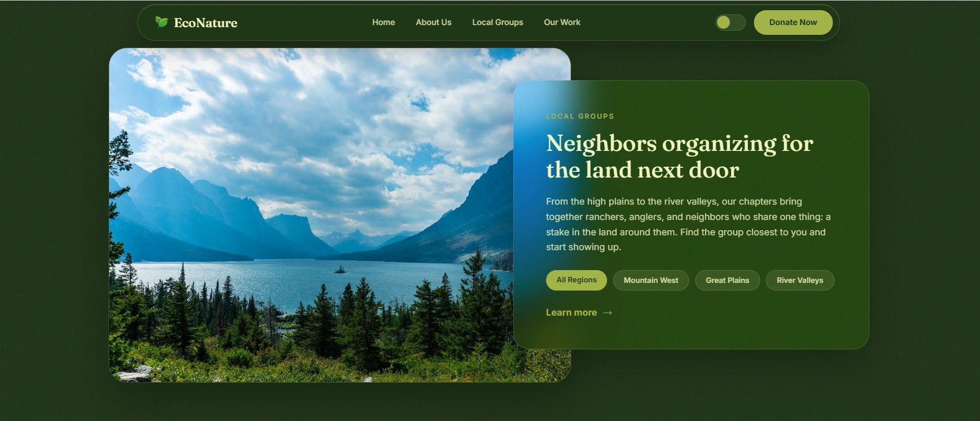
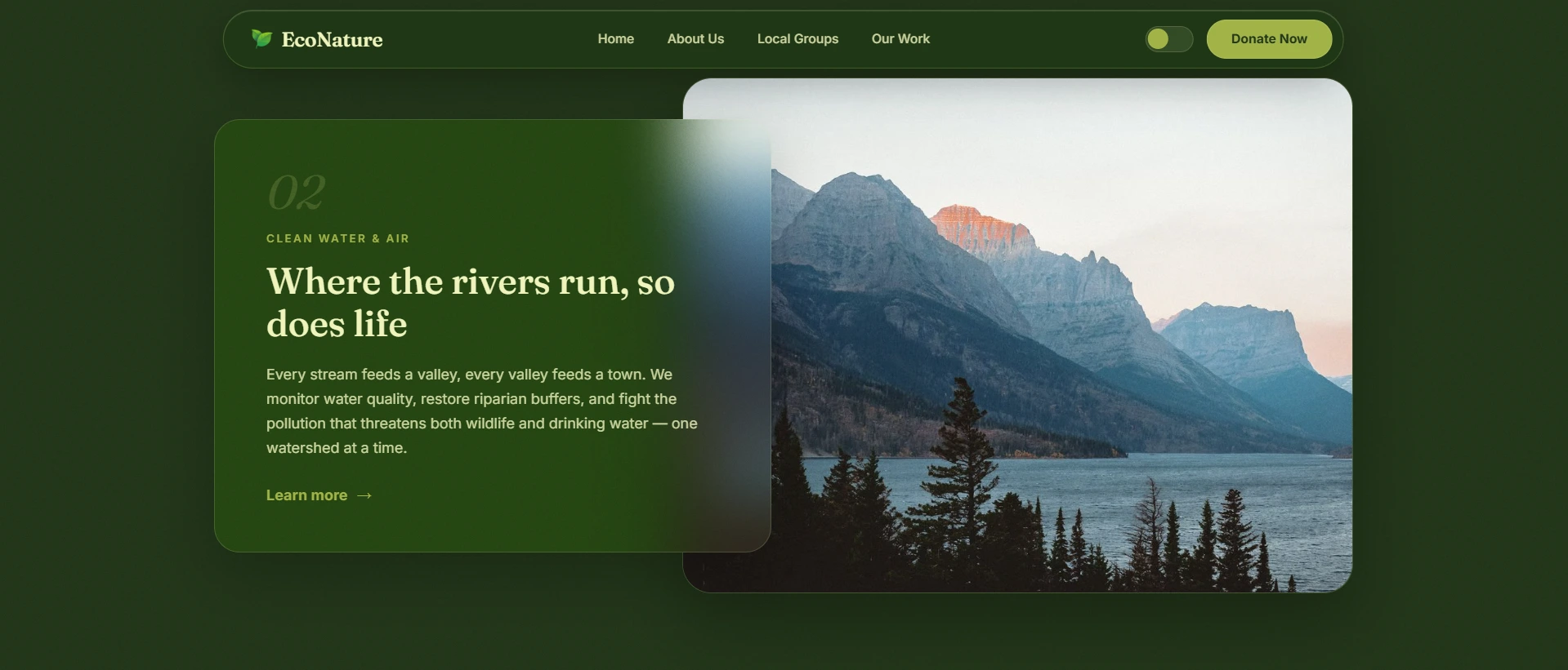
That balance became the brief: modernize the interface with a glassmorphism treatment but keep the UX just as legible and just as calm as before.
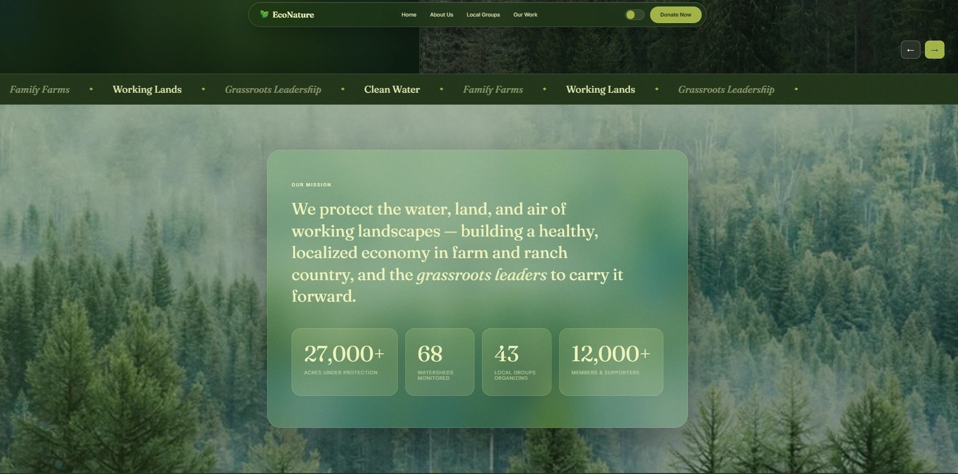
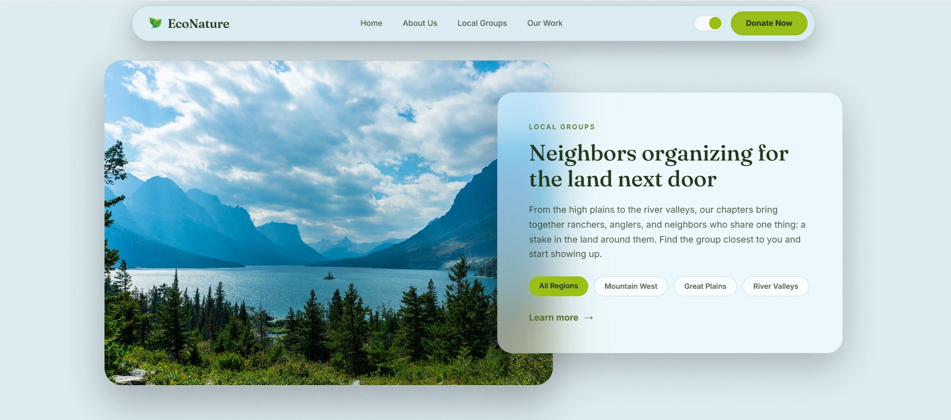
Glassmorphism: translucent, frosted-glass panels layered over a background isn't just a visual trend here; it fits the subject matter. EcoNature's mission is about mist over forests, water over stone, and layers of land and water working together. Frosted glass cards floating over full-bleed photography of misty pine forests, alpine lakes, and mountain ridgelines echo that same idea of transparency and layering, so the aesthetic reinforces the message instead of just decorating it.
What changed
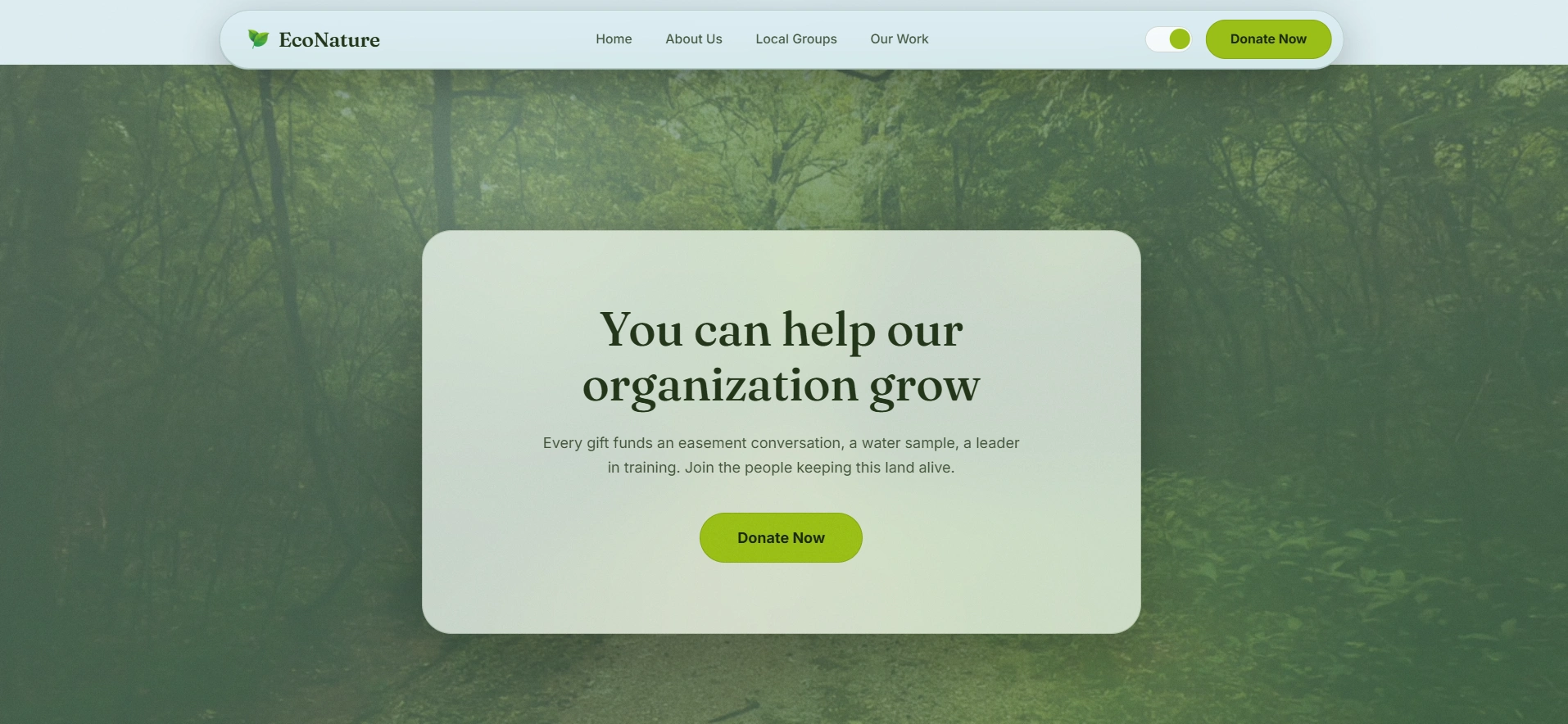
Navigation bar: turned into a floating, pill-shaped glass panel that sits on top of every hero image instead of a flat, opaque header, it stays legible while letting the photography show through.
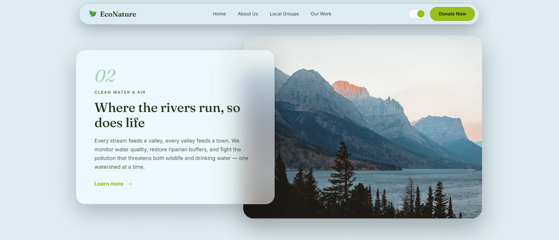
Content cards: every section, the mission statement, the "Clean Water & Air" program block, Local Groups filters, and the donation CTA now sits inside a frosted glass panel with soft blur and subtle borders, replacing the flat white cards of the original.
Photography-first hero: large, full-width nature photography (forests, lakes, mountains) became the base layer for every section, with the glass UI floating on top rather than competing with a solid background color.
Light and dark theme toggle: added a theme switch in the navbar so the entire interface glass panels, typography, and accent colors adapt between a soft, pale light mode and a deep forest-green dark mode, both keeping the same lime-green accent for buttons and CTAs.
Typography pairing: kept a serif display font for headlines (to preserve the editorial, trustworthy tone of the original) paired with a clean sans-serif for body copy so the more decorative UI treatment doesn't sacrifice readability.
Motion details: added a horizontal scrolling marquee for mission keywords and a slide-through hero carousel, giving the homepage more rhythm without adding visual noise.
Like this project
Posted Jul 23, 2026
Redesigned EcoNature's with modern, clean glassmorphism aesthetics and improved UX.
Likes
3
Views
19