Numa - Visual Identity Design
Abhay Shevkar
Introduction
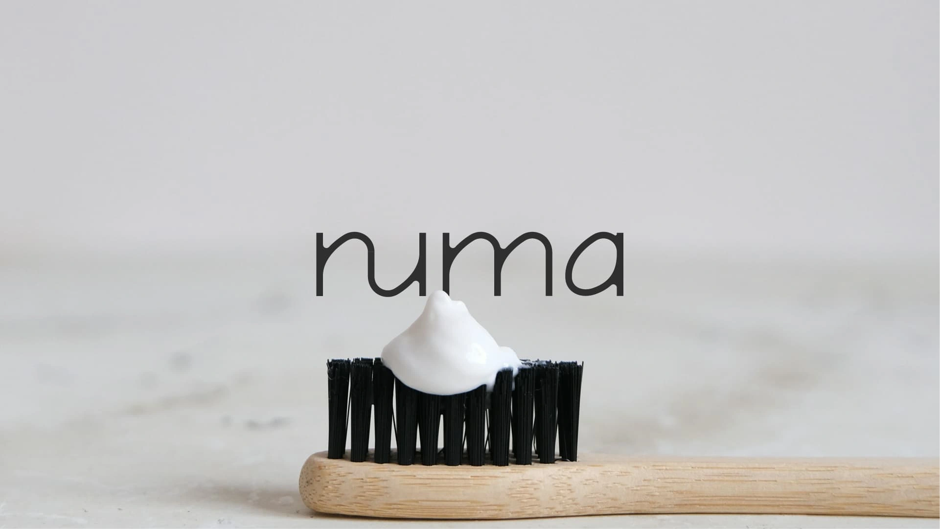
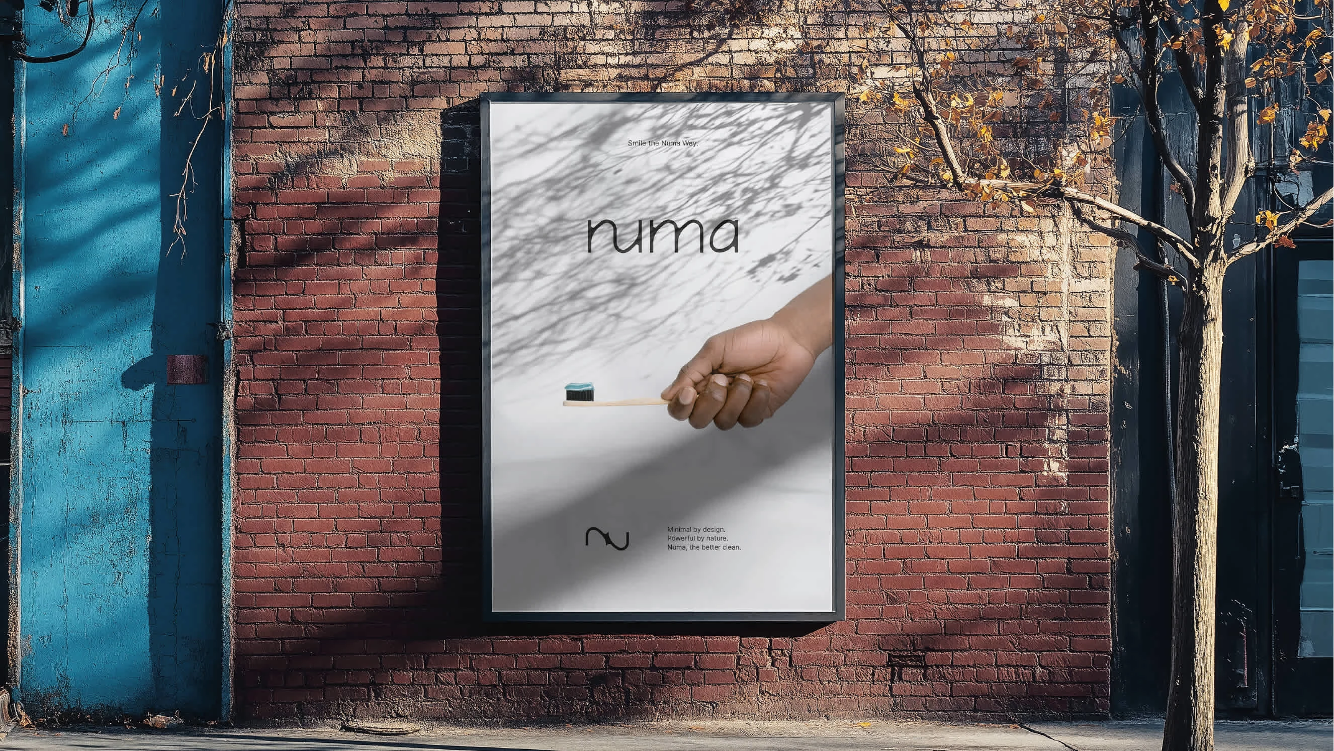
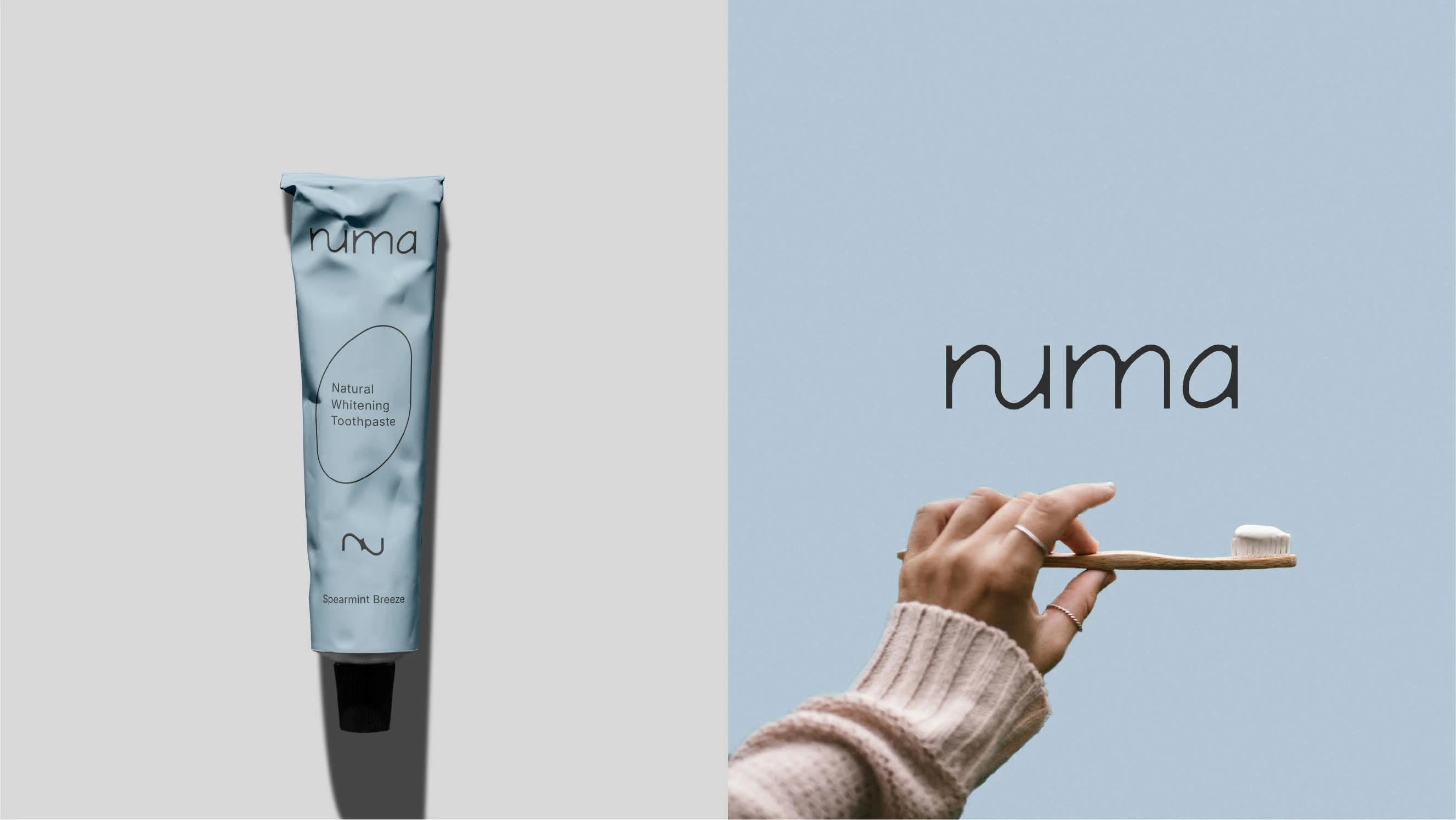
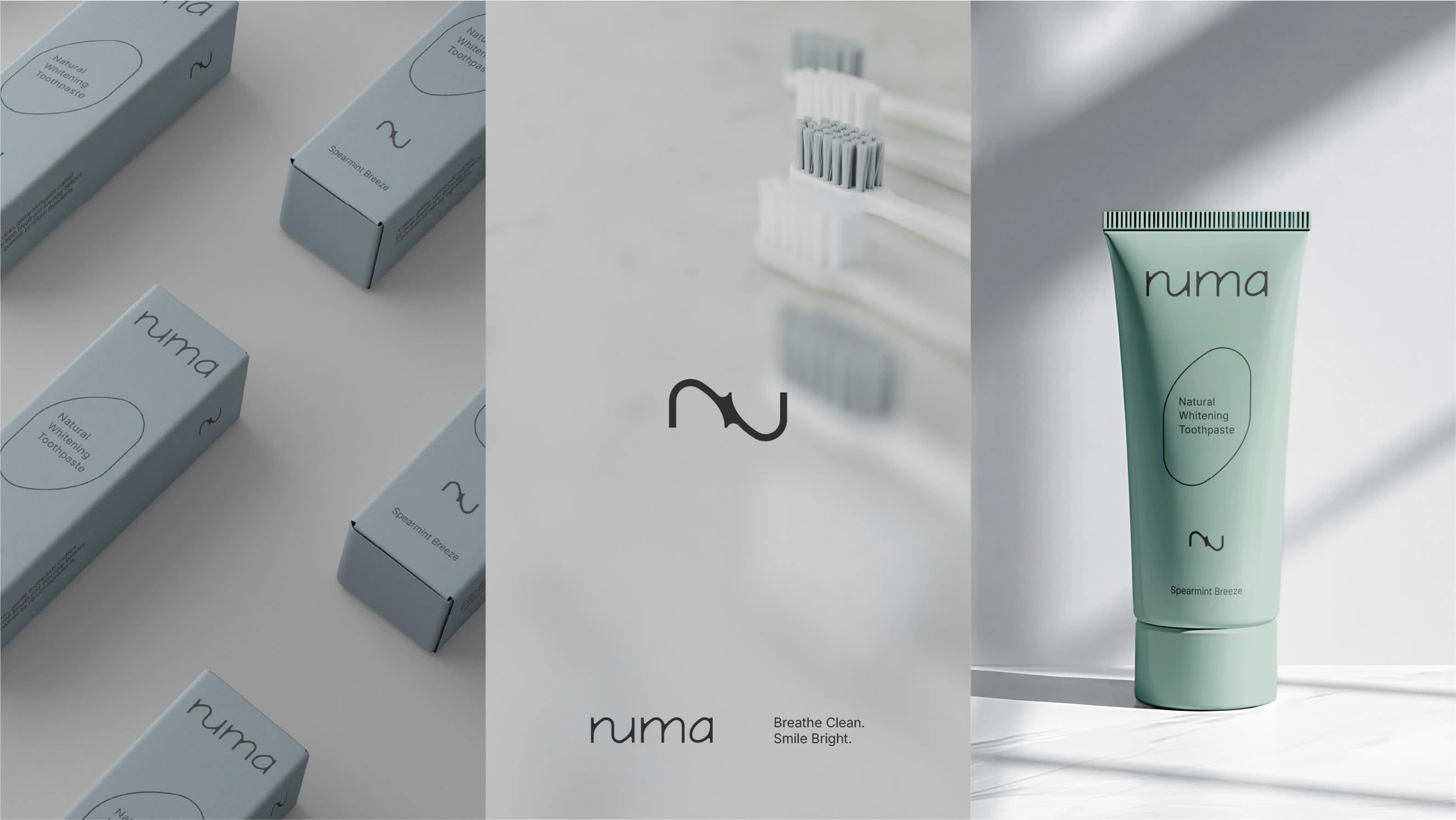
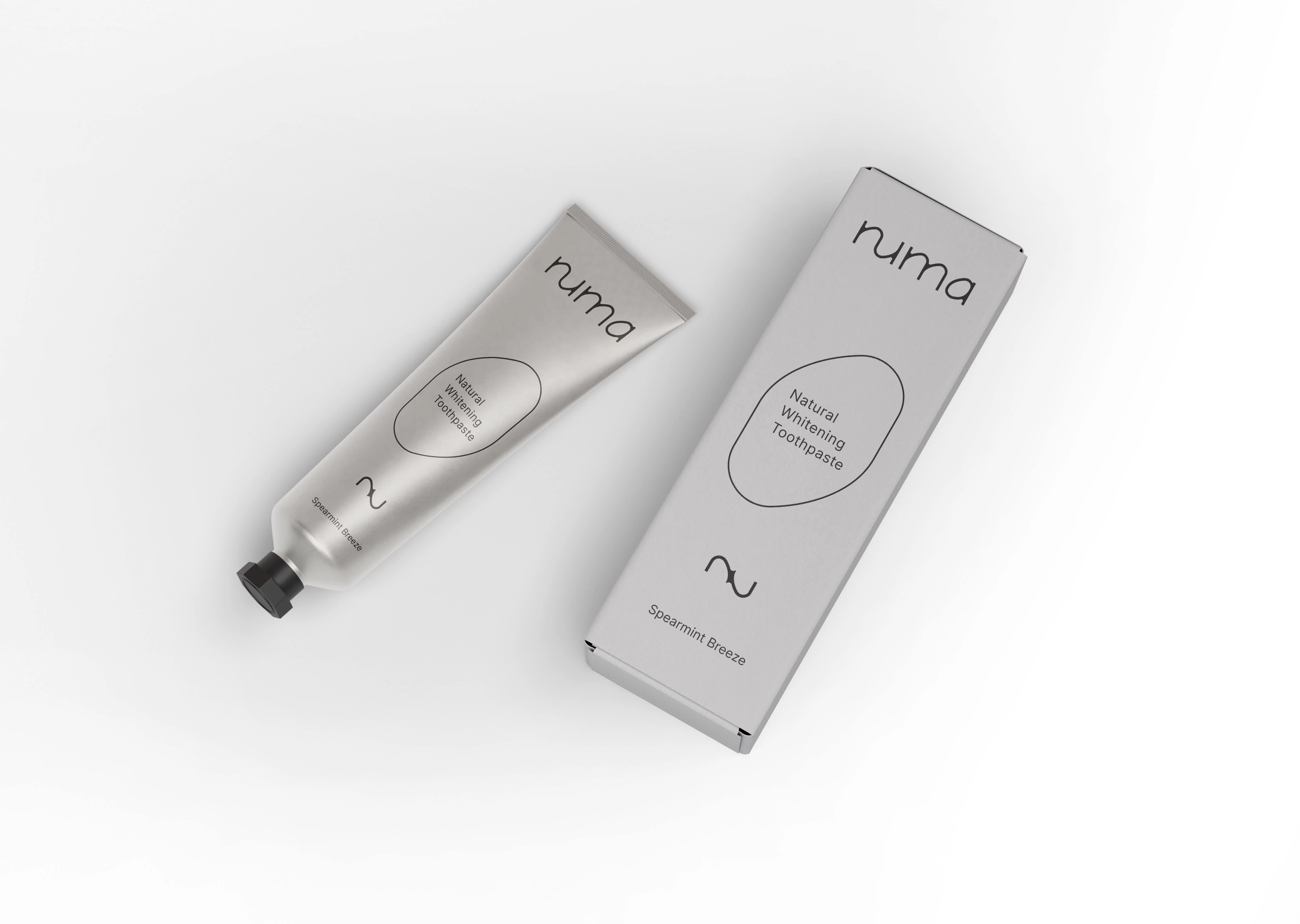
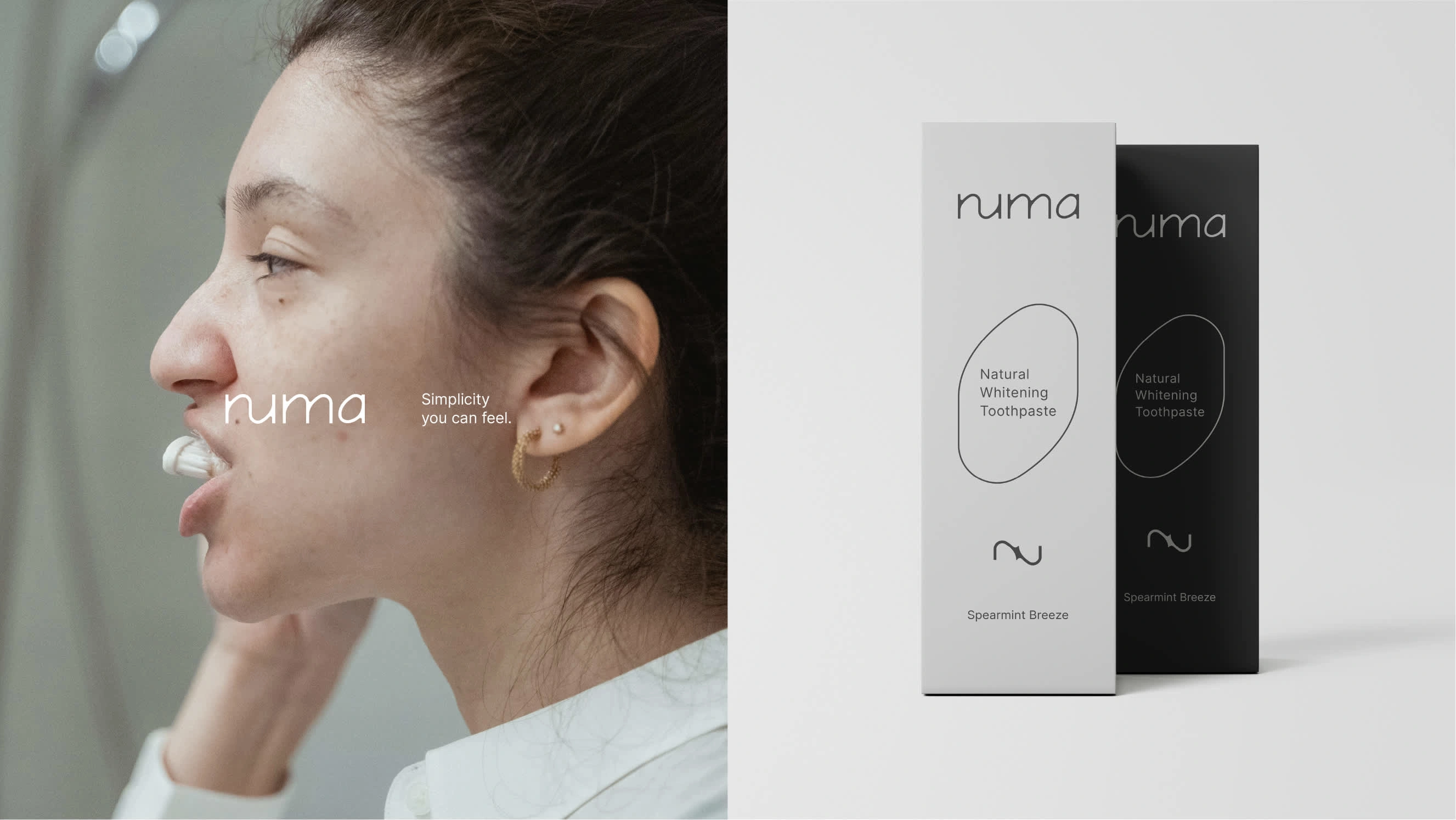
Numa is a modern toothpaste brand designed for those who seek clean, effective, and aesthetically simple oral care. The identity captures the essence of freshness, balance, and clarity - with a refined, minimal approach to beauty and wellness.
Brand Name & Meaning
Name: Numa
Inspired by: Greek roots meaning breath or life
Short, soft, and memorable
Evokes calmness, clarity, and wellness
Perfectly fits a clean beauty-inspired oral care brand

Positioning: Clean, conscious oral care
Core Values: Simplicity, clarity, care
Keywords: Breath, balance, clean, gentle, calm, purity, flow
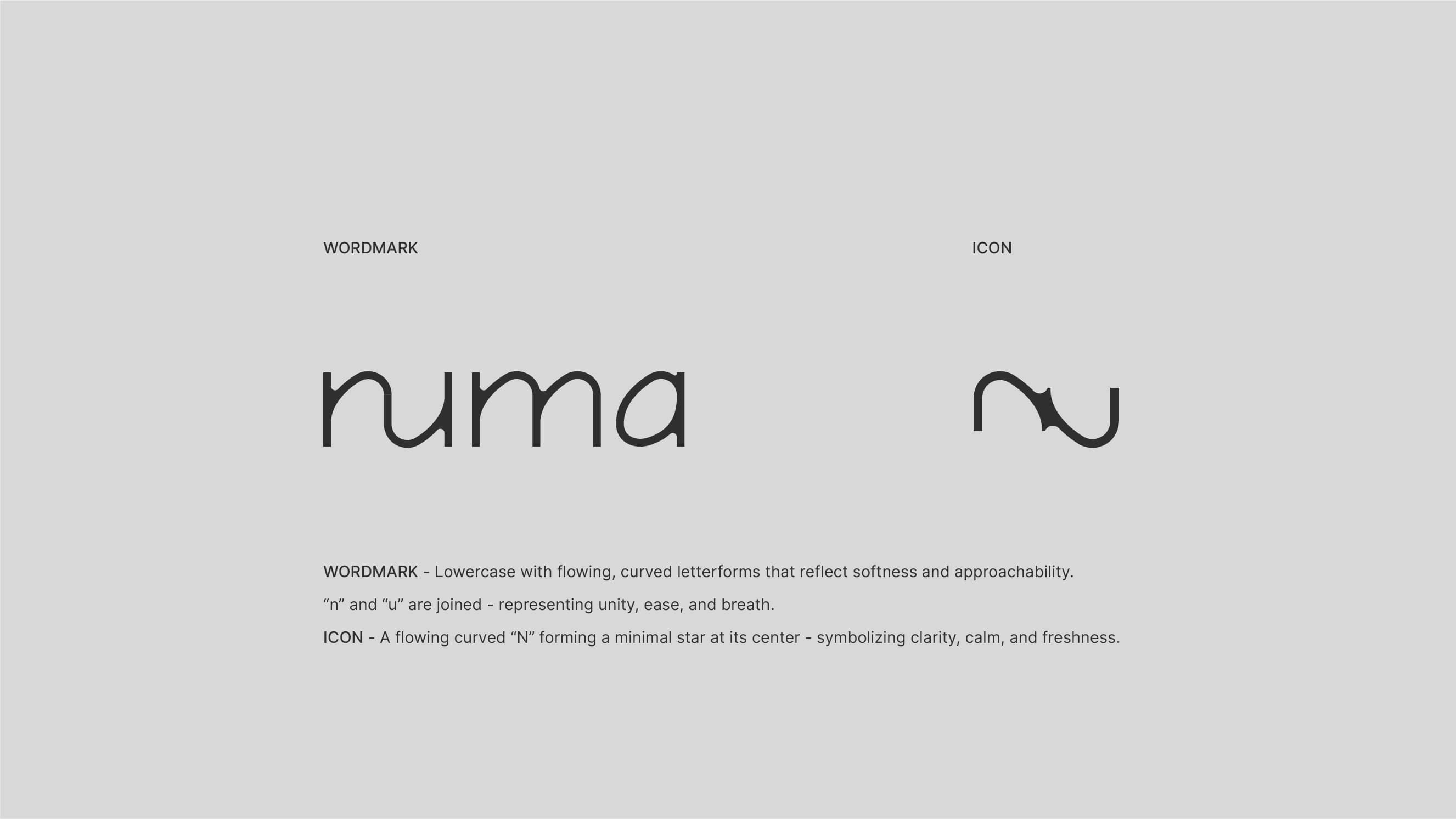
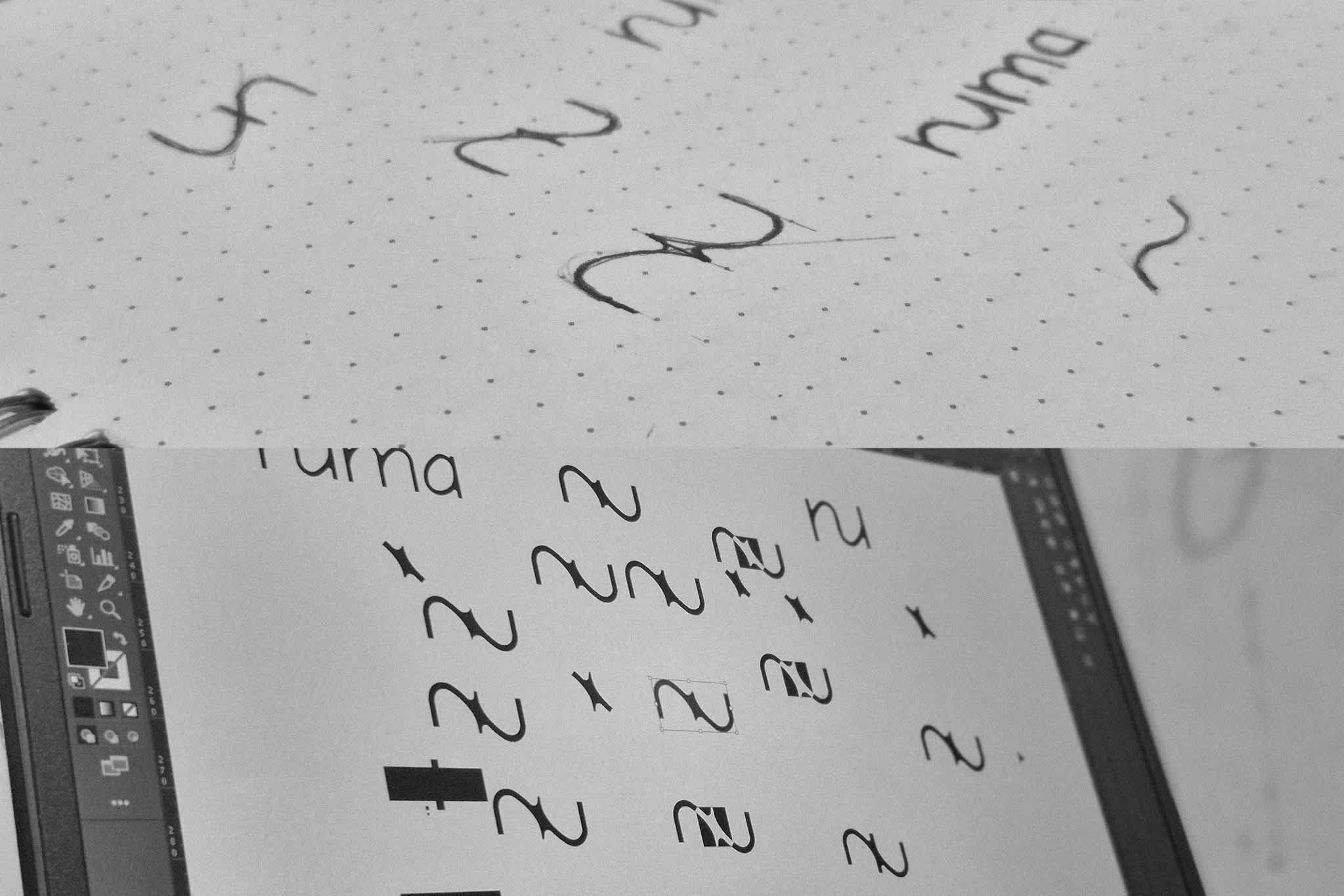
Logo Design
The Numa logo features a smooth, lowercase wordmark with the letters “n” and “u” connected, symbolizing breath and flow. The icon is a fluid, curved “N” forming a simple star at its centre, representing freshness and clarity.

Like this project
Posted Jun 7, 2025
A clean, calming visual identity for Numa, a toothpaste brand inspired by breath, balance, and gentle care.