Ohana - Visual Identity Design
Abhay Shevkar
Overview
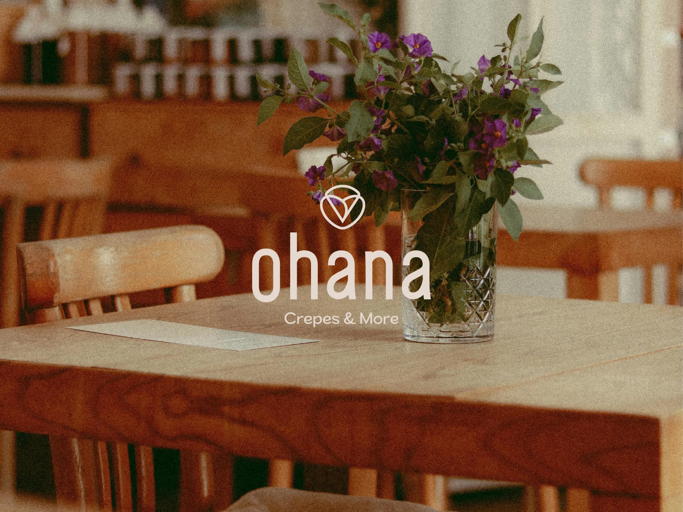
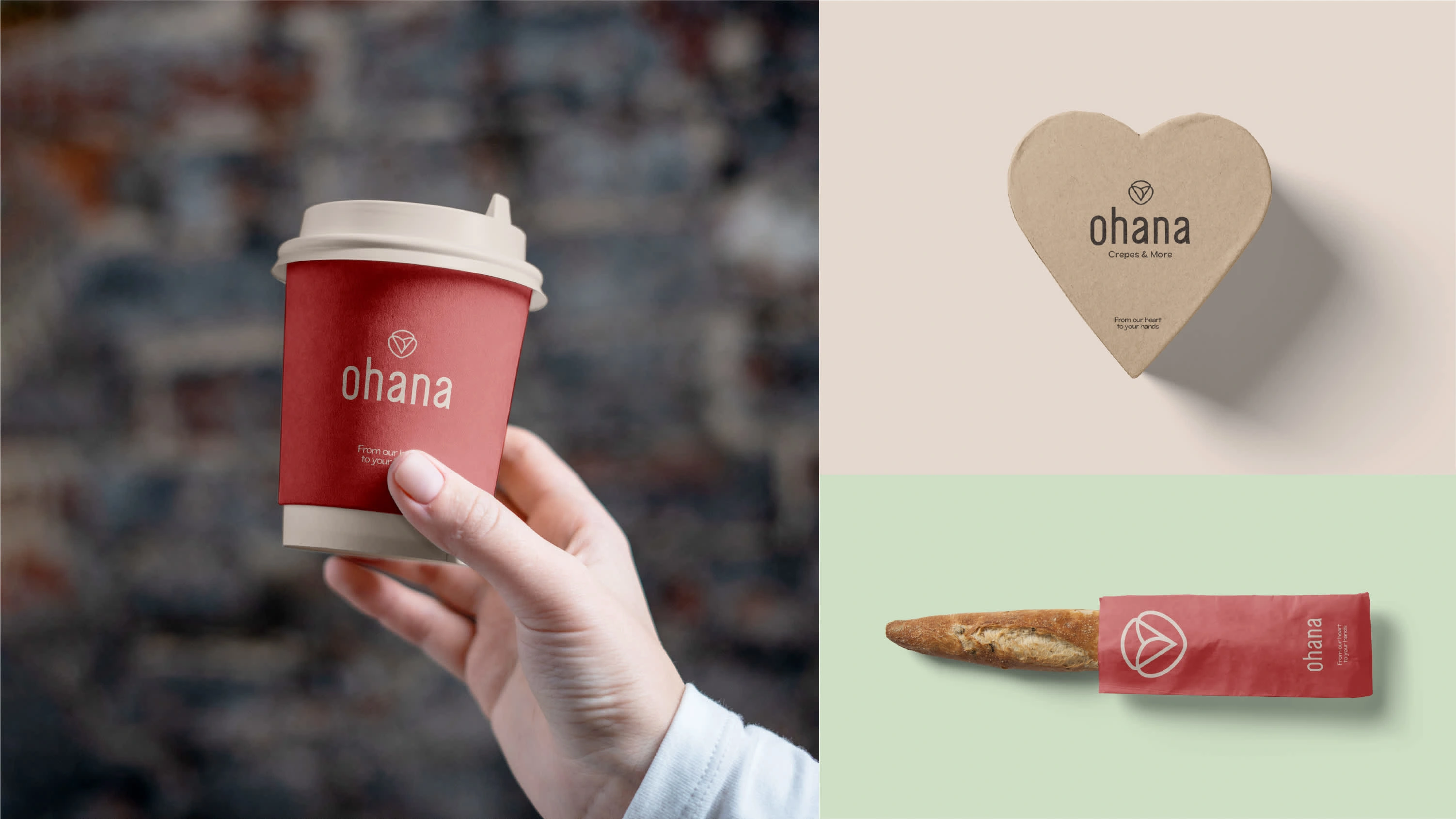
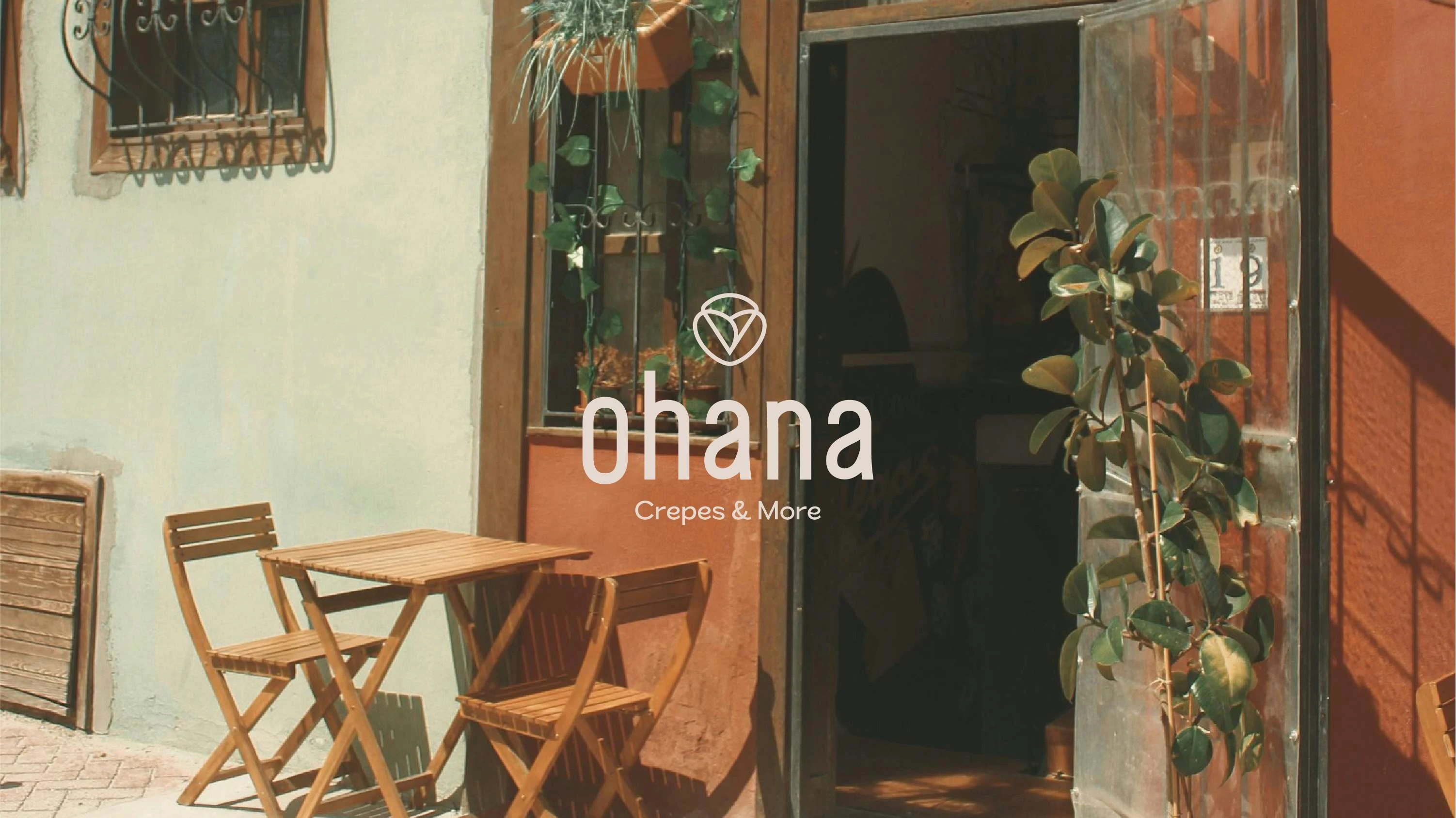
Ohana Crepes & More is a cozy café that serves handcrafted crepes, specialty coffee, and sweet treats in a warm, welcoming space. The goal of this identity was to create a brand that feels friendly, modern, and full of heart — a place where people slow down, connect, and enjoy life's little moments together.
Brand Meaning
‘Ohana’ means family — and that spirit is the soul of this brand. It’s more than a café; it’s a space for connection, comfort, and joy shared over good food.
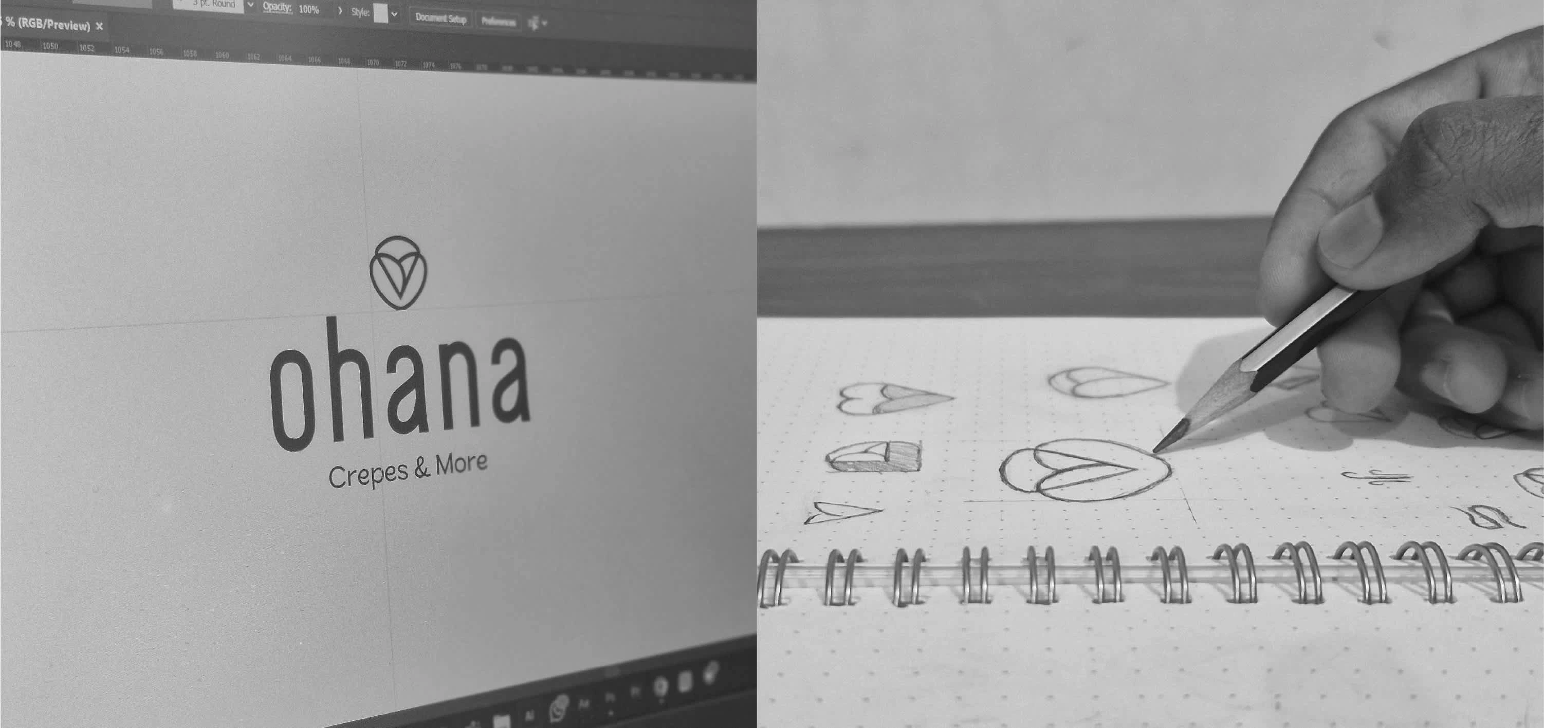
Logo Concept
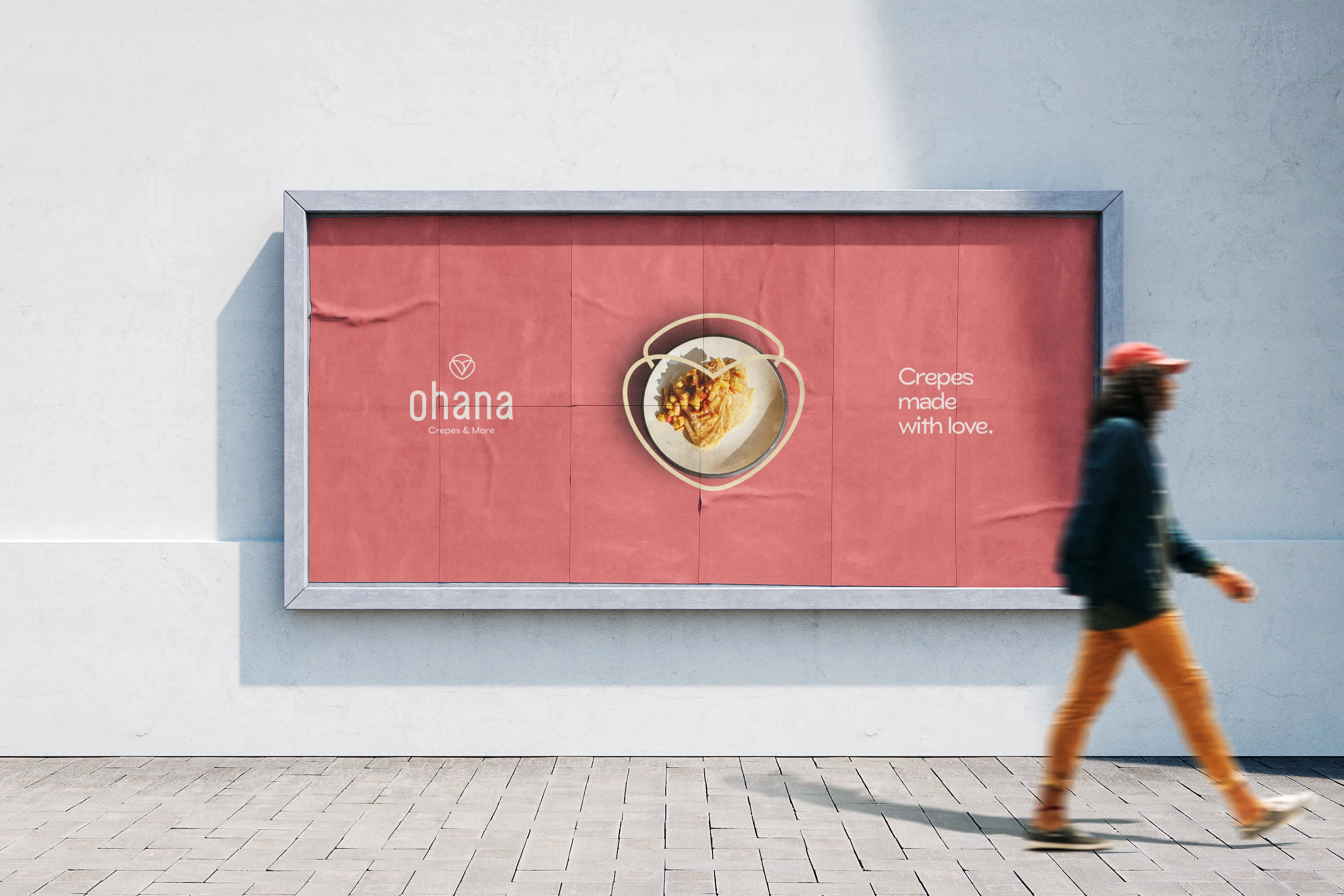
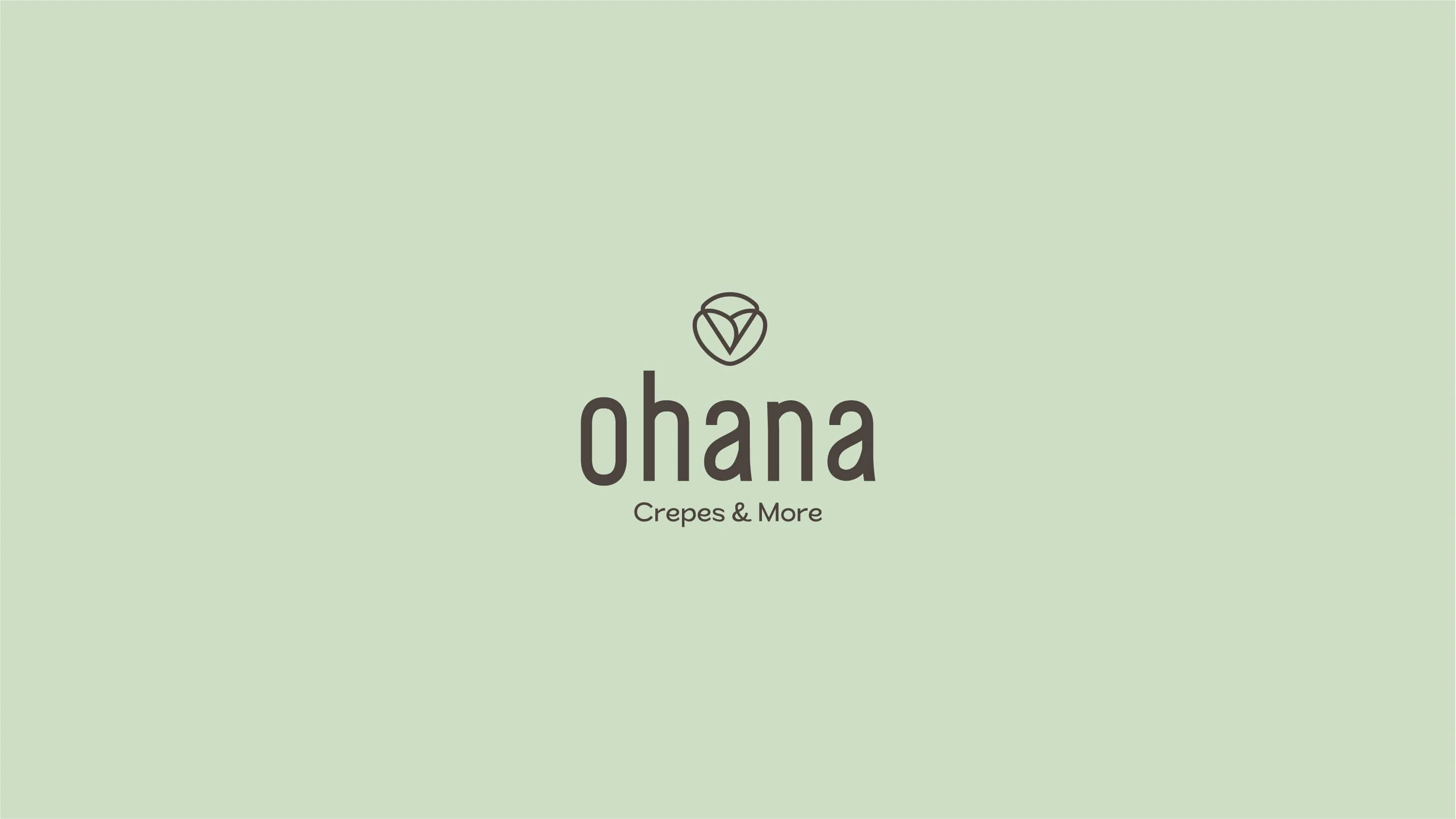
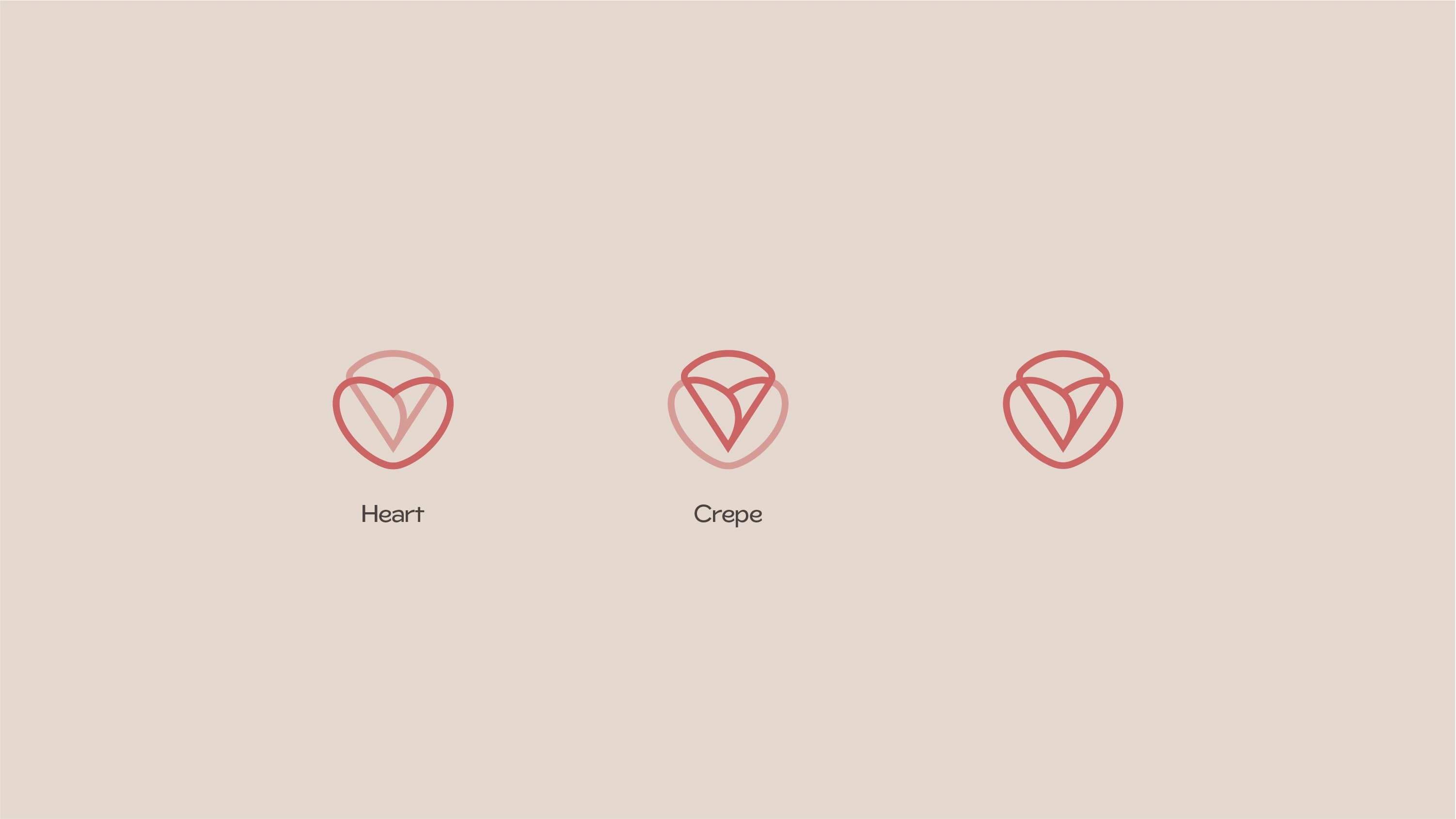
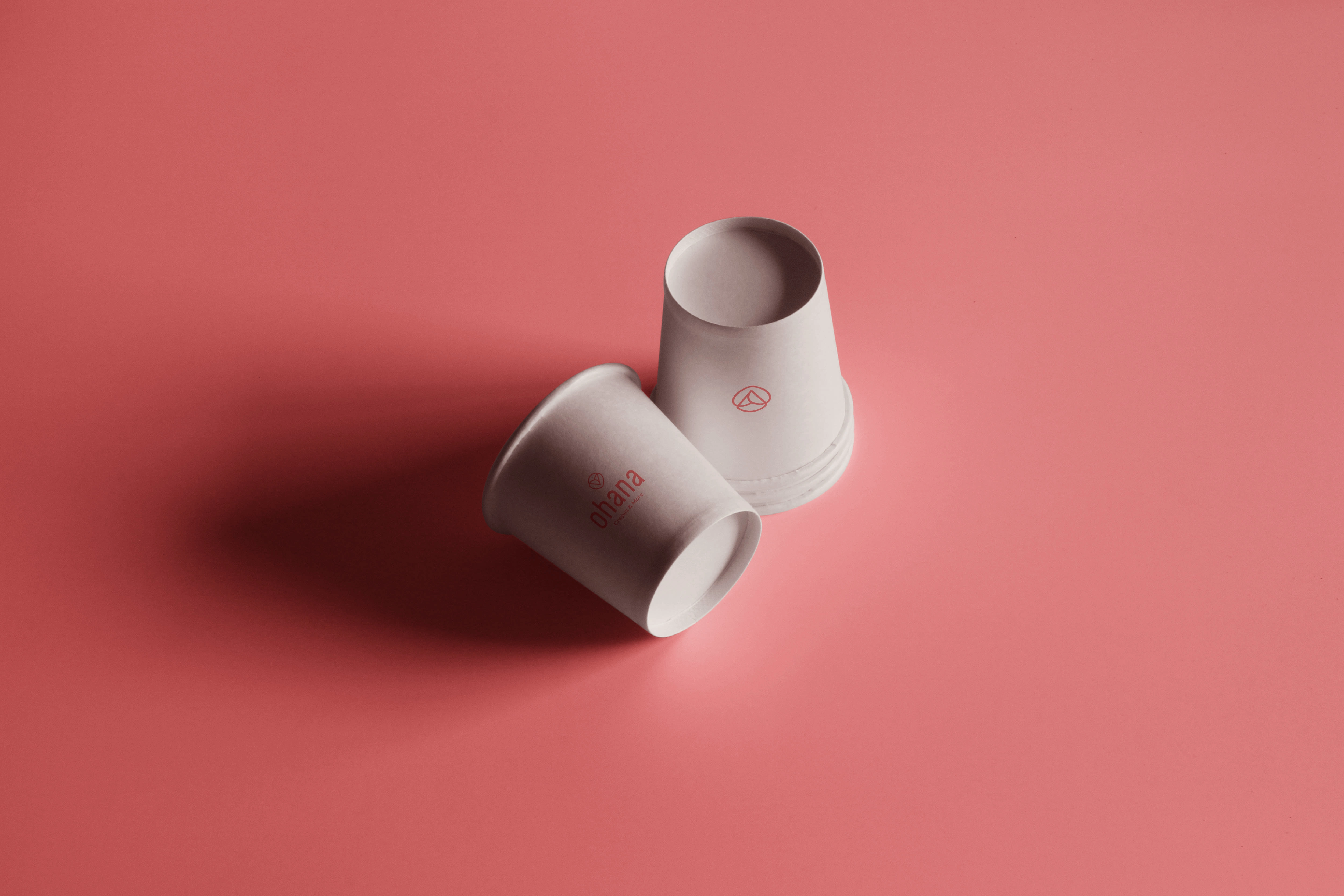
The logo brings together a heart and a crepe — representing love, care, and the café’s signature product. The mark feels soft, joyful, and modern, reflecting the handcrafted and inviting nature of Ohana.
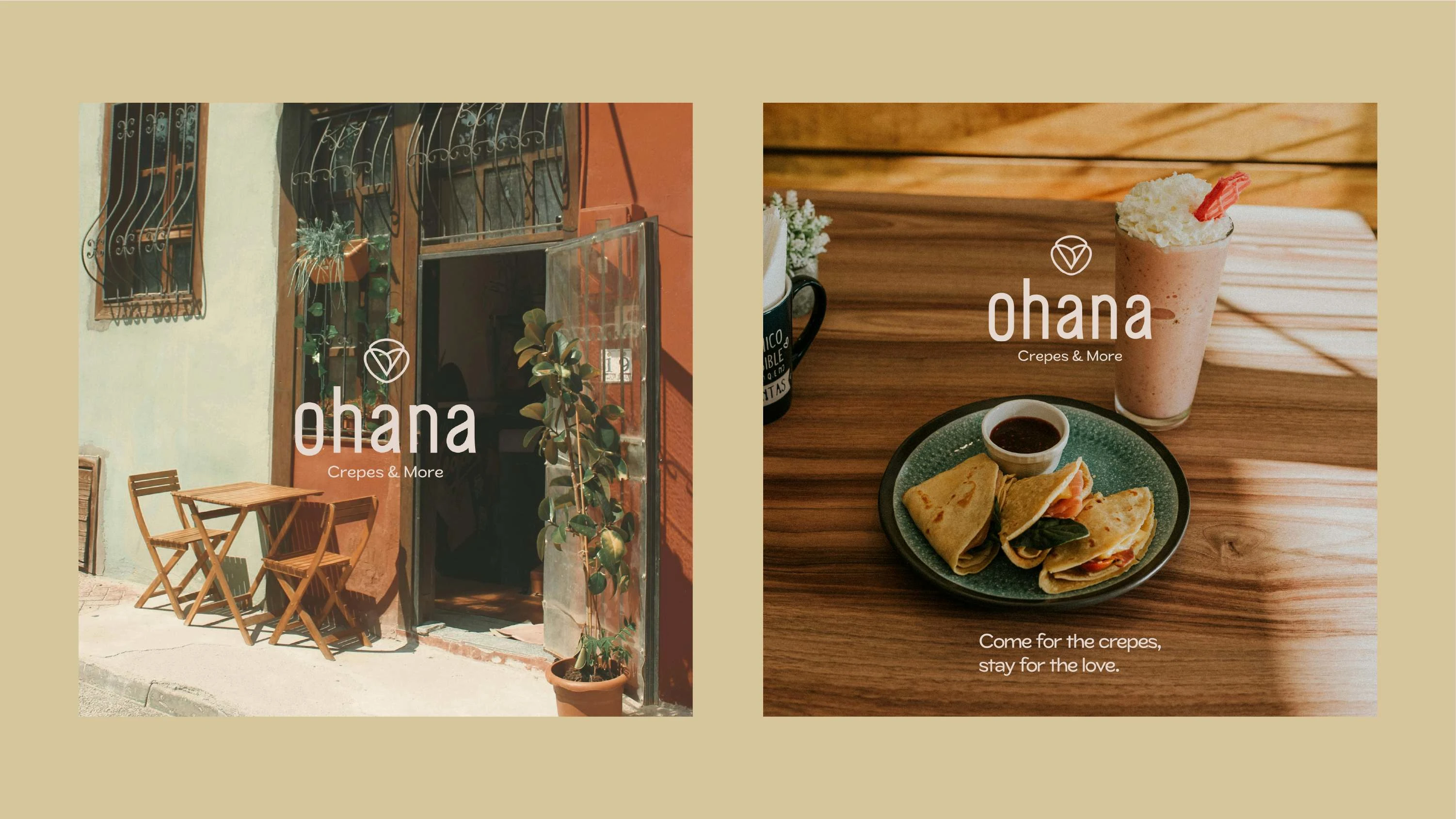
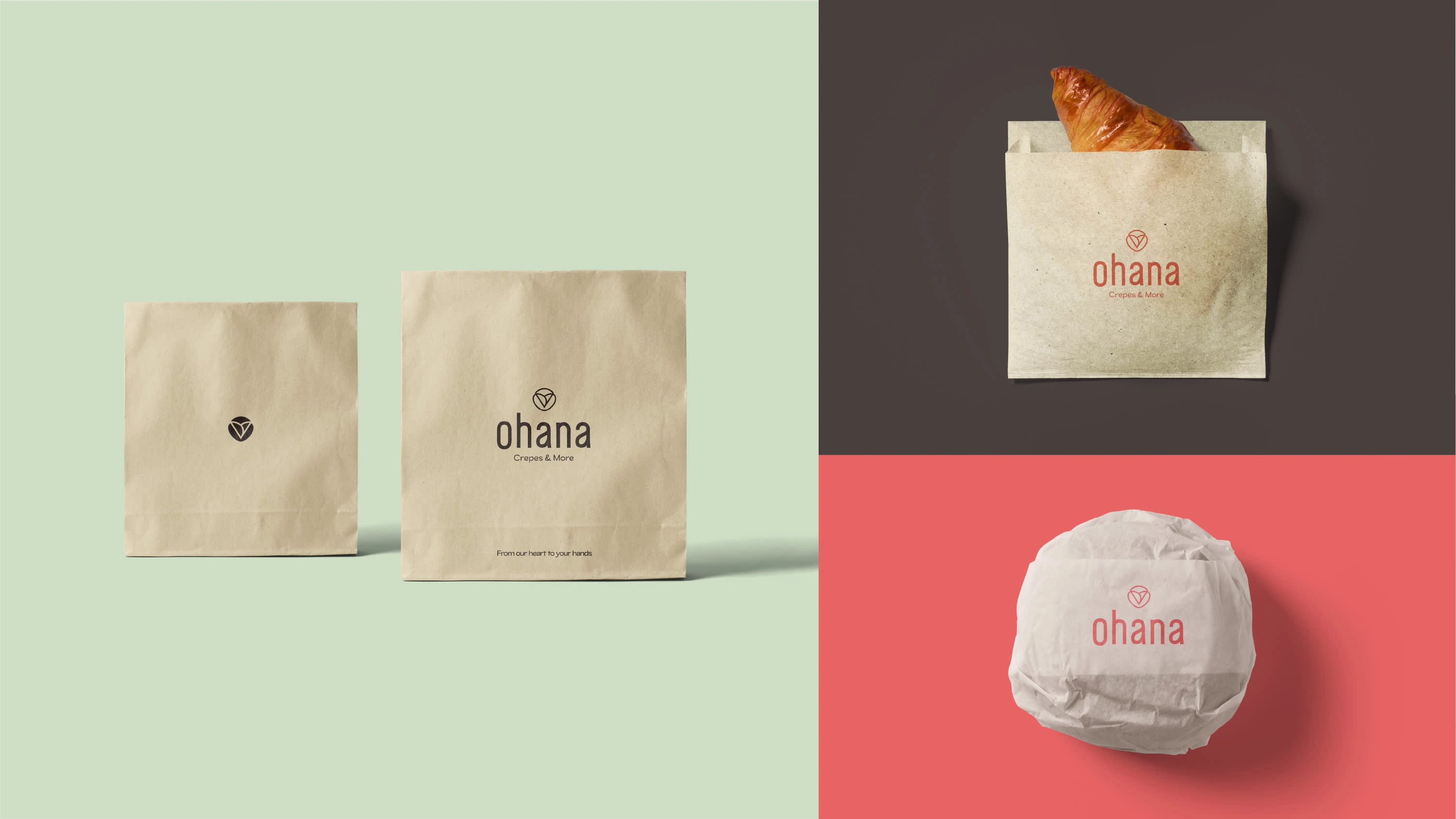

This identity was built to feel like a warm hug — thoughtful, playful, and inviting. The logo, type, and tone work together to make Ohana feel like home, whether you’re grabbing a quick crepe or staying for slow conversation.
Like this project
Posted Jun 5, 2025
Developed a warm, inviting brand identity for Ohana Crepes & More.