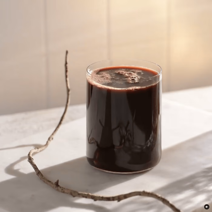
New Visual of Sunglasses Brand "brevno"

In the early 2010s, many indie businesses emerged, including the production of frames made of Siberian wood brevno.
Previously, customers learned about the brand by attending fairs of hand crafted products. In 2019, it became apparent that the focus had shifted. Customers began to familiarize themselves with the brand in glasses stores in Europe and at exhibitions in the world's fashion capitals — Tokyo, Paris, Milan, New York.
The brand reached a new level. Glasses became more qualitative and diverse. Now the new competitors are world famous brands.
First and foremost, the logo needed to be updated. The client wanted the logo to be simple, but with a recognizable twist. The new brand style should not refer to a specific time and should be durable.
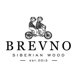
the old logo
I started my search: I sketched out some hyperbolized custom fonts to probe different directions. On the right are some of them.
After 2 iterations, we came up with the final options.
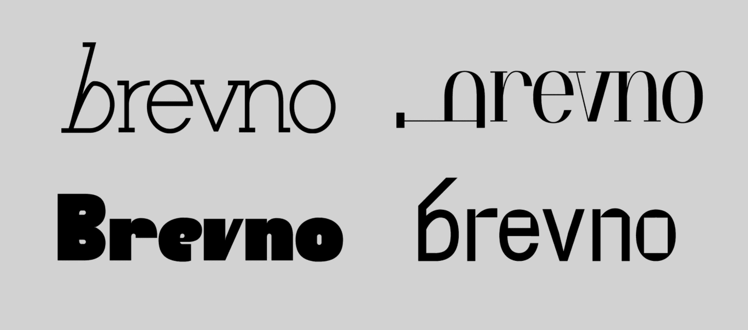
Here’re the finalists.

A little sorcery on the shapes and counterforms. It's done.

The highlight was the letter b, bold and expressive.
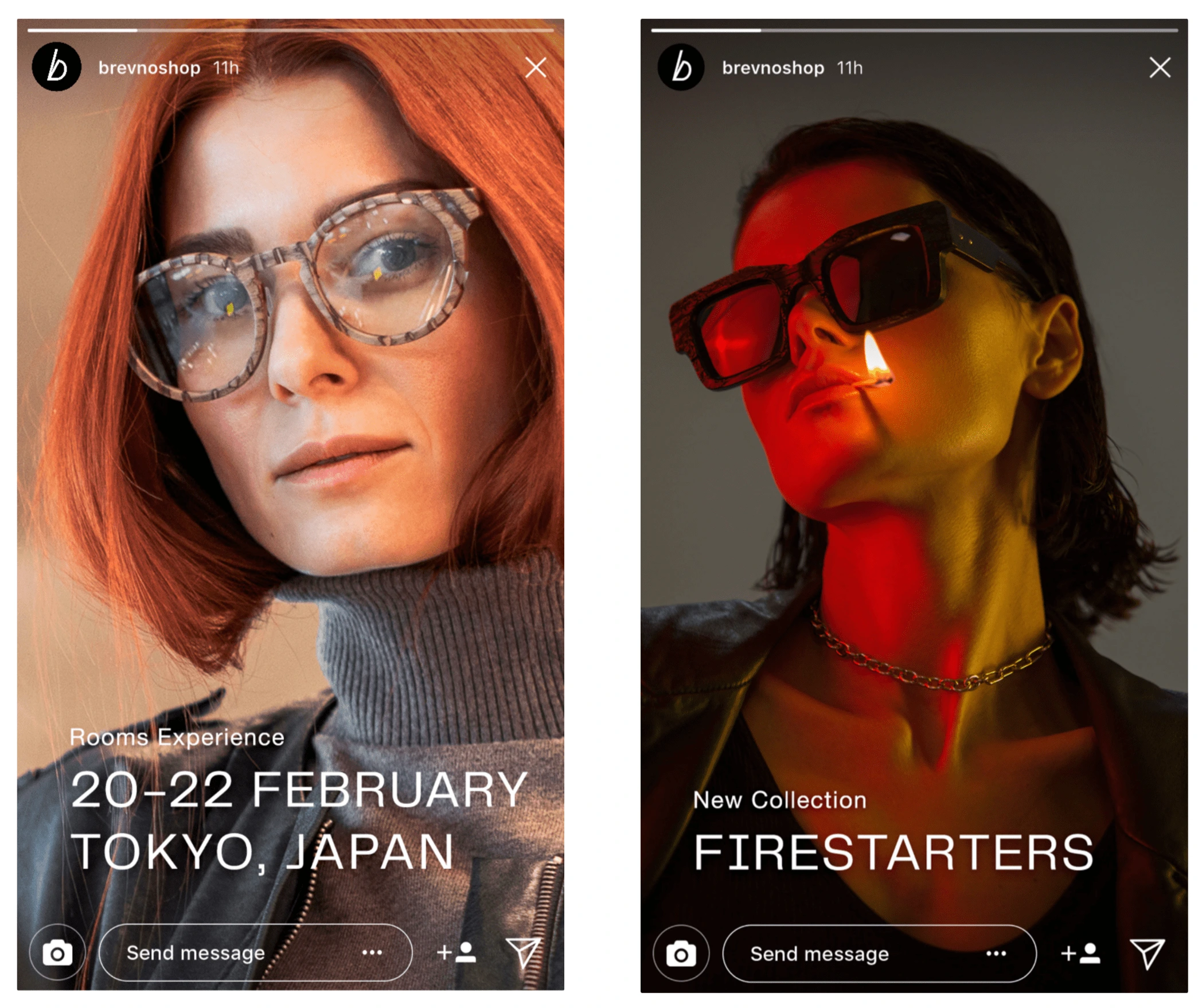
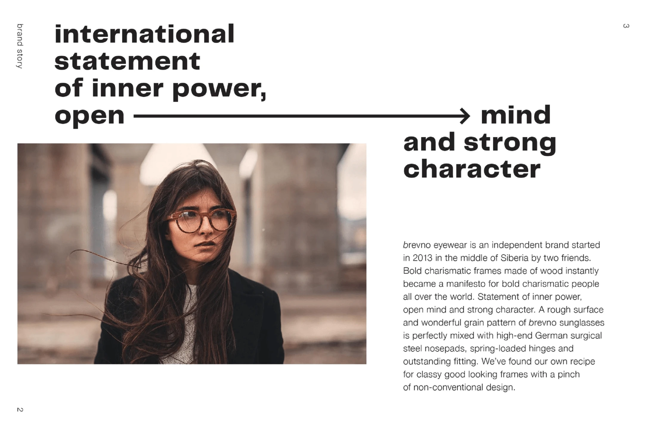
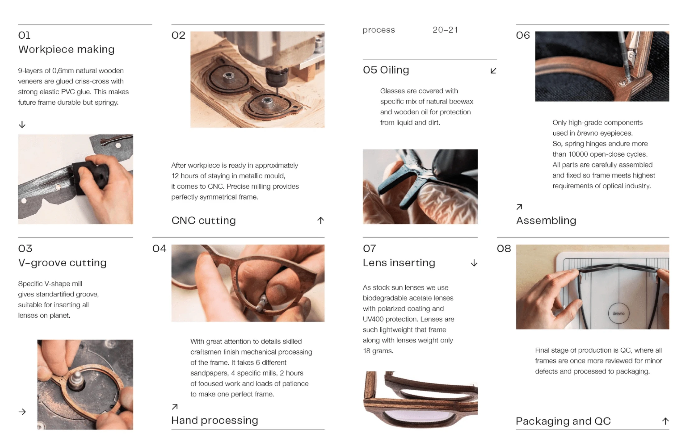
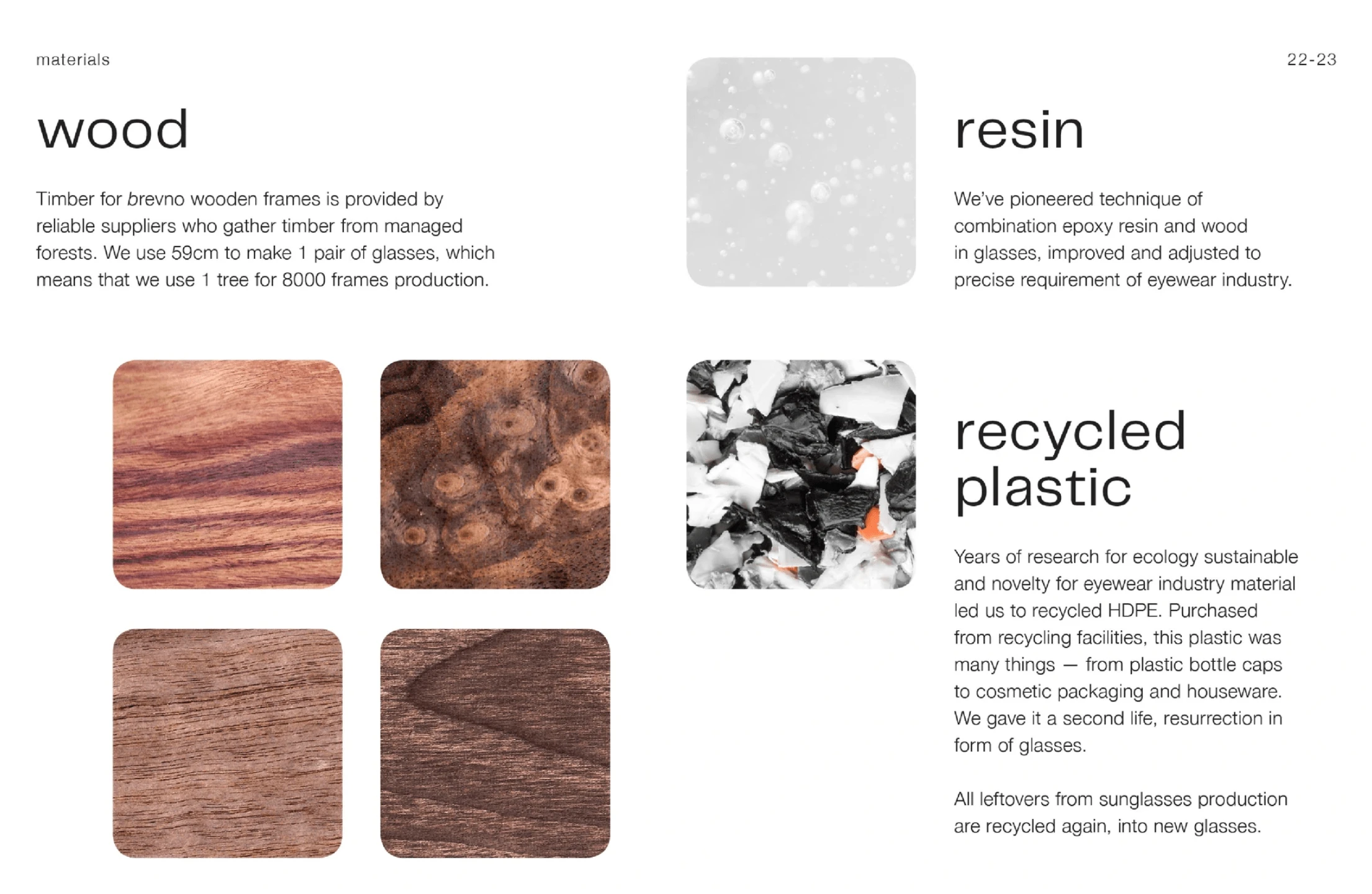
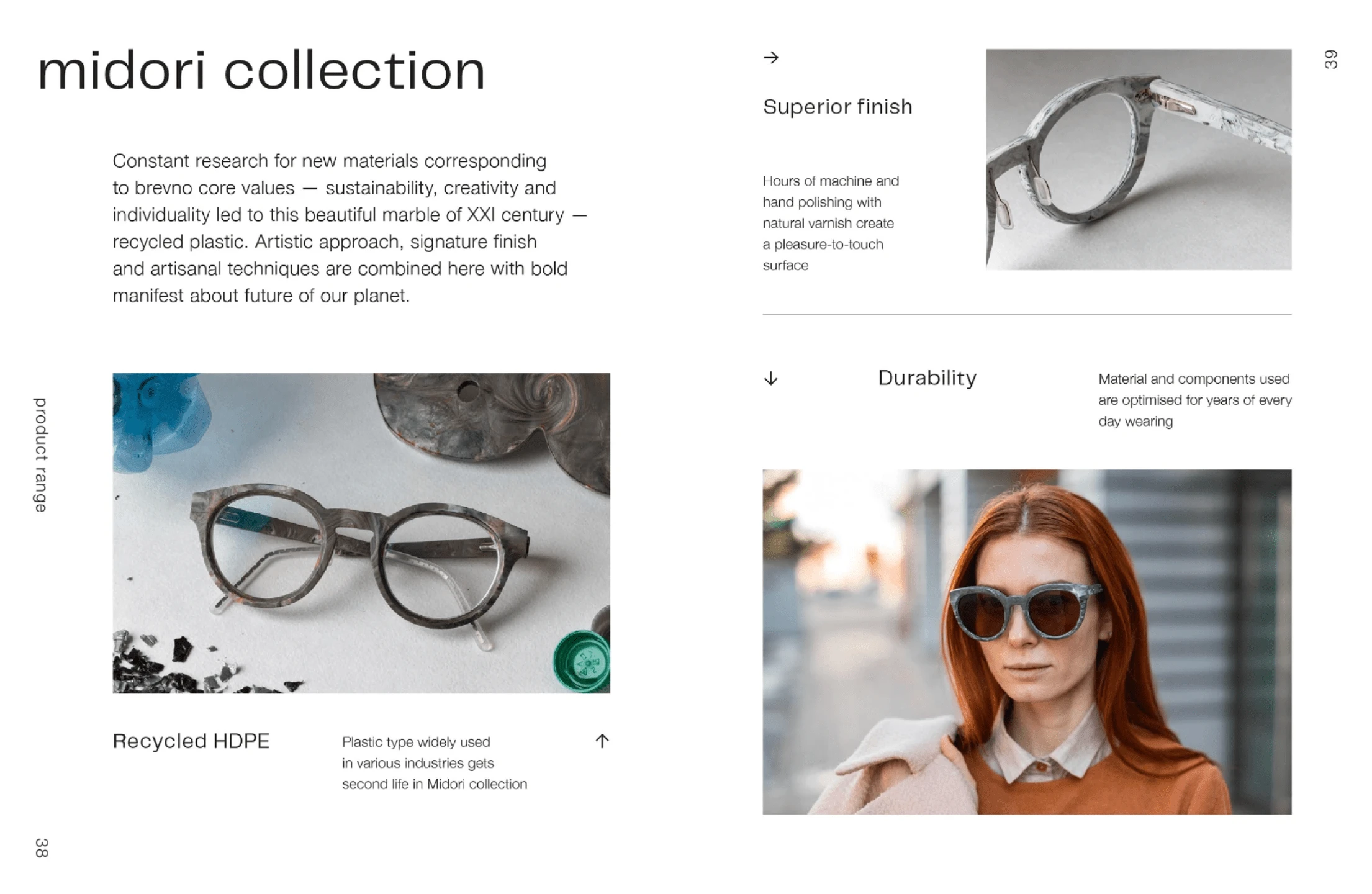
brevno is always written with an italicized b. This can be seen in the catalog for partners.

Like this project
Posted Jul 8, 2024
rebranding, logo design, typographic logo
Likes
0
Views
12
