Parcoursup Zen, AI Guidance for French Post-Bac Students

Muhammad Issa Umer


Parcoursup Zen
A French AI guidance platform that helps post-bac students navigate Parcoursup, matching their profile against 23,000+ formations, analysing their admission chances, tracking deadlines, and helping draft motivation letters. The context is what shapes everything: Parcoursup is the single most stressful administrative process in a French teenager's life, it runs on a fixed national calendar with no second chances, and most students go through it with parents who never had to. So the design does the opposite of what the subject invites. A near-white base with a soft violet, pink and mint gradient in the hero, one strong violet accent carrying every button and highlight, clean type, warm student photography, and plenty of breathing room throughout. Nothing red, nothing urgent, no countdown timers manufacturing panic in an audience that has plenty already. The product is free, and the interface makes that feel like reassurance rather than a catch.
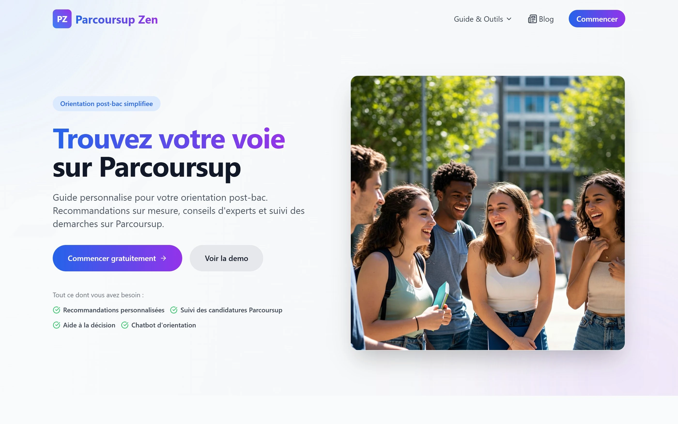
What I built
The guides below are the front door. Behind them is the platform I built:
Matching that compares a student's profile against 23,000+ formations
Admission-chance analysis for the formations a student is weighing up
A deadline tracker built on the official 2026 calendar
Motivation-letter drafting that takes a student from a blank page to a first draft
An orientation chatbot for the questions that don't fit a guide
Built in Next.js, with LangChain and LangGraph running the AI on OpenAI models.
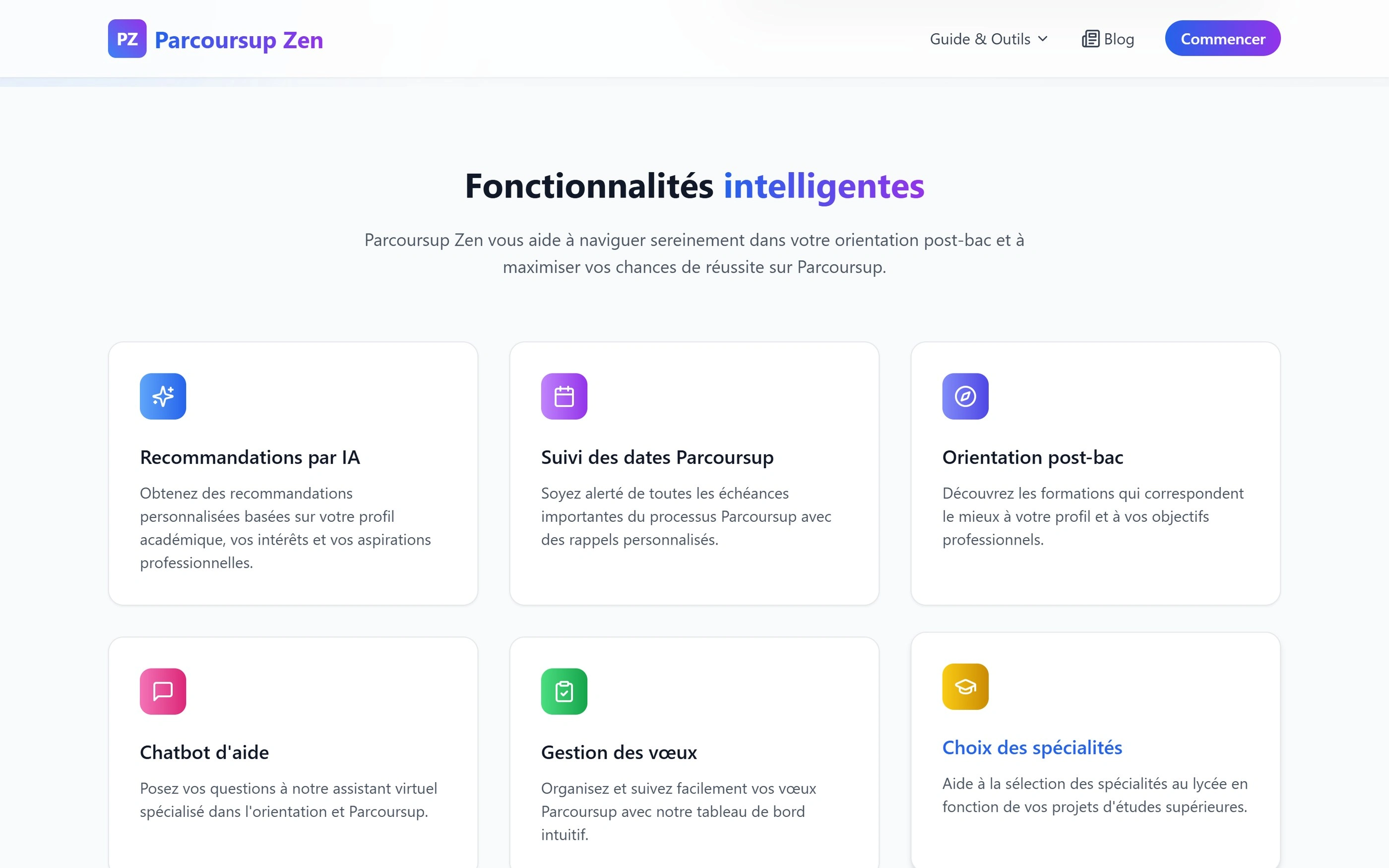
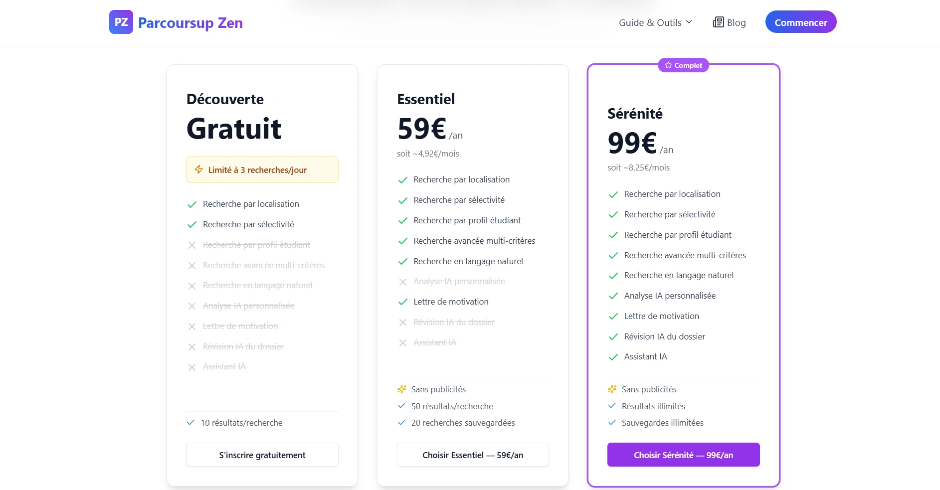
23,000+ formations, and an interface built to lower the heart rate
Guides and Outils
The hub that sits between the marketing site and the tools, and the page that decides whether an anxious student finds what they need or gives up. Everything is grouped by the question being asked rather than by product feature, when is the deadline, how do I write the letter, what does this response mean, so nobody has to know the platform's vocabulary before they can use it. Same near-white base, same single violet accent, so moving from a guide into a tool never feels like leaving the site.
Guide Parcoursup
The most comprehensive page on the site: the calendar, the 2026 rule changes, official procedures, video tutorials, and strategic tips all in one long scroll. Splitting it across pages would have been the tidier decision and the wrong one, because a student sitting down to understand Parcoursup properly wants one authoritative page they can return to rather than a documentation tree. Keeping it readable at that length falls to structure, numbered sections give the scroll a sense of progress, and colour-coded cards let someone hunting a single answer scan for it without reading the whole thing. Same near-white base and violet accents as everywhere else, so density never turns into visual noise.
one long authoritative scroll, numbered so it has a floor plan
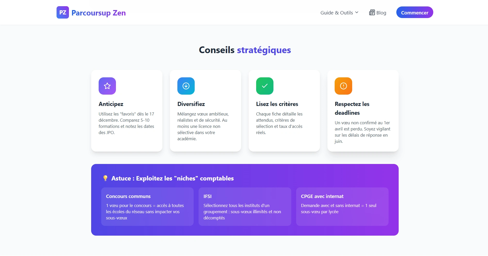
colour used to sort, never to alarm
Calendar Parcoursup
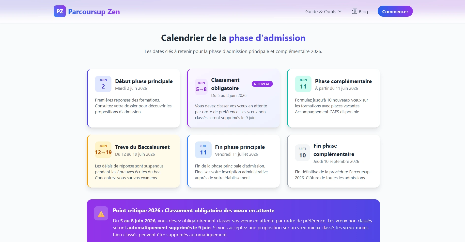
A clean vertical timeline laying out every Parcoursup 2026 deadline, near-white background, violet used only on the date markers. Deadlines are the part of the process with real consequences, missing one closes options permanently, so the page is built to be understood in a single glance rather than read. Restricting colour to the markers alone makes the dates the only thing the eye lands on, and the vertical format matches how students actually check it, on a phone, quickly, to answer one question.
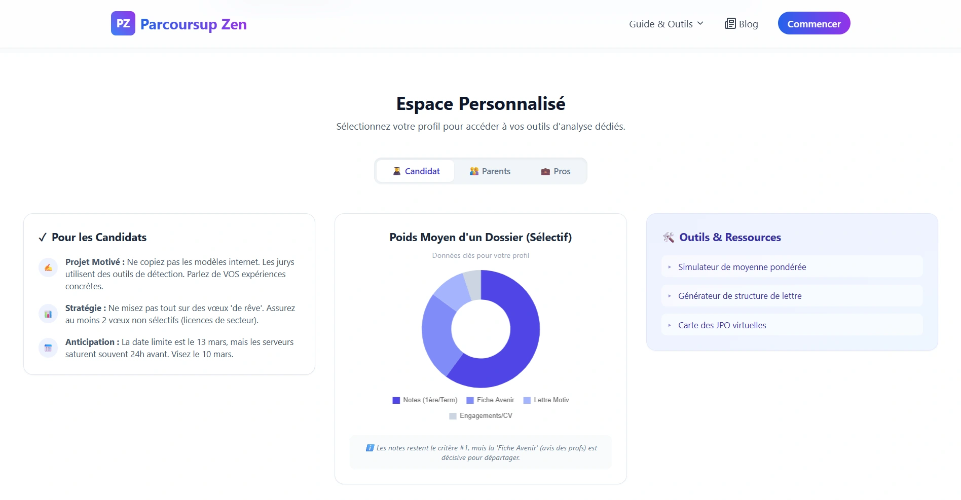
violet on the dates only, so nothing else pulls the eye
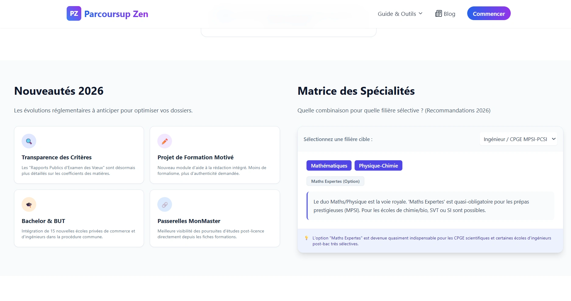
every 2026 deadline in one glance
Lettre de Motivation
A numbered, document-style guide walking through how to structure a motivation letter, introduction, development, conclusion. The format mirrors the thing being taught, so the page itself demonstrates the structure it's describing. Colour is kept to the violet step numbers and nothing else, because a student with a blank document open needs a template to follow rather than an interface to admire. This is the task most applicants dread and put off longest, so the guide's job is to make starting feel small.
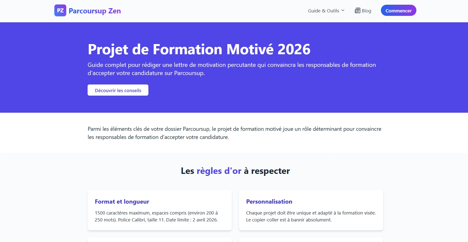
a guide shaped like the document it teaches
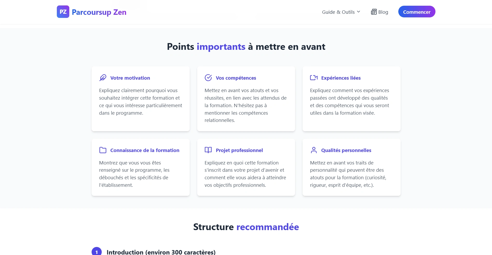
the violet step numbers are the only colour on the page
Résultats Parcoursup
Explains the four possible admission responses, Oui, Oui-si, En attente, and Non, each in its own colour-coded card with plain-language guidance on what to do next. Results day is the highest-emotion moment in the entire process, and the official wording tells students what they received without telling them what to do about it. Every card ends in a next step, including the two nobody wants to receive, since En attente and Non are exactly when a student needs guidance most and is least able to go looking for it.
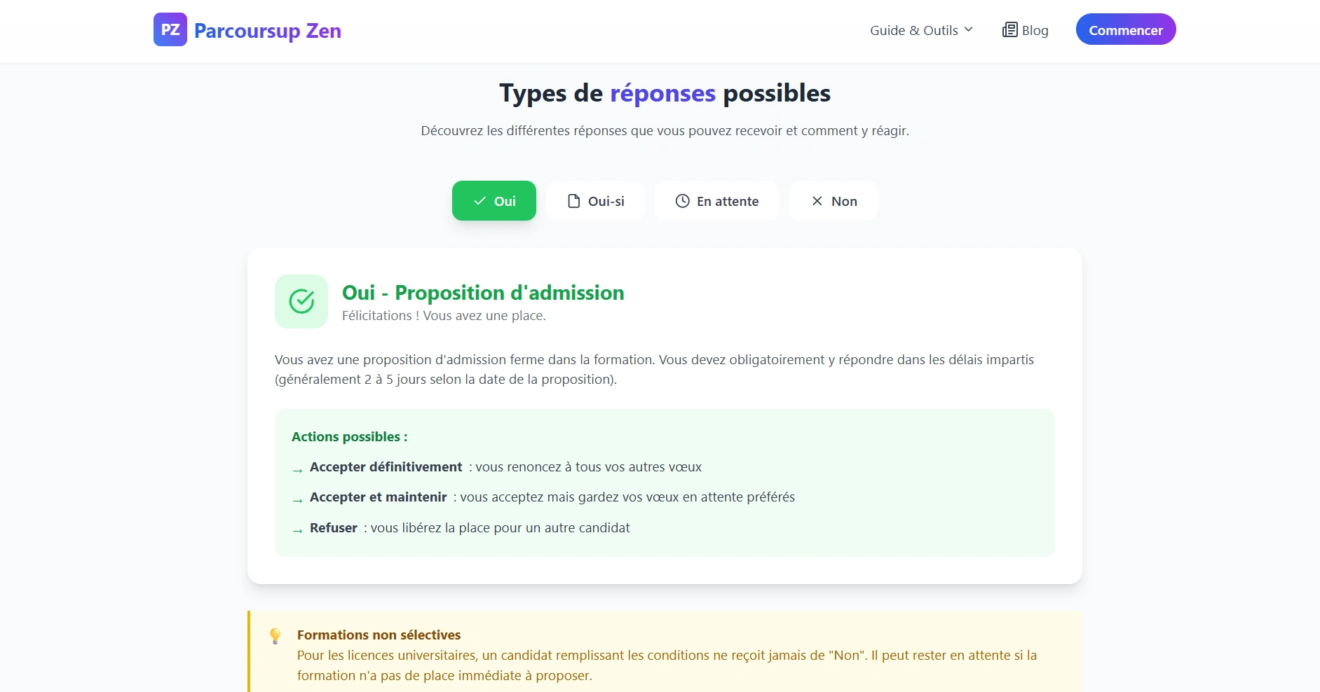
Oui, Oui-si, En attente, Non, and what each one means
Blogs
The search layer, and the entry point for most first-time visitors. Students arrive on Google months before they know a platform like this exists, typing the specific question in front of them, so the blog exists to catch those queries and hand them to the relevant tool. Article layouts stay simple and text-led, the same near-white and violet, styled to be read rather than browsed.
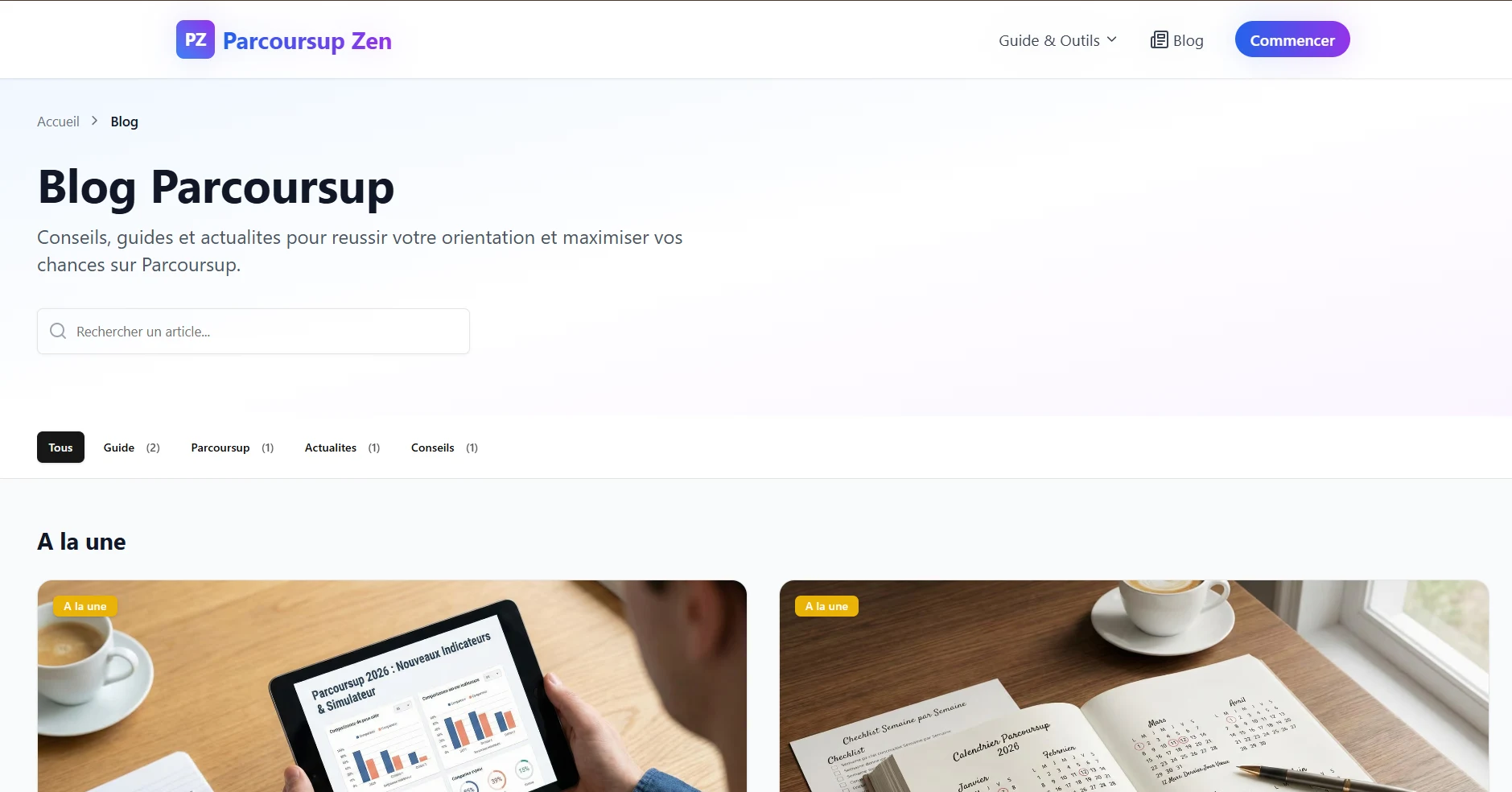
catching the question students type at 1am
Like this project
Posted Aug 28, 2026
23,000+ formations matched to a student profile, deadlines tracked, letters drafted. A calm interface for a genuinely stressful process.