Isy: How to bring E-commerce closer to our seniors
If you want to read the first part of this project I leave it linked here:
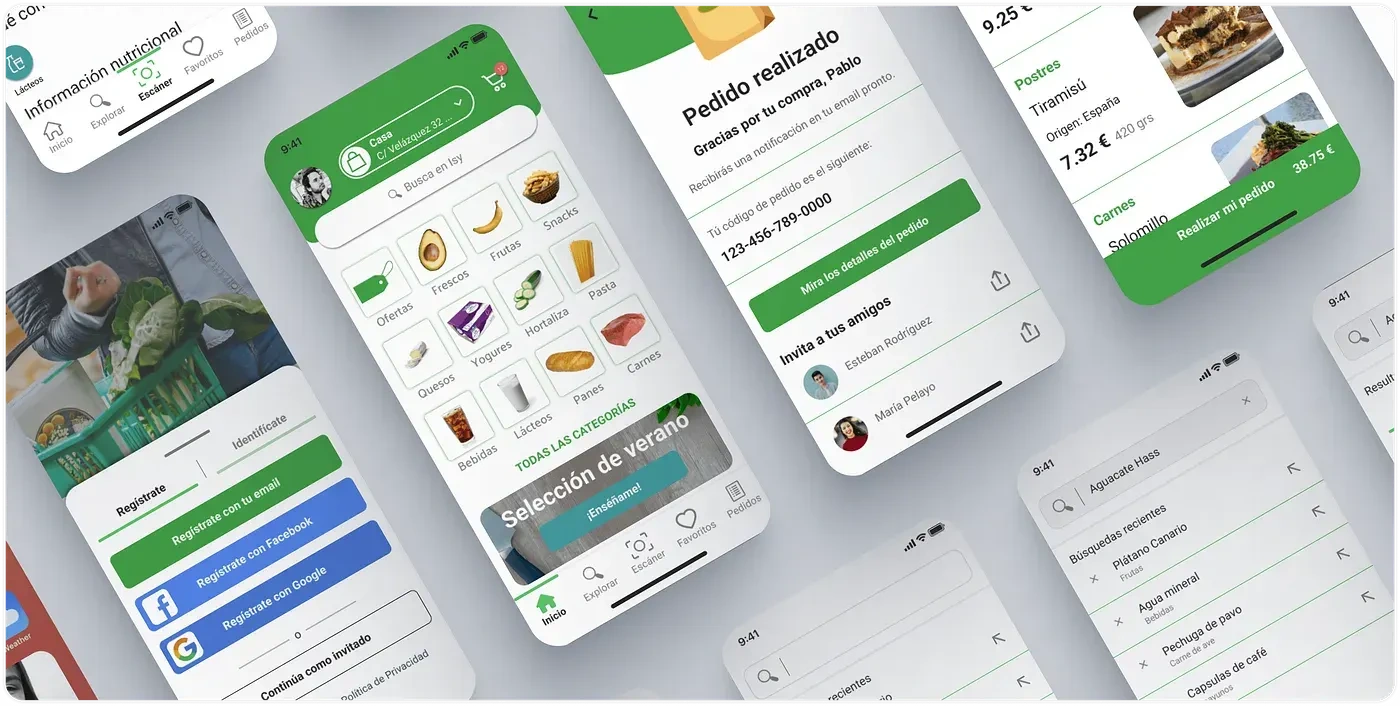
Welcome to Isy
Continuing with the work I was doing in my previous article, it was now time to face the task of giving shape and life to our project. The first thing to do was to consider the identity of our product. We were clear about our target audience and our strengths, but now we had to translate all this.
Voice and tone
Nearby
Friendly
Honest
Personalized
Value proposition
Comfortable
Agile
Intuitive
Cool
Combining these characteristic points, several names came to the fore. We finally decided on Isy. This name comes from the word easy in English but spelled in Spanish. It refers to the ease of use in everyday life and that any user can use it.
Information Architecture
Continuing with the interaction design, there were still a few more steps to go before confronting the prototype.
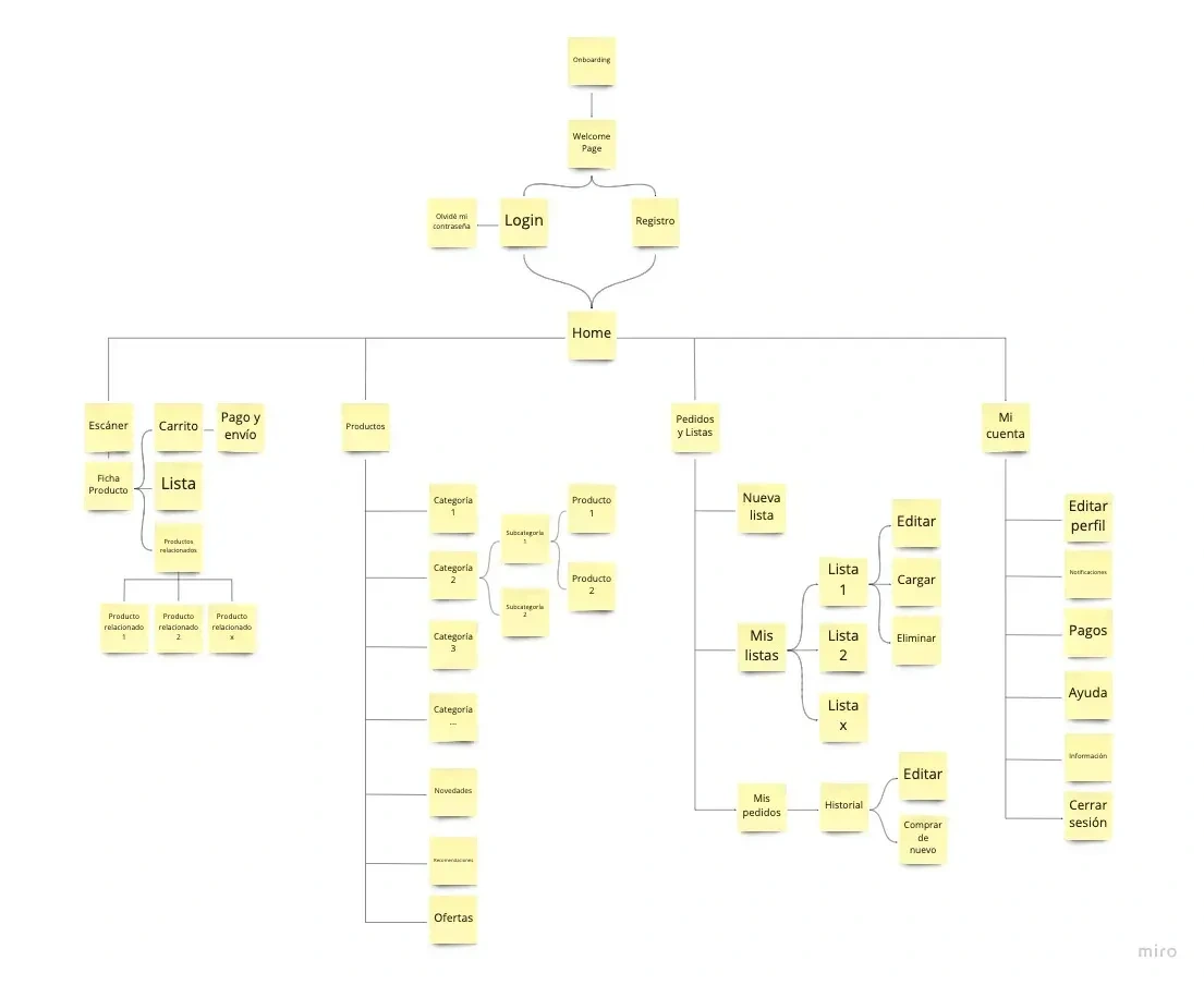
IA for Isy
To define our architecture, we made three points clear:
Consistency
Scalability
Accessibility
The division was done in an orderly manner and grouped into categories, in order to have a clear definition of the structure.
An Onboarding page that would take us to a Welcome Page where to register or login.
Once inside, we would enter our Home, which is divided into:
Scanner
We scan products and consult their data sheets.
We can see related products
Products
Products are divided into categories (fruits, meat...) and other personalized categories (offers, recommendations...).
Orders and lists
We can consult and create new customized product lists.
Consultation of our orders
My account
Customization options, help and information.
With this part already closed, two more issues had to be completed before moving on to the visual level: user cases and user flows.
User cases
Now it was time to define how the interaction between our system and the user will be. The main idea of doing this was to explain how the system should behave and what the process is. In addition, they also help to know what to do if something goes wrong and to understand the functional side of the project and to be able to develop good functional or technical requirements.
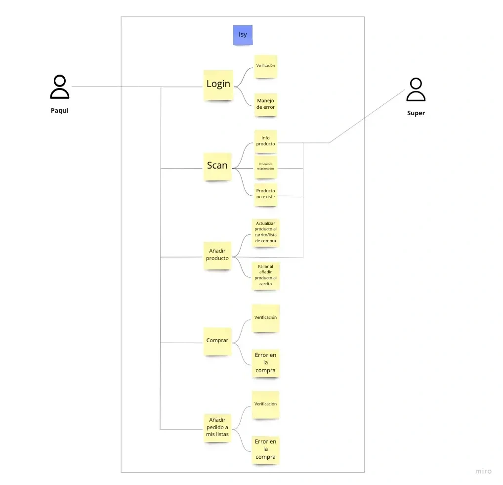
User Case
User flows
Thanks to the flows, we were able to involve the different decisions that our users should make during the use of our product. This helped us enormously to understand and comprehend how the user will think and interact.

Isy userflow
The challenge of the visual part was finally coming and we had to start little by little and on the right foot. In a first exercise, the team chose to work individually making a series of sketches by hand to let the ideas that we had been creating in our heads throughout the process flow a little. Once we had finished this process, it was time to put it in common and translate all these ideas and appreciations to wireframes that were as close as possible to what Isy would finally be at a visual level.
The idea we came up with was that of a basic interaction process with Isy: using our scanner to consult a product, add it to our basket, place an order and add what we had purchased to a previously created list.
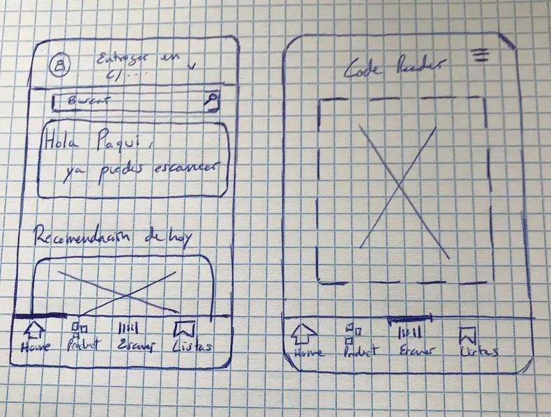
Hand sketch 1
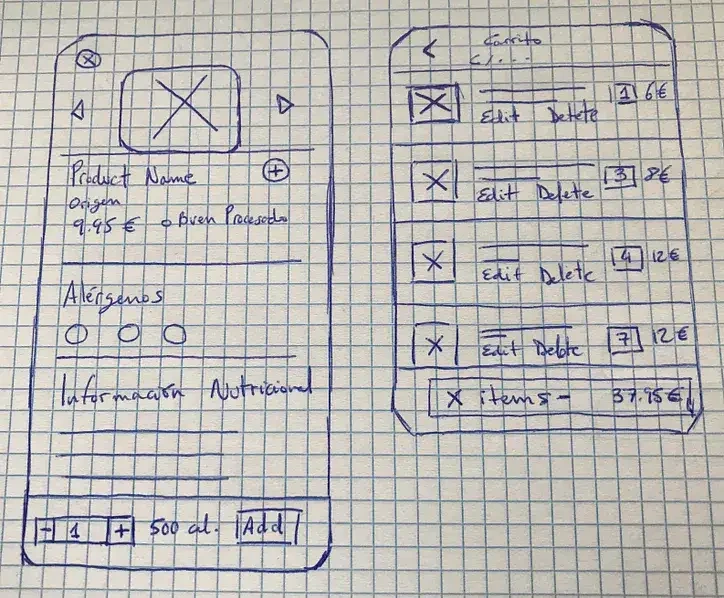
Hand sketch 2
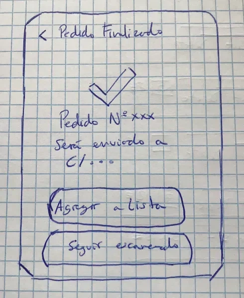
Hand sketch

First wireframes
Prototype
For this part of the process, a last minute challenge arose: to face alone the visual design and prototyping as well as the testing. I decided to accept it despite the workload I was going to have to bear, why? Because I wanted to experience firsthand the whole process of creating a visual design of an app and learn all the factors that a designer must face to get a first UI version that convinces and can be taken to a serious testing with users.
I decided to encompass all my ideas under the premise of Atomic Design: creating small pieces to make increasingly complex and reusable blocks, greatly streamlining the design process and giving uniformity and quality to what I was doing. I started my design by creating a color palette, based on the color green (confidence, closeness, success), and generating a series of well-defined typographies. By working with components and variants I was able to greatly accelerate the reuse of resources within the design. In addition to this, and for those who have OCD, I worked on a grid of 8 pixels and 2 columns so that everything was where it should be. Here is the result after studying the testing results and performing a complete redesign of the whole application:
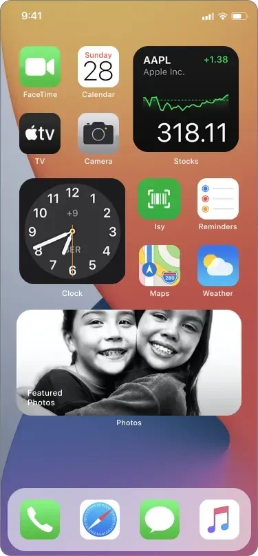
App Icon
Loading screen
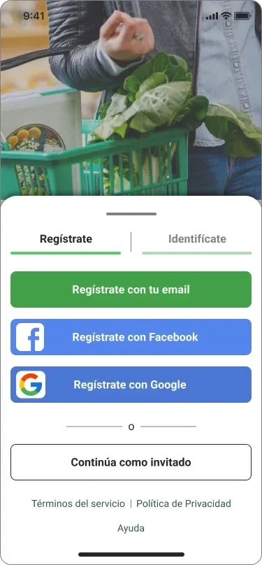
Sign up screen
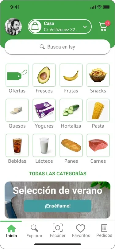
Home screen
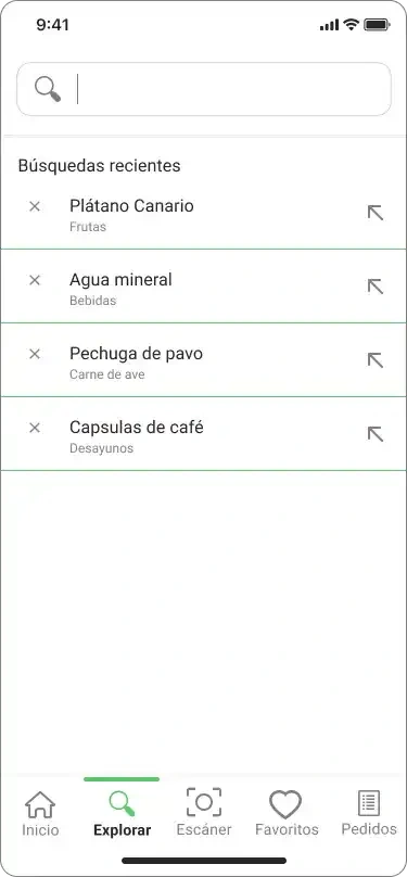
Search flow 1
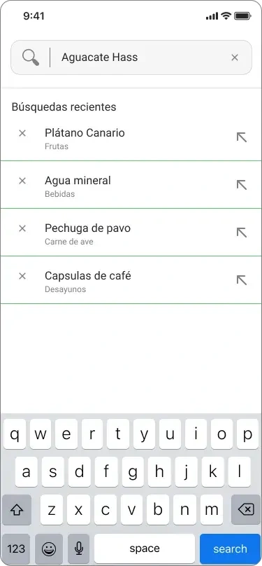
Search flow 2
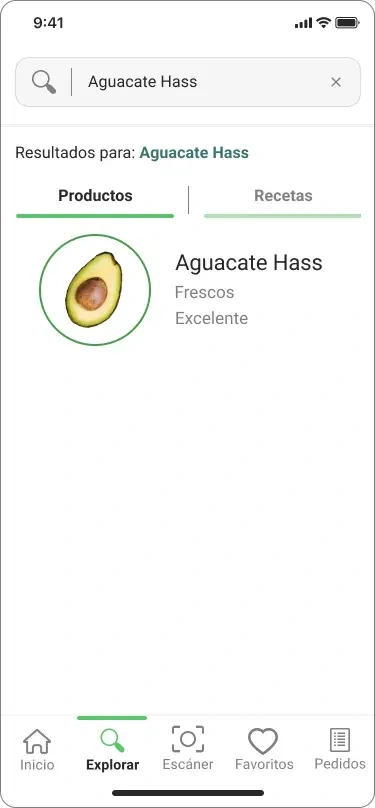
Search result
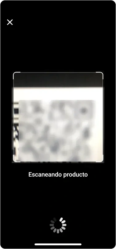
Scanning code
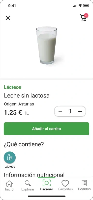
Product details
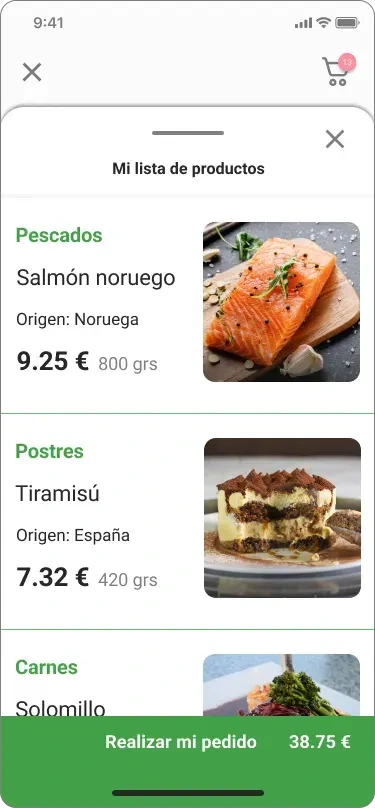
My shopping list
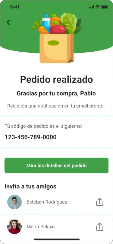
Order confirmed
Testing
We are coming to the end of this project, I hope you are not getting bored! Now it was time for the key part of this whole UX/UI design process: testing with real users for the first prototype.
My main goal with the test was to analyze the usability and ease of use of this first version of Isy. To do this, I conducted the test with a total of 6 users aged between 20 and 60 years, focusing on users with age ranges over 40 years. These are the main target we were targeting from the beginning of the project.
Maze was used as a tool. During the testing we analyzed both specific missions, with a series of steps to be fulfilled, and the user's behavior during the whole testing process. At the end of the test each user was invited to give their feelings using the app and what improvements they would add.
At the end of the testing, I got some very good conclusions and patterns, and I even found some clues that I didn't think I was going to give. The truth is that the testing phase surprises me every time with something new and shows the capacity of continuous improvement that any kind of digital product has. Let's always trust our testers!
Patterns
The floating button was not understood by all users. Especially by the older ones.
The command to add the order we just placed to an existing, or new, list was not very clear with the text contained in the button that executes that logic.
Two users did not know how to add the product they were looking for. They searched for the product and, when presented with it, clicked directly on the cart in the navigation bar.
Neither user clicked the 'Got the code?' button. They went straight to the scanner in the navigation bar.
Older users did not look at the information presented on the screen before taking any action.
A couple of users did not understand the flow to add the purchase made to an existing list.
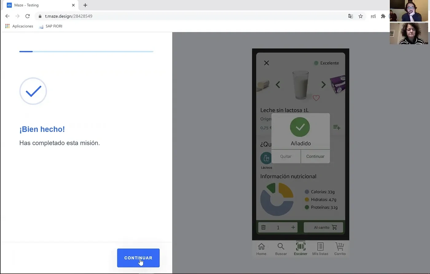
Testing with users
Graphical improvements
Remove the floating button and leave the option to create lists in the 'My lists' section.
Remove the 'Do you have the code' button. Nobody has used it.
Make important information more eye-catching for the user and get them to stop and look at it. Perhaps with better colors or larger text fonts.
Concept improvements
Be clearer and more concise with the actions requested to the user. The friendly and lighthearted tone has not also worked as intended.
Give more indications on how to add the product in the results screen. You could even add a quantity counter and a cart icon on the displayed product itself.
Change the floating button to a help button.
Make an onboarding when the user enters the application for the first time.
Final Conclusions
The design was well received.
The commands were well interpreted by almost all users.
The speed of use of the scanner was most liked by the users.
The information on each of the products was positively valued.
The navigation bar was very clear and its use was highlighted several times.
And with this we come to the end of this journey I have been working on. It has been hard and laborious but also very, very rewarding. The experience I take with me after finishing it is huge and now I just have to iterate and apply improvements, this never ends!
To next project
I come back to rescue Indiana Jones again to say that this adventure is over but we still have many more to go, thank you very much for having made it this far and we'll keep reading! Let's go!
Like this project
Posted Oct 18, 2024
A quick and easy way for our seniors to prepare their weekly shopping with just their mobile phone. Welcome to Isy.
