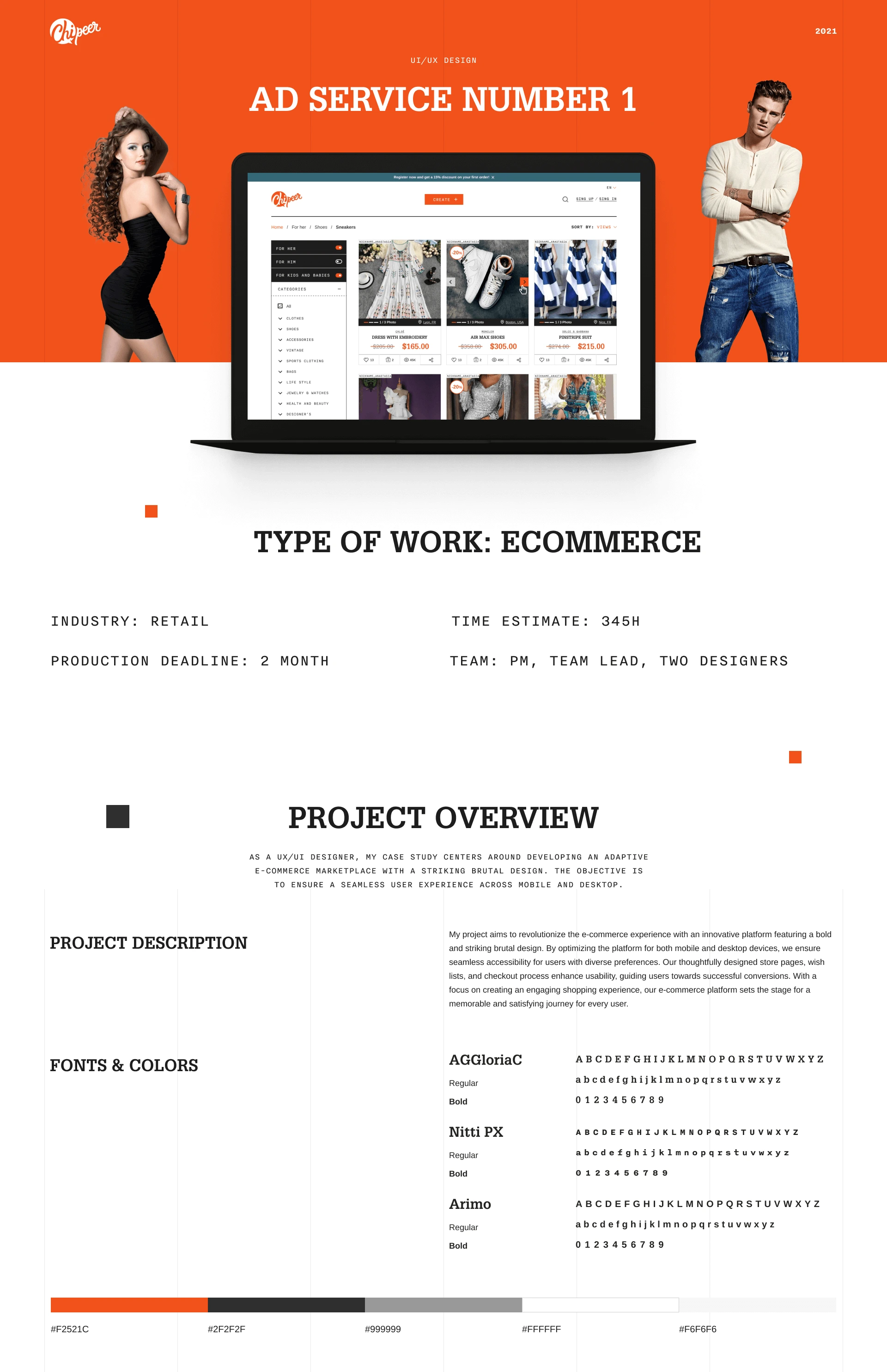
Fashion & Style Marketplace
Oleksandr Pohribnyi
📌 Overview
As a UX/UI designer, this case study explores the development of an adaptive e-commerce marketplace with a bold and brutalist design language. The goal was to create a seamless, visually distinctive user experience across both desktop and mobile platforms — prioritizing usability while embracing a raw, characterful aesthetic.
🚩 Objective
To revolutionize the e-commerce experience through a striking, brutal design that challenges traditional design norms — while ensuring cross-device usability, high accessibility, and improved user satisfaction.
🔍 Design Strategy
The project began with:
Researching modern e-commerce behaviors and user pain points
Mapping out user flows across shopping, account creation, and checkout
Creating low-fidelity wireframes, gradually improving them into high-fidelity prototypes based on iterative feedback and testing
A style guide was developed to maintain brand and layout consistency across the experience.
🧱 Visual Identity & Layout System
Brutalist Design was chosen to deliver high visual impact and memorability
A clean layout grid ensured structural hierarchy, readability, and alignment
Consistent typographic rhythm and minimalistic iconography supported scanability
The result was a unique aesthetic that breaks norms, yet retains functionality.
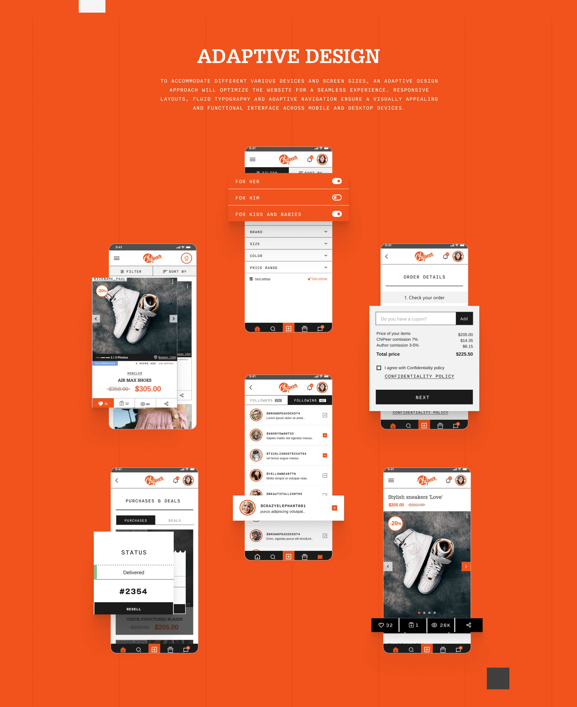
💡 Adaptive & Responsive Design
Ensuring a seamless experience across devices was a top priority. The design included:
Fully adaptive layouts and fluid typography
Navigation systems reimagined for small-screen contexts
Touch-friendly interactivity and spacing for mobile users
High-performing UI on desktop without losing mobile clarity
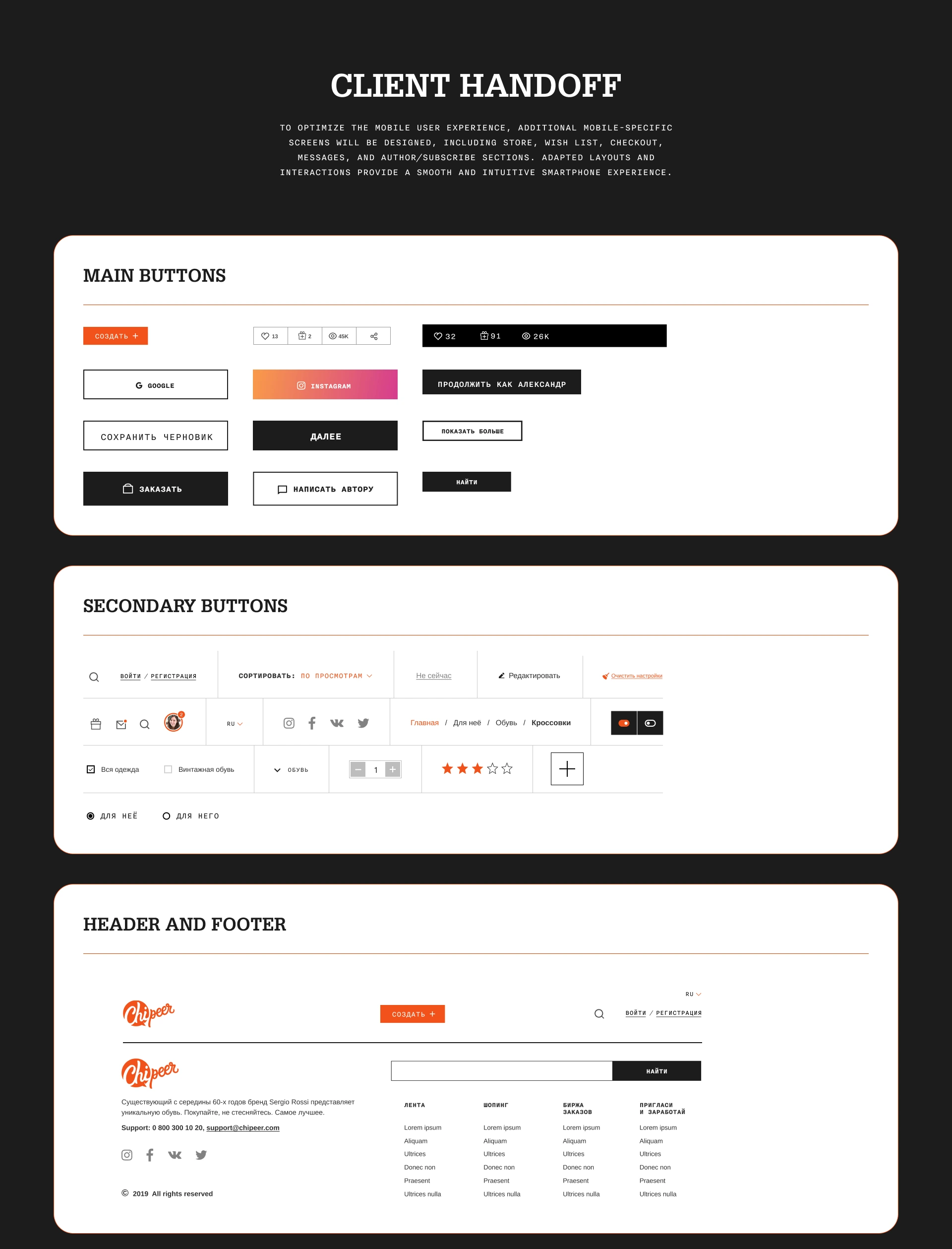
📱 Mobile-Specific Enhancements
To optimize performance on mobile:
Custom screens were designed for:
Store
Wish list
Checkout
Messaging
Author/Subscribe workflows
Mobile transitions and interactions were adapted to deliver intuitive gestures and feedback loops
All actions are easy to reach, fast to access, and consistent in flow
These adjustments created a native-app feel in the browser — increasing session depth and shopping ease.
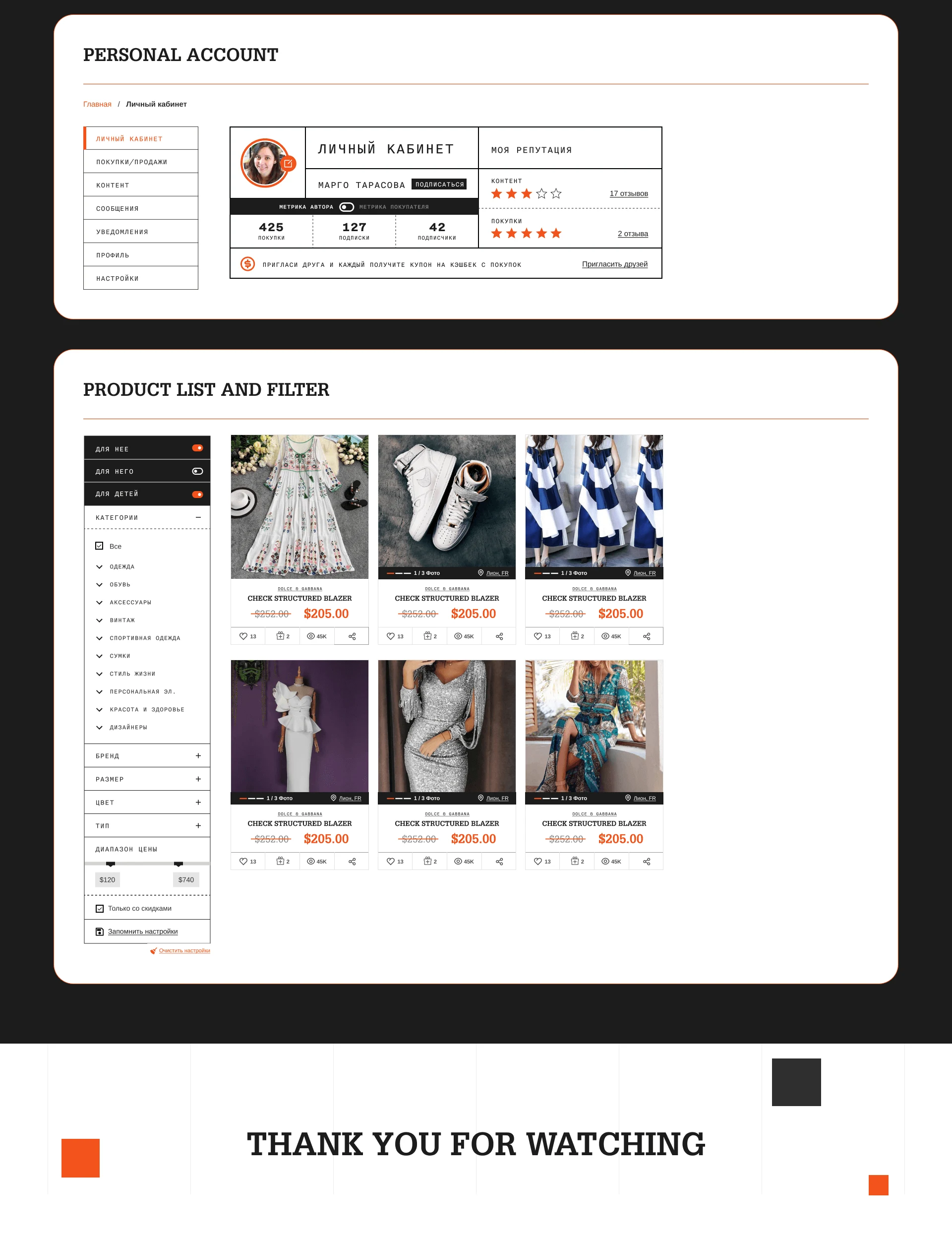
🧩 Key Features Highlight
Brutalist visual language that breaks away from standard clean e-commerce templates
Personalized store experience with deep usability logic
Clean CTA hierarchy for streamlined checkouts
Wish list and message center built for repeated, long-term engagement
Fully adaptive system ensuring cohesive functionality across display sizes
📈 Outcome
The final platform successfully merges design experimentation with practical e-commerce functionality. It reflects a bold creative direction while delivering a commercially viable, user-focused product capable of delighting both desktop and mobile users.
Like this project
Posted Jul 1, 2025
Adaptive e-commerce platform with a brutalist aesthetic, optimized for mobile/desktop, combining bold visual impact with seamless UX.
Likes
0
Views
3