Trip Flight booking app
Praise Okore
Trip is a flight booking app that ensures the smooth booking of flight tickets to travel destination.
Goal Setting
Project Name: Trip
Project Summary: Trip is a flight booking web app designed to give users the best experience they can get.
Problem/Challenge: Due to the high number of competitors in this sector, lots of users need more added value solutions to their travel booking needs, these value added solutions would be obtained via my user research and would be integrated into the web application. Service providers also want to generate more revenue based on the fees associated with the booking of flights
Project Goal: The goal is to create a solution to offer users an easy way to purchase flight tickets. The project should also generate revenue for the service providers.
Targeted Users: Tourists, families and the general tourism industry at large
The Team
-Product designer
-Product manager
-Project manager
-Business Analyst
-Developer
My Role
- User Experience Designer
What I did
- Goal Setting
- User research
- Persona Building
- User Journey map
- User flow creation
- Wireframes design
- High-fidelity design
- Usability testing
User Research
I conducted four interviews with volunteers between the ages of 26 to 34. All of them have the following in common:
i) Residents in Nigeria.
ii) They are currently working.
iii) They usually travel or usually have traveled (it may vary by the Covid-19 situation).
During interviews, we tried being as natural as possible. In this way, we created a relaxed atmosphere which let the conversation to flow. We paid attention and empathised with the interviewees so as to get our data to be useful and relevant in our study.
To have a more concrete view of the interviews, I added here some of the most relevant prompt questions:
i) Tell me your usual process of looking for flights and trips.
ii) Tell me about the last time you have a bad experience booking a flight.
iii) Tell me about the last time you look for a service related to travel in an app but then, you purchase it in another app.
Research findings
i) I would like to find an application that helps me to compare and purchase flight tickets in an easy and fast with all services in one place, no hassle.
ii) "Managing the flight search is a tedious task that makes them waste a lot of time."
Solution
Design an application specialised in offering flight tickets. Also, the user can compare and acquire them from the same application
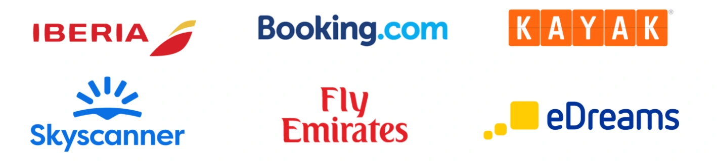
Competitive analysis
Studying and analysing competitors can be much more enriching than it seems. Before making a business decision, it is highly recommended to analyse the good practices of your competitors. It is also very interesting to take a look at other companies even if they are not your direct competitors, they may be performing actions adaptable to your business and they may be a success!
In this project I decided to make a competitive and comparative benchmarking to the companies named below:
These companies are possible competitors directly or indirectly. I chose them because the results in surveys and interviews pointed to them. They are the most popular used by users today.
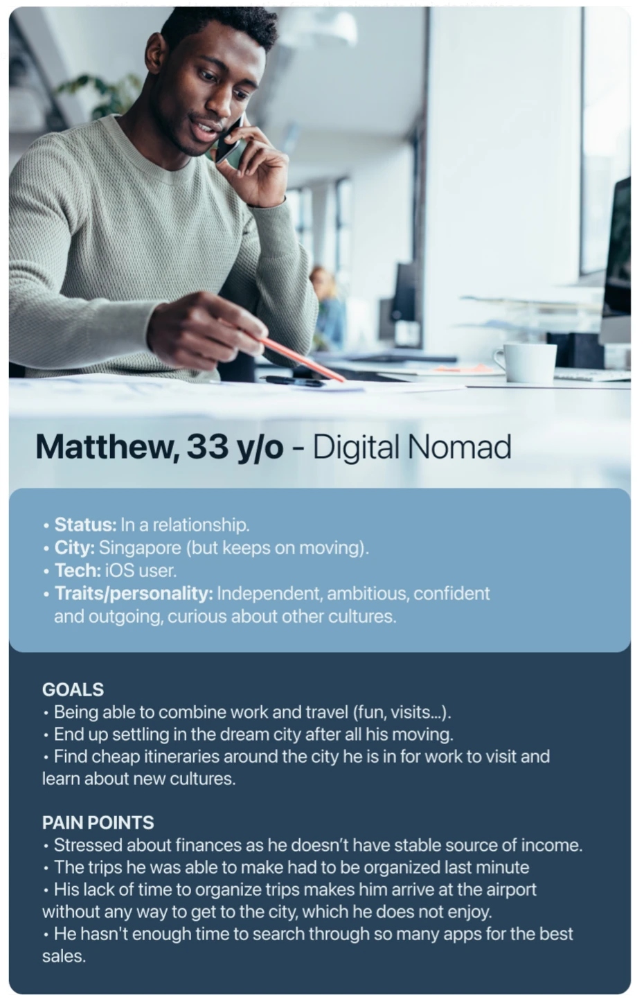
Persona
User Flow
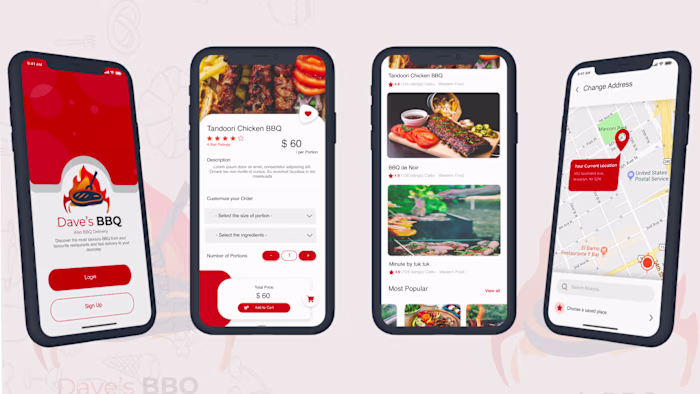
I created a user flows for steps a typical user goes through in order to complete the delivery of the BBQ.
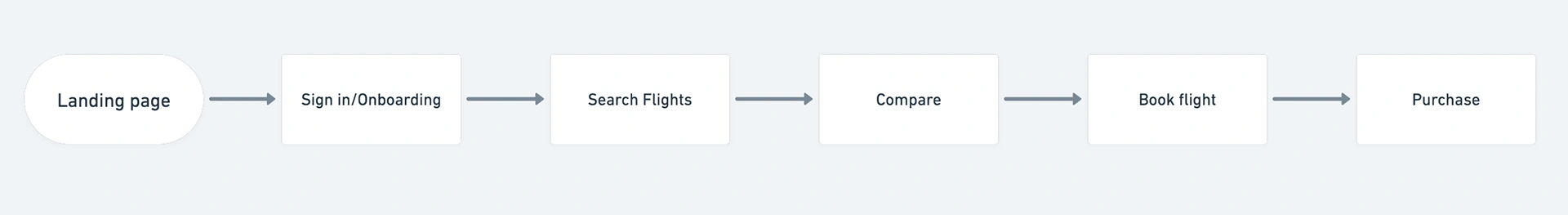
This flows was tested and re-iterated upon several times in order to provide a seamless and smooth experience
One Advantage to note about user flows is that they make all stakeholders aware of the intended experience for the users and developers can start working on any backend services or processes that needed to be worked on.
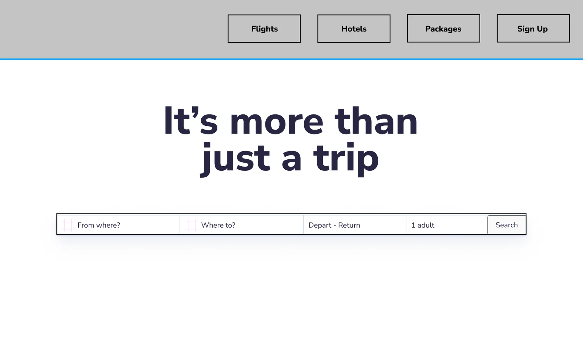
Wireframing
Once I had a better understanding of what I wanted to do and the issues to tackle, I took some time to wireframe some ideas for user testing.
From the user flows and journeys, the next step we took was to design wireframes to give an idea of the interface and test it with stakeholders which we did.
The insights gotten from the wireframes helped in informing our design decisions for the design system and hence, the prototypes.
First Usability study: findings
I conducted two rounds of usability studies. Findings from the first study helped guide the designs from wireframes to mockups. The second study used a high-fidelity prototype and revealed what aspects of the mockups needed refining.
Insights from the first usability study(helped guide the designs from wireframes to mockups) :
Throughout this phase, I moved the prototype to Figma. On this platform, I could start working digitally on my prototype. Here it starts to be a digital interactive prototype. I continued with low fidelity to work with the main ideas and continue testing the users. Most interesting results I found out:
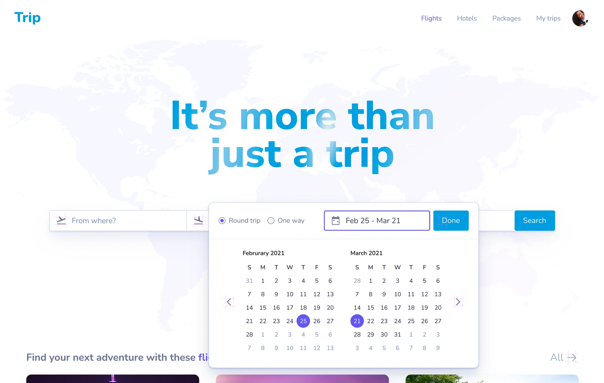
- They confirmed that they would like to see the price comparison in a calendar with different colours. This interesting fact helped me with the high-fidelity version.
- They find the information about coronavirus useful.
- They were not sure how to navigate through the calendar. During the test, they were making lateral movements on it, so this helped me to jump into the high fidelity prototype.
- They would like access to a price breakdown at all times.
Design system
After working on the wireframes, one of the things we wanted to achieve also was consistency. The importance of consistency is so that users are not confused about the colours , buttons, texts, icons, forms and illustrations as well.
Hi-fidelity mockups
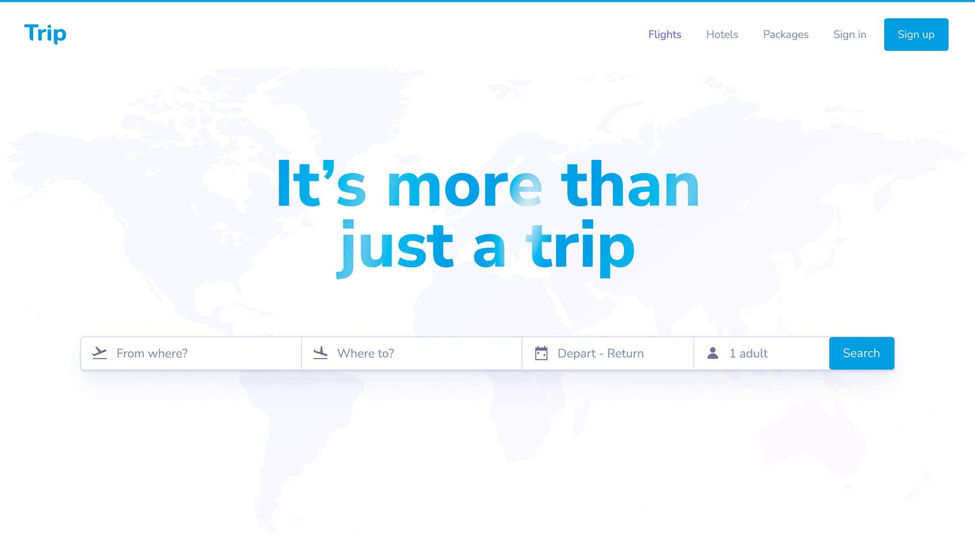
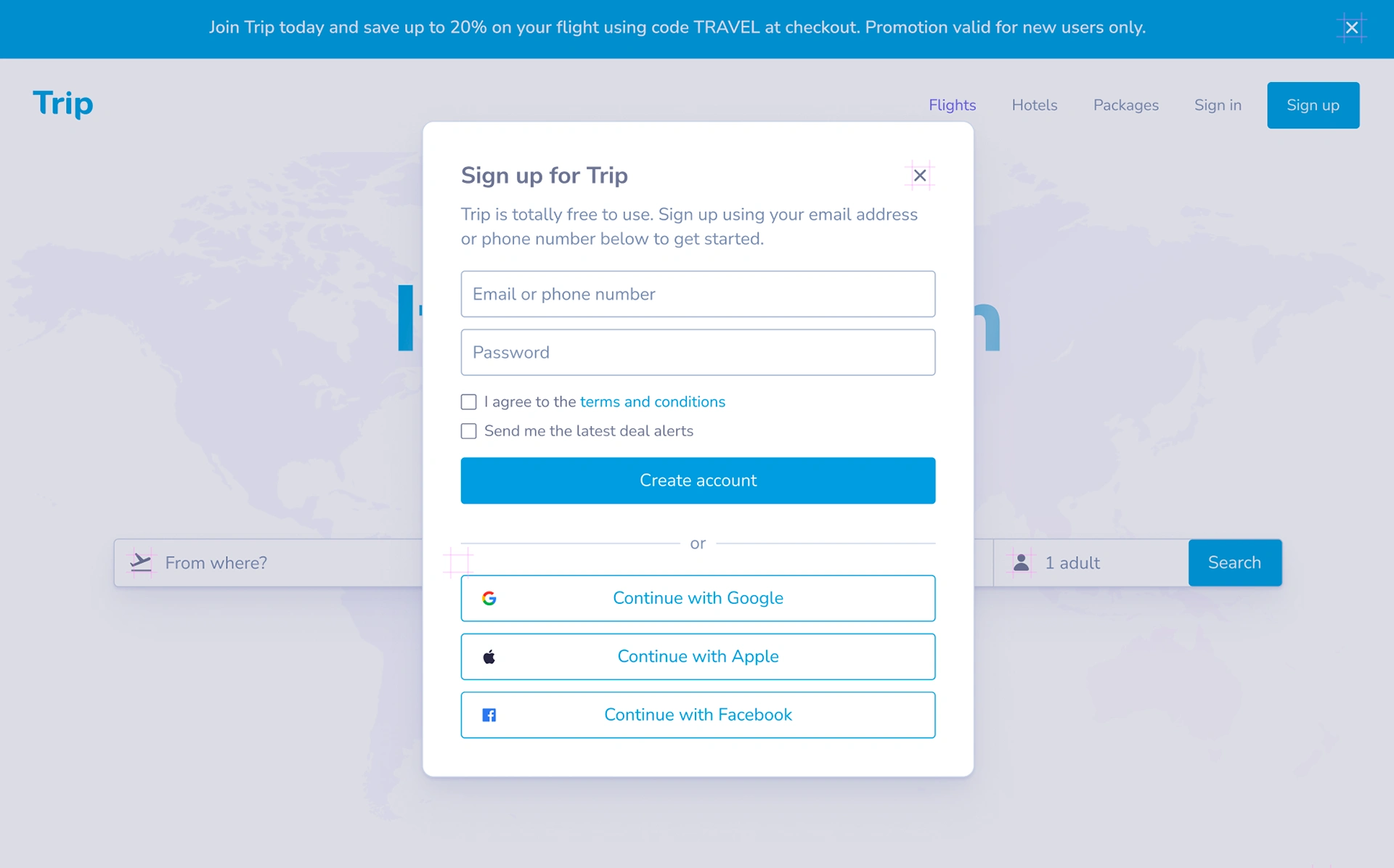
Getting Started
The get started screens allows both new and existing users to get into the app. Existing users can sign in with their username and password .
Below is the link to the prototype design for this app:
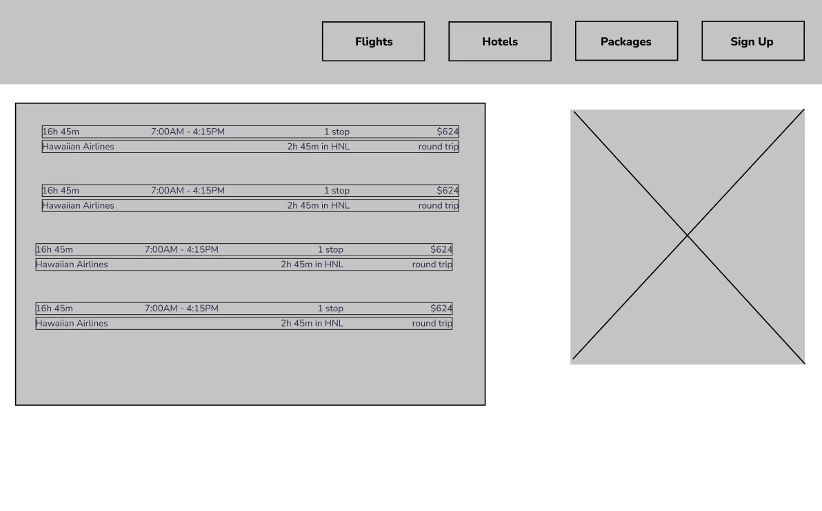
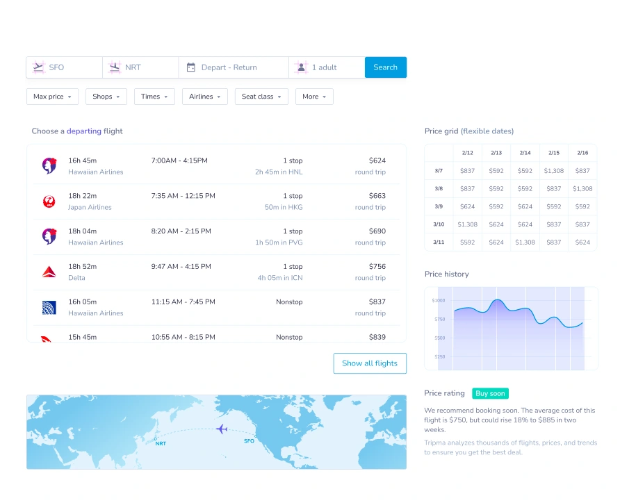
Compare Flights
This was strongly recommended by our users and it was included.
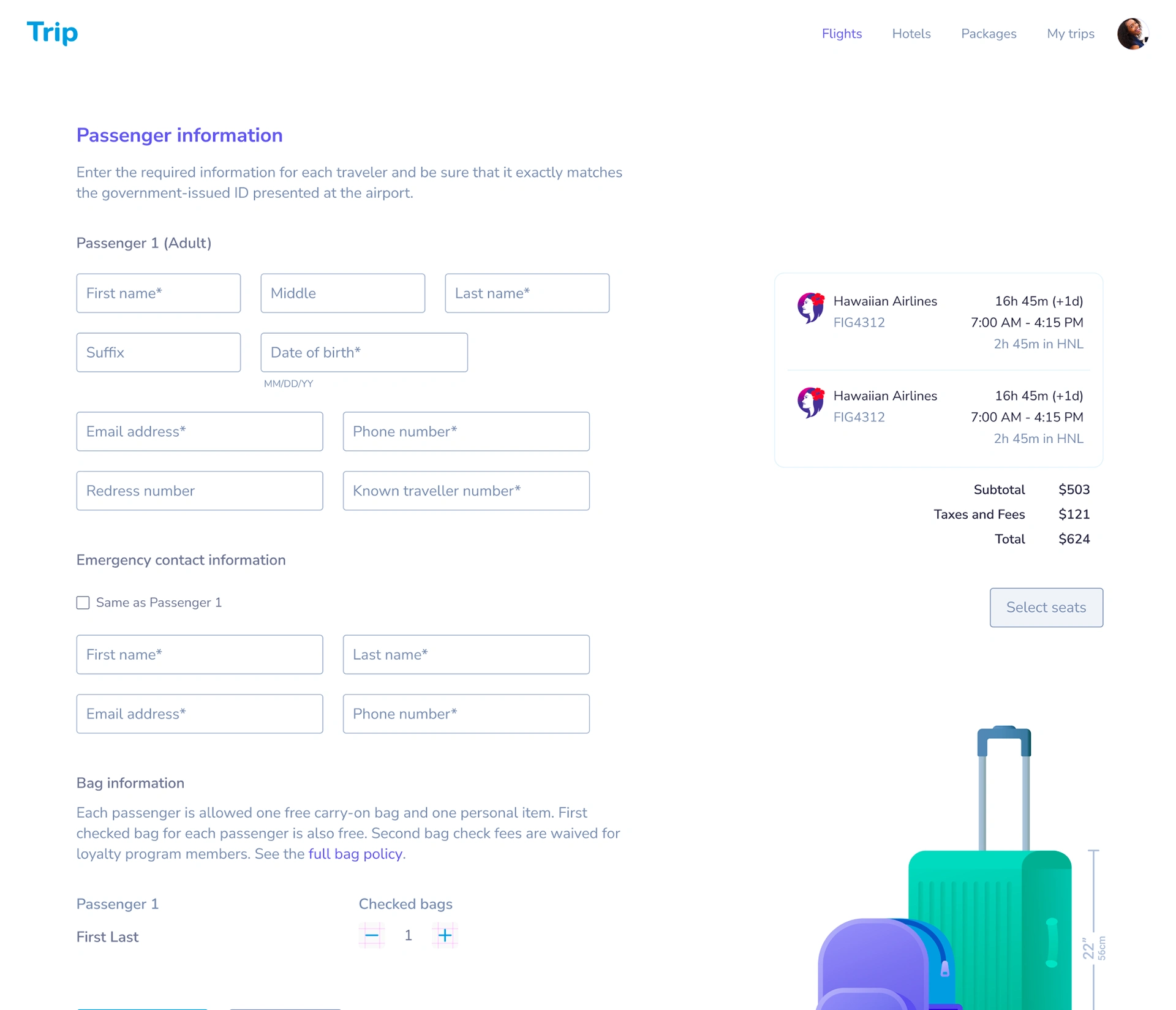
Passenger Information
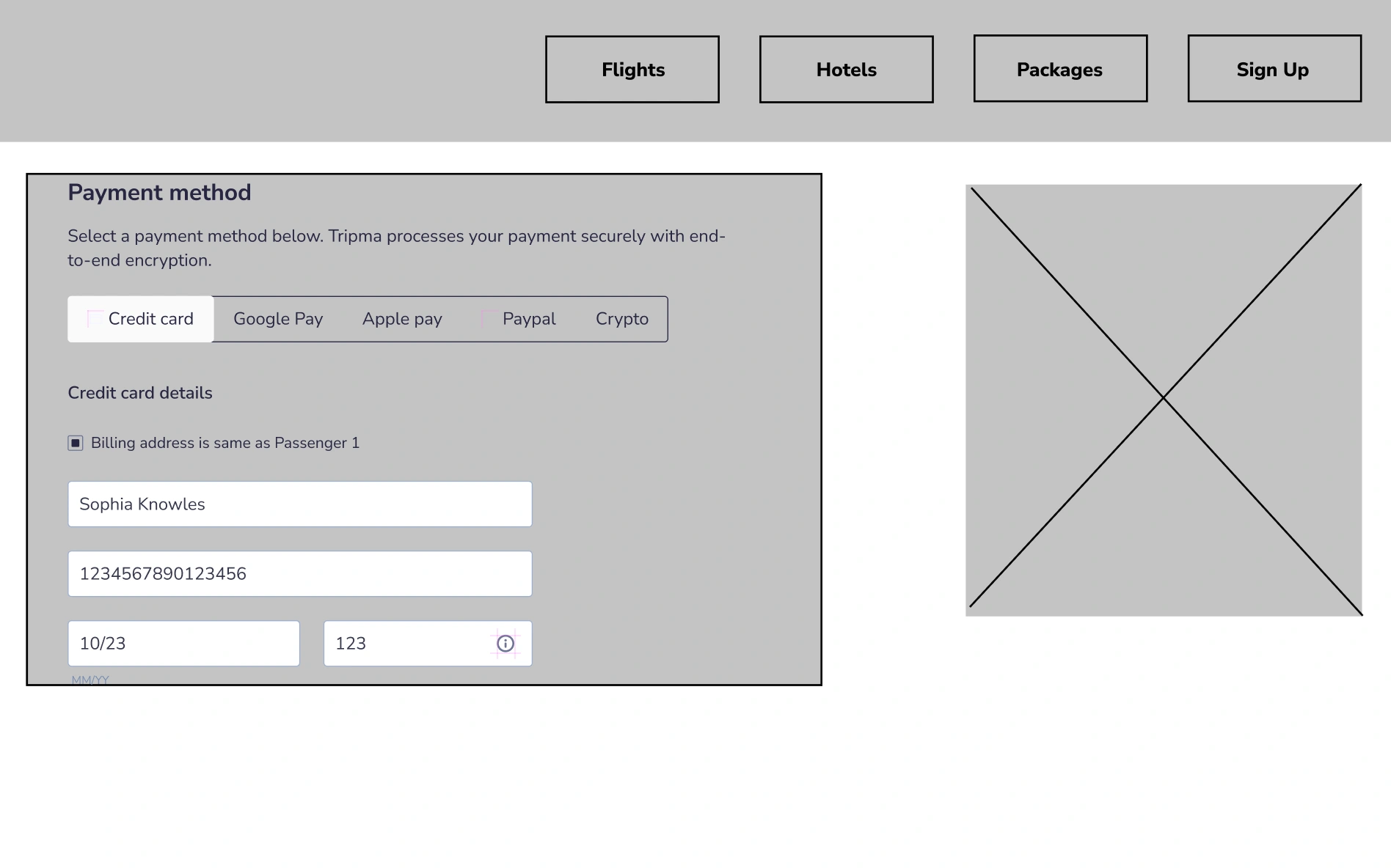
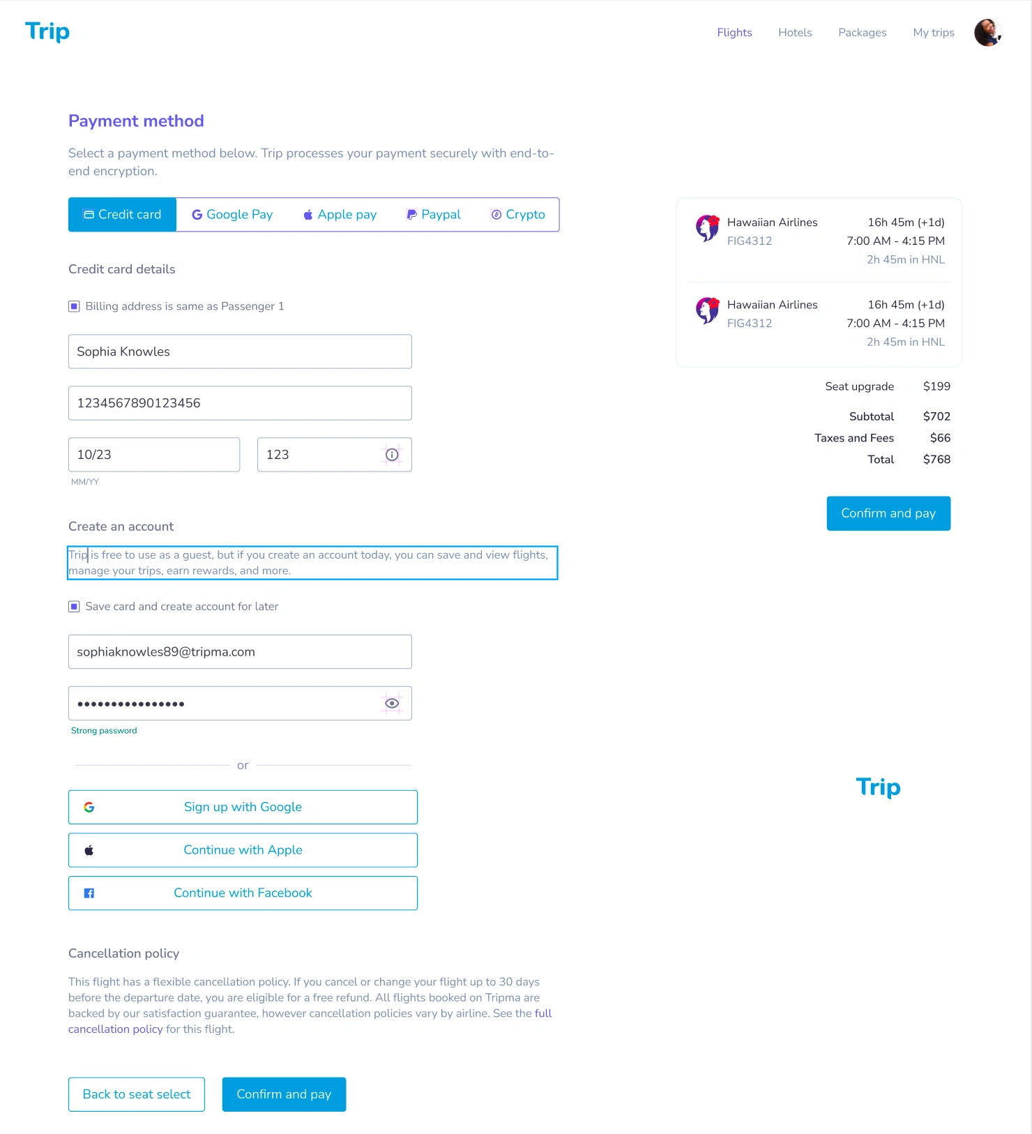
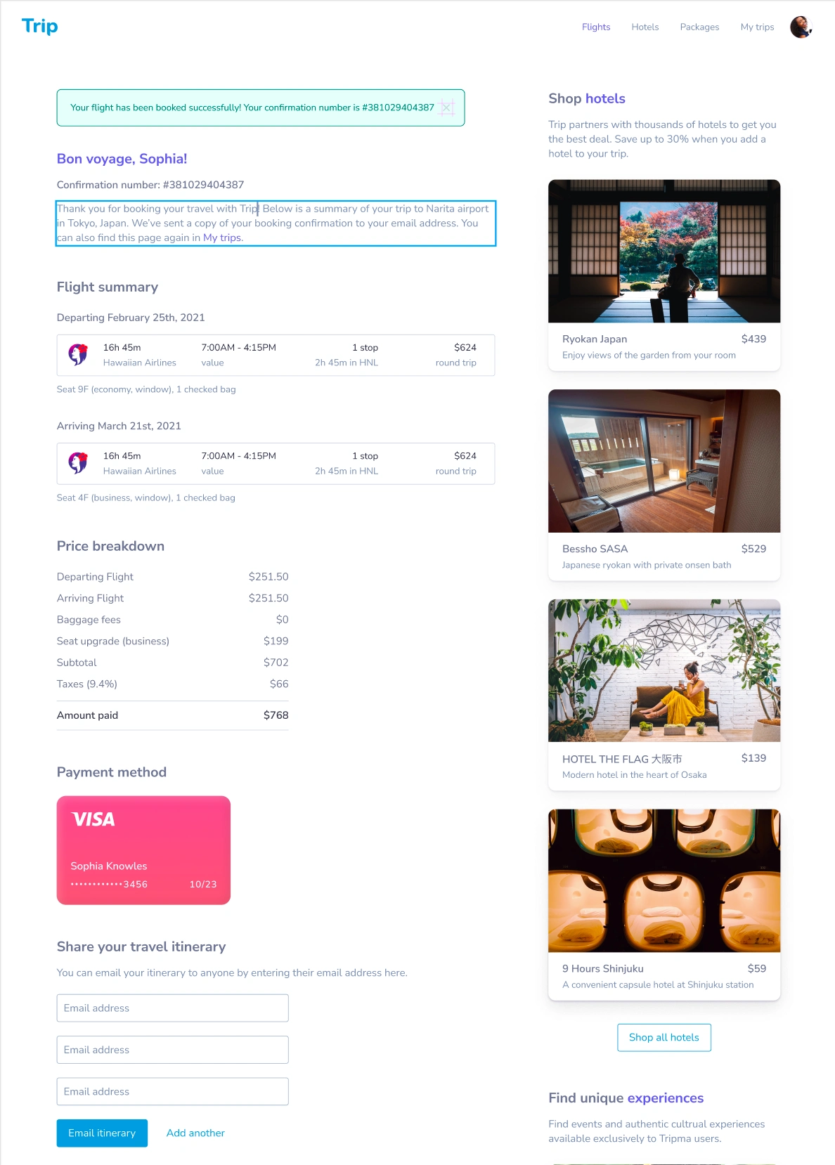
Payment
Second Usability study/testing: Findings
The second study used a high-fidelity prototype and revealed what aspects of the mockups needed refining.
Insights from the second usability study(revealed what aspects of the mockups needed refining) :
- Hotel booking additions where required
- Accessibility considerations
Solutions
- Hotel booking additions where required
- This has been added to the site
- Accessibility considerations:
- Provided access to users who are vision impaired through adding alt text to images for screen readers.
- Used icons to help make navigation easier.
Key Takeaways
What I learned:
While designing the Flight booking app, I learned that when creating web applications from ideas that already exist in massive industries, a proper user research should be conducted to reveal certain improvements in the existing available platforms, these results should guid your design.
Like this project
Posted Jun 20, 2023
Trip is a flight booking app that ensures the smooth booking of flight tickets to travel destination.